This document was written by me (or my group) and in my own words, except for quotations from published and unpublished sources which are clearly indicated and acknowledged as such. I am conscious that the incorporation of material from other works or a paraphrase of such material without acknowledgement will be treated as plagiarism, subject to the custom and usage of the subject, according to the Hogeschool Rotterdam / WdKA regulations. The source of any media (picture, map, or illustration, AI bot such as Chat GPT) is also indicated, as is the source, published or unpublished, of any material not resulting from my own experimentation or observation.
Marvin Sipma
Post-digital
‘Old’ media used like new media, new media- cultural approaches to working with so-called old media.
Post-digital artist/designer
An artist or designer practicing in the post-digital era, striving for a tangible human value in their work.
Digital
Compressed, simple, binary, absolute.
Analog
Real, physical, imperfect, rich medium.
Low-Tech
Technology that is cheap or free, low-end macintoshes from the trash, includes hardware and software, open source.
High-Tech
Newest, often expensive hardware or software. Complex digital features.
New-Media
Mass communication through digital technologies like the internet, using the latest mediums.
‘Old’ Media
Mediums that were dominant before the information/digital age including televison, radio, print, film. Or mediums that are deemed ‘obsolete’
Cyberspace
A non-physical space only existant in our heads, that is taking place in a digital environment.
Realspace
Physical space where touching, feeling, and moving through the real world is possible.
A physical or non-phisical place, realm, concept, issue or framework for which you make art, and do research.
Dérive
The dérive, or drift, was defined by the Situationists as the “technique or locomotion without a goal”, in which “one or more persons during a certain period drop their usual motives for movement and action, their relations, their work and their leisure activities, and let themselves be drawn by the attractions of the terrain and the encounters they find there.” (Laboratory Landscape)
Conditional design
Conditional Design is a design method formulated by the graphic designers Luna Maurer, Jonathan Puckey, Roel Wouters and the artist Edo Paulus, in which conditions and rules of play are drawn up that invite cooperation within a ‘regulated’ process towards an unpredictable design or result. (Conditional Design)
Moiré animation
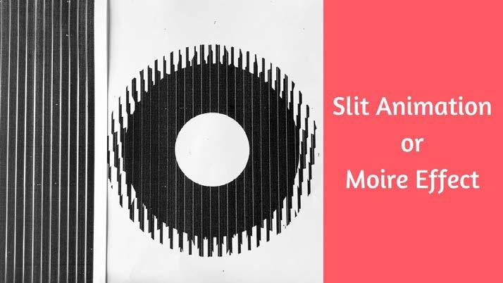
Or: Scanimation; a clever analog animation technique where an animation is devided into frames and sliced up into strips. When you move over a transparent sheet with black bars of the right widt and negative space, it creates the illusion of an animation.
Introduction
The core topic of this research project is the idea of post-digitalism in motion- and graphic design. I want to blend the analog and digital worlds by removing existing barriers and judgments about using seemingly obsolete technologies and techniques. We need to look at a medium that fits the message. Just because we can, doesn’t mean we should use the newest most fancy technologies. I introduce an experimental approach where you let your environment influence your results.
This is relevant to the contemporary design landscape because it explores the intersection of digital and analog values. In the design community, everyone is impacted by the rapid technological advancements and needs to find their own approach.
My research question is: How could the post-digital methodology redefine aesthetics in motion and graphic design? I’m creating a transformative or inspiring, visually striking, and interactive installation from the visual post-digital research results. Showcasing the unique aesthetic of low-tech accessible techniques.
For post-digital designers, it is now important to take a critical perspective on our biases and assumptions. A still predominant bias is the notion that “new is always better.” I believe that even seemingly outdated technology can have value and purpose if we approach it with an open mind and a willingness to explore its potential.
During my minor ‘Public & Private” at the WdKA, I started developing a a methodology in which the methods are inspired by situationist techniques and the thoughts on artistic research of Mika Hannula (Guntur). This research project will strengthen this methodology. The methods in this minor project were about distortion to show that the possibilities of a work get extended when you add layers of distortion or morphing to your work process. I will unpack this in the second chapter.
Sharing the findings, and collaborating with other designers will play a role in the research, and working process. The message of the work I create should remain ever-changing and criticized. I see it as a generative methodology that can be used by more people than just myself to create beautiful, playful, and accessible (LOWTECH MANIFESTO) visual outcomes.
The methodology I developed stands for experimentation. It uses accessible, lowtech techniques, but it doesn’t mean you should not use techniques that are already accessible to you. It also neglects old-fashioned terms like ‘new’ and ‘old’ media. Influenced by conditional design and site-specificity, it adds a real and human layer. The work method is based on distorting in various ways.
The methodology makes you almost dependent on your environment, which always changes. You can expect unexpected things to happen through guided distortion. You can produce unique and captivating visuals by iteratively producing more and more and reacting to these unexpected outcomes.
I’ll use conditional design, a design method formulated by Luna Maurer, Jonathan Puckey, Roel Wouters, and Edo Paulus, in which conditions and rules of play are drawn up that invite cooperation within a ‘regulated’ process towards an unpredictable design or result (Conditional Design). Plus, the distortion methods of my minor project to achieve less determined, and more unexpected outcomes. In the last phase of the project, I’ll use a participatory design/research method by organizing a workshop for colleague designers and conducting research through experimentation and making. I’m excited to explore the potential of any technique or instrument.
I joined an online discussion initiated by Tim Rodenbroeker where we discussed the ‘Lowtech Manifesto’. The manifesto is a relevant starting point to read. The project is not based on the same rules, but it inspired my research project.
03-05-2024 13:02
Updated: 18-07-99
Next Update: Later
A rant approximating the content of this document was delivered to an audience of new media artists and activists by James Wallbank, Coordinator of Redundant Technology Initiative, at The Next 5 Minutes conference in Amsterdam, March 1999.
At RTI we don't want anyone to see this statement as set in stone - hey, this is new media! So if you can suggest any development of this text, or you have any reactions, please get in touch.
Lowtech Manifesto
"Lowtech" means technology that is cheap or free.
Technology moves on so fast that right now we can recover low-end Pentiums and fast Macintoshes from the trash. Lowtech upgrades every year But we don't have to pay for it.
Lowtech includes hardware and software. We advocate freeware and low cost software. We particularly advocate the use of low cost, open source operating systems.
High technology doesn't mean high creativity. In fact sometimes the restrictions of a medium lead to the most creative solutions.
Independence is important. Don't lock your creativity into a box you don't control.
Access is important. Don't lock your creativity into a format we can't see.
High tech artworks market new PCs. Even if they aren't meant to. Artworks that make use of new, expensive technology can't avoid being, in part, sales demonstrations. Part of the message of an online video stream, whatever its content, is "Hey, isn't it time for an upgrade?".
Communicators concerned with the meaning and context of what they do may want to avoid this.
We're skeptical about the consumerist frenzy associated with information technology. Lowtech questions the two year upgrade cycle.
A lot of people say that new media is revolutionary They say the net is anarchic and subversive. But how subversive can you be in an exclusive club, with a $1000 entrance fee?
Lowtech counters exclusivity. Lowtech is street level technology
Text is great for communicating. Write down what you want to say. Make it clear and simple and non-exclusive.
Email is still the "killer app". Fast, low cost global communication for the ordinary citizen is genuinely something new.
HTML is good for lots more than web pages. Now you can author all sorts of graphical stuff with a plain text editor
Use the web for plain text and images. It's simple and cheap and quick and it works.
<- lowtech/projects
Note: In this paper, I talk about accessible design in a slightly different way. I agree with this manifesto, but in the context of this research project accessible also means accessible to you. Hyper-modern techniques are encouraged to create an interesting hybrid of digital technology and low-tech analog media.
Screenshot of the Lowtech Manifesto on 03-05-2024 http://lowtech.org/projects/n5m3/ (LOWTECH MANIFESTO)
Theory of post-digitalism
In Florian Cramer’s essay “WHAT IS ‘POST-DIGITAL’?” he stated that post-digital became a mass culture, a culture where not using the newest technology is not seen as old-fashioned, but where using such techniques is a deliberate choice of renouncing electronic technology. Examples are using typewriters instead of laptops, vinyl records instead of MP3s, or film cameras for analog photos. (Cramer 11).
A vinyl record feels real, there are imperfections in the sound, and you have a physical object in your hand. With analog photography, you choose the moments when you take a picture way more carefully than a point-and-shoot digital camera because simply, there is a limit before the film is used up. Real limitations hold a real human value, you can break, distort, and adjust it yourself with your creativity. Nowadays you can see this mentality because of the developments in AI. There is a big division in how people think about this technology, a relatable example of the division in how new technology is embraced. To put it very bland, I see in the beginning everyone is amazed about the possibilities, then scared of the potential change because of the technology, and then bored because what it creates is not real. When everything is possible, nothing is special. In her book ‘Shadowbook’ Miriam Rasch writes “Since the internet, time and space have changed. Everything is so close, so nothing is close. Everything moves fast, so nothing lasts.” (Rasch 102) But people don’t accept that they want something real.
Cramer states that this way of thinking or “hipster” attitude moved to a mainstream position (11). It has already had a big influence on many factors in our lives. In the documentary “An Impossible Project” by Pulver they show the destruction of the last Polaroid factory as a direct result of the new digital photography techniques, in this digital age people neglected the ‘obsolete’ technology immediately, so there was no business here anymore. Florian Kaps, took over the last Polaroid factory in The Netherlands. Because he was such an “analog” technology enthusiast, in this fast-changing world he went the other way, he didn’t get much success in his business replicating Polaroid at first when Kaps said: “What does Facebook smell like?” He was ahead of his time to think in this post-digital way. Later the factory got great success when the Polaroid hype came up. So successful, that Polaroid bought their factory back.
Media choices in the post-digital come from a disconnected, unhuman feeling in modern ‘digital’ media. This brings us to Post-digital artists or designers, who make art with not only straight-forward, modern technology available, but experimenting with ‘old’ media or making use of the limitations of supposedly obsolete technology too to create unique art. There is no clear definition of a ‘post-digital designer’. But like the division in society, the same division is also present under artists. Some embrace new technology such as AI as a holy grail in design, others are critical and others are even anti new-media.
Practicing post-digital design is something you might be unaware of. This mass culture influences many designers, leading to more carefully considered medium choices that better fit their message. I became a post-digital designer very consciously during my research, it became a theme in my work. It’s not a given that a post-digital designer wants to blend the analog and the digital world. But that’s where I see the artistic value and, my main focus point more interesting, new aesthetics in graphic and motion design.
Combining old ideas, and materials with new techniques and possibilities can create wonders. Like in the case of the Sagrada Familia in Barcelona. This is a more than 140-year ongoing architectural project. But when Mark Burry joined the building program years after Gaudí’s death, he introduced CNC-milling technologies to speed up the building process. “Some research suggests that this was the first instance where robotic CNC technologies had ever been used in architecture.”
(Foster Gage). This big idea by Antoni Gaudí, which he knew he would not finish in his lifetime, got introduced to new technologies many years into the building process and enhanced its potential. This is a good way of looking at combining traditional plans with high-tech solutions. I think we should not neglect any technique for the sake of it being ‘old’ or ‘new’. This is a perfect example of a post-digital, or post-technological achievement. Two techniques, two people, and two different times working together to create one grand structure. In my methodology, I strive for similar outcomes. Technology or ideas that are not made to be used in a modern context generate new possibilities. Even though this is an architectural work, we can almost look at it as a 3 dimensional graphic design piece. And take special inspiration from it.
Anti new-media?
It appears that the post-digital is by definition opposed to new media. However, I believe that the combination of the two can be highly valuable. To me, it’s about approaching techniques that have the label ‘outdated’ with an open mind and finding what they have to offer.
On the 18th of April, Florian Cramer and I had a conversation about this research project where he said he wrote his text at a time when there were people who believed that paper was going to disappear. Everything was going to be replaced by computers and we should stop teaching poster design in graphic design. In a more contemporary sense, it’s not even that interesting to talk about post-digitalism in itself. But what’s interesting is that he was writing this ten years ago and already saw that we would have artists who would create these hybrid combinations of hyper-modern techniques and “obsolete” technology, like the Riso-animations of the 11.11 collective, that I started in 2023 with Seven Shepherd.
A method I enjoy using is making new images through distortion. In the next chapter, I will discuss how distortion plays a big role in the methodology I have developed. What makes distortion interesting is its unpredictability. Each layer of distortion forces you to respond, expanding the possibilities of your work. When experimenting with older technologies, the element of unpredictability also makes it appealing. In addition to that, you have to deal with limitations, which expands the potential outcomes even more.
Riso printed animations by Marvin Sipma and Seven Shepherd (11.11.collective)
Methodology
In my minor ‘Autonomous Practice - Public & Private’ at WdKA I was inspired by an article on Wired about a beautiful artwork by Michael Burk and Ann-Katrin Krenz called “Kepler’s Dream” which used an old overhead projector in combination with high-tech 3d software and 3d printing as: “An investigation into how seemingly obsolete technology can be repurposed for our digital age.“ (Stinson) This quote inspired me to connect my already established distortion methodology to my interest in the post-digital theory. Because I was already interested in combining high-tech and low-tech techniques.
In my minor project “Engraved echos of Schieblock” I made a generative image-making apparatus through distortion.
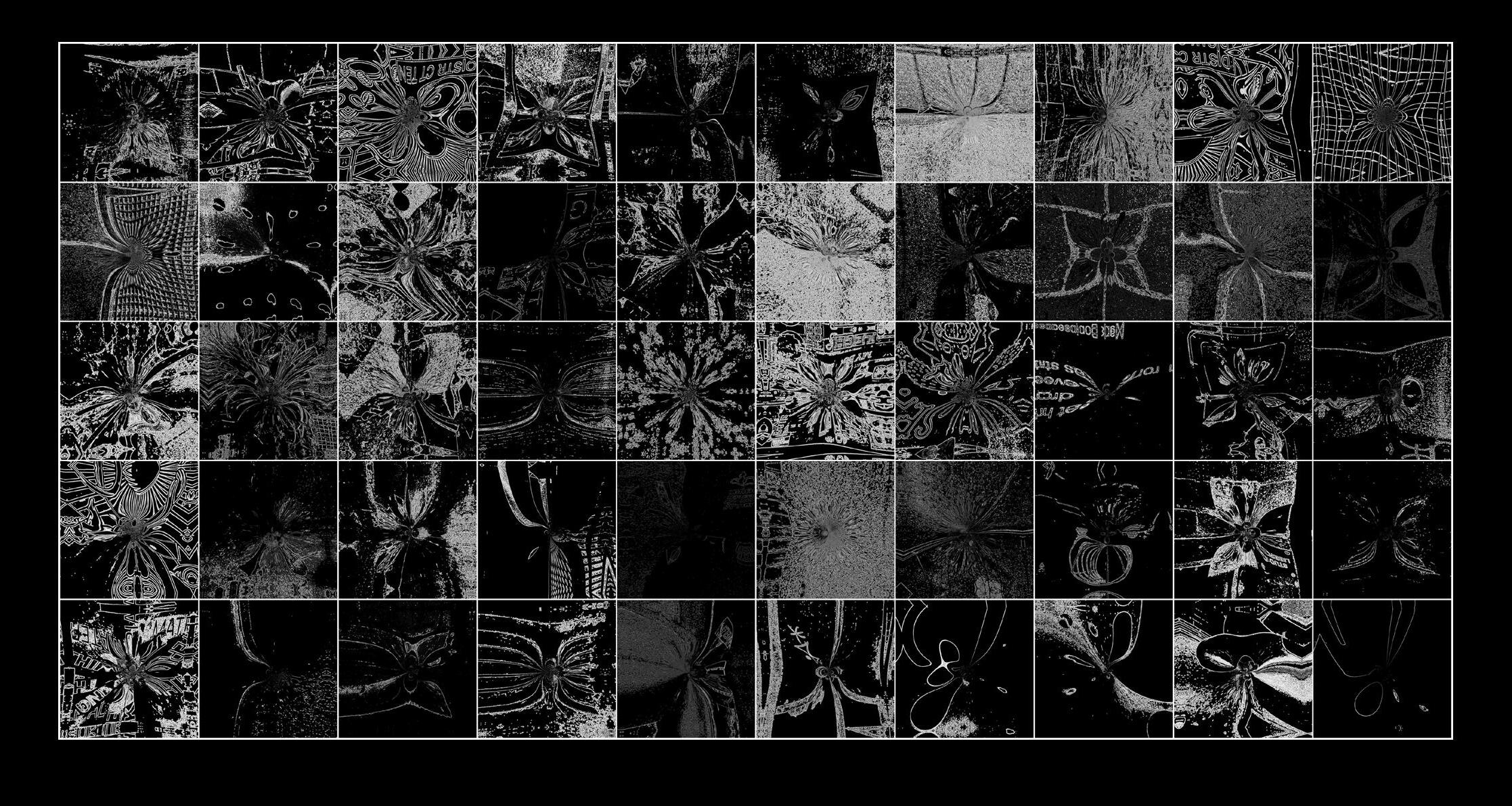
“The final distortion device I created. A phased score of layers of digital distortion. Bringing down the image to binary values (analog, 0=black 1=white) to further distort them digitally in Adobe Photoshop with a pre-determined set of effects in Adobe After Effects. Fifty visual research results are distorted in the same generative way to create a series of unique, almost indistinguishable from the original artworks.” (Sipma)
One of the major drives for this project was finding my own methodology. However, I found that this approach could be interesting for others so I published a step-bystep guide for designers on how my work process went and how to recreate it, including a reflection on the entire methodology and theory of it.
“The general research methodology consisted of these layers; Visual documentation, Distortion as visual analysis, and Realisation.
Visual documentation;
Drawing lines between obstacles and documenting those lines by redrawing from different perspectives, documenting the site with pictures with a 40 cm x 40 cm limitation, searching for lines in Schieblock that will create a nice image after distortion, and redrawing light reflections found in the site.
Distortion as visual analysis; Material(ism) research, researching tools/media and apparatuses of other artists, scoring; Distortion by AI, Analog distortion, Object distortion, Intuitive distortion. (Freeform, but directed.), And using Schieblock as a tool for making by using the surface to draw (act as an interface.).
Realization;
Distorting the visual research results, through a phased distortion device, and engraving the visual research results in acrylic glass.” (Sipma)
Conditions and limitations of this project
The ‘site’ doesn’t have to be a physical place you can walk through. In this project, I chose the post-digital realm as the site, as opposed to the minor project where the site was a literal space in Rotterdam. The way of walking through this is through research, experimenting, and exploring what is inside this realm and what isn’t.
As Miwon Kwon puts it in her book “One Place After Another”: “In this way different cultural debates, a theoretical concept, a social issue, a political problem, an institutional framework (not necessarily an art institution), a neighborhood or seasonal event, a historical condition, even particular formations of desire are deemed to function as sites.” (Kwon 28-29)
Because the previous project had a more practical outcome, and a very literal approach to distortion, I want to do it differently in this project to focus more on the post-digital aspect and to make unique works that are convincingly a product of
Fig.
Fig. 2
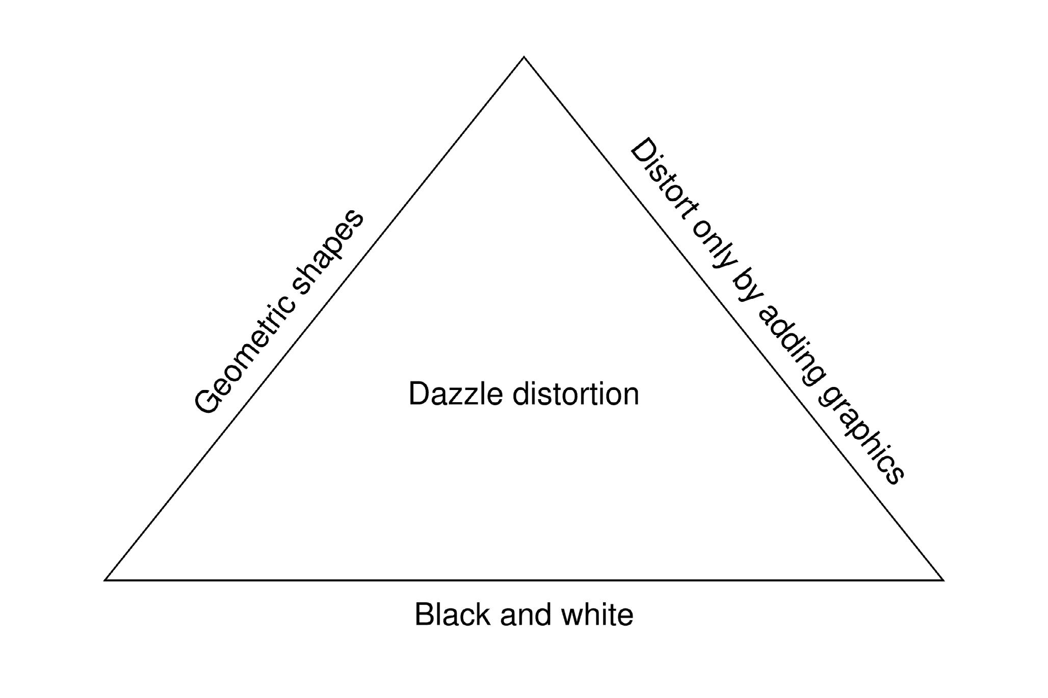
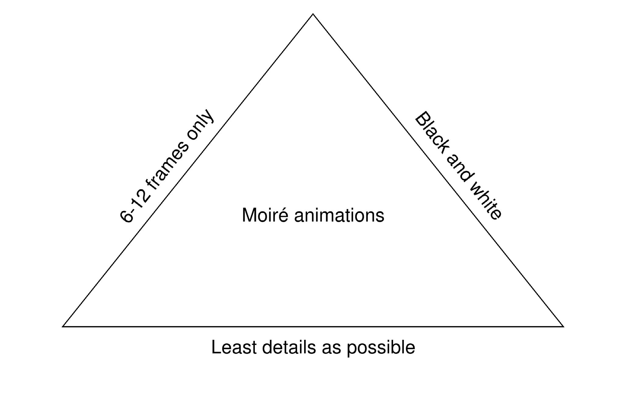
the post-digital methodology. So I’m building on this methodology and I’m exploring two new methods of real analog distortion and a new addition of analog animation. This is to drive the focus more towards post-digital and accessible methods. The methodology is based on conditional design and as a tool to define these conditions and limitations I’m using ‘The Magic Triangle’ scheme made by Tim Rodenbroeker (The Magic Triangle).
The framework
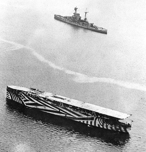
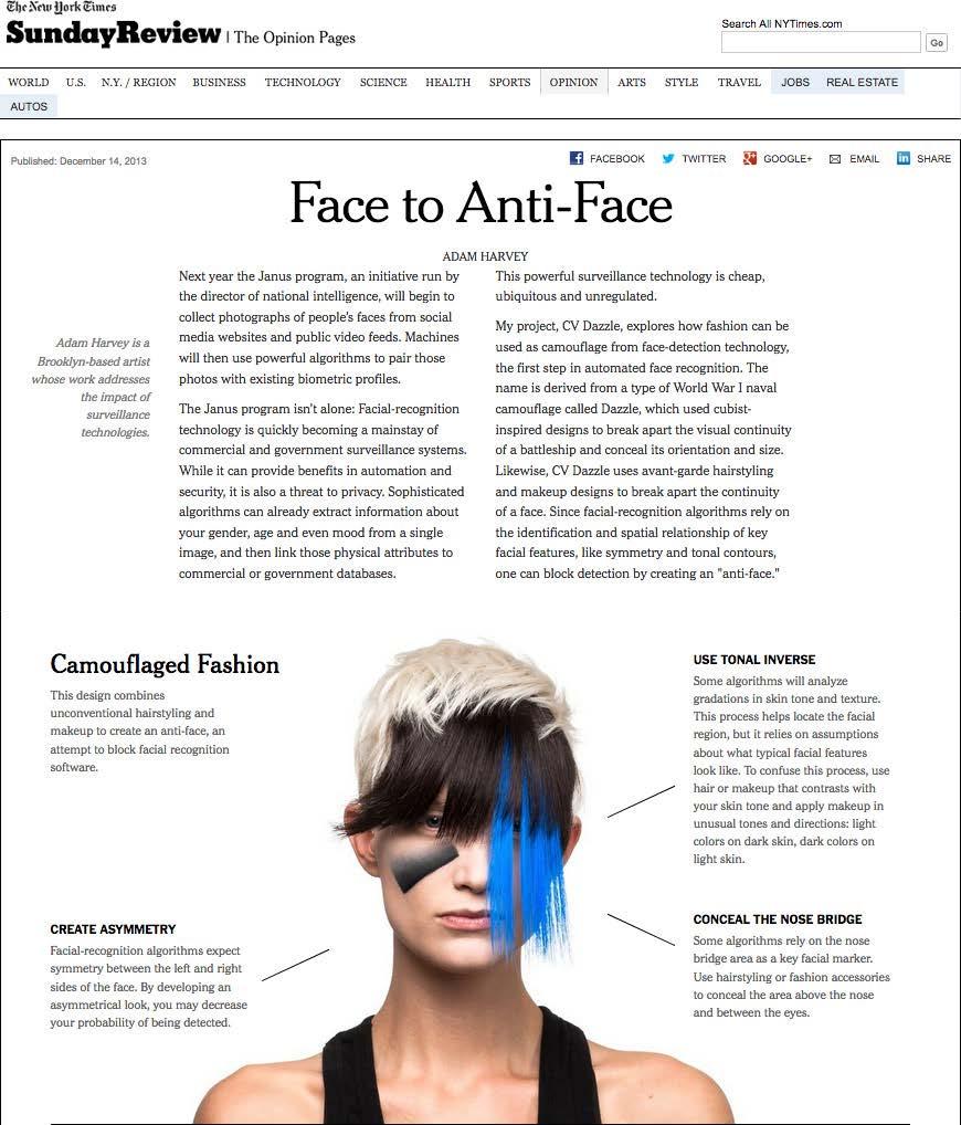
To find these new ways of analog distorting and animating, I came across two branches that I want to explore: Dazzle painting and Moiré patterns. During World War I, a camouflage method called ‘dazzle painting’ was used. “Dazzle camouflage was designed to complicate an enemy’s ability to target a ship in the water rather than attempting to blend a vessel into its surroundings. Using curved, diagonal, and parallel lines, the dazzle technique made it harder for German U-boats to estimate distance, speed, and direction for Allied vessels.” (“Dazzle Camouflage: The Art of War”) With these graphical, striking geometric optical illusions it was hard to see depth, and thus to hit the target in the right spot. The reason why this is such an interesting method is because it’s a perfect fit for the post-digital mentality. The method was deemed obsolete shortly after it was invented because, with new radar technology, it was much easier for the enemies to detect boats to the centimeter accurately.
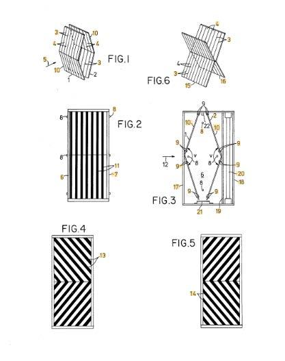
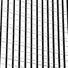
Moiré patterns are patterns that appear when you overlap two sets of lines on a slight angle. This phenomenon can be jarring when it happens on camera when someone is wearing a striped shirt. But this technique is also used creatively in different applications like a guiding light for ships to navigate into a port.
“Here, the patterns are set up so that if you’re looking straight at that light, dead on, you see parallel lines. But if you’re to either side, the arrows formed by the moiré patterns tell you which way to go to be straight on to it. You can have five different boats in five different locations out there, all looking at the same sign, and they will all see arrows pointing the right way for them, without any computers or fancy tracking.” (Tom Scott)
In children’s books, the patterns are even used as a form of creating moving images or little animations in a very simple, analog way. A beautiful example is the book New York Pyjamarama by graphic designer Michaël Leblond. A transparent sheet with lines is moved over illustrations when you turn the pages. When the black bars are moved, the line pattern cleverly reveals multiple frames of the animation.
The guide:
Step 1 - Determine the site. You must keep the site the same during the process. In this step, you choose the topic of research or a physical space that you can explore. You can’t change the site along the way if you do feel the need to do that, restart the whole methodology from step one.
Step 2 - Walk around the site and become familiar with it. Talk to people who live there, or just happen to be there. Take notes, and write about the site while you are there. In the case of a non-physical site walking around can be in the form of doing participatory and desk research, and talking to artists in your field.
Step 3 - Over two weeks, you start gathering visual data on the site. Spread around the site, and the two weeks, as much as possible. You decide what visual data you are gathering, but it’s important to stick to a limiting, conditional rule. (Use the magic triangle by Tim Rodenbröker).
Step 4 - Analyse the pictures every day and find a narrative, direction, or focus that
you will use for the visuals you gather on the next day.
Step 5 - Categorise the data (eg. on facade/floor, time/date, or focus.)
Step 6 - Make a selection of 50 visuals that fit best with your chosen focus or theme.
Step 7 - Now you can start distorting the visuals, and visually react on each iteration.
Examples
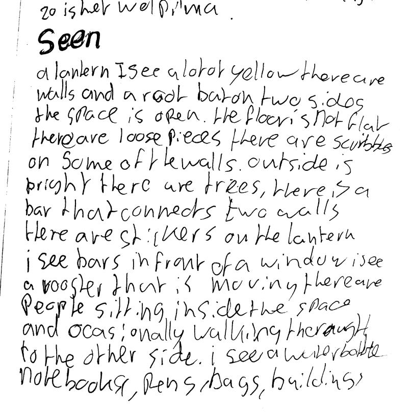
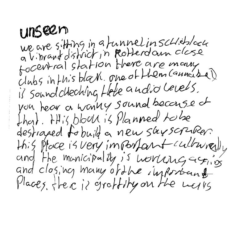
Using the first edition of this methodology in my minor, it went from a collection of images to a generative distortion apparatus. It starts by drifting through the research site of this project. In this case that is the Schieblock area in Rotterdam. A useful method is taking notes of the seen and the unseen where you should write for 5 minutes continuously without thinking too much and writing literally what you see, then 5 minutes of writing about the connotations you have with the things you see in the surroundings.
This is a good way to get in touch with the site. It will help you start to really think about the site from a deeper perspective. This helps you throughout the process of substantiating your project.
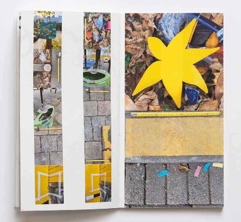
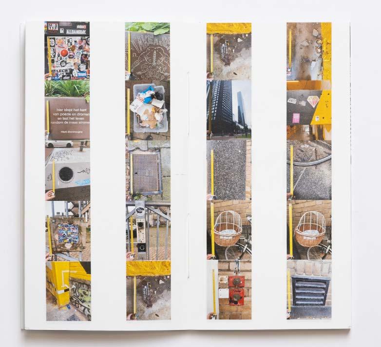
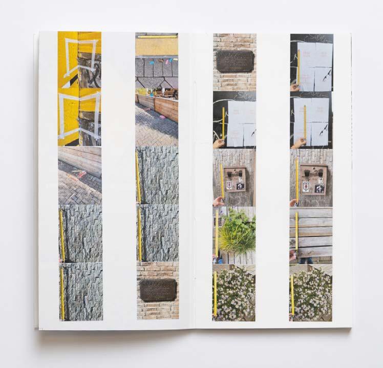
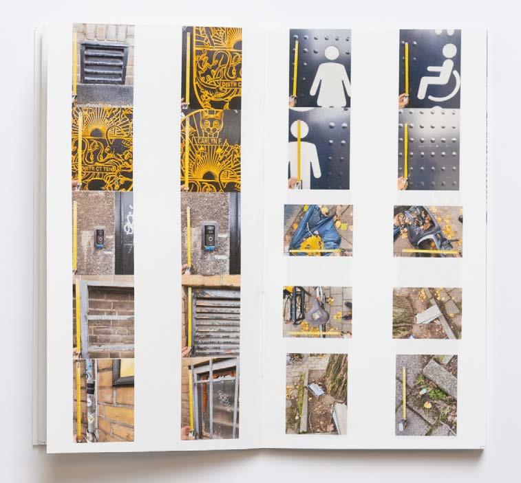
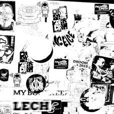
A good way to document your route and explore your unconscious interests is by creating a visual collection of your site. Limit yourself to taking a frame of 40x40cm and aim to take 100 pictures over a period of two weeks. like that, you can identify narratives and visually interesting aspects of your pictures. This exercise can help you reflect on your journey and discover new perspectives.
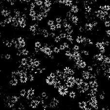
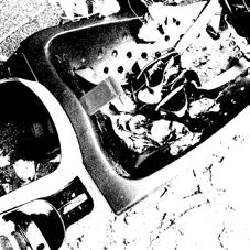
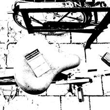
At this point in the project, I started experimenting with distortion and I found that pictures with lines and patterns gave the most interesting results. So, for the following pictures, I would focus mainly on lines and patterns.
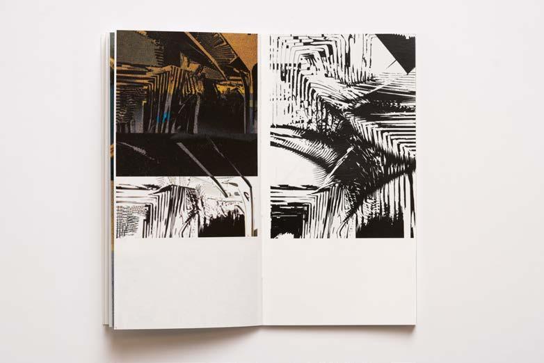
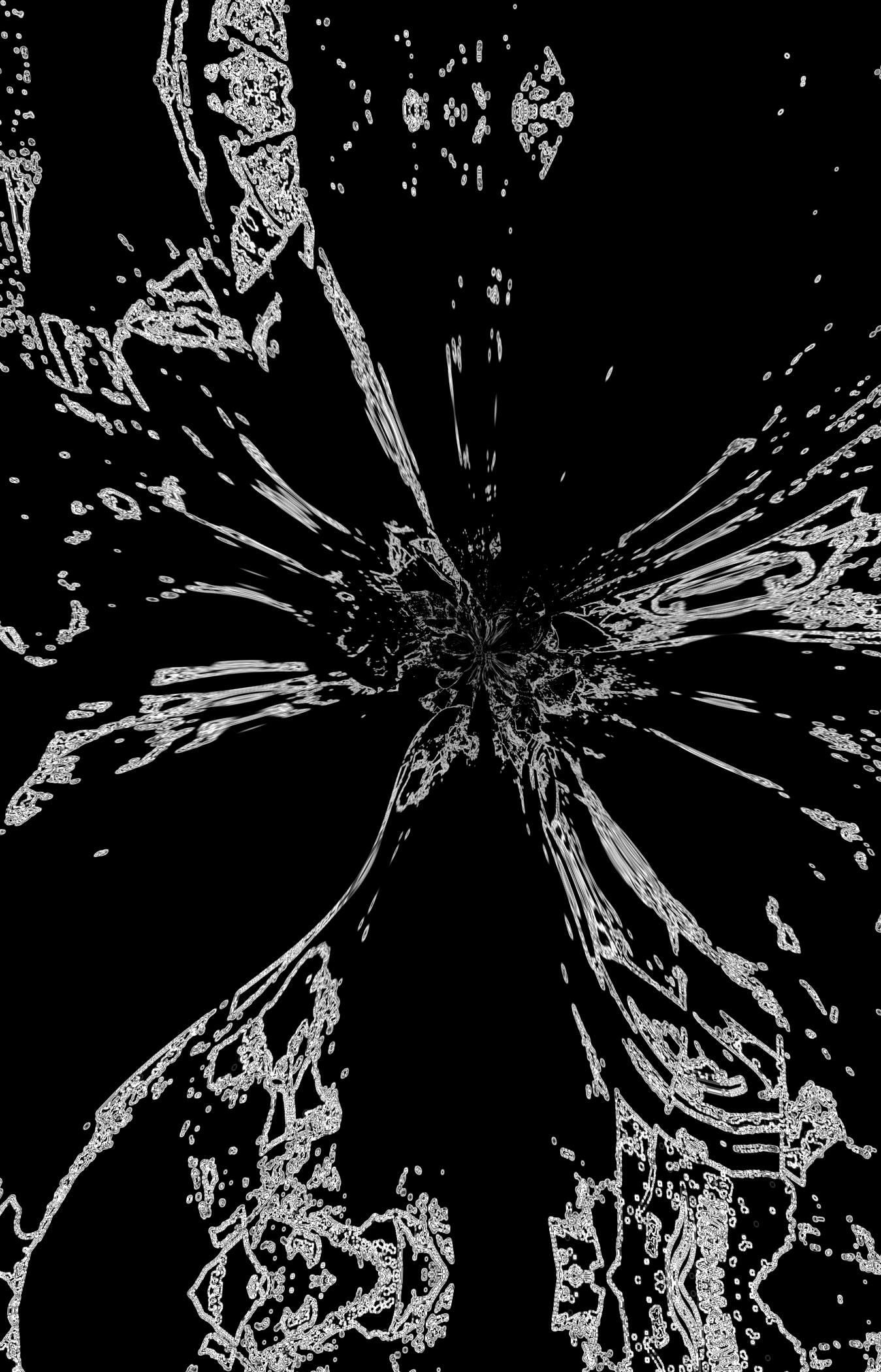
By converting everything to 100% black and 100% white values before applying the distortion apparatus I created in After Effects, the contrast becomes bigger, and possibilities for distortion grow. Also, it is an extra distortion layer that results in an almost unrecognizable visual result, as if the device creates new visuals on a generative level.
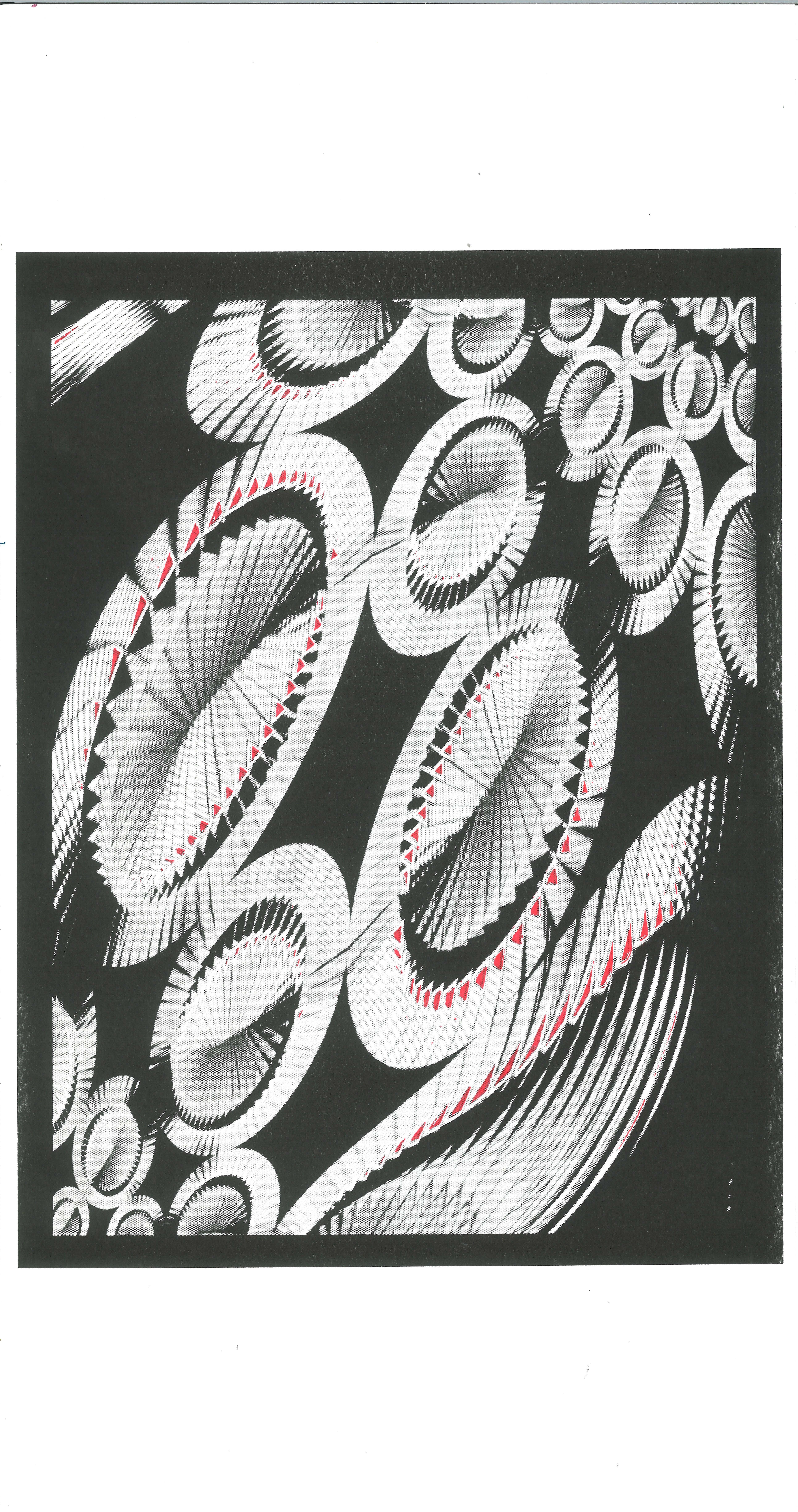
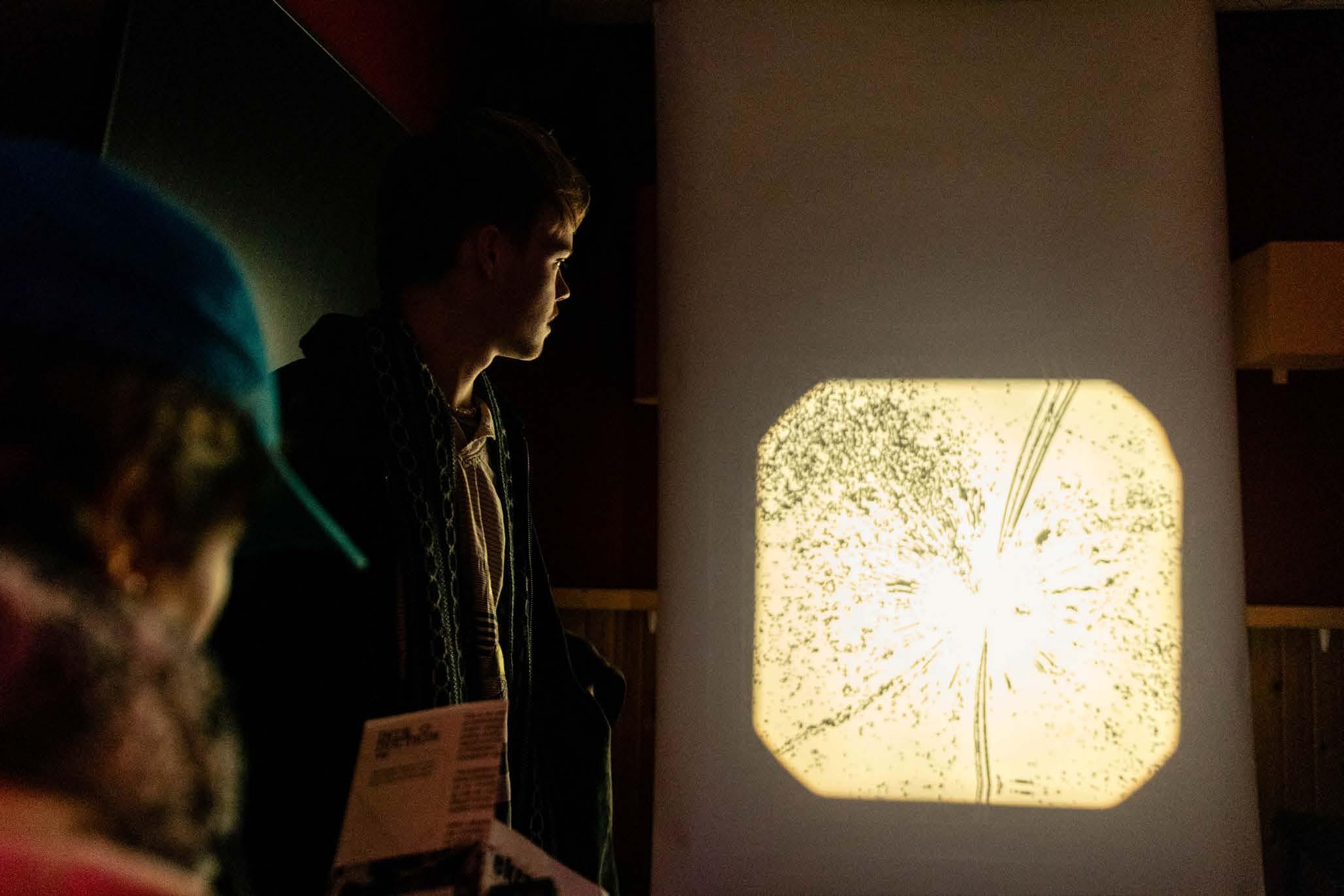
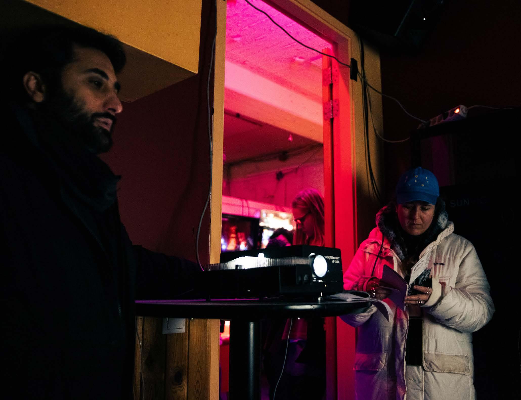
I engraved the visual results with a modern laser cutter in plexiglass, to thereafter insert them in a 1974 slide projector. The ‘obsolete’ projector presented an enlarged shadow projection of the visuals generated.
Participatory research method
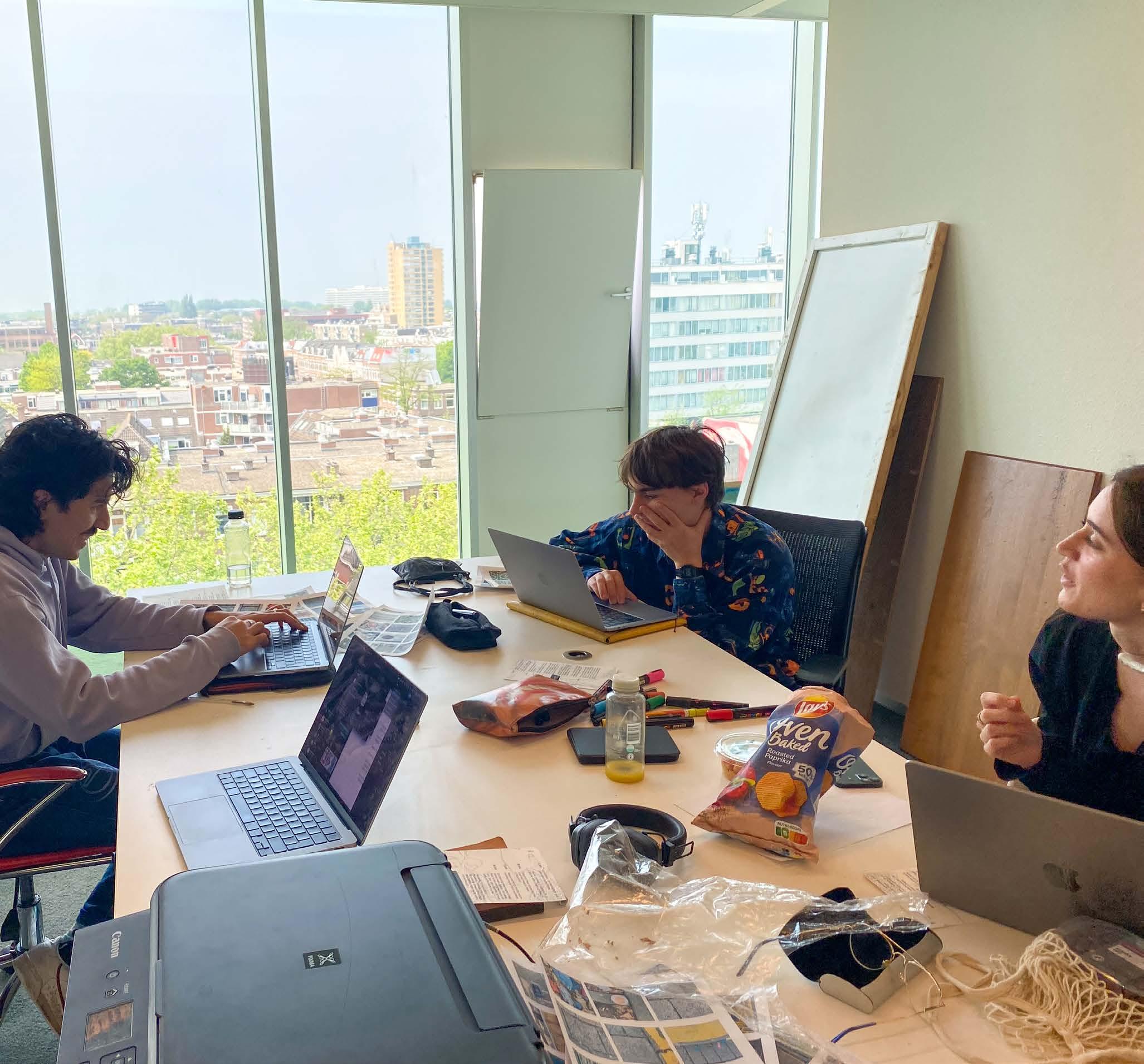
To put this into practice and to test what other designers come up with, I developed a smaller version of this guide to translate into a one-day workshop for colleague designers. Now that I know what my results are when using this methodology I’d like to see what others come up with and their findings.
The workshop is just one day to respect my colleagues’ time and because of the limited timespan of this graduation project, and the time necessary to build the methodology. It is one participatory research step as input to develop this methodology and put it to the test for the first time. It opens possibilities for building further on the methodology and possibly organizing more finished and more extensive workshops for students in the future.
I’m inviting 3 graphic designers to see what the methodology does for them. Do they understand it? Do the methods fill them with inspiration, and do they approach choosing a medium for their work with a more open mind and can it initiate uncommon usage of an obsolete technology?
I adjusted the assignment and the timeframe a bit throughout the design process of this workshop because I wanted to keep my attention and energy high throughout the workshop.
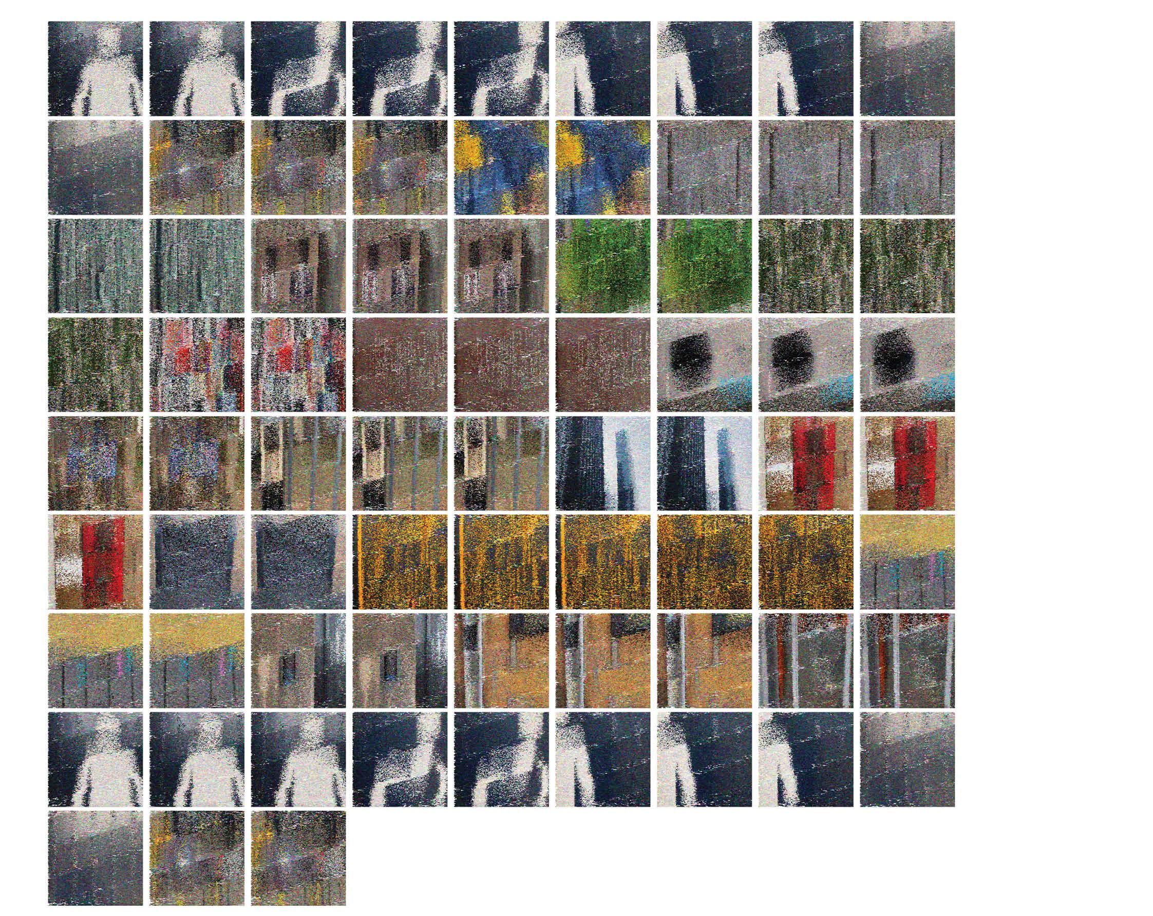
I’m supplying 50 of the input pictures that I took for my minor project to the participants because I want to see what others do with them. The iterative methodology should create totally different visuals from those of mine. I’m not showing the results of my work until they are finished. The participants are encouraged to think of and bring technology/techniques that are not made for image-making.
Distortion & Visual analysis
In this chapter, you’ll find my visual experimentation of this research project, as well as a reflection on the workshop experience and the participatory part of the methodology development.
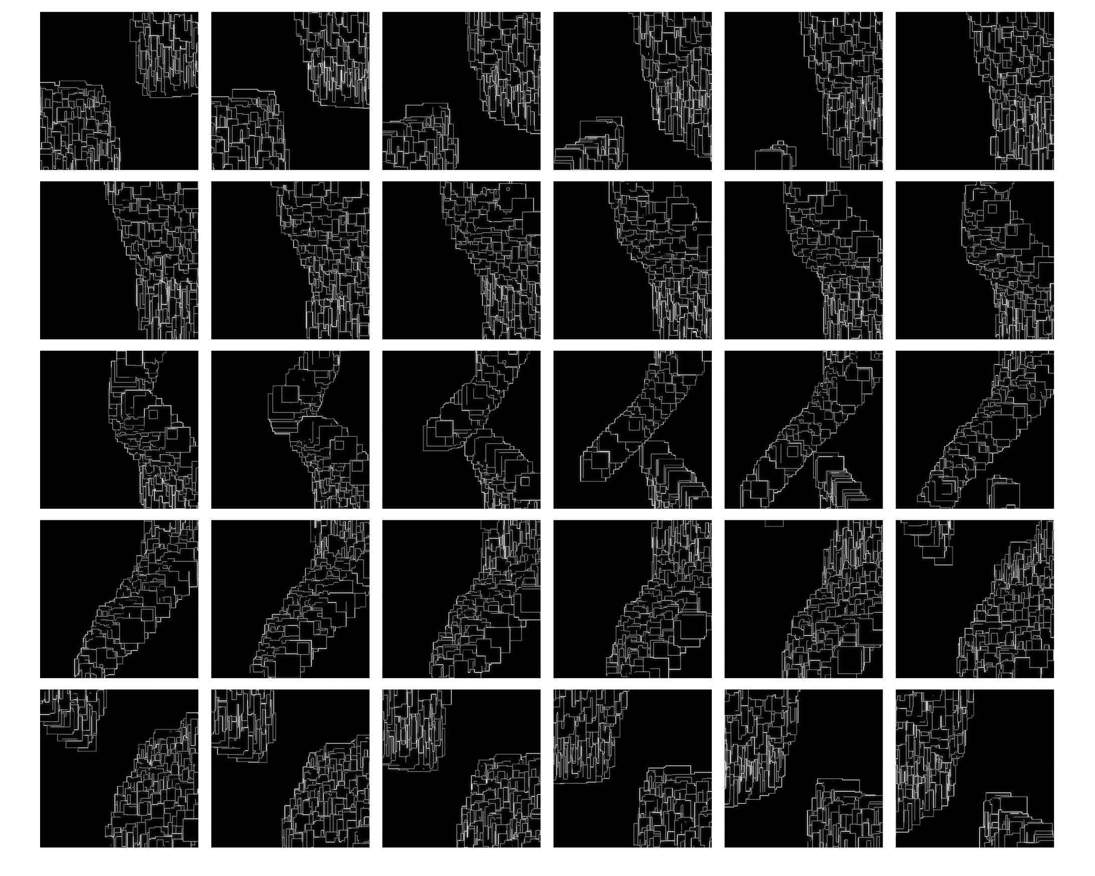
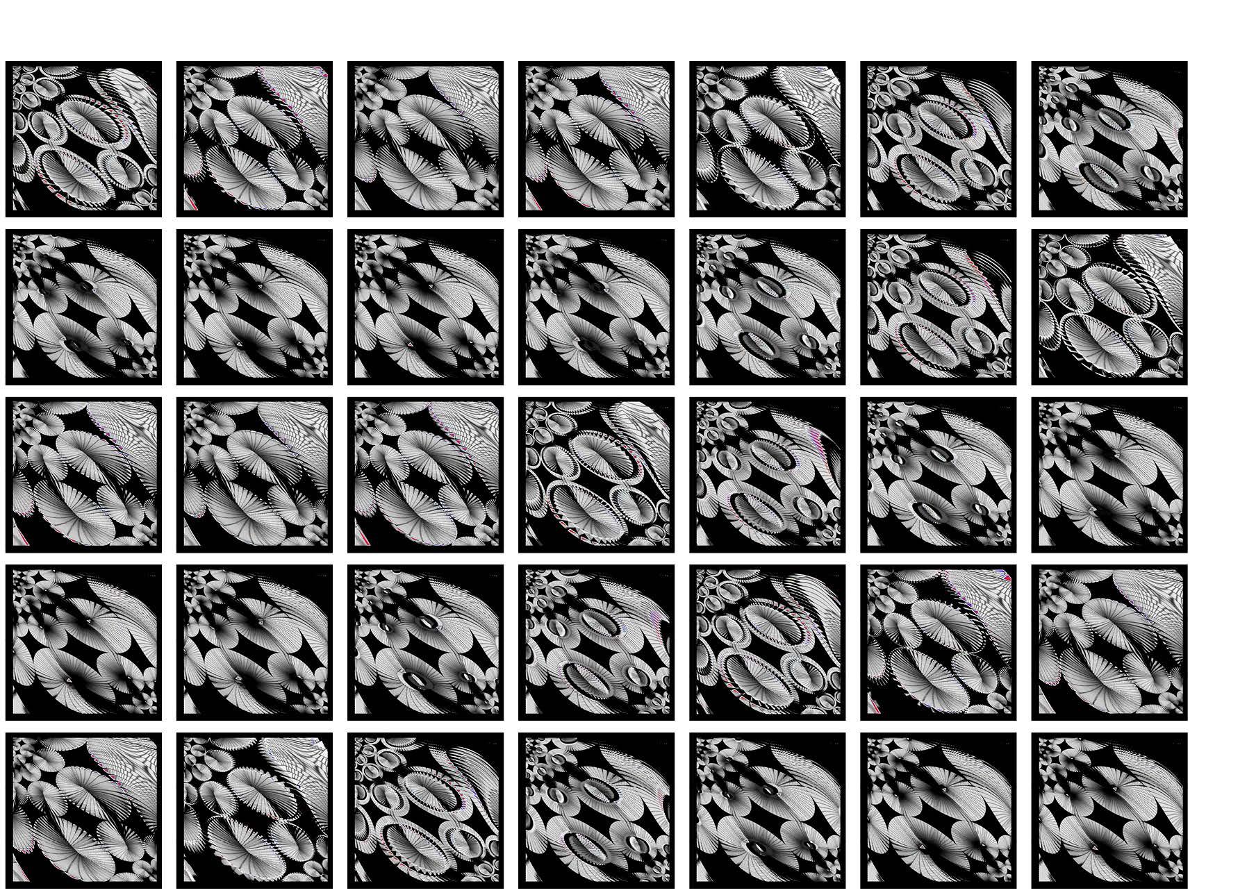
Using the earlier introduced steps, I experimented with two major branches. The Dazzle patterns and the Moiré animations. In the following pages is a visual collection of key moments in my own experimentation. In the appendix at the end of this document, you can find a more detailed description of the steps taken and iterations.
These results all belong in the visual analysis phase of the methodology, it’s image creation within the realm of the site and exploring the concepts by making, distorting, and reflecting.
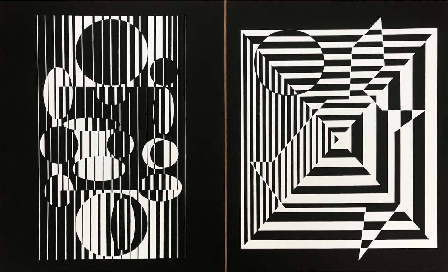
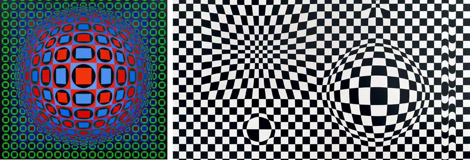
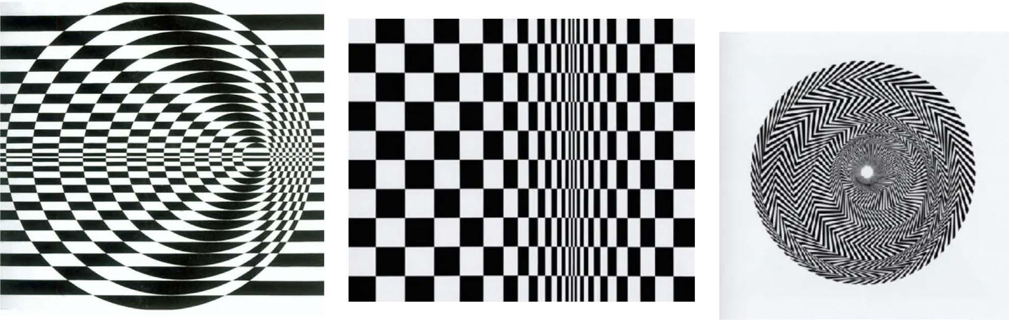
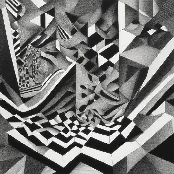
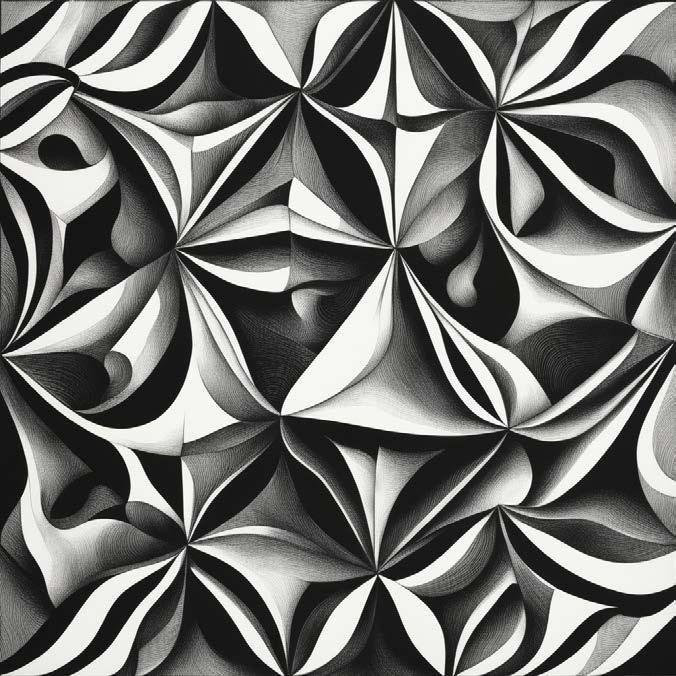
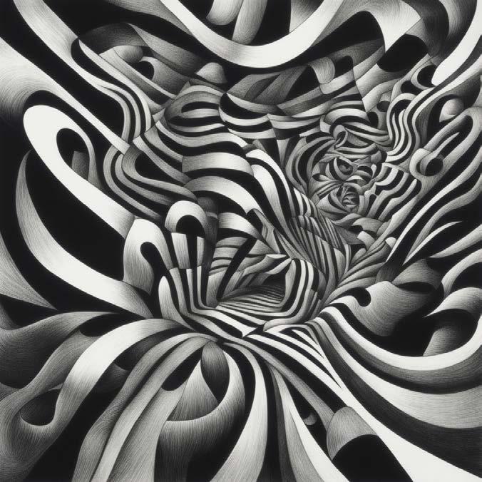
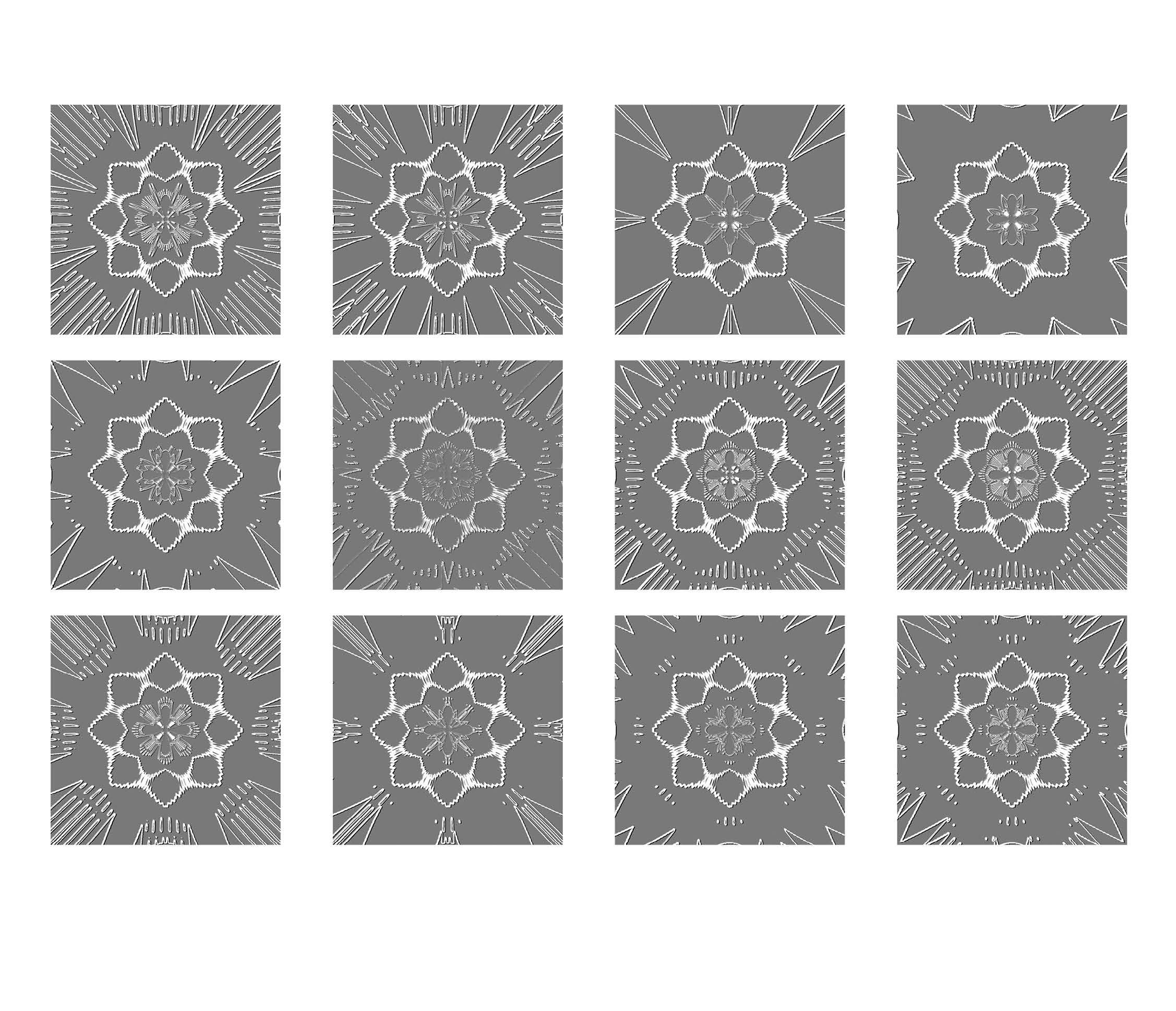
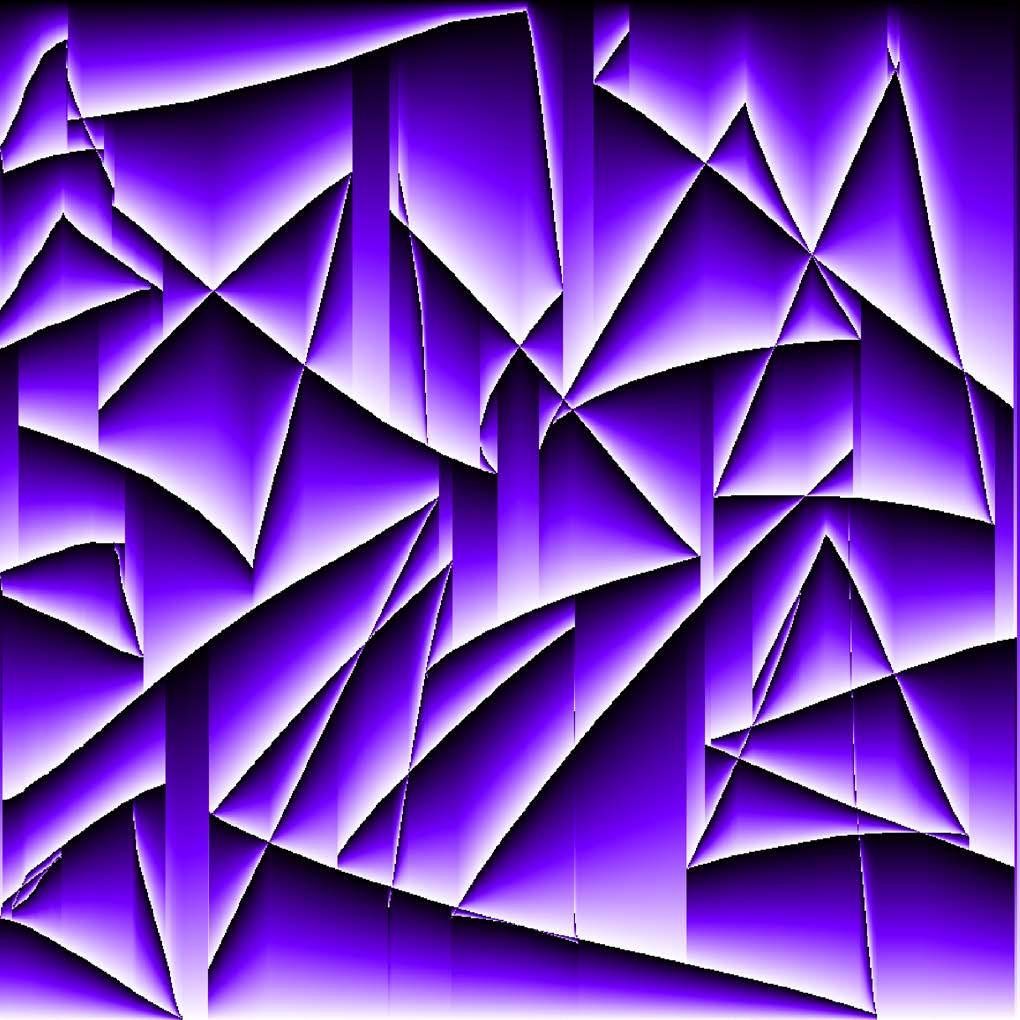
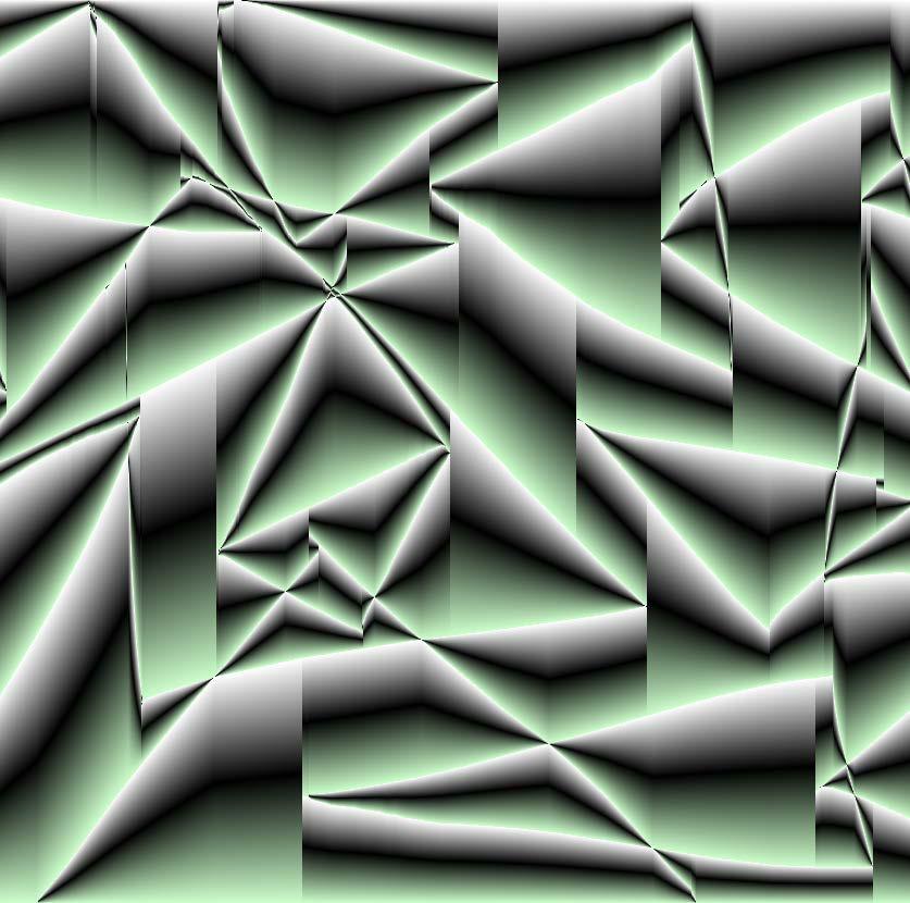
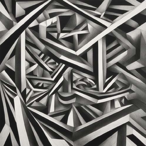
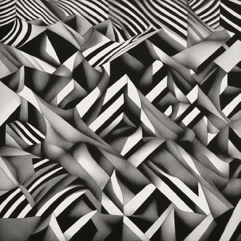
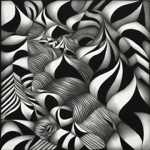
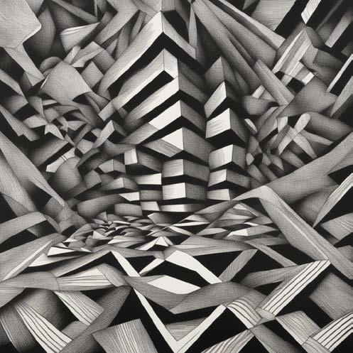
Analog distortion inspired by Dazzle painting. They are all forms of optical illusions in an artistic way. Personally, I found love for this aesthetic in the context of this research. I got inspired by works from Victor Varsaley and Bridget Riley.
Fig. 5
Fig. 6
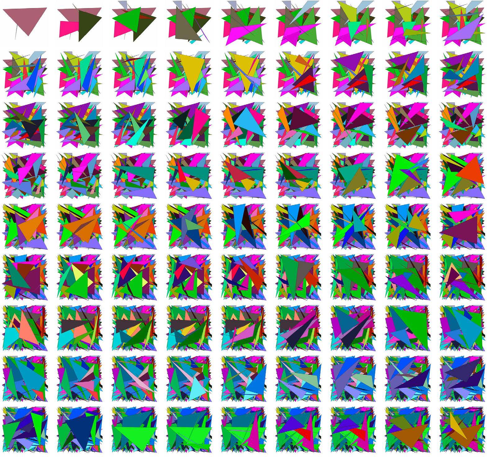
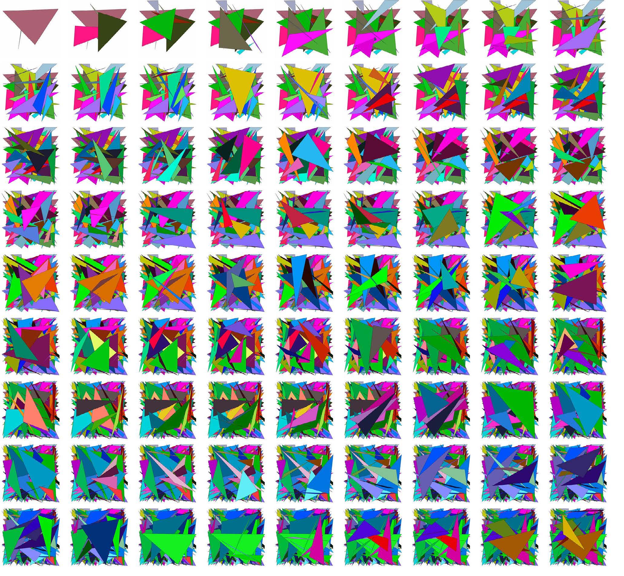
A set of the first limitations for image creation and distortion for the ‘Dazzle distortion’ branch of this visual research. The format of this graphic is generated by ‘The Magic Triangle’ Created by Tim Rodenbroeker.
Fig. 7
Fig. 8
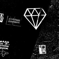
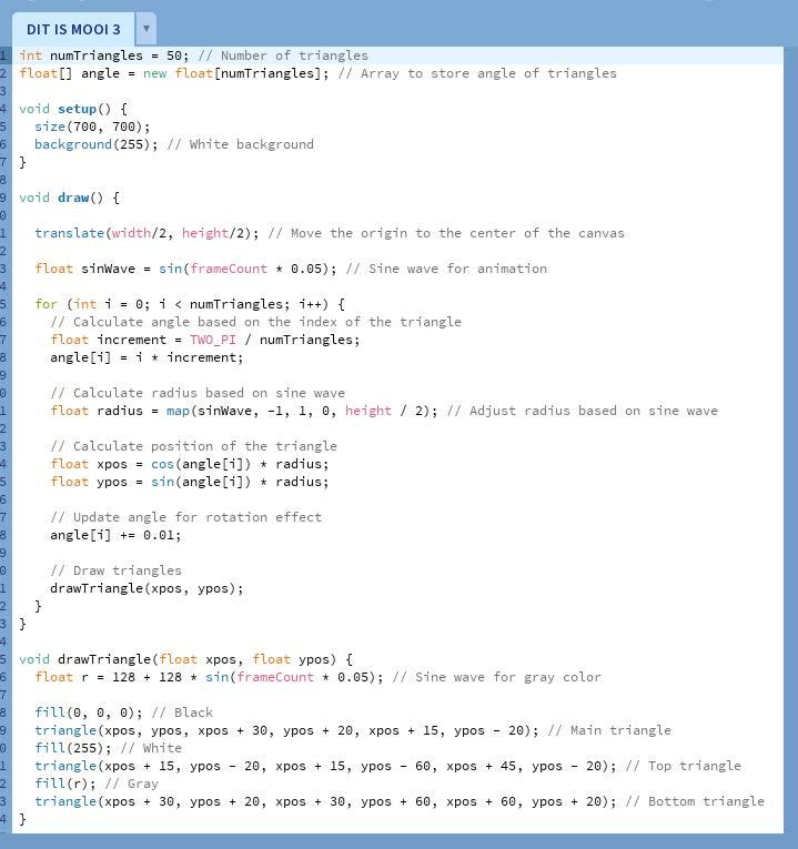
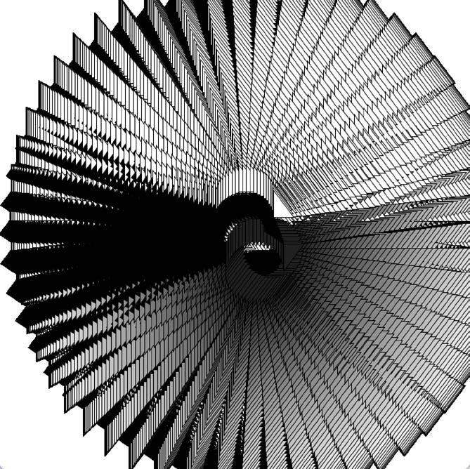
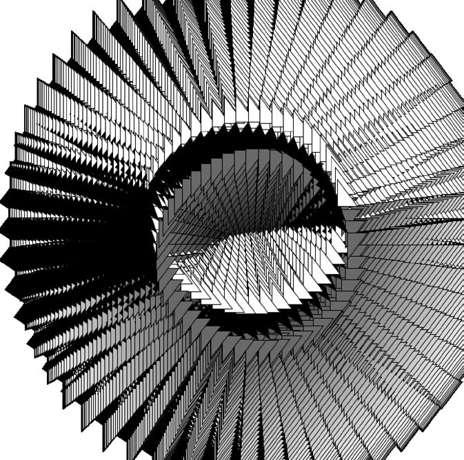
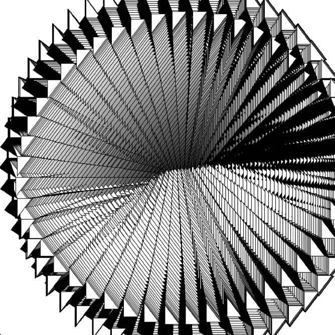
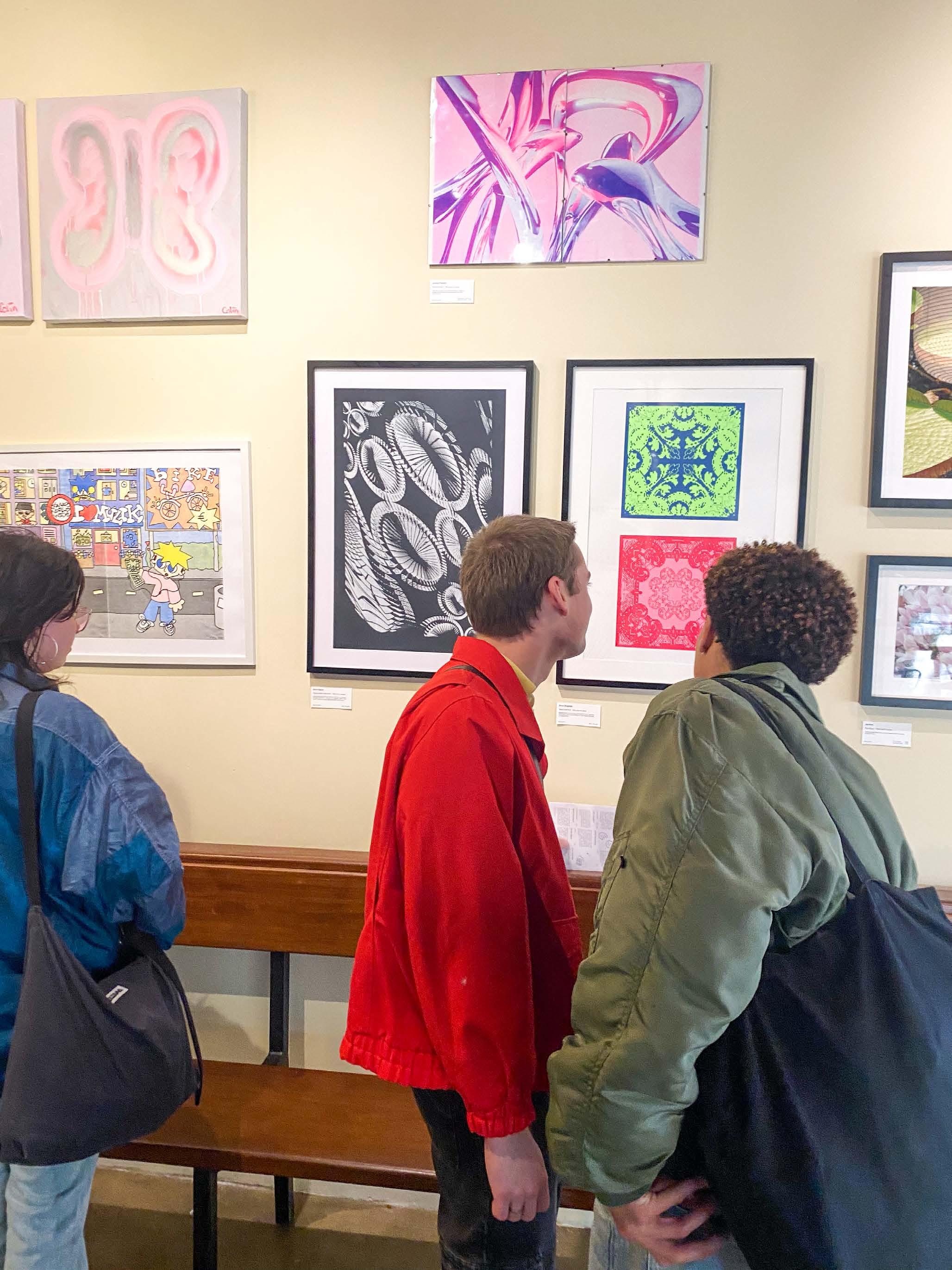
Thousands of triangles move from the inside to the outside in a SIN wave. Because I switched off the background refresh, all of them left a trace. That creates the image below. I exported this animation in video format and applied effects on it in After Effects in an iterative and distorting manner. It creates the animation below. This image I translated this to a vector image screenprinted with white ink on black A2 paper and made public in an exhibition in BUN Rotterdam. The audience found the process interesting and liked how such an abstract image could come from research about warships’ camouflage in WWI.
A second ’Magic Triangle’ for image creation and distortion for the ‘Moiré animations’ branch of the visual research. This is the second set of iterations of the process.
Fig. 11
The process of creating images came naturally to me, and I can see that the methodology also works for a non-physical site. This involved a combination of desk research, research through practical experimentation, and distortion. It resulted in analog distortion and even analog animation.
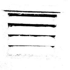
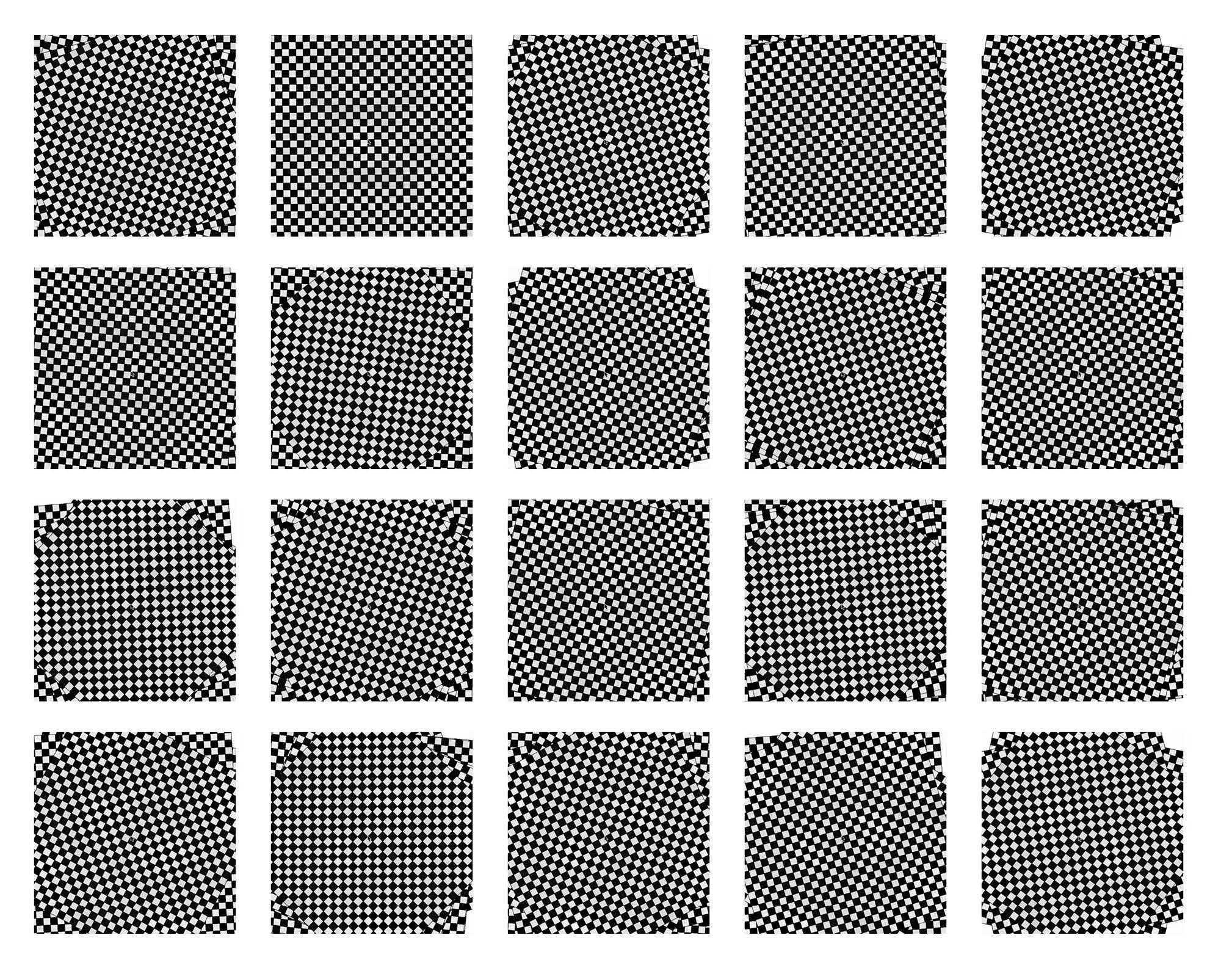
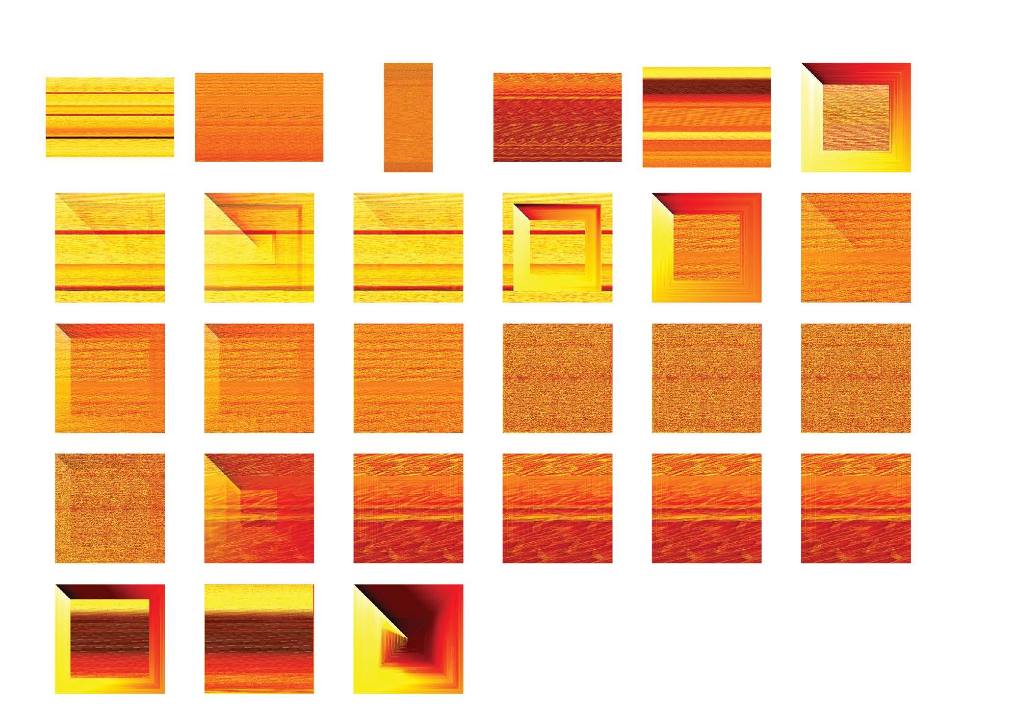
Using this online tutorial I learned how to animate with moiré patterns. The first option was too limiting because of the amount of frames, the animation was not complete and the black bars are too wide. The second animation with 7 frames works!
Fig. 12
Participatory research results
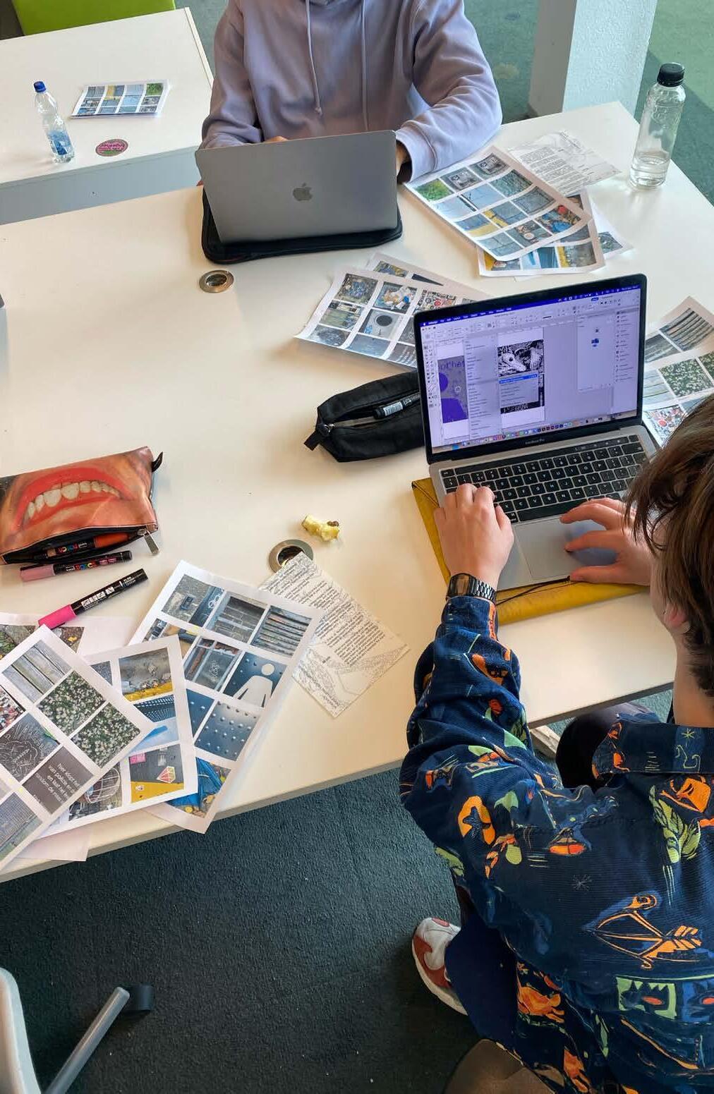
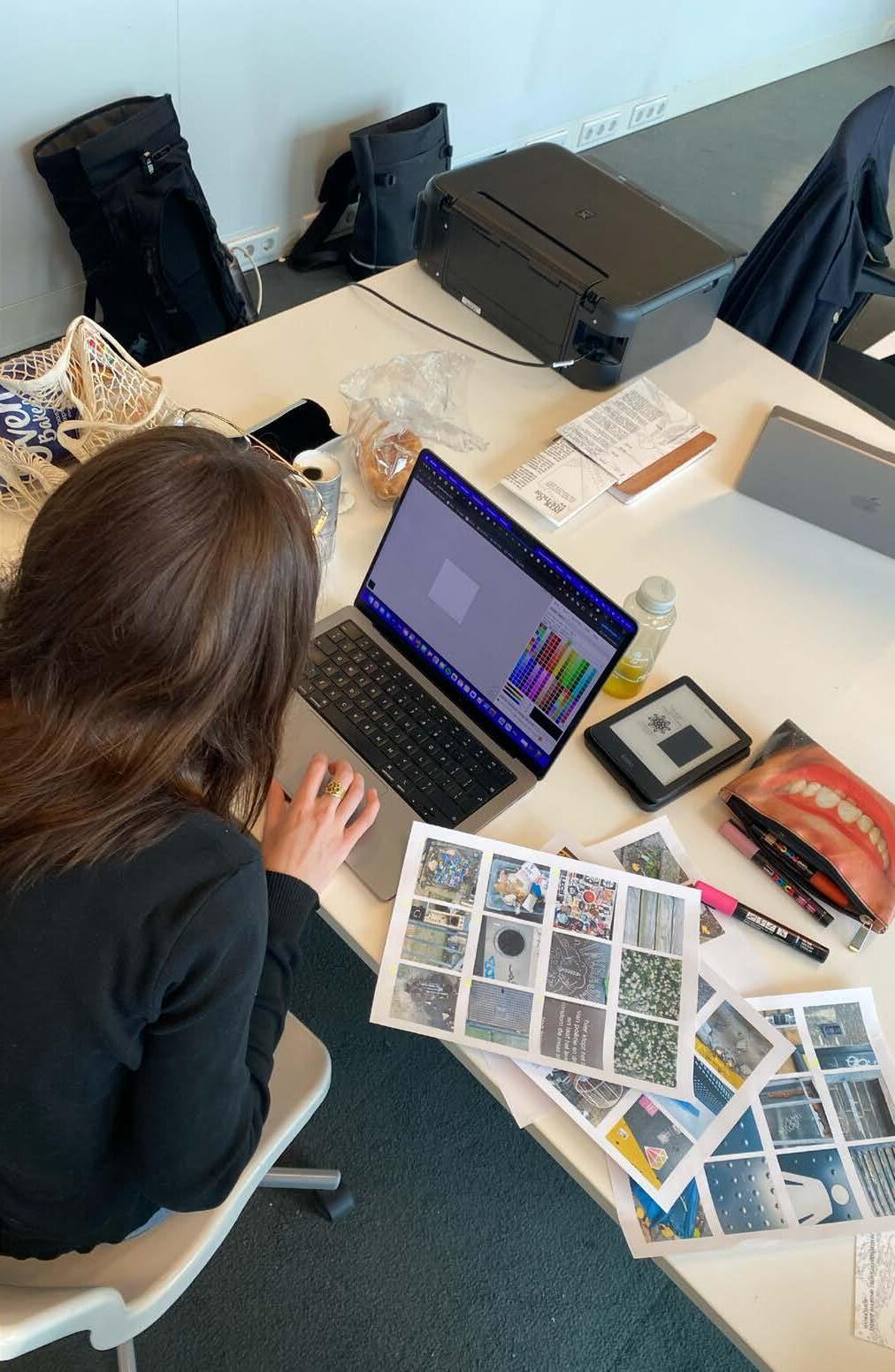
During my workshop on the 9th of May, the three participants categorized the same pictures in three different ways as the first step; Seven categorized Image and text (all selected pictures contain an image or text), Sebastiaan categorized Texture and ‘visual violence’, Aimeric’s categories were lines and grids and all that’s unnatural. The participants also gave me feedback on the workshop, as this was my first time hosting one. You can find their full answers in the appendix. There you can also find the ‘distortion tools’ that they developed during the workshop.
I wanted to test to see if the approach works and how would other designers interpret it and develop their own method of distorting. I provided them the input and they had to distort the images in their own way. You can see their results below.
Fig. 13 - Seven Shepherd’s results
Fig. 14 - Aimeric Guerre’s results
Fig. 15 - Sebastiaan Paap’s results
Participatory research reflection
By explaining the methodology to others via a presentation it became more tangible and established. The participants understood the assignment and the value of the process. They mentioned they weren’t fully clear on what the goal was. As to why we should want to create unique post-digital visuals, I will give a better introduction next time by starting with my list of propositions/manifesto.
I figured out during the workshop that it’s a very short amount of time to find a good systematic distortion device. Because the participants need a lot of time to experiment with different distortion methods before they can start distorting in guided steps. Next time I will provide them with distortion methods. The designers were having fun so we continued quite a bit after the initially planned time, so there is more time needed in the future.
The participant’s findings made me reflect on the goal of this research. How it started as a development of a methodology, it now flows into a way of system designing, encouraging the use of obsolete media. Sebastian Paap mentioned that he would have wished to know from the beginning that it is more about creating a design system than a methodology. I recognize that this wasn’t clear in the first testing, also because this workshop did not cover the entire methodology. However, they did make me think about the outcome of this project. The focus now goes to my list of propositions that I’m developing because that is what I want to communicate in the end.
Conclusion
How can this methodology change the aesthetics and workflow of graphic- and motion design? After all this research and experiments on choosing a medium and techniques, I think it’s clear that it creates a unique aesthetic that a computer can not recreate. But we’ve also seen that high-tech computers can help you in the process, adding to the unexpectedness of an iterative process. We found that even the post-digital term is an outdated term for this. We are giving a more modern meaning to the word. Florian Cramer already stated in 2014 that the post-digital notion, which was a more niche conviction of people who went against the mainstream change to the digital, became a mass culture itself. I see now that that went even further to the point where we might not even be able to call it a separate culture. It became a common understanding.
Motion design can now become a more integrated part of the graphic design process. In two of my experiments, beautiful static images and artworks came from reappropriating one or multiple frames from an animation. What’s new in the methodology I explored and developed further, is that we start embracing both sides of our artistic process. Especially in an artistic research way. We don’t have to compartmentalize our work into digital or analog. We neglect words like ‘old’ and ‘new’ and we should have fun designing with whatever medium fits best.
I hope this methodology gets a life of its own and many designers will give it a try. I think that if artists and designers start thinking like post-post-digital designers and return to having fun, and messing around, exploring new ways of using technology. There will be a big change in the flat, digital aesthetics that are dominating graphic and motion design to this day.
Through participatory research, this methodology creates many possible outcomes from the same input. The workshop only included the visual analysis part of the methodology, so with more time, designers can integrate this way of thinking into their own process.
So why do we want to change the flat, digital, and binary high-tech aesthetics in graphic and motion design? Because we are critical of the cheap, easy technological advancements in the past and in the future. Good art makes you feel, flat digital textures do not. Good design takes time. This methodology is not a holy grail, but a way of thinking. That’s why I created the following list of propositions as a conclusion of this research paper. I hope that we keep critiquing this paper and keep building on the methodology, and other designers will pick it up.
List of Propositions
1. Design is an act of playful experimentation.
2. Environmental influences are essential. The value lies in the unexpected.
3. Setting limitations is necessary to create in post-digital times.
4. ‘Digital’ aesthetics are often too simplistic, binary, and absolute. We challenge these norms to achieve unique aesthetics.
5. We strive for a hybrid of analog and digital techniques. Merging them unlocks new possibilities.
6. We need to blend the digital and analog realms
7. We neglect outdated notions of ‘old’ and ‘new’.
8. In a time of fast technological advancements, our biggest power is critique.
Bergkvist, Lars A., et al. US4629325A - Leading Mark Indicator - Google Patents. 16 Sept. 1981, patents.google. com/patent/US4629325.
Conditional Design. www.conditionaldesign.org.
Cramer, Florian. “What Is ‘Post-digital’?” Palgrave Macmillan UK eBooks, 2015, pp. 11–24. https://doi. org/10.1057/9781137437204_2.
“Dazzle Camouflage: The Art of War.” National Museum of American History, 15 July 2013, americanhistory. si.edu/explore/stories/dazzle-camouflage-art-war. “Dazzle-Art.pdf.”
Leblond, Michaël, and Frederique Bertrand. New York in Pyjamarama. 2012.
Limer, Eric. “How This Clever Naval Light Always Points the Way You Need to Go.” Popular Mechanics, 2 Nov. 2021, www.popularmechanics.com/technology/infrastructure/a19091534/inogon-leading-markmoire-effect-light.
“Miwon Kwon, One Place After Another. Site Specific Art and Locational Identity (2002).” Issuu, 3 July 2015, issuu.com/david-bowie/docs/miwon_kwon-one_place_after_another_/181. MONO TOOL. www.aspektedesrasters.de.
Rasch, Miriam. Shadowbook: Writing Through the Digital 2014-2018. 2018.
Stinson, Liz. “A Slick Mashup of an Old-School Projector and 3-D Printed Art.” WIRED, 6 Aug. 2014, www. wired.com/2014/08/a-slick-mashup-of-an-old-school-projector-and-3-d-printed-art.
Tom Scott. “The Moiré Effect Lights That Guide Ships Home.” YouTube, 5 Mar. 2018, www.youtube.com/ watch?v=d99_h30swtM.
Bibliography
“Aesthetics of Resistance: Artistic Research as Discipline and Conflict.” Mahkuzine, vol. 8, 2010.
Arendt, Hannah. The Human Condition: Second Edition. University of Chicago Press, 2013.
Bergkvist, Lars A., et al. US4629325A - Leading Mark Indicato - Google Patents. 16 Sept. 1981, patents.google.com/patent/US4629325.
Bridget Riley | Escape Into Life. www.escapeintolife.com/artist-watch/bridget-riley.
Cantrell, Scott. “Review: Sarah Sze’s Art Show at Dallas’ Nasher Sculpture Center.” Dallas News, 9 Feb. 2024, www.dallasnews.com/arts-entertainment/visual-arts/2024/02/09/review-sarah-szes-art-of-fragmentation-and-transience-at-the-nasher.
Conditional Design. www.conditionaldesign.org.
Cramer, Florian. “What Is ‘Post-digital’?” Palgrave Macmillan UK eBooks, 2015, pp. 11–24. https://doi. org/10.1057/9781137437204_2.
“Dazzle Camouflage: The Art of War.” National Museum of American History, 15 July 2013, americanhistory. si.edu/explore/stories/dazzle-camouflage-art-war. “Dazzle-Art.pdf.”
Cumbria’s Museum of Military Life, 9 Jan. 2024, www.cumbriasmuseumofmilitarylife.org. Accessed 5 Mar. 2024.
Foster Gage, Mark [Mark Foster Gage]. “How Robots Could Save One of the World’s Most Unusual Cathedrals.” Edition CNN, CNN, 19 Nov. 2020, edition.cnn.com/style/article/sagrada-familia-history-robots-test-of-time/index.html. Accessed 2 May 2024.
Genie’s Art & Crafts. “How to Make Moíre Effect Optical Illusion Template in PowerPoint | Slit Animation | Scanimation.” YouTube, 10 May 2022, www.youtube.com/watch?v=7T1F_od-BgE.
Gradientor. gradientor.afterimage.cc. Guntur, Guntur. “ARTISTIC RESEARCH: THE THOUGHTS AND IDEAS OF MIKA HANNULA.” ARTISTIC (Surakarta.Online), vol. 1, no. 2, Dec. 2020, pp. 13–33. https://doi. org/10.33153/artistic.v1i2.3115.
“Het Gebouw in Het Zomerhofkwartier &Bull; Rotterdam. Make It Happen.” Rotterdam. Make It Happen., 29 June 2021, rotterdammakeithappen.nl/media-objecten/het-gebouw-in-het-zomerhofkwartier.
Hoevenaar, Eva. “Images Come Alive With the Moiré Effect - De Monsterkamer.” De Monsterkamer, 13 Oct. 2016, www.monsterkamer.nl/en/images-come-alive-with-the-moire-effect.
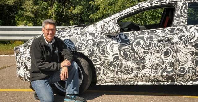
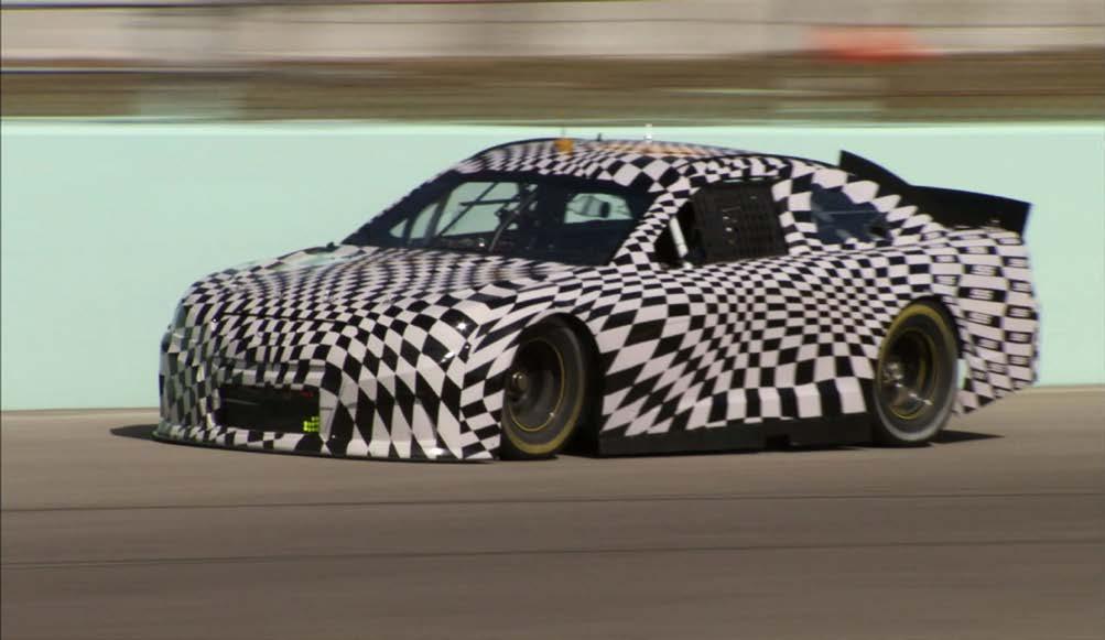
Kelly, Dane Sager. “What Are Those Weird Patterns on Prototype Cars?” WDIV, 4 Jan. 2018, www.clickondetroit.com/auto-show/2018/01/04/what-are-those-weird-patterns-on-prototype-cars.
Levinson, Paul. Real Space: The fate of physical presence in the digital age, on and off planet. Routledge, 2014. Limer, Eric. “How This Clever Naval Light Always Points the Way You Need to Go.”
Popular Mechanics, 2 Nov. 2021, www.popularmechanics.com/technology/infrastructure/a19091534/ inogon-leading-mark-moire-effect-light. ---. “How This Clever Naval Light Always Points the Way You Need to Go.” Popular Mechanics, 2 Nov. 2021, www.popularmechanics.com/technology/infrastructure/ a19091534/inogon-leading-mark-moire-effect-light.
The Atlantic, 18 Nov. 2022, www.theatlantic.com/technology/archive/2014/07/makeup/374929.
“Miwon Kwon, One Place After Another. Site Specific Art and Locational Identity (2002).” Issuu, 3 July 2015, issuu.com/david-bowie/docs/miwon_kwon-one_place_after_another_/181. MONO TOOL. www.aspektedesrasters.de.
Project Review – Life After Digital in Forward-looking Retro Doc.” The Guardian, 11 Mar. 2021, www. theguardian.com/film/2021/mar/11/an-impossible-project-review-warm-and-fuzzy-nostalgia-in-retrodoc. raquel meyers. “Index.”
Raquel Meyers, www.raquelmeyers.com.
Rasch, Miriam. Shadowbook: Writing Through the Digital 2014-2018. 2018.
Rational Animations. “Epic Conway’s Game of Life.”
The Rise and Fall of Clip Art: From Ubiquity to Obscurity - YouBrief. www.777ccc.com/summary/the-riseand-fall-of-clip-art-from-ubiquity-to-obscurity.
Santa & Cole. “Biografía De Felipe Pantone - Santa &Amp; Cole.” Santa &Amp; Cole, 10 Oct. 2023, www.santacole.com/en/biography/felipe-pantone/#:~:text=Victor%20Vasarely%20and%20Carlos%20Cruz,of%20 vibration%20as%20they%20move.
“Small Cow Fields Records | PROJECT | Andform.” Andform, en.andform.jp/work/small-cow-fields-records-studios.
“Special Report: How Design Agencies Are Actually Using AI in 2024.” Creative Boom, 27 Feb. 2024, www. creativeboom.com/features/special-report-how-design-agencies-are-using-ai-in-2024.
Stinson, Liz. “A Slick Mashup of an Old-School Projector and 3-D Printed Art.” WIRED, 6 Aug. 2014, www. wired.com/2014/08/a-slick-mashup-of-an-old-school-projector-and-3-d-printed-art.
Tom Scott. “The Moiré Effect Lights That Guide Ships Home.” YouTube, 5 Mar. 2018, www.youtube.com/ watch?v=d99_h30swtM.
Two Bit da Vinci. “EPIC Engineering of the World’s CRAZIEST Church! Barcelona’s Sagrada Familia.” You Tube, 24 Feb. 2024, www.youtube.com/watch?v=OPvJFsk-pJ0.
Victor Vasarely - Artists - GALERÍA RGR. www.rgrart.com/artists/victor-vasarely. Warfare History Network.
“The Rise and Fall of Dazzle Camouflage - Warfare History Network.” Warfare History Network, 20 Oct. 2022, warfarehistorynetwork.com/article/the-rise-and-fall-of-dazzle-camouflage.
Written Essay - Bridget Riley. www.people.vcu.edu/~djbromle/color-theory/color04/mike/index.htm.
Cited visual works
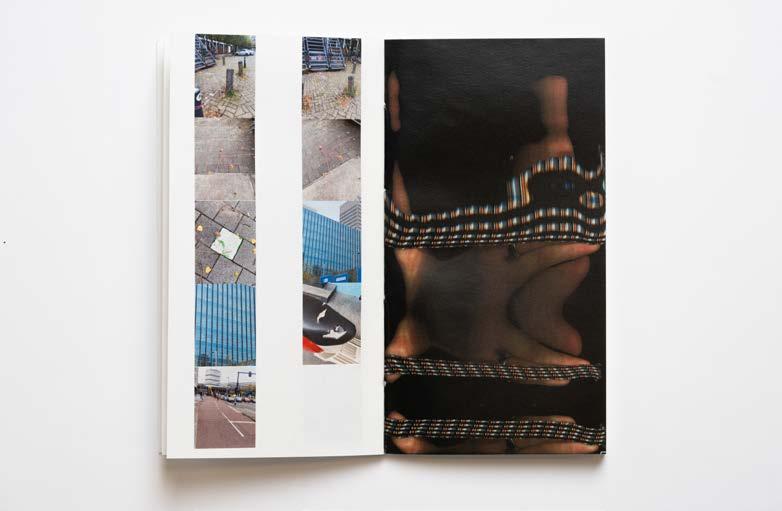
Images without caption are created by me.
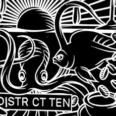
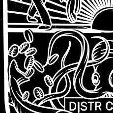
Fig. 1 - Photography documentation by Robin de Haan, part of a group exhibition ‘3013 EXPO’ - Picture of one of the works projected on the white sheet.
Fig. 2 - Photography documentation by Robin de Haan, part of a group exhibition ‘3013 EXPO’ - Picture of the slide projector from 1974 used to project the engraved plexiglass works.
Fig. 3 - HMS Argus (British Aircraft Carrier, 1918-1946) Photographed in a British harbor, circa late 1918, painted in “dazzle” camouflage. An “R” class battleship is in the distance. U.S. Naval Historical Center. https://www.ibiblio.org/hyperwar/OnlineLibrary/photos/sh-fornv/uk/uksh-a/argus11.htm
Fig. 4 - Bergkvist, Lars A., et al. US4629325A - Leading Mark Indicator - Google Patents. 16 Sept. 1981, patents.google.com/patent/US4629325. https://www.popularmechanics.com/technology/infrastructure/ a19091534/inogon-leading-mark-moire-effect-light/
Fig. 7 - Written Essay - Bridget Riley. www.people.vcu.edu/~djbromle/color-theory/color04/mike/index. htm.
Fig. 8 - Generated by The Magic Triangle. timrodenbroeker.github.io/themagictriangle.
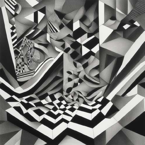
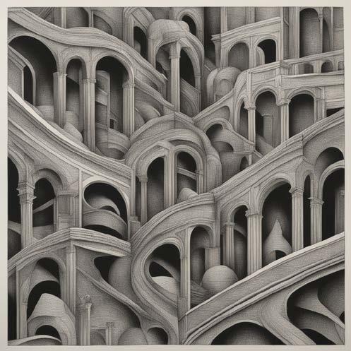
Fig. 9 - AI Generated images with the prompt “dazzle painting” as part of the exploration of the analog distortion method. “Surreal Graphics Generator.” DeepAI, deepai.org/machine-learning-model/surreal-graphics-generator.
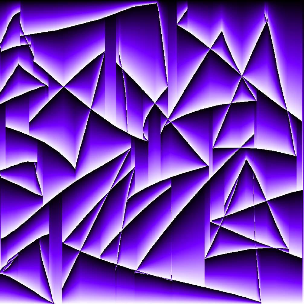
Fig. 10 - Created using open source online tool: Gradientor. gradientor.afterimage.cc.
Fig. 11 - Generated by The Magic Triangle. timrodenbroeker.github.io/themagictriangle.
Fig. 12 - How to Make Moíre Effect Optical Illusion template in PowerPoint | Slit Animation | Scanimation. youtube.com/watch?v=7T1F_od-BgE
Fig. 13 - Workshop Image Making through Distortion, Marvin Sipma ‘Final Collection’ of Seven Shepherd.
Fig. 14 - Workshop Image Making through Distortion, Marvin Sipma ‘Final Collection’ of Aimeric Guerre.
Fig. 15 - Workshop Image Making through Distortion, Marvin Sipma ‘Final Collection’ of Sebastiaan Paap.
To start collecting the first visuals I made an AI interpret ‘dazzle painting’ using “Surreal Graphics Generator.” DeepAI, deepai.org/machine-learning-model/surreal-graphics-generator.
Dazzle camouflage conditional drawing technique from https://stayontheleader. blogspot.com/2017/03/painting-guide-dazzle-camoflage.html. On paper and on Adobe Illustrator.
I like this conditional score of triangles cutting into eahother, I want to experiment with generative coding to recreate this pattern. I set a score in coding to draw triangles and at least one point should cut into one side of the previous triangle. This rule is based on the previously mentioned tutorial on drawing a dazzle pattern.
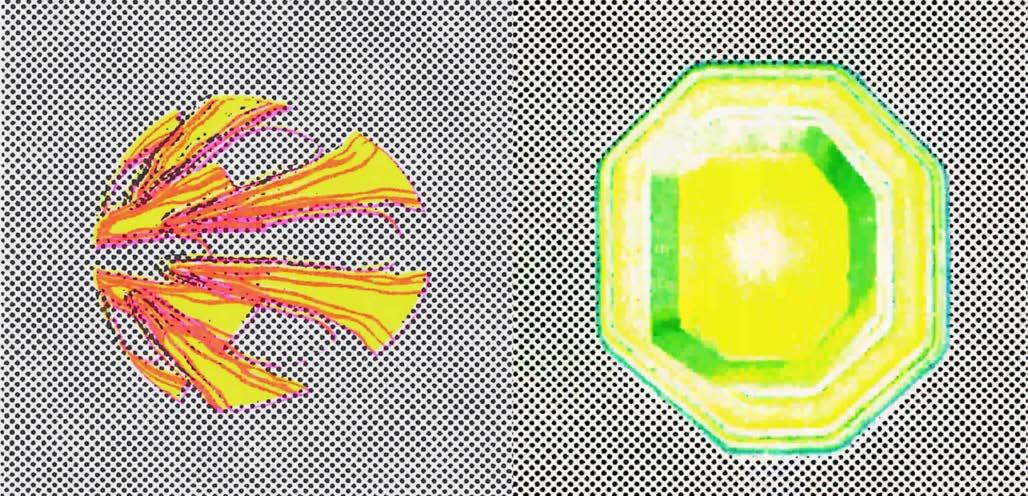
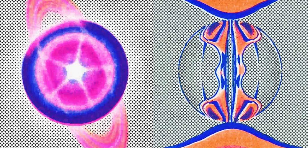
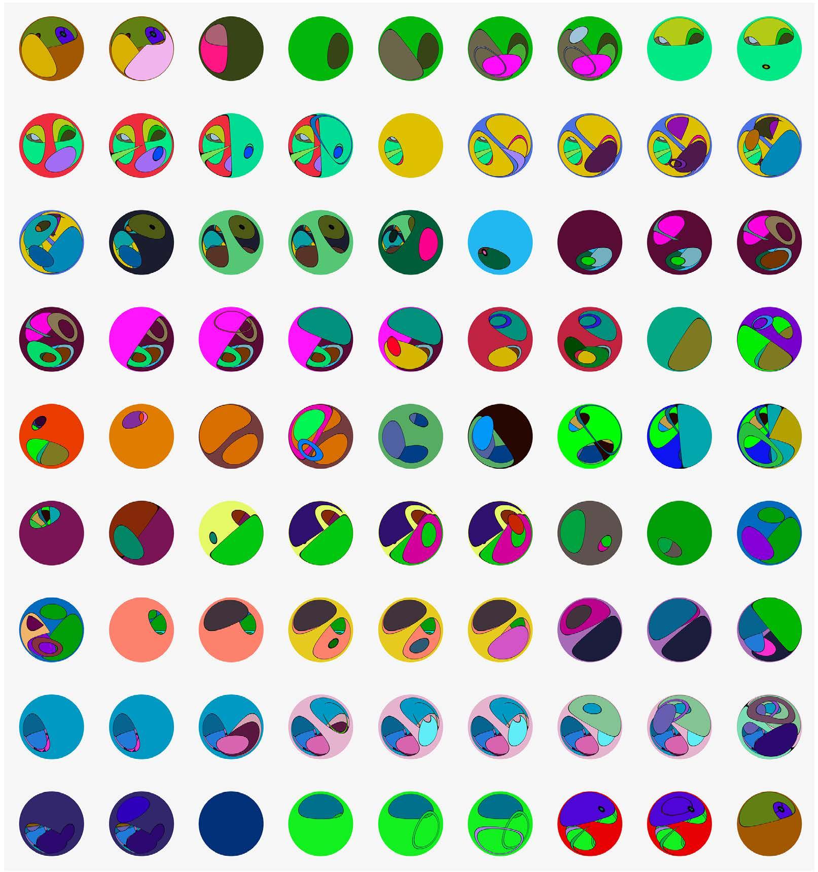
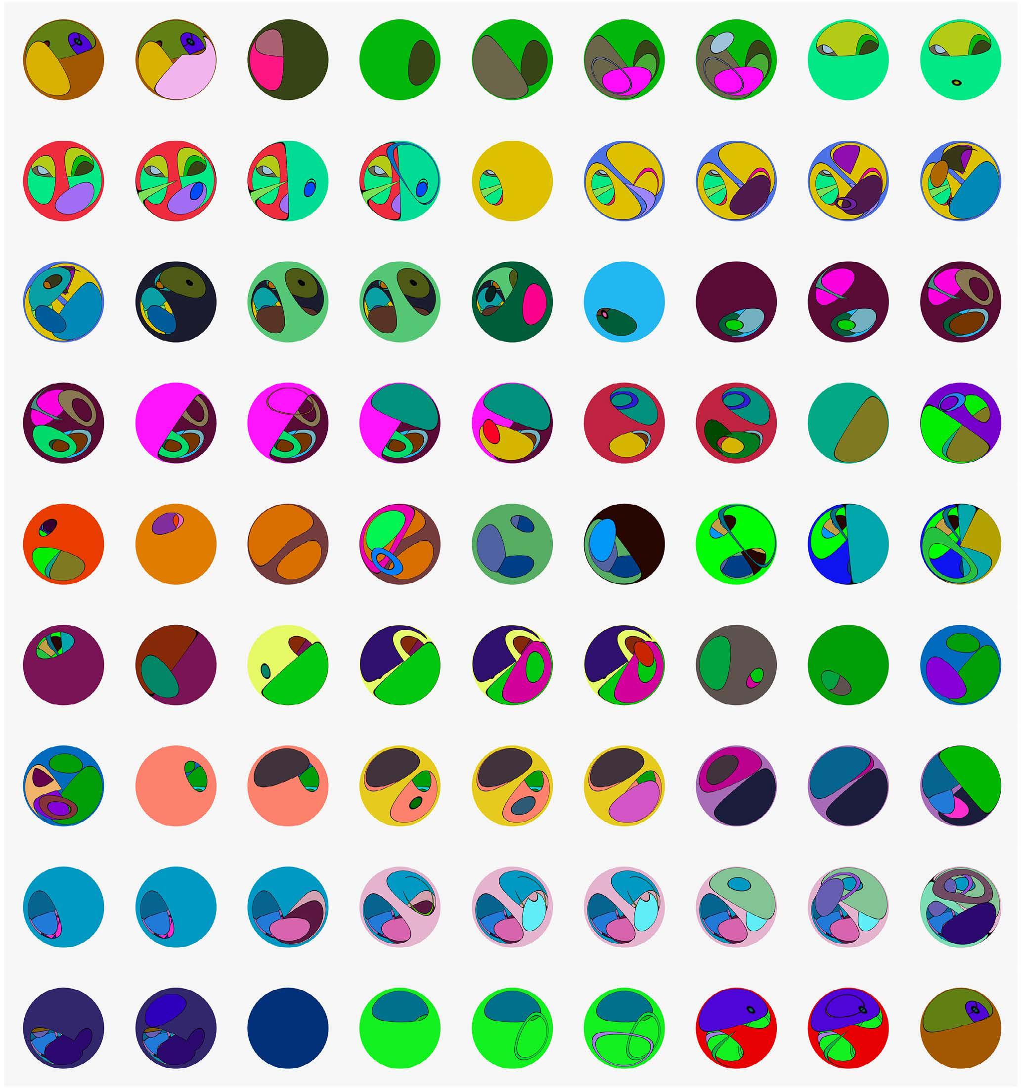
These colors were automatically generated so i thought it would be fun to distort these in after effects to create new visuals. The following series of colorful balls is created by distorting all the frames with the ‘cc lens’ effect in after effects.
Conditional design scores got me interested in experimenting with code. With creative coding you can give scores to the computer and the result is in a way unexpected. I’m using Chat GPT AI to generate a code based on a score that I give it in the form of a prompt. A good example of generative, accessible (open source), and guided way of experimenting, iterating and distorting afterwards. I noticed that the graphic design scene was moving to this way of animating and because of my reserach question this is a very interesting method to introduce to the methodology. This is an already happening change in aesthetics and workflow of motion graphics.
Workshop Image Making trough Distortion
How did you experience the workshop?
I feel like you could have added something to lead the distortion. because if I wasn’t experienced with distorting methods I think I would have struggled. I’d like multiple examples, analog, digital
and maybe I would like to follow more of a storyline. I think in all workshops there should be some constraints to let it be guided.
Would the approach of system thinking work in your own design process?
Yes. I think it has a lot to do with creative coding, and I’m interested in that in my own practice. Also using tools that are not intended for image-making, could also be implemented in my practice. I like to have an unexpected outcome.
But specifically, what I did in this workshop with audio forms I wouldn’t use in my own process
Would you like to continue with the visual reserach outcomes that you have right now?
If applicable to my future projects. I think the ‘system thinking’ yes, but the specific thing I made, no. because my result tends to be something super specific.
Workshop Image Making trough Distortion
How did you experience the workshop?
It would be nice to have a list of resources of methodologies to distort.
Would the methodology work in your own design process?
Yes, Especially using the scanner. I forgot that this is something that you can do and it was a nice re-discovery. Stepping from analog to digital is generally a good thing to do. It’s easy to say but it really makes a big difference.
Would you like to continue with the visual reserach outcomes that you have right now?
Yes, I’d like to continue with this because I’m not finished yet within the workshop time frame. It’s also nice to work with a selection that I didn’t pick myself. I like the way it’s a surprise all the time I create a new one. It creates a nice result every time. I would like to RISO print it as a next step and see what that does.
Workshop Image Making trough Distortion
How did you experience the workshop?
I think it was fun. I experimented with a lot of methods I already used, but usually, I apply them to only 1 image. Needing to use multiple images or compile a series in such a short time made me think in a system/series of work, which forced me to think differently. I felt freedom and encouragement, and I did feel a good kind of pressure to get outside of my usual distortion comfort zone.
Would the methodology work in your own design process?
Yes, I think it does. however, I always try to keep something recognizable for the sake of composition and personal aesthetic values. making something totally unrecognizable isn’t something for me
Would you like to continue with the visual reserach outcomes that you have right now?
I feel like I made a good sketch for a visually distorted series. I would like to tailor-make them for each visual, but it’s a good starting point
Step 1: Make a selection of 25 images with a strong visual image/text
(Optional) Step 2: Move these images around on a scanner to create an analog distorted effect, send yourself the digital file
Step 3: Open image in Adobe Photoshop (Beta)
Step 4: Select [Delete background] or delete the background manually
(Optional) Step 5: To make the image more interesting, select [Generate background], describe the original image and type it in the text box, and keep or delete AI-generated additions to your liking
For example: [a wall of stickers] or [graffiti on a mailbox in the city]
Step 6: Save the ‘cut out’ image as .png
Step 7: Open a new project in Adobe AfterEffects in 1:1 format
Step 8: Import the .png file into the project
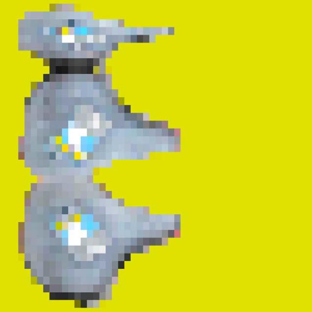
Step 9: Use the [Mosaic] effect and make sure the option [Sharp Colors] is turned on
Step 10: Play around with the {Horizontal Blocks] and [Vertical Blocks]
Step 11: If you’re satisfied with the pixelated effect of your image, continue playing around with the [Scale] tool or [Layer Styles] > [Stroke] tool, also consider copying your image and pasting it on top of each other and adding different [Effects] and [Layer Styles]
Step 12: Add a [New] > [Solid] layer behind your image to add a background color
Step 13: Export the image as jpeg by rendering the project
(Optional) Step 14: Continue the distortion be reopening the image in Adobe Photoshop and repeating (steps of ) the process
Step 1: Convert image from PNG to WAV
Go to the following website and convert the image into a wav audio file.
https://directmusic.me/wav2png/
Step 2: Import WAV file in Audacity
Select portions of the audio track and apply Effects in the menu tab. Reverb, Echo, Fading… Once content Export Audio as WAV
Step 3: Convert image from .WAV to .PNG
Using the same website go back around to an image file so that you can use Processing to tweak for a second iteration of distortion
Step 4: Import .PNG in one of Jeff Thompson’s pixel sorting Processing scripts.
They are scripts that order pixels by rgb values
https://github.com/jeffThompson/PixelSorting
Go into the script and tweak it to your liking Add + or - or * or / numbers to some of the calculations You can also add random numbers with int(random()) And ask ChatGPT for more complex modifications
int tilesX = 200; int tilesY = tilesX;
PImage[] images; // Array to hold multiple images int numImages = 25; // Number of images int currentImageIndex = 0; // Index of the current image int lastImageChangeTime = 0; // Time when the last image change occurred
void setup() { size(800, 800);
// Load multiple images images = new PImage[numImages]; for (int i = 0; i < numImages; i++) { images[i] = loadImage(“image” + (i+1) + “.jpg”); images[i].resize(tilesX, tilesY); } }
void draw() { // Check if it’s time to change the image if (millis() - lastImageChangeTime > 500) { // Change the current image currentImageIndex = (currentImageIndex + 1) % numImages; lastImageChangeTime = millis(); // Update the last image change time } background(255); noStroke();