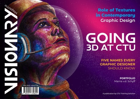
Role of Textures in Contemporary Graphic Design



GOING 3D AT CTU
FIVE NAMES EVERY GRAPHIC DESIGNER SHOULD KNOW
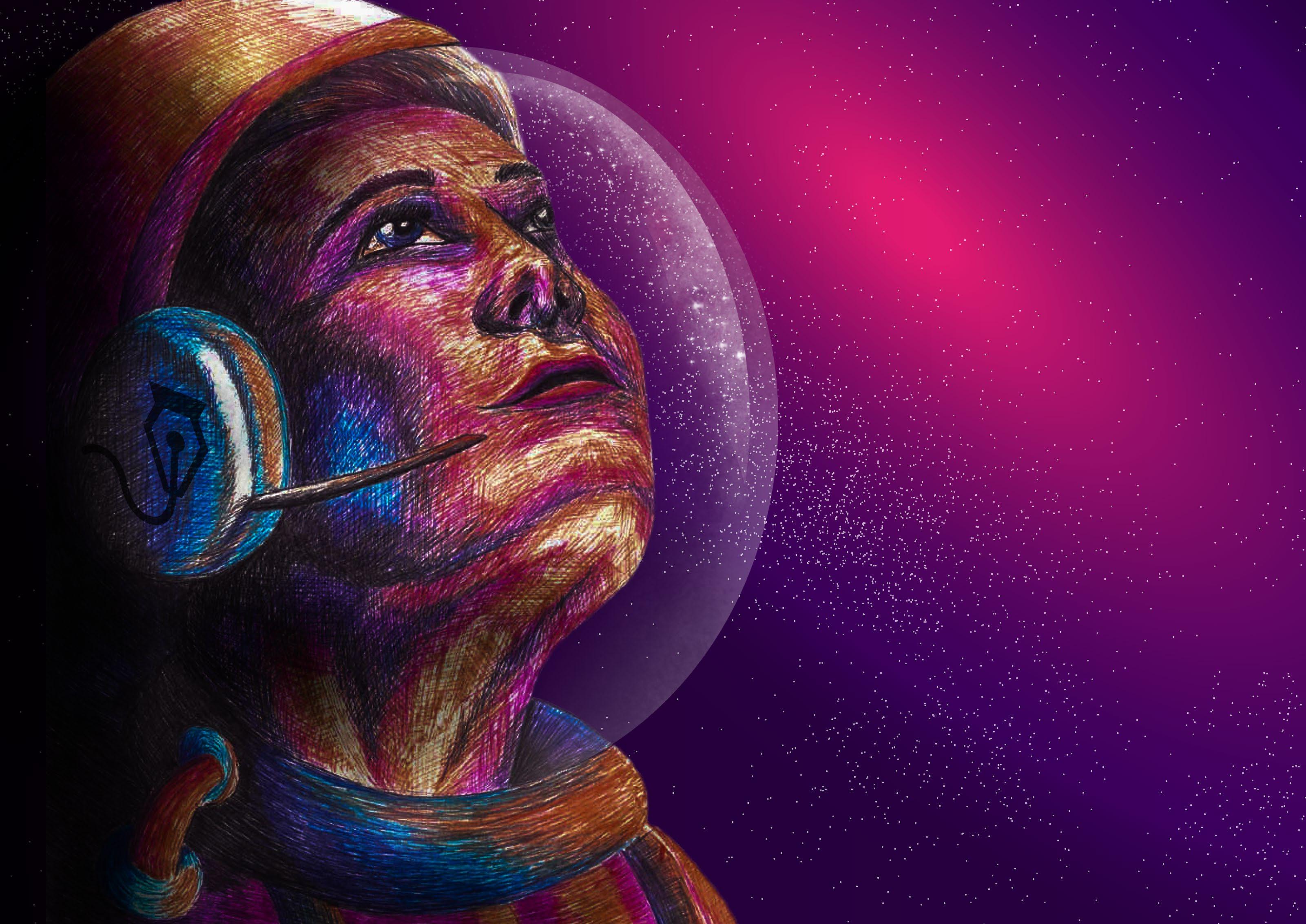
PORTFOLIO Marna v.d. Schyff
A publication by CTU Training Solution Feb 2023 ISSUE 23
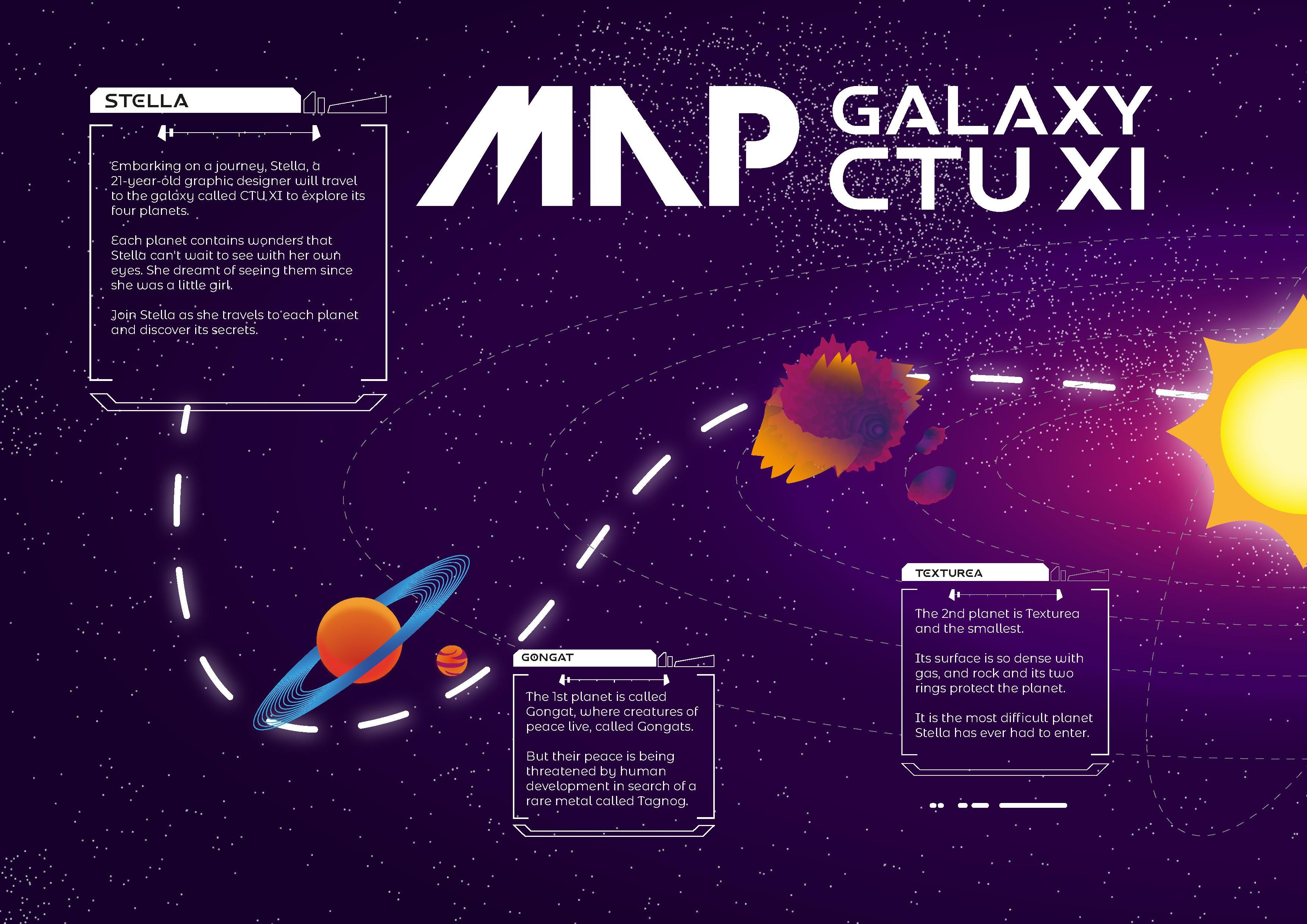


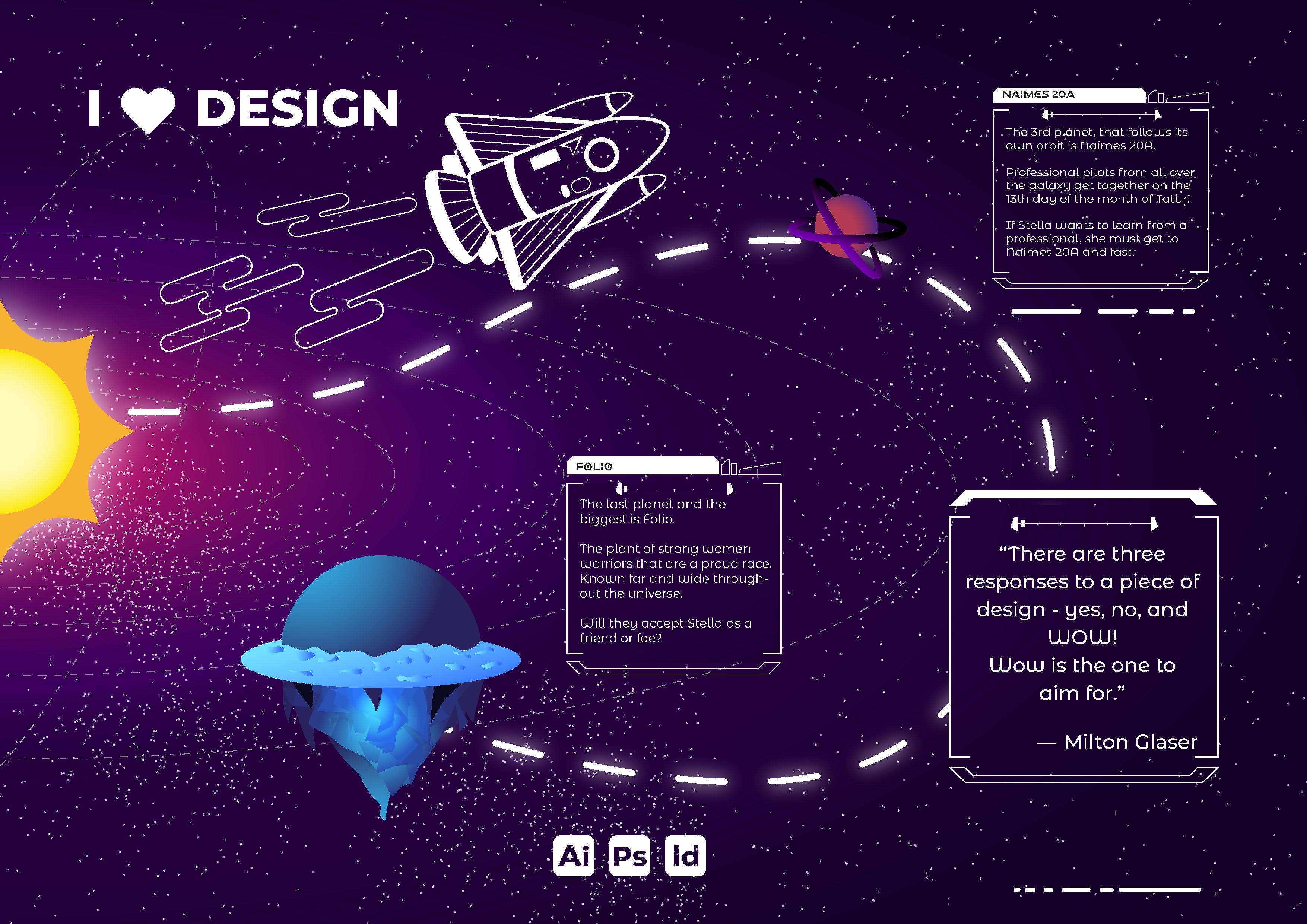








FIVE NAMES EVERY GRAPHIC DESIGNER SHOULD KNOW
PORTFOLIO Marna v.d. Schyff
Thave been living peacefully for many centuries. Their world however is about to change as human development threatens their blissful existence. The protagonist is a Gongat named Frank. Together with some of his friends, he embarks on a journey to attempt to prevent the humans from invading what they hold dear.
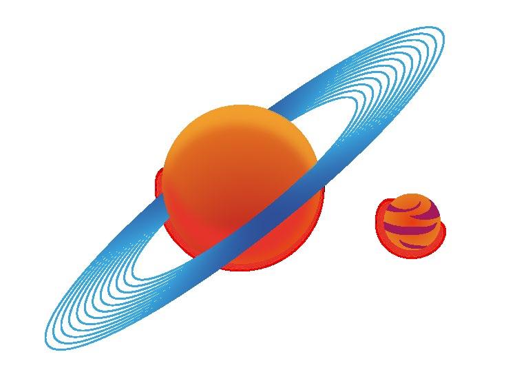

Gongats are predominantly subterranean creatures who spend most of their lives in elaborate and skillfully crafted burrows. They only venture to the surface for certain rituals such as star catharsis, moon consumption and blossom sniffing. Unlike other subterranean creatures, they do not have diminished eyesight, in fact, their eyes are brilliantly adapted for underground as well as surface conditions. Gongats are vegetarian and live predominantly from roots. Owing to the depths of their burrows they sometimes have to negotiate subterranean water sources.
Gongats are highly intelligent creatures with a strong need for social bonding. They are placid in character and extremely loveable. They do however possess a very peculiar trait in that they are unable to keep their emotions hidden. Any emotional fluctuation will manifest in a change of physical appearance. In groups of two, students were to develop and design the character of Frank.
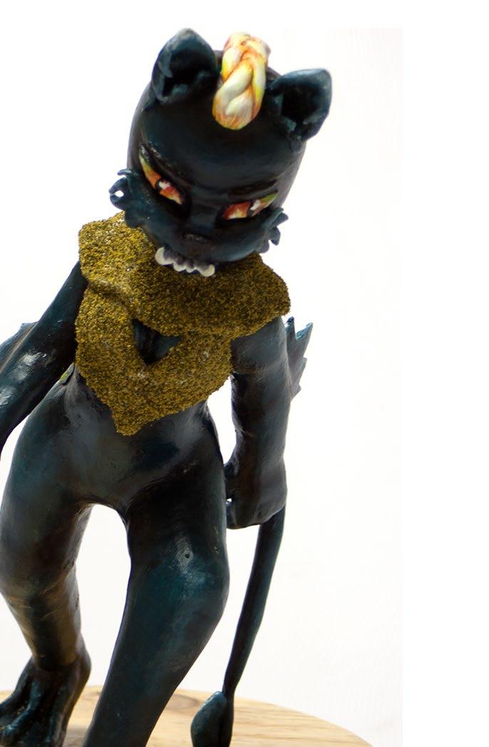
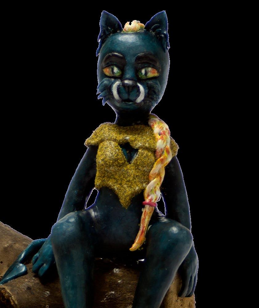
The first-year Visual Communication students were required to develop characters for a new animated feature, Gongats. The process included the development and design of a character in two different states that culminated in three-dimensional clay sculptures.
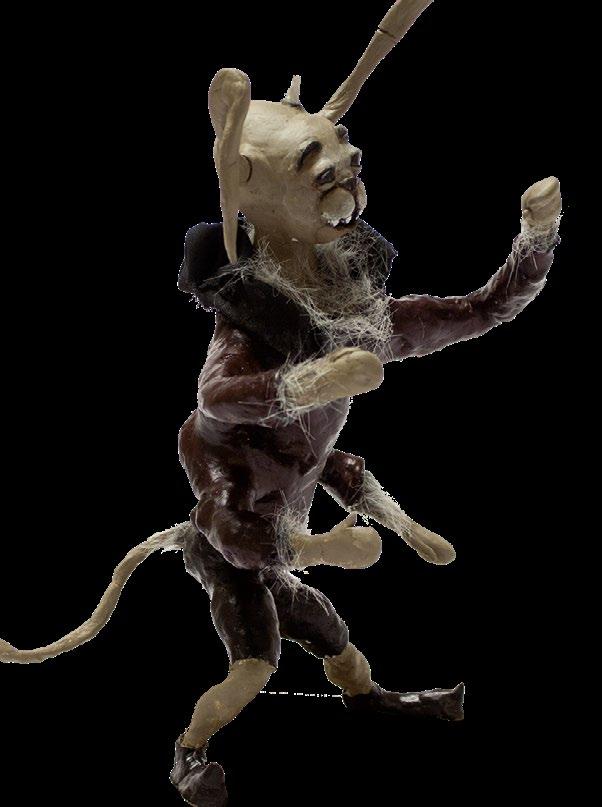
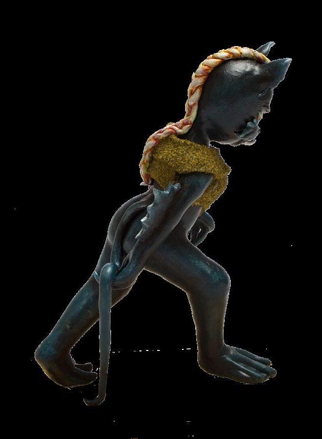
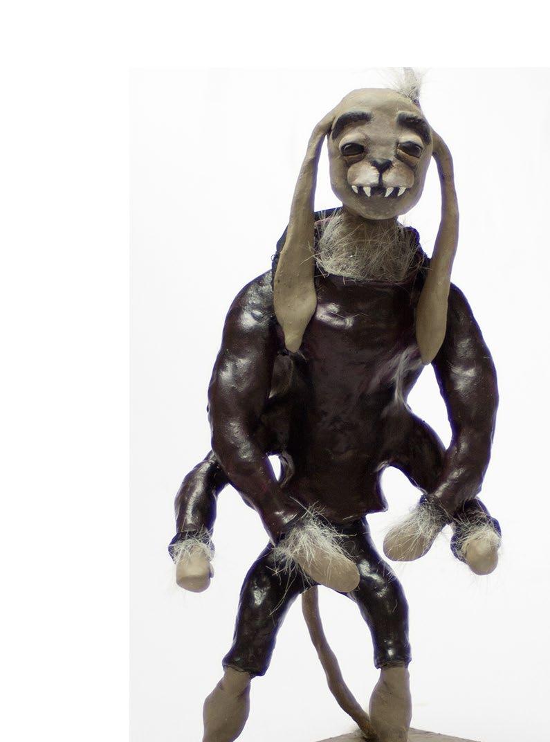
The following are extracts from the students’ rationales that were presented with the final artwork.
ANY EMOTIONAL FLUCTUATION WILL MANIFEST IN A CHANGE OF PHYSICAL APPEARANCE.

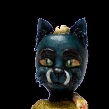
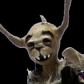
rank is an outcast of the Gongat who was never accepted by the rest of the clan owing to the fact that he lost one of his horns. Horns represented power and without his horns, he was seen as a useless Gongat. Amidst the negative comments and sneers from his peers, Frank stays positive and always seeks out adventure. The main goal of Frank was to find his horns or alternatively to find a way to be accepted by the Gongat clan. Frank goes on a quest to find his missing horn. One of his special abilities is to control and compel nature in a way that he wants. He is further able to dig holes in a short space of time using all four of his arms. Frank possesses enormous strength and can pick up to ten times his own weight. His emotional state will change rapidly when he sees something that upsets him. The change in emotive states manifests in physical changes to his body. Overall he adapts to nature and has a way to compel animals. He is a true creature of nature.M

Texture is a powerful technique for creating compelling and lifelike design projects, and mastering it will vastly improve your designs. Ever dreamt of having the skill and knowledge required to produce living, breathing designs?
Texture is the surface quality or feel of an object. The way your skin rubs against the rough fabric of your wool blanket, the warm sensation of the soapy bubbles covering your skin in the bath or the gentle touch of your hair falling down your shoulders — these are all sensations and experiences created solely by the qualities of texture.
In graphic design, texture is generally only a visual thing, but it creates a physical illusion and it continues to play a leading role in the creation of all types of visual elements.
In this article, we’ll walk you through different ways that texture can be incorporated into your own designs.
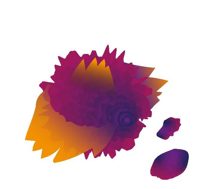
Textured graphics and backgrounds can be used in your designs in a way that gives them the effect that they are truly immersed. Immersing visual texture into your design features brings depth and detail to your art.
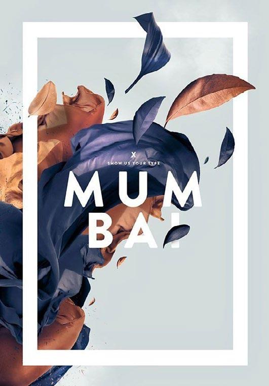
Fabian De Lange’ s exquisite poster design is a gorgeous example of immersive texture interlaced with graphic elements. The “Mumbai” art project represents a beautiful composition of 3D leafs and textile which intertwine with the surrounding minimalist graphics to create an immersive design.
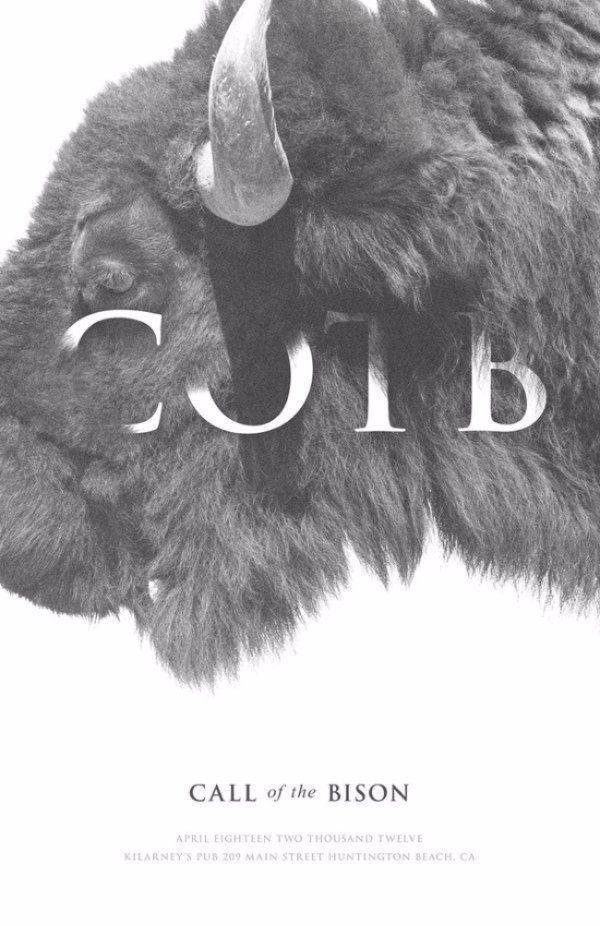
The first trick on our list is to incorporate natural textures into your designs. Natural texture imagery comprises things like the crisp look of fresh grass or the gentle touch of a small feather and inspiration can be taken from every corner of our world. Implementing natural elements into design infuses it with life, bringing vividness, warmth and beauty to the result.
Keith Barney has created a brilliant example of how nature’s texture can be intertwined with graphic elements to create a compelling poster design. The same effect (of the text being immersed into the animal’s head) can be achieved with the use of botanical photography where certain areas of the foliage are deleted to make the text look like it’s popping out of the leaves. These immersion techniques work to bring life to your designs.
Artificial textures, unlike natural textures, comprise a wide array of imagery with surrealistic patterns and human-fabricated objects. Artificial texture graphics include a broad spectrum of elements created by photography, three-dimensional design and manufacturing. Washed-out textile, crumpled paper, wall surfaces and artificial geodes along with simple line art can all create an endless selection of texture images that can form a focal point in any graphic composition. By using the power of modern 3D visualisation software, designers can add a broad range of artificial textures to their designs, and the results are limited only by imagination.
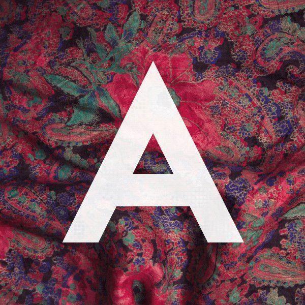
Jacopo Severitano uses the clean, symmetrical shape of the “A” letter to create a striking contrast against the gorgeous artificial fabric texture.
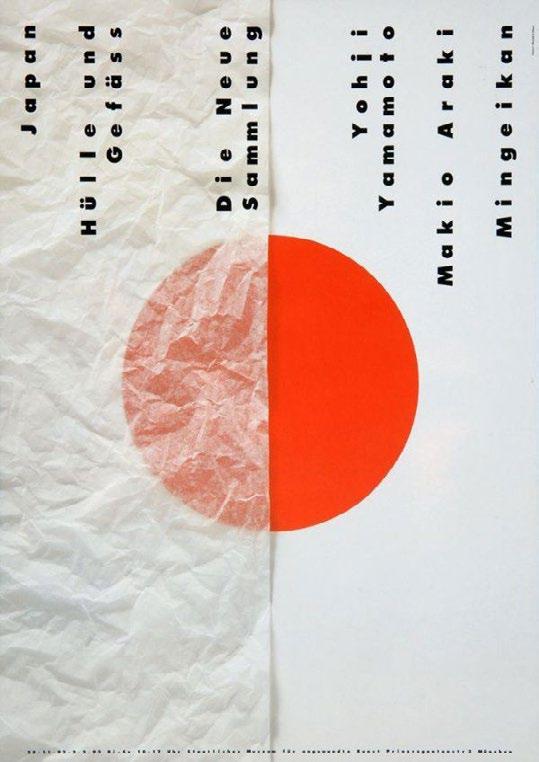
Unlike purely visual textures, tactile textures are those with a physical quality. Tactile textures come with a wide variety of uses, especially in print art where the paper type, glossy ink layers and matte surfaces attract the viewers’ attention and transforms it into a physical interest towards the design. While tactile texture describes the physical surface of objects, it can be successfully transferred into graphic design to create a certain feel. Tactile texture is a common design element in stationery design and magazines where the main intention of the design is to create a memorable item that influences the user and creates a bond between the visual and physical qualities of the object.
Pierre Mendel presents a great example of layered tactile textures used in graphic design and proves they can be applied to graphic design in many ways. Besides using different ink types as well as gold, matte and gloss foils in magazine print designs, you can also layer different design elements to attract the viewer’s attention to particular areas of the design.
IN GRAPHIC DESIGN, TEXTURE IS GENERALLY ONLY A VISUAL THING, BUT IT CREATES A PHYSICAL ILLUSION AND IT CONTINUES TO PLAY A LEADING ROLE IN THE CREATION OF ALL TYPES OF VISUAL ELEMENTS.
Chip Kidd is best known for his stunning book jackets
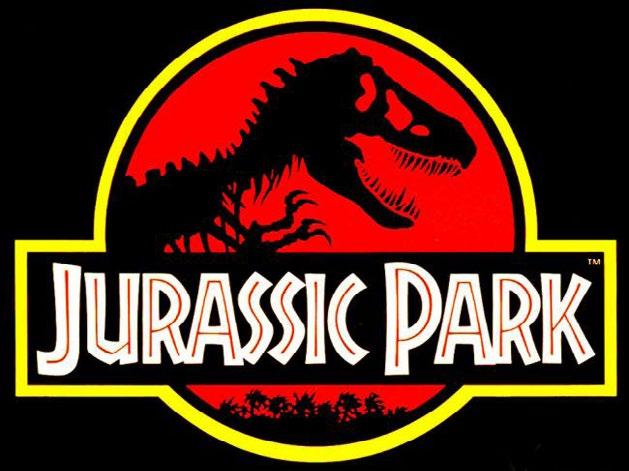
Based in New York, Chip Kidd is best known for his stunning book jackets – most notably for seminal publishing house Alfred A. Knopf. Kidd has worked for writers such James Elroy, Micheal Crichton and Neil Gaiman (amongst many others). Jurassic Park is one of his most notable book covers, and in his 2005 monograph he explained the thinking behind it: “When trying to recreate one of these creatures, all anyone has to go on is bones, right? So that was the starting point... Not only was the drawing integrated into the movie poster, it became the logo in the film for the park itself. I think it’s safe to say that the Jurassic Park T-Rex became one of the most recognisable logos of the 1990s.”
If you’re embarking on a career in graphic design – or just interested in creating some great layouts – there are some designers that you simply must know about. These are the designers that have changed the way graphic design is seen in the contemporary world; the mavericks; the thinkers; those who have made a difference.

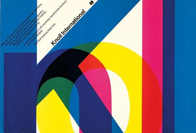
Vignelli was one of the great designers of the 20th century Massimo Vignelli died in 2014, taking with him a legacy of some of the most iconic design work of the past 50 years. Counting IBM, Ford, Bloomingdale’s (his ‘Brown Bag’ designs are still in use today), Saks, American Airlines and many more as clients, and counting Micheal Bierut amongst his protégés, Vignelli’s legacy lives on – perhaps most prominently in the subway map and signage he designed for New York City in 1972.

THESE ARE THE DESIGNERS THAT HAVE CHANGED THE WAY GRAPHIC DESIGN
 ROB CARNEY
Chip Kidd
Peter Saville is best-known for his record sleeve designs for Factory Records artists – think Joy Division and New Order (Unknown Pleasures, Transmission, Blue Monday and more). But his sleeve work spans five decades – Saville is one of the most prolific record designers of all time; if not the most prolific.

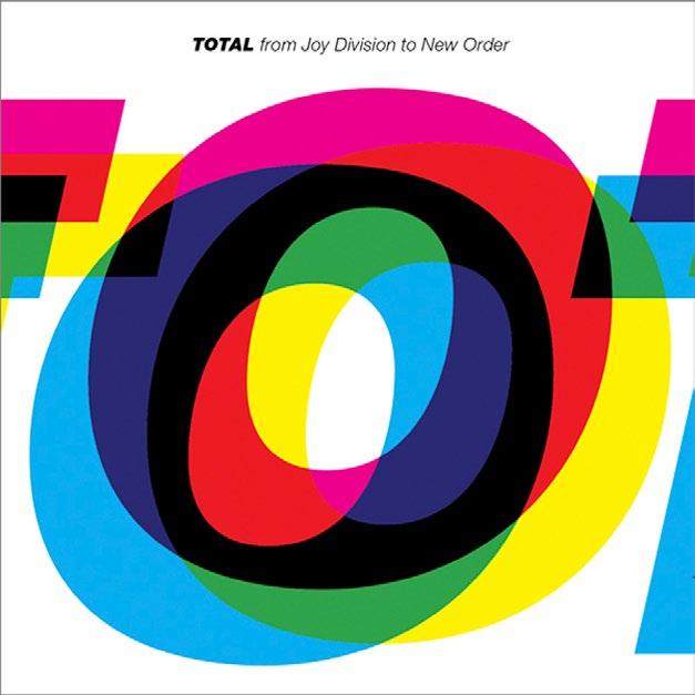
But the Manchester-born designer’s work doesn’t stop at sleeve design. In 2004 he became creative director of the City of Manchester; has worked with fashion’s elite including Jil Sander and Stella McCartney; and in 2010 he designed the England football home kit.
In 2013 he told The Guardian all about the latter: “The red and white thing has been entirely marginalised by one kind of person. It’s synonymous with an attitude that is naive, xenophobic, bullying and self-marginalising. I thought, that’s not reflective of the team, or football, or of the nation at all. But it turns out the market for those shirts are those bloody-minded xenophobic individuals with the shaved heads. When it came out, they did not like it. They did not like it at all.”
Michael Bierut has been a Pentagram partner for 27 years now. There aren’t many more design agencies that are more respected than Pentagram – and becoming a partner is one of the ultimate design accolades. Bierut has has won hundreds of design awards (he’s also got permanent work in MoMA). Before Pentagram, Bierut worked for 10 years at Vignelli Associates. The designer’s projects at Pentagram include identity and branding for Benetton, the New York Jets, Walt Disney and design work on Billboard magazine. This is of course, just a small slice of his sprawling portfolio. Bierut is also a senior critic in graphic design at the Yale School of Art.

In 2013, we caught up with him to find out what he looks for in new talent: “The best are people who are bright and articulate, and have great work in their portfolio. I could sit with them all day,” he says. “The second best have great work but can’t talk about it intelligently. That takes wor`k, but still it’s worth the effort.
“I like people who, in talking about their work, scratch below the surface. Don’t talk about typefaces and Photoshop effects; talk about the subject matter, and how that interested and inspired you.”
Why do you need to know about Rob Janoff? Simple: he designed the Apple logo. Janoff masterminded possibly the most famous mark in the world today while at ad agency Regis McKenna back in 1977. And although it’s been tweaked, the basic form has remained the same ever since – a testament to its simplicity and longevity (and it was created in only two weeks).

Back in 2013, Janoff told us that the idea of an apple with a bike taken out of it was “really a no-brainer”. He continued: “If you have a computer named after a piece of fruit, maybe the image should look like the fruit? So I sat for a couple of weeks and drew silhouettes of apples. “Bite is also a computer term. Wow, that was a happy accident. At that point I thought ‘this is going to have a wink and a nod with it, and give it personality’.”
An apple with a bite (or byte?) taken out of it was a ‘no brainer’
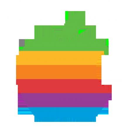
And as for the now forgotten coloured stripes?
“The big deal about the Apple II was that it was the only computer that reproduced colour images on the monitor, and it was the only computer that you could plug into your home colour TV. Also, a lot of it had to do with the aesthetic origins of both Steve [Jobs] and I, which was a kind of hippy aesthetic and The Beatles and Yellow Submarine.”
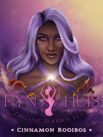
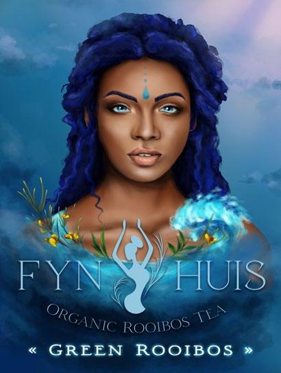
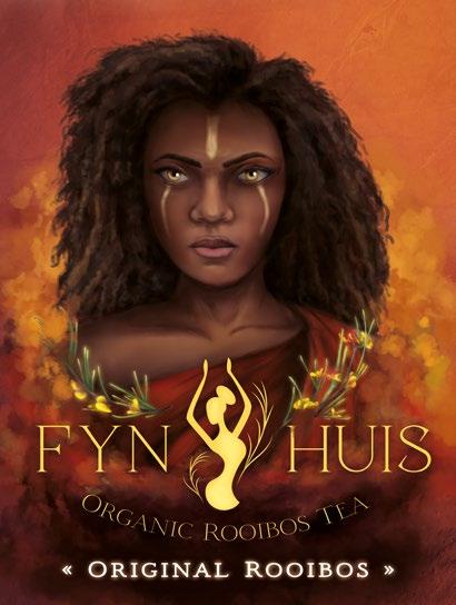
Nestled close to the Cederberg mountains in the town of Clanwilliam, Fyn Huis Tea offers a wide collection of Rooibos teas. Fyn Huis Tea’s premium teas are suitable for both local and international markets, sold online and at selected home and kitchen speciality stores. Fyn Huis Tea requires a new corporate identity reflecting a calm, wholesome, elegant presence.The logo of Fyn Huis Tea represents the figure of a Khoisan woman since they focus on the history of the indigenous Khoisan. The target audience of Fyn Huis Tea is women between the age of 21 and 40 that love tea as well as listen to stories. The logo embodies the quality of Fyn Huis Tea. It is elegant, wholesome and calm.
The focus will be on Khoisan folklore but with a fantasy twist. Empowering women their folklore as heroes that have their portraits on the packaging. The packaging will be in the form of a book since it is about the story of Khoisan history.
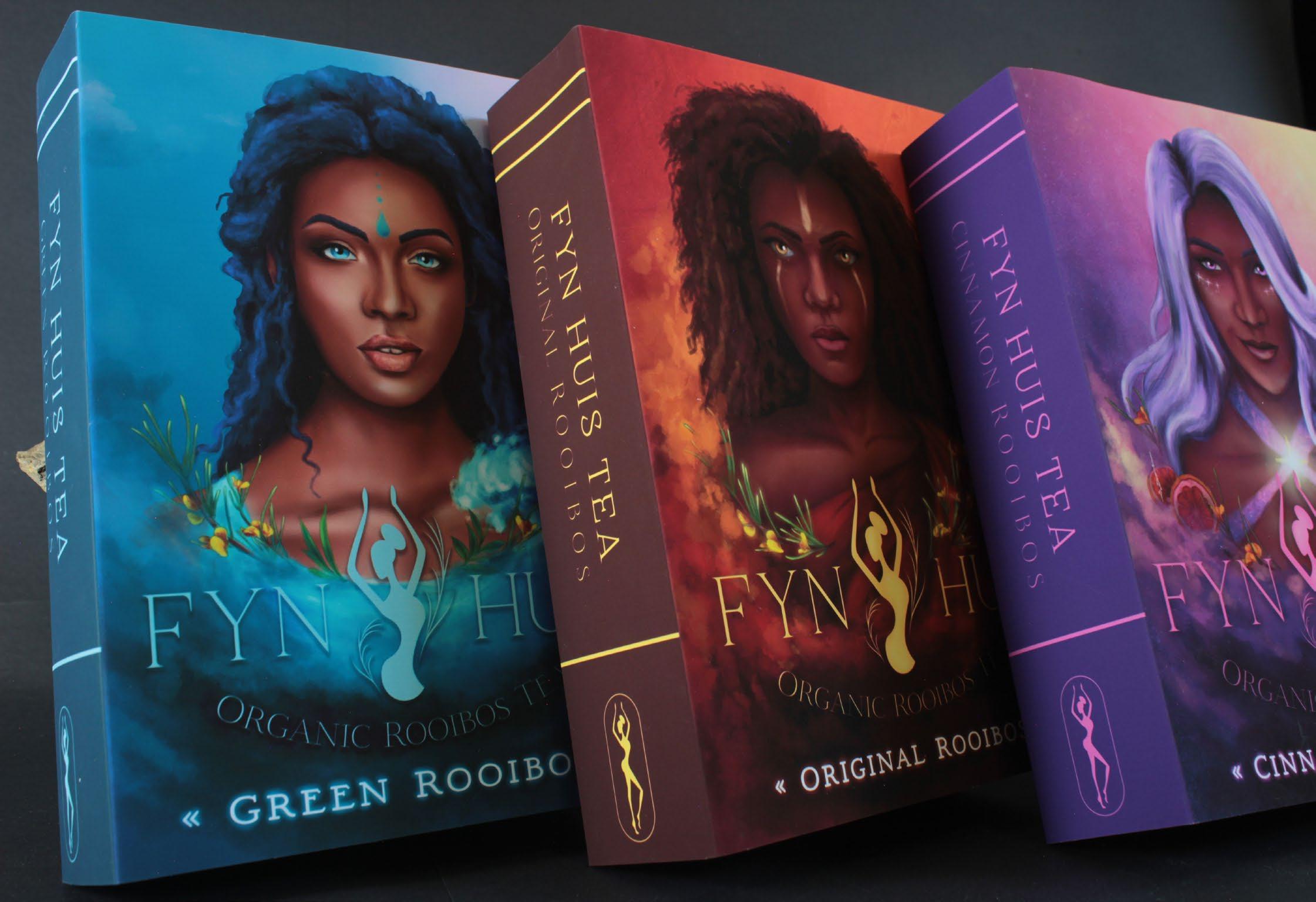
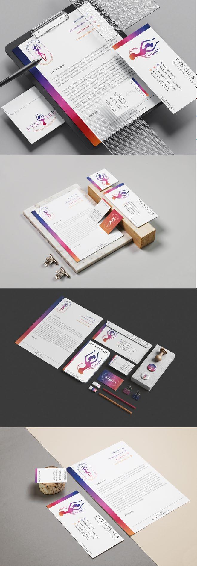
The packaging should be anything but simple with extravagant detail to showcase the product’s unique properties. With a balance of familiarity and election, Fyn Huis Tea is viewed as a special product and should function as a decorative item in any home. Owning to the exclusive habitat of Rooibos, Fyn Huis Tea is committed to the ethical sourcing and acknowledgement of its local history from the indigenous Khoisan people.
Fyn Huis Tea’s lovable Original Rooibos Tea is a balanced taste of strong and sweet earthly tea. This strong taste is equal to the tale of the ostrich’s fire and Kuaru. The selfish ostrich always hid his fire from the world. During a dance with Kuaru, the ostrich let his guard down and Kuaru was able to get the fire. Because of her acts, she warmed the hearts and souls of her kin, and so does Fyn Huis’s Rooibos tea.
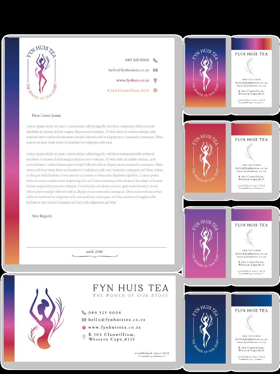
A natural sweetness with a soft taste can only be the Green Rooibos Tea. This soothing light tea is watered by the story of Lady Rain and the Elephant. Boastful and proud the elephant claimed to be greater than Lady Rain. Calmly and patiently Lady Rain departed from the elephant and the plains. After months of no water, the elephant surrendered his pride. Which made Lady Rain bless the land.
Fyn Huis Tea’s Cinnamon flavoured Rooibos Tea provides a sweet tea with notes of clove and a touch of citrus. This mysterious flavour reflects the Milky Way Myth. A strong-willed girl once took the ashes of the fire and threw them into the sky. Creating the stars of the Milky Way that leads the hero and tea lovers to the doors of Fyn Huis Tea.