
MAIREN MANNING
mairen.manning@gmail.com
PROFESSIONAL SUMMARY
Hello, I am Mairen Manning, a recent graduate of Florida State University with a Bachelor of Science in Interior Design and a minor in Museum Studies, and a LEED Green Associate.
At the heart of my design is the dedication to building connectivity. What is the project’s goal, and how do you want users to feel? How can we enhance the human experience? When people are at the center of the design, a project should use evidence-based design and research to properly support its users. I have gotten to where I am today thanks to the support of the people around me. In turn, I aim to empower and support others through the built environment’s influence. As people spend more than half their lives indoors, these spaces matter. Regardless of who you are and where you are in life, you deserve to be advocated for and supported to become the best ‘you’ you can be.
Throughout my portfolio, I hope you will notice each space’s intrinsic desire to be equitable, sustainable, and supportive.
EDUCATION
Bachelor of Science in Interior Design, Minor in Museum Studies
Florida State University, Tallahassee, FL
Leadership in Energy and Environmental Design (LEED) Green Associate
Green Business Certification Inc. (GBCI)
EXPERIENCE
Council Member
College Leadership Council for College of Fine Arts, Tallahassee, FL
• Organized events, increasing inter-department interactions.
• Helped with the publication of the SIX Magazine through Admin and Design tasks.
May 2026
January 2026
August 2024 to April 2026
• Advocated for careers in the arts by speaking with high school students and teachers.
Interior Design Intern
The Turett Collaborative, New York City, NY
• Managed materials library and samples.
• Aided with redlines and document reviews in BlueBeam and Revit.
• Updated product orders and quote sheets in Google Sheets.
• Created renders and slides for client presentation in Enscape and Google Slides.
Exhibition Co-Designer
Woven Together, WJB Gallery, Tallahassee, FL
• Done in Collaboration with Museum Studies Course at Florida State University.
• Produced Illustrator files for vinyl cut outs in the Exhibition.
• Created the SketchUp file for the Exhibition layout.
• Aided with installation of Artifacts into cases.
Exhibit and Operations Intern
Glazer Children’s Museum, Tampa, FL
• Completed exhibit concepts with budget plans in Google Sheets.
• Maintained and repaired various props alongside team members.
• Created renders with SketchUp and Photoshop.
• Constructed exhibit prototypes.
• Measured rooms and created floor plans with AutoCAD.
June 2025 to August 2025
February 2025 to May 2025
June 2024 to August 2024
Graduated Magna Cum Laude - Florida State University 2026 HONORS / AWARDS
1st Place - Material Bank’s Student Competition Spring 2025
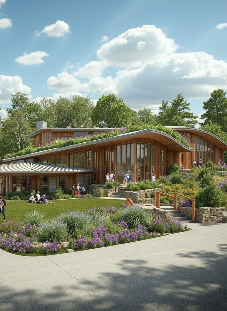
1st Place Winner for Material Bank’s Spring 2025 Student Design Competition
See Material Bank’s Announcement here! *This Image was AI-Generated
Miscellaneous Work
Market: N/A
Square Feet: N/A
Utilized AI-Generation, Photoshop, Hand Sketching, and Illustration
“Miscellaneous Work” demonstrates some of my other side projects and skills related to Interior Design. The first example is the “Acadia Visitor Center,” my winning submission for Material Bank’s Spring 2025 Student Design Competition. It experiments with AI to generate renderings based on selected materials and sketches, creating a space that can coexist with the natural environment.
In addition to this project, the section transitions into examples of my process and hand skills. This section features my hand-drawn sketches and illustrations, from quick studies to detailed drawings. These works explore built environments and architectural details, serving as tools for concept development and aids for client communication.
2nd through 4th Year
AI in Design
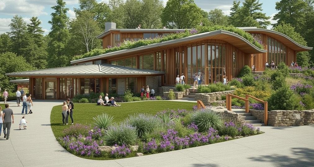
*This Image was AI-Generated
View of Acadia Visitor Center’s Exterior
Submitted for Material Bank’s Student Design Competition, Acadia National Park Visitor Center is a theoretical retail project located on the outskirts of Bar Harbor, Maine. The design is inspired by the blueberries that grow along the hiking trails in summer, the peak tourist period for this region. The Visitor Center also follows the principles of Frank Lloyd Wright, where the building must align with the nature of its environment. The main challenge of this project was to create an AI Render that was true to the selected materials and concept; it took several iterations and learning how to fine-tune a model to get the desired result.
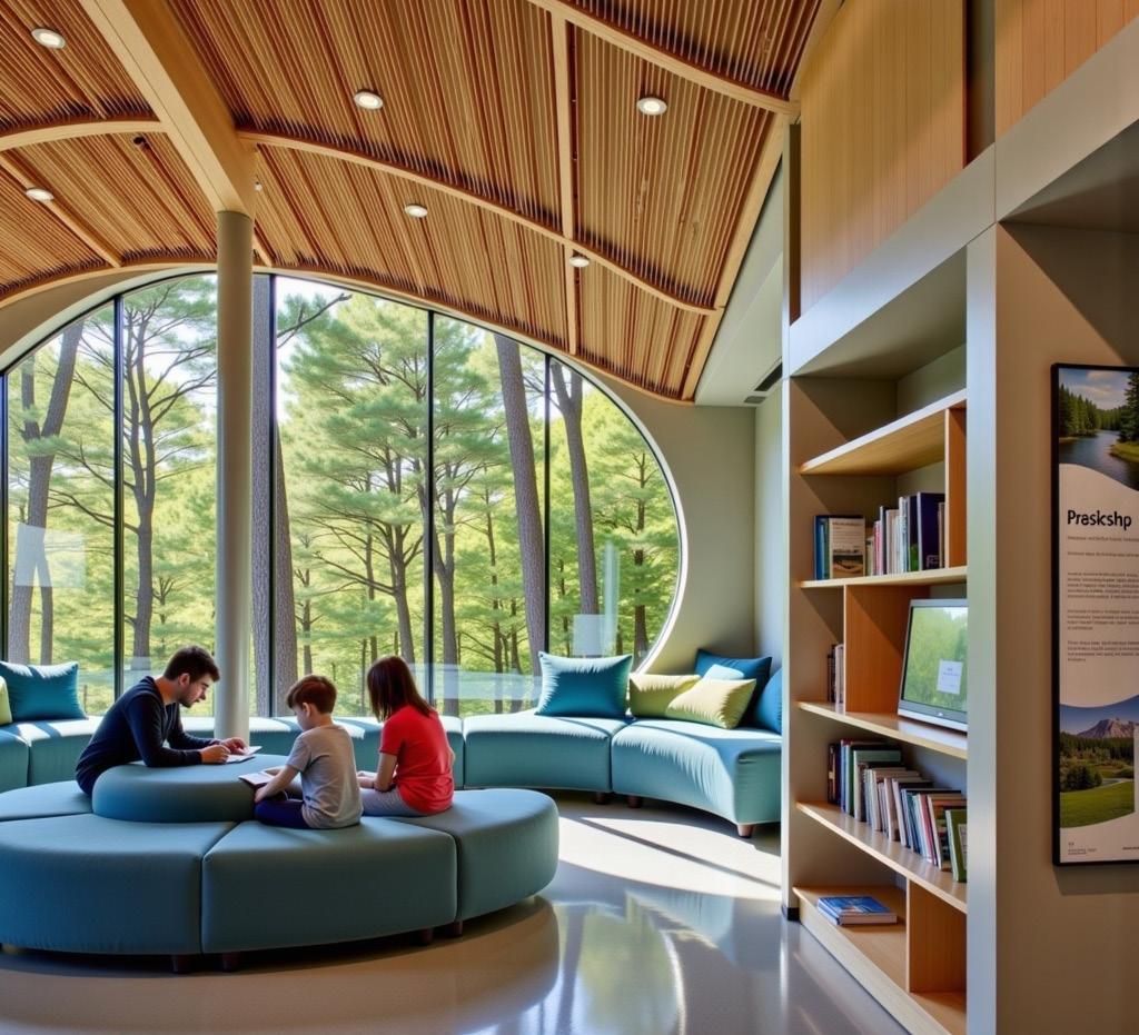
*This Image was AI-Generated
*This Image was AI-Generated
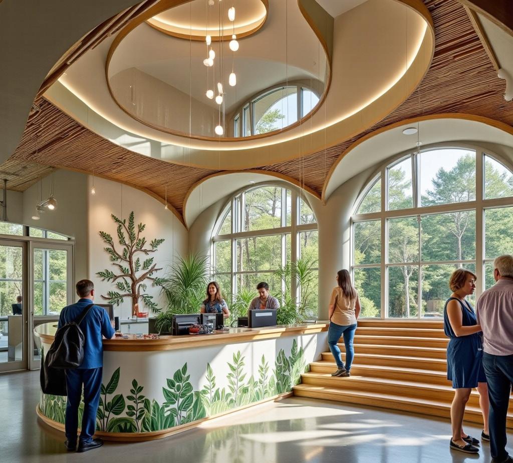
View of the Reception
View of the Education Lounge
Sketching and Illustration
Elevator Pitches? Elevator
Client meetings can go fast, and ideas need to be shared. Each sketch took between 1 minute to 10 minutes to produce. They also are less or equal in size to a half sheet of A4 (letter) paper. Images here utilize a mixture of pencil, pen, marker, and colored pencil.
SKETCHES
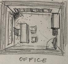
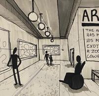
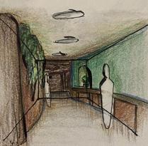
Reading Corner Sketch produced for the Glazer Children’s Museum in Tampa, FL.
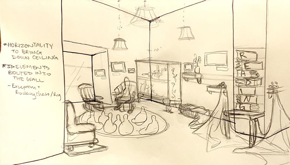
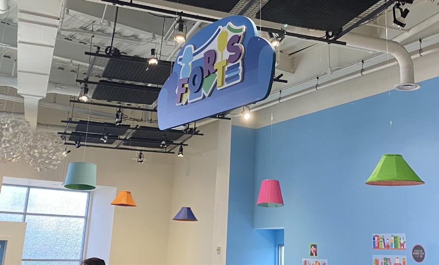
Done during my internship at the Glazer Children’s Museum, this was a sketch drawn during a brainstorming session with staff. The idea was provide a better space for the staff who provide story hours while still making use of the pre-existing Forts Exhibit. The image on the right demonstrates what aspects of the sketch were utilized for implementation, like the hanging lamp shades.
Hand-Drawn Postcards

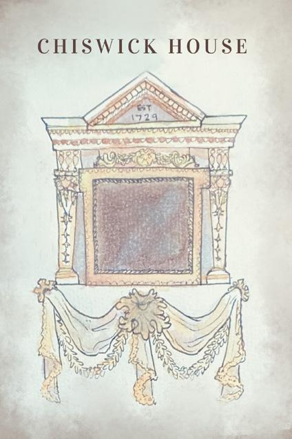
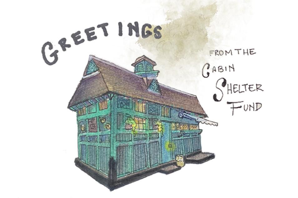
From Left to Right: A Biba Lamp from Barbara Hulanicki, a Fireplace at the Chiswick House, and a repurposed Cabmen’s Shelter. During our Study Abroad in London, we visited various sites and museums with history tied to Interiors and Architecture. In each visit, we sketched a feature that caught our eye using pen and watercolor. Each Illustration is tied to a 5:7 format in order to be usable for postcards.
Boudica’s Light
Market: Hospitality
Square Feet: 193,900 gross
Utilized Illustrator, Photoshop, Revit, Enscape, and Hand-Sketching
Boudica’s Light is a mixed-use conference-style hotel located along 60 Victoria Embankment in London, UK. Honoring the history and diversity of London, the hotel is named after Queen Boudica and her determination to protect her tribe from Roman conquest. Boudica’s Light spreads the message of Boudica’s strong sense of justice and desire for truth for her community. The Hotel’s overarching mission is to prioritize the well-being of all occupants (staff and guests) by implementing LEED Guidelines, integrating local vernacular, and creating spaces that balance work and relaxation.
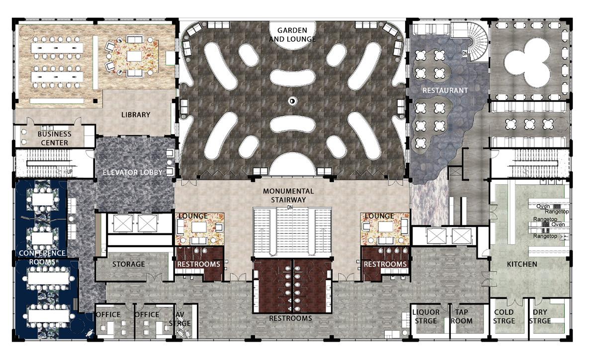
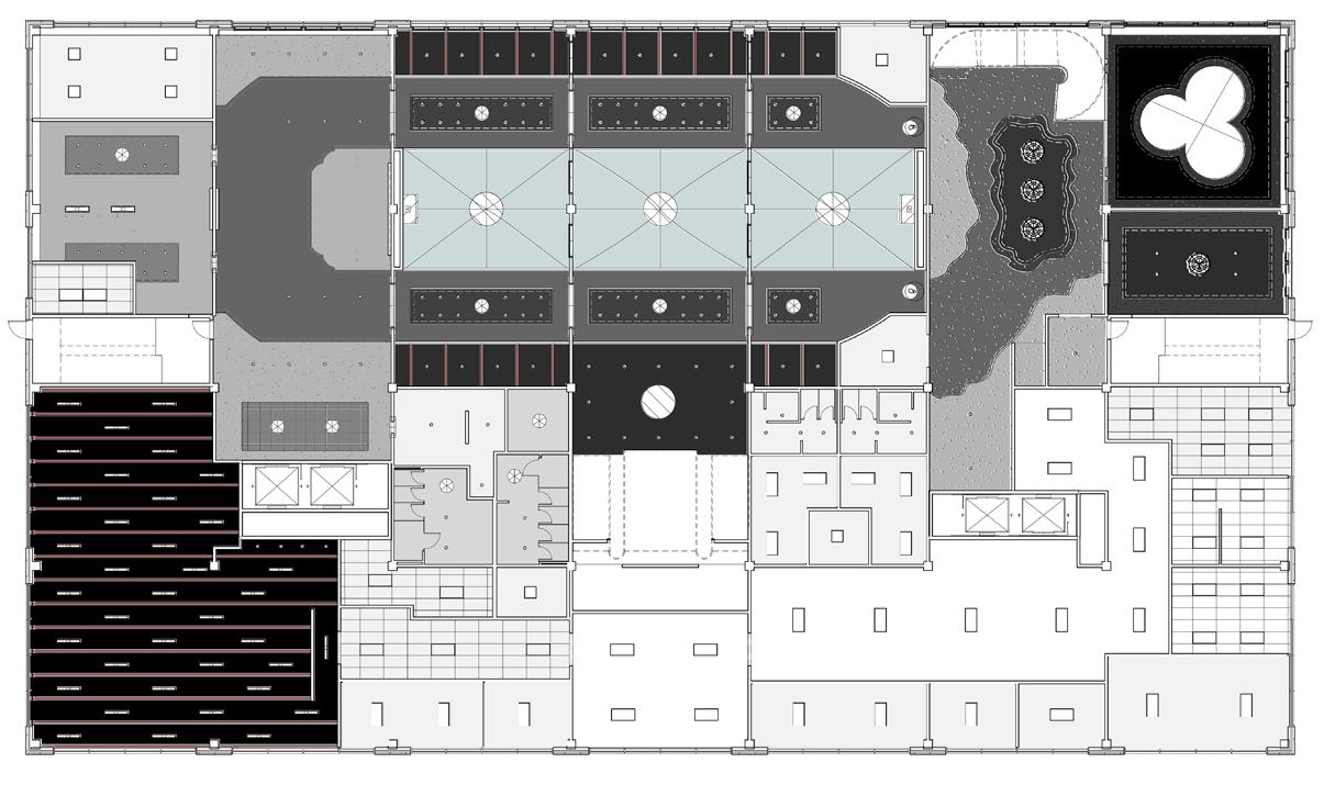
The design is inspired by Eternity and the Ephemeral and embodies London’s identity as a modern, fast-paced city rooted in centuries of history. To demonstrate the hotel’s connection to London’s identity, gothic-inspired architecture with rough-textured natural materials will ground the space, while daylighting and tall arches will heighten it, creating contrast and a sense of spatial hierarchy. Nature persists throughout this concept, demonstrating our eternal connection with nature, despite its fleeting moments. The Lobby and Garden on the first and second floors will serve as focal points because they are central on the plans and larger than the surrounding halls. Circulation through the Hotel’s front of house and hallways will inspire guests to reflect and move thoughtfully through circular movement.
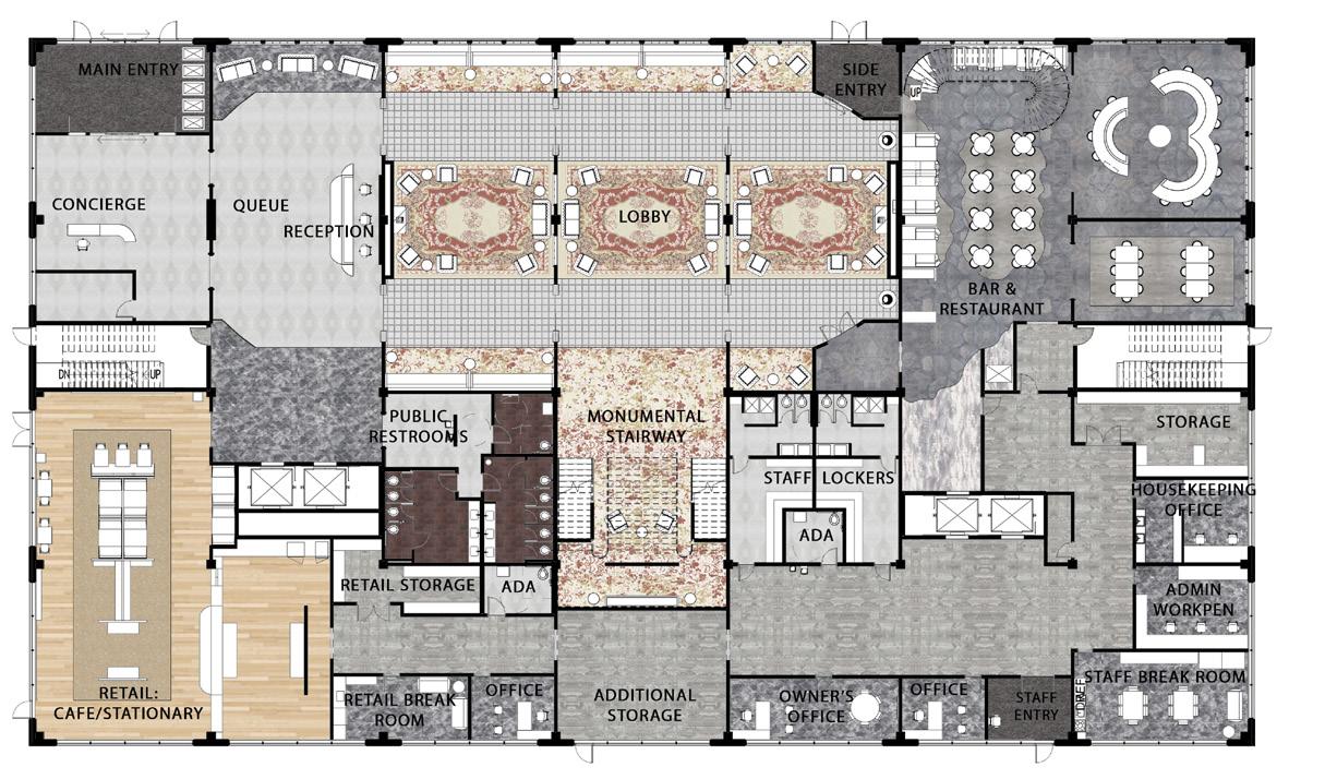
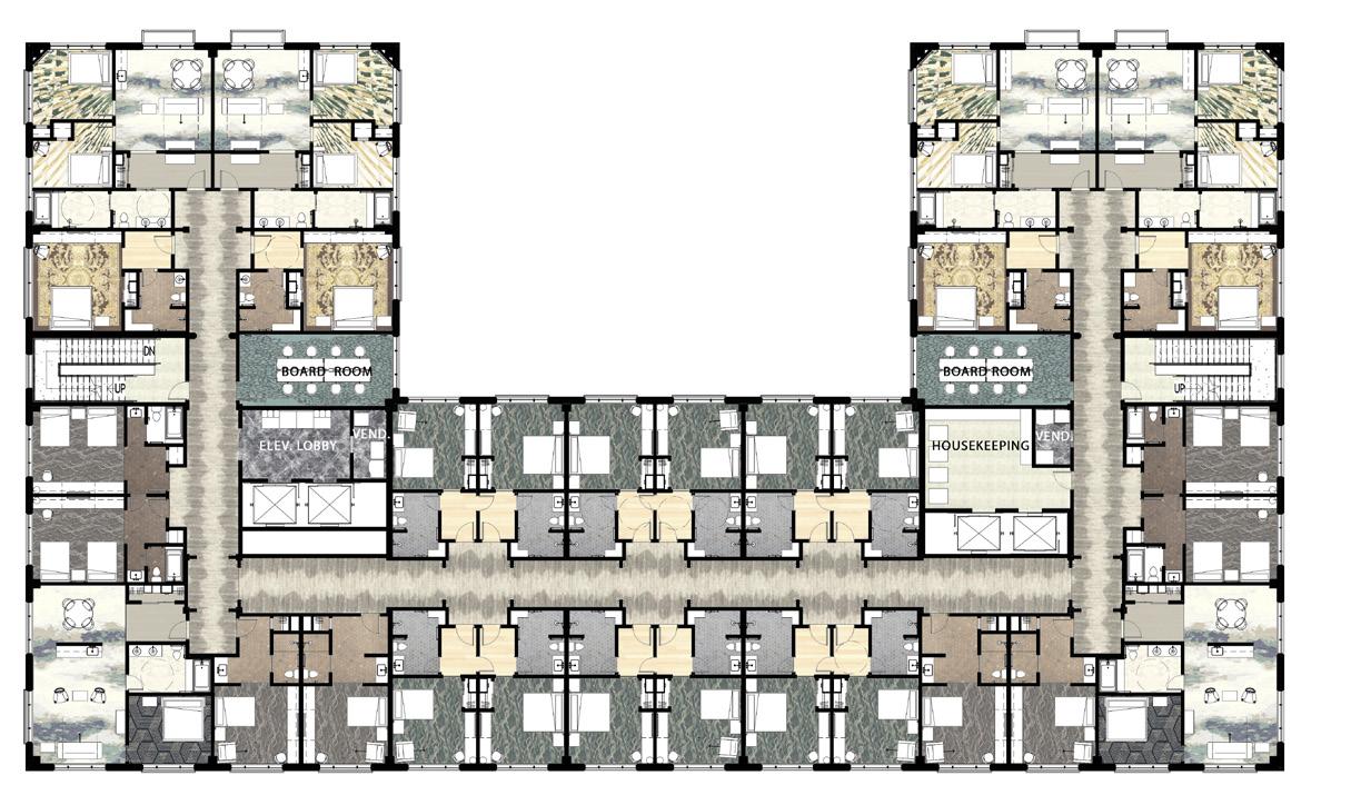
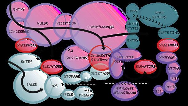
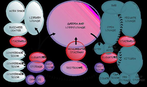
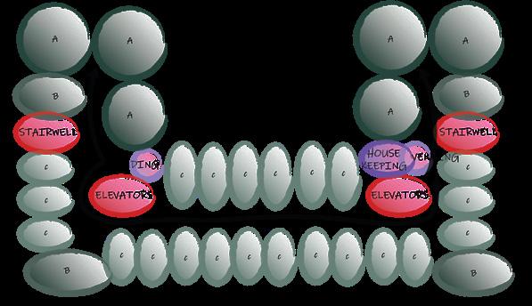
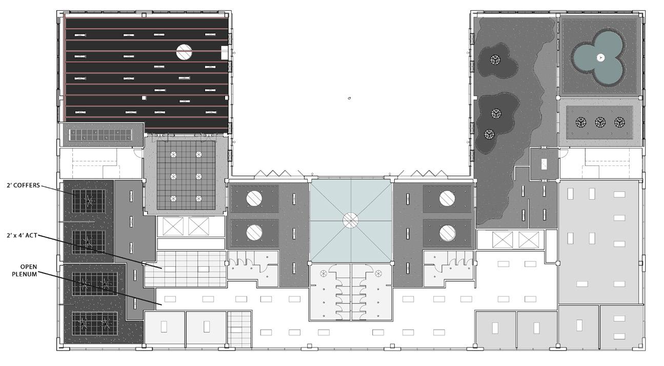
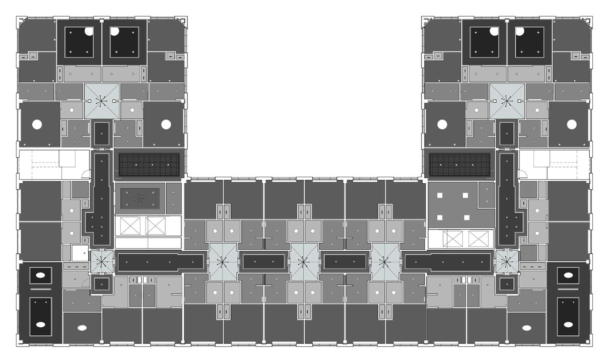
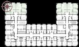
The Basement includes public/staff parking, valet, laundry, delivery/loading, storage, waste management, mechanical and electrical, and the main SubMetering energy management room. The First Level includes the Hotel’s front of house, back of house, a cafe, and the restaurant “The Geode”. The Second Level includes the garden, public restrooms, the library and conference rooms, employee back-of-house, and the second floor of the restaurant. Levels Three through Eight each include 30 keys, 2 board rooms, vending/ice, and housekeeping. In total, the hotel has 180 rentable suites.
Project Research
Approaching LEED v5 Certification:
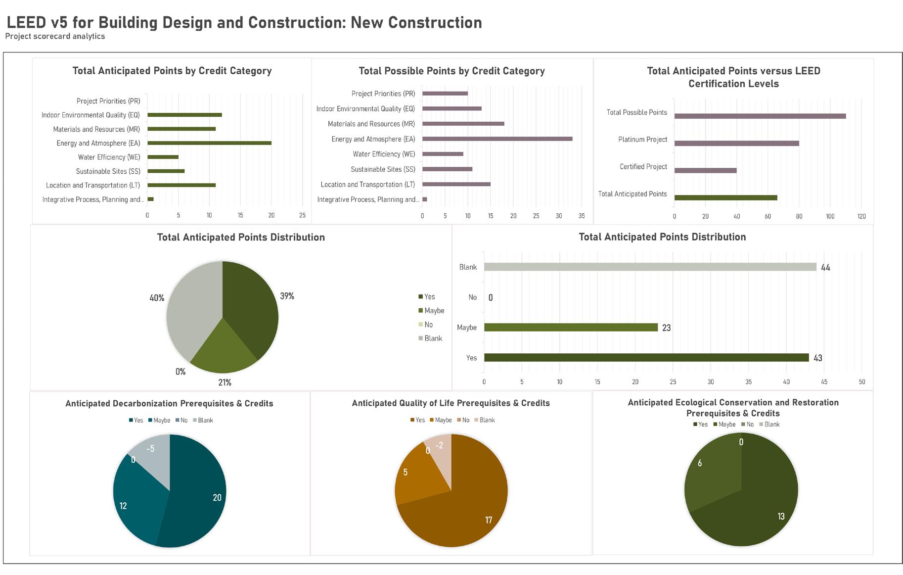
In line with the City of London’s goal to promote sustainability and diversity, this hotel has chosen to pursue LEED Certification. After site selection and review of the LEED v5 Scorecard for Building Design and Construction: New Construction, it can be determined that the project is capable of achieving LEED Gold certification. The scorecard below identifies which credits are being achieved in the project, using a Yes-Maybe-No format, to establish the project’s goals in pursuing LEED certification.
Site Analysis:
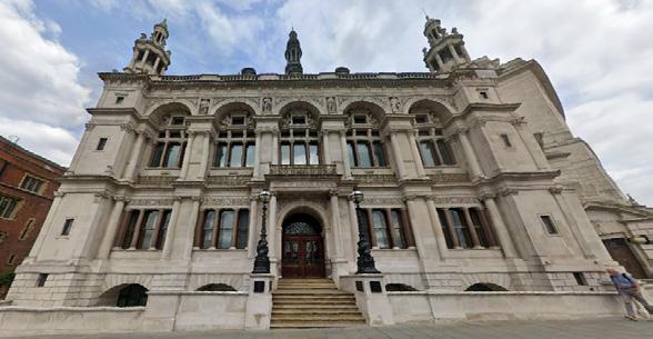
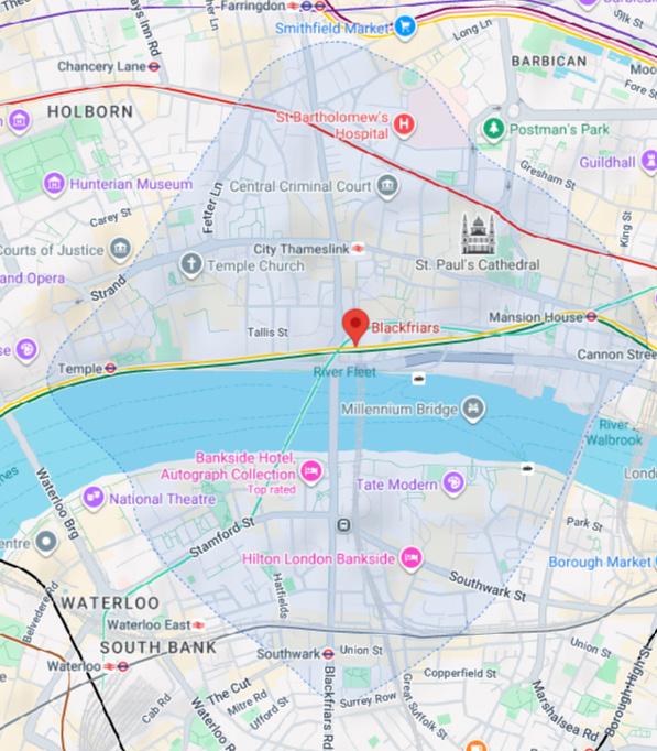
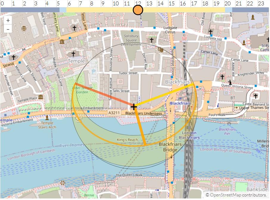
LEED’s Location and Transportation Credit Category played a major role in understanding and selecting a site for Boudica’s Light. Within a quarter mile, there are several bus stops and tube stations. WIthin the greater 15-minute walk, there are several restaurants, grocery stores, parks, markets, a hospital, and access to some of London’s museums and historical sites.
SITE FRONT FACADE
Demographic and Regional Analysis:
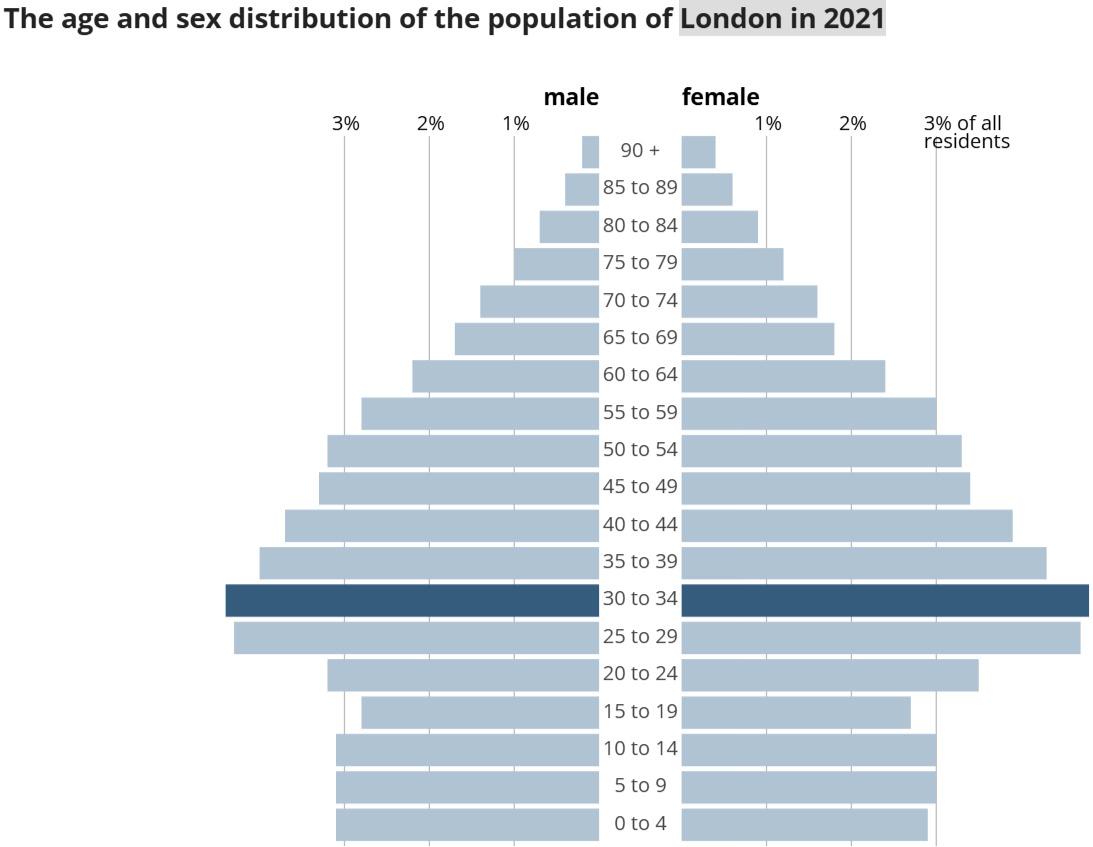
According to the 2021 census, the City of London borough has a population of 8,583 people. However, it receives tens of thousands of visitors daily. According to the 2021 Census, the largest age group is people aged 30-34, which falls under the worker population. Following trends in London’s traveler demographics, Boudica’s Light aims to cater to Business Travelers, particularly those in fields such as history, anthropology, and writing. With the selected site adjacent to major rail lines and close to museums and historical sites, this hotel will become a prime location for business travelers.
The City of London receives 2.7 inches (70mm) of rain per month, coinciding with each month averaging around 12-14 days of rain. Throughout the year, temperatures range from 41°F(5°C) to 80.1°F (26.7°C). Entry points into the hotel and guest suites will consider umbrella/coat storage to support transitions from the exterior into the interior, and vice versa.
Second Level Garden:
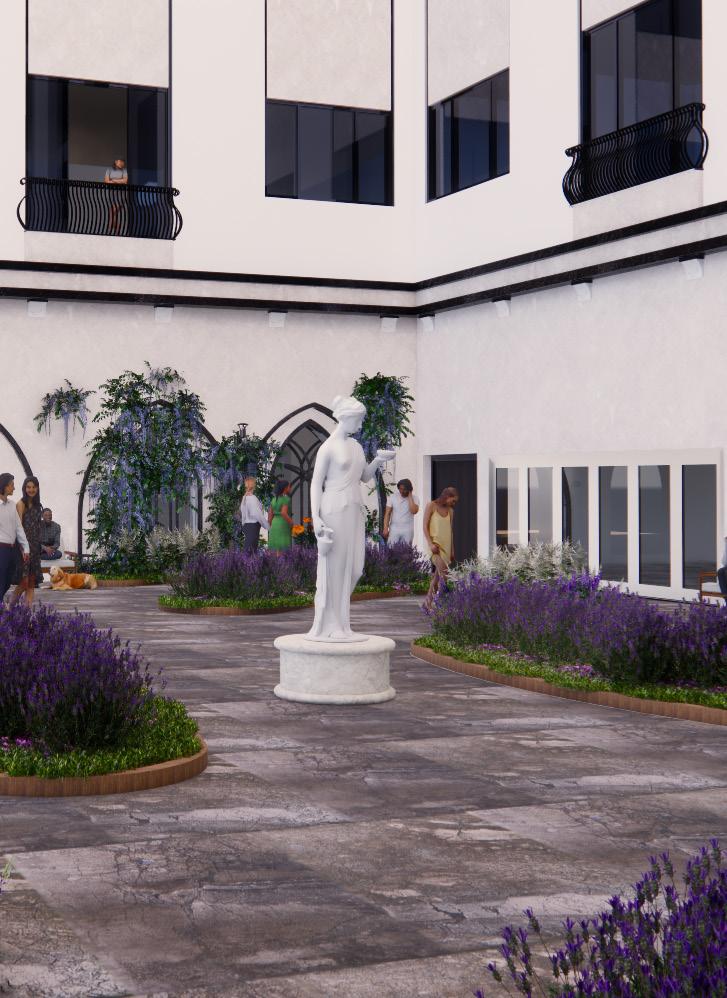
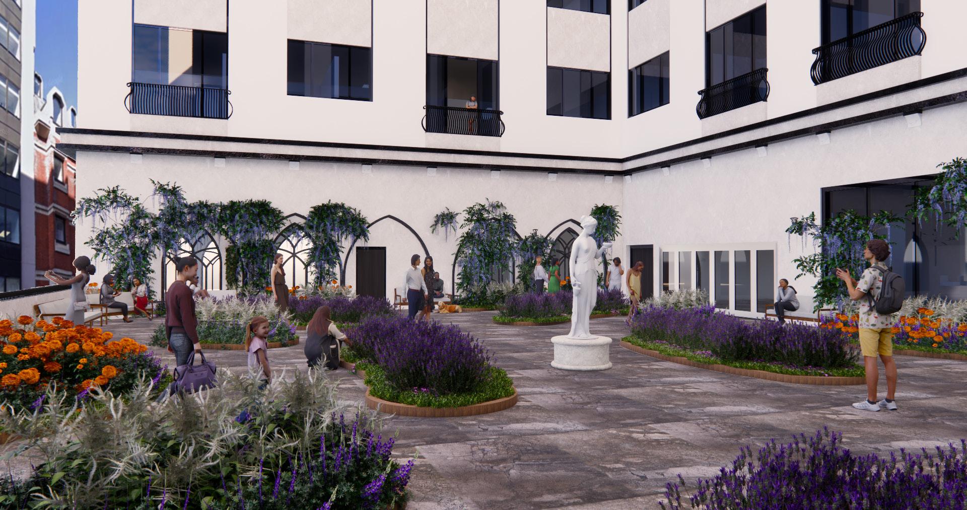
Situated on the second floor, the Garden is visible from the street and serves as a faux atrium for the rooms above. The Garden’s foliage relies on local plants suitable for xeriscaping, limiting required maintenance and water use while supporting local biodiversity. Such plants include Dutch Lavender, Wisteria, Clematis, Corsican Mint, Horse Chestnut, and more. When the weather is good, long accordion doors open out to the Garden to invite guests outside. The garden paths radiate from the large walls, converging at the center of the garden, where a statue of Queen Boudica stands. The pathing provides pockets of privacy while promoting circular movement


Reflected
Reflected
Reflected
First Impressions
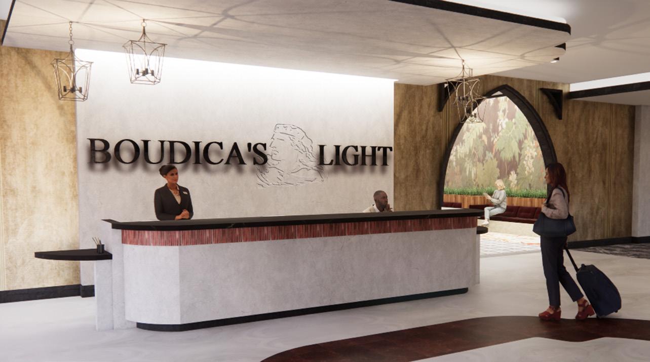
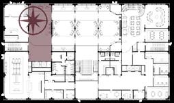
Reception

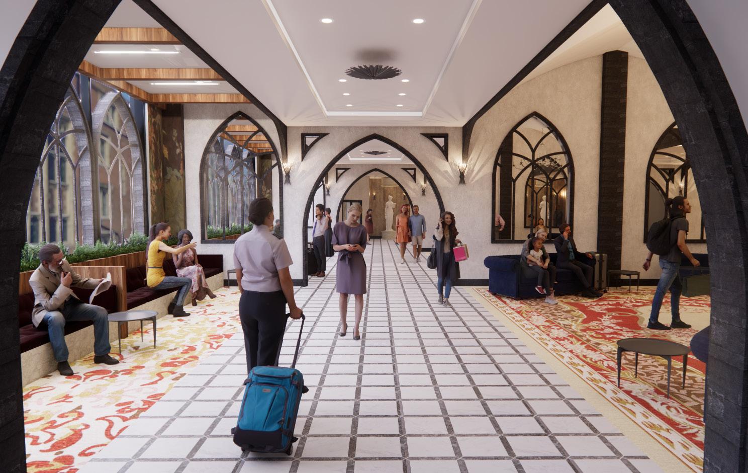
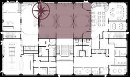
Lobby
Communicating History and Values:
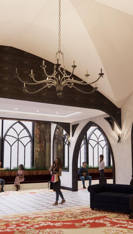
Upon entering the reception area, guests are welcomed by receptionists and have direct sightlines to the elevators and restrooms. Stone bases line the hotel’s walls, including black flagstone in the reception that connects the faux marble flooring to the walls. Arches on either side of the reception invite guests into the Great Hall—the hotel’s heart—where multiple seating areas branch from the main walkway. The lobby serves as a waiting area and communal space for small gatherings. Foliage along the windows infuses the air with a gentle floral scent, easing visitors. Arches and vaulted ceilings create an interplay of light and shadow that echoes the hotel’s name, Boudica’s Light. Together, the lobby and reception flow in a circular motion, symbolizing eternity and ongoing movement. Material selections enhance the hotel’s branding through natural stone and wood, as well as warm tones. Additionally, the contrasting hues support visitors with colorblindness or aging eyes. To counteract the space’s openness, PET beams, carpet, and fabric upholstery provide acoustic comfort
For the Educator
The Library
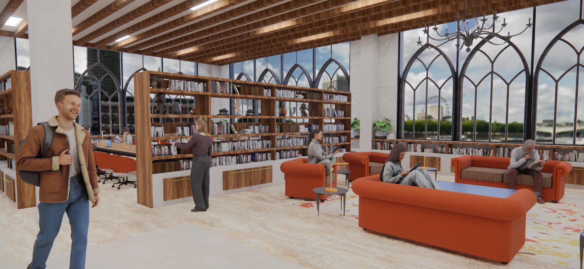
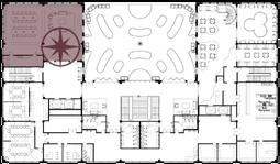
Sitting on the corner above the main entrance, the Library offers a great view of the Thames River and is divided into different seating zones. Behind the bookshelves, a workspace provides privacy and individual task lights. Overhead beams improve acoustic comfort through acoustic PET. The bookshelves feature open cuts to let light penetrate the space and display historical artifacts, with plaques honoring the City of London’s history. At the back of the library, a business center is available for phone calls and for printing or copying files.
Meeting Spaces:
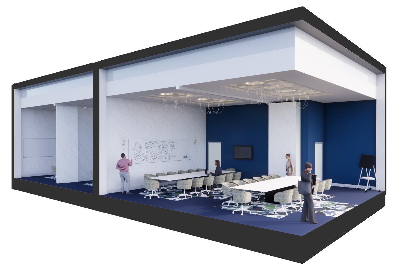
Adjacent to the library are two large conference rooms that can be divided into four smaller meeting rooms using foldable Air Walls. The conference rooms provide dimmable LED lighting, allowing brightness to be adjusted to the user’s needs. Each room includes a whiteboard and a TV with an HDMI cord. For additional flexibility, guests may rent mobile TV stands and expo markers from the hotel. Blue tones, selected to enhance focus, define the cool finishes of these primary meeting spaces. On each sleeping floor, there are two smaller Board Rooms designed for impromptu meetings or extra workspace. These Board Rooms overlook the Garden below. Each meeting space utilizes PET wall panels to provide acoustical support.
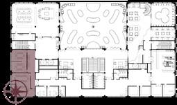
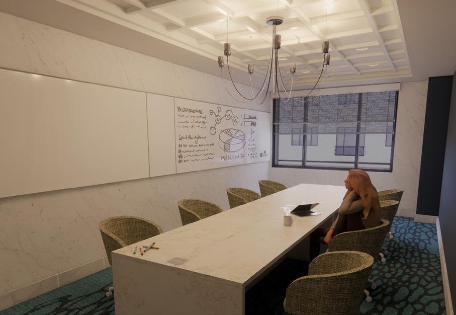
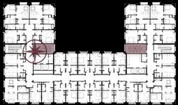
Conference Rooms Board Rooms
Sleep and Stay
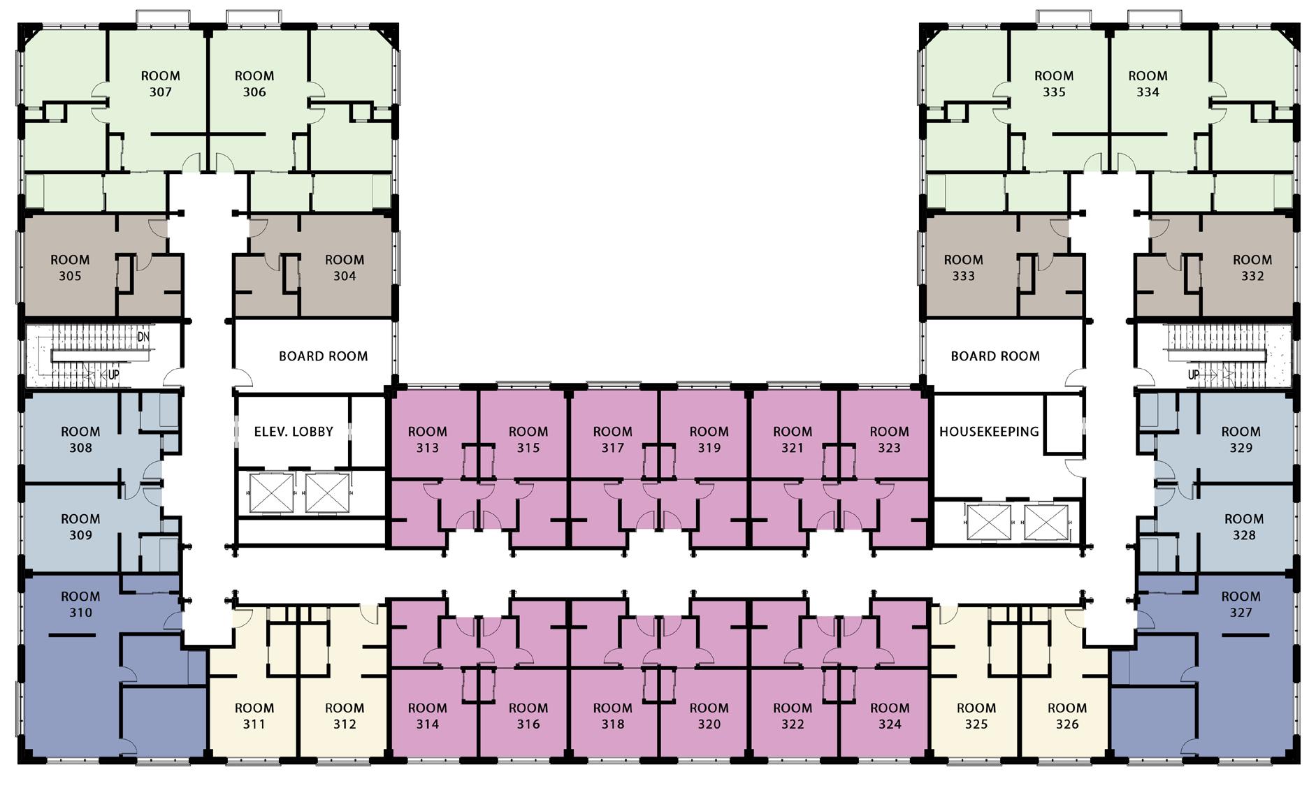

Room Types:
Boadica’s Light features 6 suite types, each designed for different budgets, space needs, and preferences. Each suite is named after historical figures linked to Boudica and the founding of London, driving home the Hotel’s historical connections and inspirations. The Boadica Suite and Voada Suite are luxury king/presidential suites that offer spacious layouts and premium amenities. The Teulu Suites are standard rooms, focused on comfort and functionality. The Anglia Rooms are affordable single rooms, ideal for solo travelers. The Iceni Rooms are designed to accommodate the highest number of guests per key. The Tacitus Suite is a typical Guest Plus suite that offers an enhanced experience with additional space and features.

The Hallways:
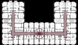
The hallways leading to the rooms feature varying ceiling heights, with vaulted sections over each bay. Wall finishes distinguish between walking and loading areas through ivory-textured wallcoverings and smooth brown paint. Arches and a vaulted ceiling reaching 10 feet distinguish each room bay. Cove and uplighting together create a consistent, diffused atmosphere. The hallway is 8 feet wide, accommodating turns, passing, and luggage. Each room bay extends by 3 additional feet to ease entry and exit.
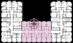
The Teulu Suite:
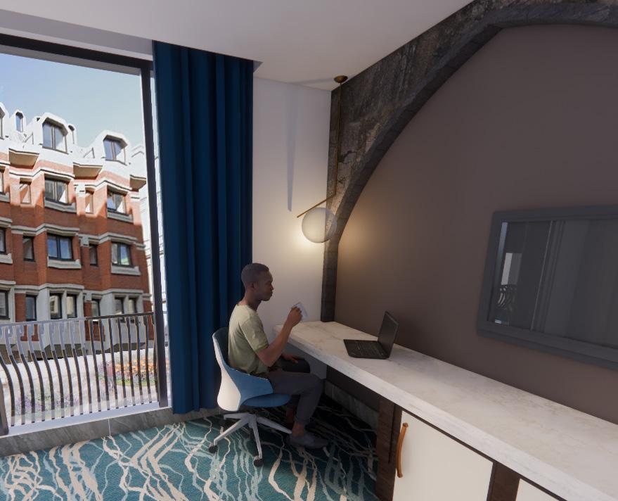
Built-In Desk and Wardrobe
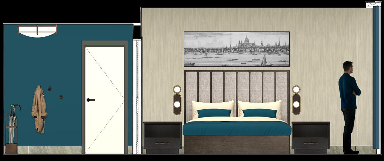
The front part of the suite is sectioned off with a sliding pocket door, dividing the room from the entry and restroom. It also provides separation from the adjoining door, adding privacy for those not renting the adjoining suite. The Teulu Suites are ADA-compliant throughout, providing enough turning space around the bed and bathroom, as well as an accessible work height with the built-in desk. Variations of the Teulu Suite shift the king-sized bed into a queen and are paired with a pull-out sleeper chair. Most suites also include a Juliet balcony, which provides operable windows and enhances guests’ connection to nature
The Boudica Suite:
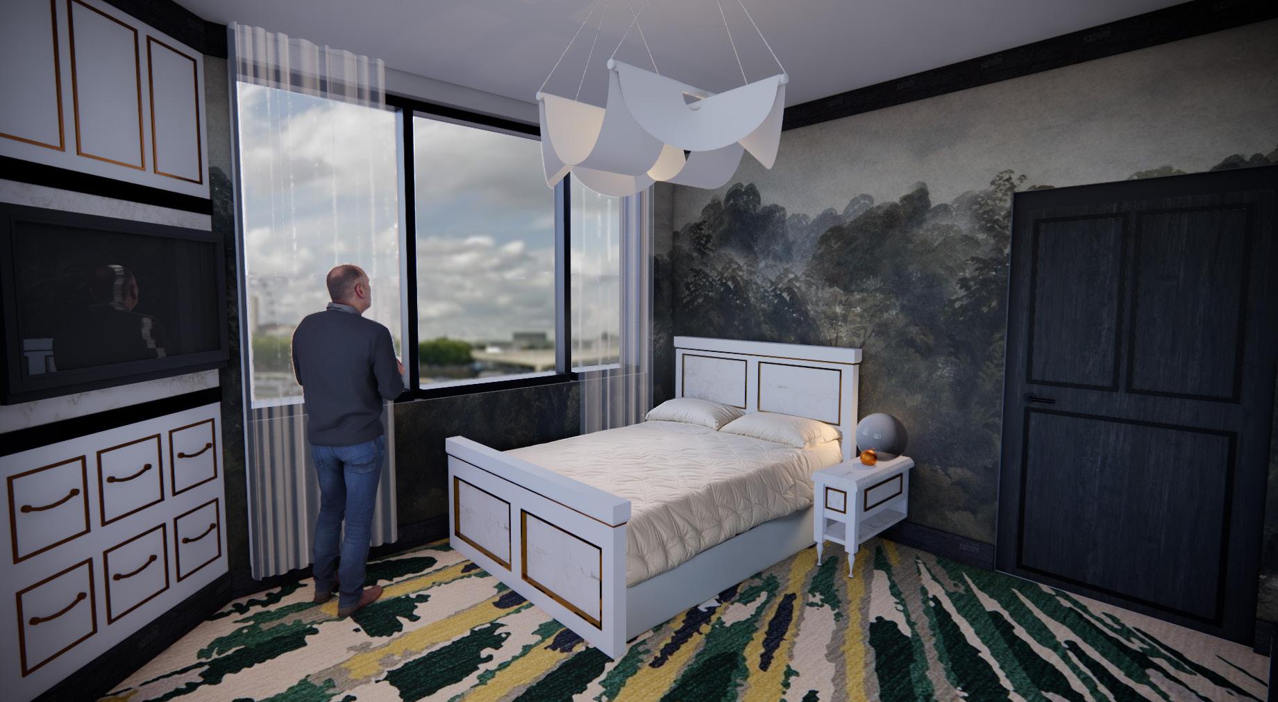
The Boadica Suite is a two-bedroom suite with a kitchenette, dining area, and living room, making it designed for larger groups with more luxurious tastes. It includes three beds, one of which is a pull-out sleeper sofa, and offers enhanced finishes and furnishings in classical styles. The bedroom features finishes inspired by the natural landscape present before and after London’s founding.
*This Image was AI-Assisted
*This Image was AI-Assisted
Boadica Suite - Bedroom 1
Teulu Suite Elevation - Facing Bed Wall
Hotel Restaurant: The Geode
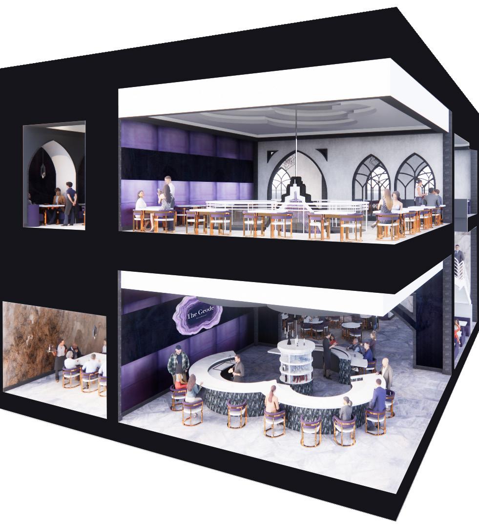
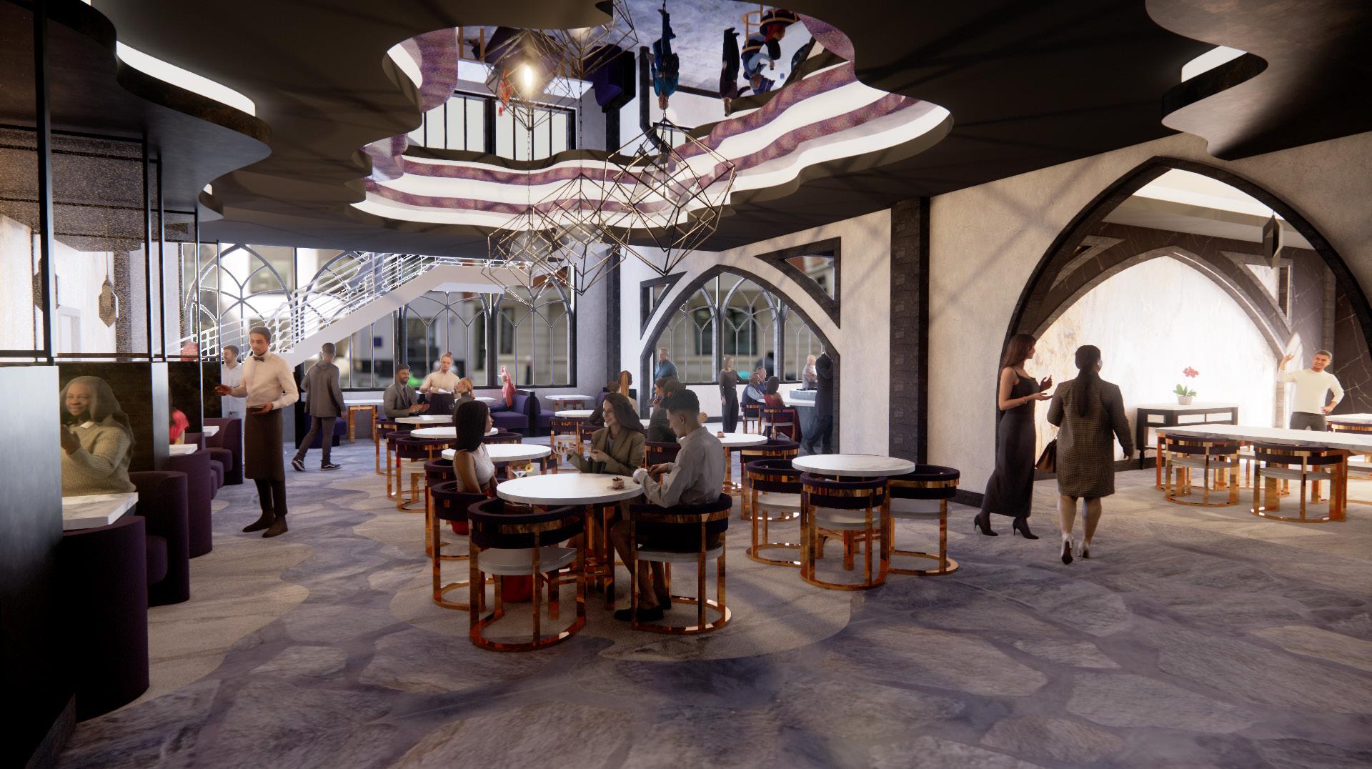
The Geode is a 2-story Pub and Restaurant that features jewel tones and lush materials, offering guests a royal experience. Directly inspired by an Amethyst Geode, the restaurant pairs multiple rough finishes, such as a rocky exterior with flagstone walkways, with sparkling finishes reminiscent of a geode’s interior. Various seat groupings increase parties’ sense of privacy and connectivity with their companions. A rentable private room is available at the back for larger parties, enhancing the floor’s flexibility.
Experiencing The Geode:
On the first floor, guests can enter from within the hotel or from the street. Throughout the restaurant, there are multiple seating arrangements, each demonstrating striking material changes like a geode. The seats feature soft purple upholstery, while the tables use reflective marble resin. The lighting design combines ambient lighting from recessed ceiling fixtures with pendant lights hung above central tables, creating a warm and inviting atmosphere. Accent lighting is strategically placed to highlight the geode-inspired ceiling features and reflective surfaces, delivering a rich sparkle reminiscent of amethyst crystals.
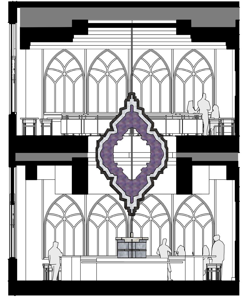
Spanning both floors, the amethyst cut serves as the Restaurant’s namesake and focal point, tying together the design elements described between both floors. The space is designed with accessibility in mind, featuring stepfree pathways, wide entrances, and two different seating heights to accommodate varying mobilities. Each floor can be accessed through either a stairway or an elevator. These inclusive elements not only ensure comfort for all guests but also foster a sense of connectivity, encouraging interaction and shared experiences among diverse groups of visitors.
Section Cut of the Spanning Amethyst
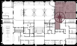
First Floor of The Geode
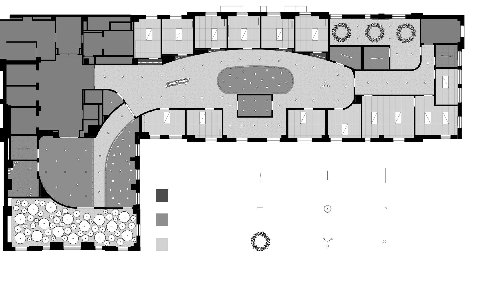
CONSULTATION ROOM
EXAM ROOM 1
EXAM ROOM 3
EXAM ROOM 5
EXAM ROOM 7
EXAM ROOM 9
EXAM ROOM 2
EXAM ROOM 4
PRACTITIONER WORKROOM
EXAM ROOM 6
EXAM ROOM 8
ADMINISTRATIVE WORKROOM
Sweetwaters Clinic
Market: Healthcare Square Feet: 6,092
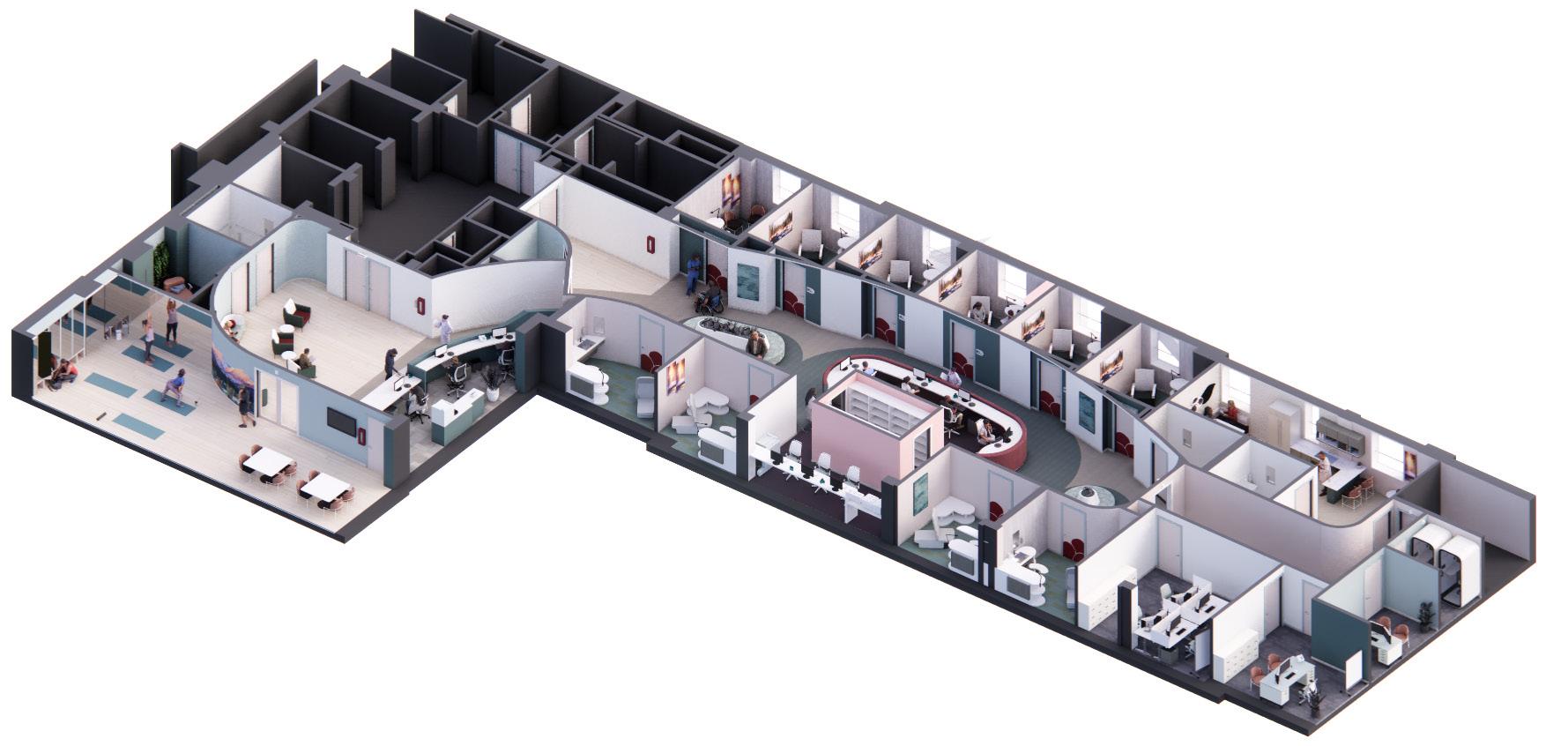
Getting help should never be a question. Yet, Whitefish, Montana, faces barriers to care that leave many wondering if seeking help is worthwhile. Sweetwaters Clinic aims to be a proactive solution, offering a primary care clinic focused on accessible education and ensuring patients feel heard. To fulfill this mission, Sweetwaters uses evidence-based design, adaptable furniture, familiar imagery, and areas of refuge.
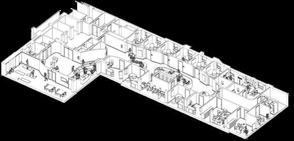
Sweetwaters Clinic is approximately 6,092 square feet and sits on the second floor of a hospital expansion project. It includes 2 ADA Restrooms, a Patient Restroom, a Sensory Room, a Multi-Use Space, a Waiting Room, a Check-In/Out, a Vitals Check Room, 1 Consultation Room, 9 Exam Rooms, a Care Desk, Storage, a Practitioner’s Workroom, an Administrative Workroom, 2 Offices, a Telehealth Room, and a Staff Lounge.
Utilized Revit, Enscape, Illustrator, and Photoshop 4th Year, First Semester
Research and Planning
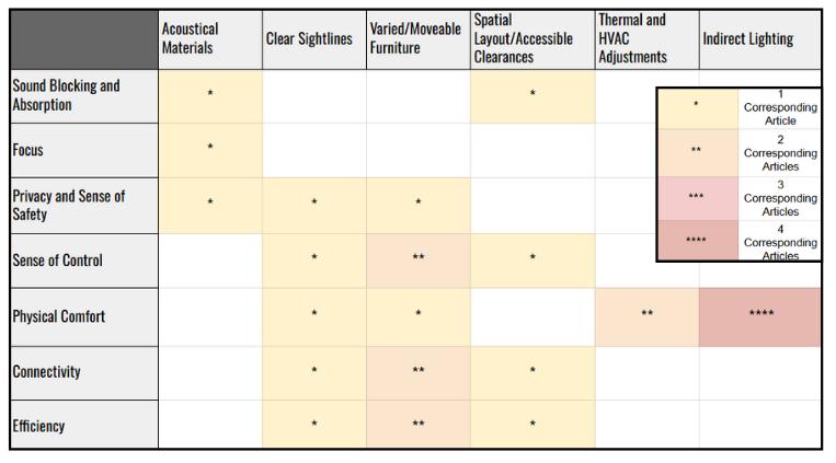
Evidence-Based Design (EBD) Matrix
Location and Demographic Analysis:
Multiple sources showed that indirect lighting increased physical comfort for workers and guests. Clear sightlines, accessible clearances, and movable furniture also provide a range of positive effects, increasing comfort and connectivity within the space. Seating can also be optimized so that waiting patients can easily see their doctors as they enter.
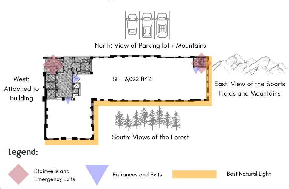
Sweetwaters Clinic is located at Logan Health - Whitefish, 1600 Hospital Way, Whitefish, Montana. Typical temperatures in Whitefish range from 12°F to 79°F throughout the year. Observing the sun path for the expansion, the best natural light is along the southeast; therefore, materiality that captures heat during winter should be considered. In conversation with the exterior, the interior can incorporate elements that reference the natural world.
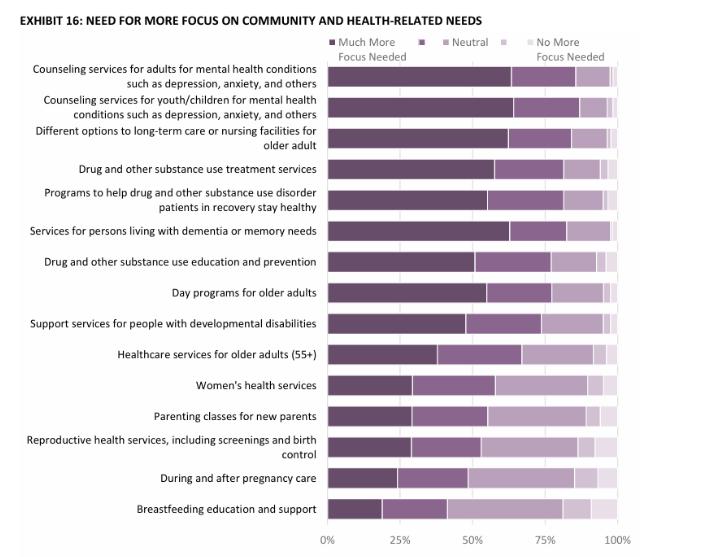
In Logan Health’s assessment of Community Health needs, Flathead County scored 0.4727 on the Social Vulnerability Index (SVI), placing it in the medium range for overall risk. Members reported needing more support around education, counseling, and programming. The clinic expansion directly benefits the community by providing flexible space for peer support gatherings and educational opportunities on chronic disease management. In addition, the new resource lounge within the Multi-Use Space will give guests easier access to information about community resources. These enhancements support Logan Health’s goals for leading into 2027 (Logan Health & Flathead City-County Health Department, 2024).
Graphic from Logan Health & Crescendo Consulting Group
SENSORY ROOM
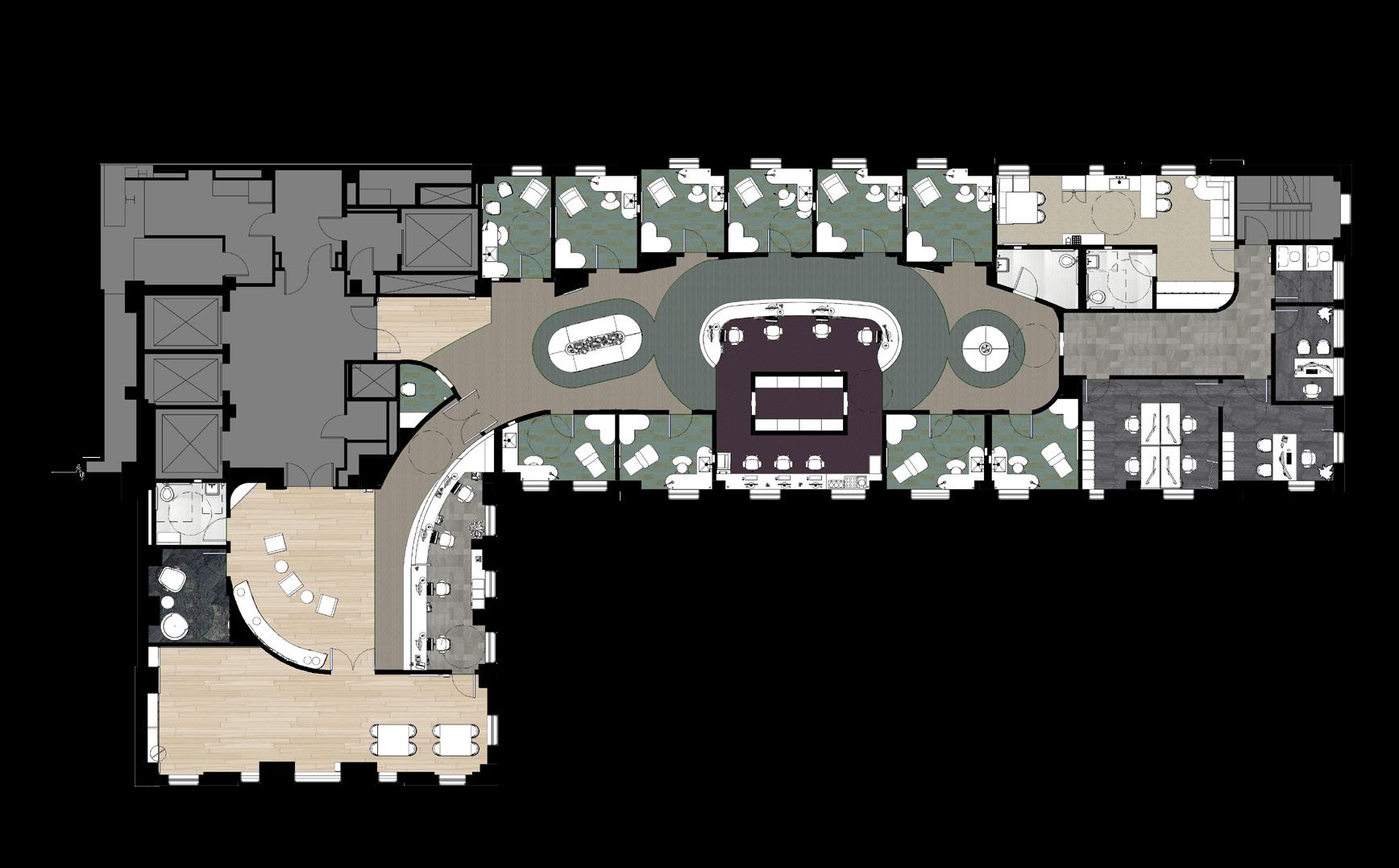

Rendered Space Plan
Lighting Plan
8’-0” Ceiling Height
Cooper Corelite Linear Light Undercabinet Lights Window Roller Shades
8’-6” Ceiling Height
Cooper Covio LED Acoustic Uplights
Cooper 6” LED Downlight
9’-0” Ceiling Height MOOOI Heracleum III ZERO Curve Cluster Panzeri Smoke Pendant
User Experience
Entry View and Reception
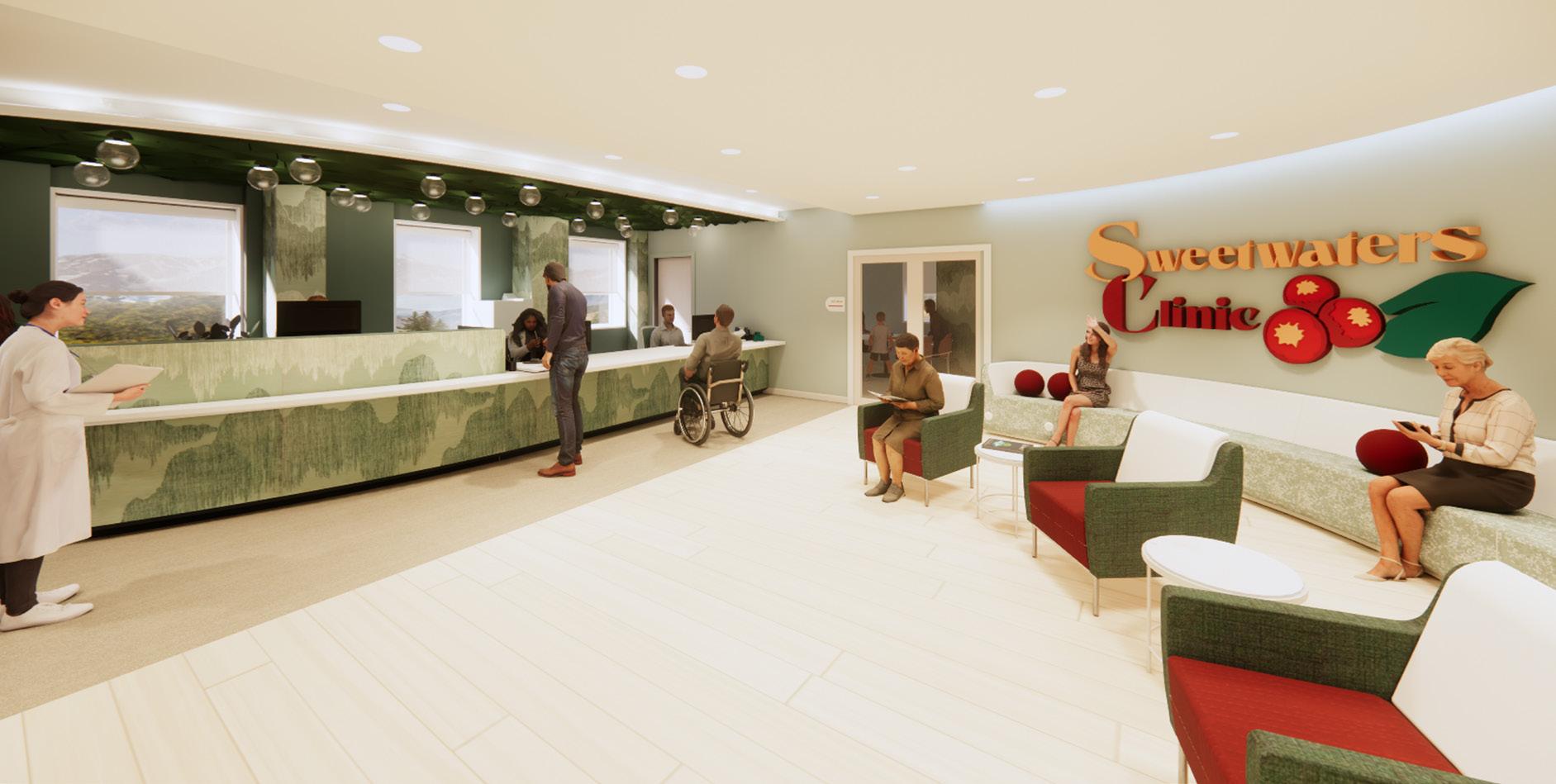
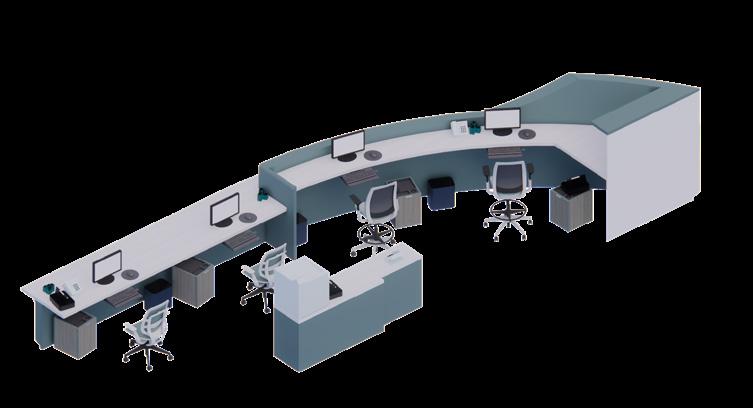
The Reception Desk for Check-In/ Out utilizes Universal Design for Size of Approach. Both Staff and Visitor Sides utilize a 34” High counter for Wheelchair Users. Along the left side of the desk, there’s a 42” High counter for staff members who may prefer to work standing. Staff also recieve completely adjustable seats for their personalization
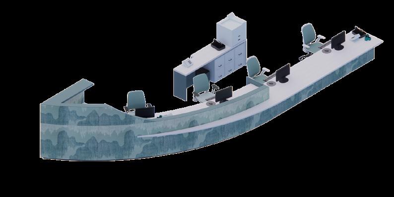
Surface Material: Moon Geyser by WilsonArt.
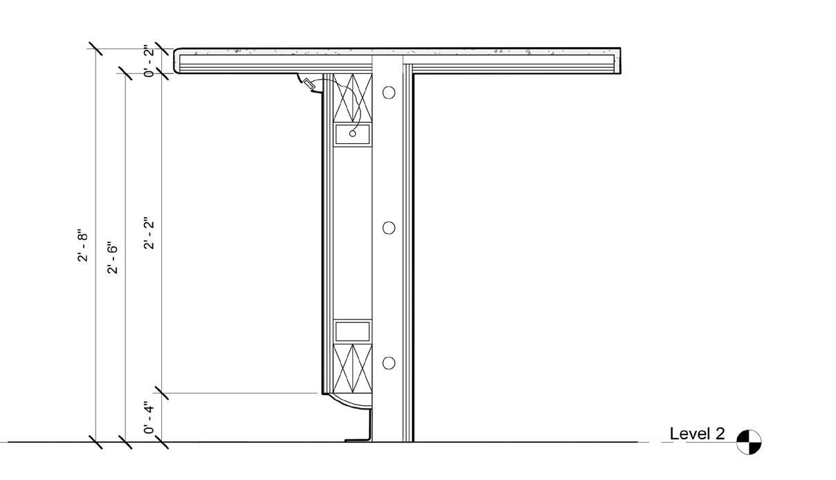
Solid Surface at 1/2”
Horizontal Metal Support
Molded Sweep Support with Built-In LED for Underlighting. See Electrical Plan
LED Driver
2 1/2” Vertical Metal Stud
3/4” Plywood
Surface Material: Spruce Mist HPL by WilsonArt
Wood Blocking
Custom MDF Molded Sweep
Rubber Toe Kick
Visitor Side Staff Side
Branding as a Welcoming Factor:
Sweetwaters Clinic establishes itself in the Whitefish community by understanding their relationship with their local nature. With huckleberries at the forefront of various community events and found along nearly all of their hiking trails, huckleberries become a prime source of inspiration for the space’s branding. Using this motif can be used as a welcoming factor because of the familiarity.
The Entry uses curves to match the branding, but also gaurantee sight-lines bet ween workers and guests: ensuring safety as well as connection.

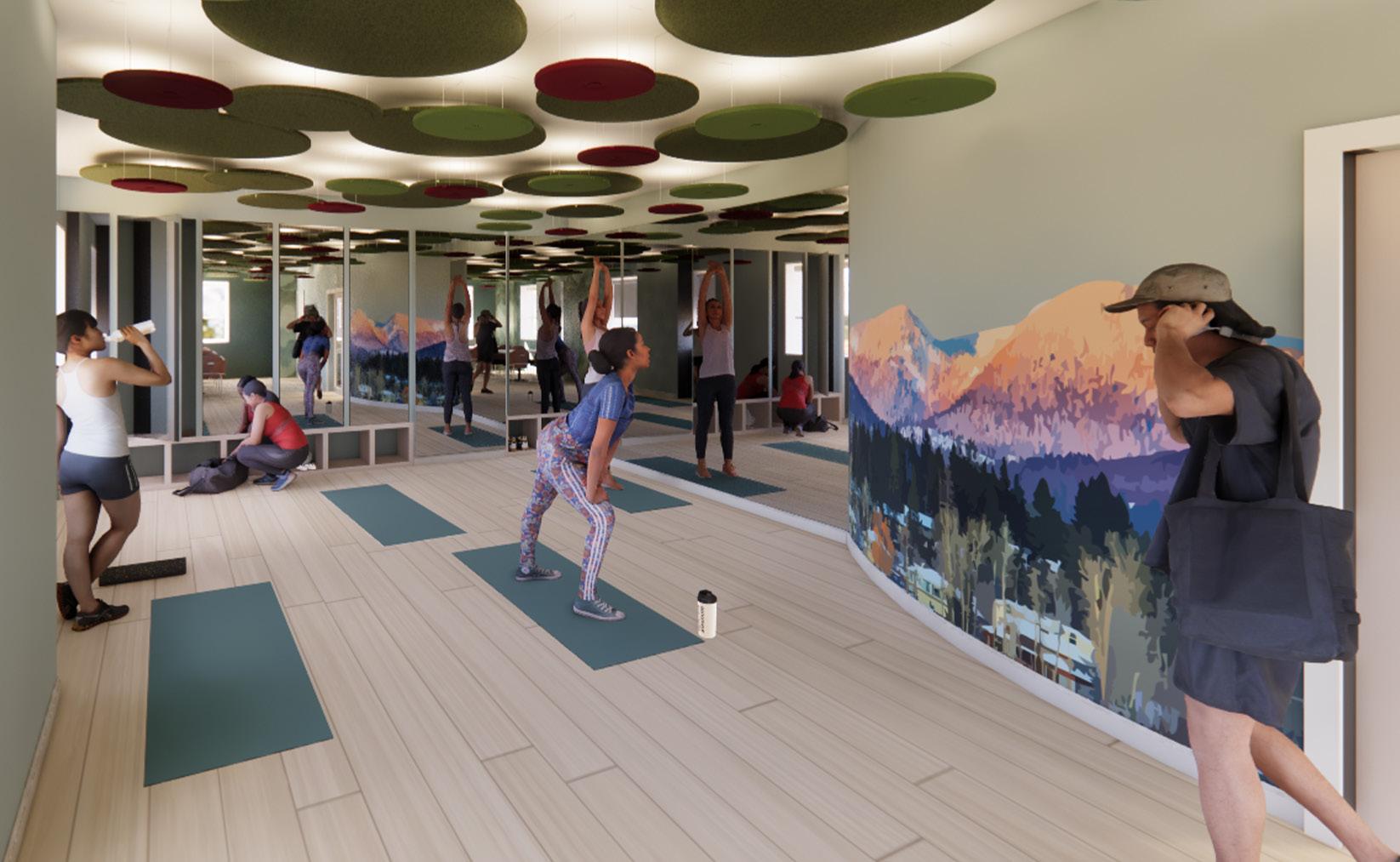
Multi-Use Space Perspective
The Multi-Use Space provides educational resources by having flexible space for exercise classes, seminars, and various workshops. It can also adapt into a Quarantine Zone or space for visiting Emergency Responders to rest. The Mountain Mural ties in community connections, building on familiarity and branding. Mirrors in the back sit on a swivel to alternate between Mirrors or an Acoustic PET Wall Panel.
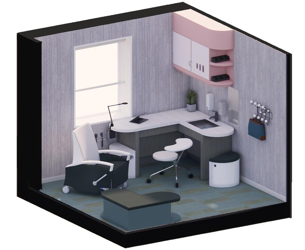
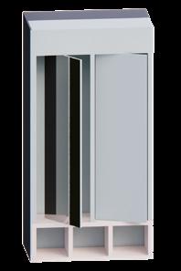
Slides open for Guest Storage and can move out as a Stool
Typical Exam Room:
Each Exam Room provides multiple ways to exist in the space, including moveable and adjustable seating, space for guest storage, and positive distraction through natural views and artwork. Positive Number-ed exam rooms feature a Barrier-Free Exam Chair for additional services.
Being Adaptive to Change:
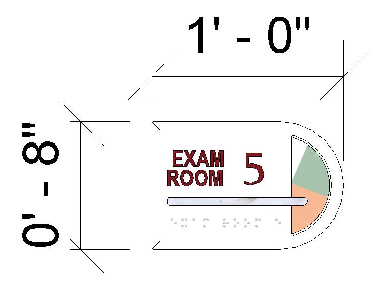
Multiple spaces throughout Sweetwaters Clinic utilizes elements that are adaptable to the needs of the user. The Exam Room signs feature a Spinnable Circle that changes color corresponding to the state of the room.
White = In Use
Green = Ready to Use
Orange = Needs to be Reset
Blue = Patient Needs to be Checked in On
The Staff Lounge sits away from the noise of the rest of the facility, providing quietness when desired. The counters sit at 34” High, following ADA Guidelines. By having multiple seating zones, Staff can choose how they want to exist in the space, increasing their sense of control
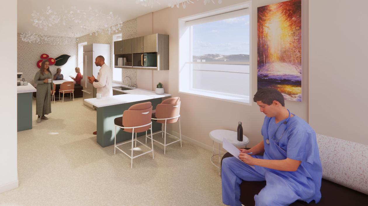
Staff Lounge Perspective
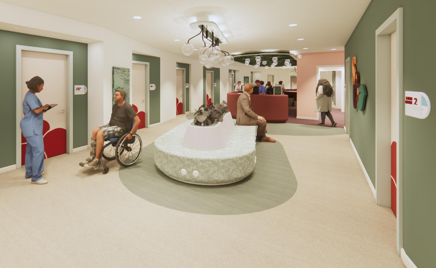
Corridor Perspective
Like the reception, the ceiling works as a central node while embodying elements from the branding
Middle seating provides additional waiting space before appointments or during for guests of the patient
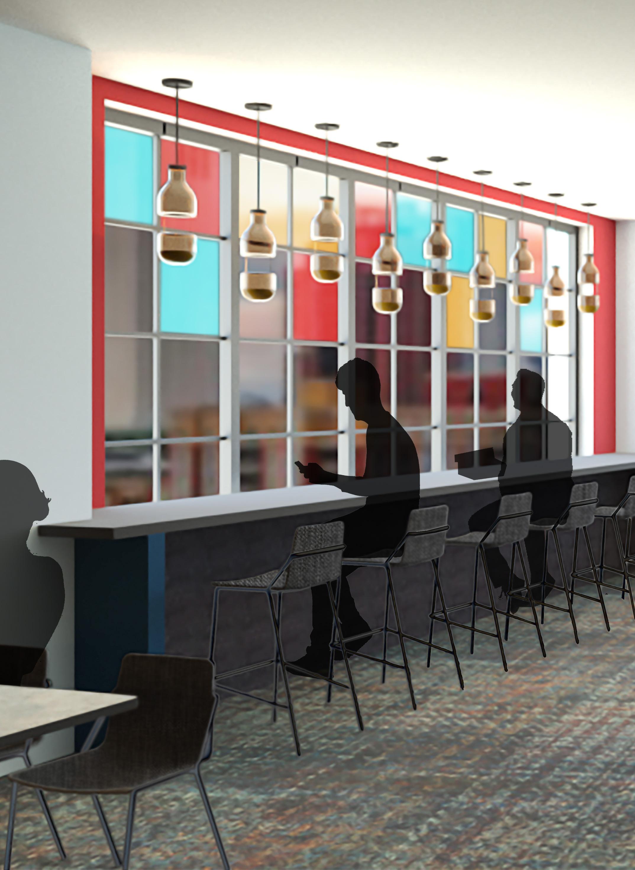
Kaleidoscopic Afterglow
Market: Workplace
Square Feet: 16,000
Utilized Revit, Photoshop, and Physical Modeling
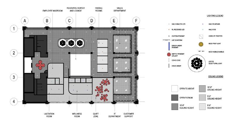
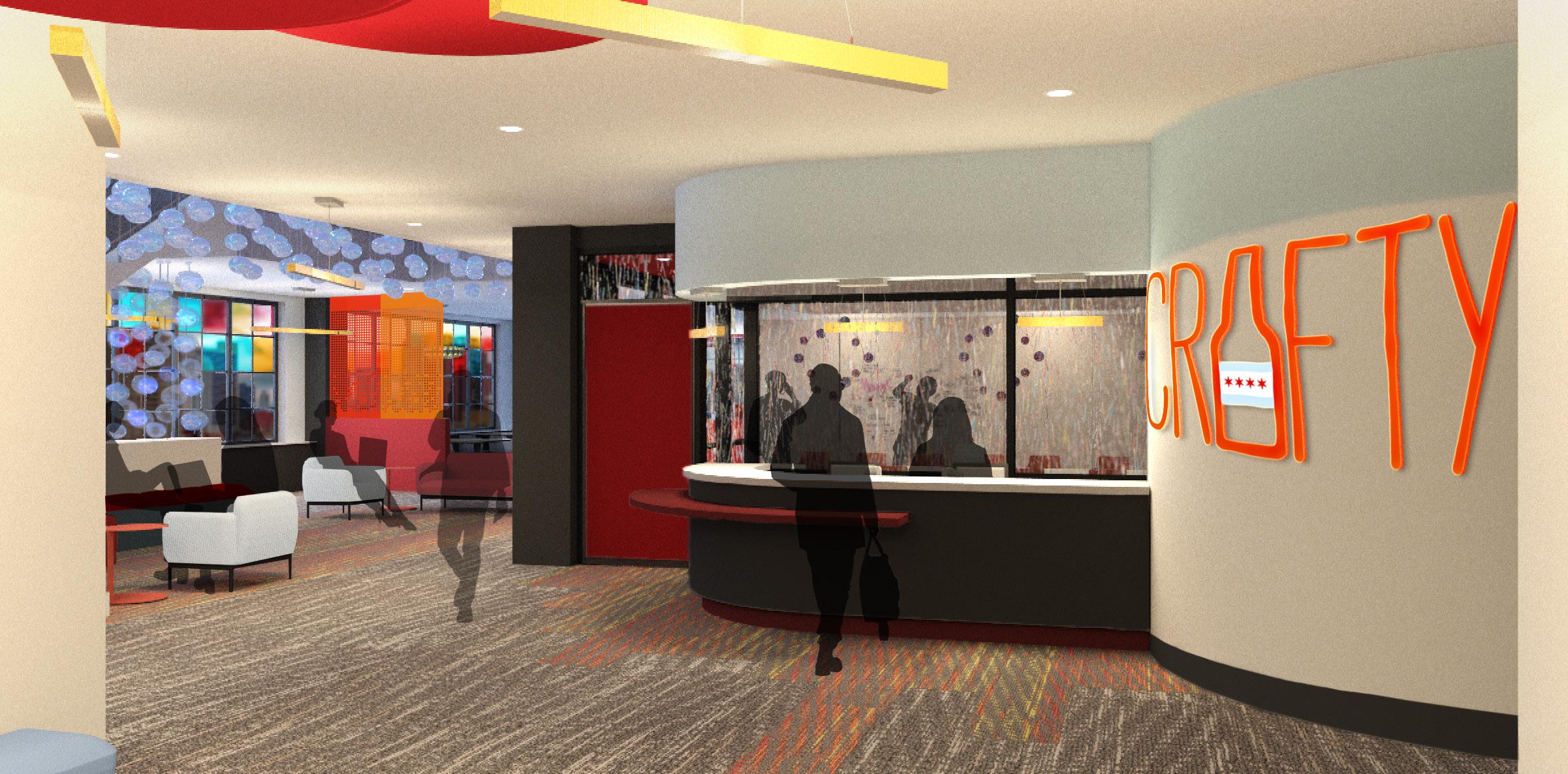
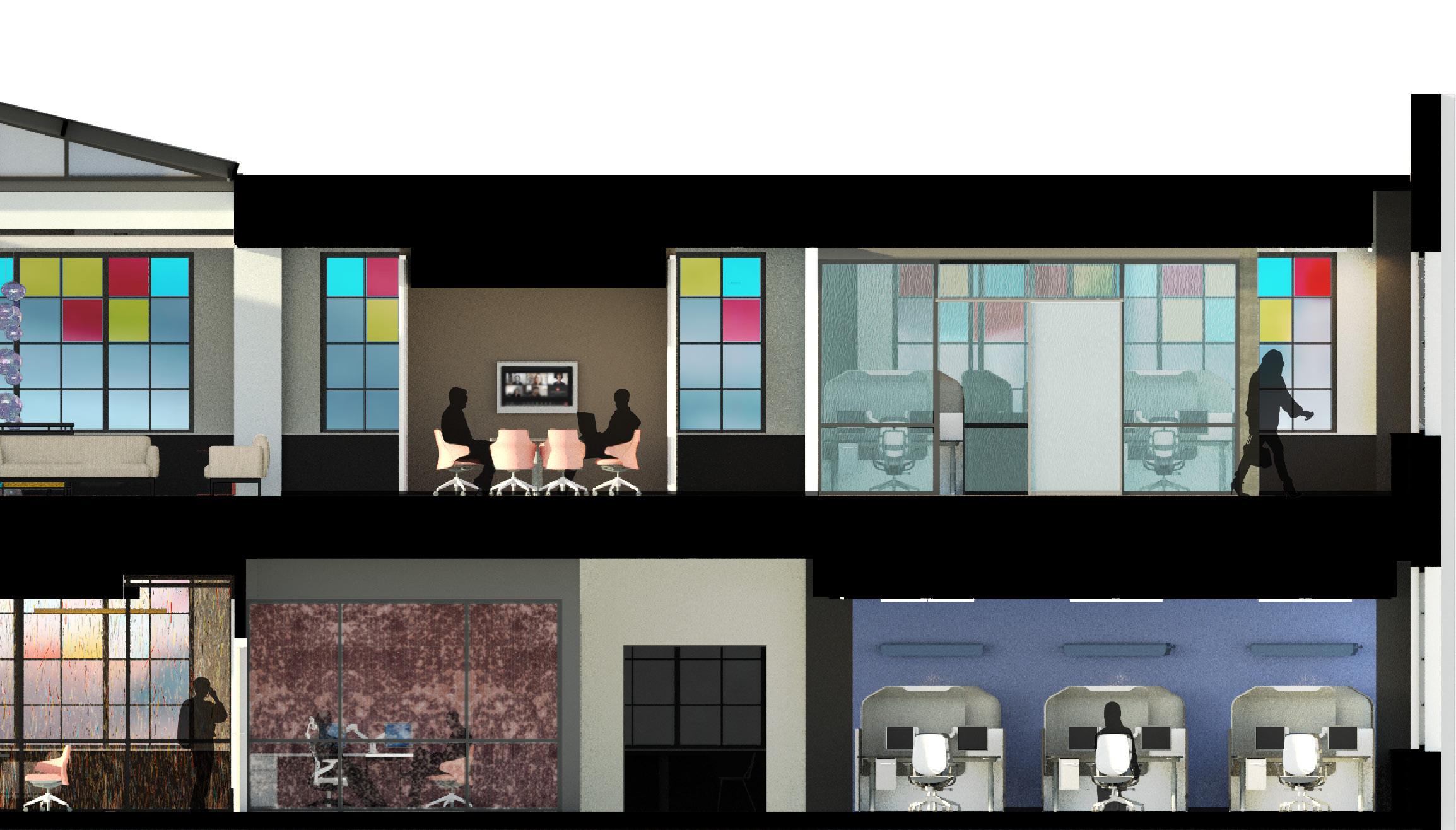
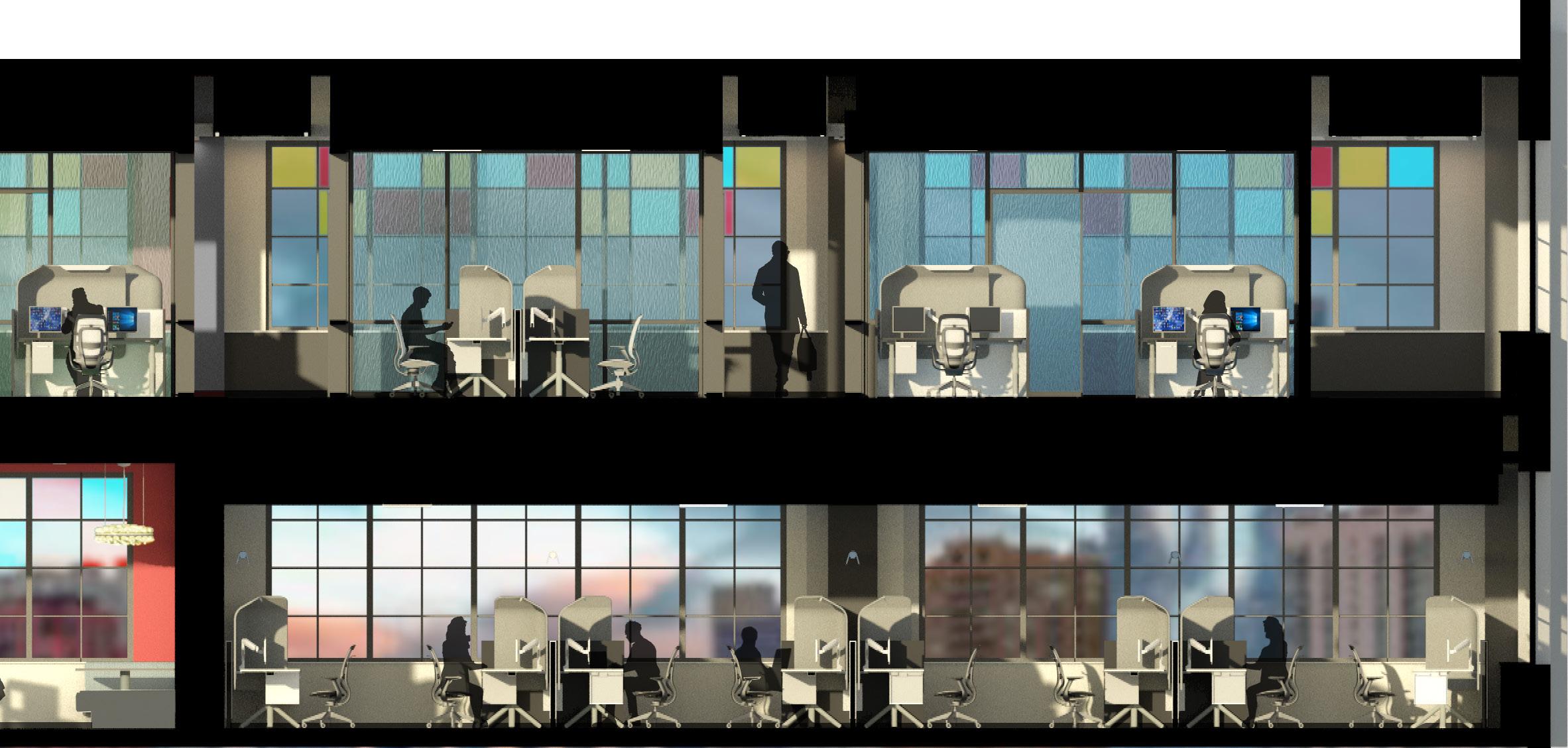
In a world where workers are expected to do more every day, how do we ensure they feel supported and satisfied in their occupation? The Crafty workplace seeks to provide the variability workers need to succeed. A major influence on the planning was the idea of the visitor and the worker. Spaces that are open and used by visitors are placed near the front entry or have a clear line of sight to it. The second floor is maintained as an employee-only zone; however, the stair atrium will convey the environment’s spaciousness and allow more light to filter through.
The Crafty Office design is inspired by the characteristics of a vending machine. Vending machines are vehicles for food-and-drink transactions, much like Crafty’s platform. Moreover, vending machines rely on human interaction in order to work. In the office layout, the concept will be demonstrated through rectilinear organization: points of privacy, spiraling movement, and boxes of connection. The design will be characterized by vibrant colors and elicit spontaneous moments of connection. Moreover, the company’s heart lies in communication and collaboration, resulting in a vibrant, colorful space.
Research and Planning
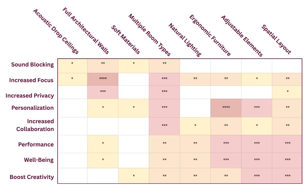
Evidence-Based Design (EBD) Matrix
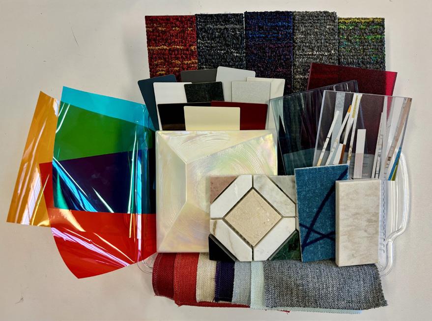
Across 15 articles, the EBD Matrix shows how different design decisions compound to support various desired outcomes. The strongest connections were between Ergonomic Furniture and Personalization, and between Full Architectural Walls and Increased Focus. Multiple Room Types and Spatial Layouts affect all desired outcomes. Creating more private spaces, as well as more public spaces, will give users options for circulation and control over their experience in the space as a whole. These all come together to ultimately improve workers’ satisfaction with their built environment. The colors and characterization add to the office’s identity, using primary colors and black and white to convey the concept of a vending machine and Crafty’s vibrant nature. The view of the Work Cafe and the Materials Board below demonstrates how the various colors support the concept, and how the various materials support differing needs and preferences
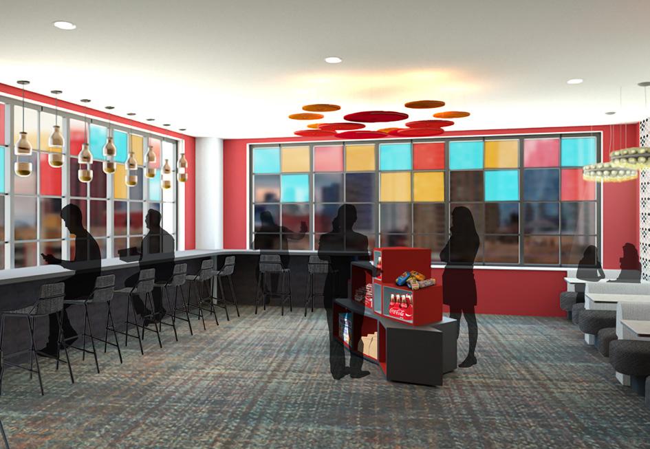
The Work Cafe
Materials Board
6th and 7th Floors
Entry View and Reception
Product and Research Department
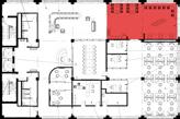
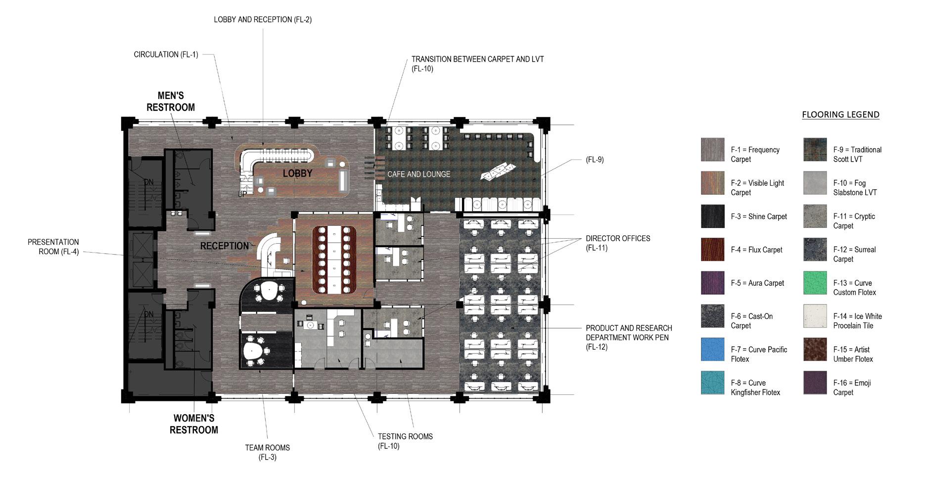
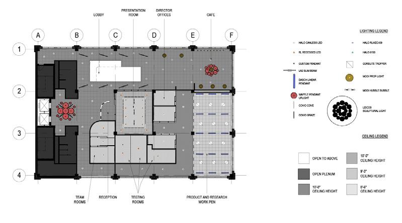
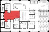
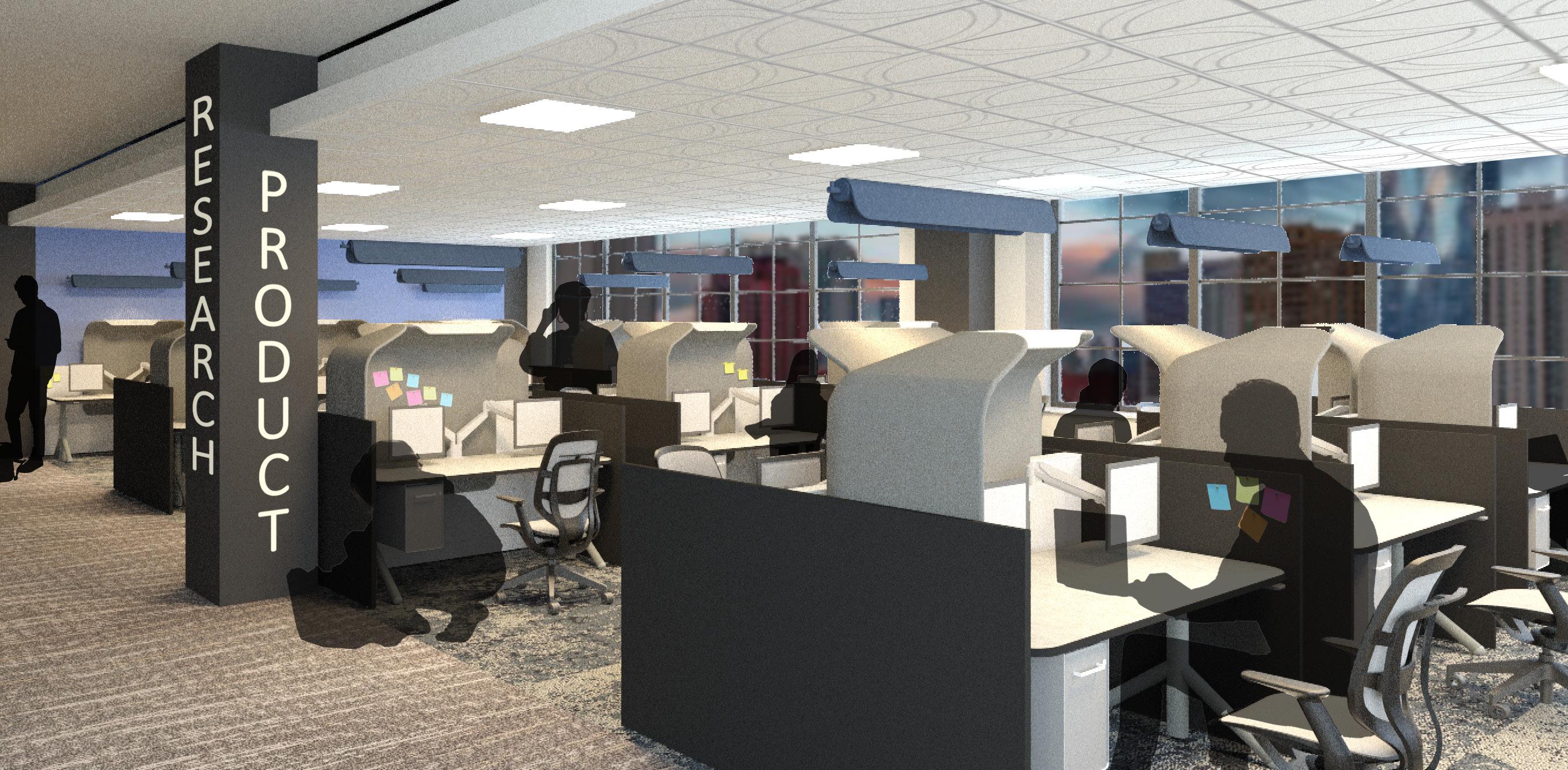
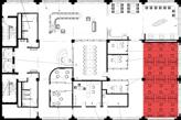
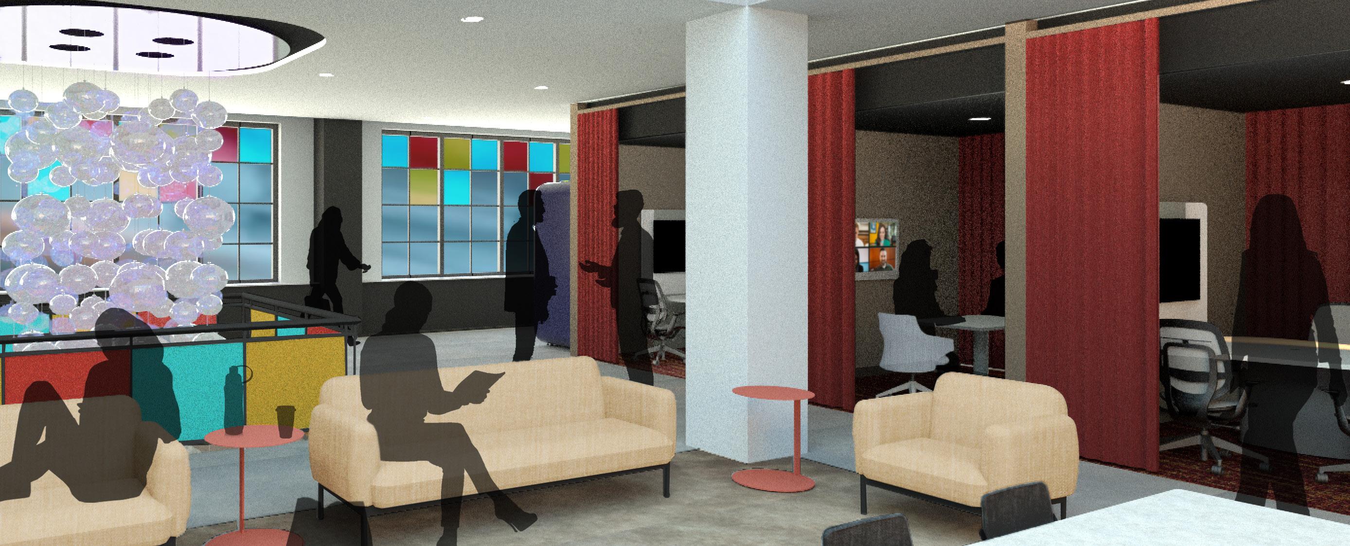
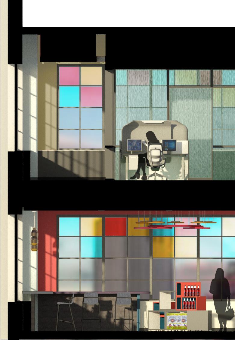
The 6th floor balances space for the public, whether that be potential clients or otherwise, and those who work within the office. The flooring materials demonstrate the transition between spaces that have different tasks and activities. The entry, presentation room, and cafe display Crafty’s playful side: taking on multiple colors and various forms. The other zones still maintain color, but are more relaxed. The work pen increases proximity, elevating spontaneous collaboration between its two departments. Each desk features height adjustment, undermount storage, and acoustic partitions with built-in task lights to support individual users
7th Floor Resource Center
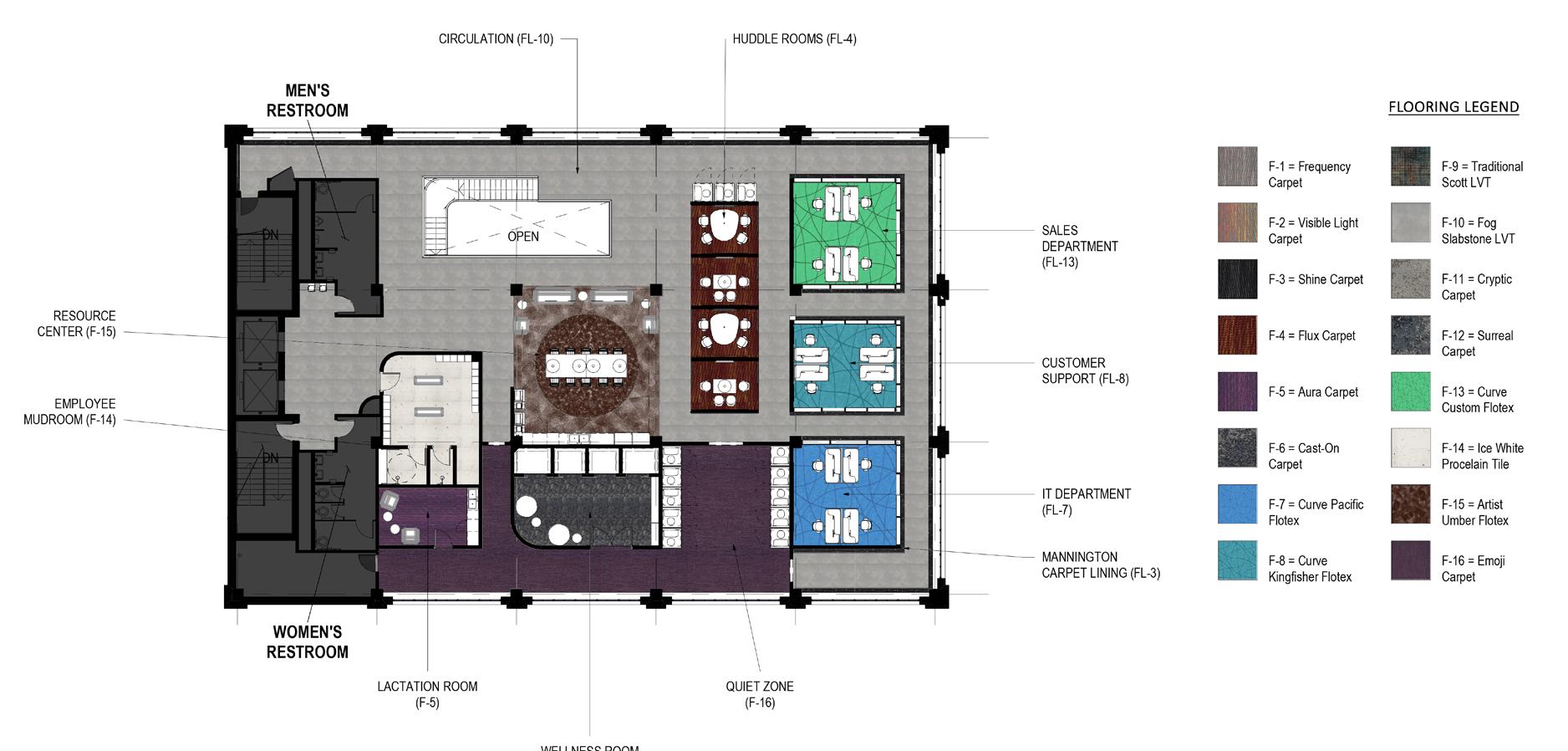
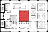
The 7th floor, while accessible to visitors, is largely reserved for Crafty’s workers. The resource center doubles as the central hub of this floor, offering views of the atrium and a lounge, and providing access to collaboration rooms. The freedom of choice allows each worker to choose the environment that best suits them, following an Activity-Based Work model, thereby increasing focus and satisfaction
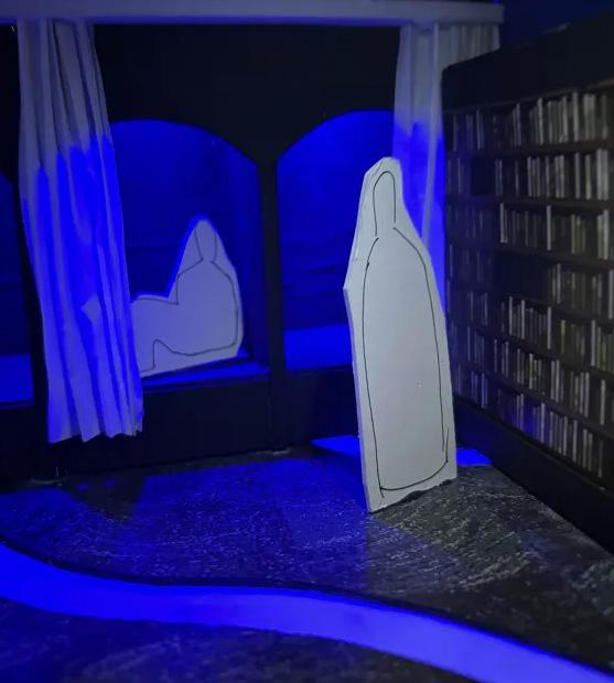
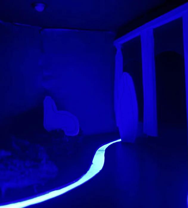
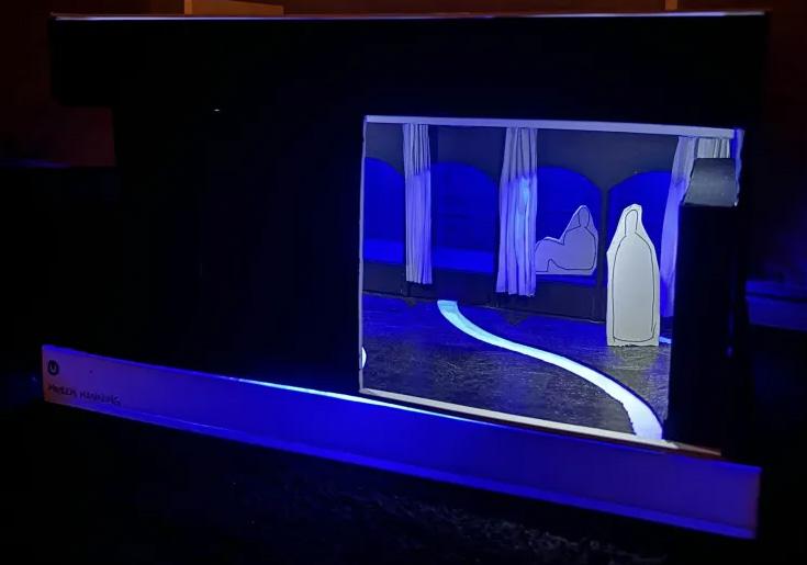
Entering the wellness zones, users will feeease as the lighting is dimmed to rest the eyes, and seating options will allow users to either sink into them or move around if needed. Separating these spaces will ensure a sense of quiet, furthered by ample acoustics. The pictures below depict a physical lighting model created for the Wellness Room. The blue lighting helps lower heart rates, and the individual pods feature controllable lighting for each guest’s needs. Ultimately, the Wellness zones serve as workers’ hideaways where they can take a breather from work.
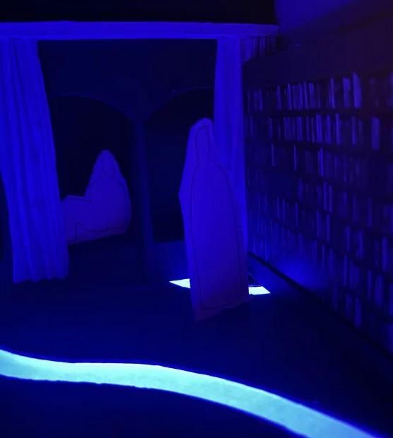
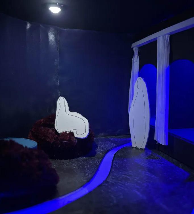
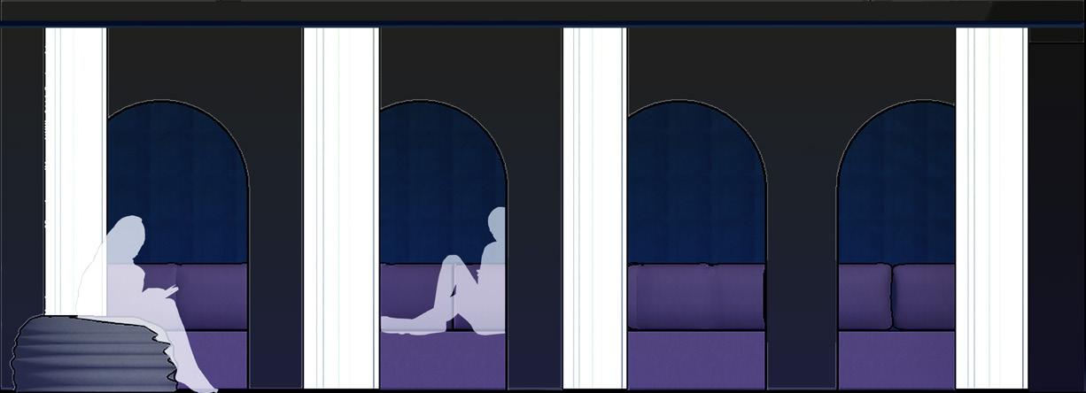
Wellness Room Lighting Model
SALES DEPARTMENT
Providing Variety:
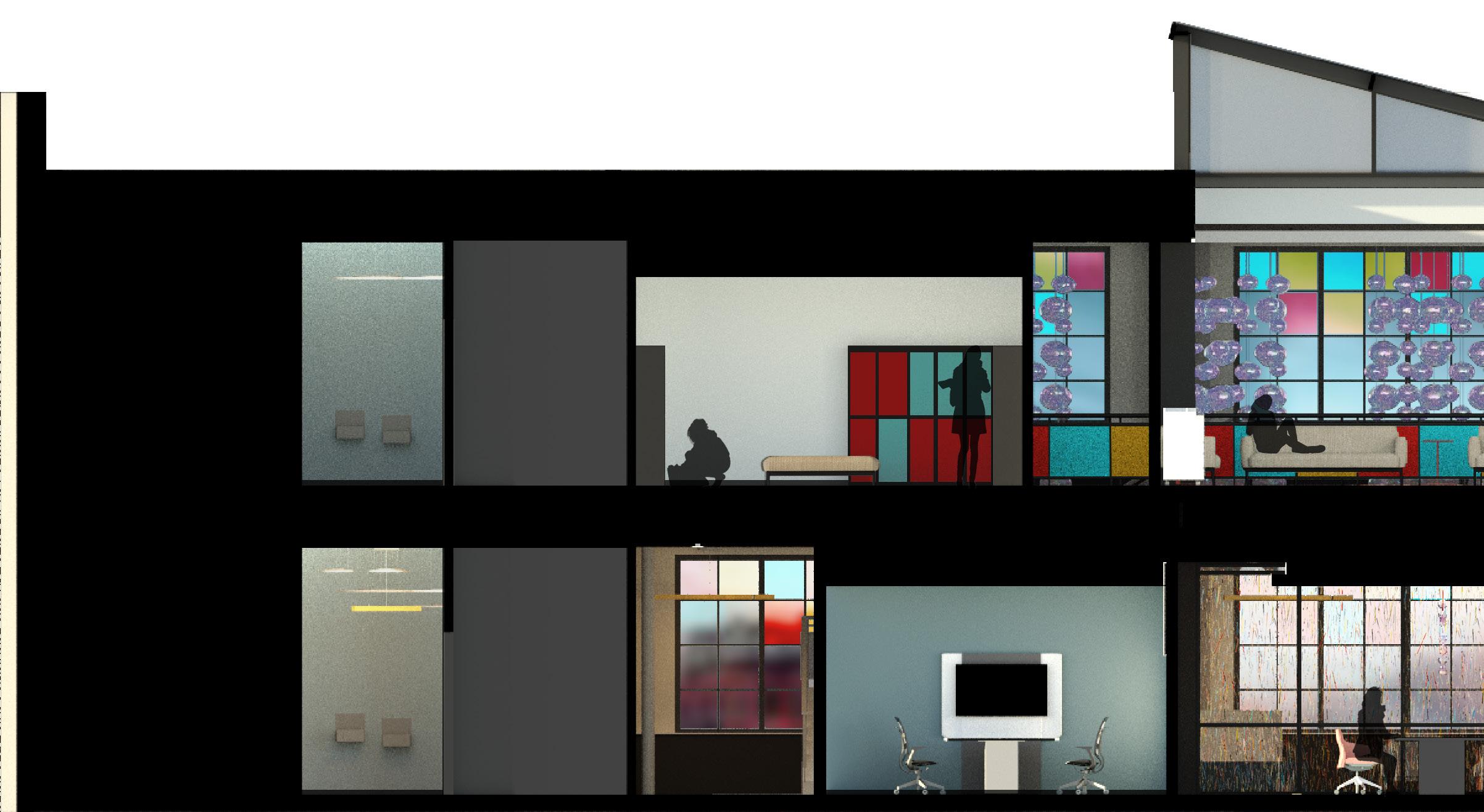
To accommodate Crafty’s various departments and workers’ different preferences, the office includes multiple workspaces: open zones, private pods, quiet zones, large collaborative tables, and standard office desks. Providing choice ensures that each person feels control over their environment, increasing feelings of safety, privacy, and focus. Giving employees options for different materials, colors, and layouts will make the space feel more comfortable for those in the workplace.
To support personalization, each space uses different vibrant colors, matching Crafty’s vibrancy while also adding a sense of identity to each department. For example, Sales is green, Customer Support is cyan, IT is bright blue, Research and Product Development is dark blue, and the quiet zone is purple.
Section Cut - Facing East
EMPLOYEE MUDROOM
TEAM ROOMS
Section Cut - Facing North
RESOURCE CENTER HUDDLE ROOMS
PRESENTATION ROOM DIRECTORS’ OFFICES
DEPARTMENTAL OFFICES
CUSTOMER SUPPORT IT DEPARTMENT
Uncle Bobby’s Library
Market: Higher Education
Done in Collaboration with RJ Sagaya Square Feet: ~20,000
Utilized Revit, Enscape, and Photoshop
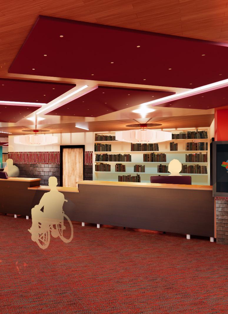
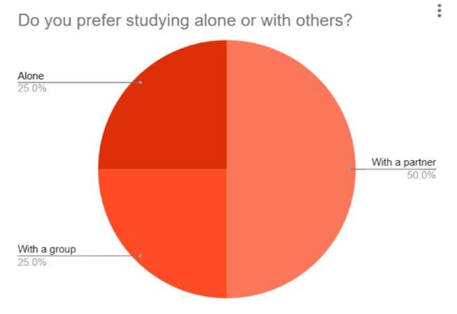
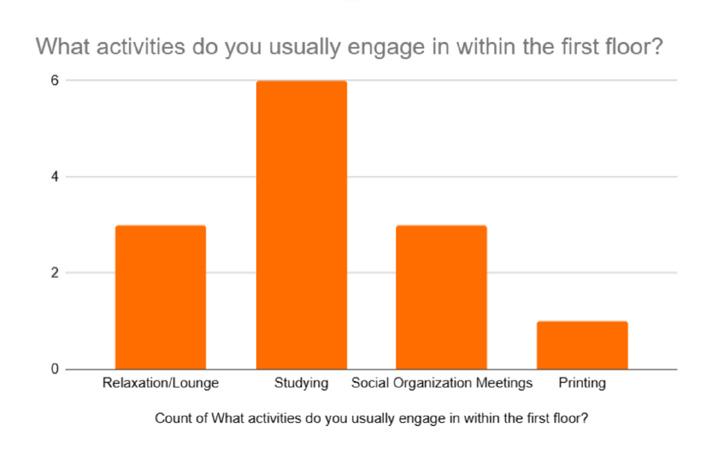
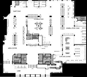
Uncle Bobby’s Library is a look into redesigning the first-floor learning commons of Strozier Library at Florida State University. The process included meeting with the Library Staff, observing the use of the library during its operating hours, and conducting surveys with the student population on how they use the library. External research was also taken into account: looking into preexisting libraries, literature reviews on seating behaviors, and Affordances Theory.
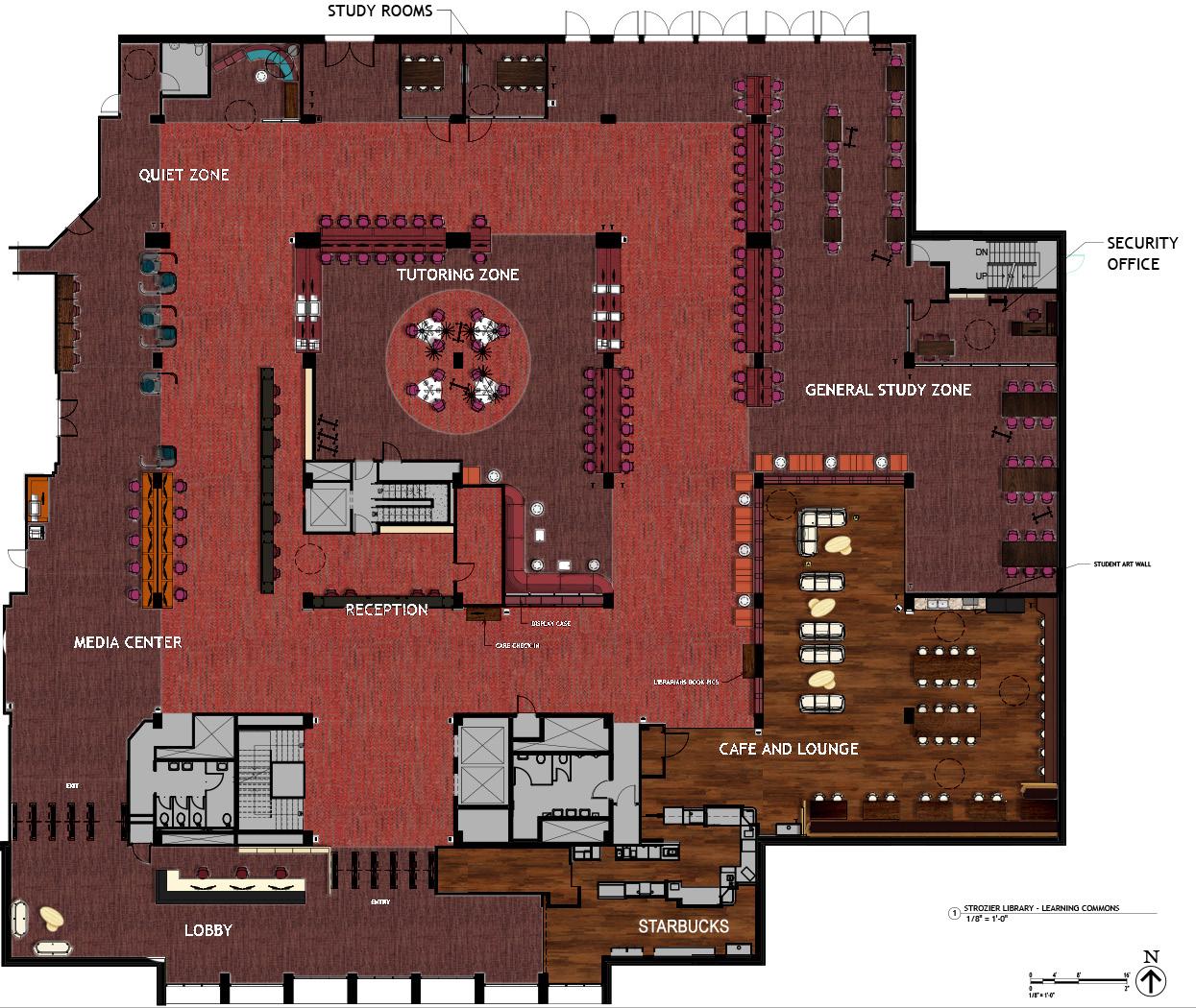
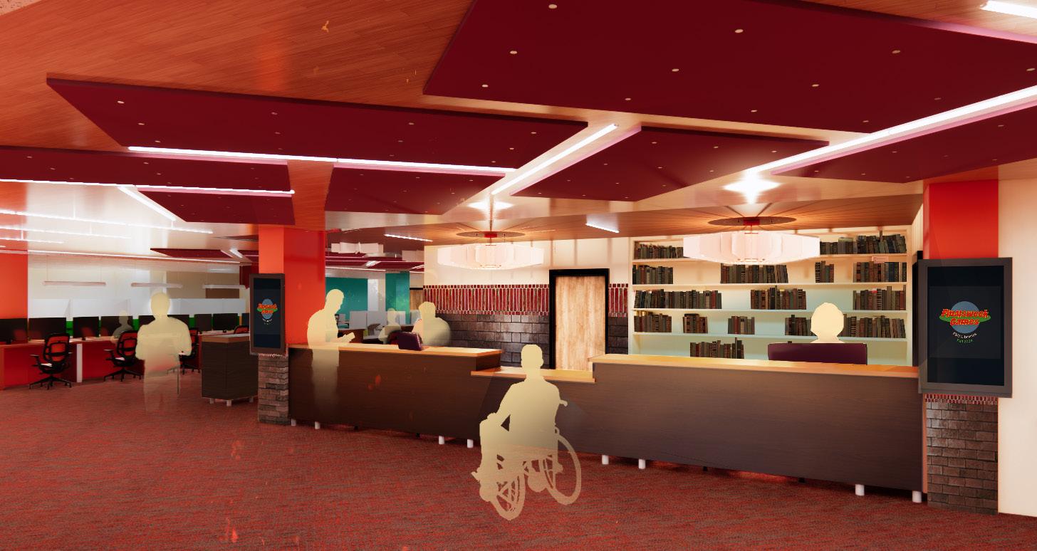
Alongside our peer RJ Sagaya, we decided to take inspiration from a campfire, as these are places typically associated with connection, gathering, and warmth. Similarly, the stakeholders of the Library wanted to go beyond typical library usage, becoming a key third place for the people of Florida State. To tackle this challenge, the project focused on the main commons, the cafe space, the reception, and the circulation. If these elements could be elevated, visitors would be guided through all portions of the library and engage with it on a deeper level.
Key Spaces in the scope of the project include security, reception, the cafe and Poplit section, the computer zone, a quiet space, the tutor zone, and a multitude of study spaces.
Research and Planning

STAFF-RELATED INTERACTION
RELAXATION-RELATED INTERACTION
STUDY-RELATED INTERACTION
Initial Planning:
Through research, it was found that social behaviors decreased further away from the entry, where the cafe and tutoring were. Furthermore, the current design was reported to be hard to navigate; this is supported by how the main circulation desk was hard to
see from the entrance. To further support the library’s population and the behaviors of its users, high activity was kept towards the front. By creating a gradient of noise throughout the floor, users can go to each corresponding zone depending on their needs. By doing a noise gradient, higher energy areas can also be isolated from quiet zones to better prevent noise from traveling.
Floor Plan
Reflected Ceiling Plan
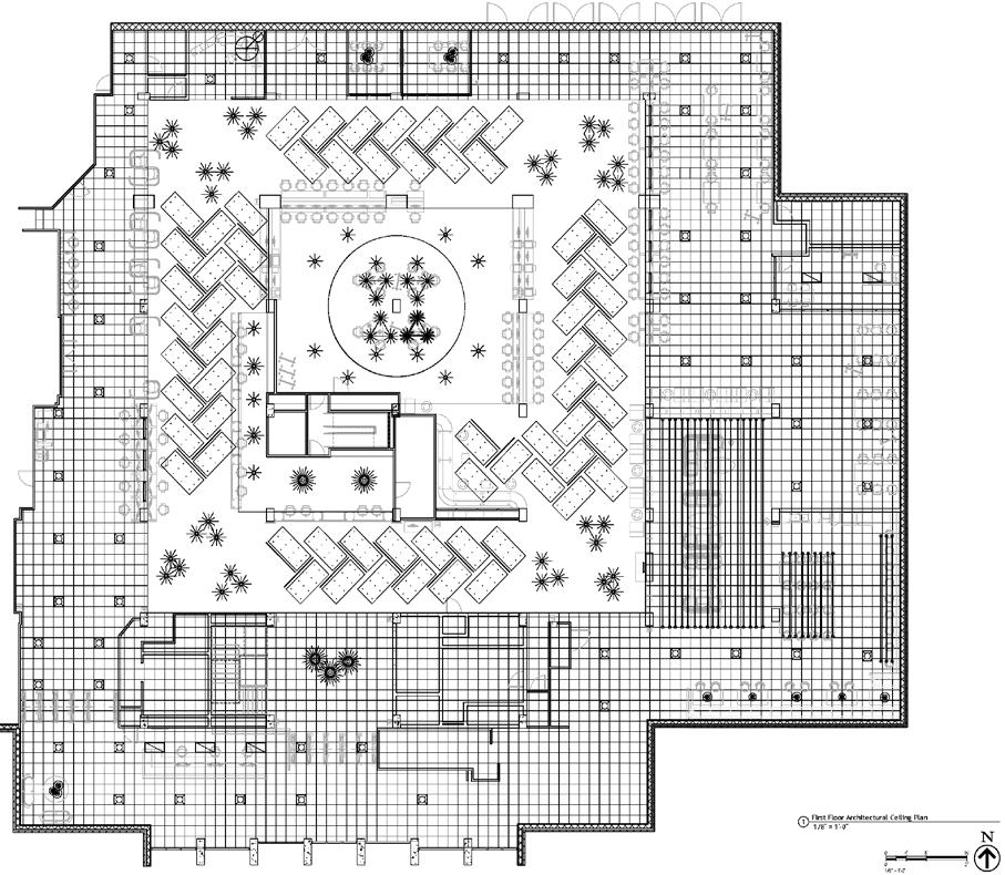
Circulation reflects the concept of a hearth by relying on a central loop of passage and providing several offshoots for movement. Furthermore, these offshoots guide visitors into quieter zones, distancing them from the energy of the library’s center. The warm atmosphere brings groups together and is heightened through the warm lighting, soft lounge furniture, and anechoic acoustics. The design provides several areas for groups and individuals to rest and work, including various heights for different work needs, as seen with the tutoring zone. The color palette connects the warm colors from the concept with Florida State’s branding to create a signature look.
Reception Entry
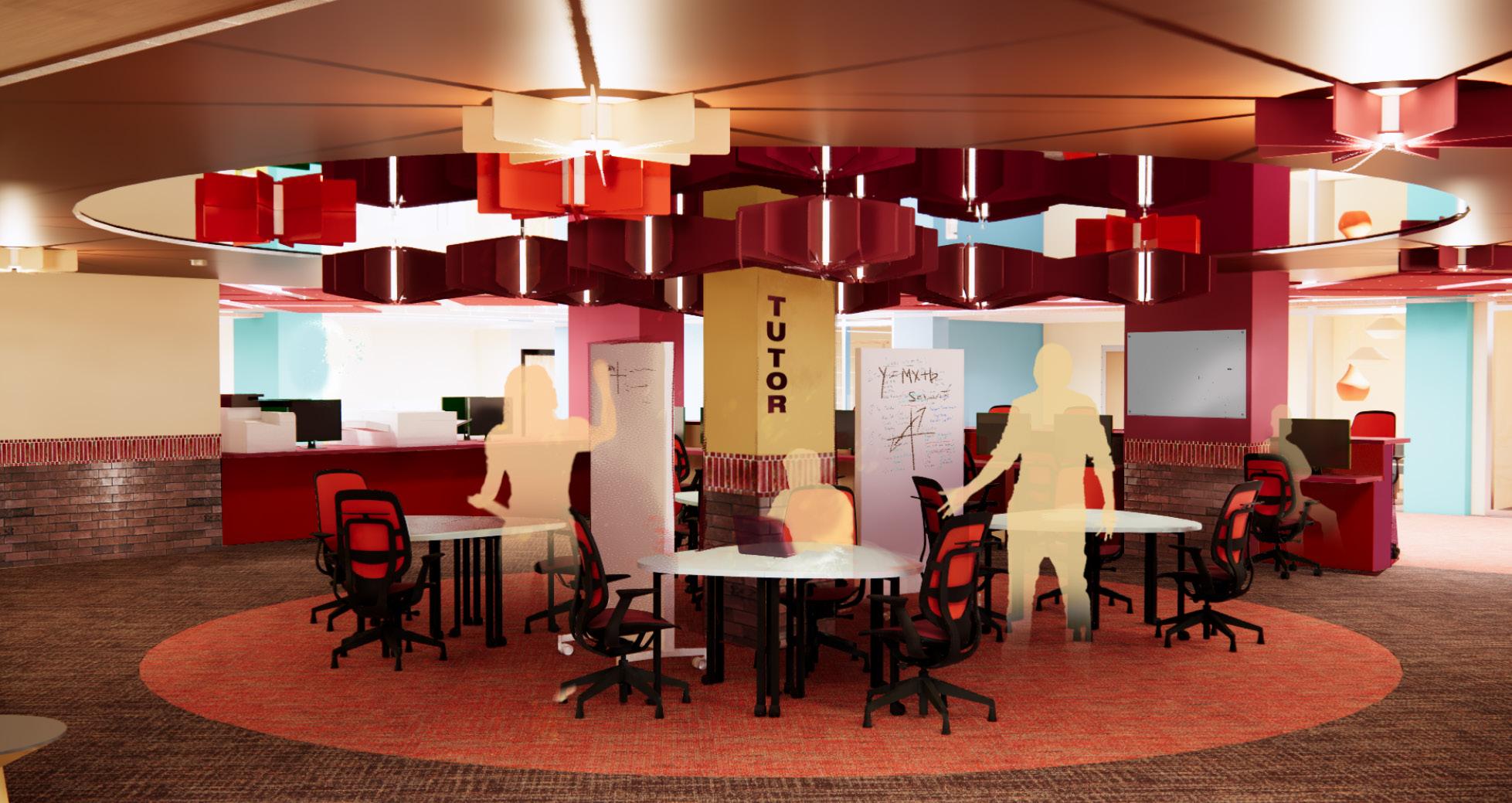
Tutoring Zone
Argonaut Construction
Market: Workplace / Core & Shell Square Feet: ???
Utilized Revit and Hand-Sketching
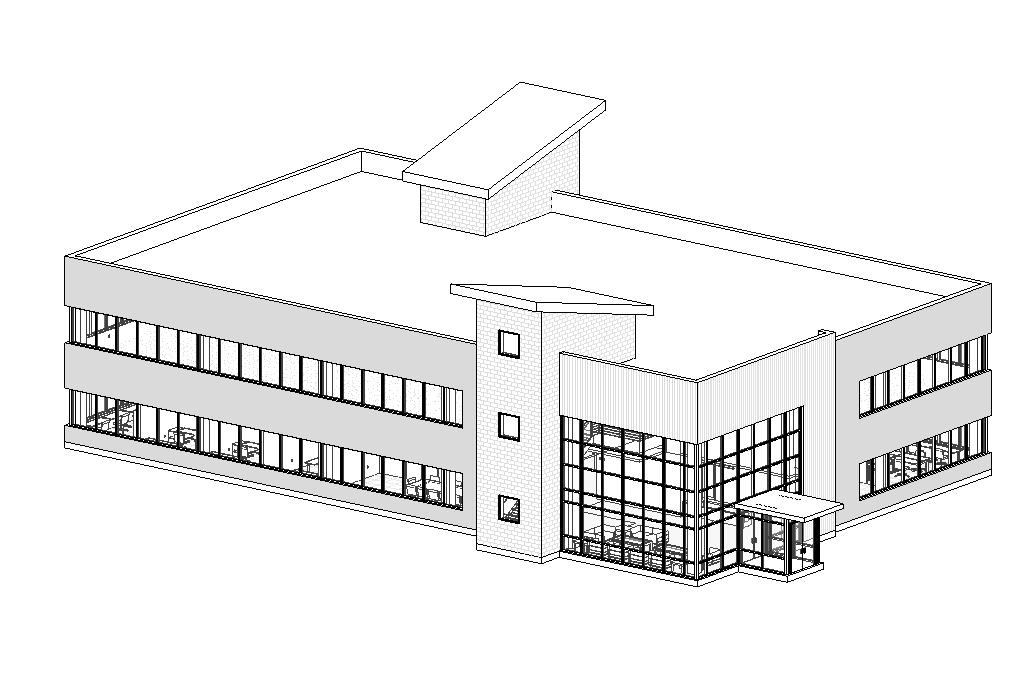
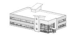
The Argonaut Building tackles providing office space for one company on the first floor and a tenant space on the second floor. The first floor sought to provide workers with various work spaces and some ammenities. The overall focus of the project was to organize the building in order to provide space for permanent employees, interns, volunteers and visitors. To demonstrate the construction, the Argonaut Project consists of 18 construction documents. The following selected pages demonstrate attention to section cuts, callouts, and overall ability to provide in-depth information. The building’s shell and required spaces were provided.
The first floor includes a general reception and waiting area, storage, restrooms, several work pens, a kitchen and lounge, various offices, and a conference room.
Overall Planning
Initial Sketching and Planning
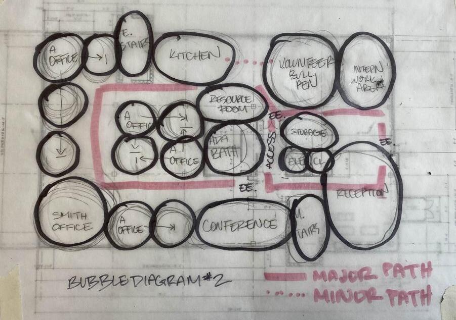
Bubble Diagram #2
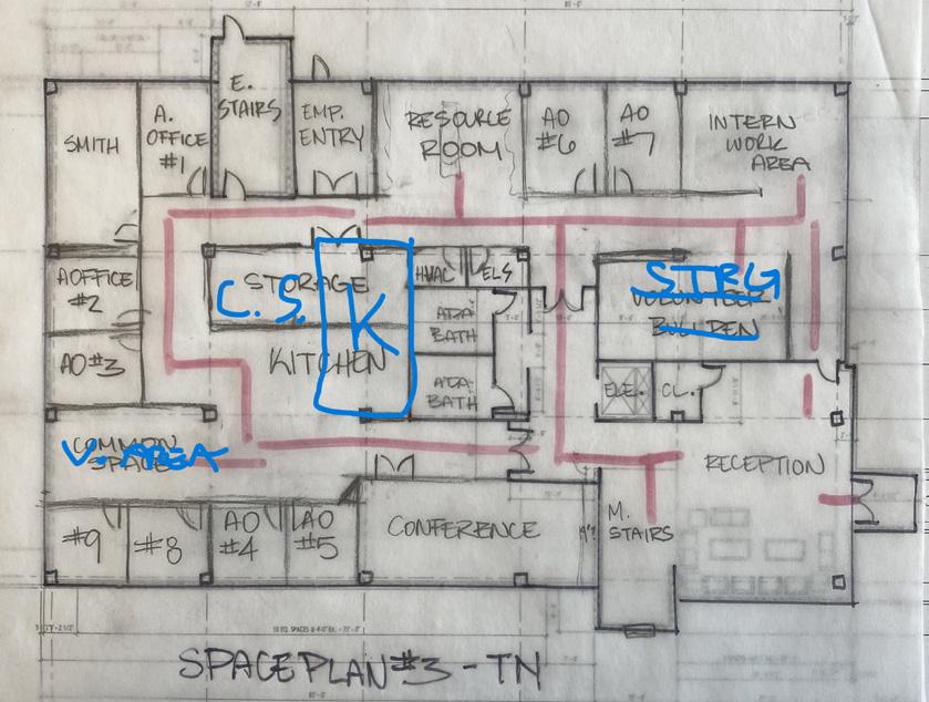
Blocking Diagram #1
Since Argonaut Construction was an exercise in learning documentation and revit, the initial planning phases went quick. The space planning process, shown above, sought to find the cleanest layout of all necessary spaces.
Staying Accessible:
To best serve a diverse set of users the building is designed in accordance with code requirements. Bathroom spaces include accessible units on each floor of the building.The Custom Reception Desk also uses multiple heights for size and approach of use, matching Universal Design Principles.
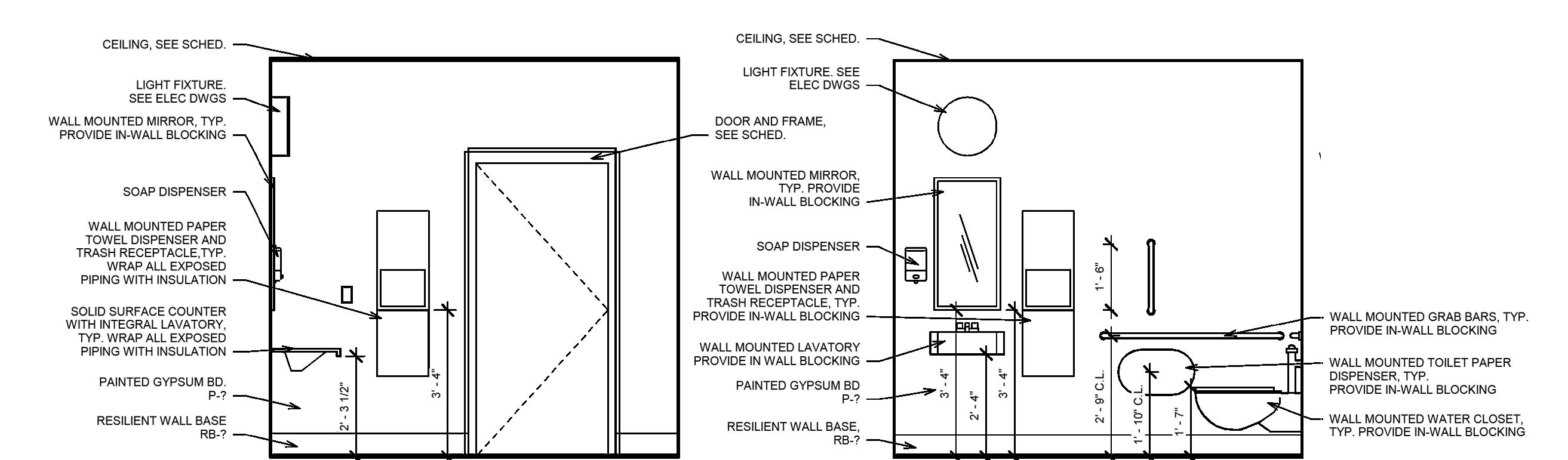
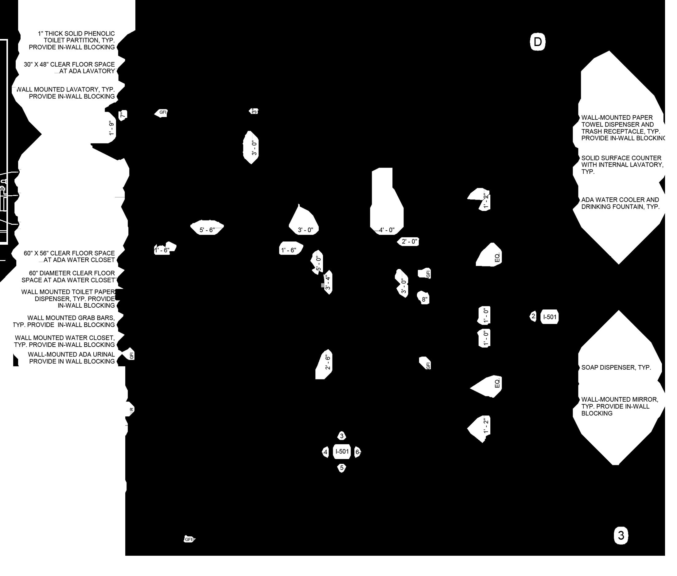
ADA Bathroom Callout
ADA Bathroom Elevations
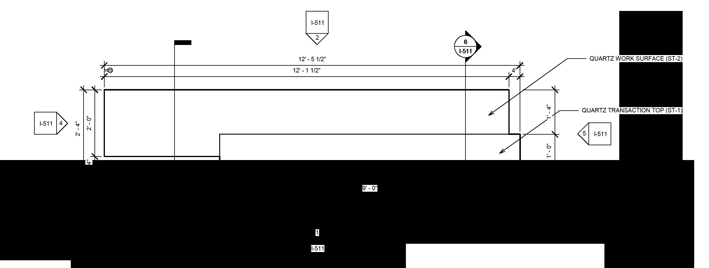
Reception Desk - Top View
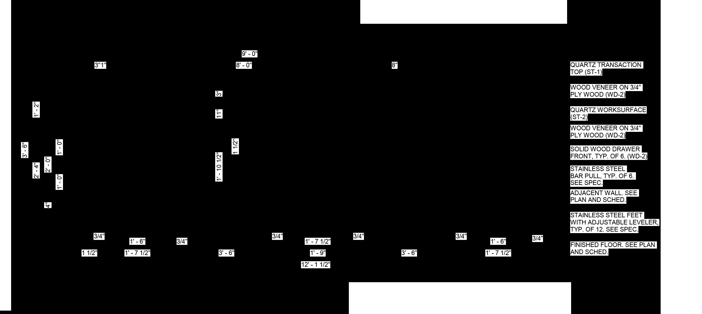
Reception Desk - Back View
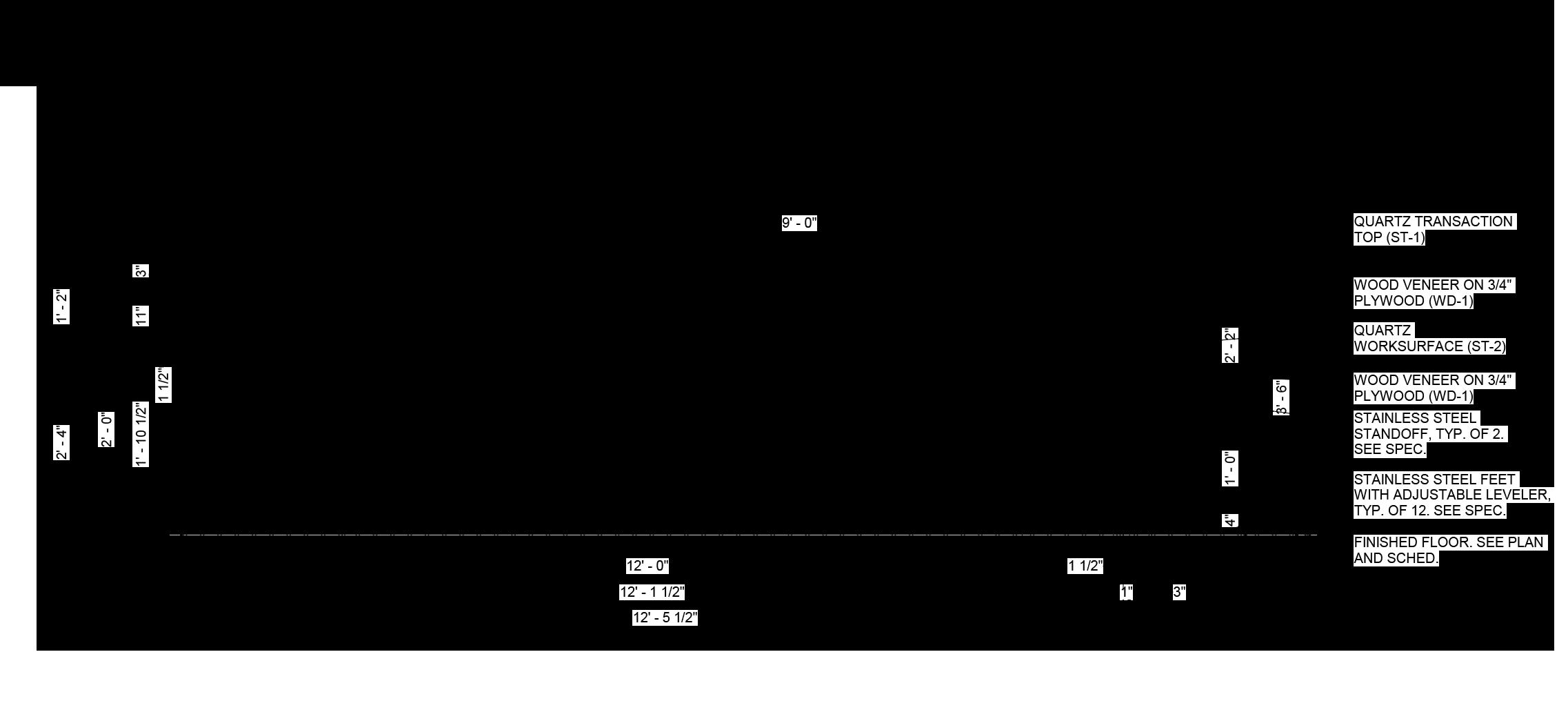
Reception Desk - Front View
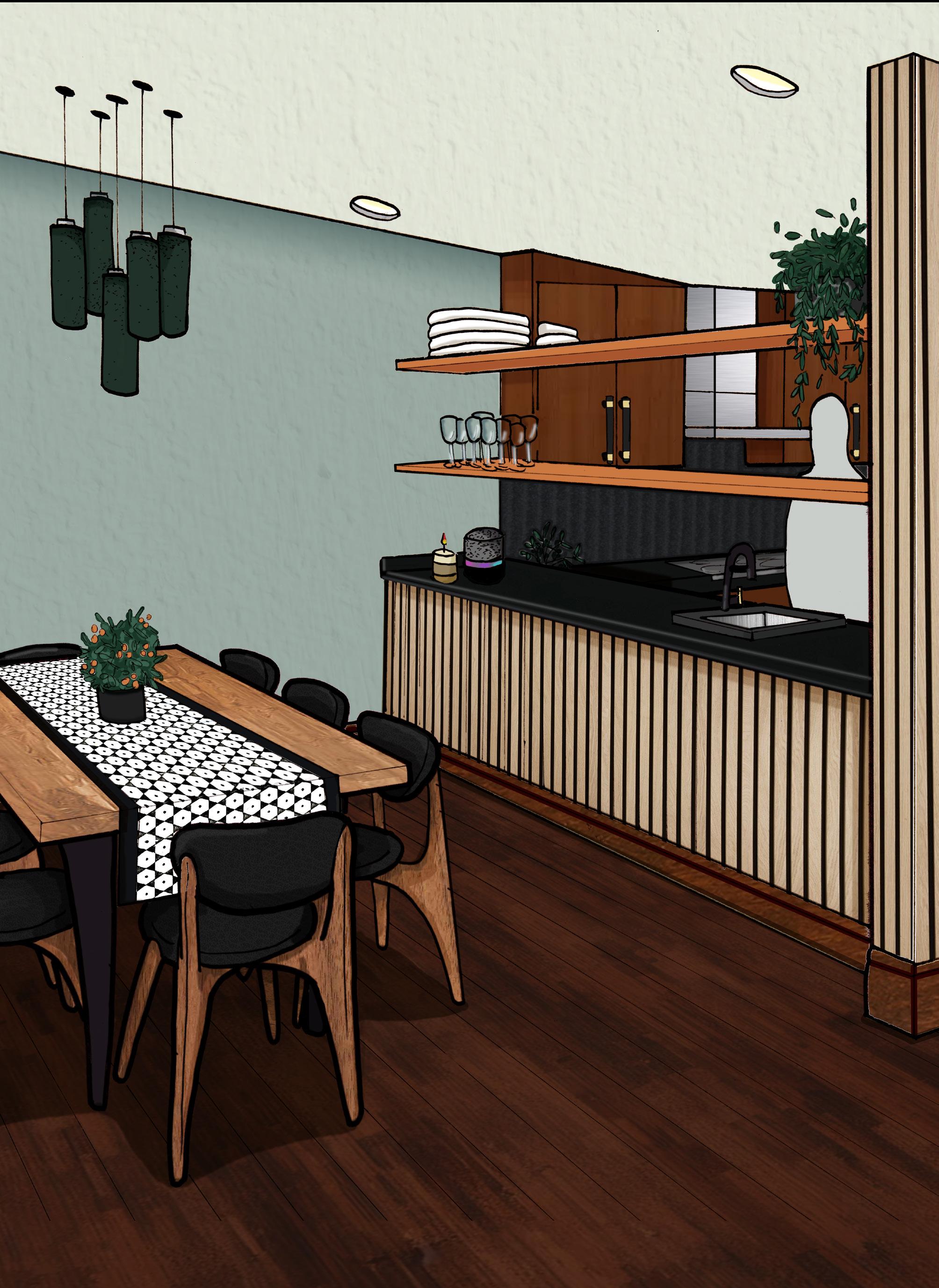
A Hygge Residency
Market: Residental
Square Feet: 1,960
Utilized AutoCAD, Revit, Hand-Rendering, and Photoshop
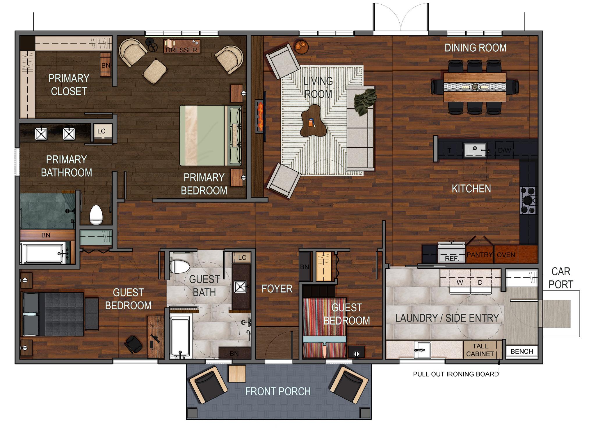
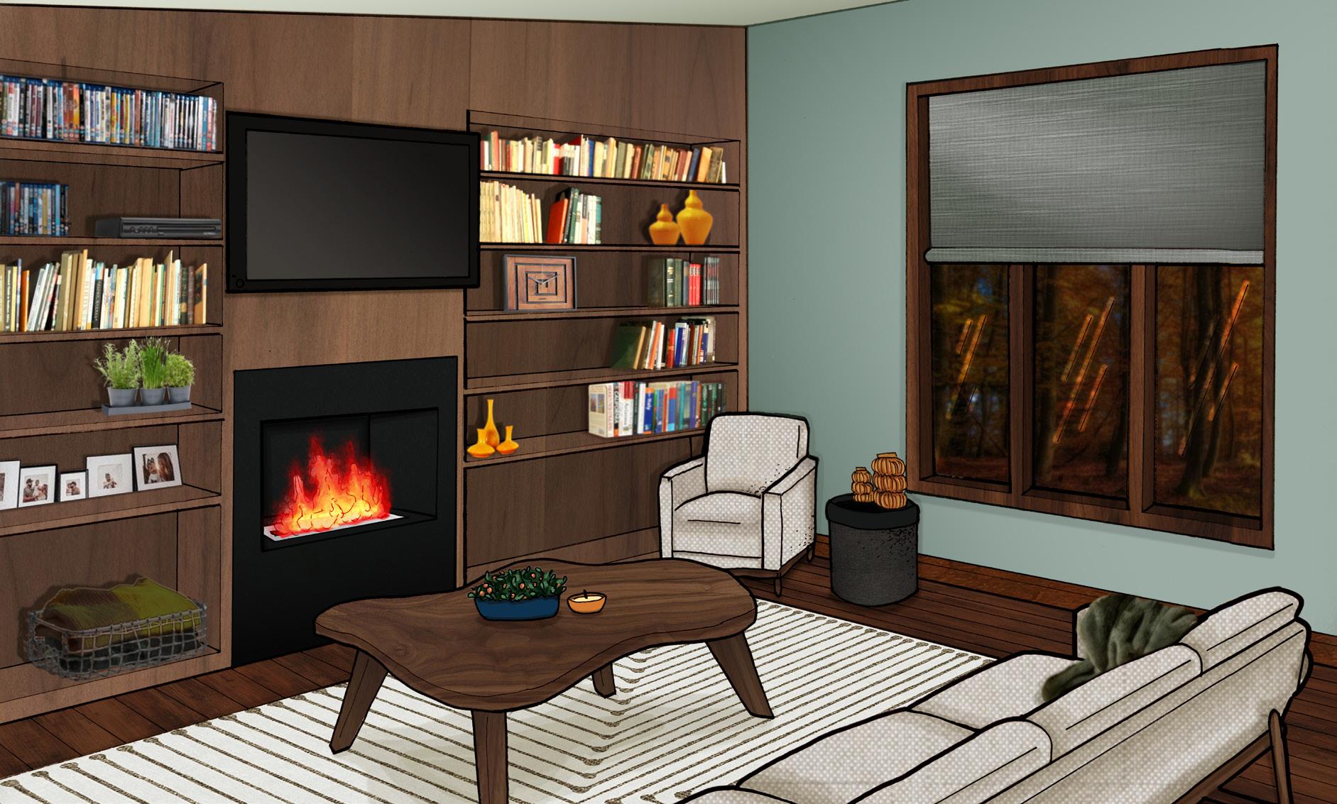
A Hygge Residency is an Aging-In-Place home designed for the theoretical clients, Mr. Taylor and Mr. Walsh, with a focus on creating a supportive and warm environment as they age. Located at 123 Park Overlook in Charleston, South Carolina, the design intent is to create a home that enables comfort and meaningful connections by tailoring spaces to meet the clients’ evolving needs as they age. Both clients value nature, baking, movie-watching, books, photography, and entertaining their extended family, and these interests shape the home’s layout and features. As they age, the design prioritizes intuitive ease of use, accessibility throughout every space, and flexibility for social gatherings. Drawing inspiration from mid-century Modernism and the concept of hygge, the design uses natural materials and organic, linear forms to create an inviting yet modern atmosphere. Warm colors dominate the palette, supplemented by cool tones for contrast and balance. The home offers both open gathering areas and private retreats, ensuring aesthetics are tightly integrated with function, so residents feel both connected to nature and sheltered within a calming refuge.
Planning for Change
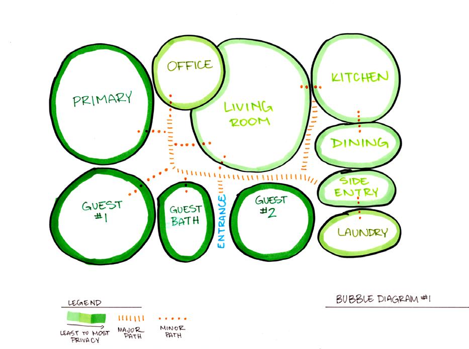
Space Planning:
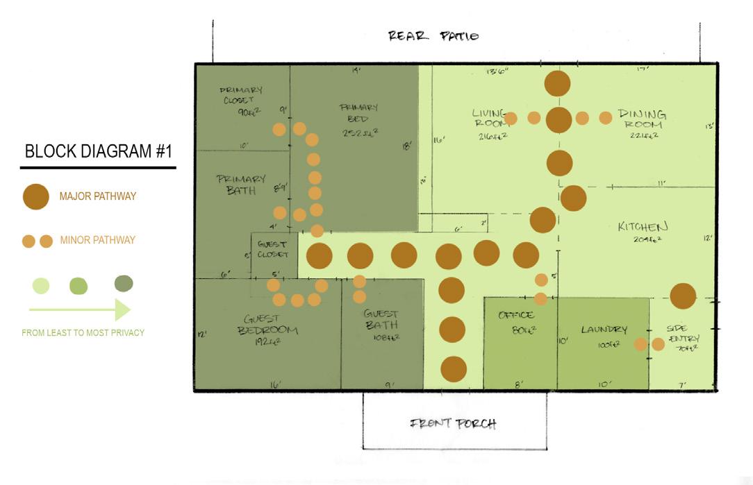
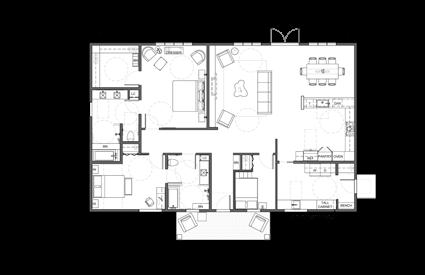
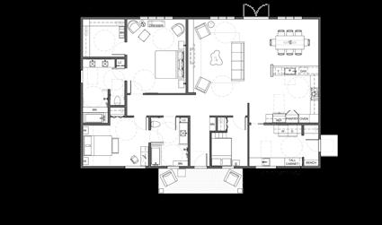
Bubble diagrams to a blocking diagram above demonstrate the intial planning stages. The rendered floor plan below represents the final design. One major change in space planning from the blocking to the final was the office. An office desk was moved into the bigger guest bedroom, while the smaller space was converted into an additional guest bedroom as requested by the client.
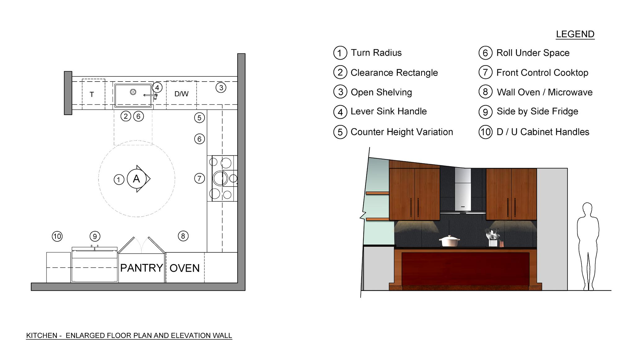
Accessibility Considerations:
In accordance with the client’s desires, each aspect of the home was made to be accesible for wheel-chair users Implementing accessible design allows for the couple to use the home as they age without needing constant renovations or changes. For example, the kitchen provides various working heights, handles are closer to front access, and there is plenty of space for maneuvering.
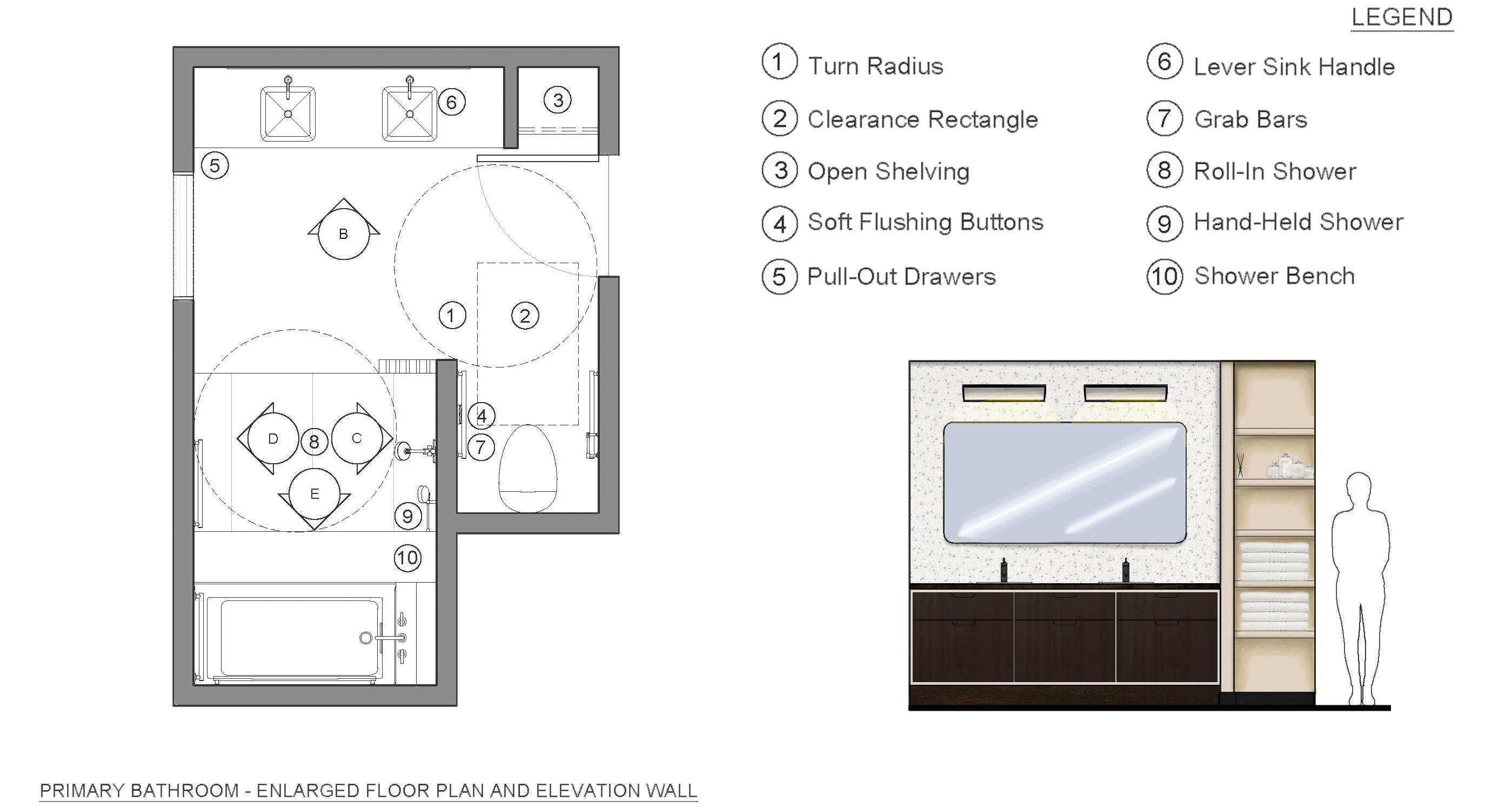
Materiality and Respite
Materials Moodboard:
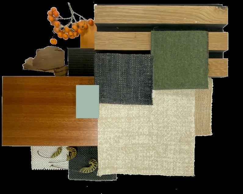
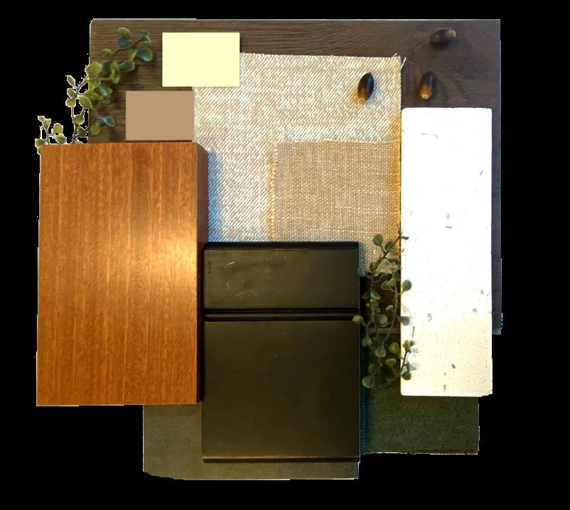
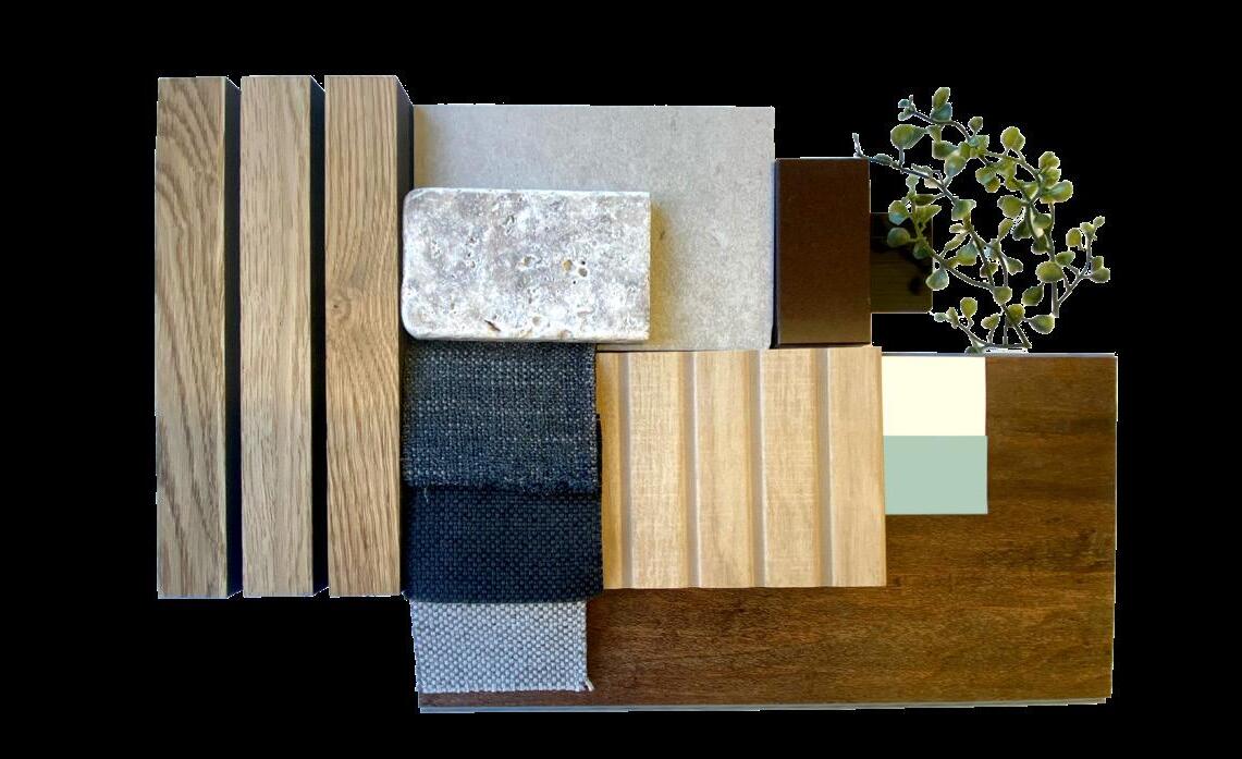
The Hygge Residency features a materials palette that combines wood, stone, and natural-toned fabrics, chosen for concept alignment, slip resistance, and ease of cleaning. Lighter bathroom tones promote cleanliness. Blues and greens evoke tranquility, while orange accents provide energy. The Dining and Kitchen area reflects these specifications, as the kitchen, a place of energy for these clients, shifts into warmer hues compared to the Dining area.
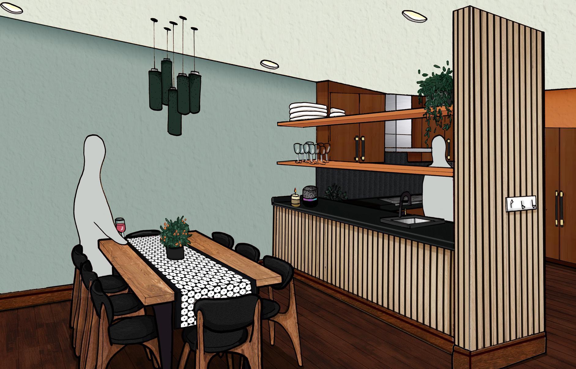
Kitchen and Dining
Providing Respite:
The clients are largely retired and frequently host their families. As such, the space sought to balance being a place for energetic conversations with a place of rest. Each space becomes grounded by having a center point, the chandelier of the dining room, the fireplace of the living room, or the reading nook in the primary bedroom. These elements draw users’ attention and settle into their conversations or moments of rest.
The reading nook in the Primary Bedroom provides a private space for the client and also serves as a dressing area if they need more support with getting ready.
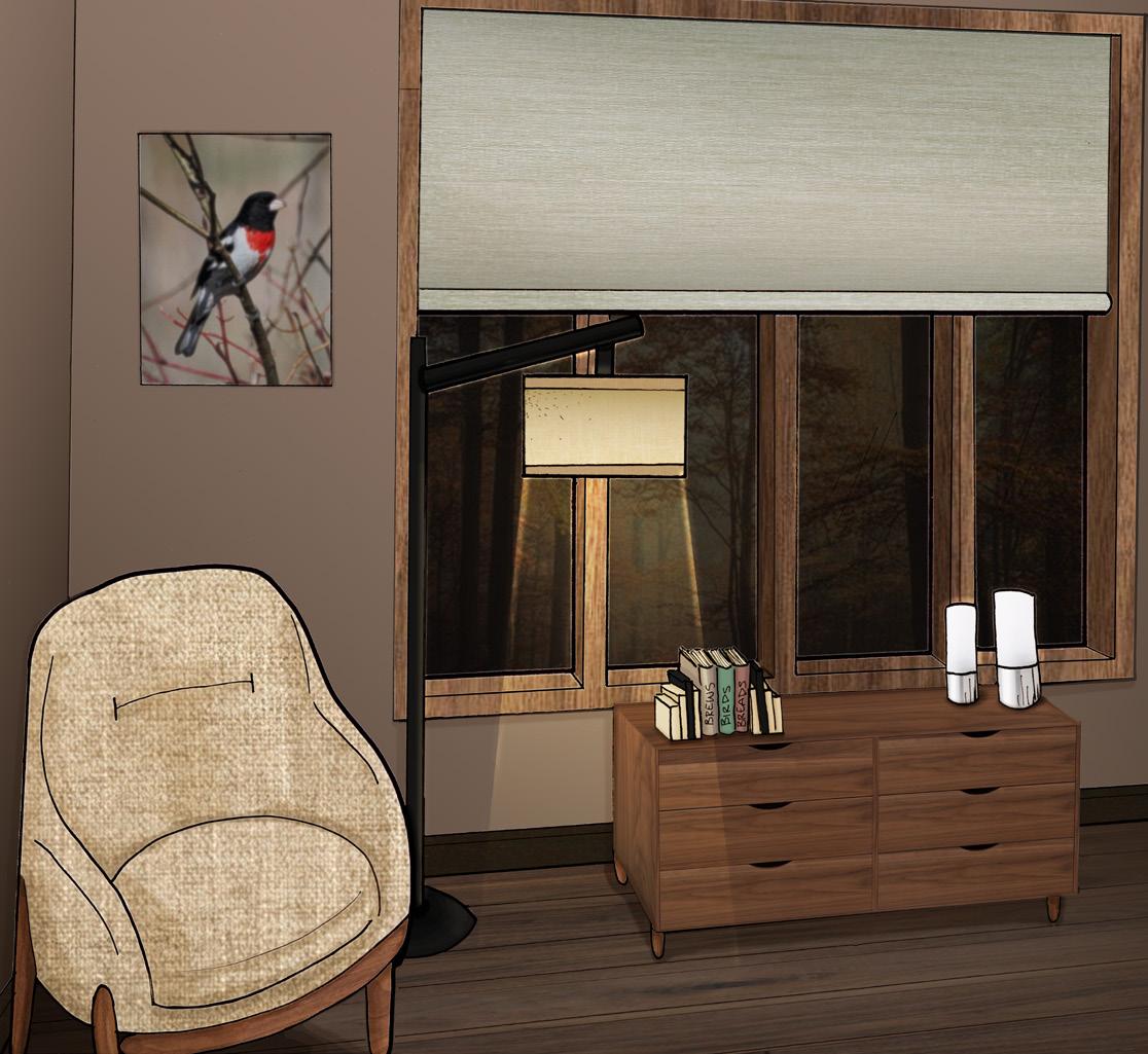
Primary Bedroom - Reading Nook
Living Room

mairen.manning@gmail.com
https://www.linkedin.com/in/mairen-manning/
MAIREN MANNING