10 minute read
Public Sector Branding In Somaliland

Public Sector Branding In Republic of Somaliland
Somalil
Advertisement

Public Sector Branding In Republic of Somaliland

Republic of Somaliland 67 Cities 6 Regions 23 Ministries 25 Agencies
Public Sector Branding In Republic of Somaliland
Somaliland Cities
The International Benchmarks
Somalil

The International Benchmarks
y g
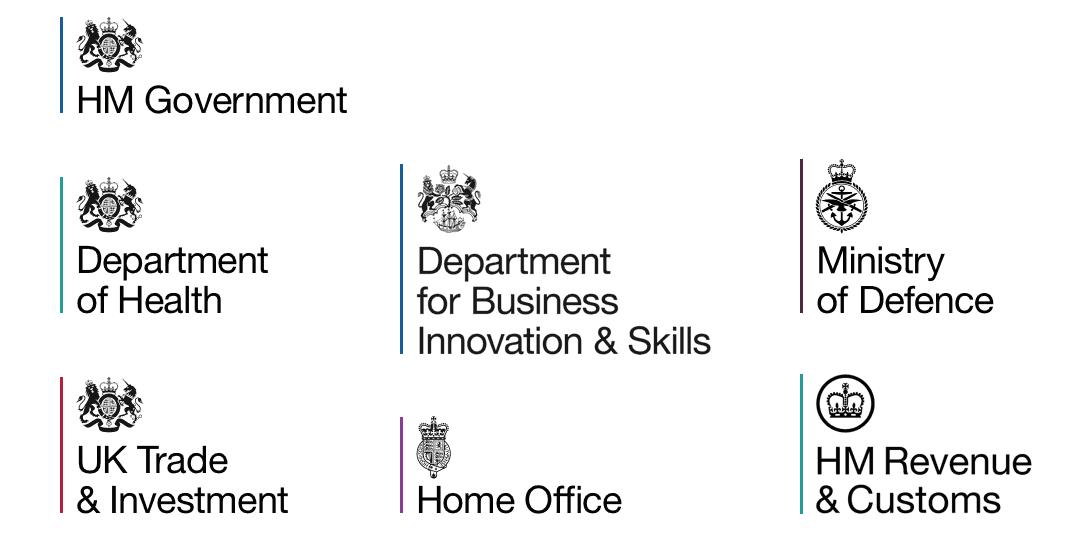
UK government branding before...
There are four, often overlapping, motivations for such transformation:
The financial benefit: saving money by investing in less brands.
Practical brand-building: improving service delivery.
Building a better bond between citizens and nation.
Brand rationalization driven by digital service delivery. In the digital age, every logo requires constant maintenance as new platforms are developed and new screen resolutions become popular, not to mention the initial cost of developing each visual identity and continuously investing to keep it in audiences’ minds. Focusing on a single brand allows this work to be done efficiently and promptly as new devices are released. Switzerland estimated that moving to a master brand would pay for itself in a single year.
Dutch government logos before 20081
Case study: The Netherlands
The Netherlands has a population of just 17 million and a simple government structure. Yet by 2008 the central government was displaying and maintaining around 200 brands. Prime minister Jan Peter Balkenende said citizens «see a mishmash of different logos and visual identities» while the Minister for the Interior and Kingdom Relations talked of «fragmentation» that could lead citizens to question the strength of the central authorities.

The new single design had four aims:
Make the government more recognizable and accessible.
Reduce barriers between government departments. Put the focus of communication into the service (not the government department). Improve efficiency and minimize spending.
A decision was taken to move to a master brand nicknamed the “blue ribbon”, an image based on a national design from 1815 (see right). Whether it is on paper, a street sign or a web page, the Dutch government guidelines state that the national brand must always be in the middle and at the top, symbolizing that the government is at the center of society and neutral, above all parties.
Costs were kept low with a phased implementation.
Government polling data showed an increase in satisfaction with government services in the five years after introduction.
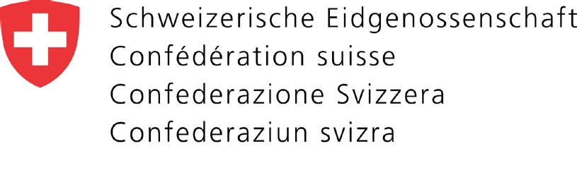
In 2003 Switzerland decided to replace more than 80 government brands with a single, national brand, known as the “CD Brand”. Its primary stated aims were:
Improving the transparency of government services.
Cost savings through standardization.
Strengthening the sense of belonging among the employees. Simplified collaboration between the individual administrative units.1
Two other goals were specified: to clarify which services were provided by the government, and to help create a stronger central image for a state that, although it has less than nine million people, is highly decentralized with four official languages.
Case study: Switzerland

The final design, introduced across government in 2007, used the national shield and “Swiss Confederation” in all four national languages. Chancellor Annemarie Huber-Hotz said the design was “classically timeless, discreet and clear”. The project had external costs of 7.5 million Swiss francs, mostly IT-related, but on introduction in 2006 was on target to save 7 million francs a year. 1
Case study: South Korea
South Korea moved to a master brand system for government departments as part of a broader, global brand-building exercise.
President Lee Myung Bak was concerned that a weak national brand meant goods produced in the country sold at a discount to equivalent products from Germany or Japan and established a Presidential Council on Nation Branding in 2009. This council not only included government officials but also academics, consultants, and leaders of well-branded businesses such as McDonalds Korea.
All government departments were moved to a master brand system based on the Taegeuk circular image in the national flag that dates back at least 1,500 years.


One of the main aims was to end confusion about state and non-state functions. Reports said even Korean officials were getting confused by multiple branding and the large number of logos was adding to costs. An official from the Presidential Council on Nation Branding said: “This (introduction of an integrated logo) will allow people to find out with just a glimpse whether an office using the new logo is a government office or not”.2
Building a bond between citizens and nation
Case study: Germany
When West Germany reunified with East Germany in 1990 two giant government machines had to be integrated. Citizens who were loyal to their country had to transfer their allegiance to the merged entity. The very substantial costs of reunification took a toll on the residents of the more prosperous West Germany - economic transfers to the East have totaled around €2 trillion .
3
However, in branding terms, the reunification was also an opportunity. It created a space in which a new identity could be created that would reinforce national unity in citizens’ minds.
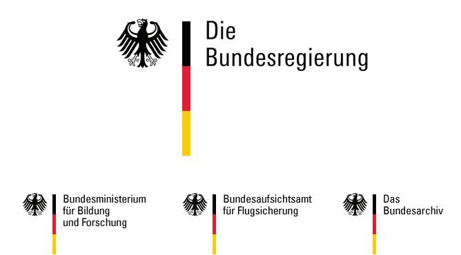
In 1999 a master brand was implemented using the design of the German eagle, the emblem of the country that dates back more than 1000 years.
The eagle was combined with a vertical stripe showing the colors of the new German flag. The branding is used by all government ministries but not by arms-length agencies such as the police and the government-funded broadcaster. Germany is a federal country, and the branding is not used by states and their agencies.
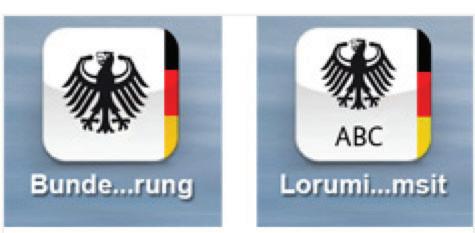
The branding has been continuously updated and extended to include web buttons, app icons for iOS, Android and Windows (left), browser bookmarks and other electronic assets to ensure that citizens that encounter a new government service can quickly navigate it.
Nearly two decades after introduction the brand is still in use.
The digital drive for brand rationalization
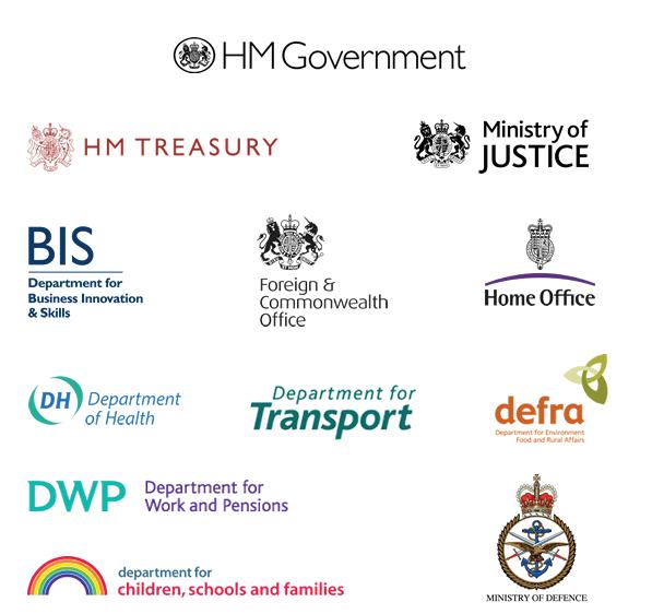
Case study: UK
In the UK, the move to a national brand was linked with the development of a single government online portal. As far back as 2006, the Organization for Economic Co-operation and Development (OECD) was saying that the real benefits of digital government could only be unlocked with portals under which citizens could access multiple government services. It stated: “The leading principle for a government that is responsive to citizens and businesses is that it is focused on user needs and assists in solving problems regardless of its own structures.”1
By 2012 the UK government was moving towards the development of such a single portal but was also wrestling with at least 47 logos for department and ministries, plus hundreds of other logos for programs and agencies (see diagram at the beginning of this section).
It was decided the only way to handle this profusion of images was to simplify. To control costs, the design work was handled by the team also designing the portal of Government Digital Services. The final design uses the UK’s royal crest, with the only variation for each department being a colored bar to the left. By law, it is an offence for commercial firms to use the royal crest: the UK government says “It is important that the public is easily able to recognize the work of government, departments, their agencies and arms length bodies”
The image is not used outside the UK, where the names of government departments would not be recognized. Instead, the UK government uses an outward-facing brand based on the national flag (left). Large, publicfacing agencies such as the police and National Health Service have kept their familiar brands. Official guidelines permit some flexibility, saying government campaigns can have a brand created for them when they need “a distinct visual identity”.1
All government departments have closed their web portals and the new site, launched in 2012, now offers the services of 25 government departments and 376 other agencies and public bodies. The UK followed up the single branding in 2015 with the elimination of departmental digital marketing teams. Digital marketing specialists now sit in pooled government hubs that cost less and ensure better government co-ordination when communicating with citizens. The UK’s portal goes an important step beyond the saudi.gov.sa portal, which serves mostly as an electronic signpost, helping citizens find the correct government site. In the UK all the services can be accessed through one portal, with a single sign-in mechanism with a single user interface. The portal handles more than three billion transactions a year and has helped the UK to top the United Nation's most recent list of e-government development. 2


Somalil