Graphic Design Portfolio Alexa Yapp
E : alexa.yapp16@gmail.com • Instagram : madebyalexa.uk • LinkedIn : https://www.linkedin.com/in/alexa-yapp-46ab2b264/

Contact Details : MADE BY ALEXA UK Alexa Yapp E : alexa.yapp16@gamil.com T : 07478740941 Content Page Green House Collective Passive Lodge Little Engine House Branding Magazine Supplement Project Name Page No. 04-05 06-11 12-13 14-21 01 02 03 04 Project No.
Green House Collective Branding
Client : Green House Collective
Completion Date : 31st May 2024
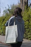
For my final major project, I created branding that reflects the core values of the Green House Collective. The name itself embodies the essence of a green space that brings people together as a collective.
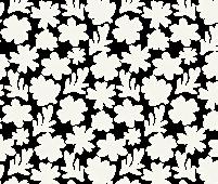
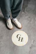
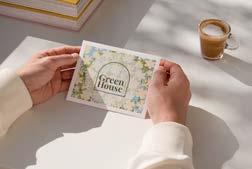
The logo is thoughtfully designed, featuring an arch inspired by the unit’s architecture, which frames the sophisticated text logo, having both structure and elegance. The colour palette and patterns are carefully chosen to evoke the feeling of a summer day outdoors. The harmonious blend of greens, yellows, and blues, along with soft, organic shapes, captures the essence of nature and tranquillity, enhancing the overall brand experience.
This branding not only supports the project’s ethos but also creates a visually appealing and inviting identity that resonates with the audience.
Scope Of Works
Ideation , Concept creation / development , Graphic design , Brand development , Branding guidelines , Photoshop, Indesign , Mock-ups



PLAYFAIR DISPLAY (BOLD)
ABCDEFGHIJKLMNOPQR STUVWXYZ 123456789

GLACIAL INDIFFERENCE (REGULAR)
ABCDEFGHIJKLMNOPQR STUVWXYZ 123456789


4 INITIAL RESPONSE & FINAL VISUALS Green House Collective Project 01
PRIMARY FONT SECONDARY FONT TYPOGRAPHY LOGO VARIATION MAIN LOGO ICONS PATTERN CONCEPT BOARD GREEN HOUSE COLLECTIVE DESIGNED BY ALEXA YAPP #D2DDE1 #FAEAC9 #F9F6EF #564F31


The Passive Lodge Branding
Client : Passive Lodge
Completion Date : 15th January 2024
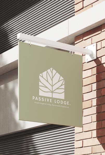
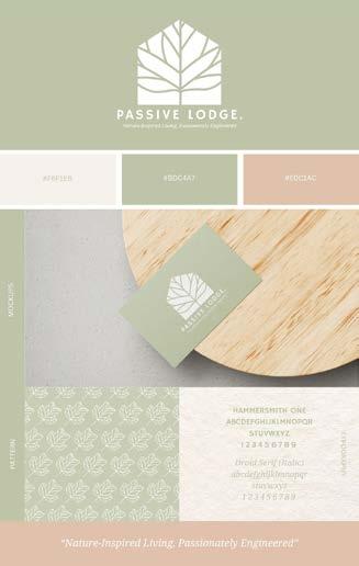
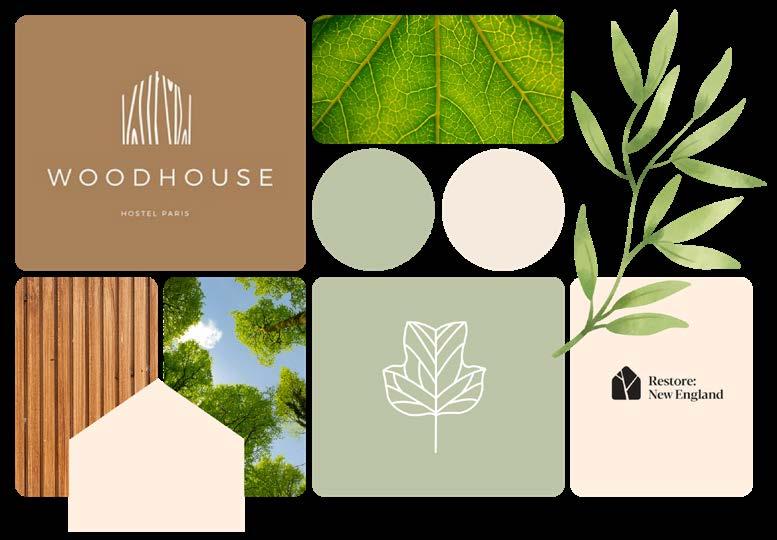
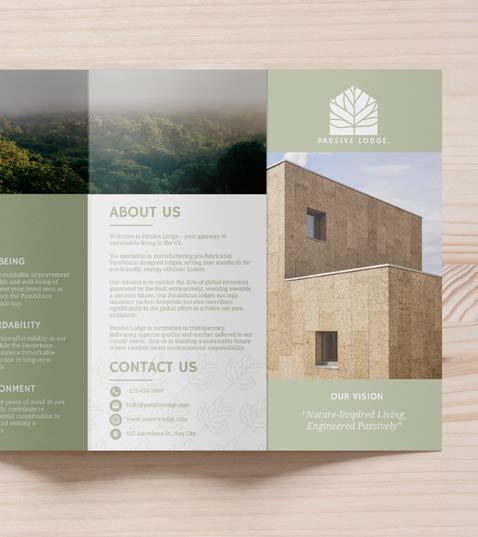
Developing Passive Lodge’s brand was about mirroring my 601 lodge designs essence. It’s about curating a bespoke space for clients that seamlessly complements their lifestyle, characterized by a light and open atmosphere. Utilizing design elements such as windows and porches, to harmoniously integrate with nature, framing its surroundings to enhance the overall experience.
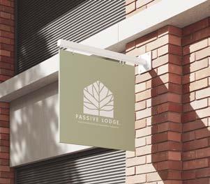
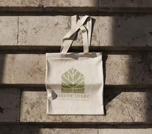
Passive Lodge draws heavy inspiration from nature in its choice of materials and colour palette. The house-shaped logo, combined with the leaf symbol and green / cream colour palette, encapsulates the organic connection between nature and living. This symbolic representation mirrors the ethos of Passive Lodge, embodying the essence of sustainability, tranquillity, and harmony with the natural world.
Scope Of Works
Ideation , Concept creation / development , Graphic design , Brand development , Branding guidelines , Photoshop, Indesign , Mock-ups
6 INITIAL RESPONSE The Passive Lodge Project 01 6 INITIAL RESPONSE The Passive Lodge Project 02

Starting Shapes - The main body of the logo Minimal shape (a suggestion on a house)
Finger Print Pattern Showing the humancentred aspect

Adding pattern for interest and character - Showcasing a part of the company
Shape and pattern
Wood Grain Pattern Showing the nature aspect
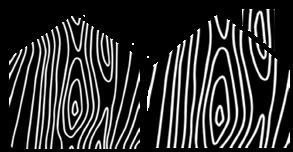


Leaf Shape - Showing the nature aspect natures finger print‘ (Combining the previous two patterns)
8 INITIAL RESPONSE The Passive Lodge Project 01 8 BRANDING DEVELOPMENT The Passive Lodge Project 02
Idea 1 Idea 2 Final
Combining
Symbol
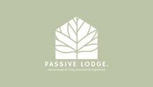
 Typography
Final Main Logo
Logo Variation
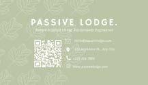
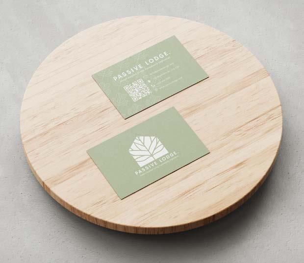
Business Card Design
FRONT
BACK
Typography
Final Main Logo
Logo Variation
Business Card Design
FRONT
BACK
10 INITIAL RESPONSE The Passive Lodge Project 01 10 FINAL MOCK-UPS The Passive Lodge Project 02
Little Engine House Branding
Location : Tregurtha Downs Cornwall, UK
Completion Date : 1st June 2023
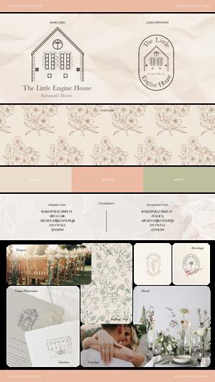
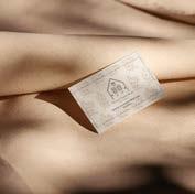
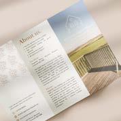
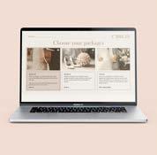
In crafting the branding for ‘The Little Engine House,’ I aimed to embody the delicate essence of weddings. My I chose a palette of soft patterns and textures, to evoke warmth and intimacy. Light, airy colours were selected for a serene elegance, while cheerful, bright images conveyed joy and celebration.
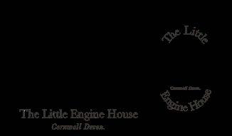
I found it fitting for the logo to encapsulate the essence of the venue building itself, as it stands as the main selling point. Combining delicate hand-drawn illustrations with a heritage-style composition and addition of the established date and location alongside the venue name. The result is reminiscent of a timeless stamp, perfectly suited for a heritage venue, evoking a sense of nostalgia and charm.
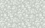
As for the pattern design, I drew inspiration from timeless wallpaper styles. Its soft colours and organic shapes create a subtle yet elegant look, serving as a grounding element for the rest of the branding.
Scope Of Works
Ideation , Concept creation / development , Graphic design , Brand development , Branding guidelines , Photoshop, Indesign , Mock-ups
12
FINAL VISUALS Wedding Venue Branding Project 03
Logo Development
Building Illustrations - Simple + Detailed

Cropping the focal point


Picking out interesting elements
Main
Sub
Adding typography
logo Stamp style composition
logo
Magazine Supplement
Client : Katrina & Henry
Completion Date : 19th Jan 2023
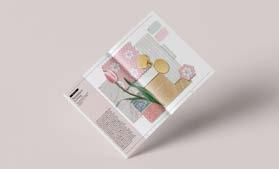
My vision for this project was to design a magazine supplement that inspires young adults to engage actively this summer, with activities like D.I.Ys and recipes, and reading through trend reports challenging conventional thinking in terms of sustainability and florals. This generation excels at innovation and seeks to address social, environmental, and global issues to improve the world for future generations.
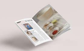
Additionally, I spotlighted local makers, emphasizing the importance of supporting small businesses. These businesses offer unique, hand crafted products, foster a sense of community support, and contribute to environmental sustainability by reducing carbon footprints through local sourcing.
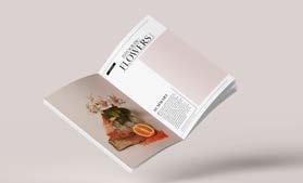
Throughout the supplement, florals serve as a recurring feature, symbolizing summertime outdoor vibes. By maintaining a cohesive narrative, it ensure a seamless flow from start to finish, enabling readers to fully engage with the content.
Scope Of Works
Ideation , Concept creation / development , Graphic design , Brand development , Photoshop, Indesign , Mock-ups
14 MOCK UPS / STYLING Magazine Supplement Project 04
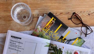
Final Magazine Supplement Styling
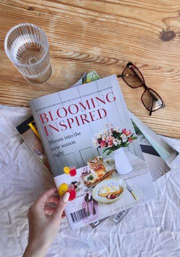
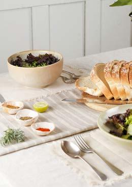
I styled my printed magazine supplement with a relaxed approach. I arranged glasses and a glass of water around the magazine pile for a casual vibe. To introduce brightness and a touch of softness, I draped a white cloth across the centre of the image with natural light flooding the scene.
For my mock-ups, I adopted a more editorial approach, aiming to showcase the magazine supplement in a sophisticated and visually compelling manner.
INTERIOR DECORATING AND THE HOTTEST TRENDS OF SPRING SUMMER
BLOOMING INSPIRED
Bloom into the new season right
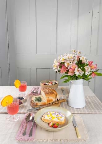

MAKER
MEET THE MAKER INTERVIEW
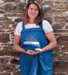
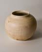
is a Devon-based potter who makes oneof-a-kind porcelain and stoneware pieces. She began as a mental health nurse and did ceramics on the side, but when a coworker decided to quit her job and pursue her passion in ceramics fulltime, Katrina was inspired to leave her job and pursue her passion in ceramics. During our interview, Katrina stated that the “landscape of sandstone cliffs surrounding her local coastline contrasted with the wild ruggedness of Dartmoor” inspires her designs during her dog walks. in her garden studio, which
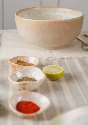
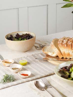
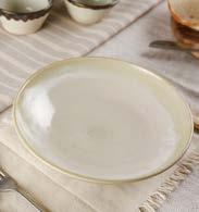
she shares with her artist husband, she works with three main materials: porcelain, terracotta, and her favorite, white stone. With a variety of techniques, including wheel turning and hand pinched pots, all with food safe glazing. What she enjoys most about her craft is that each piece thrown on the pottery wheel has its own personality. Each piece is an experiment, and she goes with the flow. She told a story about how she intended to make a deep bowl, but as she turned it on the wheel, the sides flattened and became shallow. She followed its natural shape and created a shallow bowl instead. Katrina sells her pieces on her website (www. naturalpottery.co.uk/shop), with items ranging from bowls, serving plates, small spice and jewelery dishes and plant pots / vases. Her pieces have more of a natural look with colours of green, blue, neutrals, with finishes of matte, shiny glazings and some with metallic edging. Katrin’s pieces are a perfect addition to many kitchen / dining spaces, providing a natural yet rustic feel with that handmade loving look, ideal as a gift to someone you care about or as a gift to yourself, with a timeless look that is suitable for any season mixed with the right decorations, as seen in this spread.
16
6
Katrina
KATRINA
MEET THE MAKER
Plant Pot
Moon Vase
Contact Information
Styled and photographed by Alexa Yapp
:
Spread
Front Cover ‘Meet The Maker‘ + Product photoshoot FINAL SPREADS Magazine Supplement Project 04
Examples


7 naturalpotterydevongmail.com 0750461443
Styled by Alexa Yapp
8 1 - Sand Dune Serving Bowl, £45.00 2 - Spice dishes, £6.00 3 - Shallow Sand Dune Serving Bowl, £45.00 Styled by Alexa Yapp Photographed by Bethany Conway MEET THE MAKER Natural Country Kitchen KATRINA 1. 9 2. 3.
Photographed by Bethany Conway
Photography By : Bethany Conway & Georgia Eason
TRENDS
SUSTAINABILITY
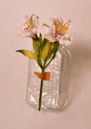
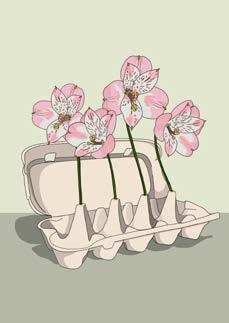
Yes, flowers die quickly when not kept in water, so why not experiment with paper flowers? They last a lifetime, are less expensive, and look beautiful all year round, as well as being a fun craft activity. Is it really necessary for it to be functional, or can it be more of an art piece? Using paper instead of water to try displaying flowers like Rosa Rabio taping a single flower to a piece of cardboard.
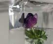
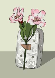
As previously stated, Generation Z is taking a stand on any issue, including the environment; consider the relationship between flower and object. Is there any significance to it? For example, do the items, such as Flor Studios photography, have plastic bags over flower heads or dunking them upside down into a glass, restrict growth? Or, as shown in my personal photo shoot, it insinuates the blooming from waste.
In this case, recycling is your best friend. A household’s waste is extensive and constantly changing, so your display can constantly change too. Try, like Fleurett and my photographs, to arrange the recycling in a way that frames the flowers, having pops of colour, and include other fresh elements like fruit.

TAKE AWAYS
1. 2. 3.
Be creative and open to new arrangements, considering different items used and their sustainability, as well as the relationship they have with the flowers.
Play with the meaning, make the viewer consider what you’re attempting to portray. Bring attention to a problem while creating an appealing piece of art.
Have some fun; this doesn’t have to be so serious and allencompassing. Collect your own items from around the house and experiment to see what happens.
Summer Loving
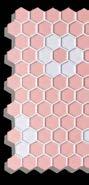
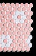
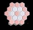
TRENDS Decorating with pretty pink shades and eco friendly materials.
1. Mono Hex Porcelain Tile Pink, £11.53 per sheet, Hyperion Tiles LTD (hyperiontiles.co.uk) Marble Porcelain Tile in Aspera Blush, £69.29 / m², Boutique Stone, (boutiquestone.co.uk) 3. Custom material Panels, price on quote, Smile Plastics, (smile-plastics.com) 4. Custom material Panels price on quote, Smile Plastics, (smileplastics.com) 5. Matt Floor in 80x80cm Birch Pattern Wood, £45.00 m², Tile, (tile.co.uk) 6. Wall Tile in 30x90 Timeless Ivory, £25.97 m², Tile, (tile.co.uk) 7. LOVELL Circular Knob in Brass, £6.95 per item, plank hardware, (plankhardware.com) 8. Decor Matte Wall Tile in 30x90 Timeless Ivory, £25.97 m², Tile, (tile.co.uk) 10. Matt Paint in No. 86 Lagoon, £51 for 2.5 Litres, Andrew Martin, (andrewmartin.co.uk) 11. Matt Paint in No. 62 Osaka Blossom, £51 for 2.5 Litres, Andrew Martin, (andrewmartin.co.uk)

34
18 25
Flor Studio
Rosa Rabio
Styled and photographed by Alexa Yapp
Trend Report + Photoshoot FINAL SPREADS Magazine Supplement Project 04
2.
Trend Materials Board
By : Bethany Conway & Georgia Eason

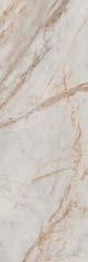
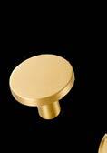
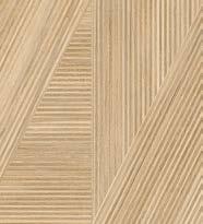




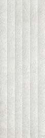
BLOOMING INSPIRED

INTERIOR DECORATING AND THE HOTTEST TRENDS OF SPRING SUMMER
the new
right 1. 2. 35 5. 7. 8. 10. 11. Back Cover
Bloom into
season
Photography
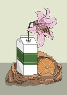
Initial Ideas : Trend Illustrations
As part of the pre photoshoot planning phase, I sketched various arrangements for my structural-style floral compositions, incorporating elements such as recycled materials and fresh fruits. This editorial aesthetic juxtaposes contrasting textures and meanings: the rugged, man-made feel of the recycled materials against the organic smoothness of the flowers and fruits, creating a visually compelling narrative.
20
PHOTOSHOOT Magazine Supplement Project 04
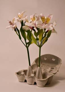
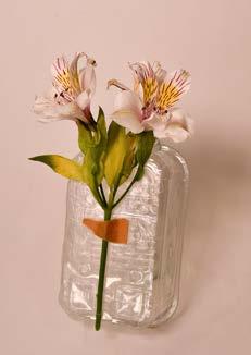
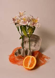
Final Images : Trend Photoshoot
The concept I aimed to convey is the environmental strain caused by our waste production, symbolized by the florals being contained within recycled materials. However, there’s also a hopeful narrative of life sprouting from the debris, illustrating our efforts to mitigate waste by reusing and recycling materials to benefit the planet. The stark contrast between textures is prominently shown in these final images, supporting the importance of the message and the visual impact of our actions on the environment.
Client : Path Finder Homes
Completion Date : 17th May 2024

Lodge Posters LOFT THE
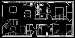
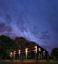
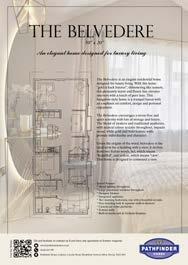
Building on my internship experience at Pathfinder Homes, where I designed posters for their national lodge show, I continued to collaborate with them on additional projects. For the Stonelign show, I created three more posters to showcase their lodges: ‘The Loft,’ ‘Merley,’ and ‘The Astbury.’
Each poster features:
• A description of the lodge
• Size specifications
• Number of bedrooms and bathrooms
• Floor plans and/or elevations
• Striking titles and engaging graphics
These elements were designed to provide a comprehensive and visually appealing overview of each lodge, effectively capturing the attention of potential buyers.
Scope Of Works
Ideation , Concept creation / development , Graphic design , Brand development , Branding guidelines , Photoshop, Indesign , Mock-ups



22 MOCK UPS / STYLING Magazine Supplement Project 04
Visit Our Website Do not hesitate to contact us if you have any questions or feature requests: Pathfinder Homes Limited, Cavalier Road, Heathfield, Newton Abbot, Devon, TQ12 6FJ sales@pathfinderhomes.co.uk 01626 833 799 Welcome to The Loft, where industrial elegance meets modern comfort. luxurious two bed, two bath lodge spacious open-plan living area, flooded natural light and adorned with sleek accents like rich dark tones and stylish pieces. The ensuite bedroom boasts a generous bed, a walk-in wardrobe, and a bathroom with a spacious walk-in Enhanced by rugged wooden accent and furnishings, the space exudes urban vibe, accentuated by the presence industrial metal pendants that cast inviting glow. Across the hall, the twin beckons with its own unique charm, industrial elements with stylish comfort provide a haven of relaxation. 40’
2 Bed, 2
x 20’,
THE LUNA



TENBY
40 x 20, 2 BEDROOMS
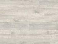
The Tenby Lodge embodies a serene and rejuvenating haven, skillfully designed to invoke a fresh, modern beach-style ambiance. Its architectural concept is a portal to a tranquil coastal realm, where contemporary design harmonises with coastal inspirations for a uniquely invigorating experience.
At its core, Tenby Lodge exudes a relaxed and casual atmosphere, seamlessly capturing the essence of a coastal escape. The design effortlessly infuses the space with an airy, easygoing aura. Carefully curated decor and layout create an environment fostering relaxation and a profound connection to nature. Drawing from beach influences, the Lodge features a palette of soft, soothing colours reminiscent of sand, sea, and sky. The inclusion of light and breezy textiles, along with thoughtfully chosen furnishings, cultivates an ambiance of comfort and tranquillity.
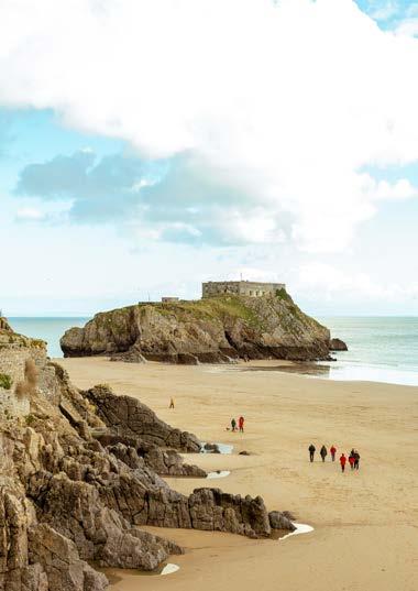
The spaces are thoughtfully optimised for functionality and visual allure. The layout promotes an open flow, allowing natural light to permeate the entire expanse. Ample windows and strategically placed glass doors provide sweeping views, blurring the distinction between indoor and outdoors.
A hallmark of Tenby Lodge is its careful attention to detail. Every facet of design, from furniture selection to decorative arrangement, is thoughtfully orchestrated to craft a harmonious and inviting atmosphere. Be it a cosy nook for unwinding with a book or a gathering space for loved ones, Tenby Lodge offers versatile havens catering to every need.

Do not hesitate to contact us if you have any questions or feature requests:

ASTBURY THE Visit Our Website Do not hesitate to contact us if you have any questions or feature requests: Pathfinder Homes Limited, Cavalier Road, Heathfield, Newton Abbot, Devon, TQ12 6FJ sales@pathfinderhomes.co.uk 01626 833 799 40’ x 20’, 2 Bed, 2 Bath Immerse yourself in the serene ambiance of Astbury Lodge, where soft, earthy tones and leaf wall features create soothing environment reminiscent of a tropical retreat. Wooden furnishings and soft textures enhance the design, infusing the space with warmth and comfort. At the heart of the living space lies a bespoke entertainment centre, surrounded by custom wall panelling that adds a touch of sophistication to the living area. The open-plan layout seamlessly integrates the living, dining, and kitchen areas, providing a versatile space for relaxation and socializing. Two generously sized bedrooms feature walk-in wardrobes for ample storage, while one indulges in a lavish en-suite bathroom. Escape to Astbury Lodge and experience the perfect blend of calm and beach holiday charm, where every detail is designed to inspire peace and serenity. Discover Astbury Lodge Visit Our Website Do not hesitate to contact us you have any questions or feature requests: Pathfinder Homes Limited, Cavalier Road, Heathfield, Newton Abbot, Devon, TQ12 6FJ sales@pathfinderhomes.co.uk 01626 833 799 Introducing Merley Lodge: Where Delicate Elegance Meets Scandinavian Chic. Step into realm of refined sophistication with Merley Lodge, exuding the charm of a country home blended seamlessly with Scandinavian twist. Clean lines and smooth surfaces define its aesthetic, complemented by delicate patterns, light colours, natural wood tones, and subtle gold accents. As you enter, you’re greeted by an inviting entrance hall adorned with stylish storage unit, setting the tone for the graceful living space beyond. Bathed in natural light, the open-plan layout offers a seamless flow, ideal for modern living. Discover two spacious bedrooms, including luxurious primary suite boasting an en-suite bathroom and coveted walk-in wardrobe. Outside, the iconic chevron cladding adds a touch of distinction to the lodge’s exterior. Welcome home to Merley Lodge, where every detail is crafted to perfection, offering a harmonious blend of comfort and style. The Merley 50’ x 22’, 2 Bed, 2 Bath LOFT industrial comfort. This offers a flooded with industrial stylish metal generous lavish shower. accent walls exudes a raw, presence of a warm, twin room blending comfort to relaxation. Bath Do not hesitate to contact us you have any questions or feature requests: Pathfinder Homes Limited, Cavalier Road, Heathfield, Newton Abbot, Devon, TQ12 6FJ sales@pathfinderhomes.co.uk 01626 833 799 Visit Our Website
The Luna is an exhilarating and contemporary architectural concept that embodies a harmonious blend of modernity and natural elements. The open plan design is crafted to provide a luxurious and intimate experience, where contrasting textures and colours create a visually captivating environment. The design highlights the interplay between dark surfaces and natural timber accents. This contrast not only adds depth and character to the space but also infuses a sense of warmth and elegance. The combination of these elements creates a striking aesthetic that is both inviting and visually stunning.
Visit Our Website
Pathfinder Homes Limited, Cavalier Road, Heathfield, Newton Abbot, Devon, TQ12 6FJ
01626 833 799
sales@pathfinderhomes.co.uk
E : alexa.yapp16@gmail.com • Instagram : madebyalexa.uk • LinkedIn : https://www.linkedin.com/in/alexa-yapp-46ab2b264/
Thank You
Graphic Design Portfolio