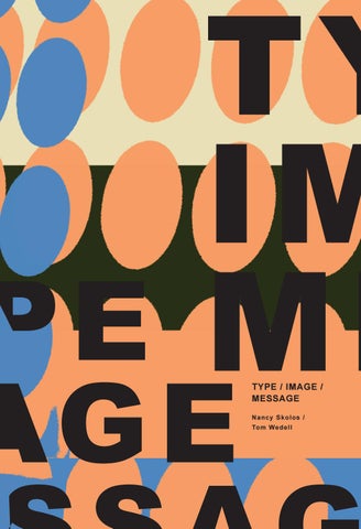
TYPE / IMAGE / MESSAGE N ancy Skolos / Tom Wedell
RO CKPORT PUBLISHERS SAN DIEGO CALIFORNIA
TYPE/ IMAGE/ MESSAGE
A GRAPHIC DESIGN LAYOUT WORKSHOP Na n c y Sk o los / To m We d e ll M a d d ie F rit h
Š2019 by Rockport Publishers, Inc. All rights reserved. No part of this book may be reproduced in any form without written permission of the copyright owners. All images have been reproduced with the knowledge and prior consent of the artists concerned, and no responsibility is accepted by producer, publisher, or printer for any infringement of copyright or otherwise, arising from the contents of this publication. Every effort has been made to ensure that credits accurately comply with information supplied. First published in the United States of America by Rockport Publishers, a member of Quayside Publishing Group 3900 Lomaland Drive San Diego, California 92106 Telephone: (978) 282-9590 www.rockpub.com
1
NANCY SKOLOS / TOM WEDELL
3
Sp a c e / Po ints of E ntry
5
Co n t ra s t / C olor / Texture
7 M e a n in g 9
F o u r Crit ic a l R elationships
11 SEPARATION 15 FUSION 20 FRAGMENTATION 23 INVERSION
NANCY SKOLOS / TOM WEDELL
More recently in a lecture at the Rhode Island School of Design, multimedia designer Mikon van Gastel offered, “One perfectly chosen word is worth thirty minutes of footage.” Value judgments aside, one thing is clear: graphic designers are both blessed and cursed for working with two very distinct modes of communication, the word and the image. As in any successful partnership, type and image work best when they complement each other—when they finish each other’s sentences. For graphic designers, a photograph isn’t finished with a click of the shutter. That is just the beginning of the creative process, as an image becomes a part of a piece of graphic design. In fact, the image must be “incomplete” so there is something left for the type to do. In the conceptual phase of a project, designers often begin working with type and image intuitively, in a mind space where the two are more like substances than entities. We experience them, imagine them, see them in our sleep, and consider them simultaneously. They never operate outside of a context and their meaning is never fully realized until they are put into play. Often they are assigned a “format” within which to interact. They can be visualized with common textures, shapes, and colors, and unified with light or shadow, but even in the realm of our greatest imagination, they remain uniquely discernible as type or image.
The viewer depends on type and image to five form and meaning to many messages and ideas. Both contain room for interpretation by the audience and extend the role of the graphic designer from form giver to mediator and guide. Through form, designers construct and create an organized system for content, emphasizing some concepts and de-emphasizing others, providing ways into, around, and out of each work. While much has been written about typography and photography, surprisingly little has been written about how the two work together. Many times while in the final throes of completing a project that employs both type and image, designers will confess, “I’m just no good with type.” The reality is that nobody is naturally good at combining type and image. Even though words and images are familiar ways of expressing human experience, the two forms of communication are inherently difficult to reconcile. This book is intended to begin to fill that gap. We call it a “graphic design layout workshop” because it originates from a place of making as much as analyzing. Pioneering, innovative graphic designers and photographers from around the world have contributed their extraordinary designs to this endeavor, and it is their inspiration within these pages that serves as the backbone of this discussion and possible reconciliation.
TYPE. IMAGE, MESSAGE GRAPHIC DESIGN LAYOUT WORKSHOP
It has often been said that a picture is worth a thousand words.
2
SPACE / POINTS OF ENTRY
“Reading” a photograph is very different from reading a text.
Photographs are representations of the physical world possessing a three-dimensional sense of time and space. Photographs of landscapes feature a horizon, while photographs of architecture have perspective and a vanishing point. Portraits contain unique human features of eyes, nose, and mouth. Each of these elements and scenarios commands a different point of entry into a picture. Unlike objects rendered in photographic space, letters and their forms do not customarily exist in three-dimensional space. Letterforms themselves have no intrinsic third dimension. Jan Tschichold, renowned typographer and designer, wrote a wonderful metaphorical essay about working with type called “Clay in the Potter’s Hand.” But type is less like clay and more like Legos. It is a prefabricated kit of parts, a closed system, with typefaces whose inner harmonies make them complete in the and of themselves
TYPE. IMAGE, MESSAGE GRAPHIC DESIGN LAYOUT WORKSHOP
For example, in Western culture, a conventional hierarchy is well established, dictating a left-toright, top-to-bottom approach. Letters make up words, words make up sentences, and sentences make up concepts. It is a primarily linear construction that cannot be easily rearranged without affecting meaning.
4
CONTRAST / COLOR / TEXTURE
Type is therefore an inherently high-contrast medium. Dieter Feseke of the Berlin-based studio umbra-dor observes, “The type is more geometry, more digital and clean. The image is patchy, spotted, more analog, natural, and dirty.” As the viewer looks at and discovers a work that is formed of both entities, the flow of experience is varied, with each medium dictating its own point of entry and rate of comprehension. The reading gets even more intricate when the piece contains multiple images and text elements. Complexity adds to the time needed to investigate and interpret a work, regulated by each viewer’s level of experience. For intricacy to transcend entanglement, designers must embrace the creative potential of photo-typographic space. These strategies should guide the viewer beyond what Rick Poynor, in his book No More Rules: Graphic Design and Postmodernism, calls “fully postmodern representational space, where all that is solid often melts into an intoxicating, semiabstract blur.”
TYPE. IMAGE, MESSAGE GRAPHIC DESIGN LAYOUT WORKSHOP
While images render the world in a complete tonal range, tonal shifts generally interfere with, more than contribute to, the clear reading of text.
6
MEANING
Images open the door to multiple interpretations through varied experiences and memories. These connections make photography a more complex, and more visceral form of communication. Unlike images, words are essentially shapes that have learned, recognized meanings. Willi Kunz describes this phenomenon in Typography: Macro–and Microaesthetics: “Every word is comprised of a particular set of letters, whose sequence and form makes each word semantically and syntactically unique.” When type meets image, there is automatically a dialogue between them and each can pull the other in many different directions. The text can support or contradict the image just as the image can illustrate or refute the written message. Each may also contain independent meanings
that may react with or against the overall message in the work. To compound the interpretation further, additional relationships can spring up from the viewers’ backgrounds and personal points of view. In his essay “The Photographic Message, Roland Barthes said of the interaction of text and image: “It is true that there is never a real incorporation since the substances of the tow structures graphic and iconic are irreducible, but there are more most likely degrees of amalgamation.” During the process of analyzing the phototypographic works contained in these pages, the difficulty of teasing out the visual from the verbal brought the struggle between the two forms of communication to the forefront. It is impossible to construct an authentic written description of the type/image relationship at work in a piece of visual communication. For, in order to measure that dynamic completely, one has to go to a place in the mind that doesn’t speak or explain, but rather absorbs. These examples are rare because they take you there.
TYPE. IMAGE, MESSAGE GRAPHIC DESIGN LAYOUT WORKSHOP
As containers for meaning and expressions of human experience, type and image have different properties—but they also operate on different levels of cognition.
8
FOUR CRITICAL RELATIONSHIPS
When type and image coexist, each remains a distinguishable entity, occupying its own space and time to greater and/or lesser degrees, while continuously interacting in distinct ways. Through the combinations of permutations of type and image are infinite, the integration of these media can be delineated according to the following criteria:
SEPERATION FUSION
INVERSION
TYPE. IMAGE, MESSAGE GRAPHIC DESIGN LAYOUT WORKSHOP
FRAGMENTATION
10
S E PA R AT I O N when type and image operate independently
12
TYPE. IMAGE, MESSAGE GRAPHIC DESIGN LAYOUT WORKSHOP
S E PA R AT I O N
FORMAL QUALITIES
Layering The type is superimposed on the image but remains distinct from the image.
Border or frame A border or frame contains the type and sets the stage for the photograph.
Compartments or windows The picture plane is divided into type spaces and image spaces.
To play the type against the image To create a series To provide clarity
The principle of fusion, uses a unifying force to synthesize the type and image. The alliance of form and meaning presents itself in a strong visual coherence—a “cause and effect.” Some images and text are optically altered, and others are circumstantial through motion or juxtaposition, they are all the result of deliberate, holistic choices made by the designer.
TYPE. IMAGE, MESSAGE GRAPHIC DESIGN LAYOUT WORKSHOP
APPLICATIONS
14
FUSION when the type and image blend to form a unity
16
TYPE. IMAGE, MESSAGE GRAPHIC DESIGN LAYOUT WORKSHOP
FUSION
FORMAL QUALITIES
Optical effect Perspective, lens, or filter
Shared surface or texture Type and image are woven into a texture of , or adhered to, a unifying surface—either the picture plane or other homogeneous field(s) in space.
Motion or gesture Type and image are acted on by a common force, or affected by the implied motion of a human or mechanical gesture.
Metaphor Type and image are fused by a calculated visual metaphor that operates through mutual dependency of the verbal and pictorial elements.
To blend two or more things that aren’t customarily related to make a strong association To strengthen an existing conceptual connection through harmony and integration in order to present a galvanized point of view To create an altered reality that challenges the viewer to reexamine a particular subject from an unexpected perspective
The principle of fusion, uses a unifying force to synthesize the type and image. The alliance of form and meaning presents itself in a strong visual coherence—a “cause and effect.” Some images and text are optically altered, and others are circumstantial through motion or juxtaposition, they are all the result of deliberate, holistic choices made by the designer.
TYPE. IMAGE, MESSAGE GRAPHIC DESIGN LAYOUT WORKSHOP
APPLICATIONS
18
FRAGMENTAT I O N when the type and image disturb or disrupt each other
20
TYPE. IMAGE, MESSAGE GRAPHIC DESIGN LAYOUT WORKSHOP
F R A G M E N TAT I O N
FORMAL QUALITIES
Irregularities Elements are torn, divided, or unevenly dispersed.
Displacement The composition appears as an individual frame that has been extracted from an animated film
Interruption The type or image intrude on one another or punctuate or disconnect the message.
Exaggeration Actions are amplified through scale, color, and complication
To animate and energize To imply the passing of time To construct a complex message with multiple meanings To create a surreal scenario To privilege one idea over another
The principle of fragmentation occurs when type and image disturb or disrupt one another, usually with one providing the impetus for activation the state of flux. There is an unsettled nature of a design with fragmentation, the interrelationships have the potential form interweaving multiple meanings and a high degree of decoding.
TYPE. IMAGE, MESSAGE GRAPHIC DESIGN LAYOUT WORKSHOP
APPLICATIONS
22
INVERSION when the type and image trade places and the type takes on pictorial properties or the image takes on typographic qualities
24
TYPE. IMAGE, MESSAGE GRAPHIC DESIGN LAYOUT WORKSHOP
INVERSION
FORMAL QUALITIES
Hyper-realism The type is physically photographed or rendered through other hyper-realistic means.
Building blocks The letterforms appear within the picture plane as the building blocks from which the image is constructed.
Frames The letters create frames for preexisting photographic images.
To reveal a potential or unrealized connection among elements and ideas To create harmony and integration among different or related texts by blending them into visual union To generate visual or verbal puns, or both To invent fictional narratives between words and letterforms become characters To create the strongest possible connection between the word and the image
The principle of inversion is a specific category of fusion, in which type and image fuse by exchanging roles. When type is portrayed as part of an image, or when an image is built from type, it captures our imagination and transports us beyond the potential communicative properties of type or image alone and into an elevated sense of discovery.
TYPE. IMAGE, MESSAGE GRAPHIC DESIGN LAYOUT WORKSHOP
APPLICATIONS
26
This workshop is focused primarily on poster design as a form because posters transcend and propel layout into a realm where type and image can combine seamlessly.
All four interactions—separation, fusion, fragmentation, and inversion—manifest themselves both formally and pragmatically. Designers can use them for many purposes as well as to create a range of visual effects. The practical applications reviewed here include: to present and clarify facts, to tell a story to persuade, and to express emotion, or to create an atmosphere.
TYPE. IMAGE, MESSAGE GRAPHIC DESIGN LAYOUT WORKSHOP
In poster design, words and pictures step out of the compositional boundaries and workaday responsibilities that often distance them in conventional page layout.
28
A C K NO WLED GME NTS I would like to thank Nancy Skolos and Tom Wedell for sharing their process. Their methods of separation, fusion, fragmentation, and inversion have changed the way I think about poster design. They have inspired me to be strategic, but also experimental with design. I would also like to give a special thanks to the students in ART 303 Graphic Design: Typography. Thank you for your dedication to your work and your inspiring optimism. A special thanks to the professor Courtney Mayor for facilitating a positive and supportive environment.
I N D EX O F CO NTRIBUTE RS Nancy Skolos https://twitter.com/nskolos 1 Ahn Sang-Soo http://ssahn.com/?p=6935 7
Book an d c o v e r d e s i g n
Maddie Frith
Typefac e D e s i g n
Robin Nicholas Patricia Saunders Robert Slimbach Typefac e s
Arial Minion Pro