Luxe Magazine - September/October 2025 Faces Of Design
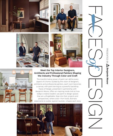
Meet the Top Interior Designers, Architects and Professional Painters Shaping the Industry Through Color and Craft
The transformative power of paint can define every aspect of a home. Guided by the vision of designers, architects and professional painters, each room becomes a canvas, with paint serving as a powerful backdrop. Faces of Design, presented in partnership with Benjamin Moore, offers an inspiring inside look at how today’s creative leaders use paint to design spaces that are unforgettable. Step into their projects and perspectives, where color—from bold, dramatic statements to subtle, layered neutrals—shapes each story.
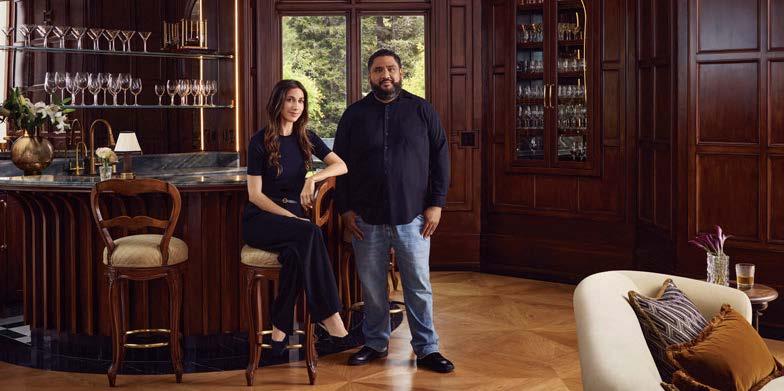
Momo Wong + Jesus Mulato
DENVER, CO
In the minds of design’s most discerning talents, the idea of sanctuary is ever-present, shaping the spaces one inhabits. For designer Momo Wong, it’s the foundation of her work. “My practice is centered on how home can truly nurture,” she says. “It’s about honoring memories while creating a space for what’s to come.” Wong’s aesthetic is both intentional and inviting—timeless, tailored and layered with striking moments, including her signature use of color. This shared reverence for color and harmony is what sparked Wong’s partnership with professional painter Jesus Mulato. “We collaborated on a project, and Jesus’ energy was immediate,” Wong recalls. “His enthusiasm and attention to craft made it clear we’d be working together for a long time.” Mulato shares the sentiment. “A strong designer-painter relationship transforms plans and paint swatches into beautiful reality,” he says. “Momo’s precision, her eye for color and clarity of vision make her an extraordinary collaborator.” Together, they draw from Benjamin Moore’s library of 3,500-plus colors to create spaces that feel deeply personal and beautifully expressive, bringing warmth, character and individuality to every detail.
momowongdesign.com; dadandsonpainting.com
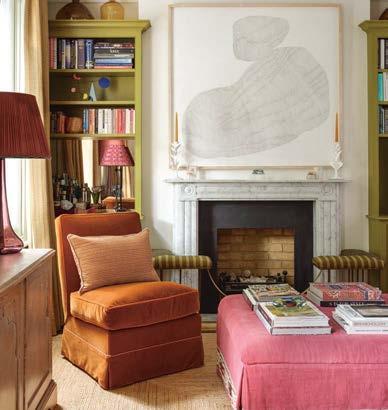
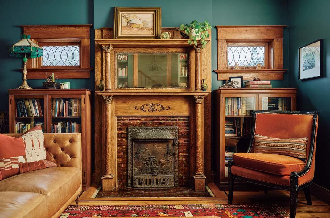
Yorktowne Green HC-133 in eggshell brings a cozy, classical warmth to this living space.
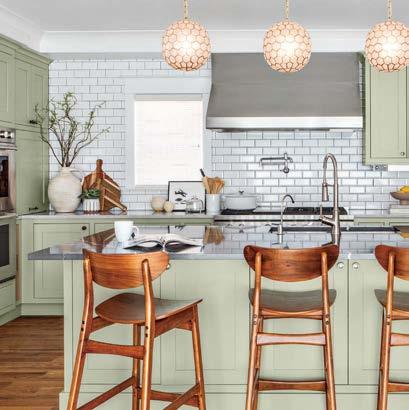
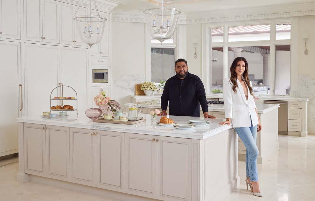
Cover: Walls in White Dove OC-17 and cabinets painted in Saybrook Sage HC-114 combine for a chic kitchen.
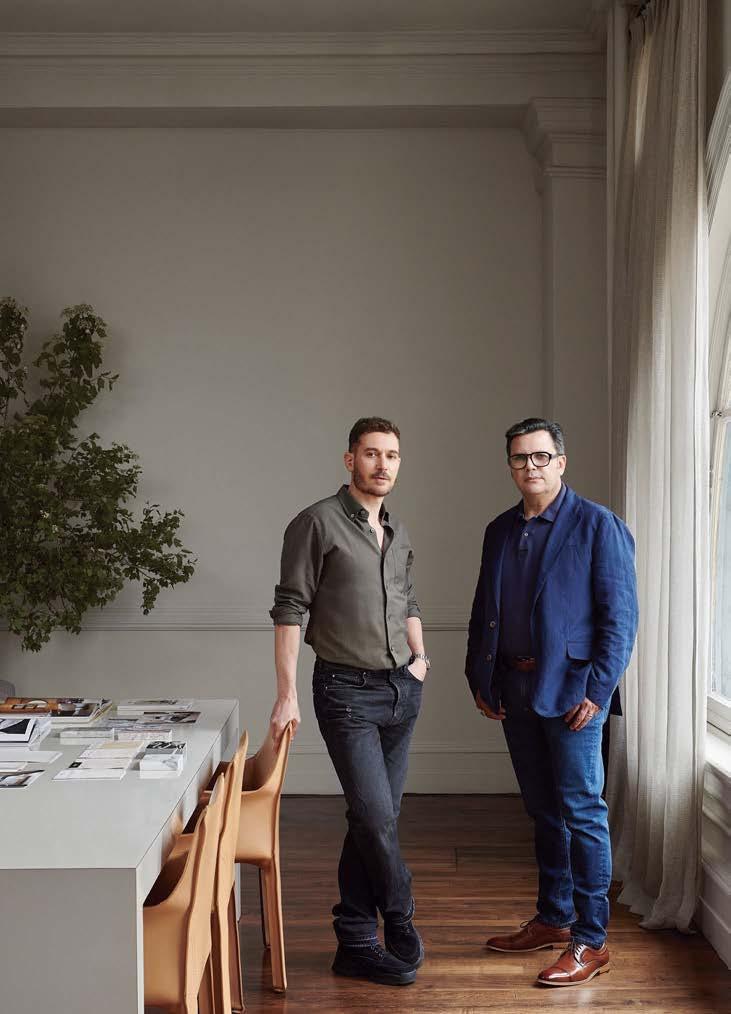
Clive Lonstein + Francisco Bojorquez
NEW YORK, NY
At its core, design is storytelling—an alchemy of materials, mood and meaning. For interior architect and designer Clive Lonstein, it’s this narrative power that drives his work. “I’m endlessly fascinated by how finishes, materials and color can elicit emotion,” he says. “Paint, in particular, has this incredible range—it can whisper or make a statement, and that nuance really matters.” To achieve this balance, Lonstein turns to one of his most trusted collaborators, professional painter Francisco Bojorquez. “Francisco’s craftsmanship is impeccable,” Lonstein says. “He respects the process, never rushing, and that integrity shows in the results.” Their partnership spans over three years and countless projects, each defined by precision and attention to detail. For Bojorquez, the satisfaction lies in translating vision into form. “What I love most is bringing someone’s imagination to life,” he reflects. “Clive’s ability to see both the fine details and the big picture gives us clear direction. From there, we build something extraordinary together.” With Lonstein’s elevated design chops and Bojorquez’s expert execution, their collaboration consistently raises the bar for intentional, artful interiors. clivelonstein.com; reliableandaccuratepainting.com
The prep work is the most important part. It guarantees durability, improves the appearance and helps the paint adhere better.”
–FRANCISCO BOJORQUEZ
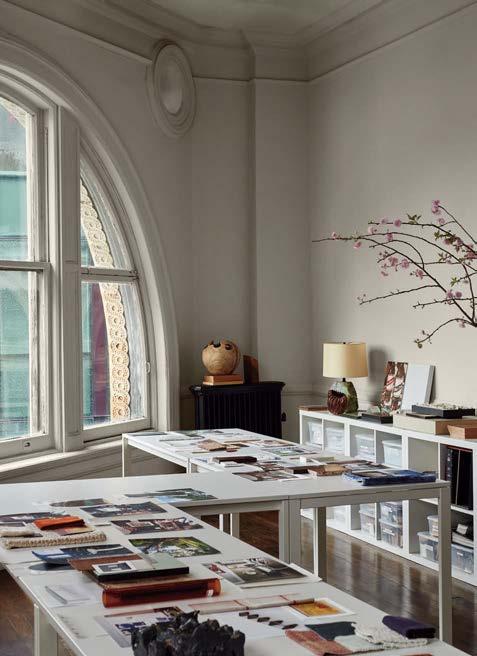
Balboa Mist OC-27 on the walls and China White OC-141 on the ceiling combine for a crisp, yet character-filled studio space.
Kitchens, bathrooms and smaller spaces often benefit from a slightly higher sheen, giving them a more spacious feel.”
–DAREK GOLABEK
Isabella Worsley + Darek Golabek
LONDON, ENGLAND, UK
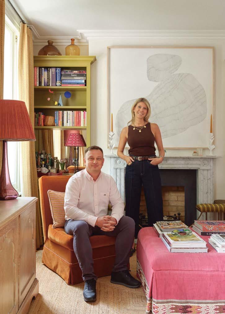
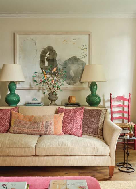
For an interior designer, true creative fluency lies in the ability to pivot—stylistically, conceptually and emotionally—with each project. London-based designer Isabella Worsley embraces this adaptability as a guiding principle. “Being stylistically nimble is essential,” she says. One of the most powerful tools in her arsenal? Paint. The final finishes beautifully complement the story that begins with fabric. Worsley often starts with a woven texture to guide the chromatic direction of a space. “A shade pulled from a textile feels more considered, more connected,” she notes. This thoughtful approach resonates with Darek Golabek, the professional painter who expertly executes each detail. “It’s a gift to work with someone who understands your shorthand,” Worsley explains. Together, they use paint to set tone, alter scale, shift mood and ground a room’s architectural story. “Prep is everything,” Golabek emphasizes. “A dry matte finish is my go-to for walls, but in smaller spaces, a high-gloss finish using Advance can be bold and unexpected. It’s all about perfect preparation.”
isabellaworsley.com; jdbuildltd.com
Vapor AF-35 on the walls and Dragonwell CSP-930 for the bookcases contribute the perfect backdrop and bright pop of personality in this Notting Hill flat.
Mélanie Cherrier, Laurence Pons Lavigne + Charles Campeau
MONTREAL, QUEBEC, CA
In interior design, the smallest details make the greatest impact—none more so than paint, the element that transforms surfaces through hue, texture and finish. For Mélanie Cherrier and Laurence Pons Lavigne, the creative duo behind Blanc Marine Intérieurs, the artful use of color is central to their aesthetic: timeless, refined and contemporary in its simplicity. “Design lives in the details, and paint is a crucial one that can make or break the visual impact,” says Cherrier. To bring their vision to life, they rely on Charles Campeau, a painting specialist whose technique and steady hand have made him a key collaborator for over five years. “What started as a simple referral evolved into a lasting partnership,” Lavigne says. “Charles is meticulous, patient and brings a calm energy to each project.” With a shared love for earthy tones, the finish is as important as the hue itself. “We usually opt for Regal Select Interior for its washability,” Campeau explains. “For deeper shades, Aura Interior with a matte finish creates a rich, velvety texture.” Together, they compose spaces where color becomes an experience—balanced, beautiful and atmospheric. blancmarine.ca; Charles Campeau: 450.631.1587
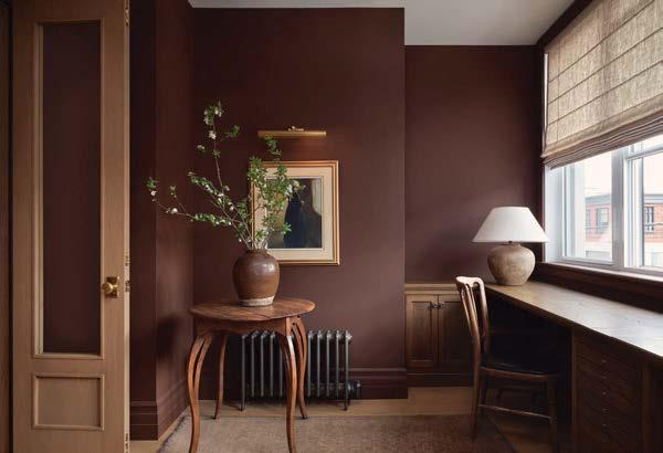
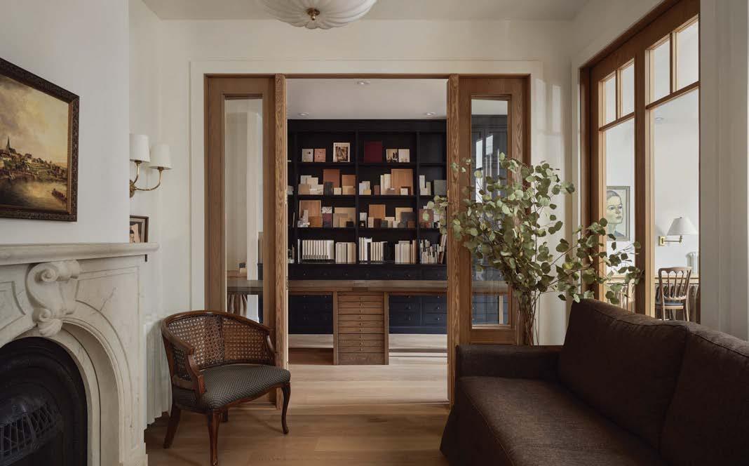
White Dove OC-17 in eggshell serves as the ideal shade of white for the open part of this studio, while Hasbrouck Brown HC-71 in a matte finish brings depth to the room shown above.
Claudia Afshar + Antonio Martinez
LOS ANGELES, CA
The visual language of a home sets the tone for every detail, and nowhere is this more evident than in designer Claudia Afshar’s recent 26,000-square-foot project, where architecture and masterful design converge in a Mediterranean silhouette. For the interiors, Afshar envisioned a dialogue between a romantic Italian villa and refined transitional design, with paint becoming a defining element. “This wasn’t a project where you simply choose three shades for baseboards, walls and ceilings,” Afshar explains. “One room alone required layer upon layer of carefully considered finishes.” From elaborate casings, face boards and ceilings to applied wall paneling and crowns, the design demanded a nuanced palette and expert application. This is where Antonio Martinez stepped in, bringing in his artisanal techniques to ensure the project’s flawless finish. Known for his craftsmanship, Martinez transformed even the simplest substrates into heirloom-quality finishes, painting MDF to mimic aged wood and using advanced spray applications to meet tight timelines without sacrificing precision. His golden rule? “It all starts with prep and Benjamin Moore’s Fresh Start Primer. Getting that foundation right makes all the difference.” claudiaafshar.com; amcustompainting.com
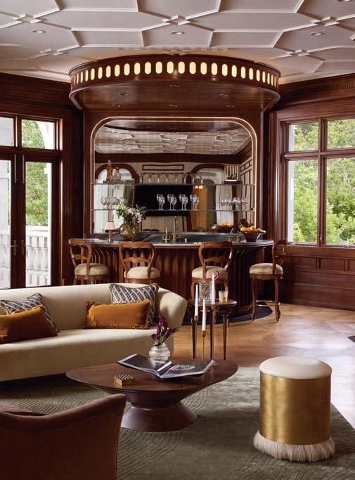
Cloud White OC-130, China White OC-141, Baby Fawn OC-15 and Pashmina AF-100 all feature in the beautifully bright kitchen. In the game room shown above, Cloud White OC-130 and Feather Down OC-6 complement a unique decorative application technique that mimics wood paneling.
DuVäl Reynolds + Joe Conticello
FAIRFAX, VA
Great design collaborations go beyond complementary skills—they thrive on shared creativity and mutual inspiration. Enter DuVäl Reynolds and Joe Conticello, whose partnership exemplifies this perfect alignment. When asked about their favorite paint colors, both share a laugh before replying, “We’re not sure we can settle on just one, but it would probably be something electric and aggressive.” A look at their work together on projects confirms this; it’s bold, dynamic and full of unapologetic color choices. It all began when Reynolds enlisted Conticello and his team for a project in his own home. The outcome was a standard of craftsmanship that solidified the foundation of a trust-based partnership. Today, they approach every project with a deep respect for each other’s expertise, from design to execution. Reynolds explains, “When it comes to product, that’s Joe’s domain. He’s the expert, whether we’re using Aura, Regal Select or Advance.” Conticello adds, “What I admire about DuVäl and his team is their efficiency and clarity. They have a laser-sharp vision, and every detail is thoughtfully considered, making each project a true collaboration.” duvalreynolds.com; premiumpainters.com
A fresh coat of paint can transform a space, brightening it, adding warmth or completely redefining its character. It has the power to create intimacy, enhance natural light or even define distinct areas.”
–DUVÄL REYNOLDS
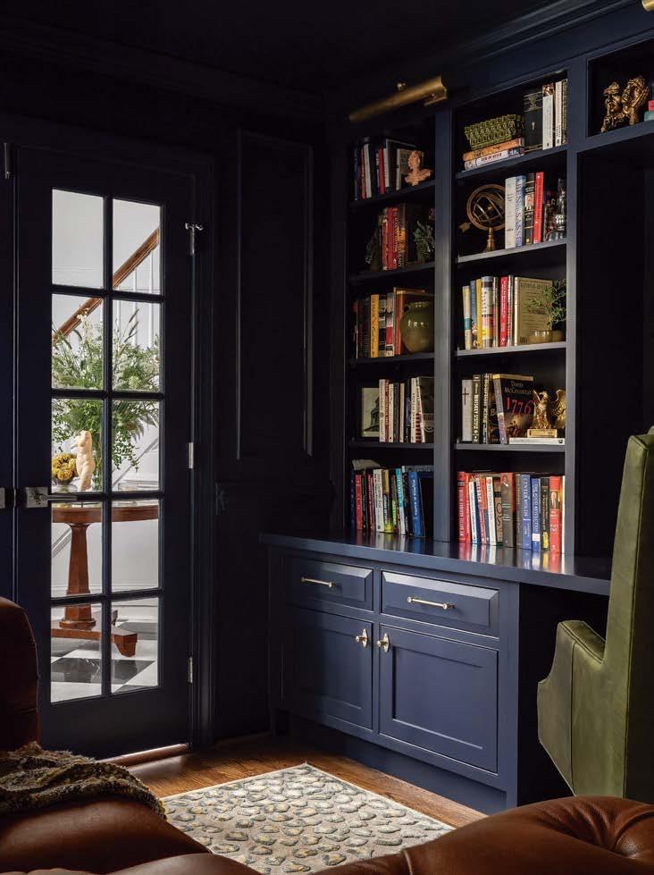
Hale Navy HC-154 brings the drama and depth to this studious space. Meanwhile, White Dove OC-17 is a perfect backdrop in the office shown to the left.
PAINT THEORY
FROM PREP TO PERFECTION—EXPERT ADVICE ON COLOR, TECHNIQUE AND FINISH.
Best Paint Product
“Aura Interior is my go-to— it delivers exceptional color, beauty, and performance every time.”
–CLIVE LONSTEIN
Inspiring Color Palettes
“I’m naturally drawn to rich, jewel-like tones, but lately I’ve been gravitating toward the understated beauty of a more rustic palette. I adore Firenze AF-225.”
–ISABELLA WORSLEY
Go-To Technique
“I love rolling; it creates a flawless, even finish that works seamlessly in any space.”
–CHARLES CAMPEAU
Transform With Texture
“Faux finishes and specialty techniques let you add character, texture and dimension—Benjamin Moore paints bring those details to life beautifully.”
–ANTONIO MARTINEZ
Perfecting Every Hue
“Paint is the foundation of a project. You can’t finalize a color until you see it in the space—it has to feel just right.”
–CLAUDIA AFSHAR
Trusted Favorite
“Regal Select is durable and stain-resistant, making it ideal for high-traffic areas or spaces that require frequent cleaning, like kitchens or bathrooms.”
–JOE CONTICELLO
HUES THEY LOVE:
Personal Favorites from this Year’s Designers and Painters