Copyright @ 2024 Lucy Yin
All rights reserved. This book or any portion thereof may not be reproduced or used in any manner without the permission of the publisher.
The Dollhouse was created from the exploration of the physical material items every girl encounters everyday. The bed she sleeps on, the desk she works on, the chair she sits on, the pillow she rests her head on, etc. All of these pieces of furniture or itemized amenities all come from somewhere and were thought of by others. The Dollhouse walks its guests through the making of what they have in their bedrooms and how it has come such a long way to end up there. We hope to spread inspiration and gratitude as we display different iconic and aesthetic pieces of furniture and objects. This brand guidelines book walks through the requirements and protocols to ensure the correct portrayal and promotion of our brand. These standards are important to keep professional cohesivity and communication so please read and follow through.
Mission Statement
At The Dollhouse, we’re all about celebrating the history of things found in a girl’s bedroom. Our goal is to help you appreciate this special space and learn about the stories behind each item. We want to create fun memories for you and your loved ones as you explore together. We believe in valuing the little things in life and recognizing the effort that went into making them. With cool displays and activities, we offer a place where you can have fun and enjoy time with others. Come join us at The Dollhouse Museum and discover the joy of everyday treasures.
Curiosity: We encourage curiosity about the stories behind everyday objects, fostering a sense of wonder and appreciation for the design and craftsmanship involved.
Inspiration: We aim to inspire our guests by showcasing iconic and aesthetic pieces of furniture and objects, sparking creativity and ideas for their own spaces.
Gratitude: We promote gratitude for the journey each item has taken to reach its place in our lives, fostering a deeper appreciation for the things we often take for granted.
Education: We believe in educating our audience about the making of the items in their bedrooms, providing insight into the design process, materials used, and the impact of consumer choices.
Inclusivity: We strive to create a welcoming and inclusive space for all guests, regardless of their background or experience with interior design, encouraging participation and engagement with our content.

How it came to be
Display Options
Clearspace
Minimum Size Do’s and Don’ts

The Dollhouse logo aims to connect its acronyms with a pictorial icon to describe the brand. The Dollhouse is a museum themed around a woman’s bedroom which can be all sorts of aesthetics. We focused on the subject’s femininity and use more traditionally ‘girly’ imagery. This logo with the opened door inside a swirly doorframe demonstrates the artifacts in this museum. Every room has a door and there are so many varieties of how a door is structurally built or even how it’s decorated. This particular door has a swirly doorframe that ties in with the theme of femininity and elegance.
The door and its doorframe also have typographic meaning. The doorframe is a ‘T’ to represent the word ‘The’ and the door is in the shape of a ‘D’ to represent ‘Dollhouse’. However, the ‘D’ shape is the most important part so the emphasis is to make the letterform read more as a ‘D’. The typeface we chose for this logo also displays the feminine ‘swirly’ aspect. The boldness of the font creates clear legibility even when scaled down. The Dollhouse uses the typeface Gelica with a slight serif to create a traditional connotation.
When the sharp edges are paired with the rounded corners, a pattern of duality and versatility emerge. This represents the types of designs and aesthetics that each individual considers when designing their own personal, private place of rest. There is no defining mark on what is “feminine” because all women are different and our aesthetics or visual interests don’t define that word. The Dollhouse logo purely emulates the inclusion of the women in the world, inviting everyone to step inside and explore the items you don’t normally think much about.
The horizontal logo is used most often because it includes the museum name which makes it more identifiable. Since the word “Dollhouse” is longer, it is better suited to be displayed horizontally rather than above or below the icon.
The icon by itself can also be used for brand design but should be carefully considered because it does not display the brand name.

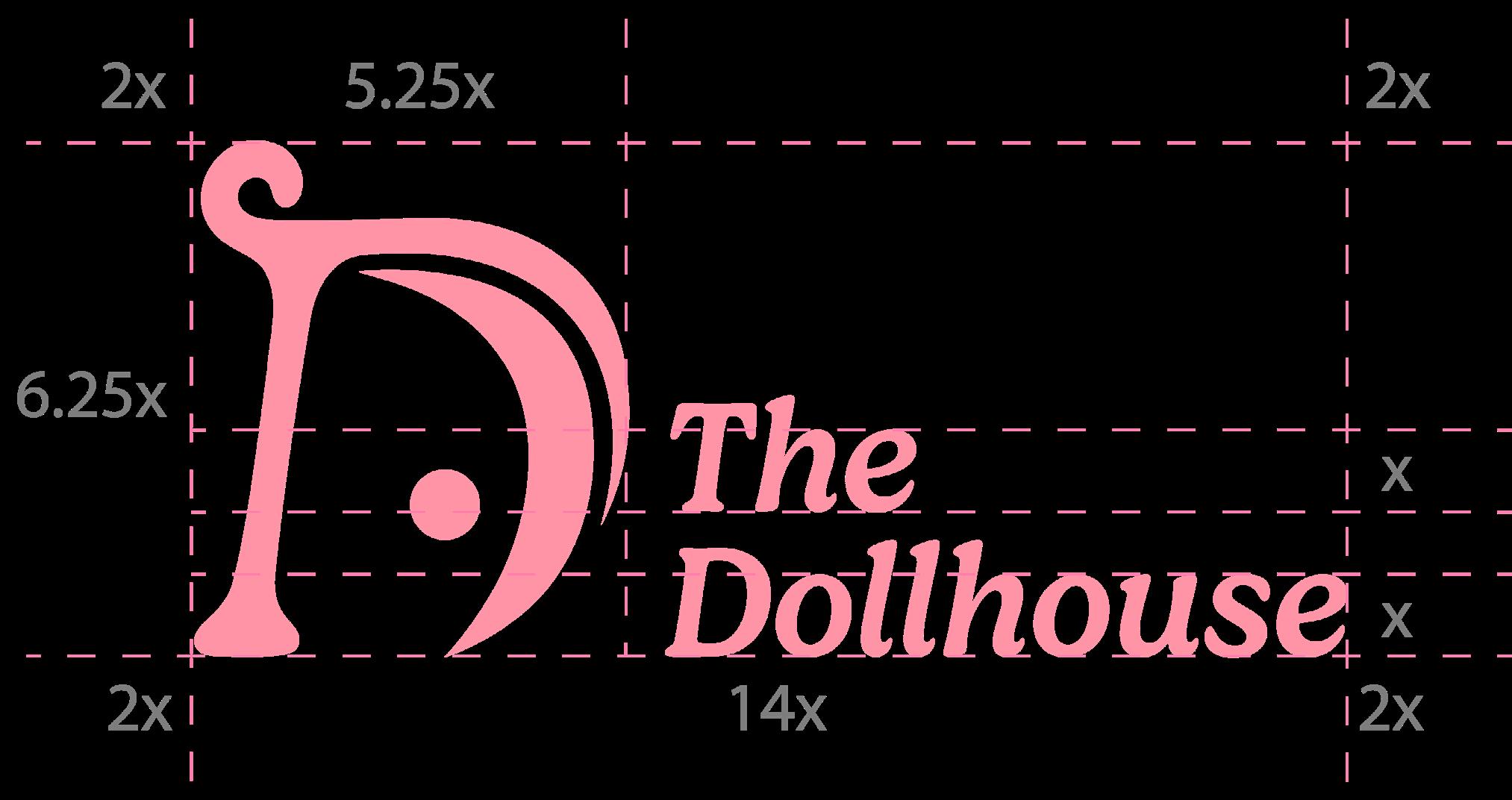
Minimum size with wordmark
To protect the legibility of the brand wordmark, the recommended minimum size of the logo icon and wordmark should not be under 0.75 inches in height for print and 0.50 inches in height for web.
0.75 in 72 px
Minimum Size without wordmark
To protect the legibility of the brand wordmark, the recommended minimum size of the logo icon should not be under 0.50 inches in height for print and web.
0.5 in 48 px

Follow these guidelines to ensure logo and brand recognizability and legibility.
1. Change logo color to any color in our brand color palette.
2. Keep the color of the icon and wordmark same when used together.
3. Put logo over images with high contrast to display logo.
4. Put logo over solid color with contrast to display logo.
5. Use the icon and wordmark together or only the icon.


1. Change logo color to a color not in the brand color palette.
2. Place wordmark above or below icon.
3. Distort or change imagery of logo.
4. Put logo over similar color background.
5. Use different colors for the icon and wordmark when used together.
6. Outline the logo.
7. Use drop shadow or other visual effects
8. Rotate the logo.
9. Change icon or wordmark size unproportionally from each other.





Our color palette
Color usage
Dollhouse Pink
hex: #fe94a6
rgb: 254, 148, 166 cmyk: 0, 53, 16.29, 0
Pure White
hex: #ffffff
rgb: 255, 255, 255 cmyk: 0, 0, 0, 0
Wallpaper Beige
hex: #ffeee3
rgb: 255, 238, 227 cmyk: 0, 6.42, 7.95, 0
Dollhouse Pink is the color we use most often and is our signature color. To display our logo, most times we want to use this color from the color palette. It’s a delicated crafted blend of the perfect color to represent the femininity, delicacy, and cheerfulness of our brand.
Wallpaper Beige is a creamy, warm toned beige that embody the calming, maternal qualities of our brand, displaying the bedrooms that all ages and all types of women have. The accenting Houseplant Green represents the nature in the design of everything one owns. Pure White and Midnight Black are great contrasting values and necessary for the Dollhouse branding. These colors working together create a dainty, fun, pretty palette that delivers our brand’s mission.
hex: #b6dd86
rgb: 182, 221, 134
cmyk: 30.78, 0, 61.48,
Please refer to the color values on this page to ensure color specifications. Do not stack colors if there is low contrast to ensure legibility of contents. Use any color from the color palette for the logo as long as there is high contrast from the background. Do not use two different colors for one logo.
hex: #ffe9eb
rgb: 255, 233, 235
cmyk: 0, 9.75, 2.38, 0
The typeface Gelica is used for most branding. It is a great representation of the professional, yet elegant nature of our brand. It comes with many variations which help with text hierarchy and readability. When italicized, Gelica displays a new feel of femininity and elegance because it slightly mocks the look of script font.
We also use Keplet Std for body text, which has a delicate serif with a slight modern twist. This typeface also has many varieties, keeping our text unified yet easy to communicate with.
These typefaces work together to bring a unified, feminine feeling to The Dollhouse.
Typeface 1:
Gelica Extralight
Gelica Light
Gelica Regular
Gelica Medium
Gelica Semibold
Gelica Bold
Gelica Black
Gelica Extralight Italic
Gelica Light Italic
Gelica Italic
Gelica Medium Italic
Gelica Semibold Italic
Gelica Bold Italic
Gelica Black Italic
abcdefghijklmnopqrstuvwxyz
1234567890&$%
Typeface 2:
Kepler Std Light
Kepler Std Regular
Kepler Std Medium
Kepler Std Semibold
Kepler Std Bold
Kepler Std Black
Kepler Std Italic
Kepler Std Medium Italic
Kepler Std Semibold Italic
Kepler Std Bold Italic
Kepler Std Black Italic
abcdefghijklmnopqrstuvwxyz
1234567890&$%
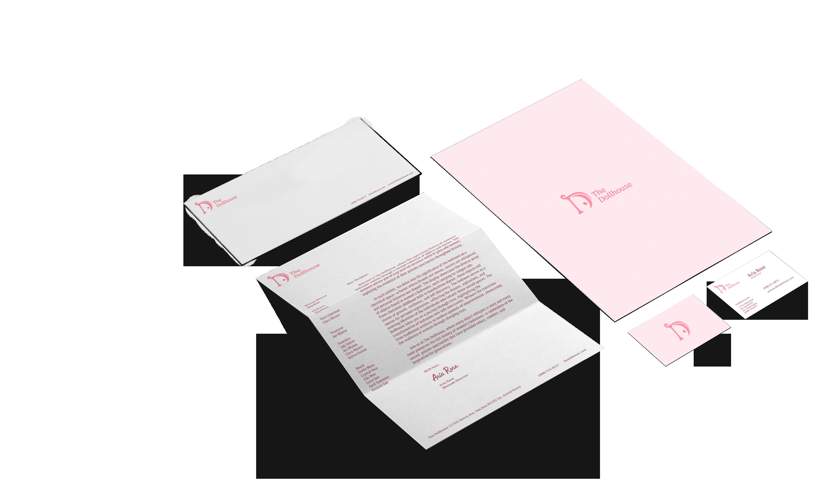
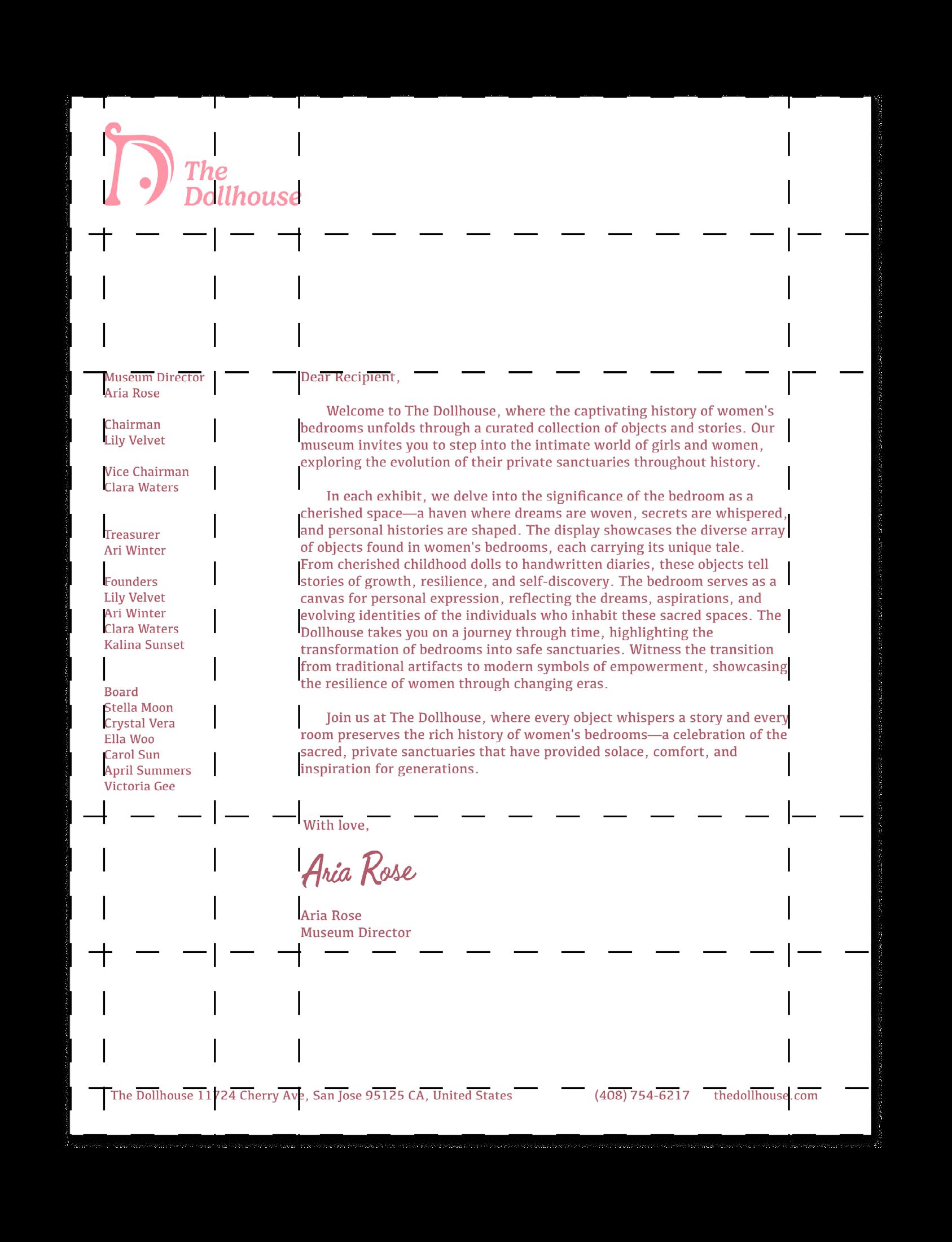
The letterhead has the logo with the wordmark on the top left corner to indicate our brand.
Dimensions
8.5 by 11 inches
US Letter Weight
120 gsm, uncoated
White Print
Offset
CMYK
Letterhead Backside HEX: ffe9eb
The letterhead will be used for all official communication from The Dollhouse through physical mail.
Dimensions
9.5 by 4.125 inches
Weight
120 gsm, uncoated
Offset
CMYK
Letterhead Frontside
The envelope interior is a light pink color
HEX: ffe9eb



9.5 in
The envelope will be used for all official communication from The Dollhouse through physical mail.
Envelope Backside
3.5 by 2 inches Weight
400 gsm, coated
CMYK Business Card Backside
3.5 in
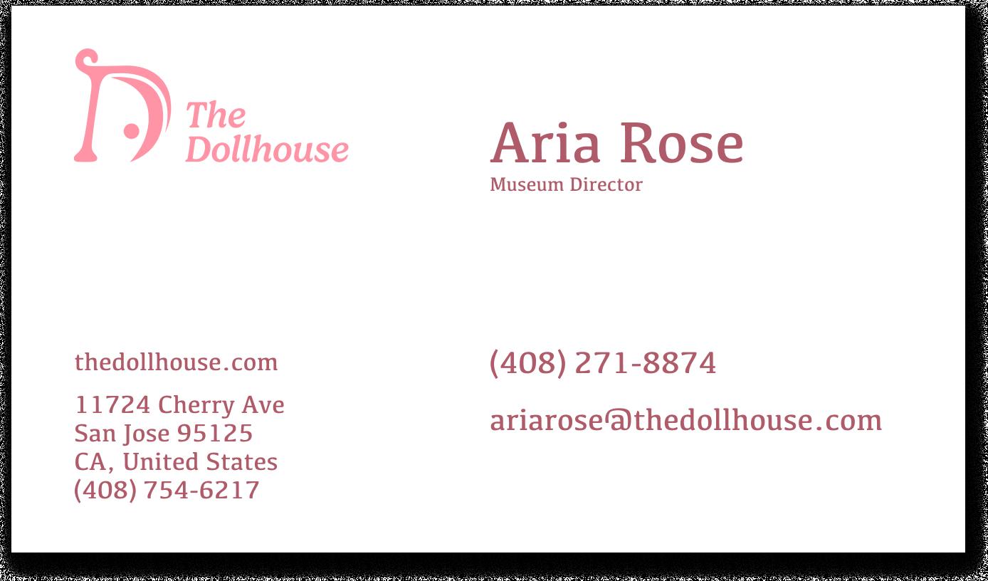
This business card design will be used for all employees to give our their contact and display our brand in professional settings.
Information on every card includes brand name and logo, brand website, address, phone number. For each employee, the business card will include their name, professional role, work number, and company email.
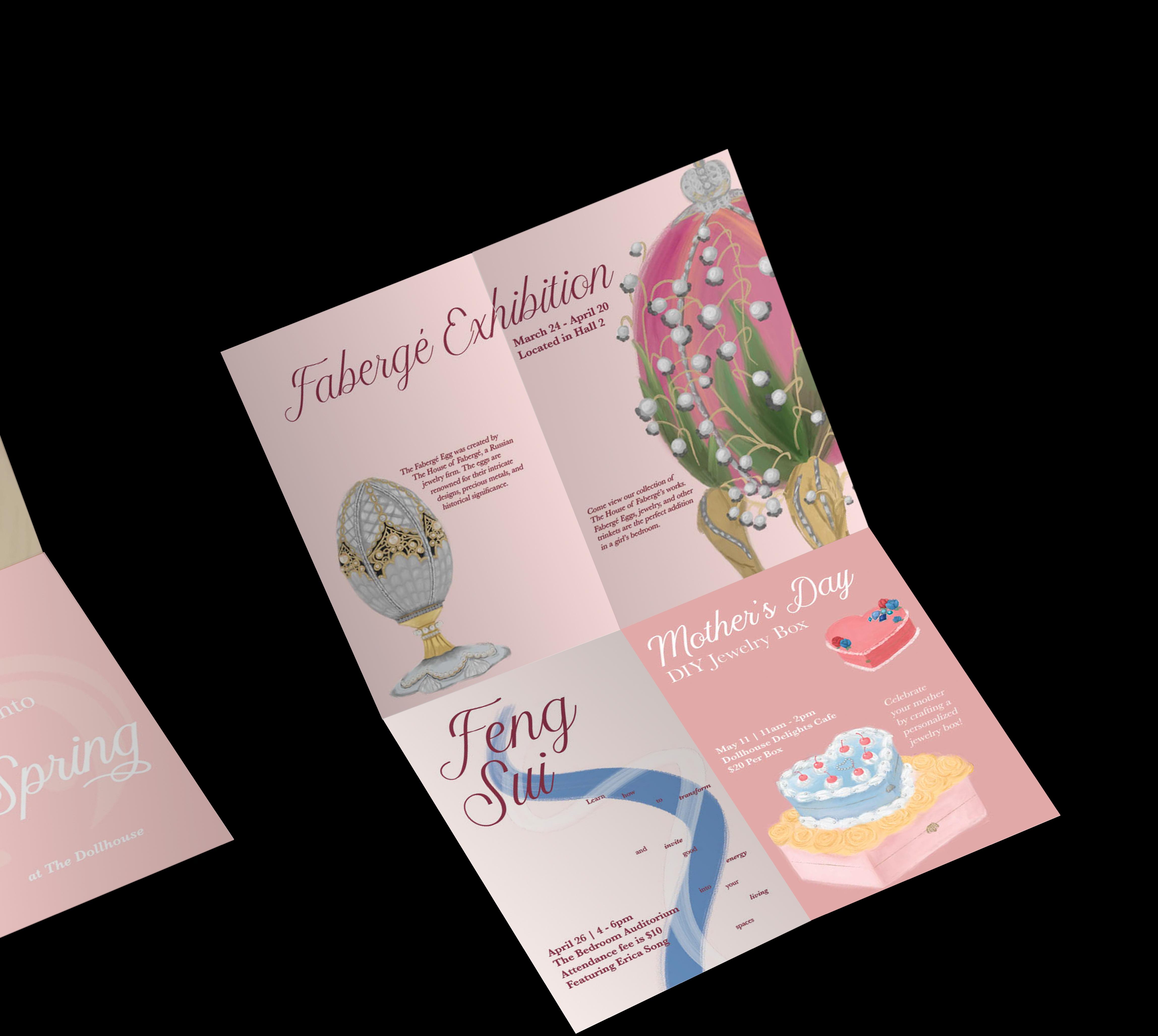
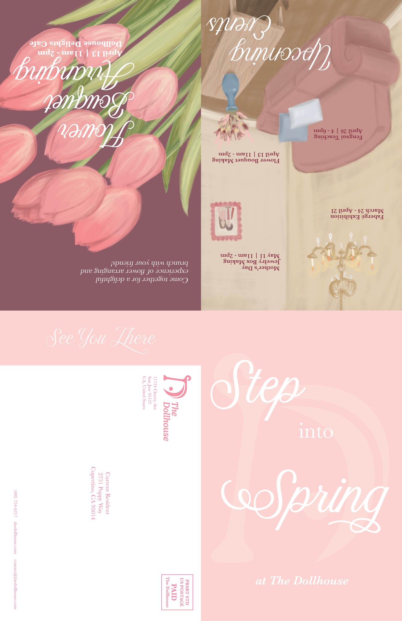
These self-mailers are intended to promote our company and events to residents nearby. These guidelines can be changed according to the new designs but need to align with standard mailable sizes.
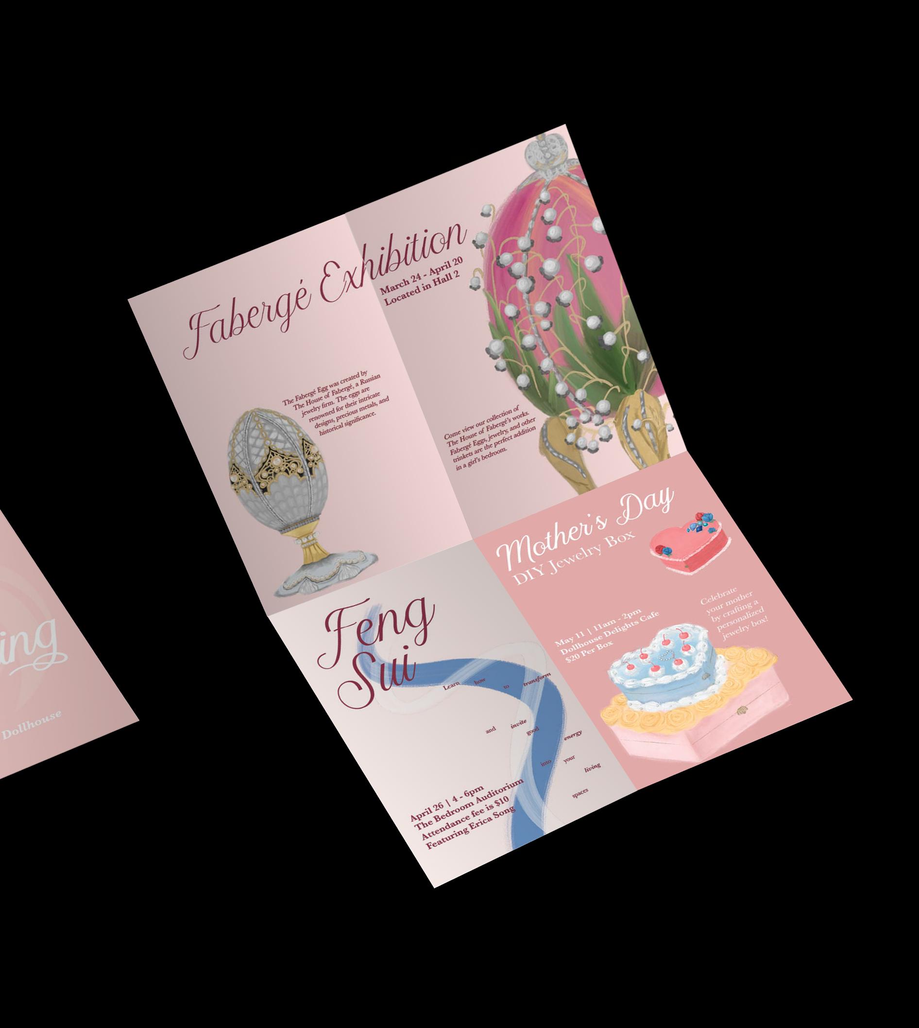
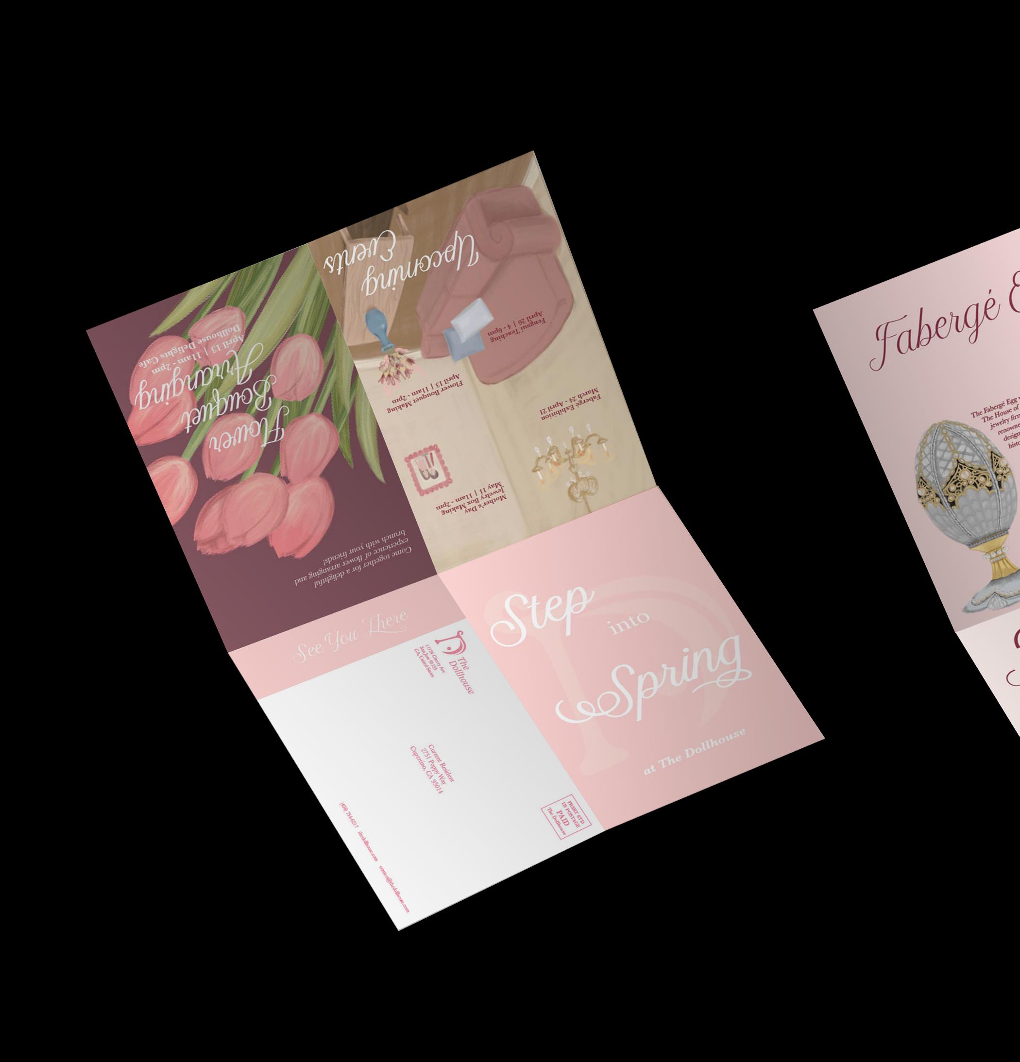
11
Frontside
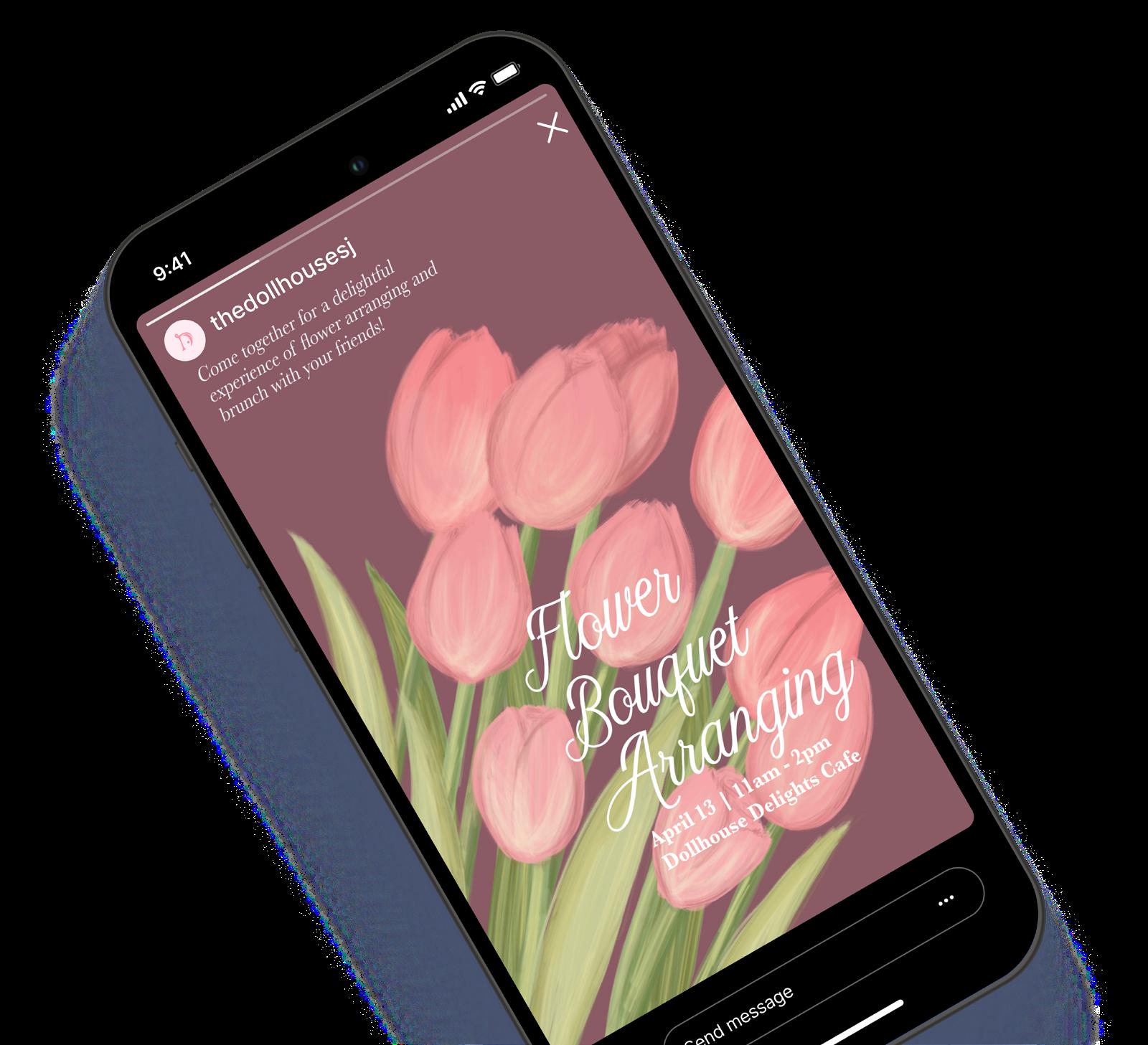
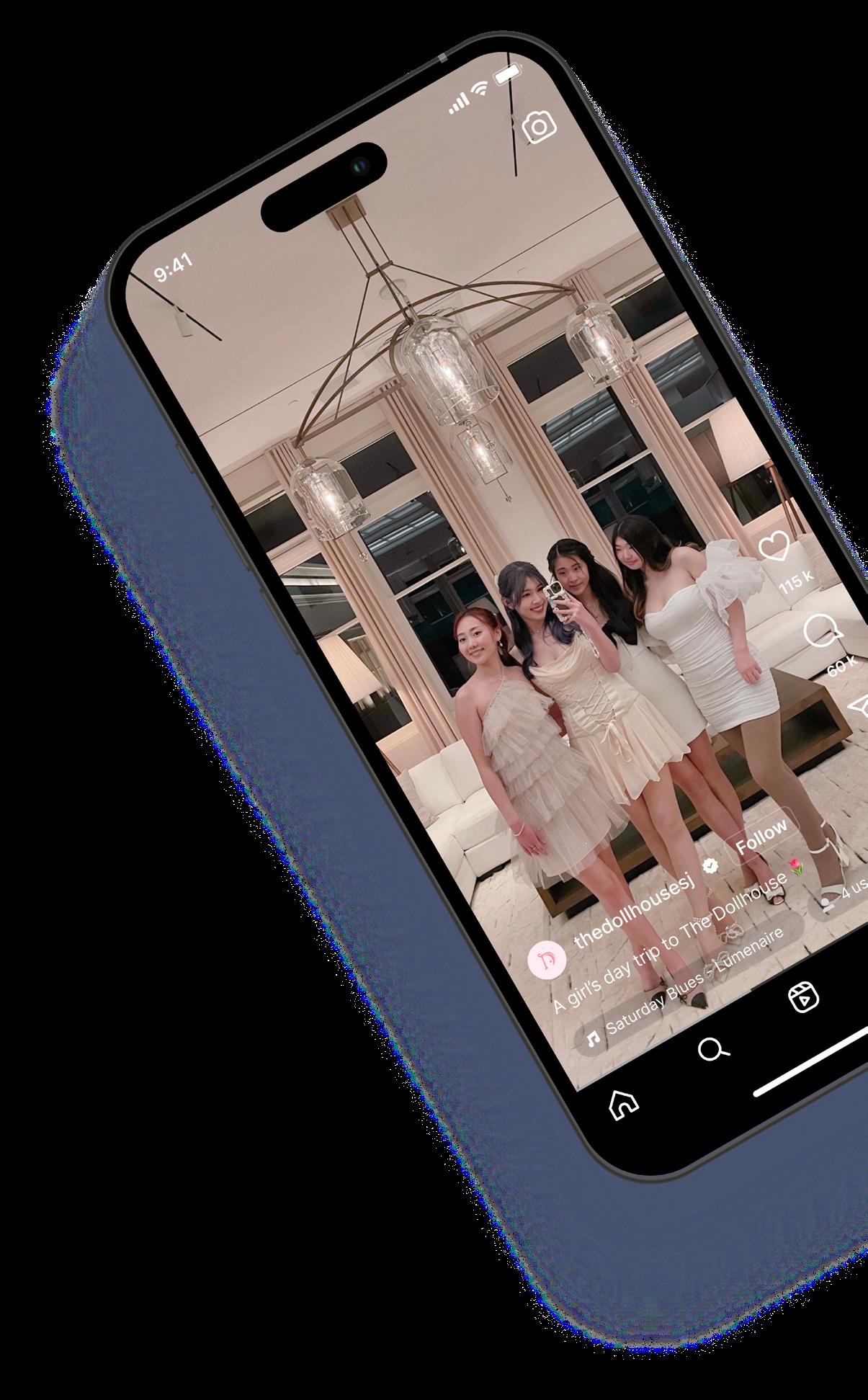
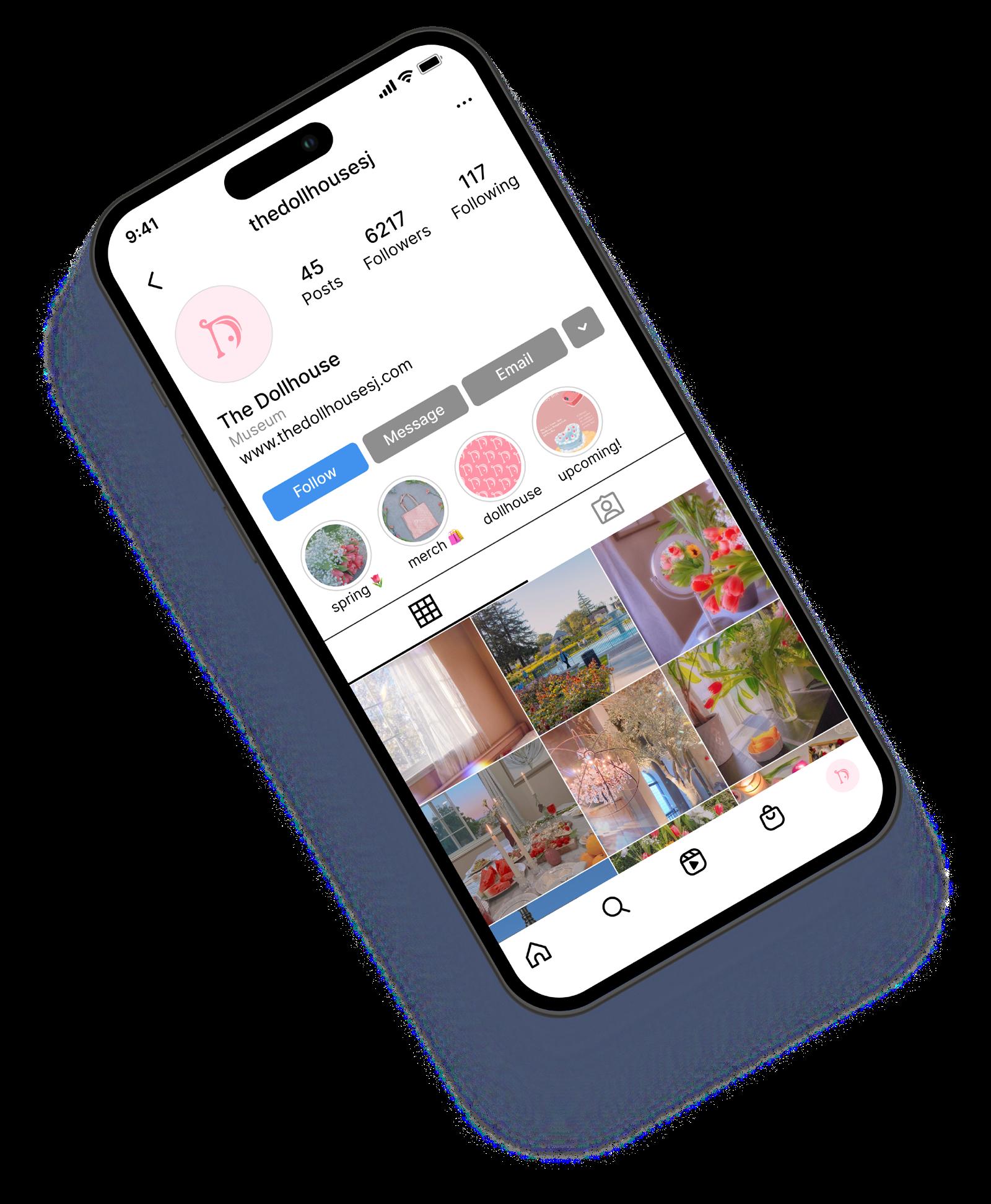
Our social media accounts displays photos, exhibit details, and upcoming events. It’s a place where we can connect with our community and provide easily accessible outreach.
Staying on top of social media trends and ways to expand our business is a high priority. Our Instagram gets updated frequently to inform others about events and exhibits. We also utilize sponsorships to show our content to reach a wider audience.
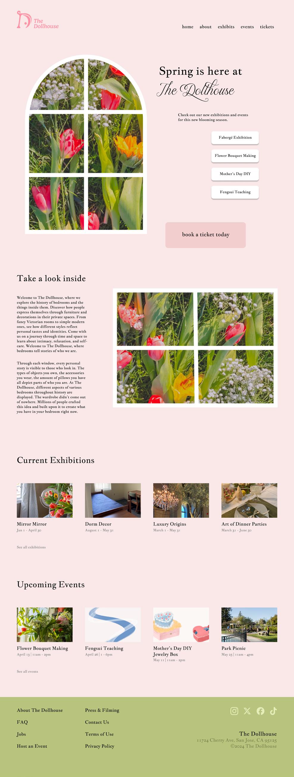
This website is for people to learn about our museum, book tickets, read exhibit articles, and learn about our community events. Our website must be easy to use, organized, and stylized to represent the feminine nature of our brand.
This homepage is customized for the spring season. The format and layout stays the same as we feature new exhibitions and seasons on our homepage. The photos behind the window outline will change along with the written content. The ‘Current Exhibitions” and “Upcoming Events” stay where they are throughout the seasonal updates.
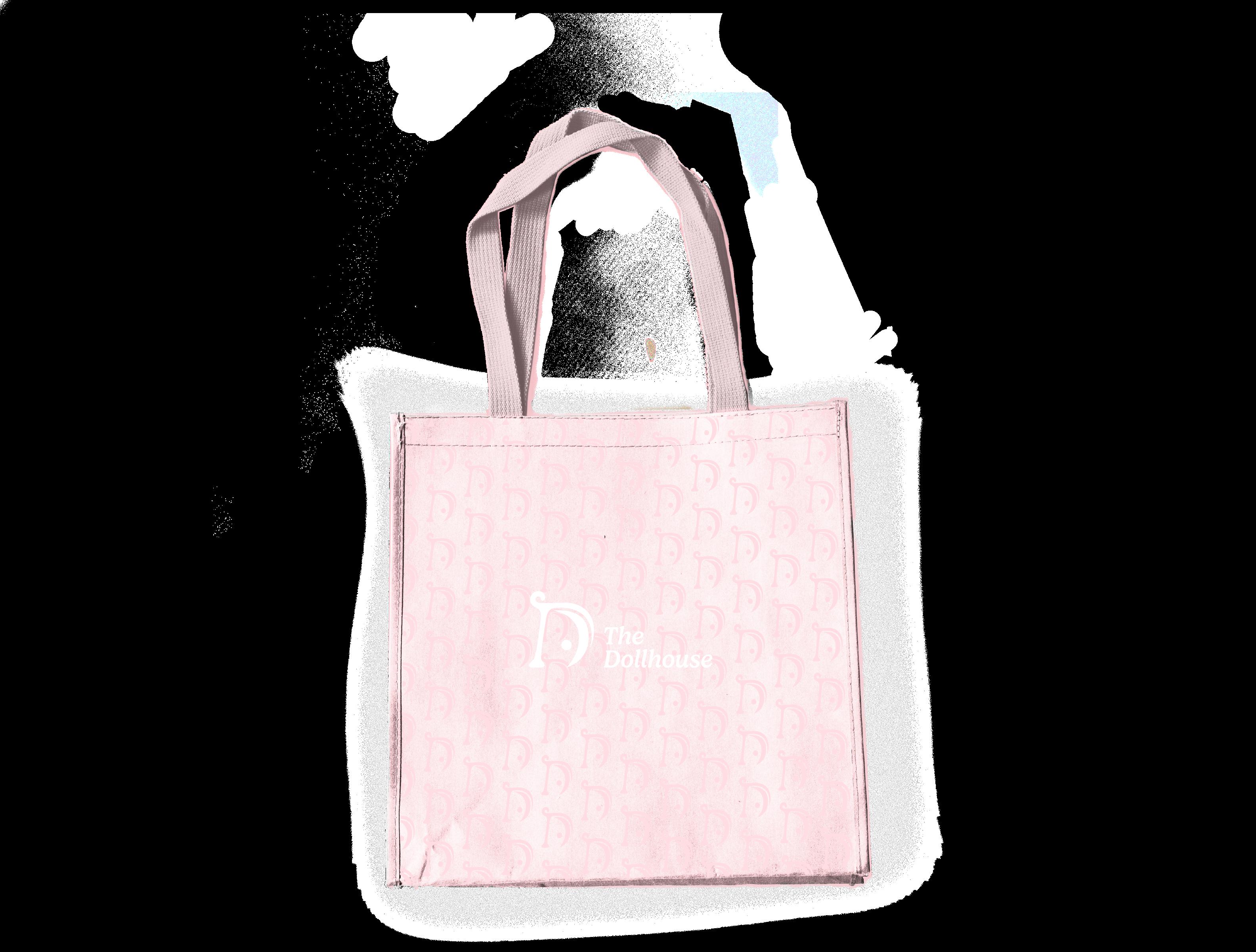
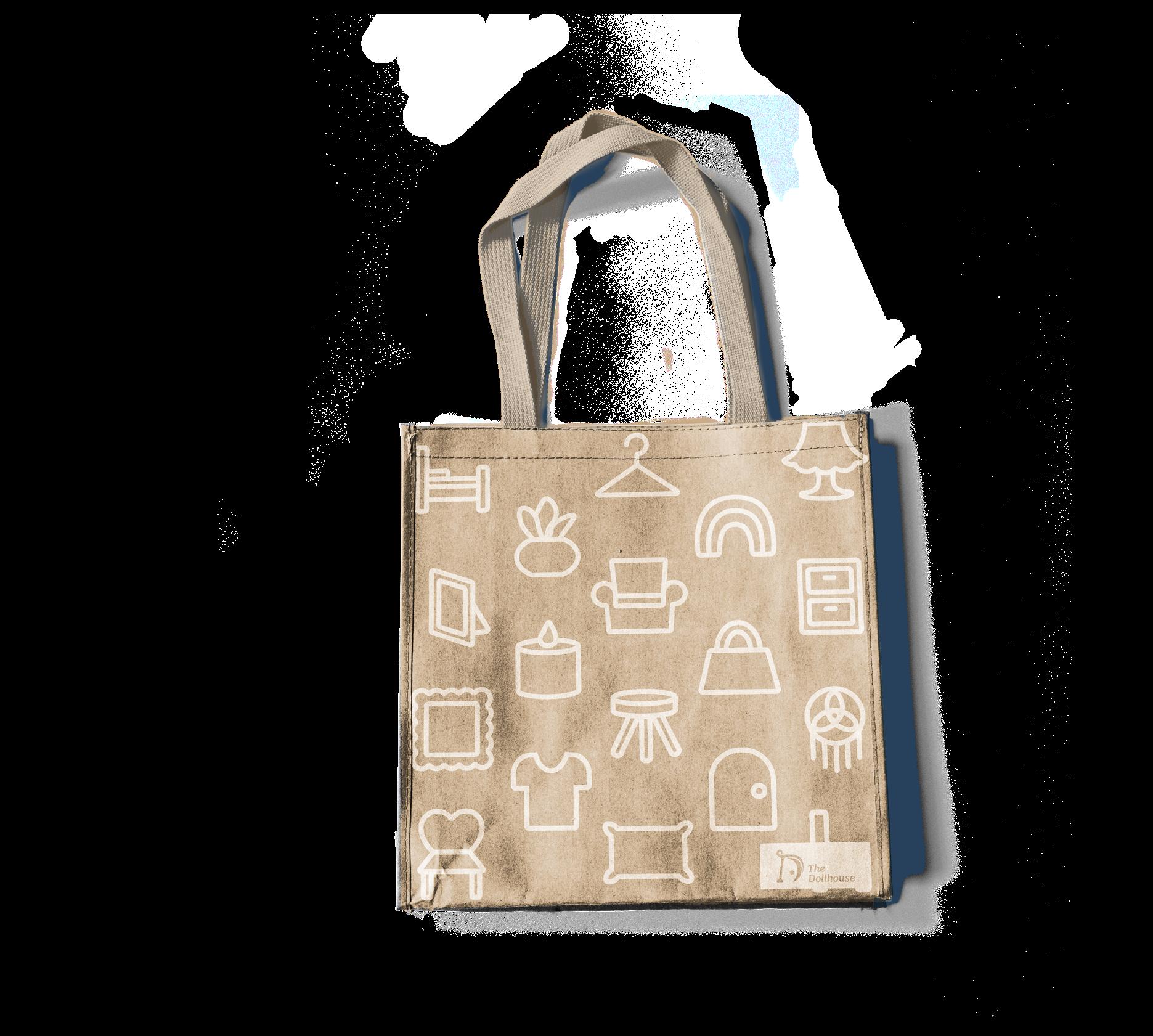
These tote bags showing our brand and logo will be sold at the gift shop. These tote bags are a great way for guests to promote our museum as they wear our logo out. Our two designs create variations so guests can choose which style they prefer. We value aesthetics when applying our brand on merchandise because it provides a
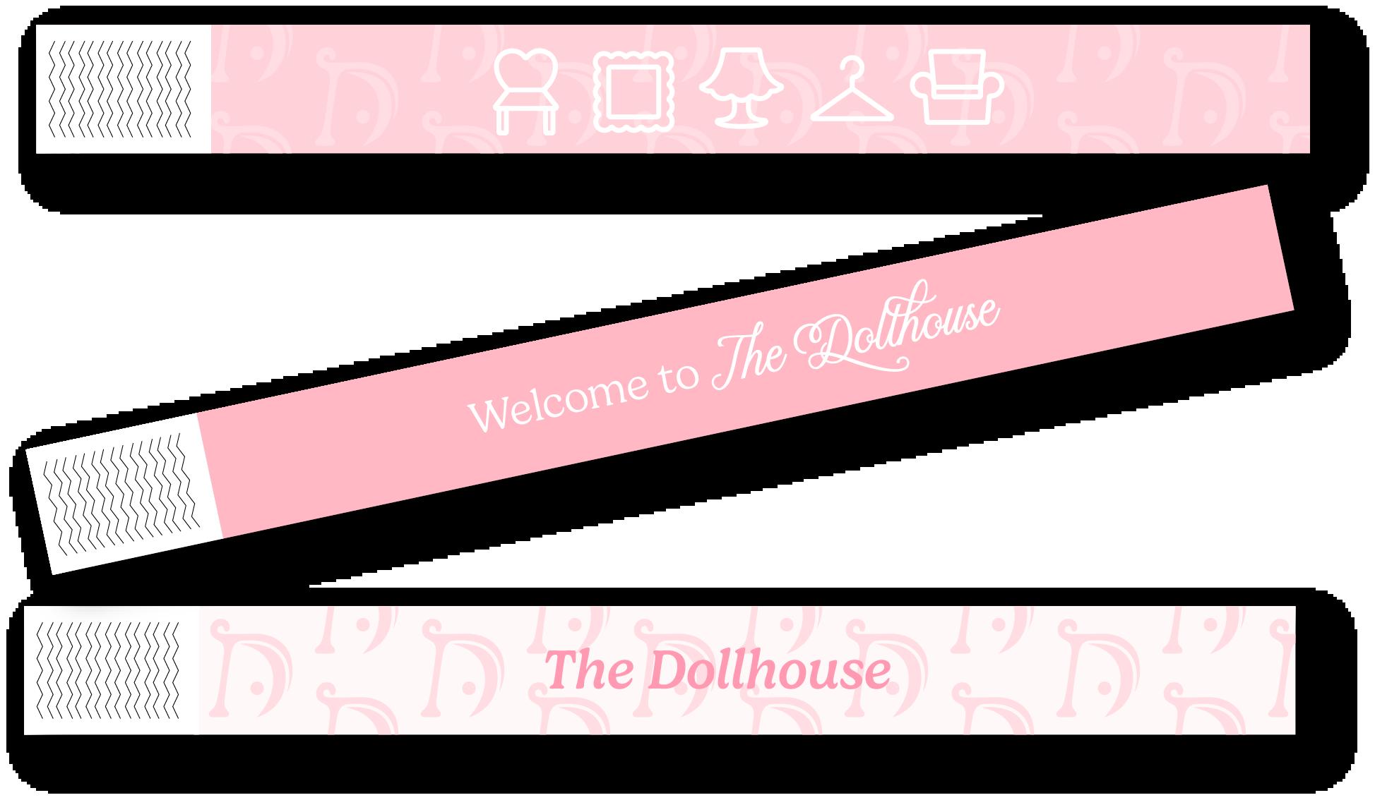
When guests buy a ticket or check in with their onlined purchased ticket, they will receive a wristband to wear throughout The Dollhouse. This wristband is proof of their ticket purchase and the design of it displays our brand with other decorative elements.
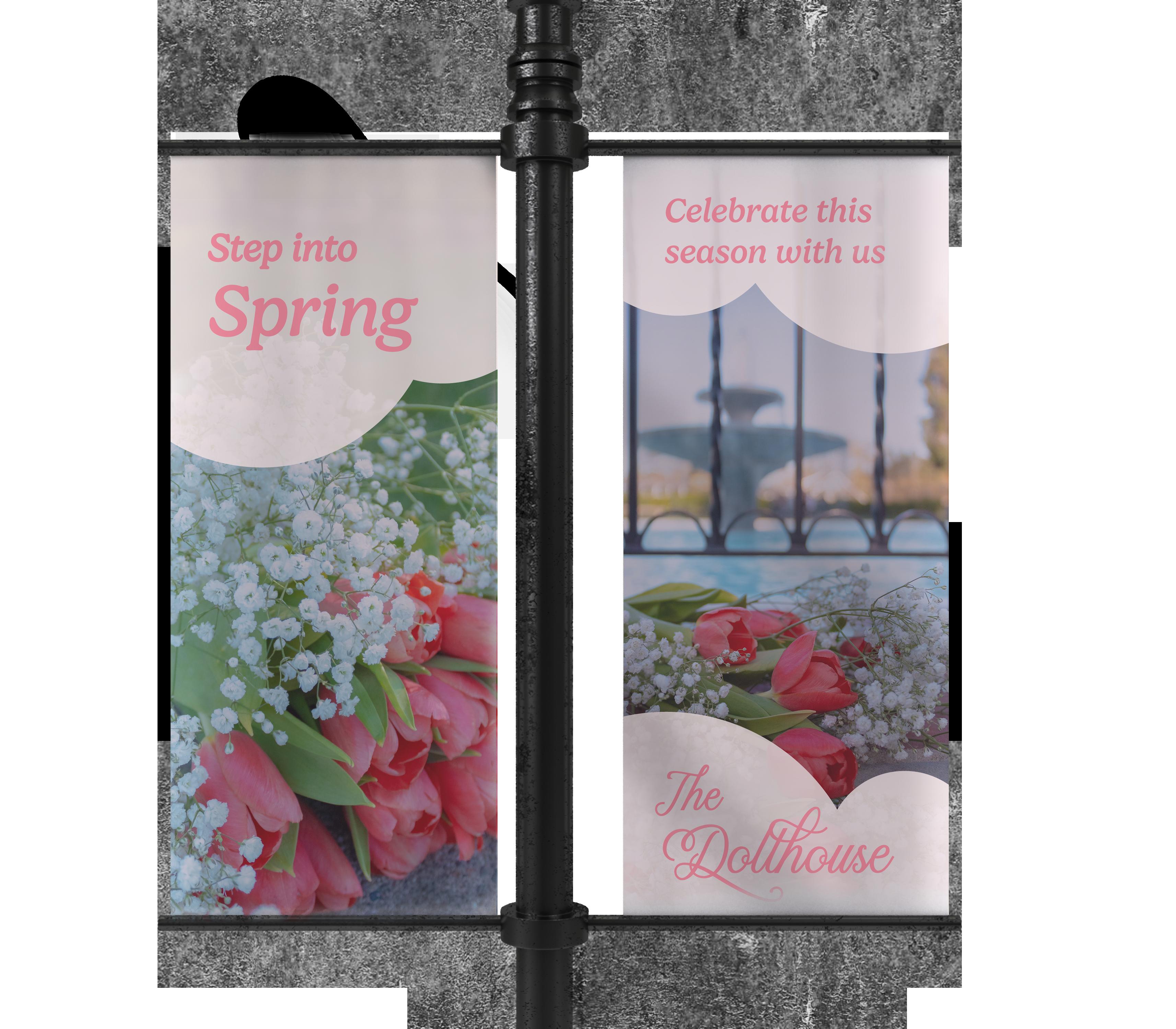
Banners are a great way to publically promote The Dollhouse in local areas. Our banners change according to our seasons, exhibitions, and events. We encourage creativity while keeping our brand guidelines and aesthetics to market our museum and encourage attendance.
This lamp post banner promoting our spring season uses aesthetic flower photography to incite curiosity in viewers to make them wonder what ‘The Dollhouse’ is.