DRAWING IN TIME LUCIA KAISER ART 1600-206
1
1. TABLE OF CONTENTS 2. INTRODUCTION 3 - 4. ON SIGHT SKETCHES 5 - 6. THUMBNAILS 7 - 8. REFERENCES 9 - 10. FINAL IMAGES 11 - 12. DETAILS 13 - 14. REFLECTION
2
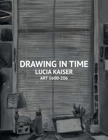
For my project, I painted the arched window in my dorm room at three different times of the day. Two paintings were from my perspective inside my room looking out, while the third is from outside looking in. Because I live on the first floor, these windows become an aperture to the movement of daily life around me.This project highlights the movement and routine of life while noticing the beauty in mundane details.
INTRODUCTION
TABLE OF CONTENTS
w
ON SIGHT SKECTHES
3
4
I chose this space not only because of its accessibility to me but also its innate beauty of simplicity. I spend a lot of time at my desk, and something about capturing a glimpse of my routine in my space felt very special. I love my arched windows as they open the room with their vastness while providing beautiful natural light. My perception of the space became more appreciative and intentional as I noticed many stunning elements in the monotony.
THUMBNAILS
5
6
I wanted to highlight the transformation of movement in the three different paintings, as in the morning, minimal motion occurs in and outside the room. Movement reaches its peak midday as my roommate and I are up and about, and so are those outside. The dorm takes on many roles of a bedroom, kitchen, workspace, and entertainment room, but the paintings specifically focus on where I spend the most time: my desk.
REFERENCES
7
One artist who inspires me is Paul Heaston, who primarily creates sketches of his daily observations. While his sketches capture many details, it isn’t muddy or overwhelming. His color palette was similar to the one in this assignment, and he helped me explore depth and shadows through grayscale.
8
A place I constantly draw inspiration One painting I drew inspiration from from is The New Yorker magazine, was Night Windows by Sally Storch especially this cover from August due to its large paint strokes but 30th, 1976. The way it features the emphasis on the different lights and view from outside the window while shadows. Its composition is intereststill highlighting the space in front of ing, too, as the detailing in the foreit brought me great inspiration. While ground decreases as light descends this work is in color, the contrast to the background. between the coolness outside the window and the warmness inside the space fascinates me.
10
FINAL IMAGES
9
10:00 AM
3:43 PM
8:38 PM
My final pieces were created using Liquitex acrylics on a 7x14” canvas.
DETAILS
11
I wanted to choose a medium I could layer and manipulate and thought that acrylics would be the best choice. I also wanted a long canvas to emphasize the window’s proportions, so I chose a 7x14” canvas. I knew I wanted to paint in a way that captured the light and depth of the space while not being hyperfocused on details. With the paintings in black and white, I knew I wanted to use larger brushes to have larger strokes and a focus on color blocking.
12
The dominant light shifts from natural to artificial as the day passes. In the morning and afternoon, the light from the window flows into my dorm and illuminates it completely. Because my window faces east, the sunrise fills my room with light in the morning. However, this differs from the night as artificial light from my lamp is the dominant light that illuminates the sidewalk outside.
REFLECTION
13
As these pieces were the first of the semester, there were a lot of learning curves and experimenting. I got more comfortable utilizing acryllic paint when it comes to maximizing details. I also attempting to go outside of my comfort zone with paitning in a more colorblock style using larger brushes instead of smaller ones. This project also allowed me to work and reflect on my time management skills as I had to complete these three images in about two and half weeks.
14
I wanted to focus on the dual perspectives of the window as I see people pass, but they see me as well existing in my space. I also wanted to emphasize the natural light through the window that illuminates the room and how that contrasts with the warm glow of the artificial light that the lamp provides at night. This project forced to me to observe my mundane spaces I occupy frequently with a fresh and intentional eye to realize the beauty in simplicity.
ART 1600-206
LUCIA KAISER
DEPERSONALISATION
1. TABLE OF CONTENTS 2. INTRODUCTION 3. VISUAL RESEARCH 5 - 6. COLOR 7. MIND MAP 8. INFLUENCES AND INSPIRATION 9 - 10. MATERIAL TESTING 11 - 12. FINAL IMAGES 13 - 14. DETAILS 15 - 16. REFLECTION
2
For the monochromatic mundane drawing, I focused on a space that I occupy frequently but gives me mixed emotions: a car. Being in a car is a conflicting experience as it causes anxiety for me, as I do not like driving, but it also can be a place of comfort, like when my parents are driving, and we are listening to music. This piece comes from the perspective of someone in the car’s back seat looking at themselves in the rearview mirror. It conveys a sense of anxiety and fear as the waves push from the center, and the subject starts to become depersonalized, losing control and separated from the experience around them.
INTRODUCTION
TABLE OF CONTENTS
1
VISUAL RESEARCH
3 4
COLOR SELECTION
5 6 Color
8
MIND MAP
Katherine Akmulun, 2021
Jess Chung, Youtube, 2021
Caleografia, Tumblur, 2021 I initially chose this perspective from a screenshot of a video I took sitting in the back of the car as my parents were driving, trying to capture what a beautiful moment it was. As this was my first time using gouache, I turned to YouTube for help and found that Jess Chung had a great video explaining the steps. I was also heavily inspired by Katherine Akmulun’s gouache work in her sketchbook and how she utilizes color blocking and contrast to convey a fascinating visual composition. I was also influenced by the user Caleografia on Tumblr and their specific black and blue piece with gouache, as it aided me in utilizing black and white while shading the blue.
INFLUENCES / INSPIRATION
7
MATERIAL TESTING
9
10
When first using gouache, I had difficulty figuring out how much water should be added and the effects of applying the paint. My first attempt on a mixed-media drawing pad is pictured on the left. I found that the paper was too thin and curled when it got wet. I also discovered that the most watered-down version of the paint should be applied first and then built upon. I also experimented with alcohol markers for the swirls in the center. After I was happy with my second attempt’s paintwork and marker work, I felt it lacked depth and decided to add colored pencil on top. Pictured above are my tests for which colors would look best on top of the markers and how the two mediums interacted.
FINAL IMAGE
11
12
My final piece was created on 11x14” watercolor paper using Winsor and Newton gouache paint, Caran d’Ache colored pencils, and Prismacolor art markers.
DETAILS
13
The eyes staring at the viewer through the rearview mirror highlight the feeling of unsettlement and anxiety the subject is experiencing. The facial expression of the eyes is conflicting as they could be shocked, fearful, or even nervous. I wanted the eyes to be the center focal point of the painting while presenting greater detail than the rest to contrast with the blurriness of the arrangement. There is also an emphasis on how the most detailed part is the smallest.
14
With the layered cross-hatching effect pictured above, I wanted to give it the perspective of tunnel vision and a sense of uneasiness. With the swirls growing increasingly inconsistent, there is an emphasis on the anxiety the subject is feeling. The detailing in the car also shows a blurry navigation screen, showing the subject has no control over where things are going.
REFLECTION
15
Through this project, I could experiment with different mediums like gouache and colored pencils while also pushing myself to do so in a monochromatic color palette. This project gave me a greater sense of awareness for the spaces I occupy, no matter how mundane they may seem to be.
16
I also pushed myself past what I usually create, which is highly detailed work, and went more abstract and conceptual. I am very pleased with the piece’s overall composition and found my confidence grew more as I successfully learned how to use a new medium and create something I am proud of.
OWED BEAUTY
LUCIA KAISER
ART 1600-206
1. TABLE OF CONTENTS 2. INTRODUCTION 3. IMAGES 5 - 6. TRANSLATION 7. NOTES 8. INSPIRATION 9. DRAWING 10. DETAILS 11. NOTES 12. INSPIRATION 13. OBJECT 14. DETAILS 17 - 18. REFLECTION
2
For this project, I wanted to focus on owed beauty and how women may feel pressured to sustain painful measures to maintain their outer beauty. I wanted to emphasize how this way of thinking was enforced by societal norms even since childhood. The theme of girlhood was what I had in mind going into this series of projects, which is why the Barbie shoe is featured throughout, posing a metaphor for how women are the dolls of society constantly having to dress and perform to the standards of the current culture.
INTRODUCTION
TABLE OF CONTENTS
1
4
IMAGES
3
30 Images from photoshoot
TRANSLATION
5 6
8
With this in mind, I staged a photo shoot with my friends to highlight typical girlhood and femininity, featuring makeup, high heels, magazines, and light pastel colors. For the translation, I wanted to find a universal symbol for femininity, where the Barbie high heel came into view, as it also commented on the young girl aspect of this concept of owed beauty. I also used a ball-jointed foot to make the Barbie foot more obvious. This Vogue magazine cover from 1967 and its editorial style of composition heavily inspired me. Instead of having a physical woman as the subject I wanted a more metaphorical subject of the heel itself.
INSPIRATION
NOTES
7
10 This Barbie wears a bandaid, commenting on the physical and emotional pain women experience when they feel pressured to perform with their beauty. I painted the sides with pages to create the illusion that the canvas is a book or magazine with the spine stating “Owed Beauty.”
DETAILS
DRAWING
9
A barcode is also in the bottom left corner to create this illusion further and comment on a highly capitalistic society. My final piece was created on a 6x8” canvas using Liquitex Acrylic Paint.
12
One influence was the sense of unconventional fashion, which serves a role other than its traditional functional purpose. An example of this is Lady Gaga’s lobster shoe and how it is still technically a shoe but not entirely functional.
I thought the idea of covering the entire shoe with little shoes would complete this goal as the shoe could not be worn comfortably but could still be worn.
INSPIRATION
NOTES
11
14
I wanted the buckle accessible so the shoe could still be worn.
My final piece was created using a womens size 8 heel with 300 Barbie shoes and hot glue.
With different layering of the shoes on the strap, I wanted to create a thick and heavy layer of plastic onto the original shoe. I wanted to cover the sole and the heel so that it would be uncomfortable to actually wear the shoe. I also made sure that no two kinds or color of shoe touched.
DETAILS
OBJECT
13
REFLECTION
15
This project allowed me to work on my creativity and translation skills, working with one image and developing two projects from it. I created two pieces I am very proud of because of their assembly and more profound meaning within societal issues. Creating something that commented on my feelings about womanhood and femininity was freeing and allowed the project to be rooted in truth.
16
It was also fun to feel this youthfulness again by using the Barbie shoes and recognizing some I used to own as a kid. Everyone who encountered these projects could immediately see the connection between social pressures on women and the use of the Barbie shoe. I learned more about how I should organize my thoughts throughout the creative process and how that can help my ability to translate from a single source.
EXTRA CREDIT
17
Performance link: https://drive.google.com/file/d/1mC6lmwACnhE3KbYv2zhIMkyRL6LA35Zt/view?usp=drive_link
18
18