4 minute read
Brush of Diva


d e nergy and intrigue to your home with jewel tones . d A
Written by Staci Perry Mergenthal
A BRUSH
OF DIVA
From rich emerald green to vibrant ruby red, jewel-toned colors are seemingly everywhere in interior design today. When done correctly, adding jewel tones to your home can create an elegant, classy space that brings your personality to light.
We dropped in on Wendy Doornink of Hirshfield’s to find out how the color specialist and Realtor helps homeowners incorporate these trending pops of color to their homes.
“I see this movement of jewel tones add richness and luxe in places where people just want to embrace a feeling of warmth and intrigue, a little mystery and differentness,” Doornink says.
SOPHISTICATED SHADES
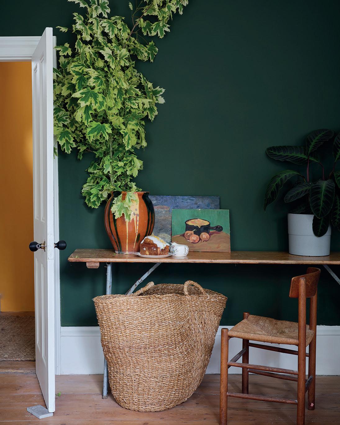
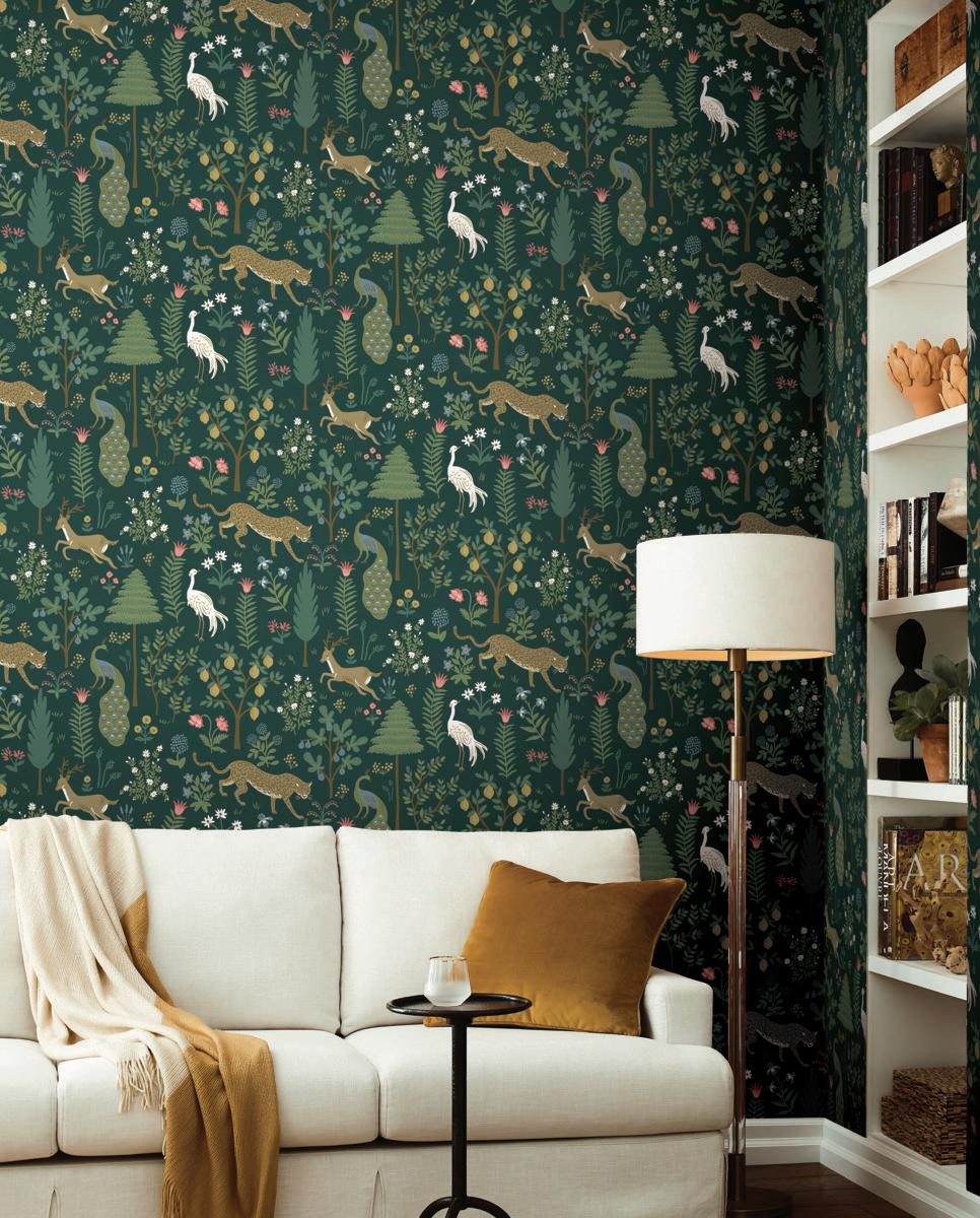
Emerald green is having a huge moment and is appearing on cabinetry, wood wainscotting, accent walls in bedrooms and entire powder bathrooms. It corresponds to the trend of incorporating natural colors into our environment. Green is healing and calming, the color of growth and renewal.
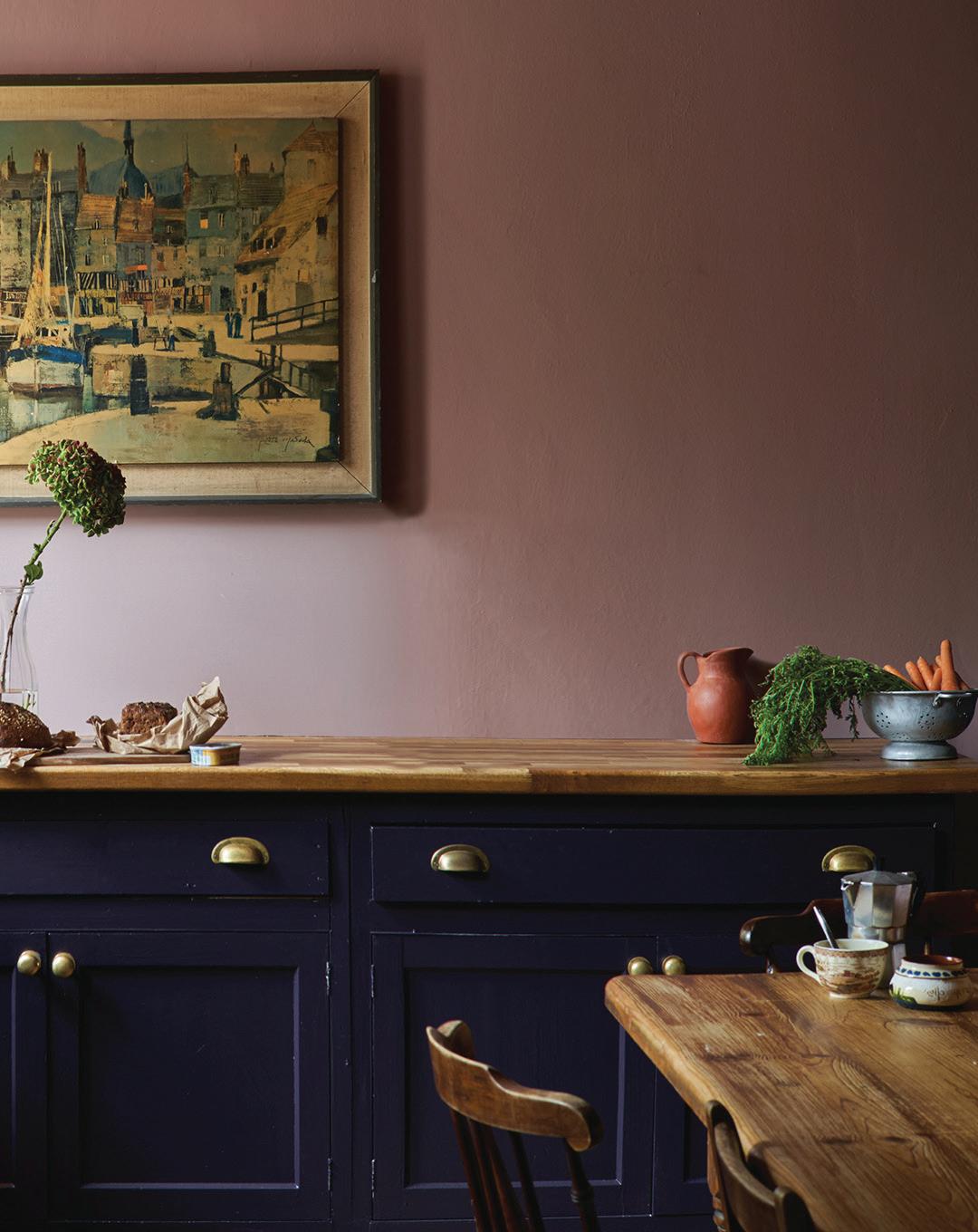
Cerulean or sapphire blues are timeless, and, as crisper and clearer colors, can add energy in addition to anchoring the room. Blue cabinets are almost a staple in design at this point, and bolder colors stand out from the norm.
Citrine, a yellow tone, is a stronger color personality and should be added with care so as not to overwhelm a space. A great place to start with this tone is in décor like pillows, artwork, bedding, curtains—things that can be added in smaller quantities.
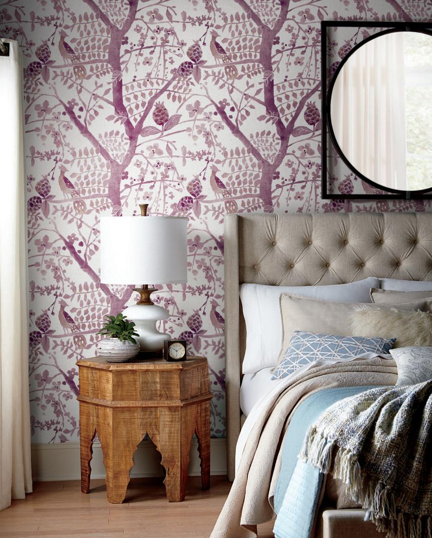
Amethyst tones are grayed-down versions of red that lean a bit purple but not too much. To find the right jewel tones, look for natural colors—ones that feel like they could
Hirshfield’s, 1975 Annapolis Lane N.; 763.577.9864; hirshfields.com Hirshfields @hirshfieldspaint Hirshfields @hirshfields

have been created naturally, like dyeing cloth with beets. These colors feel comforting, homey, easy and true. Amethyst falls perfectly into that category.

GETTING IT RIGHT


Jewel tones are a perfect choice for people tired of homes full of neutrals and ready for vibrancy and energy. Doornink notes that breaking the style norm is good, but there’s a right way to do it.
Pick one color as your main jewel tone and accent with the rest. “You’re usually drawn to one or two. Use one for your main accent walls and bring the rest in soft décor like furnishings, chair covers, rugs, pillows, drapery and couches,” Doornink says.
Avoid using strong colors throughout. It’s overwhelming and makes your house feel small, even with good lighting. “There’s usually one star of the show—one color that’s dominant and the rest of the colors are supporting players,” Doornink says. “You have to let the diva be the diva.”
Test a swatch before committing. Paint two coats on a swatch on your walls, and look at the color at the time of day you’re going to spend the most time in that room. “Every room feels different—a north facing room feels so different from a sunny west in the afternoon,” Doornink says.
Don’t go too bright. Once you get it on the wall, color shines like crazy. “I have a saying, ‘When in doubt, gray it out,’” Doornink says. “Make it more gray than you think, and it’ll still come through with a lot of color.” She also recommends using a matte or eggshell paint instead of a satin or semi-gloss when painting with jewel tones.


Gentle & effective care...so you can enjoy life…and live well! Here to serve you Safely and Effectively in 2022!


Chiropractic • Massage Therapy • Acupuncture


WINNER BEST
OF
’22 763-420-8595
7237 Forestview Lane N. • Maple Grove, MN 55369 www.bromanchiro.com
PREFERRED SBA LENDER.