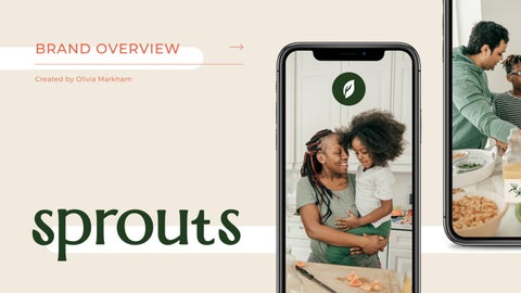
BRAND OVERVIEW Created by Olivia Markham
Design Rationale SPROUTS REBRANDING
Harvesting Happiness Organic, Fresh, & Natural Sustainability + Zero Waste Open to families and singles Friendly & focused on your health
Brand Overview Sprouts are getting a facelift to the visual and amping up our messaging to reach more people and do more for the planet. Our visuals will be giving Sprouts a more approachable and contemporary look. Our new messaging will include the old messaging but adding the emphasis on sustainability.
ORGANIC, FRESH, NATURAL, & SUSTAINABLE.
Brand Voice The rebranding is created to bring more young adults and families to the store, as well as, introducing the new messaging. The style is moving into the contemporary age with new colors, typefaces, icons, and imagery.
#223D1E
#BECD40
#F1EBDF
Colors
#C4812F
This is the color palette for the rebranding. These colors are used throughout the entire rebranding.
#F7B178
#EB6345
Typefaces
OUR OFFICIAL TYPEFACE These typefaces are to be used for all Sprouts rebranding.
Marcellus
Montserrat
Aa Bb Cc Dd Ee Ff Gg Hh Ii
Aa Bb Cc Dd Ee Ff Gg Hh
Jj Kk Ll Mm Nn Oo Pp Qq
Ii Jj Kk Ll Mm Nn Oo Pp
Rr Ss Tt Uu Vv Ww Xx Yy
Qq Rr Ss Tt Uu Vv Ww Xx
Zz 1 2 3 4 5 6 7 8 9 0
Yy Zz 1 2 3 4 5 6 7 8 9 0
New Logo
Logo Variations
Horizontal
Icon Presentations are tools that can be used as lectures and more.
Logo Variations Horizontal
Icon
THE SAFE DISTANCE TO PUT YOUR LOGO IN
Exclusion Zones It is crucial to keep padding around the logo and icon to ensure the success of the logo identification.
Icon Positioning
Square
Landscape
THE SAFE DISTANCE TO PUT YOUR LOGO IN The logo can be placed based on where it is best suited depending on application and tone.
Portrait
Useage
DO NOT change the color. Use only the colors in the palette.
RULES ON LOGO USE TO KEEP IN MIND
DO NOT crop
DO NOT add shadows
the logo.
or effects.
Useage
RULES ON LOGO USE TO KEEP IN MIND
DO NOT rotate
DO NOT put over
DO NOT use tint
the logo.
another illustration.
or opacity.
Logo Application THE RULES ON PROPER POSITIONING
When applying the logo to digital space make sure the background highlights the logo and allows it to be seen.
Imagery REBRANDING PHOTOGRAPHY
These are the photographs to be used for the rebranding. More is located in the folder.
Sprouts Rebranded WWW.SPROUTS.SQUARESPACE.COM