1 minute read
Graphic Design


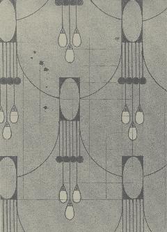
The graphic design produced by the Wiener Werkstätte followed the same rules previously established: the abstraction of nature with an emphasis on manipulating inorganic shapes. However, since most of the graphics produced by this department were for posters, organic shapes were not as heavily looked down upon and, in fact, complemented the geometric layouts. While not as popular commodities as the woodworking and furniture making areas of the Workshops, graphic design was still an important part of the further development of all the different sectors, as they applied the concepts in their purest forms—one that could be converted to various other mediums—and acted as the primary mode for the shift from Art Nouveau.
Advertisement
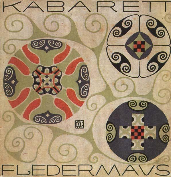
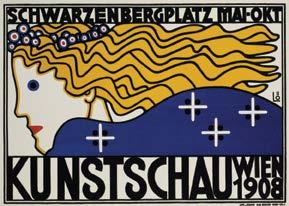
Designs for posters often relied on the use of swirls, something not as widely seen in woodworking and textiles. The curling of the strokes followed one of two options: close and thick—imitating a circle, or thin and wide—reminiscent of the Fibonacci spiral. Berthold Löffler’s poster for Kabarett Fledermaus (1908) displays this with the sans-serif type he uses incorporating the swirls into the letters themselves. This contrasts Carl Otto Czeschka’s cover of Program I, Kabarett Fledermaus (1907), as it incorporates the swirling patterns into the background of the image instead. The style that Löffler adopts for the faces he depicts on his posters are a staple of the Workshops, as he also uses it in works not associated with the Kabarett Fledermaus, as seen in his poster for Kunstschau Wien 1908 (1908).