CARTIER
Leonard Joel presents an extraordinary collection of rare Cartier jewels and precious objects for private sale, dating from the beginning of the 20th century to the early 2000s, and sourced from leading international collections. Available exclusively through Leonard Joel, the collection will be unveiled at a series of invitation-only preview events in Sydney and Melbourne during late August and early September.
To register your interest, please contact events@leonardjoel.com.au
Welcome to issue 123 of Leonard Magazine.
In this issue, we explore the remarkable life and work of the pioneering artist Nora Heysen, from her wartime service to her quietly observed interior scenes. We visit the studio of master silversmith Fortunato “Lucky” Rocca to reflect on an incredible career of over 50 years, including the creation of the iconic Melbourne Cup. We also discover how three ambitious brothers built a jewellery empire and look at how Gilbert Albert warped traditional watch design.
We also delve into interior design pattern books from the late 19th century, make a case for the appeal and usefulness of big bags, and learn about the history and significance of racing colours.
Please enjoy these stories and many more from our specialists and guest contributors.
features
Antiques in the Mist
Threads of Victory: The History and Heritage of Racing Colours
Cartier: The Family that Built a Jewellery Empire
Living Large: The Return of the Big Bag
Pinned for Purpose: The Brooch as a Personal Statement
Watch Weird Wave: Gilbert Albert Shakes Up Classic Watch Design
Colour in 19th Century Interior Design A Year of Extraordinary Collections
Nora Heysen: A Pioneer in Art and Life
Beyond the Landscape: How Dorrit Black and Grace Crowley
Helped Introduce Modernist Ideas to Australia
In Conversation with Monica Curro A Closer Look at Black Opals
Shearer in Wool
in focus
From the Workshop: Fortunato “Lucky” Rocca: In Silver and Gold
Five Minutes with Anna Akacich
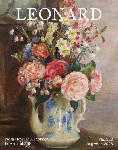
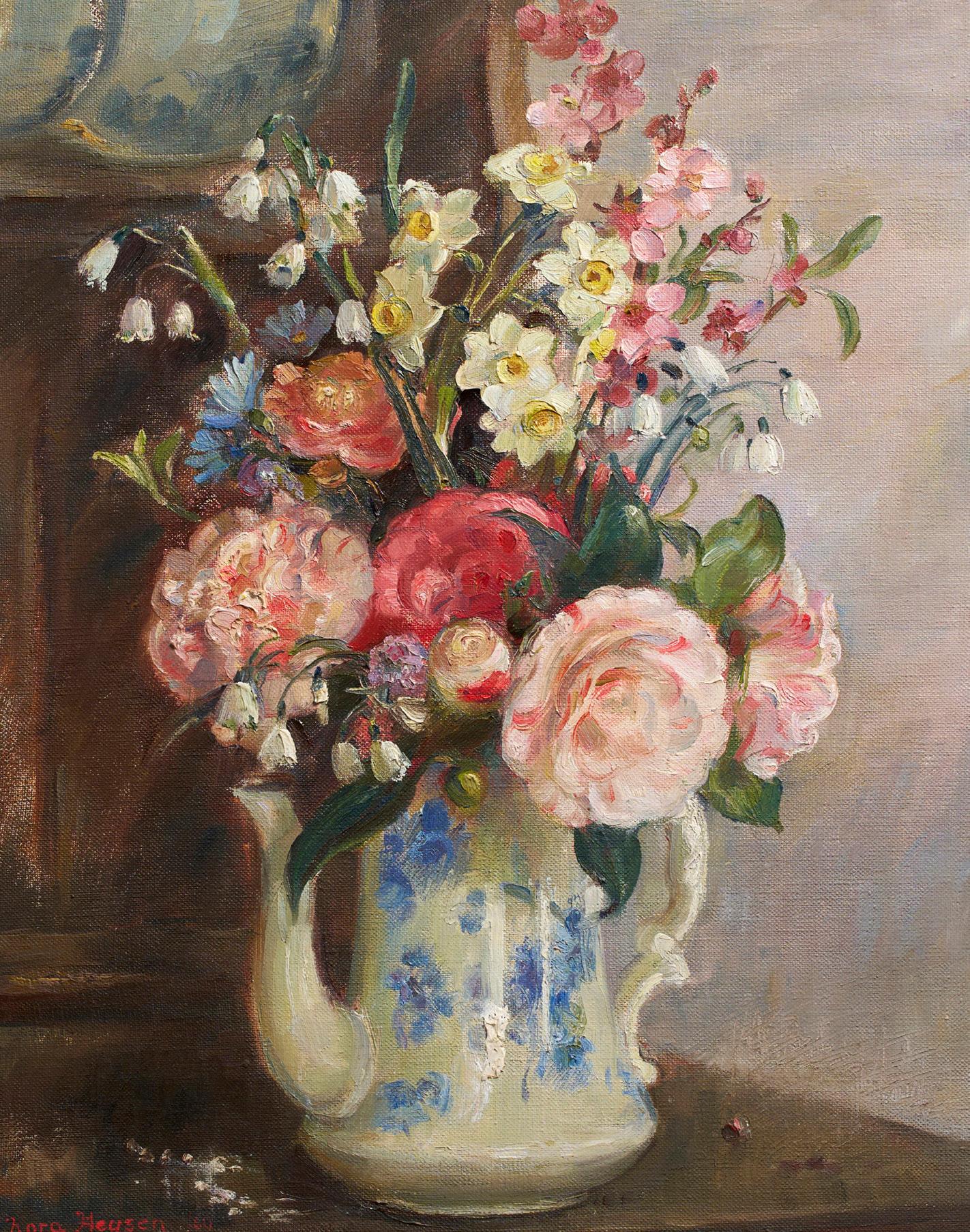
cover: Nora Heysen (1911-2003) (Still Life) 1960 (detail)
on canvas, 55 x 45cm
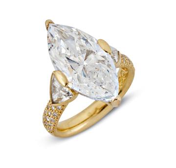
$20,000 – 25,000 Women Artists Auction Monday 14 September below: Magnificent 10.06ct
$200,000-300,000 Fine Jewels Sydney Auction Monday 17 August
22nd Report: In Zambia’s Lower Zambezi, Elephants are Moving Freely Again A Last Look join us Connect Value, Sell & Buy
AUGUST –
SEPTEMBER 2026
September
Arts of Asia
Mon 3 Aug, 10am
Melbourne
The Terence Lane Collection
Part II
Tue 4 Aug, 10am
Melbourne
Timepieces Sydney
Mon 17 Aug, 4pm
Sydney
Fine Jewels Sydney
Mon 17 Aug, 6pm
Sydney
Luxury
Tue 18 Aug, 10am
Melbourne
Modern Design
Mon 24 Aug, 10am
Melbourne
Specialist Rugs Thu 3 Sep, 10am
Melbourne
The Collector's Auction
Tue 8 Sep, 2pm
Sydney
Women Artists Mon 14 Sep, 6pm
Melbourne
The Sydney Jewellery Edit Wed 16 Sep, 10am
Sydney
The Collection of Dr Lee Price, Maleny
Tue 29 Sep, 10am
Queensland
The Auction Salon
Furniture & Interiors
Objects & Collectables
Jewellery
Art
Every Thu from 10am
Melbourne
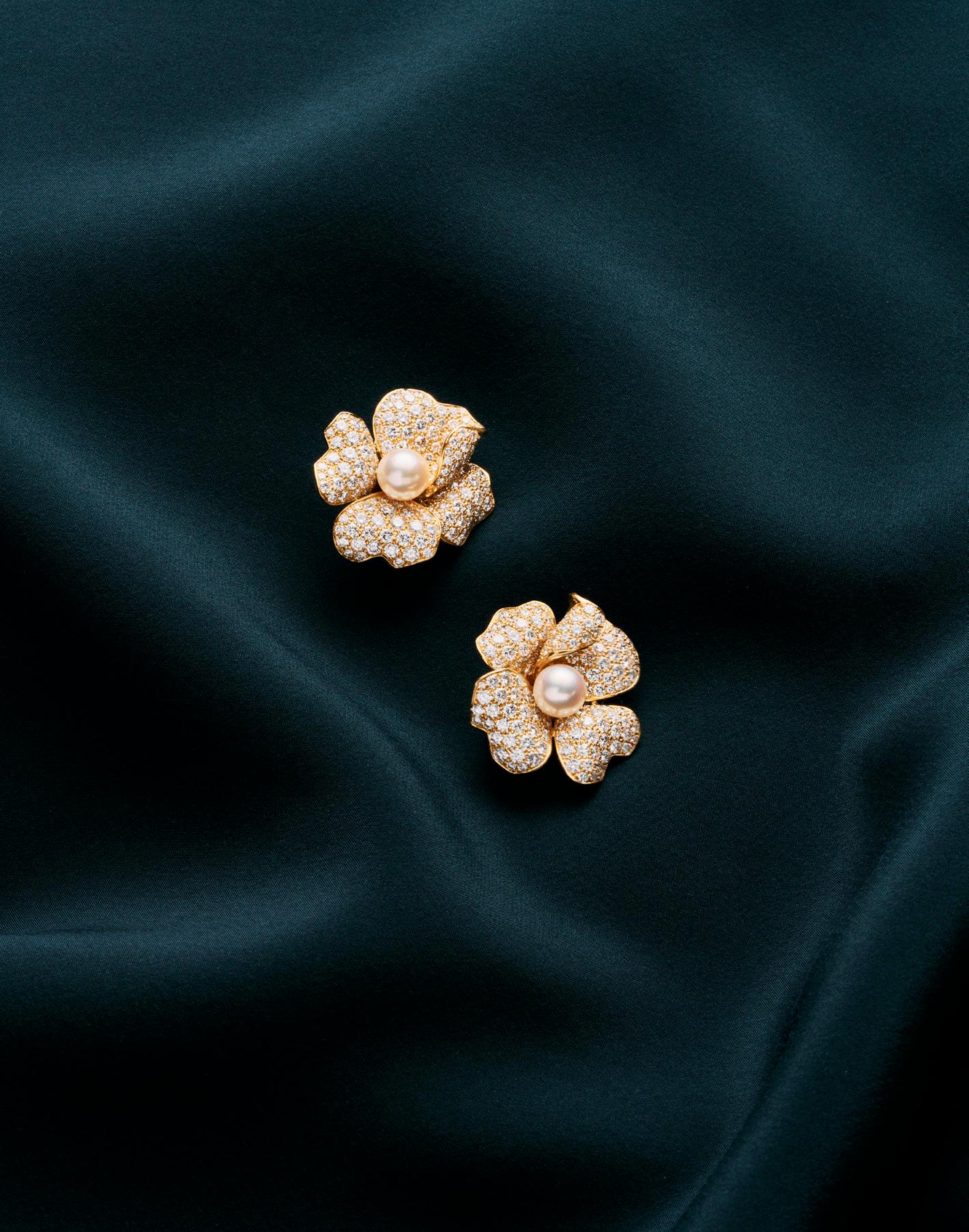
Cartier pair of pearl and diamond earrings
$48,000-55,000
Fine Jewels Sydney Auction Monday 17 August
Antiques in the Mist
by john albrecht, managing director & head of important collections
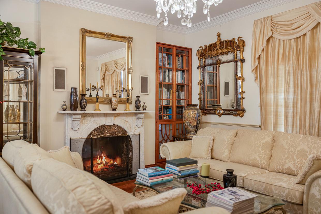
what is it about doctors and lawyers? Time and again, I find there’s a connection between these professions and a deep, often highly intellectual approach to collecting. Dr. Lee Price was just such a collector.
Every collection is special in its own way, that almost goes without saying, but each is also, in a sense, a three-dimensional library of a life: a record of taste, passion, and curiosity. This particular collection stands apart not just for its quality, but because of the rare opportunity to present it in its original setting, in Queensland.
Typically, material emerging from Queensland for public auction makes its way south. That’s often driven by vendor preferences, but also by practical realities - most notably, the absence of a traditional, fully equipped auction room in the state. This collection offered something different and we were enthused to bring Leonard Joel to Maleny for this viewing and auction.
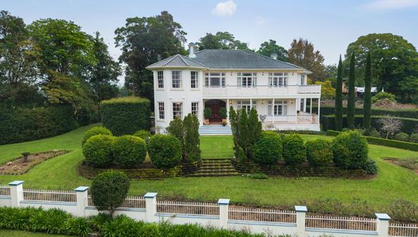
Even before my first visit, I sensed that this was an opportunity to present a collection exactly as its owner had intended, not fragmented, not relocated, but experienced in situ. The property itself, in Maleny, is nothing short of grand. It is beautifully composed, with meticulously cared-for gardens and commanding views across the Queensland hinterland.
When I first arrived, however, the mist was so dense that the view was entirely obscured. Yet the garden alone was extraordinary; lush, green, and deeply evocative. It was clear from that moment that this was a place of care and sustained attention.
Inside, that same sensibility revealed itself in full. The collection unfolds throughout the house, not as a series of discrete objects, but as an integrated whole. This was a home conceived as a living museum, shaped by a man with a growing passion for Japanese and broader Asian art.
The collection, spanning some 250 lots, is comprehensive in both scope and ambition. But what makes it truly special is that it is not limited to a handful of highlights. Instead, we are afforded the privilege of presenting the entire story; the furnishings, the decorative elements, the carefully sourced interiors, much of it acquired through fine Brisbane makers and designers. It feels complete, and in that completeness, deeply personal.
This sense of wholeness extends beyond the collection itself. In collaboration with Queensland real estate agents, we are able to offer not just the objects, but the property as a whole, opening it to both national and international audiences. It is a rare convergence: a significant collection, a remarkable home, and a setting that elevates both.
Over time, Dr. Lee Price’s taste refined and evolved, as is often the case with serious collectors. He gravitated toward the fine ceramic traditions of Japanese Satsuma ware, developing a particular appreciation for the mastery and delicacy of these works. Japanese screens, too, became central to the aesthetic of the home, serving both as decoration and as quiet background statements.
In this way, the collection becomes more than an assemblage, it is a survey of a period of exceptional artistry, filtered through a singular and thoughtful eye.
It is also important to acknowledge the man behind it. A prominent and highly respected figure within the Queensland health community, Dr. Lee Price was, in many respects, a Renaissance figure. His work in medicine, particularly in chemical pathology, combined with a passion for teaching and a wide-ranging intellectual curiosity, earned him a reputation within his field as something of an “oracle” .
This home, and the collection within it, was clearly his sanctuary, a place of reflection, study, and enjoyment, where the beauty of objects and ideas could coexist.
It is therefore a privilege for Leonard Joel to present this deeply personal collection. To do so in Queensland, and in its original setting, makes the opportunity all the more meaningful.
Now begins the next chapter, the process of placing these objects into new hands, with collectors who will, in time, build their own stories around them.
The Collection of Dr Lee Price, Maleny Auction will take place on Tuesday 29 September in Queensland. For viewing times and to see the full catalogue please visit our website.
The property itself, “Mountain View,” Maleny, will be presented to market by Jamie Hill and Mark Osborne at Property Today.
Threads of Victory: The History and Heritage of Racing Colours
by Madeleine Mackenzie, head of decorative arts & art, sydney
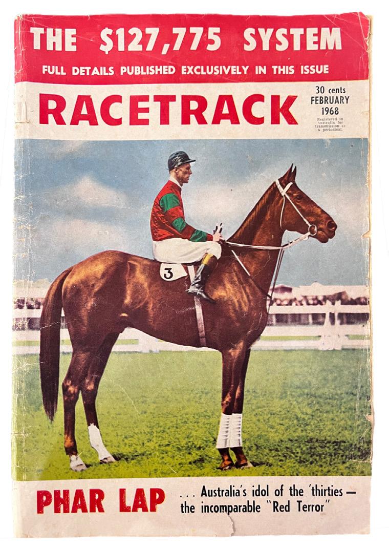
left: Jim Pike mounted on Phar Lap c.1931 on the cover of Racetrack, February 1968
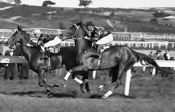
opposite left: Pike and Phar Lap waiting to pounce on Billy Cook and Chide in the AJC Randwick Plate, 1931
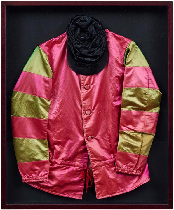
opposite right: PHAR LAP: JIM PIKE'S RACE-WORN RACING SILKS, 1931
A set of owner’s racing silks comprising a red silk jacket with red and green hooped sleeves, buttonfront fastening, together with a black racing cap, representing the registered colours worn by jockey Jim Pike aboard Phar Lap during the 1931 racing season.
PROVENANCE
Jim Pike (1892 − 1969), jockey for Phar Lap 1929-1931
Thence by descent $20,000-30,000
before television broadcasts brought every stride into sharp focus, there was only one reliable way to tell one horse from another during a race: the colours.
Today, they are universally recognised as racing silks or racing colours, featuring combinations of stars, stripes, hoops, and checks flashing across the turf. Some may rely on the colours alone to pick a favourite, yet these seemingly decorative garments are among the oldest surviving traditions in horse racing.
Despite the name, most modern “silks” are no longer made from silk at all. Lightweight synthetic fabrics have long since replaced the luxurious textile, but the original name has endured as a reminder of racing’s aristocratic beginnings when silk was the fabric of royalty and privilege.
The concept of using colour to distinguish oneself during a race stretches back to as early as the chariot drivers of Ancient Rome, whose coloured capes and headbands helped spectators distinguish competitors hurtling around the Circus Maximus. Others have noted similarities to medieval heraldry, when knights displayed family colours on shields and banners during tournaments. Whatever their precise origin, one thing is certain, visibility mattered.
As organised horse racing flourished in England during the eighteenth century, so too did the crowds. At Newmarket, where races were often run across vast stretches of countryside, distinguishing one horse from another became increasingly difficult. In 1762, The Jockey Club introduced one of racing’s most enduring rules: owners were required to register unique colours so that every horse could be recognised at a glance. It remains one of the world’s earliest examples of a formal sporting registration system.
Some of those original registrations are still in use today. For example, The Duke of Devonshire’s distinctive “straw” colours, first recorded in 1762, are believed to be the oldest continuously used racing colours in the world, a remarkable thread connecting modern race meetings with Georgian England.
When horse racing arrived in Australia, the tradition travelled with it. Early colonial race meetings listed not only each horse but also the rider’s “dress”, allowing spectators to follow the action. By the time the Melbourne Cup was established in 1861, racing colours had become an essential part of the spectacle, although duplication remained common until the Victoria Racing Club required owners to officially register their colours in 1867.
Australia has since produced some of the sport’s most iconic combinations. Archer carried jockey John Cutts in the famous all-black colours of Etienne de Mestre to victory in the first two Melbourne Cups. Phar Lap’s familiar red jacket with black and white hooped sleeves became inseparable from the champion himself after he won the Melbourne Cup in 1930 ridden by jockey Jim Pike. These original silks are now housed in the Melbourne Museum, Victoria. However, some may not realise that racing colours are registered to the owner of the horse and when a horse changes ownership the jockey must wear the newly registered colours of the new owner. In 1931 when ownership arrangements changed for Phar Lap, the silk colours also changed to red with red and green hoops on the sleeve and a black cap. This second set of colours, worn by Jim Pike when he rode Phar Lap to multiple victories in 1931, is being sold by Pike’s grandson in our Collector’s Auction in Sydney on the 8th of September.
If one were wishing to create a new set of colours today, they would find that it’s no mean feat. Every design must be unique within its racing jurisdiction, forcing owners to navigate an intricate web of quarters, hoops, chevrons, stars, diamonds, spots, and sleeves. As registrations have multiplied, originality has become increasingly elusive, turning colour selection into something between art, branding, and genealogy.
Perhaps that is why racing colours hold such enduring appeal. They are both practical identifiers and also deeply personal emblems. Passed through generations, instantly recognisable to racing enthusiasts, and immortalised in winners’ photographs, they become visual shorthand for sporting greatness.
Long after the roar of the crowd fades and the trophies are polished and put away, it is often the silks that remain fixed in memory as bright flashes of colour racing across the turf.
The Collector's Auction will take place on Tuesday 8 September in Sydney. For viewing times and to see the full catalogue please visit our website.
What do a pearl necklace, an Indian maharaja, and a pioneering aviator have in common? At first glance, very little. Yet each played an unlikely role in transforming Cartier from a modest Parisian jeweller into one of the world’s most celebrated luxury maisons.
by lauren boustridge, head of fine jewels, sydney
Cartier: The Family that Built a Jewellery Empire
with all the excitement surrounding the spectacular Cartier exhibition currently captivating visitors at the National Gallery of Victoria, it seemed the perfect time to look beyond the glittering jewels and discover the fascinating stories behind the family that built the brand. While Cartier’s creations have adorned royalty, Hollywood icons, and some of history’s most influential figures, it was three remarkable brothers - Louis, Pierre, and Jacques Cartier, whose vision, ambition, and ingenuity shaped the Maison’s extraordinary legacy.
As part of the NGV exhibition, Francesca Cartier Brickell, author of the best-selling book, "The Cartiers" lent a moving war-time letter from 1915 where Pierre Cartier speaks of the bond between the three brothers in Paris, London, and New York. He writes:
“My two brothers are everything to me. Together, we dreamed of the greatness of our family business, and together we developed and spread its renown to all four corners of the globe.”
Pierre Cartier and the Necklace that Bought Fifth Avenue
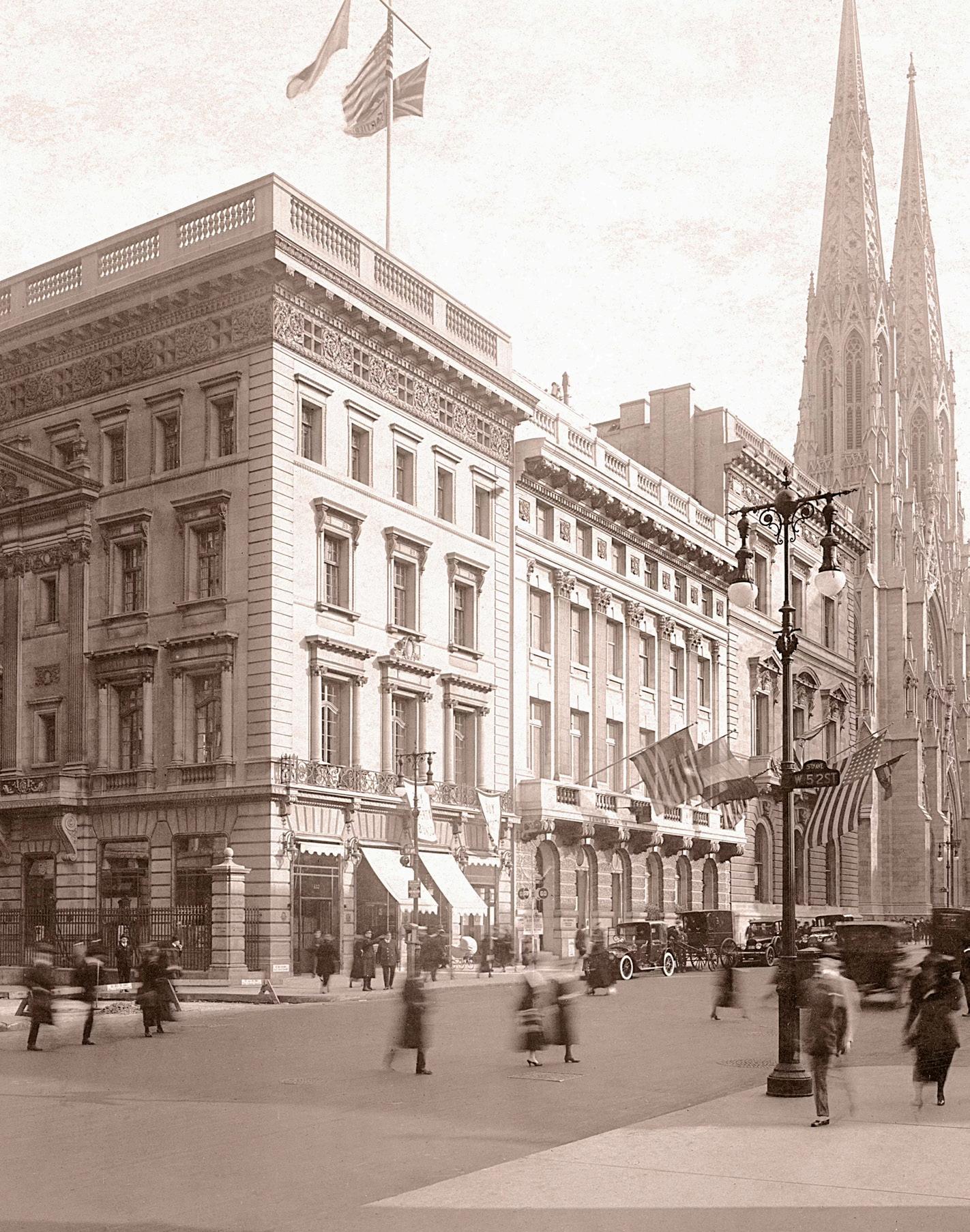
Imagine swapping a pearl necklace for one of New York City’s most valuable buildings. It sounds too extraordinary to be true, yet in 1917 Pierre Cartier did exactly that.
Determined to establish Cartier’s American headquarters on Fifth Avenue, Pierre had set his sights on the elegant mansion owned by railroad magnate Morton F. Plant. The only obstacle was its staggering price. Fortunately, Plant’s wife, Maisie, had fallen in love with an exceptional double-strand necklace of perfectly matched natural pearls displayed by Cartier.
Before cultured pearls transformed the jewellery industry, natural pearls were among the rarest treasures on Earth, and this necklace was valued at approximately one million dollars, almost exactly the same as the mansion itself. Seeing an opportunity, Pierre proposed an extraordinary exchange: the necklace, together with a modest cash payment, for the Fifth Avenue property.
The deal was accepted, and more than a century later, Cartier still occupies the iconic building. Widely regarded as one of the greatest business deals in luxury history, Pierre’s bold negotiation cemented Cartier’s presence in America and proved that vision can be just as valuable as the jewels themselves.
Jacques Cartier and the Treasure Hunt of a Lifetime
While Pierre was negotiating landmark deals in New York, his younger brother Jacques was embarking on adventures few jewellers would ever experience. In the early twentieth century, he travelled extensively through India, Persia, and the Gulf, forging relationships with maharajas, princes, and influential gem merchants.
Rather than purchasing stones through intermediaries, Jacques believed Cartier should source the world’s finest gemstones directly from their origins. His travels took him inside magnificent palaces where royal collections overflowed with Colombian emeralds, Burmese rubies, Kashmir sapphires, and intricately carved gemstones unlike anything seen in Europe. Many rulers entrusted Cartier with transforming centuries-old heirlooms into dazzling new creations.
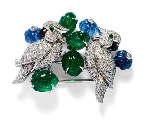
Jacques returned with far more than extraordinary gems. He brought home inspiration. The vibrant colour combinations, carved stones, and Eastern influences he encountered inspired Cartier’s iconic Tutti Frutti jewels, one of the Maison’s most distinctive and enduring design styles. His travels forever changed the artistic direction of Cartier and helped introduce a bold new aesthetic to Western jewellery.
Louis Cartier and the Watch that Changed Time
If Pierre was the businessman and Jacques the explorer, Louis was the visionary designer.
His most famous innovation began with a simple complaint from his friend, Brazilian aviation pioneer Alberto Santos-Dumont. Frustrated by having to remove a pocket watch while flying, Santos-Dumont remarked that there had to be a more practical way to tell the time in the air.
Louis accepted the challenge. In 1904, he designed a slim, elegant wristwatch that allowed the aviator to check the time without taking his hands from the controls. Although wristwatches already existed, they were far from common for men. Louis transformed the idea into something practical, stylish, and unmistakably modern.
The Santos became one of Cartier’s most iconic creations and helped popularise the men’s wristwatch around the world. More than 120 years later, it remains one of the Maison’s signature collections, a lasting reminder that great design often begins by solving an everyday problem.
Together, Louis, Pierre and Jacques Cartier transformed a family jeweller into a global luxury empire through vision, courage, and curiosity. Their legacy endures not only in iconic creations, but in the stories behind them, proof that Cartier’s true brilliance lies as much in its history as in its jewels.
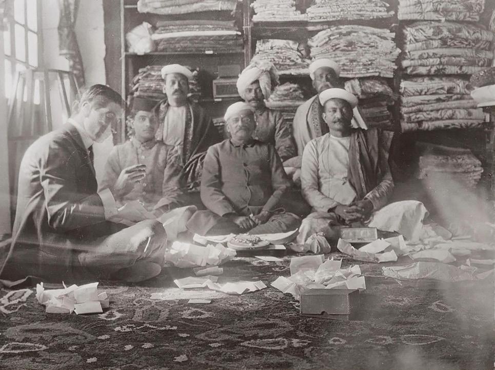
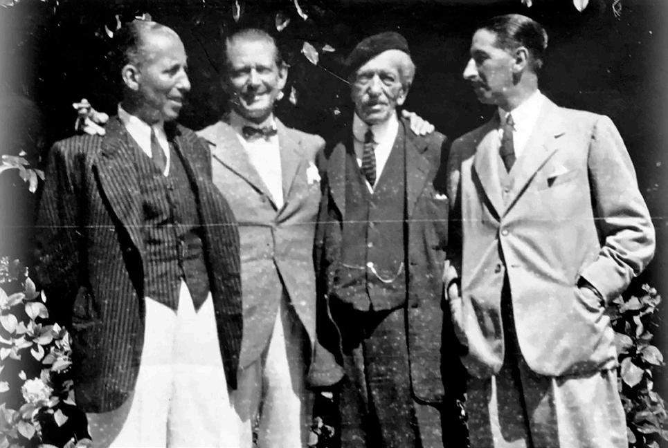
top: Jacques Cartier buying gems in India / Cartier Family Archives, Francesca Cartier Brickell, www.the-cartiers.com
bottom:
The three Cartier brothers; Pierre (far left), Louis (second from left) and Jacques (far right) with their father, Alfred (second from right), 1922 / Cartier Family Archives, Francesca Cartier Brickell, www.the-cartiers.com
Living Large: The Return of the Big Bag
by sisi levinson, luxury specialist
opposite
opposite
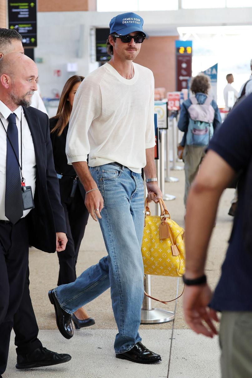
left: Jacob Elordi arrives at the airport wearing a yellow Louis Vuitton Speedy bag / Backgrid
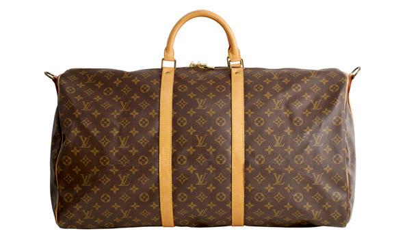
left: Louis Vuitton, Keepall Bandoulière 60
$1,000 - 1,500
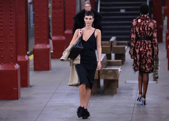
right: Vittoria Ceretti walks the runway during the Chanel Metiers D'Art Show 2026 in New York / Alamy
the big bag – the bottomless, black hole kind of big bag – has never been more back than it is this year. After years of the mini bag ruling supreme, fashion’s pendulum has swung back around in favour of practicality, functionality, and a distinct taste for the noughties. What’s old is new again, and so the cycle continues.
As a true millennial, I grew up on images of Mary Kate and Ashley Olsen, the Hilton sisters, Lindsay Lohan and the like, toting around their Chanel jumbo Classic Flaps, Louis Vuitton Speedys and Balenciaga City bags. Now, the Olsen twins have their own luxury line, The Row; having helped usher in not only the era of “Quiet Luxury”, but also the return of the big practical tote bag in exquisite leathers with their Margaux bag. First launched in 2018, the Margaux bag has gained huge popularity in the last few years, cementing its cult “it bag” status amid comparisons to being the “new Birkin” and engendering endless waitlists.
Matthieu Blazy’s latest Métiers d’Art 2026 collection with its array of giant, slouchy, maxi flap bags in supple suedes and unstructured caviar leather, has continued to lead the big bag agenda this year. His vision for the new, modern Chanel woman has generated intense buzz and caused many “sold out before launch” tales online. Louise Trotter has continued Blazy’s love of supersizing silhouettes at Bottega Veneta – from their Andiamo to their new Barbara tote – styles to sling across the body and clutch under elbows, all in their signature interacciato leather. In his first collection for Celine, Michael Rider re-issued a Phoebe Philo-era signature: the Phantom bag, this time with even more exaggerated wings and a shorter height, pushing the silhouette visually wider and larger again.
Even Jacquemus – the ultimate proponent of the mini-est of mini bags with their Chiquito bag, known for barely holding a pair of AirPods – has released the Turismo shopper bag, recognising the desire amongst the population to be able to carry their phone inside their handbag (what a concept!), along with everything else a modern person needs in today’s society.
And the big bag isn’t limited to just women, men have been arguably even better ambassadors for the big bag of late. Jacob Elordi, a brand ambassador for Bottega Veneta since 2024, has frequently been photographed wearing his Bottega Veneta weekender and tote bags during travel. Not only that, he has also been spotted sporting multiple colours of Louis Vuitton’s Speedy P9 – a vibrant, luxurious expression of heritage meets contemporaneity. His favour of carrying bags usually reserved for women has undoubtedly inspired a wave of young men to seek out and carry bags of their own.
The French World Cup football team recently made waves upon their arrival in Boston, taking the opportunity to demonstrate even more national pride with their selection of bags from French luxury houses. Players carried not just the usual Louis Vuitton Keepall Bandoulière styles, but Hermès Haut à Courroies and Kelly bags, and even a bright green Chanel suede maxi flap from a 2019 collaboration with Pharrell Williams. It is exciting to see not only men in fashion carrying these bags, but sports stars as well. It really speaks to how luxury is ever growing in its influence and representation in culture and media.
The big bag is the ultimate style status symbol currently. The big bag has insouciance, audacity, and personality – a canvas to express fun and individuality on. It can also be simply the most practical rendition of a bag, executed in the most luxurious of materials. Whichever style suits you best, do away with the mini bag, get yourself an obnoxiously large bag, and pile it all in.
The Luxury Auction will take place on Tuesday 18 August in Melbourne. For viewing times and to see the full catalogue please visit our website.
PINNED FOR PURPOSE
by annie soust, head of fine jewels & timepieces, melbourne
The Brooch as a Personal Statement
once in a time when dress etiquette was governed by convention, the brooch was seen as the quiet final addition. Like gloves, a hat, or a tie pin, the brooch quietly completed the look. Formalities and royal orders aside, the brooch today has become an individual form of expression. The modern brooch has not just experienced a resurgence but has become a must-have piece as wearers embrace its ability to tell a story, represent something personal, or show off that little bit of flair.
At Leonard Joel, this revival is evident in the auction room. Brooches are attracting growing interest from collectors, fashion enthusiasts, and first-time buyers alike. From antique diamond sprays and Victorian mourning brooches to whimsical animal studies or bold mid-century designs, brooches are achieving strong results and finding new audiences. What was once considered a somewhat old-fashioned category has reemerged as one of the most exciting areas of the jewellery market.
Historically, brooches were worn according to strict social rules. They served practical purposes, fastening garments and cloaks, while also communicating status, rank, and occasion. A gentleman’s tie pin, a military insignia, a lady’s diamond spray worn to a formal dinner, or a royal order pinned to ceremonial dress all conveyed specific messages understood within society. Today, those rules have largely disappeared, and the brooch has disrupted dress and expression.
Now, brooches can be worn wherever one chooses. There is no longer a correct place or occasion. A diamond flower or spray may adorn a denim jacket, a cuff on a shirt, a collar, or a lapel. An antique sapphire brooch may be pinned to a handbag or a scarf. A Victorian insect becomes a conversation piece on a modern blazer in place of - or alongside - a pocket handkerchief. The freedom to wear a brooch without convention is precisely what makes it so appealing and fun to contemporary collectors.
Because the brooch is now embraced, and while jewellery trends come and go, it offers something different; individuality. A carefully chosen brooch can reveal a sense of humour, a passion, a memory, a personal aesthetic, symbol, or be worn just because.

Adopted as part of one’s personal style, we increasingly see lapel brooches, gemstone-set insects, floral motifs, and decorative pins adding character to tailored clothing at red carpet events and beyond, on men as well as women. Antique jewels are being styled in contemporary ways, proving that exceptional craftsmanship never goes out of fashion. Collectors are drawn to pieces that reflect their personality rather than simply complement their wardrobe.
Perhaps this explains the growing popularity of animal brooches. Whether depicting birds, foxes, dogs, florals, insects, or mythical creatures, these jewels often reveal something about their owner. They are styled, charming and highly individual. Brooches of bees are hugely popular for their use of gems, colour, texture, and sparkle.
Victorian mourning brooches have been reinvented as bold statement pieces. Fashioned from jet, gold, seed pearls, enamel and occasionally incorporating locks of hair, they were designed to commemorate loved ones and preserve their memory. While modern tastes mostly differ from Victorian customs, in a world increasingly influenced by mass production and fleeting trends, buyers are seeking objects with history, craftsmanship, and character. Antique and vintage brooches offer all three. Each piece carries a story and invites a new chapter with its next owner.
At Leonard Joel, we have witnessed growing demand across our collections with brooches in diamonds, coloured gemstones, enamel, jet, and costume jewellery. The brooch may once have been a formality but today it is no longer about following the rules; it is about expressing individuality. So, whether worn on a lapel, scarf, hat, handbag, or dress, I encourage you to style a brooch to show who you are without saying a word.
WATCH WEIRD WAVE
by patricia kontos, senior jewels & timepieces specialist
Gilbert Albert Shakes Up Classic Watch Design
by the mid-20th century, it was becoming increasingly apparent that things were starting to get more and more ‘out there’. A pervasive resistance to conformity and monotony began to emerge across all sectors of society. The watch industry was equally swept up in this cultural rebellion, led by its two primary disruptors, Gérald Genta (1931-2011) and Gilbert Albert (1930-2019) who caused classic watch design to get ‘all shook up’.
Both of these designers tore up the traditional horological rulebook, approaching the watch as a canvas in completely opposing, yet equally revolutionary ways. What resulted were some mind-bending designs so distinct and influential that they permanently altered the (watch) face of horology for time evermore.
While Gérald Genta is understandably worshipped for his Audemars Piguet Royal Oak and the Patek Philippe Nautilus - the design that would give rise to the modern luxury sports watch category, Gibert Albert was equally unconventional but in a more sculpturally organic way.
Born in Geneva in 1930, the son a newspaper delivery man, Gilbert Albert’s artistic journey was shaped by a lifelong fascination with the natural world, a profound connection that would play out in his future designs through organic textures and structures. Albert was enrolled at the prestigious l’Ecole des Arts Industriels in Geneva at the age of 15. There, he would immerse himself in modern sculpture and the revolutionary spatial languages of the pioneering modern artists Constantin Brâncusi and Piet Mondrian. From this study he would come to fuse the rigid, geometric minimalism of Mondrian with the fluid, spatial abstractions of Brâncusi. No doubt the advice of his college mentor; “If you want to succeed, do what others will not do,” was not lost on Albert.
In 1955, at 25 years old and fresh from his training, Albert was hired by Patek Philippe as part of the design team. Henri Stern, who managed the company at the time, was himself a trained jeweller and was quick to identify something unconventional and equally exceptional in Albert. Recognising a shift in the cultural landscape, Stern observed that the burgeoning post-war jet set craved bold innovation over traditional conformity. But nurturing Albert’s radical vision was a calculated gamble. It may have aligned with Stern’s desire to expand Patek Philippe’s jewellery-fused watch capabilities but was the watch world ready for a watch case revolution and particularly from a maison whose ethos was best embodied in the classic restraint of their signature Calatrava?
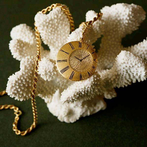
Albert would let rip at Patek Philippe, introducing wildly asymmetrical case designs that felt more like mid-century sculpture than traditional watchmaking. Pebble shapes, flying wedges, organic forms, lop-sided silhouettes; these cutting-edge timepieces pushed the boundaries of what a wristwatch could look like. Today, we find it difficult to grasp the initial resistance these designs were met with from certain sectors. Basel crowds may have queued to glimpse Albert’s latest creations, but risk-averse retailers routinely balked at their commercial viability. Just as an aside, this is the same market scepticism that in 1977 mirrored the reception of the steel Nautilus, a time when American executives despaired that the manufacturer had ‘lost its mind.’
After his time at Patek Philippe, Albert went on to work for Omega. His collaboration with Omega was even more experimental. The watch curiosities produced during this period are less utilitarian and even more conceptual. His most daring timepiece designs were almost exclusively for women. Elaborate mesh bangle watches such as the Mailles d’Or, Rocaille d’Or and Frisson d’Or became signature pieces, often with the watch dial hidden beneath the intricate design of the bracelet.
Ultimately these rare, avant-garde masterpieces remain a testament to a designer who was perpetually ahead of his time. Alongside but in contrast to Genta, Gilbert Albert remains one of the most imaginative, revolutionary, and awarded watchmaking jewellery designers of his era. Albert’s legacy lives on in his strange, yet strangely compelling, creations that sit closer to modern art than horological equipment.
The Timepieces Auction will take place on Monday 17 August in Sydney. For viewing times and to see the full catalogue please visit our website.
above:
Perhaps the most famous and recognisable of Gilbert Albert and Patek Philippe's collaborations is the Ricochet produced from 19621968. In this unconventional and avant-garde creation, we recognise how Albert drew inspiration from Brancusi and Mondrian. The asymmetrical geometric form reflects the experimental spirit of the period and stands in sharp contrast to the traditional Calatrava aesthetic.
Patek Philippe Ricochet Ref 789/1 a pendant watch designed by Gilbert Albert, circa 1962
$8,000-12,000
Inspiring Designers and the Masses
by chiara curcio, head of decorative arts, design & interiors
Colour in 19th Century Interior Design
urbanisation during the middle decades of the 19th century, together with the rise of an affluent and wealthy middle class, led to extensive development of new housing including fine townhouses in newly fashionable districts of major cities, namely New York, London, and Paris. As this spread, so did the development of the architectural profession and associated trades and businesses to cater for everything - from building the houses themselves to decorating and furnishing them.
The growing middle class of this time were very much engaged with contemporary designs and fashions through the birth of the international exhibitions starting from 1851, which showcased techniques and crafts from local and international designers and artisans. These led to a growing interest in ornamental and interior design on a wide scale.
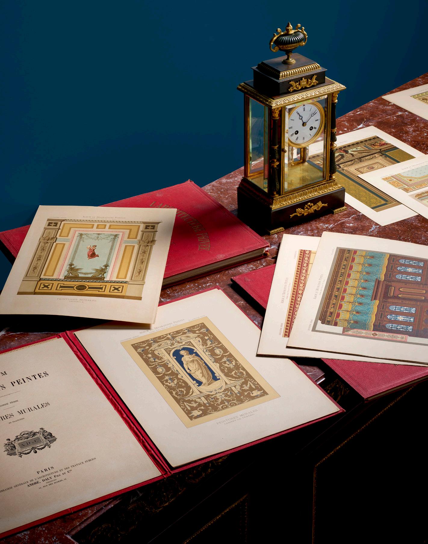
At the same time, modernisation and increasing efficiency in publishing coupled with technological advances such as the development of chromolithography raised architectural and decoration pattern books to new heights of sophistication, the finest of these being illustrated with rich plates in many colours including gold. The popularity of chromolithography grew, being highly prized for its vibrant colours and fine detail.
All this culminated in instructive books being published with chromolithographic illustrations, a vast contrast to similar books that had previously been published in black and white. The chromolithographic books provided dissemination of artisanal instruction, which both catered to the trades and their clientele.
One of the first and the most well-known books of this type is The Grammar of Ornament published in 1856 by British architect and designer, Owen Jones. Considered a seminal publication for the period, Jones had assembled 160 chromolithographic plates of ornamental designs from all over the world, extensively ranging from Asia to the middle east, including ‘savage tribes’ and ‘Egyptian’ designs. Jones had embarked on a grand tour visiting countries including Egypt, Italy, Greek, Turkey, and Spain. His publication was a summary of the design theories in thirty-seven key principles which he considered to be the ‘best’ he had documented.
Jones’ publication was the first of many that provided endless inspiration in the second half of the 19th century, matching the increasing sophistication of the clientele, as well as the architects, artisans, and tradesmen that served them.
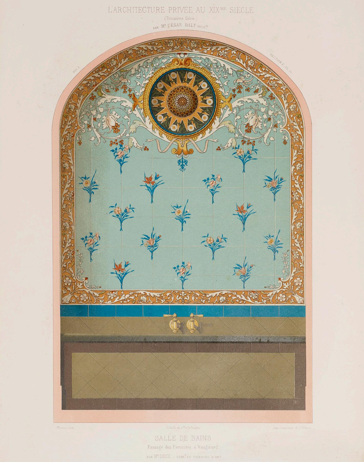
Throughout this period, influential French architect, writer, and publisher César Daly published various volumes of pictorial guides illustrating private architectural designs including a two-volume set of painted interior decoration, which included fifty-five chromolithographic plates. This set detailed various colour combinations and designs for lounges, bedrooms, dining rooms, studies, entrances, and outbuildings, all in decadent designs fit not only for the nobility and the aristocracy, but also serving the rising middle class of entrepreneurs, merchants, and intellectuals.
Former NGV curator and historian, Terence Lane OAM, had a huge affinity for interior design and traditional decorative ornamentation and within his library are various volumes of chromolithographic interior design pattern books, as well as their black and white illustrated predecessors, such as Peter Frederick Robinson’s Designs for Ornamental Villas and Designs for Farm Buildings. Examples of other chromolithographic books in this collection include a first edition of W. & G Audsley’s Polychromatic Decoration as Applied to Buildings in the Medieval Style and A.W Pugin’s Glossary of Ecclesiastical Ornament and Costume, together with a copy of César Daly’s Architecture Privée au XIX Siècle: Decorations Intérieures Peintes.
We look forward to sharing another insight into Terence Lane’s intellectual pursuits with this auction in August.
The Terence Lane Collection Part II Auction will take place on Tuesday 4 August in Melbourne. For viewing times and to see the full catalogue please visit our website.
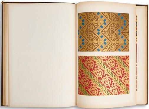
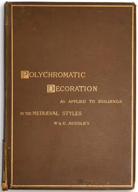
previous page & opposite: Daly, César, Architecture Privée au XIX Siècle: Décorations Intérieures Peintes, and two others similar $700-900 left: Audsley, W. & G., Polychromatic Decoration as Applied to Buildings in the Mediæval Style. First edition, 1882. $200-300
A YEAR OF EXTRAORDINARY COLLECTIONS
bridging cultures; the collection of christine & james liao
“It was our pleasure to present paintings and works on paper from the estate of the founding director of the Chinese Museum in Melbourne, Dr Christine McEachran Liao, and her husband, James Tzeng Chiang Liao, showcasing their passion for Asian culture and deep commitment to cross-cultural understanding.”
- Luke Guan, Head of Asian Art
Our specialists reflect on twelve months of presenting interesting and diverse private collections to market.
a private collection of important australian art
“It was a great honour to handle the Private Collection of Important Australian Art. The collection featured a number of historically significant paintings, including Frederick McCubbin’s The Lime Tree, which achieved a result of $1.5 million. Bringing together works of such quality and provenance was a highlight and reinforced our ability to successfully manage and present important, high value art collections.” - Wiebke Brix, Head of Art
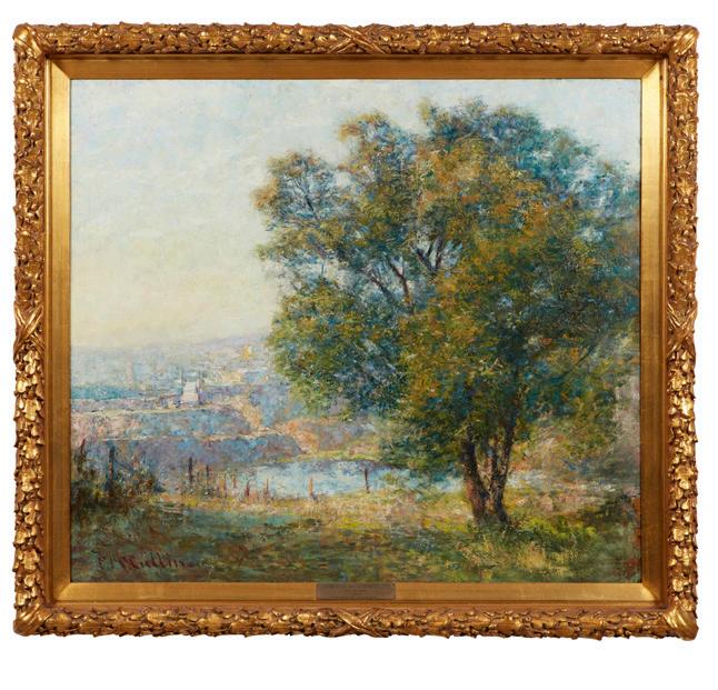
Frederick McCubbin (1855-1917)
The Lime Tree (Yarra River from Kensington Road, South Yarra) 1917
Sold for $1,500,000
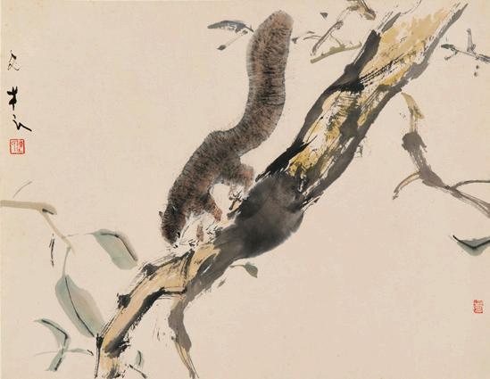
Chen Wen Hsi 1906-1992
Possum
Sold for $8,500
a private Queensland jewellery collection, the estate of robin stewart
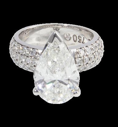
“It was an honour to present the Estate of Robin Stewart, a collection that reflected a true passion for exceptional jewellery. From the extraordinary black opal and diamond ring to the magnificent 5ct pear shaped diamond, the collection was a testament to a lady whose passion for fine jewellery was matched by her discerning eye for rarity, beauty, and craftsmanship.”
- Troy McKenzie, Head of Private Collections, Queensland
select works from the robert bleakley collection
“Robert Bleakley not only established the Tribal Art department at Sotheby’s in London but then personally brought the Sotheby’s name out to Australia. Given his passion for tribal art and his willingness to share his knowledge, working together with Robert on this auction was both an exciting and educational experience.”
- Madeleine Mackenzie, Head of Decorative Arts & Art, Sydney
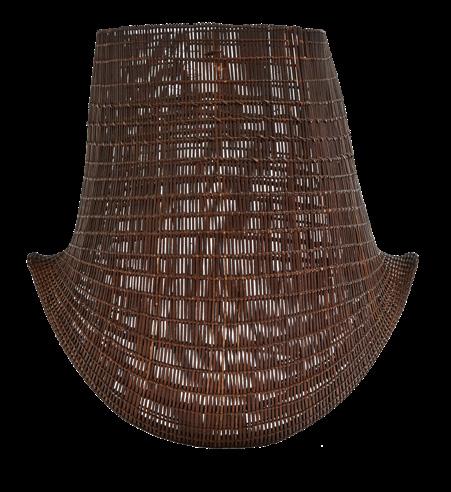
works from the print council of australia collection
“One of my favourite parts of working with a collection is the story behind each piece of art. Looking through the Print Council of Australia collection is a little like tracing the history of printmaking itself. Spanning six decades, the collection reflects changing artistic movements, evolving printmaking techniques and the artists who have helped shape the medium in Australia.”
- Hannah Ryan, Senior Art Specialist, Manager of Specialty Auctions
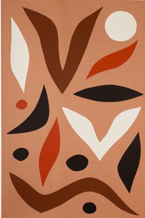
John Coburn (1925-2006)
Walbiri 1984
Sold for $3,750
© John Coburn/Copyright Agency, 2026
a life in london, the jo walker collection
“A Life in London was a wonderful celebration of Jo Walker’s years living and traveling abroad acquiring all things bold and beautiful. It really highlighted what can be achieved when someone trusts their unique sense of style and combines this with a love of antiques.”
- Madeleine Mackenzie, Head of Decorative Arts & Art, Sydney
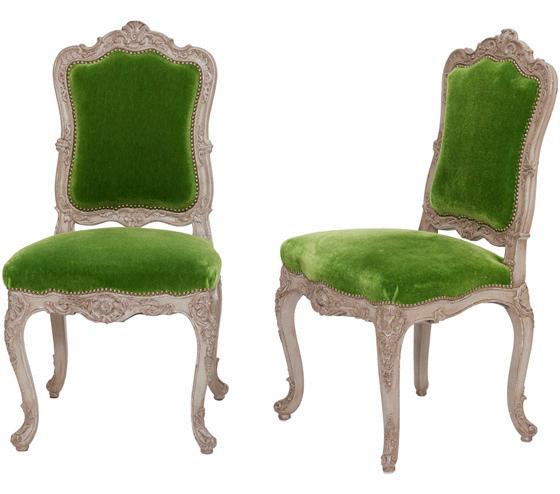
A set of twenty Louis XV style silver painted dining chairs (part) Sold for $15,000
A large GIA certified pear shaped diamond ring Sold for $68,750
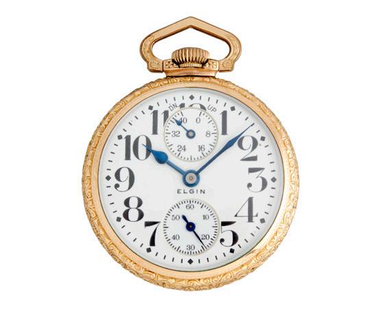
“A standout for me was the American railroad watch collection sold over several auctions. It offered collectors a rare opportunity to own a piece of horological history, one that pays homage to the mighty rail network that truly unified the United States at the turn of the 20th century. Now when I look at a railroad watch, I see the epic history bound up inside it.” - Patricia Kontos, Senior Timepieces
& Jewels Specialist
Sold for $100,000 a private collection of
contents of a toorak property
“This auction was the perfect storm of excellent taste, broad selection, and competitive interest with over 1,000 registrants leading to a white-glove result.” - Chiara Curcio, Head of Decorative Arts, Design & Interiors
Ethel Carrick Fox (1872–1952)
A still-life of peony roses and other flowers in a vase on a table
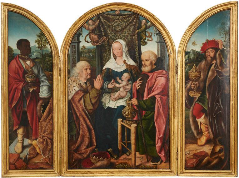
old master paintings from the robert compton jones collection
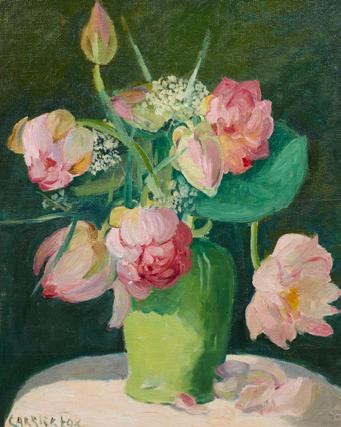
“It was remarkable to discover a collection of Old Master paintings of this calibre within Australia, let alone to have the opportunity to bring them to market. The results were exceptional and really proved that Australia can proudly hold its own in the international marketplace.” - Madeleine Mackenzie, Head of Decorative Arts & Art, Sydney
The Master of Frankfurt and Workshop (Antwerp c.1460-?1533)
The Adoration of the Magi; and The Annunciation
Sold for $250,000
Elgin Watch Co. a gold filled openfaced railroad grade watch with winding indicator Sold for $5,000
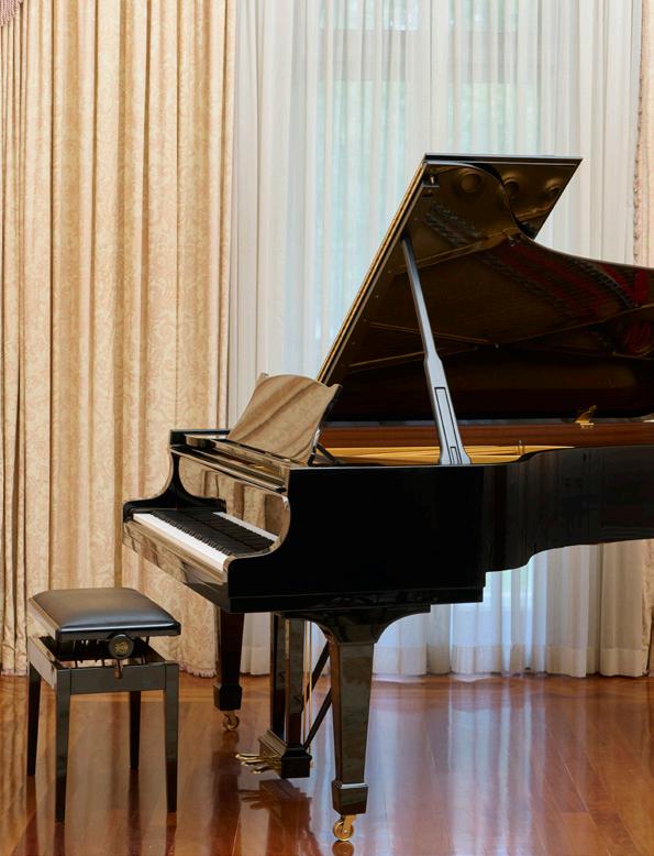
‘coonac’, toorak – selected fine art, furniture, & objects
“Housed within Australia’s most valuable property, the collection represented the fine taste of its occupants and included a record for the highest price paid for a Steinway piano at auction; $112,500 IBP.”
- Chiara Curcio, Head of Decorative Arts, Design & Interiors
A Grand Piano by Steinway & Sons Steinway & Sons, New York and Hamburg, Model B, numbered 560528, 2002
Sold for $112,500
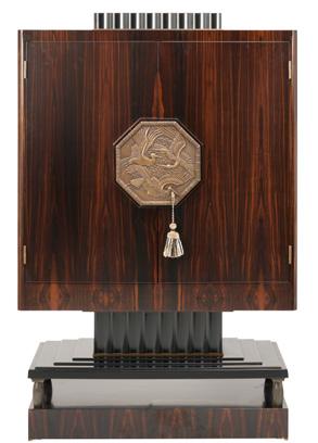
contents of a melbourne penthouse
“Evoking the glamour of the 1920s, this Melbourne penthouse paid homage to the greats of the Art Deco era. I am delighted to have achieved a white-glove result for this single owner auction.”
- Rebecca Stormont, Senior Modern Design Specialist
A Meuble À Fards cabinet after the design of Émile-Jacques Ruhlmann by Bainbridge Fine Furniture
Sold for $6,250
the terence lane collection, part i
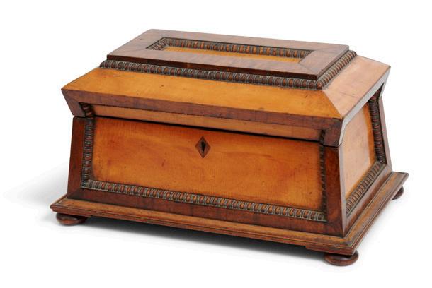
“Terence Lane’s collection was a well-balanced physical reflection of his diverse intellectual interests centring on his life-long field of study of domestic interior design in Australia. A rare example within the collection included a Tasmanian colonial tea caddy, which demanded a record auction price.” - Chiara Curcio, Head of Decorative Arts, Design & Interiors
A large fine and rare Colonial Tasmanian specimen wood tea caddy circa 1830 Sold for $40,000
Nora Heysen: A Pioneer in Art and Life
by wiebke brix, head of art
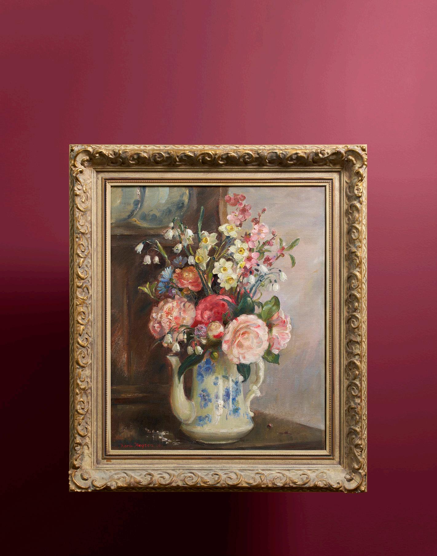
as we are approaching our annual Women Artists auction, I wanted to use this opportunity to write about a significant female trailblazer of Australian art. Nora Heysen (1911 – 2003) was a pioneering artist and a strong persistent voice in a then male dominated field. The artist, born in Hahndorf, South Australia, was the fourth of eight children born to the celebrated landscape painter Hans Heysen and his wife Selma.
Hans Heysen (1877–1968) was and still is one of Australia’s most admired artists and a central figure in the development of Australian art. He is renowned for his watercolours and paintings of the Australian bush, particularly the towering gum trees of the Adelaide Hills and Flinders Ranges.
The family lived and worked at The Cedars in Hahndorf, a large property Hans Heysen purchased to help preserve the Australian bush from widespread tree clearing. Although born into one of Australia’s most prominent artistic families, Nora was determined to establish her own identity as a painter. While her father encouraged her to work in watercolours, she preferred oils, believing the medium better suited her artistic vision. She developed a distinctive style of her own and deliberately chose subject matter that differed from her father’s celebrated landscapes, focusing instead on portraiture and still life.
The desire for independence was evident from an early stage in her career. “At one time she was concerned that people might be asking for her work only because of the Heysen name, so she signed several flower pieces ‘NORAH’, sent them home and asked her father to show them to the dealers.”¹
Following her first solo exhibition in Adelaide in 1933 including portraits, still life, and drawings, Heysen travelled to London from where she immersed herself in European art and culture. Encounters with artists such as Orovida Pissarro, granddaughter of Camille Pissarro, broadened her artistic outlook and influenced her evolving approach to colour and composition. Here she started developing her distinctive style of vibrant colour and form.
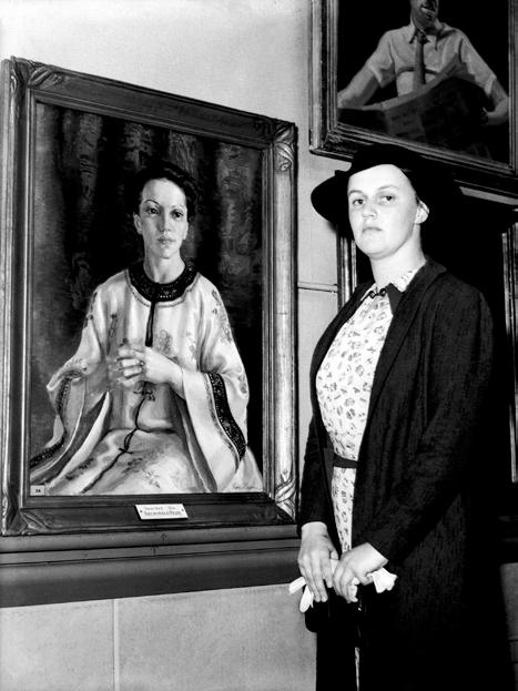
After returning to Australia in 1938, Heysen settled in Sydney and quickly established herself as a leading portrait painter. One of the defining moments of her career, and indeed Australian art history, came when she became the first woman and the youngest artist to win the Archibald Prize for her portrait of Madame Elink Schuurman. Nora was drawn to her sitter’s striking appearance and elegance, qualities well suited to her refined style of portraiture.
The significance of this achievement cannot be overstated. The Archibald Prize had been established in 1921, meaning Nora became the first female winner after 17 years of male recipients. To date, only 13 women have won the prize, accounting for 15 victories from 105 awards. Equally revealing is the fact that out of those 105 winning portraits only 18 depict female sitters.
Heysen continued to break new ground when, in 1943, she became Australia’s first female official war artist. During the Second World War she travelled to New Guinea, Morotai, and Borneo, producing portraits and studies of Australian service personnel. Her work differed from much of the military art produced by men, which often focused on military activity and battle scenes. Instead, Heysen’s paintings frequently emphasised the human experience of war, capturing resilience, vulnerability and everyday life.
The statistics again highlight the significance of her appointment. 18 artists documented the First World War, none of them women. During the Second World War, 41 artists were commissioned, yet only four women were appointed; Nora Heysen, Sybil Craig, Stella Bowen, and Sali Herman. In the decades that followed, female representation improved, with artists such as Wendy Sharpe, eX de Medici, Lyndell Brown, and Megan Cope contributing to Australia’s ongoing tradition of official war art.
Following the war, Heysen continued to exhibit while balancing her artistic career with family life after marrying Dr Robert Black in 1953. Retrospective exhibitions in South Australia and Sydney during the 1980s reaffirmed her important contribution to Australian art.
Nora Heysen’s legacy endures through a body of work distinguished by elegance, technical accomplishment, and quiet determination. Her portraits reveal strength and character, while her still lifes reflect a more contemplative side of her practice. The independence, confidence, and sensitivity that defined her life remain evident throughout her work. Nora Heysen opened doors for future generations of women artists and secured her place among Australia’s most important twentieth century painters.
References
1 Klepac L., Nora Heysen, The Beagle Press, Sydney, 1989, p. 13
Speck C., Beyond the Battlefield, Reaktion Books, London, 2014
Australian official war artists | Australian War Memorial Accessed online 20/06/2016
Archibald Prize Art Gallery of NSW Accessed online 21/06/2016
Nora Heysen | Art Gallery of NSW Accessed online 21/06/2016
The Women Artists Auction will take place on Monday 14 September in Melbourne. For viewing times and to see the full catalogue please visit our website.
opposite:
Nora Heysen (1911-2003) (Still Life) 1960
oil on canvas
signed and dated lower left:
nora Heysen | 60 55 x 45cm
$20,000-25,000
The Hunter Collection, Adelaide Thence by descent
right:
Nora Heysen with her Archibald Prize-winning portrait of Mme Elink
Schuurman, 21 January 1939 / Sun News, Picture by Staff, Fairfax Photos
BEYOND THE LANDSCAPE
by hannah ryan, senior art specialist
How Dorrit Black and Grace Crowley Helped Introduce Modernist Ideas to Australia
one of the great pleasures of collecting is discovery. Sometimes it is the discovery of an artist. More rarely, it is the discovery of a story.
I was fortunate enough to visit the Dangerously Modern exhibition in Sydney recently, and it was wonderful to see so many important works brought together in one exhibition. Many of these paintings had spent decades in private collections or remained largely overlooked, making the exhibition feel as much a rediscovery as a celebration.
Through Leonard Joel’s annual Women Artists auction, we have been able to help place rediscovered works into major public collections. I was delighted to see Hilda Rix Nicholas’ The Arab Sheep Market, Tangier, a work we previously handled, included in the exhibition following its acquisition by the Art Gallery of New South Wales. Moments like these are a reminder that the story of Australian art is still evolving, and that there are always new discoveries waiting to be made.
As much as I enjoyed seeing these works in person, it was the story behind them that stayed with me. It wasn’t only about the paintings themselves, but about the women who travelled overseas, embraced entirely new ways of thinking about art, and returned home to help shape the future of Australian art.
When we think about Australian art, landscape painting often comes to mind first. The golden paddocks of Hans Heysen, the sunlit vistas of Arthur Streeton, and the bush scenes that have become part of Australia’s visual identity are familiar to many collectors.
Yet at the same time as these artists were defining an Australian vision, another story was beginning to take shape. A generation of artists were travelling to Europe, encountering new ideas and returning home with a very different way of seeing the world.
At the time, travelling abroad was considered an essential part of an artist’s education. Paris and London sat at the centre of the art world, attracting artists from across the globe and new ideas were emerging at a remarkable pace. Cubism had challenged traditional notions of perspective. Abstraction was beginning to gain momentum, and artists were experimenting with colour, design and form in ways that would have seemed radical only a decade earlier.
Among the Australians drawn to this environment were Dorrit Black and Grace Crowley. Today, both artists are recognised as key figures in Australian Modernism. Yet the most interesting part of their story began when they returned home.
Both Black and Crowley studied in Paris under the French artist and teacher André Lhote. His school attracted students from around the world and encouraged a new way of thinking about art. Rather than simply painting what was in front of them, artists were encouraged to consider structure, composition, and design. These ideas were reshaping artistic practice across Europe and offered a striking contrast to much of what was being taught in Australia at the time.
Returning home, Black and Crowley quickly set about sharing what they had discovered overseas. In 1930, Black established the Modern Art Centre in Sydney, a school dedicated to modern art. Crowley joined her the following year to teach and exhibit, helping create a space where artists could engage with contemporary international developments and experiment with new approaches to their work.
Alongside fellow artist Rah Fizelle, Crowley established the Crowley-Fizelle School, which became one of the most important centres for modern art education in Australia. The school encouraged students to think critically about composition, structure, and colour, helping foster a generation of artists who would continue to develop and expand these ideas.
One of the most rewarding parts of being an Art Specialist is that every artwork has a story to tell. In recent years, that has become especially apparent through a renewed focus on female artists and their contribution to Australian art. Exhibitions such as Dangerously Modern have helped bring overlooked female artists back into the spotlight, recognising the vital role they played in introducing international modernist ideas to Australia.
Today, nearly a century later, interest in both Dorrit Black and Grace Crowley continues to grow. Major exhibitions have introduced their art to new audiences and encouraged a reassessment of their place within Australian art. For collectors, the appeal lies not only in the historical significance of their work, but in its enduring freshness. Whether through Black’s bold linocuts or Crowley’s refined exploration of form and colour, both artists produced works that remain engaging today. Their work reminds us that some of the most important chapters in Australian art began with artists willing to look beyond what was familiar.
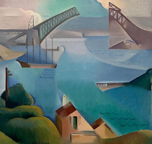
above: Dorrit Black
The Bridge 1930 Oil on canvas on board
(the collection of the Art Gallery of South Australia, Adelaide) / Alamy
IN CONVERSATION WITH MONICA CURRO
by amanda hayward (née north), senior art specialist
The Intersection of Art and Music
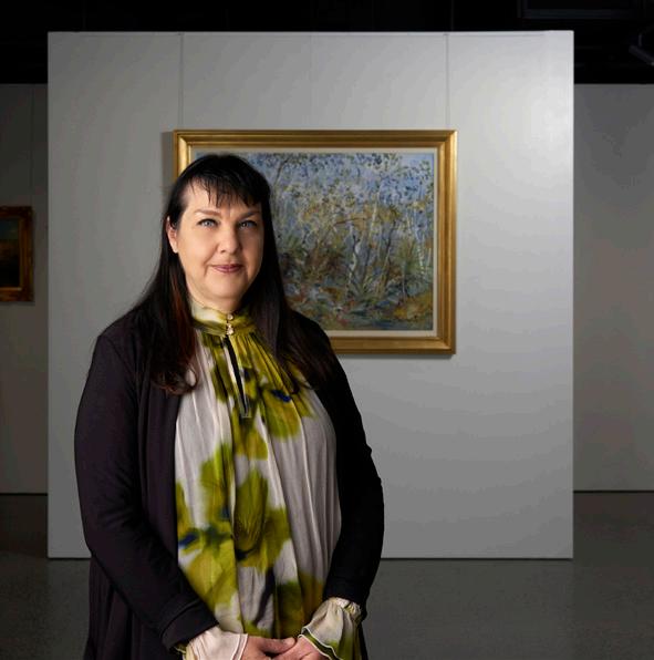
monica curro is a distinguished violinist with a rich career in the performing arts. She has been the Assistant Principal Second Violin of the Melbourne Symphony Orchestra (MSO) since 1998 and has played with numerous other prestigious orchestras. Some of her recent work includes curating the ‘Music at McClelland’ series at McClelland Sculpture Park & Gallery and serving as joint Artistic Director of the Port Fairy Spring Music Festival. Here, we chat to Monica about the connections between music and visual art and how unexpected collaborations can create new ways for audiences to experience both disciplines.
What drew you to become involved with McClelland Sculpture Park & Gallery? And for those who haven’t visited before, what makes McClelland such a unique destination?
I first experienced McClelland thanks to my partner in music and life Stefan Cassomenos and his association with the brilliant Maudi Palmer and Lisa Byrne. He performed a piano recital meticulously curated to a selection of the Park’s artworks for the opening of the Sarah & Baillieu Myer Pavilion in 2018 and it was yet another powerful demonstration of how two different artistic disciplines combined can amplify the experience and impact of both – also I couldn’t believe I’d lived in Melbourne for decades without knowing about this magical place! Every year since 2022 I have had the great joy of curating a 10 concert monthly Sunday series in the Pavilion, which showcases our many extraordinary musicians from Victoria and beyond, in every genre under the Art Music umbrella, surrounded by breathtakingly beautiful bushland.
Have there been any artworks that have inspired a particularly memorable musical response or performance?
One of the highlights of my artistic life was the epic and multi-disciplinary project “NERVOUS” ritualistically revealed with two live performances in 2016 at Gandel Hall at the NGA – three years in the making, the central and autobiographical narrative was the collection of sculptures from artist extraordinaire Heather B. Swann. It was curated by Deborah Hart, with music and electronics by Thomas Green, poetry by Kevin Brophy, performed by soprano Astrid Connelly and baritone Jack Swann, my trio PLEXUS, Continuum Sax, and the Leichhardt Espresso Chorus, swathed in nine big bad banksia men sculptures which alone took Heather two years to hand sew, and which were acquired by the AGSA even before the first performance!
What was it like curating music to the artworks of female visual artists at the Port Fairy Spring Music Festival?
Well it was 2020 in Melbourne and we had a fair idea that there would be no in-person Festival that year in Port Fairy, so like everyone else in the performing arts we “pivoted” (the word still gives me a little shudder!) to an online digital Festival of nine streamed concerts instead of the weekend’s usual 30 in 48 hours.
Since we had plenty of spare time, we decided to showcase eight southwest Victorian artists and match their works with every piece performed – it did take ages to immerse into the artworks and music but after a few months of absorbing and reflecting it all fell into place, like they were made for each other. It’s to do with mood, texture, dynamism - all fairly intangible concepts which need the rare luxury of time and contemplation to intertwine. Deborah Cheetham’s Sunday Gala was performed alongside works woven at the Australian Tapestry Workshop – Lumpu Lumpu Country by Walmajarri artist Daisy Andrews, and Dulka Warngiid (Land of All) by 7 Kaiadilt women from Bentinck Island.
Tell us about the work you’ve done with the NGV in the past, including the upcoming MSO+ and Cartier collaboration?
In 2018/19 my trio PLEXUS (Philip Arkinstall, clarinet, Stefan Cassomenos, piano, and myself, violin) had the great honour and joy of curating concerts and performing inside the exhibitions at NGV International – seriously, if it existed this would be my dream full-time job! For each event we commissioned a new piece of music from a Melbourne composer for world premiere, in response to and surrounded by the artworks, including talks from NGV expert curators, interviews with the composers, and a panel discussion with weavers from the Australian Tapestry Workshop. 2019 was the Alexander Calder show (Melissa Douglas, Shifting), 2018 was MoMA (Lilijana Maticevska, Mit den Augen Kirchners) and the Roger Kemp tapestries in the Great Hall (Luke Speedy-Hutton, Warp and Weft).
We are very excited to return to this epic room as part of the NGV Friday Nights MSO+ Residency in September and October this year, with four shows in response to the glittering Cartier exhibition, curated by the stellar musicians of the MSO.
With thanks to Monica for her time.
image: Monica Curro
A CLOSER LOOK AT BLACK OPALS
by john albrecht, managing director & head of important collections
Learning from Nathan Harris
nathan harris, an opal merchant in Melbourne, was my first introduction to the finer points of a fine black opal, but my first sighting of one of these stones came earlier. I vividly remember my father and Ross Allan at Kozminsky marvelling over an oval example that they were designing a diamond surround for. What were they marvelling at? The opal displayed a small black section, miraculously shaped as the silhouette of a diving bird, and on this piece it was if it was diving into the fire of the opal. It was an extraordinarily rare formation of colouring.
Later, I would meet Nathan or “Nat” as he would invite us to call him. Nat was a well-known and respected jewellery merchant (he celebrated his 100th birthday in 2022) but he was an extremely cautious bidder and was almost always outbid at my auctions in the late 1980s, unless it was a fine opal. Inevitably, he would be the successful buyer of every fine black opal that came our way. In those two years or so, that was maybe three or four. Such is the rarity of the “fine blacks” as we’d often refer to them.
Nat also explained to me that the earlier set opals, that is those that are within a piece of jewellery, were certainly more bankable and desirable the longer they had been out of the ground without crazing. ‘Craz-
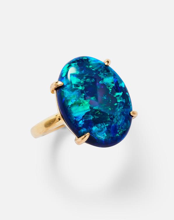
ing’ is a condition that opals can be susceptible to where their water content can decline and then create fine cracks on the stone’s surface. As Nat taught me, if it’s been mined and converted to jewellery in, say, the 1930s and 40s, and it hasn’t crazed yet, it’s unlikely to craze and represents a strong and stable opal.
This is unquestionably the critical finer point in understanding what underwrites an opal’s value and stability. In my view, this makes the exquisiteness of a great flaming black opal all the more fascinating because it is a precious gem that needs to be cared for and understood in a quite different way to its rival precious stone family.
SHEARER IN WOOL
by john albrecht, managing director & head of important collections
Texture and Colour on a Memorable Scale
whenever a large wool tapestry appears at Leonard Joel, it’s worth noting that works of this scale are rare to market. More often than not, such a piece is a visitation from the 1970s, a period when tapestries enjoyed a surge in popularity. Ben Shearer, the artist known to many as a watercolourist of Australian landscapes with an aerial sensibility, also produced some extraordinary works in wool.
The scale and medium of these pieces inevitably narrows the collecting field of appetite, yet it is pleasing to see them move quietly through auction, without too much fuss. At times, we have even sold works from that period, now half a century old, for as much as three thousand dollars. My first encounter with a Ben Shearer tapestry was in the mid-1970s. I was visiting a besser brick home in Malvern - one of those quintessentially 1970s residences with a central open-plan design. A staircase rose through the space, allowing you to walk up and look down from above. And what we looked down upon was an extraordinary Shearer work, almost sculptural in its presence.
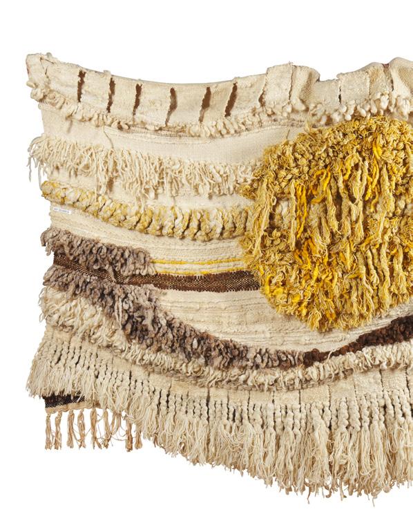
From memory, I knew it as The Three Wise Men. I recall it as a young child, struck by its immense scale. Beyond that, it was the way it hung, how it completely occupied a wall that stretched over two floors, and the true three-dimensionality of the work. As a child, I found it deeply inspiring. That remains my singular memory of that home.
As my mother would say, it is “lovely” to see these works of art, perhaps the less typical ones in terms of medium, finding their way back onto the market, to be rediscovered and recollected by new generations, now half a century later.
image: A Ben Shearer wall hanging 'Sunset 1985' Sold for $3,000
From the Workshop
Fortunato “Lucky” Rocca: In
Silver & Gold
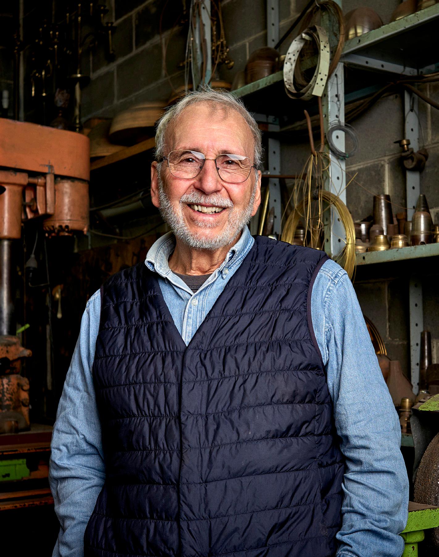
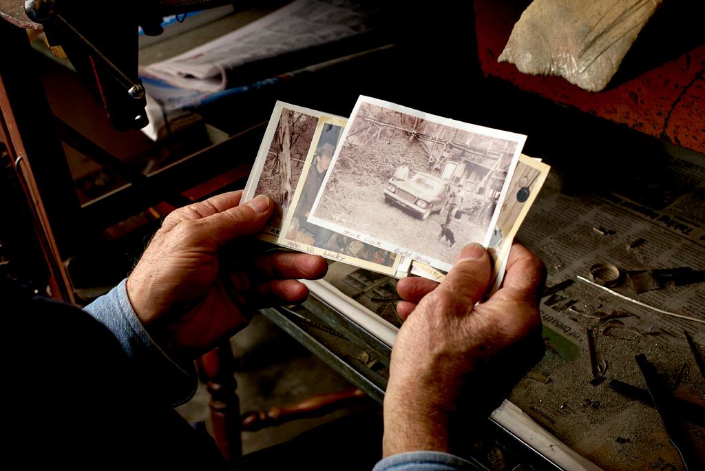
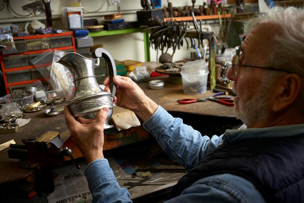
In this series, we visit the ateliers of skilled artisans to learn more about interesting, rare trades and crafts. This issue, we chat to silver and goldsmith, Fortunato “Lucky” Rocca, at his workshop on Elgin Street in Carlton, where he has worked since the early ‘70s crafting chalices, ceremonial maces, trophies – including the Melbourne Cup – and more. His workshop speaks to an incredible life and career; there are old photos, newspaper articles, mementos, even keys to an old gold mine!
You started making the Melbourne Cup at just age 24 and continued each year for 30 years. What was the process of making the trophy?
Well, when we got an order from the racing club, we’d source the materials. When they came in, the racing club would send a representative around and we’d check everything to make sure it was what was needed.
We started with around 34 pieces of metal. It was either 9 carat or 18 carat gold at the time, it depended on the price and what was available when we ordered it. The first thing we’d make was the bowl because that was the major part of the operation. We’d hammer it up into shape and work to our patterns. Then we’d make the stem and the base, and from there we’d make the handles. The handles were made up of four parts each, plus clips to hold them onto the bowl. The handles weren’t soldered because if you soldered the whole thing, the heat could distort the top part of the bowl and it wouldn’t stay perfectly round. So, they were pinned at the top and fixed at the bottom.
After that we’d file it, polish it, and finish it off. The base was made separately and fitted in. Then it would be sent away for engraving. The process took around 200 hours.
How did it feel to be entrusted with such a historic commission?
Well, when I first started working on it, I was an apprentice. I was a young bloke, and I thought, “Listen, I reckon I could do something like this.” My boss (Maurice Steeth) said, “Well, if you can make one, I’ll give you a raise.” So, I started - I made bits and pieces of it, but I never actually finished the whole trophy in those early years. So I never got the raise! Then he passed away, and when I got the commission in 1971, I already had a bit of a head start, I knew I could do it. It was pretty special. When you read the newspapers and everyone is talking about the Melbourne Cup, and everyone has a holiday for it - it’s a big thing.
To be a young bloke and already doing something like that, you think, “Gee, I’m doing something pretty good here.” I was proud. You can’t help but be proud.
Can you tell us about some other meaningful commissions that you’ve worked on over your career?
One thing that stands out was when Princess Anne got married, we made a rose bowl that was commissioned by the state government and presented to her for the wedding. We’ve also made ceremonial pieces, the last one that really stands out was the mace we made for the Welsh Parliament when it was established.
We’ve made some important bits and pieces over the years. Sometimes you forget because you do them, finish them and move on. Then later you think, “Oh yeah, we did that job.”
What advice would you give to a young silversmith starting today?
If you like making jewellery and you like the work, find a way to learn. If you can’t get an apprenticeship, take classes and learn the basics. You need to learn how to solder, how to finish something properly, and how to put things together. Once you know that, you’re on your way.
I can’t work without a drawing, and I still have them all. You need to know what you’re making, what materials you need, how thick everything has to be. You can’t just start, especially with gold. If you get it wrong, it costs you.
You don’t need too much to start. You just need a few tools and you can set up a little workshop. Learn your trade and look after what you make.
Can you describe a favourite memory from your workshop?
The classes we taught were probably some of the best memories. We started back in the ‘60s and did them for about 40 years. We’d have 10 people at night, two nights a week. It became more than just a class, it became a social thing. Before class we’d meet at the local pub, have a counter lunch, then after class we’d go for a drink. People really enjoyed it.
We had doctors, nurses, house mums, young kids, all different sorts of people. The important thing was making sure everyone achieved something every night. Because if you’re learning, you want to go home and say, “Look what I made.”
With thanks to Lucky for his time.
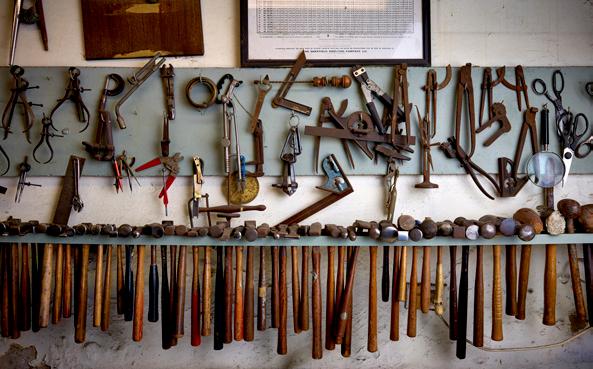
previous, left & opposite: Lucky Rocca in his Carlton studio
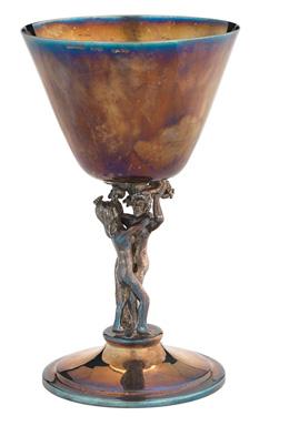
right: Fortunato Rocca, Goblet 1973. Purchased, 1974. Image courtesy National Gallery of Victoria, Melbourne.
FIVE MINUTES WITH ANNA AKACICH
This issue, we asked our Jewellery Salon Manager, Anna, to share some of her favourite things.
favourite designer
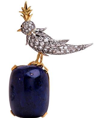
For me, it’s hard to top Jean Schlumberger for Tiffany & Co. His playful approach to design and use of coloured stones is so tactile and fun.
what’s on your “saved favourites” list from leonard joel at the moment?

favourite cocktail
A dirty vodka martini with three olives always hits the spot.

favourite auction purchase
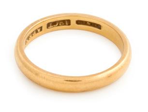
One of my very first auction purchases was an antique Australian wedding ring with beautiful engraving from 1926, with marks attributed to legendary Australian Jewellers G & E Rodd of Melbourne. I’m a bit obsessed with antique wedding bands but this one feels extra special.
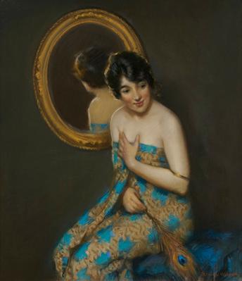
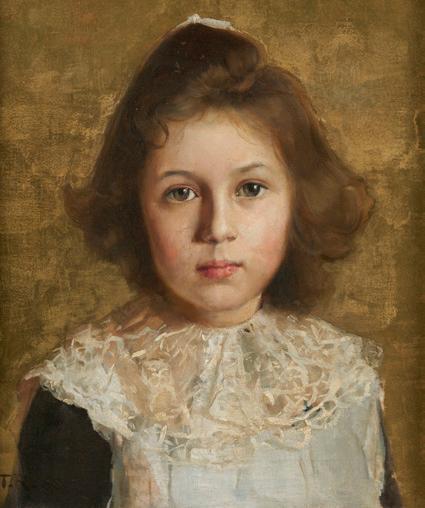
I absolutely adored Lot 4 in our recent Fine Art Auction - Dora L. Wilson’s Portrait of a Young Woman. The colours and posture are so evocative, and knowing this has been appreciated by a single owner for some time, I really could stare at this painting all day.
favourite book
This is a relatively recent read for me! The Goldfinch by Donna Tartt combines all my great loves - art, crime, travel, and found family. It’s an epic, sweeping tale that grabs you from the first page. Highly recommend!
by zanjji sinkala, ifaw contributing writer
In Zambia’s Lower Zambezi, Elephants are Moving Freely Again
From the air, the elephants of Zambia’s Lower Zambezi no longer move in fear. During a recent patrol flight over the Zambezi River, small family groups wandered calmly across the landscape below, a visible sign that years of anti-poaching and conservation efforts are helping wildlife reclaim ancient movement routes.
Flying in Conservation Lower Zambezi’s (CLZ) Cessna 172, I watched the river snake through forests and escarpments stretching towards Zimbabwe and Mozambique. Below us, elephants moved steadily through the wilderness in groups of three, eight, and ten, rather than gathering in large defensive herds. Conservationists see this behavioural shift as a sign of recovery—a more natural rhythm returning to one of southern Africa’s most important elephant landscapes.
Supported by IFAW’s Room to Roam initiative, CLZ combines aerial surveillance, ranger support, legal enforcement, and community partnership to help secure a vital transboundary wildlife corridor connecting Zambia’s Luangwa Valley with Zimbabwe’s Mana Pools and Mozambique’s Tchuma Tchato. The Lower Zambezi is home to elephants, lions, leopards, wild dogs, and hippos, but the landscape remains under pressure from poaching, illegal mining, wildlife trafficking, and organised crime operating along the river.
Protecting an elephant corridor across borders
The Lower Zambezi forms part of a vast connected landscape that allows elephants and other wildlife to move across borders in search of food, water, and breeding grounds.
“Lower Zambezi is one of Africa’s last strongholds of elephants,” says Ian Stevenson, CLZ’s CEO and co-founder. “When we started, elephants would bunch into huge herds, stressed and moving in panic. Now we’re seeing smaller groups of three, eight, ten, or even twenty moving naturally through the ecosystem. That’s a real success.”
Connectivity sits at the heart of IFAW’s Room to Roam vision— ensuring elephants and other wildlife can move safely across landscapes and borders, while communities benefit from healthier ecosystems.
Eyes in the sky
Covering 20,000 square kilometres of protected areas surrounding Game Management Areas, CLZ’s aerial patrols have become indispensable. The organisation’s spotter plane helps detect more than half of all illegal activity recorded in the landscape, including elephant carcasses, bushfires, illegal fishing camps, and gold mining pits carved into fragile river systems.
The terrain below is rugged and difficult to patrol on foot. Once

illegal activity is spotted from the air, ground teams can respond far more quickly. The Zambezi River itself has become another frontline for organised crime syndicates moving bushmeat, ivory, firearms, and mining equipment across borders.
Why IFAW’s support matters
For CLZ, the Room to Roam initiative has been transformative. The partnership helps fund ranger accommodation, fuel, aerial patrols, field equipment, and legal enforcement, while strengthening the capacity of Zambia’s Department of National Parks and Wildlife (DNPW) to protect the landscape over the long term.
IFAW’s support has also contributed to practical infrastructure improvements, including upgraded ranger housing and elevated water tanks designed to withstand damage from elephants and other wildlife.
Strengthening wildlife crime enforcement
In 2018, CLZ hired a legal assistant to strengthen the prosecution of wildlife crime cases in the Lower Zambezi. The role helps to guide investigations, manage case files, and track wildlife crime trends across the region. The results have been significant. Since 2018, the Lower Zambezi has maintained a wildlife crime conviction rate of more than 80%, reaching a national record of 94% in 2024.
Securing the future of elephants in Zambia
Despite the progress, threats to the Lower Zambezi continue to grow. By embedding its Room to Roam vision in Zambia, IFAW is helping secure the Lower Zambezi as a critical landscape for elephant conservation and connectivity, ensuring wildlife can continue moving safely across borders while communities build resilience alongside nature.
From the air, the difference is already visible. In a landscape once shaped by fear and poaching, elephants are beginning to move naturally again across rivers, forests, and borders that have connected wildlife for generations.
On 22 March 2017, the first industry briefing between IFAW (International Fund for Animal Welfare) and auctioneers and antique dealers from Australia took place, with the view to ending the auction and antiques trade in rhinoceros horn and ivory. That same year, Leonard Joel introduced a voluntary cessation policy and we are proud to no longer sell these materials. In the 22nd Report, IFAW share the latest news about their conservation projects.
image: A Conservation Lower Zambezi (CLZ) aircraft conducts an aerial patrol over the Zambezi River in Zambia. Photo © Conservation Lower Zambezi
The Art of AME Bale Quiet Corners
TOWN HALL GALLERY
12 AUG TO 17 OCT 2026
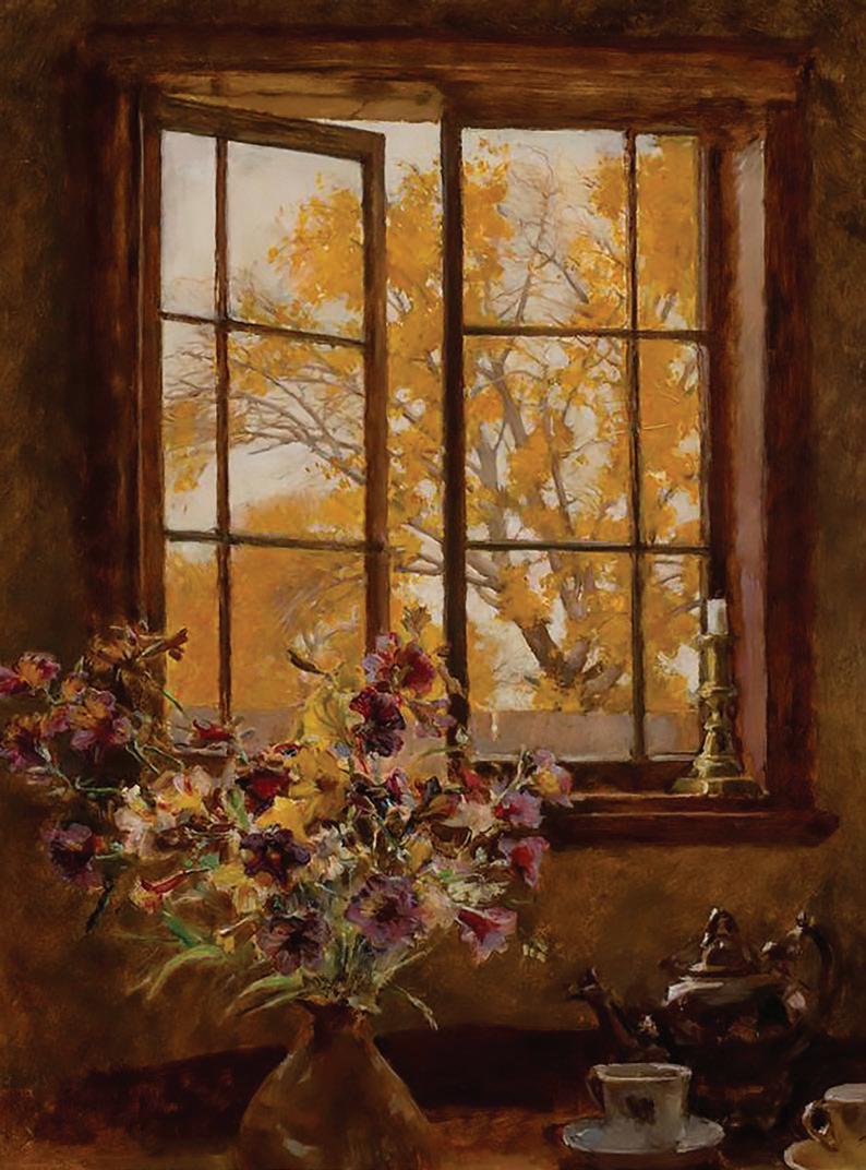
With over 80 works from public and private collections, this landmark exhibition is the largest survey of AME Bale’s work in recent years.
Image: AME Bale, ‘A Castlemaine Casement’, 1927, oil on board, 61.5 x 46.5 cm. Courtesy of the Castlemaine Art Museum Collection.
HAWTHORN ARTS CENTRE 360
ROAD HAWTHORN, VICTORIA 03 9278 4770






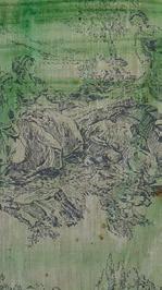

THE ANTWERP 6, BILLY
JASON
LESLEY




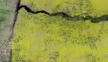

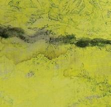
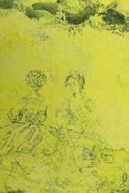
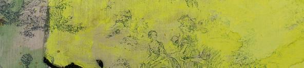


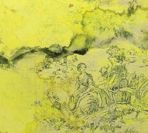
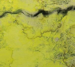
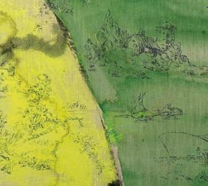
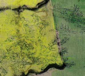

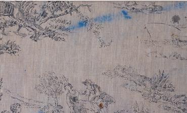
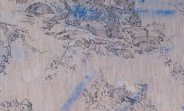
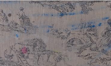
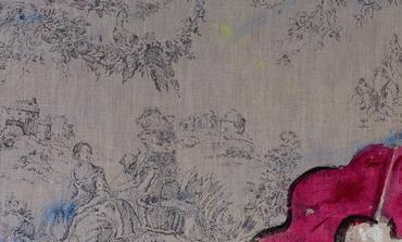
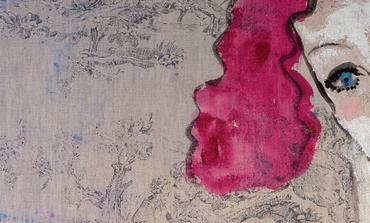
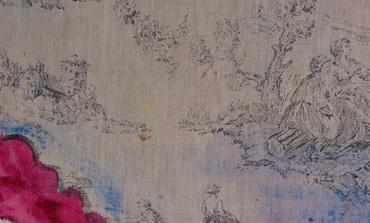
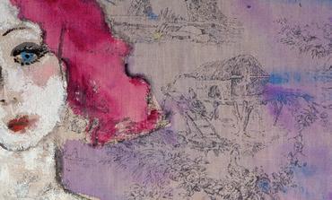
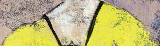
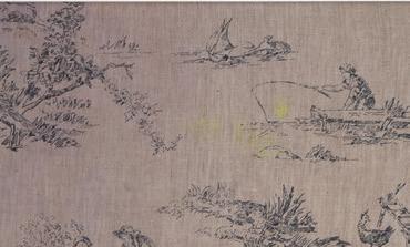
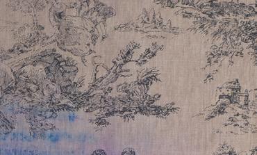
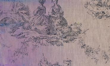
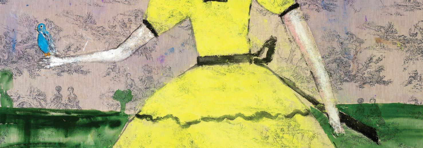
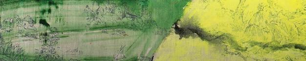
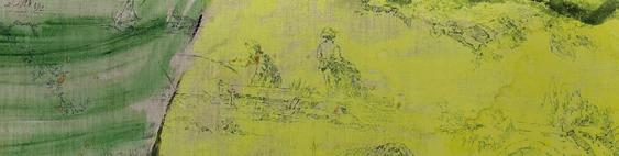
JENNY WATSON Scarlett O’Hara with a budgerigar (detail), 2014 Acrylic and Japanese pigment on rabbit skin glue primed English printed linen, 182 × 128 cm
Courtesy of the artist and Roslyn Oxley9 Gallery, Gadigal Country/Sydney
BAIN,
DUMBRELL, LIAM FLEMING,
GREIG, NADIA HERNÁNDEZ, DOUGLAS KIRKLAND, MIKE PARR, LIAM ROSS BAKER, KATHLEEN RYAN, MINDY SEU, RHODA TING & MIKKEL BOJESEN, JENNY WATSON & MORE
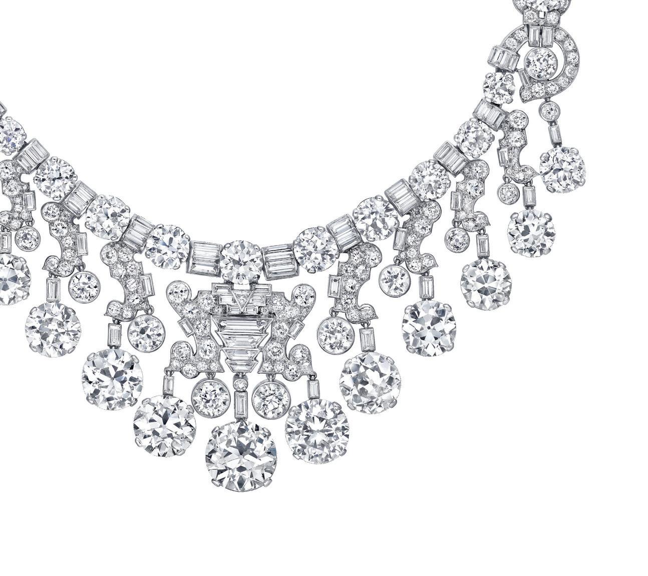

Cartier, London Necklace 1934, special order. Cartier Collection © Cartier. Photo: Nils Herrmann (background) Image: Studio Sabine Marcelis
A LAST LOOK
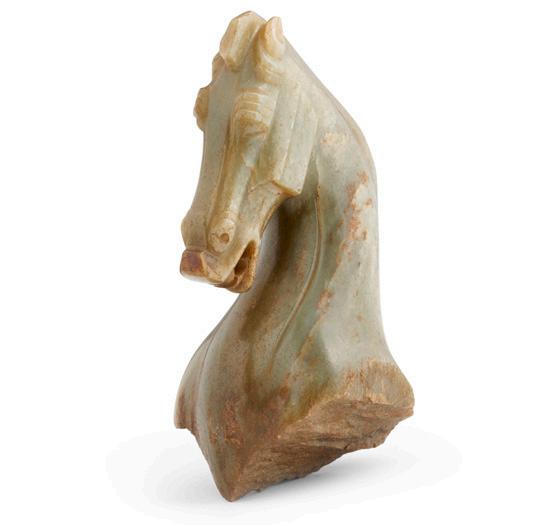
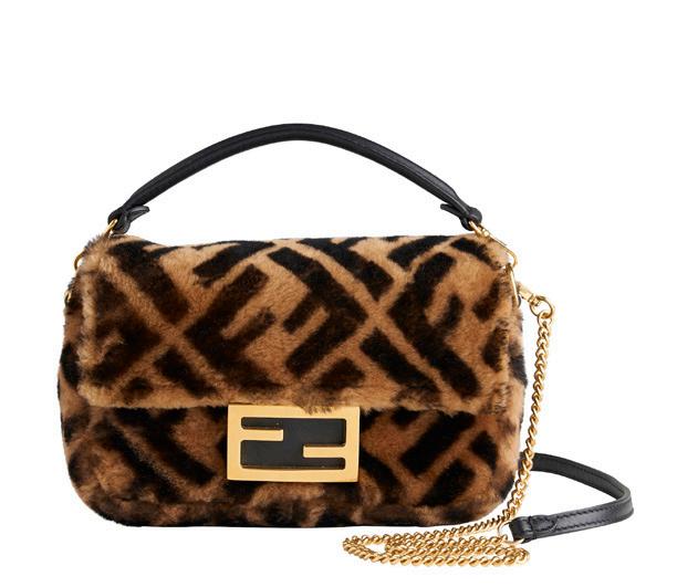
In this feature, we revisit a handful of beautiful and extraordinary pieces that have passed through our doors since the last issue.
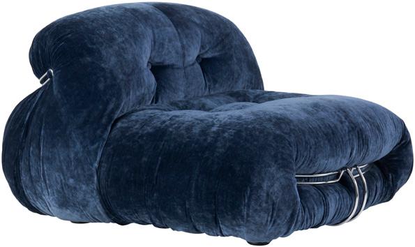
Afra & Tobia Scarpa 'Soriana' lounge chair for Cassina
Sold for $8,750
Modern Design, June 2026
Tom Roberts (1856-1931)
Little Nell Simpson 1888
Sold for $187,050
Fine Art, June 2026
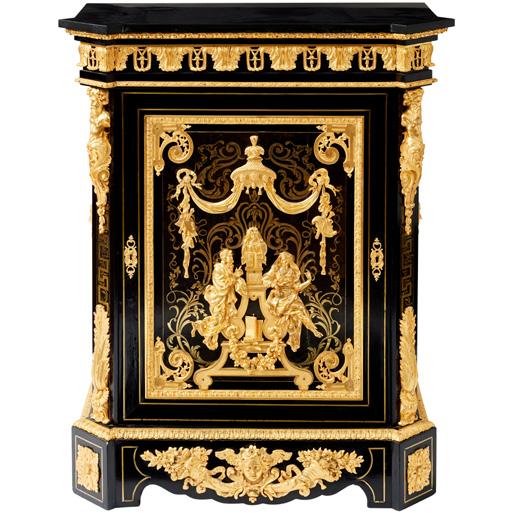
A Napoleon III gilt-bronzemounted and Boulle side cabinet by Mathieu Béfort Sold for $22,500
The Collector's Auction, June 2026
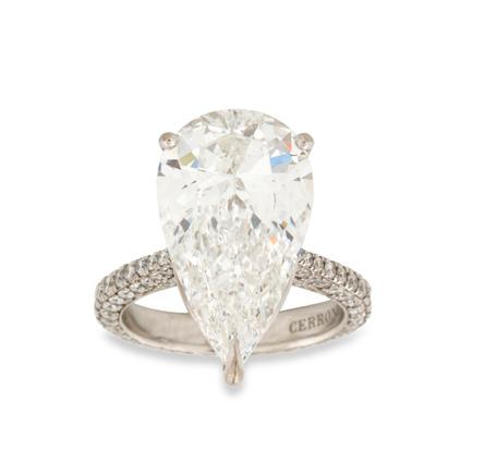
Cerrone, 18ct white gold and diamond ring
Sold for $293,750 Fine Jewels, June 2026
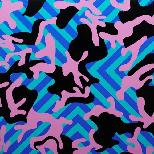
Reko Rennie (Born 1974) Camo OA 2024 Sold for $60,000 Centum, May 2026
Fendi, a Baguette mini bag Sold for $2,750 Luxury, May 2026
A Chinese celadon and russet
jade horse head, possibly Han Six Dynasties
Sold for $47,500
Important Chinese & Asian Art, June 2026
With regular auctions in Fine Art, Jewels & Watches, Decorative Arts, Modern Design, Luxury and more, there’s something to suit every taste at Leonard Joel.
browse
Browse our online auction catalogues or view in person at one of our salerooms.
bid
Create an account online and use it whenever you bid. You can also receive Lot alerts tailored to your interests.
Bidding is simple and you can do so in person, online, by phone or by leaving an absentee bid. Our team is always on hand to guide you.
now delivering
Get your auction purchases delivered straight to your door with Leonard Home Delivery (Melbourne only), our convenient, fast, reliable delivery service managed by our in-house team. Please visit our website for more information or contact delivery@leonardjoel.com.au
connect
Subscribe to our email newsletter through our website to stay up to date with news on upcoming auctions, special events, and industry insights. website leonardjoel.com.au instagram @leonardjoelauctions facebook facebook.com/leonardjoelauctions youtube youtube.com/user/leonardjoel1919

VALUE, SELL & BUY
Contact a Leonard Joel Specialist
managing director & head of important collections
John Albrecht 03 8825 5619 john.albrecht@leonardjoel.com.au
Auction Specialists
fine jewels & timepieces
Annie Soust
Head of Department, Melbourne 03 8825 5645 annie.soust@leonardjoel.com.au
Lauren Boustridge
Head of Department, Sydney 02 9362 9045 lauren.boustridge@leonardjoel.com.au
fine art
Wiebke Brix Head of Department 03 8825 5624 wiebke.brix@leonardjoel.com.au
Amanda Hayward (née North)
Senior Fine Art Specialist 03 8825 5644 amanda.north@leonardjoel.com.au
decorative arts
Chiara Curcio
Head of Department 03 8825 5635 chiara.curcio@leonardjoel.com.au
asian art
Luke Guan Head of Department 0455 891 888 luke.guan@leonardjoel.com.au
modern design
Rebecca Stormont
Senior Modern Design Specialist 03 8825 5637 rebecca.stormont@leonardjoel.com.au
luxury
Sisi Levinson, Luxury Specialist 03 8825 5605 luxury.specialist@leonardjoel.com.au
prints & multiples
Hannah Ryan Senior Art Specialist, Manager of Specialty Auctions 03 8825 5666 hannah.ryan@leonardjoel.com.au
sydney
Ronan Sulich Senior Adviser 02 9362 9045 ronan.sulich@leonardjoel.com.au
Madeleine Mackenzie
Head of Decorative Arts & Art, Sydney 02 9362 9045 madeleine.mackenzie@leonardjoel.com.au
brisbane
Troy McKenzie
Head of Private Collections, Queensland 0412 997 080 troy.mckenzie@leonardjoel.com.au
adelaide
Anthony Hurl Representative Specialist 0419 838 841 anthony.hurl@leonardjoel.com.au
perth
John Brans Representative Specialist 0412 385 555 john.brans@leonardjoel.com.au
The Auction Salon Specialists
art
Millie Lewis 03 8825 5630 art.manager@leonardjoel.com.au
furniture
Alex Sargeant 03 8825 5640 furniture.manager@leonardjoel.com.au
jewellery
Anna Akacich 03 8825 5618 jewellery.manager@leonardjoel.com.au
objects & collectables
Kieran Grogan Carpenter 03 8825 5655 objects.manager@leonardjoel.com.au
Valuations
David Parsons
Head of Private Estates and Valuations 03 8825 5638 david.parsons@leonardjoel.com.au
Marketing & Communications
Blanka Nemeth
Senior Marketing, Media, and Communications Manager 03 8825 5620
blanka.nemeth@leonardjoel.com.au
Maria Rossi
Graphic Artist
Paolo Cappelli
Senior Photographer & Videographer
Adam Obradovic
Photographer & Videographer
Jon Bader
Photographer & Videographer, Sydney
Sale Rooms
melbourne 2 Oxley Road, Hawthorn, VIC 3122 03 9826 4333
sydney
The Bond, 36–40 Queen Street, Woollahra, NSW 2025 02 9362 9045
Leonard Magazine
editor
Blanka Nemeth
graphic design
Maria Rossi
subscriptions
For Leonard Magazine subscription enquiries and requests, please contact lucy.lewis@leonardjoel.com.au
melbourne 2 Oxley Road, Hawthorn, VIC 3122 03 9826 4333
sydney
The Bond, 36-40 Queen Street, Woollahra, NSW 2025 02 9362 9045
brisbane 54 Vernon Terrace, Teneriffe, QLD 4005 0412 997 080
adelaide 429 Pulteney Street, Adelaide, SA 5000 0419 838 841
perth 0412 385 555
info@leonardjoel.com.au leonardjoel.com.au
