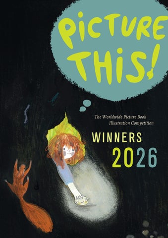
The Worldwide Picture Book Illustration Competition
WINNERS
2026
AND THE WINNERS ARE... The Worldwide Picture Book Illustration Competition
THE NETHERLANDS
Anika Johanna Pardijs Su Ekin Demir Wieteke Opmeer GERMANY
Anca Trif Susanne Hirche Tanja Salomäki I TA LY
Simona Naldi Paola Abeni Maria Antonietta Saputo THE UNITED KINGDOM
Agnieszka Zapala Czacarri Muli Windy Zhu SOUTH AFRICA
Maricel Botha Marli Lyon Mone Van Rooyen
TA B L E O F C O N T E N T S
P R E FA C E
7
THE NETHERLANDS
Anika Johanna Pardijs Su Ekin Demir Wieteke Opmeer
12 16 20
GERMANY
Anca Trif Susanne Hirche Tanja Salomäki
24 28 32
I TA LY
Copyright: © 2025 Lemniscaat b.v., Rotterdam
Simona Naldi 36 Paola Abeni 40 Maria Antonietta Saputo
44
Cover illustration: © Clara Gilod
THE UNITED KINGDOM
Photographs: © the winners Picture this! Logo: © Tobias Hickey Juries: The Netherlands & Belgium: Jan Jutte, Miriam Bos, Sophie Pluim, Jesse Goossens
Agnieszka Zapala Czacarri Muli Windy Zhu
48 52 56
United Kingdom: Petr Horáček, Louisa Jackson South Africa: Piet Grobler, Alida Bothma, Anzette Williams Italy: Nicoletta Bertelle, Chiara Raineri, Beniamino Sidoti, Sara Saorin ,Francesca Segato Germany, Switzerland and Austria: Ulf K., Dr. Pauline Liesen, Dr. Paula Peretti, Susanna Wengeler, Franziska Neuhaus More information on www.wwpbic.com
lemniscaat
rotterdam
SOUTH AFRICA
Maricel Botha Marli Lyon Mone Van Rooyen
60 64 68
The Worldwide Picture Book Illustration Competition P R E FA C E 2026 marks the twelfth anniversary of the Picture This! competition, and we are proud to present this catalogue featuring our winners from the United Kingdom, South Africa, the Netherlands, Germany and Italy. It’s been another impressive year for entries, and our regional juries have chosen a diverse and inspiring group of debut picture book artists. We cannot underestimate the role that picture books play in children’s early development and cognitive growth. Picture books are the equivalent of an art gallery – a child’s very first introduction to the visual language of storytelling. They encourage empathy, and they can unlock a limitless world of the imagination. When the world around them is shifting, picture books offer comfort and familiarity to children. Finding new creators for these books, with fresh artistic perspectives is one of the best parts of my job as an Art Director, and the Picture This competition has been a wonderful tool with which to do that. What makes Picture This! so unique is that it’s a competition for emerging creators globally. Picture books may vary across territories in narrative style, visual design and physical format – but this competition is about coming together, to celebrate our creative similarities (and differences) and the global wealth of new artistic talent. The organisers from the territories – from publishers, academies and cultural institutions, meet each year at the Bologna Children’s Book Fair. We come together to celebrate the art of the picture book. Our aim is to provide an international platform for emerging talent, and twelve years on from the first competition we are delighted that many of our past winners are now published authors. We hope that you enjoy the breadth of talent in this catalogue as much as we have enjoyed choosing it – and on behalf of us all, Lemniscaat Publishers in the Netherlands, Walker Books in the UK, Protea Publishers in South Africa, Camelozampa in Italy and the Bilderbuchmuseum Burg Wissem and Peretti Agency in Germany – we wish our winners every future success. louise jackson Executive Art Director Walker Books UK
THE NETHERLANDS
GERMANY
Anika Johanna Pardijs
Anca Trif
Su Ekin Demir
Susanne Hirche
Wieteke Opmeer
Tanja Salomäki
AND THE
WINNERS ARE...
I TA LY
THE UNITED KINGDOM
SOUTH AFRICA
Simona Naldi
Agnieszka Zapala
Maricel Botha
Paola Abeni
Czacarri Muli
Marli Lyon
Maria Antonietta Saputo
Windy Zhu
Mone Van Rooyen
I FOUND YOU ANIKA JOHANNA PARDIJS
A V A L O V E S C O L L E C T I N G unusual things she
finds outdoors. One day, she discovers a small stone with a face drawn on it, and it soon becomes her favourite find. But when she loses it, the
stone embarks on a long journey through all kinds of places and into the hands of many different people. While Ava continues to miss it, a new and extraordinary discovery ultimately awaits her
CAROLINE RODRIGUEZ VELASCO
For as long as I can remember, I have had a great love of words and images, particularly children’s books and picture books. As a child, I made up stories and musicals for my younger sisters and created little books with my nieces and nephews. Now that I have children of my own, they remind me that play, experimenting freely with materials, letting go and embracing imperfection are important in finding joy in the creative process. They give images a certain depth. Astrid Lindgren is a major source of inspiration. The freedom and individuality of the children she portrays in her books, along with her love of nature and community, inspire me to draw time and again. I hope this is reflected in my work. I work with gouache, watercolour, coloured pencil, crayon and pastel. . I N S TA @ a N i k a J o h a N N a . a r t
T E C H N I Q U E U S E D This is a digital
Watercolour, gouache, pencil and crayon, followed by digital finishing.
12
AND THE WINNERS ARE…
A N I K A J O H A N N A P A R D I J S - I found you
13
J U R Y R E P O R T With I Found You, Anika Johanna Pardijs presents an entry in which image and story work beautifully together. The story of Ava, who finds, loses and rediscovers a stone, has a simple premise but touches on themes such as wonder, attachment and loss. As a result, it appeals both to young readers and to the adults reading with them. The jury appreciates the world Anika creates. Her illustrations invite the reader to look around and discover details. These details reinforce the themes of collecting, searching and finding. At the same time, the images leave enough room for the text, demonstrating the artist’s understanding of how a picture book works. The characters, too, are convincingly developed. Using a relatively simple visual language, Anika gives each of them a distinct personality. Their postures and facial expressions make their emotions immediately clear, allowing the reader to empathise easily with Ava.
14
AND THE WINNERS ARE…
The chosen technique supports the story well. With loose lines, textures and layered areas of colour, Anika creates images with depth. Her use of materials contributes to the character of the work. The compositions are also striking. The absence of a clear horizon and the use of large, dark areas create an image structure that surprises the viewer and guides the eye. The abundance of detail sometimes demands a great deal of the reader’s attention, but it is also an important part of this entry’s appeal. The jury sees Anika Pardijs as an illustrator with a distinctive visual language and a vivid imagination, and looks forward with interest to seeing how her work develops.
A N I K A J O H A N N A P A R D I J S - I found you
15
ON THE WAY TO THE CITY SU EKIN DEMIR
S U E K I N D E M I R I am a picture-book illustrator and graphic designer. Originally from Istanbul, I now live and work in Antwerp. After studying Fine Art and Graphic Design, I completed a master’s degree in Graphic Design at the London College of Communication. I then settled in Belgium. After several years working for agencies and design studios, I have devoted myself entirely to picture-book illustration since 2024. To me, picture books are a unique art form in which illustration, design and story come together. I work with traditional techniques and mixed media, exploring how texture, composition and atmosphere can strengthen a story. Outside my studio, I almost always carry a sketchbook with me. I draw while travelling, photograph the often-overlooked details of everyday life, make ceramics, visit contemporary art exhibitions and explore the world through play with my young daughter. All these experiences find their way into my work and continue to enrich my visual language. I N S TA @ s t u d i o _ _ s u
A Y O U N G P E N G U I N visits the city with her mother for the first time. Everything is new: tall
buildings, busy streets, cafés, markets, trains and museums. Another discovery awaits around every corner. Yet, however exciting all these new experiences may be, she ultimately realises that the warmest and safest place is still close to her mother, on their way home. On the Way to the City is an atmospheric and tender picture book about curiosity, the magic of a first adventure and the comfort of having someone who is always close by. With richly layered mixed-media illustrations and an evocative visual narrative, the book captures both the vitality of the city and the universal feeling of safety and belonging.
16
AND THE WINNERS ARE…
T E C H N I Q U E U S E D These are traditional mixed-media illustrations made with gouache, oil pastel, collage and coloured pencil. The illustrations were then digitally refined with minor adjustments in Procreate and Photoshop.
S U E K I N D E M I R – On the Way to the City
17
J U R Y R E P O R T With On the Way to the City,
Su Ekin Demir presents a thoughtful entry. The story follows a young penguin visiting the city with her mother for the first time. Through her eyes, the reader discovers a world full of new impressions. The story concludes with a sense of safety and connection, naturally bringing together wonder and emotion. The jury appreciates how clearly the illustrations are constructed from the young protagonist’s perspective. The city serves not merely as a backdrop, but above all as an experience. The images therefore play an active role in telling the story. The scenes are clearly composed and guide the reader effortlessly through the book.
18
AND THE WINNERS ARE…
Demir also demonstrates strong technical skill. The combination of mixed media, collage and digital techniques forms a cohesive whole. The colourful backgrounds bring energy to the images, while their contrast with the black-andwhite penguins ensures that attention remains firmly focused on the main characters. The compositions and shifts in perspective create variety and reinforce the sense of discovery. The style remains consistent without becoming predictable. Some illustrations still feel a little cautious, but their accessibility will appeal to many young readers. At the same time, the jury sees opportunities to add further layers to certain scenes by occasionally including more visual information. This entry shows that Su Ekin Demir has a strong sense of visual storytelling and a clear understanding of her audience. The jury sees an artist with a distinctive visual language and looks forward to her further development.
S U E K I N D E M I R – On the Way to the City
19
T H E V E LV E T E E N R A B B I T (after The Velveteen Rabbit by Margery Williams, 1922) WIETEKE OPMEER
A B O Y R E C E I V E S a stuffed velveteen rabbit
for Christmas. In the toy cupboard, the rabbit feels insignificant among the boastful mechanical toys, but the old horse tells him that toys can become ‘Real’ when a child loves them truly and
W I E T E K E O P M E E R I grew up in a creative family on the outskirts of a small village. My world was filled with nature, stories and beautifully illustrated books. As a child, I spent a great deal of time outdoors and was always drawing and making things. The wonder I found in nature and the imaginary worlds of stories remain the main sources of inspiration for my work. After studying Product Design/Free Design at the Utrecht School of the Arts, I worked as an independent product designer, museum educator and art teacher. I now teach drawing and painting to a wide range of groups. My love of illustration and visual storytelling remains as strong as ever. In my free time, I enthusiastically experiment with different techniques and materials and spend many hours drawing and painting. I remain especially fascinated by the way illustrations can enrich stories and, together, evoke an entirely new world. . I N S TA @ w i e t e k e o p m e e r
T E C H N I Q U E U S E D I used various types of gesso, acrylic paint, watercolour, gouache and coloured pencil.
20
AND THE WINNERS ARE…
for a long time, even if that leaves them worn and shabby. When the rabbit is placed in the boy’s bed to comfort him, the two become inseparable. They play, whisper and sleep together, while the rabbit grows increasingly worn and threadbare. When the boy calls him ‘Real’, the rabbit realises that the magic has already begun. In the woods, he meets wild rabbits who find him strange because he neither moves nor smells as they do. Later, the boy falls ill and the rabbit remains faithfully by his side. When the rabbit is about to be thrown away after the boy recovers, a magical fairy transforms the worn-out toy into a real, living rabbit. A year later, the boy sees a rabbit in the woods that looks vaguely familiar.
W I E T E K E O P M E E R – The Velveteen Rabbit
21
J U R Y R E P O R T With her interpretation of The Velveteen Rabbit, Wieteke Opmeer demonstrates a strong command of her craft. The three illustrations show impressive drawing skills and a keen sense of atmosphere, light and composition. They capture the emotional heart of the story and make the relationship between the characters palpable. The jury appreciates the quality of the draughtsmanship. Wieteke works with care and has a firm command of her materials. Her illustrations have a classic quality without feeling old-fashioned. Her use of light, colour and texture, in particular, reveals both control and craftsmanship. Here and there, looser touches lend the images additional softness and movement. The characterisation also stands out. The velveteen rabbit, the horse and the boy each have a distinct presence. Through posture, gaze and facial expression, Wieteke conveys emotion without exaggeration. The scene with the boy and the rabbit is particularly moving and convincing.
22
AND THE WINNERS ARE…
The compositions are well,Light directs the viewer’s attention and supports the story. The jury sees opportunities to create an even greater sense of space by experimenting further with depth and distance. We also wonder how her work might develop if she occasionally disrupted her classical approach with an unexpected choice. This entry reveals an illustrator who has mastered her craft and knows what she wants to convey. The jury sees quality, craftsmanship and great potential.
W I E T E K E O P M E E R – The Velveteen Rabbit
23
BAREFOOT SPRITES
T E C H N I Q U E U S E D Oil on watercolour paper, with coloured pencil details and digital finishing in Procreate.
SIMONA NALDI a m i d t h e j o y s and sor-
rows of everyday life, a child walks through the world. With every step, a different shade of his soul comes to light. His emotions and most secret thoughts take shape: tiny creatures made in his image, barefoot and silent, guardians of a parallel universe, an intangible place where neither
24
AND THE WINNERS ARE…
shadows nor matter exist, only feelings. Sometimes, the boundaries grow thin, and the two worlds brush against each other. The child cannot see them, but he can sense their presence. They are clever and discreet spirits, silent companions on his inner journey.
When the weight of the world becomes too much to bear, those little souls, each so different from the others, learn to join forces, overcome their differences, use their imagination, and help the child overcome even the greatest obstacles.
S I M O N A N A L D I – Barefoot Sprites
S I M O N A N A L D I was born in Bologna, where
she still lives. After graduating in Veterinary Medicine and working as a veterinarian for several years, she left the profession to devote herself to raising her two children. Sharing stories and picture books with them sparked a passion for children’s illustration and led her to pursue her own artistic path. She trained at Ars in Fabula, developing a visual language that combines traditional techniques with digital tools. Her illustrations are rich in parallel narratives, ironic details and unexpected elements, reflecting her love of playful storytelling.
In 2025, she received an Honourable Mention in the Picture This! competition and was a finalist in Illustrada. In 2026, her work was selected for both the Annual Autori di Immagini and the Premio Illustri Annual. She strongly believes in AI as Artistic Intelligence: the deeply human ability to transform imagination, emotions and everyday life into images and stories. I N S T A @ _ STUDIO L I N O _
J U R Y R E P O R T Through a poetic and deeply original visual metaphor, Simona
Naldi gives tangible form to the emotional complexity of childhood. Delicate draftsmanship, a restrained yet luminous palette, and remarkable narrative control transform inner feelings into playful, expressive characters that move seamlessly between imagination and reality. A work of great sensitivity that demonstrates both technical mastery and an exceptional ability to tell stories through images.
26
AND THE WINNERS ARE…
S I M O N A N A L D I – Barefoot Sprites
27
H A N S E L A N D G R E T E L by The Grimm Brothers PAOLA ABENI hansel and his little sister gretel
live in the home of a poor woodcutter. When a terrible famine leaves the family without food, their stepmother convinces their father to abandon the children in the heart of the forest. The first time, Hansel manages to find his way back thanks to a trail of white pebbles, but his second attempt fails: the breadcrumbs he left along the path are eaten by birds, and the two siblings get lost in the woods. After several days of hunger and fear, Hansel and Gretel follow a little white bird to a wonderful little house made of bread, pastries, and sugar. They are greeted by an apparently kind old woman, who offers them food and a warm bed. But behind that smile lurks a terrible witch, ready to imprison Hansel and force Gretel to serve her. With courage and cunning, however, the two siblings manage to outwit the witch. Gretel pushes her into the burning oven and finally frees Hansel. Before fleeing, the children find precious chests filled with pearls and gems in the little house. Guided by hope and helped by a little white duck to cross the river, the two siblings finally find their way home and into their father’s embrace. From that day on, all fear and misery come to an end, and their life returns to peace and happiness.
P A O L A A B E N I was born in Brescia in 1984,
where she lives and works. She studied at the M. Olivieri Art High School in Brescia and later graduated in Illustration from the Scuola del
Fumetto in Milan in 2009. She further developed her artistic practice through workshops at the International School of Illustration in Sarmede and Ars in Fabula in Macerata. Her illustrations have appeared in several magazines and have been selected for exhibitions including Immagini della Fantasia in Sarmede, the Turin Book Fair, Lucca Comics & Games, and the Key Colours Competition in Hasselt.
She enjoys creating magical atmospheres through traditional techniques, particularly gouache, acrylics, and coloured pencils. She is inspired by Paul Gauguin’s words: “Art is an abstraction: squeeze it out of nature while dreaming in front of it, and worry more about the creation than the result.” www.behance.net/paolaabeni
T E C H N I Q U E U S E D Tempera paint
and coloured pencils on paper.
28
AND THE WINNERS ARE…
29
J U R Y R E P O R T With a distinctive visual language and a bold imaginative vision, Paola Abeni reinterprets a classic fairy tale through striking compositions and unexpected imagery. Her refined use of colour, stylised characters, and carefully balanced symbolism creates an atmosphere that is at once enchanting and unsettling. A confident and highly original work that reveals a unique artistic voice and a remarkable sense of visual storytelling.
30
AND THE WINNERS ARE…
P A O L A A B E N I – Hansel and Gretel
31
T H E L I T T L E P R I N C E by Antoine de Saint-Exupéry MARIA ANTONIETTA SAPUTO
T E C H N I Q U E U S E D Woodcut
by Antoine de Saint-Exupéry is a story that explores the themes of love, friendship, and the meaning of life through the eyes of a child. The narrator, a pilot crashed in the Sahara Desert, meets the Little Prince, a special boy from asteroid B-612. The Little Prince recounts his journey through several planets inhabited by bizarre adults and his encounter on Earth with a fox, who teaches him the true value of friendship and love. Having understood the unique bond with the rose he left on his planet, the Little Prince decides to return there, leaving the pilot with a profound life lesson: “What is essential is invisible to the eye”.
the little prince
M A R I A A N T O N I E T T A S A P U T O lives in
Rome and is an illustrator with a passion for children’s books. She holds a Master’s Degree in Art Graphics – Illustration and Publishing from the Academy of Fine Arts. Throughout her career, she has explored a variety of printmaking techniques as tools for visual storytelling, with a particular interest in paper engineering and woodcut. She also integrates digital media into her creative process using Photoshop, Illustrator, and InDesign. She believes that illustrations have the power to tell stories and communicate emotions, often beyond the written word. Convinced that every element of a picture book—from its illustrations to its paper and format—contributes to its visual language, she is committed to creating books that inspire imagination and foster children’s emotional and creative development.
w w w . b e h a n c e . n e t / g a ll e r y /
2 5 3 0 6 24 5 5 / p o rt fo l i o ? p l at fo r m = direct
32
AND THE WINNERS ARE…
M A R I A A N T O N I E T T A S A P U T O – The Little Prince
33
J U R Y R E P O R T By embracing the demanding medium of woodcut, Maria Antonietta Saputo demonstrates both dedication and artistic curiosity. Her bold graphic compositions and restrained visual language reinterpret The Little Prince with clarity and consistency, capturing the timeless simplicity of the story. A promising work that reveals technical commitment and an encouraging sensitivity to visual storytelling.
34
AND THE WINNERS ARE…
M A R I A A N T O N I E T T A S A P U T O – The Little Prince
35
A GLASS OF MILK ANCA TRIF e m m a h a s o n e s i m p l e g o a l : to reach the at-
tic, curl up with her favorite books, and enjoy a glass of cold, fresh milk. But first she must fetch
the milk from the kitchen and make her way through a bustling house where everyone seems to need something from her. The cat follows her, hoping for a taste of the milk, the dog begs her to play, Grandma needs help threading a needle, her sister tries to lure her outside into the rain, and her little brother would do anything for a sip of her milk. Eve-
ry interruption is small, familiar, and almost impossible to avoid. Yet Emma keeps going, accompanied by the beloved characters from the stories she loves, who quietly join her on her journey upstairs. A Glass of Milk is a picture book about determination, focus, and holding on to what matters when the world keeps pulling at your attention.
Told in real time, it is illustrated entirely in gouache, whose rich textures and warm palette evoke the lively, often chaotic home Emma navigates while capturing the worn character of an old family house and the quiet traditions that shape her world. Intended for readers aged 4–8, the story gently reminds children that it is okay to pursue something simply because it brings them joy.
A N C A T R I F I am a Romanian-born illustrator living and working in Berlin. My path to illustration began with a lifelong love of picture books, which deepened after discovering Martin Salisbury’s books on writing and illustrating them. Since then, I have been dedicated to developing my craft and creating stories that combine warmth, observation, and visual storytelling. Although I am a self-taught illustrator, I hold a BA in Communication, a background that continues to shape how I think about narrative, emotion, and the relationship between text and image. My work is created primarily in gouache, often combined with ink and scanned paper textures, and is inspired by everyday moments, family life, and quiet human connections. My picture book projects have received early recognition, including two selections for the dPictus Unpublished Picturebook Showcase in 2025, being shortlisted for the 2025 Bologna Children’s Book Fair Illustrators Exhibition, and being longlisted for the 2026 World Illustration Awards. These milestones have strengthened my commitment to creating picture books that invite children to slow down, observe, and find wonder in ordinary moments. I N S TA @ s a r a c u p e r L o
T E C H N I Q U E U S E D water colour
36
AND THE WINNERS ARE…
S A R A C U P E R L O – The Gobbler
37
J U R Y R E P O R T A child is sitting on a bed, looking at us. The atmosphere is cozy: a
sleeping cat, a doll, and a book lie on the floor. Our gaze is drawn to the large windows: it’s raining outside. The child has a plan. “A Glass of Milk” tells the story of the child’s journey through the house to the attic, where they want to lose themselves in the books they’ve been saving for just such a day. What might not sound like a big deal at first turns into a small hero’s journey in this picture book. After all, there are a number of obstacles to overcome. The child is accompanied on this journey by characters from his favorite books, whom we can spot as silhouettes in Anca Trif’s illustrations. The illustrator depicts the dimensions of the house from the child’s perspective by portraying the rooms from an elevated viewpoint. She chooses a rich, warm red as the base color and a muted grass green as a vibrant complementary color.
38
AND THE WINNERS ARE…
Even walking down the hallway becomes an experience in itself. Passing the coat rack, rows of shoes, and umbrellas, we catch a glimpse of the kitchen that the child is about to enter with the cat. On the carpet: the silhouette of a crocodile. In the next picture, as the child pours a glass of milk from the heavy bottle, we can let our gaze wander through a lovingly furnished kitchen. In the foreground is the dark table; behind it, the stove, the sink, and a wide-open refrigerator containing a birthday cake. Behind the window is another shadow—this time a rooster—and a turtle is crawling along the wall. There’s something surprising about these elements, but nothing threatening. The child’s full attention is on the glass of milk. We’re eager to see how Anca Trif’s story unfolds! (sw)
A N C A T R I F – A glass of milk
39
MY FAVORITE WONDER THING SUSANNE HIRCHE as a sequence: 11 different children are introduced with their favorite wonder thing. The wonder things are surreal obthis book is designed
jects with small toys, found items, or handcrafted things. In the children’s imagination, imaginative play worlds arise that invite exploration
and immersion. Each picture tells its own story, the text is in rhyme form. The last wonder thing seems to have no owner, and surreal guesses are made about what might be inside and to whom it might belong. These motifs are reflected in the cover image. At the end, the “reading” child is addressed directly, as this wonder thing belongs to them and it has hidden itself there in play. In
the front and back endpapers of the book, you can see the children playing together and their imaginative worlds blending.
S U S A N N E H I R C H E I was born in 1974 in Dortmund, Germany, as Susanne Meister. From an early age, I loved telling stories through pictures. In 1999, while studying at the State Academy of Fine Arts in Stuttgart, my picture book project „Prince Hustelgrübchen and his Nose“ was selected for the Illustrators Exhibition at the Bologna Children’s Book Fair. After graduating, I worked as an art teacher, but my passion for picture book illustration remained. For many years, I created stories and illustrations in the quiet of my studio. A few years ago, I felt the desire to further develop my craft, so I attended workshops with illustrators and completed a distance-learning course at the Textmanufaktur, focusing on children’s and young adult literature. My work is inspired by my observations of nature and children, as well as by the magical atmosphere of opera stage design. My wish is that my pictures and stories find their way to children and touch them. w w w . s u s a nn e h i r c h e . d e
I N S TA
@ s u s a nn e h i r c h e
T E C H N I Q U E U S E D Spray paint, acrylic, oil on canvas/cardboard,
400 x 500 mm
40
AND THE WINNERS ARE…
41
J U R Y R E P O R T Who doesn’t sometimes dream of making their own toys—or even building an entire
play world? Some children actually do this if they’re given enough freedom to do so. Susanne Hirche’s illustrations inspire exactly this kind of fantasy world. Whether it’s a weather station that looks like an old-fashioned TV, or objects made of paper, feathers, and string that can grow like plants or fly: there are no limits to the imagination! The acrylic-painting style of the illustrations does not blur or run, but is supported by rather austere, stage-like surfaces. Arranged in this way, the viewer’s gaze isn’t overly distracted and finds calm in the graphic backgrounds, inspired by wallpaper or tile floors. Fascinated of being able to turn a game on and off whenever one wishes, the viewer steps into the images and plays with the motifs in his or hers imagination. And each pictorial game in itself is an invitation to join the storytelling and spin the “wonderful things” further. Even without text, this book concept takes you on a journey. (pp)
42
AND THE WINNERS ARE…
SUSANNE HIRCHE –
My favorite wonder thing
43
GROWING UP IS HARD TANJA SALOMÄKI is hard is a book about experiences in life that are challenging for children as for adults, but showing that these experiences might be sweet and funny as well. The book is written in short poetic sentences which underlines and strengthens the illustrated scene. Each double spread has one half that shows the child or
growing up
44
AND THE WINNERS ARE…
children in action and the other half showing the location of the event. These three elements, the text, the child and the place, forms a complete description of the experience that can be discussed with the reader and the listener.
T A N J A S A L O M Ä K I is an illustrator living in Berlin. She is born in
Finland, studied architecture in Sweden and worked as an architect in the Netherlands and Germany. The picture book as a physical object and the impact illustrations and stories have on the reader is something that inspires Tanja to make her own books.
I N S TA l o n g l a k e f o r e s t
T E C H N I Q U E U S E D mixed techniques
T A N J A S A L O M Ä K I – Growing Up Is Hard
45
J U R Y R E P O R T In Growing up is hard, Finnish illustrator Tanja Salomäki relies heavily on the
reader’s active participation. The illustrations in her book project should always be viewed as a combination of a two-page spread: The left-hand page depicts children in individual situations, while the right-hand page captures the space and thus the setting of the action. Short sentences provide associative clues as to how the two juxtaposed (visual) scenes are connected. The child, the space, and the text should be viewed as a single unit, yet despite their manifold clues, they leave room for numerous interpretations. Now it is up to the reader or viewer to ask: How can the different visual motifs be “deciphered” and linked to a story? Fundamentally, Tanja Salomäki alludes to small, somewhat uncomfortable situations in life. She knows that children and adults alike share experiences of this kind. She thus sees her images, among other things, as an opportunity for cross-generational discussion. To create her illustrations, Tanja Salomäki works with various textures, some of which she creates by hand, scans, and then digitally collages and colors. Overall, her use of form and color is very minimal. Spaces are rendered as flat planes, and figures are depicted without contours. Body language is also minimalistic, yet clearly demonstrates that, with a skilled eye, even a small amount of movement can be captured precisely. This restraint in the artistic design greatly benefits the entire collection of illustrations and the book as a whole: it does not overwhelm the viewer, whose thoughts are surely already captivated by the task of integrating the images spread out before them into a narrative context. (pl)
46
AND THE WINNERS ARE…
T A N J A S A L O M Ä K I – Growing Up Is Hard
47
THE ROSEHIP JAM
AGNIESZKA ZAPALA
A G N I E S Z K A Z A P A L A was born in Poland
with a family of mice preparing themselves for a long and exciting autumn walk. The two little mice are happily pointing to the changing scenery, such as frost appearing on leaves and puddles freezing over. The little mice have never seen this before. Mummy Mouse explains to her children why such things happen. While on the walk, the family of mice also see other animals such as tiny frogs ice skating on a frozen puddle and a spider trying to fix its broken web. Many items are collected by the family on their travels, such the story begins
48
AND THE WINNERS ARE…
as colourful leaves and acorns. However, the real treasure is the discovery of a rosehip bush. The family decides to make rosehip jam and the story now focuses on the recipe. They follow the steps to make the jam, and once the jam is ready, they invite all the little friends they met on their walk over for jam on toast. The story focuses on finding joy in appreciating the small things in life: stopping to notice the change in season and reflecting that we are part of nature, meeting new friends, sharing little moments and, of course, jam on toast.
T E C H N I Q U E U S E D Agnieszka’s submission
pieces were created digitally in Procreate, utilising various paint brushes to build upon her original hand-drawn sketches.
A G N I E S Z K A Z A P A L A – The Rosehip Jam
and spent her early years reading picture books, drawing, painting and watching small animals. In 2011 her love for drawing pushed her to move to London to study Illustration and Visual Media at the University of the Arts London. Since graduating, she has worked across various industries while continuing to create illustrations and accompanying stories. Agnieszka draws inspiration from the natural world and enjoys drawing little creatures like mice and insects while creating stories about their lives. Her work seeks to reflect the magic of small everyday situations. She enjoys using mixed media techniques like acrylic paint and coloured pencils. Lately, she has also been creating her art digitally. Away from her work, Agnieszka enjoys collecting mid-century glass and furniture pieces, visiting museums and art galleries and trips to the seaside. However, picture books and storytelling have always had a special place in her heart, and she hopes to be able to share her stories with the world one day. Agnieszka, or Agi, as everyone calls her, continues to live in London with her partner and their two-yearold son.
I N S T A @ a g i . i ll u s t r a t i o n s
49
J U R Y R E P O R T Agnieszka has created a cosy, softly focused world.
The art has chalky, muted textures, and an autumnal palette with a comforting warmth that chimes perfectly with the story of a family of mice on their autumn walk. There are beautifully observed small elements of nature used in a decorative way to build the scenes, which feel in places more like a textile pattern. This is coupled with large representations of the characters and small playful details, like the tiny frogs skating on the pond, that will delight the reader. The simplicity of the art reflects the themes of this gentle story, of appreciating friendship and the small pleasures in life.
50
AND THE WINNERS ARE…
A G N I E S Z K A Z A P A L A – The Rosehip Jam
51
TECHNIQUE USED
Czacarri’s process begins on paper – playing with watercolours, gouache, inks, pencils and charcoals to bring the sea to life. Individually drawing all the sea creatures and then scanning them to digitally collage them together in a spread. The ship was particularly fun to draw – rendered using charcoal powder and collage to emphasise a feeling of pollution.
T H E S E A W E S H A R E CZACARRI MULI t h e s e a w e s h a r e is a set of illustrations about a local fisherman’s sea that’s teeming with life. This once balanced relationship between the village and the waters is disrupted when a big big big trawling ship appears and threatens to take away the magic of the sea. The illustrations show the trawling ship’s net underwater and the fisherman’s line in
52
AND THE WINNERS ARE…
comparison. The net spans multiple pages, highlighting the level of destruction these ships cause to sea floors, leaving them completely barren. Will the fisherman be able to protect the sea that brings life to his home?
C Z A C A R R I M U L I is a Filipino-Irish illustrator and designer bringing a sense of warmth and care through playful image-making. His narrative approach to illustration seeks to connect people and inspire important conversations, developing a community-driven ethos that has nurtured an empathetic practice concerned with heritage storytelling and social change. He has been recognised by the Association of Illustrators as a 2026 Illustration Graduate to Watch and is currently a Raising Voices Fellow with Children’s Books Ireland. From championing
C Z A C A R R I M U L I – The Sea We Share
diverse stories and engaging children through a textural, colourful and hands-on approach, he is committed to award-winning projects. When Czacarri is not covered in paints, pastels and post-its, he can be found smelling the roses. I N S TA @ c z a c a r r i czacarri.com
53
J U R Y R E P O R T Czacarri’s story of the sea uses bold shapes and an
intense colour palette against an inky blue backdrop. The use of texture and colour – orange, pink and zesty yellows – bring the underwater world to life with a glowing intensity. The overlaying of semi-transparent shapes adds a depth to the striking compositions. The sense of foreboding is captured brilliantly in the piece where the hull of the tanker casts a shadow, with the fisherman’s single white fishing line alongside, all juxtaposed against the vibrant beauty of the marine landscape. The net is a recurring graphic feature spanning the spreads – with the orange whale captured and looking out from it with a sad, knowing eye. This is the story of a fisherman but we never see him. Czacarri instead focuses on the fullness of the world that he is trying to protect. This is brave picturebook making, graphic, powerful and emotive – and we loved it.
54
AND THE WINNERS ARE…
C Z A C A R R I M U L I – The Sea We Share
55
W H A T C O L O U R A M I ? WINDY ZHU ‘Colourless is not empty — it holds every colour, waiting.’ a l i t t l e f i s h wonders what colour it is. It asks the creatures around it: am I red? Pink? Orange? Yellow? Yet no one can give a clear answer. Feeling different and uncertain, the fish continues its journey through a world full of colours. In the end, it discovers that it does not belong to a single colour. It carries every colour within itself. This is a story about identity, belonging and embracing the complexity of who we are.
W I N D Y Z H U is an author-illustrator and
designer from China, and a graduate of the MA in Children’s Book Illustration at the Cambridge School of Art. Her picture books explore themes of identity, growth and self-discovery. With a background in interior and book design, she is interested in how the physical form of a book can contribute to storytelling, combining thoughtful visual composition with poetic and interactive approaches.
Her work was selected as a finalist for the 2026 Bologna Children’s Book Fair Illustrators Exhibition and received a Highly Commended award in the 2026 Macmillan Prize for Illustration. Her work has also been recognised by 3x3, The Magazine of Contemporary Illustration, and the BIBF International Illustration Competition. I N S TA @ w i n d y f . z h u
www.windyzhu.com
T E C H N I Q U E U S E D Windy works primarily with digital illustration and RISO printing,
and she enjoys exploring ink painting. 56
AND THE WINNERS ARE…
W I N D Y Z H U – What Colour Am I?
57
J U R Y R E P O R T Windy’s story of the sea and the little fish trying to find
his identity has strong compositions and dense graphic shapes. The limited primary colour palette reinforces the secondary topic of colours. The colours in the illustration are used sparingly – the sea represented as a textural, cream backdrop. Windy uses simple compositions alongside colour to great effect – the orange octopus cropped sharply and filling the right of the page – it’s green eye echoing the colours of little fish. The fish floats alone on the facing page, surrounded by negative space, with green and orange the only two colours in the piece. It’s not until the final spread, at the end of little fish’s journey, that Windy changes the pace entirely, and we see all the colours in a whirling, busy, bold finale against a striking black contrasting sea.
58
AND THE WINNERS ARE…
W I N D Y Z H U – What Colour Am I?
59
DREAMKEEPERS MARICEL BOTHA
t h i s e n c h a n t i n g s t o r y follows Nina, a
young girl who collects fragile, coloured dream orbs hidden in secret places across nature. One late afternoon, she meets Lindi and explains that dreams are living things that can die if they are squashed, unloved, or ignored. Having lost many of her own dreams to the rain or a family that didn’t believe in them, Nina is wary. Gentle and caring, Lindi offers to keep Nina’s dreams safe in a hidden treasure box under her floorboards, promising that her grandmother will believe in them. Together, the two new friends set off into a field, where Nina helps Lindi discover and collect her very own dreams.
M A R I C E L B O T H A is a lecturer in the School
of Languages at North-West University in Potchefstroom, North West Province. A lifelong art lover who trained under Stella Olivier, she balances her academic work with creative passions like painting, etching, linocutting, and pine-needle basket weaving. Living just a stone’s throw from the Mooi River with her family, Maricel draws deep inspiration from local nature, birds, and plant life. Winning this competition fulfills a long-held dream of blending her professional love for language and storytelling with her passion for children’s book illustration.
MAIL maricelbotha@gmail.com
•
•
•
60
i l l u s t r a t i o n 1 Nina reaches into a tree branch near a bird’s nest to collect a dream orb, explaining to a curious Lindi that birds, moths, and moles all know where dreams are hidden. i l l u s t r a t i o n 2 Intertwining portraiture with elements of nature, Nina explains that dreams can die if they are left in the rain, forgotten, or if people stop believing in them. i l l u s t r a t i o n 3 Lindi excitedly offers her secret treasure box as a safe haven for the dreams, creating a surreal, twilight atmosphere where nature and friendship blend beautifully.
AND THE WINNERS ARE…
maricel.botha@nwu.ac.za
T E C H N I Q U E U S E D Maricel crafted these illustrations using vibrant Japanese watercolour (Kuretake gansai tambi). She used the fluid, transparent qualities of liquid purple to evoke a surreal, twilight dreamscape. By weaving natural elements directly into her portraits, she perfectly captures the fragile, magical essence of the story.
61
J U R Y R E P O R T The drawing skills and sensitive watercolour application
of Maricel Botha unanimously caught the attention of the judges. Her illustrations tell a story about a love of nature and the importance of dreams and friendship in a tender and convincing manner. Strong compositional awareness, varied focal points and gentle characterisation all contribute to this beautiful entry.”
62
AND THE WINNERS ARE…
M A R I C E L B O T H A – Dreamkeepers
63
of the classic fairy tale follows four extraordinary performers—a ballet-dancing donkey, a statuesque Great Dane, an acrobatic cat, and a singing rooster. For years, they bring wonder to every town aboard a magnificent travelling merry-go-round. However, as the modern world becomes distracted by glowing digital screens, the crowds disappear, and the fair closes down. Left with nowhere to belong, the animal troupe sets off into the forest. When they stumble upon a house full of robbers, they combine their strange talents to create a terrifying silhouette and scare the thieves away, discovering that true home is not a place, but the family they have built together.
this beautiful retelling
•
•
•
i l l u s t r a t i o n 1 The four animals perform brilliantly on their glowing carousel,
but the crowds slowly fade away for modern entertainment until the fair closes for good on a rainy night. i l l u s t r a t i o n 2 With nowhere left to go, the companions drive their bus deep into a lonely forest, where they spot a house with warm light flickering through patterned windows. i l l u s t r a t i o n 3 The animals climb on top of each other in the shadows to form a wild, monstrous creature with flapping wings and a ferocious bray, terrifying the robbers into fleeing.
M A R L I L Y O N holds a BA in Graphic Design from North-West Uni-
versity and an MPhil in Illustration from Stellenbosch University. Her deep relationship with books echoes her master’s thesis on the “Bibliohome”—the powerful idea that books can become a portable place of belonging. Allowing for imperfection, Marli crafts her art entirely by hand using acrylics, inks, and manual cut-outs to celebrate texture and the human touch. She often designs paper puppets first to discover how her characters move, creating offbeat, playful imagery that helps make sense of the world while holding onto the curious logic of childhood.
MUSICIANS OF BREMEN MARLI LYON 64
MAIL m a r l i lyo n @ i c lo u d . c o m
T E C H N I Q U E U S E D acrylic, ink, and coloured pencil.
M A R L I L Y O N – Musicians of Bremen
65
J U R Y R E P O R T In this retelling of the German folktale The Town Musicians of Bremen, Marli Lyon demonstrates how experimentation with a variety of media can result in a quirky and playful visual narrative. Strong compositional skills and convincing characterisation add to the charm of this promising entry.
66
AND THE WINNERS ARE…
M A R L I L Y O N – Musicians of Bremen
67
COLOURS OF FRIENDSHIP MONÉ VAN ROOYEN
c o l o u r s o f f r i e n d s h i p is a gentle story about self-acceptance, kindness, and
belonging. It follows three unusual bushveld friends—a Leopard with bright spots, an Elephant covered in vibrant colours, and a Giraffe with a very bendy neck. When they notice other animals whispering about their unique looks, the trio embarks on a journey of discovery. Together, they realise that their differences are not flaws to hide, but extraordinary gifts to celebrate.
M O N É V A N R O O Y E N is a self-taught South African watercolour artist, ceramicist, and emerging surface pattern designer based in Mpumalanga. As a mother of three, storytelling is deeply personal to her. Operating under the motto ‘Gracefully Bold. Wildly You,’ she creates whimsical, imaginative worlds to inspire children to embrace their differences. Her unique artistic style combines vibrant watercolours, playful colour palettes, and hand-drawn details, layered with pastel and ink for rich texture. MAIL
m o n e va n ro oy e n @ g m a i l . c o m
T E C H N I Q U E U S E D watercolour
68
AND THE WINNERS ARE…
M O N É V A N R O O Y E N – colours of friendship
69
J U R Y R E P O R T Moné van Rooyen demonstrates a playful, irreverent ap-
proach to image-making, creating quirky African animal characters in a bold and colourful setting. With further attention to the integration of the various techniques employed, this tale celebrating individuality in a world that can be quick to judge could develop into a delightful picture book.”
70
AND THE WINNERS ARE…
M O N É V A N R O O Y E N – colours of friendship
71
T H E C O M P E T I T I O N I S S U P P O RT E D B Y :
Lemniscaat Publishers (nl) Camelozampa [it] Walker Books (gb) Protea (sa) Burg Wissem Bilderbuch Museum Troisdorf (de) Paula Peretti Literary Agency (de)