Brand Guidelines
Version 1.0

Version 1.0
A brand exists primarily in the perceptions people have about who you are, what you do, and why you do it.
That means every time we communicate — whether it’s posting on social media, sending promotional material by mail, or talking directly with prospects — we give people a reason to form new opinions about our brand based on those interactions.
These guidelines show how we take advantage of those opportunities to convey who we really are, and why it really matters.
To do that, we all need to be on the same page about our brand identity, the tangible, real-world system of design and copy we use every day to tell the world about ourselves. The key to building our brand in the long term is to be as consistent as possible over time. The more consistent and confident we are when telling the LVC story, the better our audiences will understand and trust what we have to say.

What separates LVC from the hundreds of colleges and universities in our region and the thousands of institutions across the country? What does LVC do differently — and even better — than all the rest of them? The answer is in our positioning.
Based on comprehensive research, our Brand Platform reveals the key insights that establish our positioning and ultimately guide our brand strategy.
01 02 03 04
Our Brand Essence presents our strongest and most unique position in the market. This is not a tagline, but rather a simple, distilled phrase that forms a foundational point for our strategy.
Our Brand Pillars further define our competitive advantage through our three biggest strengths: what we do better or differently than other institutions, what connects us to people and what we believe in.
Our Personality is how we think of ourselves, and consequently, how we want the world to think of us. Personality words specifically help us establish and maintain a consistent tone throughout our communications.
Our Foundation is a collection of strong yet non-differentiating aspects of our institution. These are core to who we are but not lead messages.
Exceptional academic programs, especially in the science and health professions, and meaningful learning experiences empower students to perform beyond expectations and achieve more than they ever thought they could.
WHAT WE BELIEVE IN Optimism for the future
Critical thinking, communication, analytical, and creative skills are essential for career and personal success in the 21st century. Our student-focused faculty, outcomesfocused academic programs, and countless opportunities for work experience ensure our graduates are ready for the world that needs them.
WHAT MAKES PEOPLE FEEL CONNECTED Optimism for ourselves
Our cherished values of community, hard work, and personal responsibility empower our students to do and achieve more than they ever thought they could. We know that believing in each other is as important as believing in ourselves.
WHAT WE DO DIFFERENTLY AND BETTER Optimism for society
We combine kindness and care for others with determination — and achieve big results. Our academic programs, especially in the science and health professions, address the growing human need for enhanced physical, psychological, social, cultural, and emotional well-being.
PERSONALITY
Liberal arts & pre-professional programs
Small class sizes; personal attention
Close-knit, family atmosphere

If positioning is what distinguishes us, then our voice and messaging defines how we want to talk about ourselves. The verbal guidelines that follow, including the brand narrative and brand voice, provide a cohesive direction for how LVC communicators can best tell our story to the world.
The role of our narrative is to lay the foundation for writing in a distinct voice, as well as to inspire the messages we communicate going forward.
You’ve hit the milestones. Passed the tests. You’ve even surprised yourself along the way.
But you didn’t come this far to stay put — to not go any farther.
At LVC, we promise to give you the tools you’ll need to go further in life. Get ready to do more for yourself, your family, and the world through deeper explorations of the subjects you’re interested in, closer connections with the professors you admire, better experiences to enhance your knowledge and skills.
We’ll give you an education that propels you toward what’s next.
Here at the Valley, we help you connect the dots between where you want to go and how you’ll get there.
Further. More.
Each story we tell should have an authentic tone that feels distinctively LVC. The first step is to commit the personality words to memory, as a reference. The second step is to use the following guidelines and tips as a stylistic gauge.
No matter how complex or nuanced the subject, remember to write and speak simply. Not only will your content be easier to understand, by breaking down big ideas and concepts into more manageable parts, you will also stumble upon fun ways to make your copy more creative.
Audiences lose patience easily. Think of all the media out there today — books, movies, music, ads, the internet, and social channels like Facebook and Snapchat. Remember: we are in direct competition with all of it. Keep that in mind when writing or speaking and be concise.
We fight for the attention of the people we want to communicate with. When it comes to telling our story and getting our message across, always make a strong case for the benefit of an LVC education, and the impact we make on our community, our state, and our world. In other words, make sure your writing or speaking exemplifies at least one of the three brand pillars and always ties back to why we matter.
Speak or write as if you were speaking to a friendly acquaintance or a prospective student visiting campus. Professional, confident, informed, helpful, honest, and friendly.
Choose stories and examples rather than saying “We are hardworking, genuine, and kind.”
This section shows how to turn facts and figures into engaging LVC-branded copy.
First use the LVC brand pillars to select relevant content for your message. Add energy and voice to routine news items and proof points by applying the LVC personality words and narrative tone. When we bring these verbal elements together, we can begin to tell a much bigger story about LVC that will spark positive conversations about the College and its impact.
Editorial note:
Please contact the Office of Marketing & Communications to track down the latest proof points and greatest news stories about LVC.
Critical thinking, communication, analytical, and creative skills are essential for career and personal success in the 21st century. Our student-focused faculty, outcomes-focused academic programs, and countless opportunities for work experience ensure our graduates are ready for the world that needs them.
To be confident about the future, you’ve got to be prepared for it.
Our Breen Center for Graduate Success combines career services, academic advising, and professional experiences to help students plan for what’s next.
Little wonder then why LVC — where 84% of grads secure employment or graduate school admissions within a year — ranks #1 nationally among “The Best Colleges in Each State for Getting a Job in 2018.”
LVC is #1 nationally among “The Best Colleges in Each State for Getting a Job 2018.”
The placement rate for the Class of 2008 was 96.185%.
The Breen Center for Graduate Success integrates career preparation with student academic development and hands-on experiences.
One year after graduation, 44.4% of LVC Class of 2017 alums report being employed full-time and 41.5% report being enrolled in or having completed a graduate or professional program.
Hardworking, and confident as a result.
NARRATIVE REFERENCE
“We’ll give you an education that propels you toward what’s next.”
This section shows how to turn facts and figures into engaging LVC-branded copy.
Our cherished values of community, hard work, and personal responsibility empower our students to do and achieve more than they ever thought they could. We know that believing in each other is as important as believing in ourselves.
Over the past 150 years, we’ve built more than a beautiful campus here in Pennsylvania. We’ve created a genuinely supportive culture where students help one another further their education and get more out of college. It’s this proud community that helps explain why the vast majority of our students — nearly 70% — graduate within four years, putting us in the top 10% among all 4-year degreegranting colleges and universities.
70% of LVC students graduate in four years, compared to the graduation rate across the Pennsylvania State System of 36%. This ranks LVC among the top eight percent for actual graduation rate among the 644 regional institutions in U.S. News and World Report’s 2019 “America’s Best Colleges.”
LVC has a beautiful, safe campus.
Hardworking and Kind—dialing up the power of working together.
NARRATIVE REFERENCE
“Here at The Valley, we help you connect the dots between where you want to go and how you’ll get there.”
This section shows how to turn facts and figures into engaging LVC-branded copy.
We combine kindness and care for others with determination — and achieve big results. Our academic programs, especially in the science and health professions, address the growing human need for enhanced physical, psychological, social, cultural, and emotional well-being.
Beyond the personal and professional milestones, LVC students aspire to move society forward by doing more for themselves, their families and their communities. Our alumni have gone on to become world-class surgeons, NASA scientists, governors, and inventors of life-saving products like bulletproof glass — as well as beloved brands like Kit Kat.
Alumni include past PA governor Tom Corbett, Dr. Si Pham, a world-famous heart-lung transplant surgeon, a NASA scientist who helped train Sally Ride, the inventor of bulletproof glass, and the developer of the Kit Kat Bar.
Hardworking, Kind , Genuine — together, these add a level of magnitude to the LVC brand essence, aiding the transition from the personal to the global/societal.
“Get ready to do more for yourself, your family, and the world through deeper explorations of the subjects you’re interested in, closer connections with the professors you admire, better experiences to enhance your knowledge and skills.”

The success of our brand identity ultimately hinges on how well we execute the details of our visual language — the logo, color, photography, typography, and graphic elements. The following section will describe how to maintain consistency in everyday design decisions so that all of us communicate the LVC story in a unified, more powerful, way.
The Lebanon Valley College wordmark spells out our name in a distinctive manner and forms our primary mark. Always use the wordmark when communicating to external audiences.
Acceptable color variations: Black, white
The LVC interlocking logo is most commonly used on non-print materials, such as clothing, signage, and items directed to an audience more familiar with the College, such as alumni. There are two accepted versions of the LVC interlocking logo: one with the surrounding oval and one without.
Acceptable color variations: Black, white
The interlocking LVC logo may be used with the wordmark or alone.
Acceptable color variations: Black, white
This term refers to the space around a wordmark or logo that must be clear of type or imagery in order to give the wordmark or logo sufficient presence. For the wordmark, that space should equal the height of the lower case letters.
For the interlocking LVC logo, it should equal one quarter of the width of the logo. The only exception is when the wordmark is used with a return address on an envelope and the address of the College appears directly below it.
The wordmark should not be reproduced smaller than 2 inches in width.
Keep these restrictions in mind when working with our logo.
Under no circumstance should the wordmark be recreated by keyboarding the words. The wordmark has been carefully drawn and hand adjusted. This gives our wordmark the distinctive characteristics that make it unique.
Do not distort the size or shape of the LVC wordmark.
Do not use any color combinations other than those specified on the previous page.

Do not reproduce using more than one color at a time.
Do not use on an interfering background.
Do not attempt to recreate or deface with other graphics.
The official school colors are blue and white. These colors should be used in all internal and external communications. Black is not a school color, but since it is often used for text, backgrounds, and onecolor reproductions, we have included it here.
Tints and shades may be used at the discretion of the Office of Marketing & Communications
Pantone 540 C
CMYK: 100 / 57 / 12 / 66
RGB: 0 / 42/ 78
WEB: #002a4e
CMYK: 0 / 0 / 0 / 0
RGB: 255 / 255/ 255
WEB: #ffffff
CMYK: 0 / 0 / 0 / 100
RGB: 0 / 0/ 0
WEB: #00000
Our secondary palette adds warmth to contrast with our cool primary palette.
Tints and shades may be used at the discretion of the Office of Marketing & Communications
CMYK: 91 / 62/ 23 / 5
RGB: 32 / 96 / 144
WEB: #22608f
Our accent palette is designed to complement our primary and secondary palettes, but these colors should be used more sparingly for background graphics or pops of color.
Tints and shades may be used at the discretion of the Office of Marketing & Communications
CMYK: 39 / 11 / 5 / 1
RGB: 149 / 193 / 220
WEB: #95c1dc
CMYK: 35 / 36 / 45 / 2
RGB: 168 / 152 / 136
WEB: #a89888
CMYK: 2 / 5 / 100 / 0
RGB: 255 / 228/ 0
WEB: #ffe400
CMYK: 12 / 9 / 9 / 0
RGB: 221 / 221 / 222
WEB: #dedede
CMYK: 25 / 95 / 88 / 20
RGB: 160 / 42 / 44
WEB: #a02a2c
Sans serif
Our sans serif typeface, Raleway, could be described much like LVC: hardworking, genuine, kind. It is an extensive and versatile font family that can flex from elegant and understated in the thinnest weights to friendly and outgoing when used in the bolder weights. It works well for both headlines and body copy.
WHERE TO BUY
Can be downloaded from Google Fonts for free, or synced from Adobe Fonts
Free Google Fonts alternative:
None; Raleway is already a free Google Font.
SangBleu Versailles, our serif typeface, is as approachable as it is academic. It may be used for headlines and body copy.
Available from Swiss Typefaces.
200 CHF ($200.00) for a license for up to 10 users + web use (licensing options for more users are available)
AaBbCcDdEeFfGgHhIiJjKkLlMm
NnOoPpQqRrSsTtUuVvWwXxYyZz
1234567890!@#$%^(*)
AaBbCcDdEeFfGg HhIiJjKkLlMmNn
OopQqRrSsTtUuVv WwXxYyZz
1234567890!@#$%^(*)
Regular Semibold
Our accent typeface, Plaak, is perfect for infographics, subheads, and callouts. It’s strong and energetic and packs a surprising punch when used sparingly in our publications.
Do not use Plaak for body copy.
Available from 205.tf
Desktop license for up to five users is 180 € ($203.18). Other licensing options are available.
Free Google Fonts alternative:
AABBCCDDEEFFGGHHIIJJ KKLLMMNNOOPQQRRSS TTUUVVWWXXYYZZ 1234567890!@#$%^(*)
LIGHT REGULAR MEDIUM SEMIBOLD BOLD
Follow these tips for best results when working with LVC typefaces.
Line spacing, called leading, should be set tight, but not too tight. For body copy, try leading that’s two or three points higher than the type size.
The space between letters is referred to as tracking. As a rule, set tracking slightly looser for captions, and slightly tighter for headlines.
Leading that’s too loose leaves too
much pause between the lines.
TOO LOOSE 12 pt. type / 25 pt. leading
When tracking is correct, the reader won’t even notice.
BODY COPY 12 pt. type / +0 tracking
Leading that’s too tight leaves too little pause between the lines.
TOO TIGHT 12 pt. type / 12 pt. leading
When tracking is correct, the reader won’t even notice.
HEADLINE 22 pt. type / -10 tracking
When leading is correct, the reader won’t even notice.
CORRECT 12 pt. type / 15 pt. leading
When tracking is correct, the reader won’t even notice.
CAPTION 8 pt. type / +25 tracking
Our typefaces can be used in different ways to speak to different audiences or occasions.
This example is a starting point only and is not prescriptive.
Raleway Bold
44 pt. type
46 pt. leading -15 tracking
SangBleu Versailles Medium
12 pt. type
16 pt leading -25 tracking
Raleway Medium 9 pt. type
12 pt. leading default tracking
Alitiost orernatem. Nam reperum que dolessi intur. Et faccusti as rem faccus il ipsusda mendipsae qui debis conesequati ut doloriate.
Alitiost orernatem. Et faccusti as rem faccus il ipsusda mendipsae qui debis conesequati ut et velliatur. Am volenit emporporeria dolecta que labor sectium dolor atquis a plabo. Nam reperum que dolessi intur? Qui tetur, untur molupta nones percietur? Ducimiliquas mossunt. Ehenem hitatus, aceptas et estruptas dic totatur, tempere hendae con consed experitiae vel incilit odicius es perferferum, veria coreium quam doloriate esequiant quost, omnis cuptur am ut dolorupta.
Nam reperum que dolessi intur? Qui tetur, untur molupta nones percietur? Ducimiliquas mossunt. Ehenem hitatus, aceptas et estruptas dic totatur, tempere hendae con consed experitiae vel incilit odicius es perferferum, veria coreium quam doloriate esequiant quost, omnis cuptur am ut dolorupta.
Our typefaces can be used in different ways to speak to different audiences or occasions.
This example is a starting point only and is not prescriptive.
Raleway Thin 68 pt. type
70 pt. leading -20 tracking
SangBleu Versailles Book 11 pt. type 14 pt. leading -15 tracking
Raleway Medium 9 pt. type
12 pt. leading default tracking
Infographic:
Statistic: Plaak 2 Regular
Small text: SangBleu Versailles Bold Italic
Alitiost orernatem. Et faccusti as rem faccus il ipsusda mendipsae qui debis conesequati ut et velliatur.
Am volenit emporporeria dolecta que labor sectium dolor atquis a plabo. Nam reperum que dolessi intur? Psusda mendipsae qui debis conesequati ut et velliatur. Qui tetur, untur molupta nones percietur? Ducimiliquas mossunt.
ULLATUR
Our photography style draws inspiration from our color palette, which is a mix of warm and cool tones.
To balance LVC blue, a cool color, warm photography should be our default style— but it’s okay to bring in “pops” of cool photography as well. The key is to make sure that whenever we do this, it feels intentional. Our photos should be clearly either warm or cool.
Regardless of whether a photo is warm or cool, LVC photography should feel bright, optimistic, and use natural lighting whenever possible.
When planning a shoot, consider capturing some of each of the following images shown on this page. The guidance provided under each header is just a rule of thumb. For effective storytelling and dynamic page layouts, images from each category should be mixed and matched within a piece.
Do not use AI-generated photos, imagery, or video unless cleared by the VP of MarComm.

Student-teacher interaction photos are ideal to use when describing a program or opportunity at LVC.
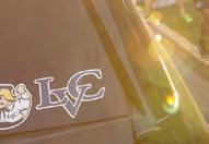
Incorporate detail shots to balance page layouts and to help viewers experience LVC from a close-up perspective.

Always incorporate student interaction photos when describing student life at LVC. Avoid staged shots— aim to capture true-to-life interactions and settings.

Formal portraits are compelling on the cover of a piece or in a section beginning with copy that speaks directly to reader. They are also good to use when showcasing a student or alumnus/a outcome.

Use candid portraits when featuring an in-depth profile of an individual. Candid photos may also be used alongside a more formal portrait.

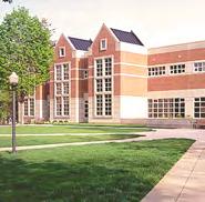
Use landscape photography when discussing campus, regional opportunities, hands-on opportunities or off-campus opportunities.
The rule of thirds is an important photo composition technique that tends to result in pleasing, wellbalanced images.
When shooting an image, mentally divide up the frame into a grid of two evenly spaced horizontal lines and two evenly spaced vertical lines. Position important elements of your composition near these lines or the points where they intersect.
This technique creates breathing room around a subject and reveals more of their environment — which can make for a more memorable and emotionally resonant image.
That’s not to say there is never a time and place for a centered composition, but as a rule of thumb, when shooting LVC photography, shoot with the rule of thirds in mind.

WHEN TO USE THE RULE OF THIRDS
More often than not
Photo cropping is another helpful storytelling technique. It can add a closer connection between the viewer and the subject.
To preserve narrative quality, be sure to consider the rule of thirds and maintain some context for the surrounding environment.
To draw in a viewer emotionally
To correct a poorlycomposed image
To add interest to a page layout



Lines are found everywhere in our environment. When a photographer identifies them and strategically uses them to draw a viewer’s eye through a photo, they are called “leading lines.”
Keep an eye out for strong lines to enhance your compositions.
When shooting portraits
When shooting architectural photography



LVC photography primarily utilizes a medium depth of field, allowing our subjects to stand out from their background while still revealing some context.
A shallow depth of field is created by using a high aperture setting on your camera, while lower aperture settings will result in fuller depth.
The background is completely blurred out and the subject is extremely clear and sharp. Good for close-up portraits and detail shots.


The subject is still clear, but the background isn’t fully blurred out. Good for interaction shots or candid portraits of an engaged student.


This provides full clarity of the background. Best for landscape or architectural photography.

Color duotones are an effective way to add color and create a neutral backdrop for text and graphics. A duotone treatment can also help compensate for poor lighting in a photo.
To make a photograph into a duotone, open the image in Photoshop. In the top menu, select Image > Mode > Grayscale. Save the image as a TIFF or jpeg, and import into InDesign. Click once on the image to change the background color. Click twice to change the foreground color.
CMYK: 35 / 36 / 45 / 2
RGB: 168 / 152 / 136
WEB: #a89888
CMYK: 100 / 57 / 12 / 66
RGB: 0 / 42/ 78
WEB: #002a4e


CMYK: 12 / 9 / 9 / 0
RGB: 221 / 221 / 222
WEB: #dedede
CMYK: 91 / 62/ 23 / 5
RGB: 32 / 96 / 144
WEB: #22608f BACKGROUND
Six different graphic elements form the foundation of our brand toolkit. Use this toolkit to add visual interest and to help tell stories from our College.
It is not necessary (or recommended) to include every element in a single piece, but when used consistently over time, these graphics create continuity in our families of materials:
A. “Further”/ “More” symbols
B. “Further. More.” pattern
C. Dot texture
D. Connected lines
E. Sketched illustrations
F. Handwriting
Symbols representing the creative foundation of our brand — going further and doing more — are a cornerstone of our visual language. They may be used in conjunction with copy that references “Further. More.,” or separately. Files for this resource are available to download.
A pattern has been created from the “Further.” “More.” symbols that may be used as a textural element in our materials. Files for this resource are available to download.

Subtle background patterns can be incorporated to add visual interest and continuity throughout a piece or series of pieces. For LVC, the dot grid symbolizes a clean slate, or mapping out one’s path. Files for this resource are available to download.
Narrow rules connected by dots can be used as both a decorative and symbolic element. These types of graphics reinforce many of our key messages to prospective students, e.g. “going further,” or “connecting the dots.”
Tutorial: For a sophisticated treatment of this element, the stroke on the rules should be thin (0.5 pt or less) and the dots very small. A stroke matching the page background color should also be added around the dots.
Seek out illustrations with a loosely hand-drawn appearance. Because many of our graphic elements are bold and geometric, these types of illustrations, like handwriting, can help add a more compassionate and personal touch to our materials.
To add a more human and personal touch, handwriting may be scanned into Photoshop and used as an illustrative or textural element.
Tutorial: Write with a thick pen or thin marker on a white sheet of paper, and scan the image into Photoshop. Go to Image > Mode > Grayscale, and then Image > Mode > Bitmap. Save the handwriting file as a bitmap. You can then change the color in InDesign.
“Further. More.” is more of a creative foundation than a formal “tagline”. We’ll use the words in various headlines and messages, but there’s a formula to doing so that will ensure our audiences understand the distinction.
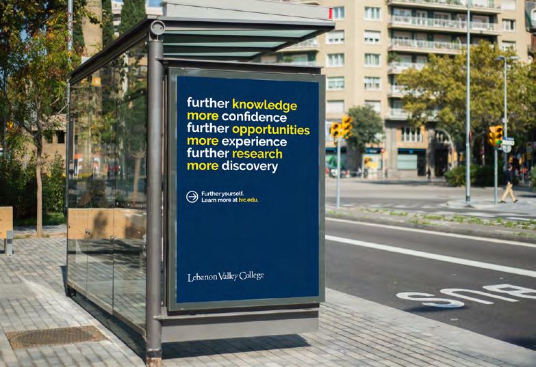
On any tactic with a range of phrases — T-Shirts, Lightpole Banners, etc. — we want to use a 4:1 ratio: Four sets of “Further [action]. More [outcome].” to every one use of “Further. More.” (See figure 1.)
When used, these expressions may be (but do not have to be) paired with the corresponding graphic symbol — an arrow for “Further” and a plus sign for “More.” (See example on the right.)
“Further” symbol/ “Further” headline


“More” symbol/ “More” headline

We’ve been through the verbal and visual elements of our brand. Now we’ll see a few examples of how everything could come together in the real world.





Liberal Arts Education starts with a simple goal to discover the best of what’s been thought and done throughout history. We achieve that goal with a simple, yet challenging and intensive, assignment — reading the greatest thinkers and doers to ever live.































Across the College, make decisions and act in ways that create experiences for students that align with the brand strategy. Interactions, policies, and practices large and small influence how someone feels about LVC.
01 02 03 04 05
Deliver educational experiences that lead to the following outcomes for students/graduates:
Communication skills, critical thinking, analysis, and creative skills
Career skills
Meaningful work experiences
Model optimism and the values of hard work, determination, personal responsibility, confidence, and empowerment of those around you. This includes in-person interactions at events, emails, presentations at conferences, and phone calls. Mingle, ask questions, and be as helpful as possible.
Exhibit kindness and care for others and their experiences, including care for the quality of your work.
View your own work as it relates to human and societal well-being and articulate to the students that this is a value of LVC’s. Help them understand how their own educational experiences and life goals play an important social role.
Keep the following housekeeping points in mind when you’re creating content for your department at LVC.
01
Incorporate brand colors, voice, and tone guidelines into your department/program social media presence. You should also choose and create content that aligns with the Brand Platform when crafting social content.
02 03
When ordering uniforms, giveaways, balloons, t-shirts, etc. provide vendors with official color palette and font options. Match materials as closely as possible to these specifications.
The Office of Marketing & Communications supports departments and programs writing/ editing and designing content and collateral intended for admission and alumni/advancement audiences (e-newsletters, newsletters, flyers, graphic identifies or logos, etc.) Do not create your own admission or advancement printed handouts, advertisements, logos, signage for admission/ advancement events, or taglines. Do not hire outside consultants to develop a brand identity for your department or program.