6 minute read
ONE FOR THE BOOKS

from htvjtfdjvfkj

When these homeowners downsized, they also edited their lavish library, keeping a fraction of the books and only the most meaningful of the bunch. Although the curtailed collection is still substantial, designer Robyn Rider was up to the task of making it work in the renovation of their new abode.
Lucky for her, these clients weren’t afraid of style, colour or putting faith in her expertise. The resulting space is a reader’s dream, boasting book-laden walls and cozy corners for devouring the next great read, cover to cover.
Advertisement
TEXT SARA CATION | PHOTOGRAPHY STACEY BRANDFORD STYLING ANN MARIE FAVOT
O N E F O R T H E BOOKS
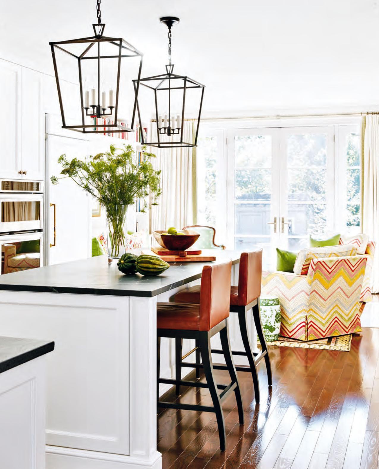
French doors – which lead to a backyard oasis that borders a ravine – let a tremendous amount of light into the living room of this Toronto house designed by Robyn Rider. Because of the kitchen’s proximity to this space, it was decorated with statement pieces, such as oversized lantern-style pendant lights, to unify the areas.
DESIGN, Robyn Madeline Interiors, robynmadeline.com; ARCHITECTURE, Monica E. Kuhn; CONTRACTING, Weenen General Contracting; MILLWORK (throughout), custom CABINETRY, Bellini Custom Cabinetry; White Tie 2002 WALL PAINT (throughout), All White 2005 MILLWORK & CABINETRY PAINT (throughout), Farrow & Ball; STOOLS, South Hill Home; PENDANT LIGHTS, Visual Comfort & Co.
“They didn’t give me a lot of direction, but THEY
HAVE GREAT TASTE and great pieces to work with.”
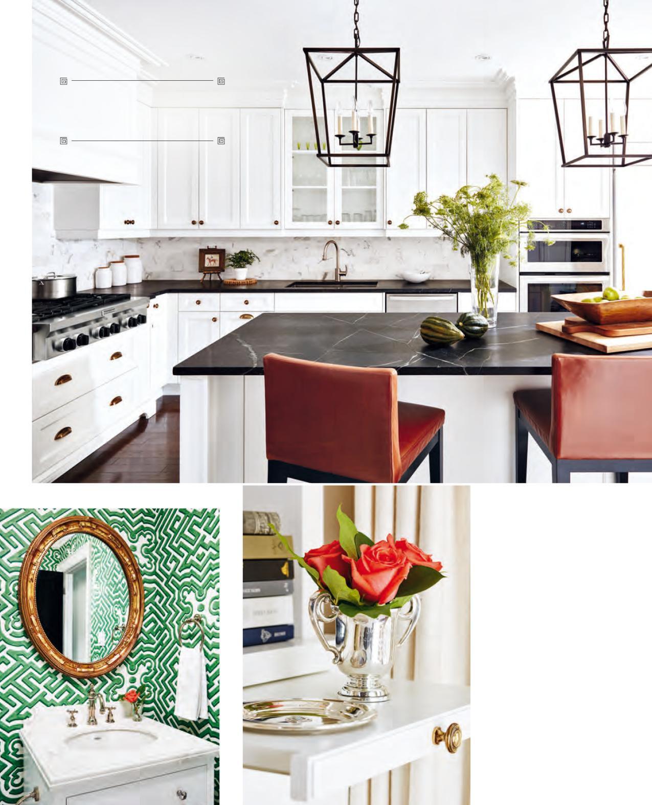
ABOVE Black soapstone countertops break up the white kitchen cabinetry that would have otherwise looked too clinical in this cozy space. Even though it’s quite high maintenance, soapstone adds warmth and lustre. “It’s an extra layer of luxury,” says Robyn.
COUNTERTOPS, Greensville Soap- stone Company; BACKSPLASH TILES, Marble Granite Depot; APPLIANCES, Tasco; FAUCET, Taps Bath Centre; CABINETRY HARDWARE, Ginger’s.
FAR LEFT The first space you see when you walk through the front door is the powder room. It sets the tone for the punchy greens and bold prints used throughout the rest of the house.
WALLPAPER, Lee Jofa; custom VANITY, Bellini Custom Cabinetry; FAUCET, Taps Bath Centre.
Easygoing, trusting and super stylish: These homeowners were downright dream clients for designer Robyn Rider, whom they hired to revamp their newly purchased three-bedroom dwelling in downtown Toronto. The protege of the designer who’d transformed their previous house, Robyn was the prime candidate to deliver an updated look to these downsizing lawyers’ home.
“They have great taste and great pieces to work with,” says Robyn – plus, lots of books. Though the homeowners significantly reduced their large book collection, the remaining titles were more than substantial, including legal references, favourite reads, hardcover sets and prized heirlooms. It’s only fitting, then, that the only directive Robyn was given was to accommodate this veritable library, which ended up dictating much of the main floor’s design.
Robyn added floor-to-ceiling bookcases throughout the entire main level to achieve the perfect marriage of library and living space. This is especially evident in the dining room, which she designed as a place to not only eat meals and host dinner parties but also to lounge by the fire with a good book. To that effect, a cozy armchair by the fireplace is accompanied by a reading lamp and footstool, and the banquette at the round urn-based dining table is extra-deep and extra-comfy. “I wanted to create an intimate area that could accommodate guests, but where the homeowners wouldn’t feel ridiculous when it’s just the two of them,” says Robyn.
While the central kitchen marks a bit of a departure from the scholarly look, it still feels like a seamless part of the open-concept living area. “I used cabinets featuring the same profile and colour as the millwork in the adjacent dining and living rooms,” says Robyn. Integrated and panelled appliances as well as cabinetry with footed toe kicks lend the space a furnished feel, while oversized lantern-style pendant lights above the island are the kind you might find over a formal dining
BELOW & OPPOSITE, BOTTOM RIGHT The library-inspired living room features clever design details, such as space-saving pullout shelves in place of side tables. “I was channelling British townhouse style, in which everything has a purpose,” says Robyn.
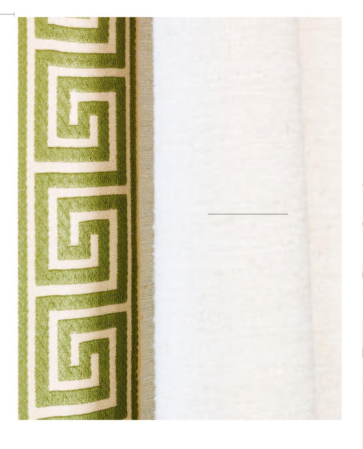
Custom SOFA & ARMCHAIR, Robert Custom Upholstery; ARMCHAIR FABRIC, patterned TOSS CUSHION FABRIC, DRAPERY TRIM, Primavera; BERGÈRE CHAIR FABRIC, Lee Jofa; COFFEE TABLE, Boo Boo & Lefty; DRAPERY FABRIC, Threadcount Textile & Design; DRAPERY SEWING, Superior Installation; SCONCES, Cocoon Furnishings; green TOSS CUSHION FABRIC (throughout), Kravet Canada.

ABOVE Reminding Robyn (pictured right) of gardens in Provence, the table base, an oversized urn, was the jumping-o point for the dining room’s palette. “I love its intense green colour,” says the designer, “and I just went with it!” The homeowners also love the extra-deep banquette. Robyn used a bold botanical print on the Roman shades to blur the border between indoors and out, imparting a lively and ver- dant atmosphere.
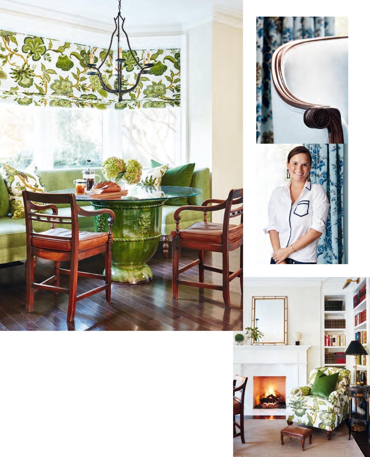
Custom BANQUETTE, Robert Custom Upholstery; BANQUETTE FABRIC, Primavera; ROMAN SHADE & TOSS CUSHION FABRIC, Bilbrough & Co.; ROMAN SHADE SEWING, Superior Installation; CHANDELIER, Boo Boo & Lefty.
RIGHT A dining area and read- ing nook rolled into one, this room sees a lot of action. The bookcases, lined with selec- tions and collections most meaningful to the home- owners, lend an old-world vibe that is punched up by the fresh armchair fabric.
Custom ARMCHAIR, Robert Custom Upholstery; ARMCHAIR FABRIC, Bilbrough & Co.; RUG, MIRROR, Elte; FLOOR LAMP, Restoration Hardware; PICTURE LIGHT, Cocoon Furnishings.
table, further blending the lines between the cooking zone and the rest of the home.
After all, the kitchen leads right into the living room, which returns to books. “I didn’t even try to organize or colour code them,” says Robyn of her approach to keeping the look cohesive. “It would have felt too contrived.” (Plus, the husband is pretty particular about organizing things by subject.) So, to temper the mismatched assortment, Robyn created a serene envelope of white millwork and cream walls, which she used throughout the main level. “We could afford to be quieter with the paint palette considering the books and the bold textiles,” she explains, noting examples like the traditional multi-hued heirloom needlepoint rug and contemporary zigzag-patterned armchairs. “The homeowners definitely didn’t need to be convinced to use colour,” says Robyn. “It actually took some convincing to leave the walls neutral!”
Once Robyn finessed the final details of the newly designed house, the homeowners unpacked and arranged their last tomes onto the shelves, ready to begin their new chapter.
A serene departure from the rest of the house, the main guest room is soft yet sophisticated. The antique settee is a family heirloom that Robyn had reupholstered with a contemporary centre stripe design. From there, Robyn layered in more powder blue and cream elements into the space but brought in dove grey to counter the femininity. “Powder blue on its own can border on prissy,” she explains.

Simply White OC-117 WALL PAINT, Benjamin Moore; SETTEE FABRICS, Robert Allen; SETTEE UPHOLSTERY, Robert Custom Upholstery; DRAPERY FABRIC, Primavera; DRAPERY SEWING, Superior Installation; RUG, Y & Co.; THROW, Elte.


