GRAPHIC DESIGN PORTFOLIO
T (317) 453-7682
E laurenfost23@gmail.com
Linkedin laurenfosterdesign LAUREN FOSTER
Indianapolis, IN
A DESIGNER WHO CRAFTS IMPACTFUL, ACCESSIBLE
PROJECTS WITH THOUGHTFULNESS AND INTENT.
ABOUT ME MY WORK
T (317) 453-7682
E laurenfost23@gmail.com
Linkedin laurenfosterdesign LAUREN FOSTER
Indianapolis, IN
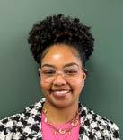
Inspired by Vincent Van Gogh’s words, “What is done in love, is done well,” I approach every design with passion, purpose, and a deep sense of inclusivity. For me, design isn’t just about making things look good—it’s about creating solutions that make people feel heard and seen. With a focus on accessibility and brand design, I take a minimal, bold, and intentional approach to ensure my work is both effective and meaningful.
I dream of one day teaching art to children, sharing my love for creativity, and helping them see the world through vibrant, colorful eyes. Currently I am pursuing a UI/UX certification to broaden my knowledge and expertise in user-centered design.
Indianapolis, IN
BACHELOR OF FINE ARTS IN GRAPHIC DESIGN
BALL STATE UNIVERSITY
MUNCIE, IN
Aug 2020 - May 2024
GRAPHIC DESIGNER | SWAG DIRECTOR MODEL 1 / INDIANAPOLIS, IN
Oct 2024 - CURRENT
GRAPHIC DESIGN INTERN THE HERITAGE GROUP /INDIANAPOLIS, IN
July 2022- Jan 2023
GRAPHIC DESIGN INTERN WALLETGYDE / REMOTE
Aug 2021 - Dec 2021

Best Selected Work from 2023/2025
Branding
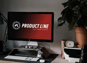
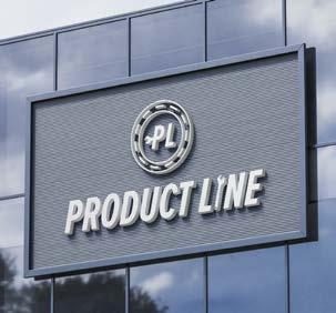
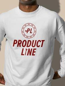
Developed the branding for the Product Line Team at Model 1, focusing on an automotive-inspired aesthetic.
The concept centered around elements commonly associated with the automotive world, such as tools, gears, and tire tracks, to convey the mechanical precision and innovation of the team.
TOOLS/
DATE/
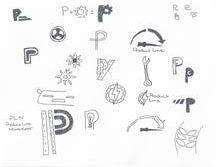
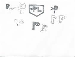
The logo design process began with creating a moodboard and hand-drawn sketches, during which I explored a range of automotive elements and concepts, experimenting with shapes, typography, and symbols.
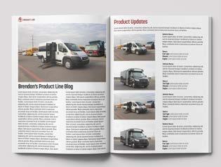
In addition to the visual branding, I created and maintain a monthly newsletter designed to keep employees engaged and entertained.
The newsletter includes sections like Bus in the Wild, where employees can share photos of vehicles they spot on the street, including those we sell and companies we partner with, as well as an interactive crossword puzzle that entertains and educates readers about the product line and the company.

TOOLS/ DATE/ Adobe Illustrator, Adobe Photoshop February .25.2025
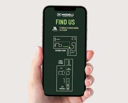
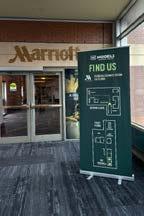
For Work Truck Week, I created a wayfinding retractable banner featuring easy-to-read visual directional signage. The banner guided attendees throughout the tradeshow, from the convention side to the hotel side, ensuring smooth navigation and a seamless event experience.
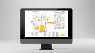
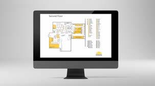
This project aimed to enhance accessibility within The Heritage Group by redesigning the building map to better serve employees.
The goal was dual-focused: first, to create a more intuitive and user-friendly map that employees could easily navigate, and second, to improve the visibility and accessibility of office seating arrangements.
THE HERITAGE GROUP
SUCCESSFULLY UTILIZED FOR OVER 2+ YEARS
TOOLS/ DATE/
Adobe Illustrator, Adobe Photoshop July .25.2023
SENIOR COLLAB PROJECT
DATE/ April .29.2024
TOOLS/ Adobe InDesign, Adobe Illustrator, Adobe Photoshop In collaboration with Maddy Burton and Payton Ridge
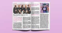
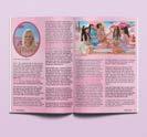
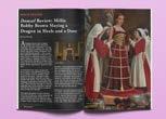
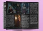
Film Fanatics is a theoretical movie magazine to be sold in local stores. Film Fanatics covers a wide range of topics referencing movies from The Oscars, to what’s new and how to commemorate the old.
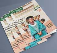
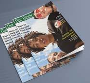
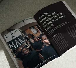
Our Block is not just a magazine; it’s a powerful movement aimed at preserving the cultural identity and unity of Portland’s Albina community in the face of gentrification.
TOOLS/ DATE/ Adobe InDesign, Adobe Illustrator, Adobe Photoshop April .26.2023
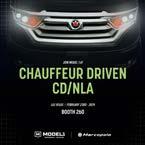
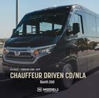
Chauffer Driven Tradeshow Acknowledgement Posts
This project involved the creation of two social media posts promoting our company’s participation in the CD/NLA (Chauffeur Driven/National Limousine Association) Tradeshow. Working alongside the marketing team and the HubSpot specialist, the goal was to generate awareness and drive engagement leading up to the event.
TOOLS/ DATE/ Adobe Illustrator, Adobe Photoshop February .20.2025
TOOLS/ DATE/ Adobe Illustrator, Adobe Photoshop
November .10.2023
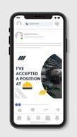
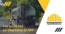
The project focused on creating a set of social media assets for AMI, an umbrella company of The Heritage Group. The assets were designed for new hires to use across social platforms when announcing their acceptance of a new role.
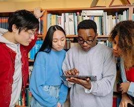
An accessibile student resource program designed to empower college students who have visual disabilities.
P4P creates a safe, welcoming space where students can access vital resources such as interpreters, audiobook-formatted textbooks, in-class accommodations, and more.

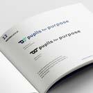
Beyond meeting immediate academic needs, P4P also helps students navigate coursework effectively and prepares them to excel in real-world environments.
TOOLS/
DATE/ Adobe Illustrator, Adobe InDesign, Adobe Photoshop, Color Contrast Checker April .20.2024
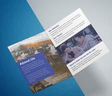
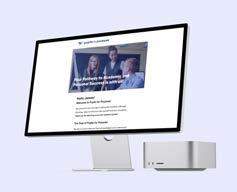
As the lead designer, I created a comprehensive brand identity, a full suite of campaign materials, and a fully integrated wayfinding system designed specifically for campus environments.
The signage system — featuring directional markers for elevators, stairs, restrooms, and the Pupils for Purpose resource room — was thoughtfully designed with braille and in full compliance with ADA accessibility standards
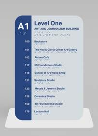
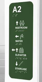
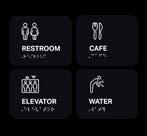
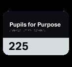
The wayfinding system was designed for a three-story campus building, with each floor assigned a distinct color for the directional columns to aid in spatial orientation. Facility signs were kept black to maintain visual consistency and ensure high-contrast legibility for all users, including those with visual impairments.