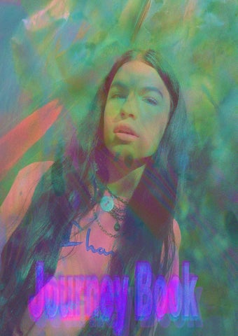
1. Freedom and self-expression of an individual 2. Nostalgia
1. To celebrate freedom, nostalgia, and adventure through vintage sportswear 2. Promoting past and current events to reminisce
This book aims to demonstrate the journey I have taken from Brand Me to my Final Major Project. Not only will the work I have created through my journey represent me, but it will also represent my chosen career path. Throughout the process of the journey, I have expanded and showcased my skillset to create a strong narrative that supports my journey. My vision is to create digital communication such as digital
styling and typography to present the narrative of my journey, which have been heavily influenced by 90s rave culture, films, photographers, and personal interviews. By producing these visuals, I will demonstrate my story evoking 90s sportswear and the effects of the global pandemic.
Reflecting on my journey throughout my Brand me, it has been refreshing and exciting for me as a digital communicator. Ever since I was a young child, I’ve always been creative as my imagination would run wild as soon as I’d pick up pens and pencils; my inner artist was expressed through drawings and anything crafty. Throughout my Brand Me module, maintaining a heavy amount of research and development was vital to expand and build on my ideas, which then progressed into my Final Major Project. I decided that for my Final Major Project that my vision would be to evoke 90s sportswear. Looking back to my original 360 campaign concept idea, my
brand, Polluted Orange stemmed from the idea of vintage, upcycled clothing. My brand name, Polluted Orange, came from the main colour of my brand which was a dirty orange colour. This colour represented my brand as looking into the meaning behind orange, I found that it was an active, energetic colour which represents the excitement and adventure of my brand, also, the colour represents social and optimism, therefore, this reflects the ambitious messages my brand communicates. The initial conception to my final visualisation has been a journey of twists and turns, I have changed my mind multiple times for the better. My original 360-campaign concept was to focus more on the
adventure concept of my brand. I then discussed this with Tracey, and we both decided that my work wasn’t researched enough, and it was very surfaced. From this, I then began to narrow down my research to one aspect of youth culture, rave culture. I then ensured the campaign I created was to communicate all three brand concepts: freedom, adventure, and nostalgia, rather than just one. By gradually shaping the identity of my brand, I have built on my skills creating a gap in the market to successfully campaign my final visualisation.
I came into the idea of looking into 90s sportswear and rave culture when reflecting on my brand messages throughout Brand Me, which were adventure, nostalgia, and freedom. I wanted to communicate these messages through my strong narrative of digital communication such as digital styling and typography. The purpose of this was to communicate my strongest skill set, and, that the fashion industry is constantly everchanging, and especially now after the pandemic, the digitalisation of the fashion industry is real. Sportswear includes everything from basic products such as t-shirts and socks, to premium
designer pieces and highend streetwear sneakers. The sportswear clothing market ranges from leisurewear, team sportswear such as football and rugby, indoor and fitness and aerobic and indoor fitness. Sportswear has rapidly evolved over the years, and companies must find new and finer ways to reach consumers. From new technologies, new products, new marketing strategies or sustainable operations, different brands strive to better themselves. Reflecting on my Brand Me story, I chose to focus my 360-campaign based on 90s sportswear because not only does it fit my aesthetic, but it fits with my narrative of the influences of rave culture.
Looking for gaps in the market is essential as it’s a way to look at changes and developments within the future of fashion. My vision is to bring back 90s sportswear by successfully creating a digital and real-life 360-campaign communicating my brand messages, freedom, nostalgia, and adventure. The styling for this will be 90s sportswear such as Umbro, Puma, Nike, Champion, Sketchers and Adidas. These are my chosen brands for my campaign because are popular brands that communicate vintage and nostalgia. The global pandemic caused by coronavirus was a huge catalyst for digitalisation. Zoom calls from home and endless scrolling on
social media became the norm for three solid months. The global pandemic changed consumers preferences for health, lifestyle, and fashion. The new reality of comfort, health and wellbeing is becoming a bigger priority for consumers. Sportswear has come even bigger due to the pandemic, as everyone wants to be all about comfort.
My narrative is to successfully bring back 90s sportswear, using other influences and primary research, to successfully promote my brand and my messages communicating my narrative. Through typography, digital styling and interviews I will tell a story that represents nostalgia. The pandemic has turned the world upside down and we are waiting around until we are free again. I wanted to create a campaign that would be influenced by 90s rave culture but was also influenced by the pandemic, as we’ve all been locked inside following restrictions for over a year now, therefore, freedom and adventure has never been
more appealing. Especially after the global pandemic, it’s made us want to live our life to the full more than ever before.
Several influences played a huge part in my research for my Final Major Project. As I began to research into 90s rave culture, I heavily researched online, reading books and articles about 90s raves. I then decided to find films that were based around 90s rave culture to see what they wore, how they spoke and how they acted to get a true feeling of the subculture. Human Traffic and Better Living Through Circuitry were a film and documentary which I watched to gain a clearer understanding and education on rave culture. Human Traffic is a film which is based
in Cardiff, Wales. The film embeds the illegal events in a narrative that draws from popular mainstream genres, such as the teen rebellion film and the romantic comedy, suggesting that these drugs are a typical consumer choice for the youth dance subculture. This film influenced my Final Major Project through the styling of the characters, and what they would say. I created typography with different words extracted from the movie from what different characters say. I wanted to create impactful visuals to communicate to my audience effectively. I believe
my typography interpretation is synonymous with rave culture as the colours, shape, and effects represent the euphoric, nostalgic rave scenes. Using effects such as blurring, waving, and distorting reflects the exhilaration and ecstatic energy which rave culture emits. The use of bright colours communicates the neon flashing lights and a fluorescent entity that dominates raves. Better Living Through Circuitry is a documentary made in 2001, which presents aspects of rave culture. As this was a documentary, it opened my eyes to the rave culture and educated me on the way people behaved. Individuals were interviewed within this documentary, which thoroughly explored the passion and intensity of time's most significant youth culture movements.
Another influence on my work is a photographer Micheal Tullberg. Tullberg is a renowned photographer from America, who captured the essence of rave culture in the 90s. Tullberg created a photobook which is named “Land of the Free, Home of the Rave”, this photobook is the spectacular storytelling of rave culture in the 90s. Tullbergs work relates to my brand because of freedom expressed through the psychedelic images he produces, capturing the cultural explosion. Tullbergs photographs heavily influenced my work as he captures the spirit of rave culture, visually documenting the real-life rave scene. I invited myself to a group on Facebook called “90s ravers” which was a group created by passionate ravers. I messaged a handful of individuals asking them specific questions, on how raving has evolved over the years
and how the pandemic has affected this. I chose to interview these people because I wanted a better understanding of the decade, and I wanted to explore my research even more. One of the individuals who I messaged sent his response as a voice note, I then decided to create a TikTok with this. I extracted a video of a rave in the 90s to use as the video for my TikTok, I then added glitching effects to this then added the voice note over the top of the video. The video consisted of individuals in a club “raving”, wearing baggy sportswear style clothing. By using an old video from a rave in the 90s and adding glitching effects alongside the voice note, this video represents nostalgia. By using a real person to speak about their personal view on raves, it creates an authentic feel to the video. This video aims
to support my campaign and develop an awareness of nostalgic rave culture and scenes using primary and secondary research collected by myself. By using a real person to speak about the culture, it gives the opportunity to share his story, whilst expressing my brand to the audience.
I decided that the chosen consumer for my brand would be generation z. Generation z are a unique group of talent and have some form of digital footprint in their early 20s. Not only are they digital natives, but they experts in social marketing too. This demographic use sportswear to express their vision and identity to reinforce systems of value. By using sportswear to style my campaign, I am communicating my brand values; freedom and self-expression of an individual, whilst also successfully marketing to generation z. It was important for me to research the social factors such as the consumer habits and
characteristics of Generation Z, as I needed to understand this to strategically market and target my campaign. Whilst researching about generation z, I have found that the young demographic thrives off one-of-a-kind vintage, repurposed or recycled fashion, as they are distinctively experimental and gravitate towards mixing vintage and sportswear (Levato, 2020).They also redefine newness in fashion to fit their needs and values, as fashion consumption for this generation is a communication of individual identity. The aim of my campaign to use vintage sportswear to communicate my brand messages to generation z, therefore, understanding the buying habits of the
demographic was vital, ensuring I have a strong understanding of my consumer to promote my brand. My campaign is aimed at both male and female who fall into the generation z demographic. I decided to create a survey which was aimed at generation z, to get a clearer understanding of how this demographic would react to my outcome. I wanted to communicate with my consumer to help define my brand to successfully communicate my messages. I sent my surveys to both male and female genders, who all fall into the generation z demographic. I created a consumer profile to
get a sense of who I was targeting my brand at, helping me to craft suited marketing concepts and addressing their challenges and needs. As my target audience is generation z, my consumer profile consisted of a female who aged 22 is a full-time student. Creating a consumer profile gave me an insight to the demands of my target market, whilst allowing me to define my consumer and helped me understand my consumers attributes.
100% said Yes
90% said Yes
55.5% said Sportswear
100% said Yes
100% said Yes
100% said Images 70% said Digital
100% said Yes
To begin our brand me research, we were given secondary research to look at, which consisted of different designers from different market levels. I was able to determine which brands influenced my work and dictated my market level. From this, I understood that my brand is positioned within the high street market sector. Understanding the positioning for my brand was essential to ensure my brand would be marketed successfully. As my market level for my brand sits within the high street sector, I decided that the styling would be brands of Reebok, Champion and
Sketchers. These brands sit within the high street market level, and they support the purpose of my brand, which was to evoke 90s sportswear.
As an aspiring graphic designer, for my FMP outcome, I wanted to create typography. I researched typography and fonts, and how they not only deliver messages, but how they engage the reader. Typography can create a tone of voice and personality, therefore, there must be a balance between the visual and verbal aspects of design when communicating a message. As I’m using typography to communicate my brand, it was important for me to research the importance of typography and the power of font in marketing. I created multiple typographies from words extracted from scenes in Human Traffic and Better Living Through Circuitry as these were the main influences on my work. I aimed to create impactful visuals to communicate my story effec-
tively. Throughout my journey, I have produced typography that is consistent and represents my brand. Having a consistent look for the visuals, I have created helped maintain my brand identity. I have used the same front, Arial Bold, for all my work, as well as my logo, as I feel that this represents my brand the most. Arial Bold is a font that is full and soft, therefore, combining, transforming, and expanding the text allows this to be more fluid to work with. With the typography I have produced, I have distorted the text, therefore I need something big and bold to add colour, expression, and emotion to create a relationship with my target consumer whilst remaining a professional appearance that fits with my brand.
For my final outcome, alongside typography, I wanted to create different visuals of digital styling and croquis to showcase the development of my concept. I wanted to create digital photoshoots using the styling of sportswear with different effects to experiment with a different visual language to communicate my narrative. All the visuals created are cutouts of sportswear clothing, merged, and manipulated together to create a digital photo shoot. I added other distorted images and effects to add colour, shape, and texture to the image. I wanted to produce this because not only does it showcase my digital skills and aesthetic, but by experimenting with visual language, with the rapid increase in digital technologies and new trends such as The Fabricant (a digital fashion house), I wanted to my work to be future proof.
Therefore, creating digital styling allows me to focus attention on the visual aspects which demonstrates my story in a world of rapid digitalisation. The Fabricant sits within a luxury market level; however, the trickle-down effect allows trends to become well-adopted, therefore, eventually, high street and fast fashion brands will become influenced by the actions and produce a quicker and cheaper product. By producing digital croquis, I’m communicating effectively with my audience as they’ve had no choice but to adapt to digital transformation. Therefore, the leading shift in digital technology is influencing their behaviour.
In one of my previous modules for university, Fashion Futures, I created a piece of work on “The Rise of Digital Media”. The purpose of this study was to demonstrate how there has been a rise in digital media in recent years. Secondly, it explores the social, political and environmental factors of the rise of digital media, and how the coronavirus pandemic was a catalyst for digitalisation. I decided to create a digital zine to communicate my typography and digital styling. I wanted to showcase my skills and communicate my visual strengths, whilst also marketing my brand in a generation z revolution. With the rise of digital media in a fast-growing industry, consumer behaviour is changing drastical-
ly, and brands have responded by shifting focus onto digital channels. Although I will be targeting my campaign to generation z, by creating a digital zine I will engage with a wider audience as it is easily accessible. I aim to communicate my brand values through the zine, showcasing the typography and digital styling I have created throughout my journey. The digital zine will also communicate a nostalgic element, as it will feature words from individuals I interviewed. The zine will be personalised and express my passion for rave culture, whilst communicating the narrative of my brand. I named my zine “Reminisce”. The meaning of reminiscing is “to talk or write about past ex-
periences that you remember with pleasure” (Dictionary, 2021). As my zine consists of typography from 90s films/documentaries, and words extracted from multiple interviews of “90s ravers”, I thought that the word reminisce would suit my campaign concept. I created a survey with questions that consisted of questions based on graphic design and digital communication. I wanted to ask these questions to individuals who fell into the generation z demographic, as I wanted to have supportive data to help me market to my chosen audience correctly. One of the questions was “If you were to read a digital magazine (zine), would you focus on the images or the text”. 100% of the answers were “Yes”. From this, I decided to fully focus my zine on the visuals I’ve created, using minimal text to fully engage my consumer.
I have chosen for my zine to be accessed through a QR code, which will be placed outside of bars and clubs to link with the messages of my campaign. The QR code will be placed within a poster “Reminiscence”, which is my campaign name, which will have the same aesthetic and design as the digital zine. This poster will capture the attention of the generation z audience, as people will walk past and look, reminiscing of the times before the pandemic hit and changed our lives. In my digital communication survey, one of the questions was “Do you feel that due to the pandemic, you rely on digital communication more? Such as the use of mobile phones, apps, social media?”. 100% of the answers were yes. The purpose of asking this question was to direct me into creating a QR code, enabling easy, fast and free access to my zine.
I created a SWOT analysis to look at different elements that frameworks creating a digital zine to market my brand. Looking at the strengths, I found that a digital zine would be easily accessible, which can be delivered and stores anywhere. The zine could be downloaded and read at any time. Digital zines are also cost free and sustainable, therefore, producing the zine won’t cost anything, and there won’t be any distribution costs or harm to the environment. The weaknesses of creating a digital zine were that there is possible competition. With the higher demand for digital media and marketing, this makes it more challenging to other competitors.
Looking at the possible opportunities within creating the zine, lockdown and accelerated digital transformation creates opportunities for brands and businesses. As they have had no choice but to shift online, especially with traditional print media slowing down, digital media has benefited hugely from this. Finally, I looked at the threats of creating the digital zine. Due to the constant technological change, this can be a threat to digital media. Digital brands have been renowned for adopting innovation and new processes to keep the top positions within the market. By creating a SWOT analysis, I was able to strategically look at the factors which will I have to consider creating a digital zine. By examining these factors, I’ve been able to assess and identify certain elements to successfully market my brand.
To create digital styling and croquis for my FMP, I planned a photo shoot in the garden of my house. The initial idea of this was to style my model wearing sportswear, and then I was going to cut the clothing out of the photographs and create digital styling from this. However, I decided to take videos during the process of my photoshoot also as I wanted to create a TikTok video from this. I decided to do this because when I was researching my consumer, generation z, I felt that I needed to market using a social platform that would strategically target my chosen audience. Therefore, alongside my digital zine, I created two TikToks to support my campaign. Due to the COVID-19 pandemic, not only did it leave people to consume social media more than
ever, but as we were forced into isolation, TikTok becomes the new media sensation (Johnson, 2020). Tiktok is a completely fresh and unique opportunity for individuals and brands and allows you to connect with the community on a creative level, therefore, I thought this would be a perfect way to market my campaign to my consumer. Researching into the social media habits of Generation Z, I found that TikTok is the most used app (Forbes, 2020), therefore I decided to create a short video with videos captured during my photoshoot. The TikTok video I created is multiple short clips of my model styled in 90s sportswear: Reebok, Champion and Sketchers. I styled my model using these brands because it supports my
brand concept. The song I chose to accompany this short video was Fred Again, featuring Marea x The Blessed Madonna- We Lost Dancing. I decided to use this song because it is a new anthem paying tribute to closed nightclubs worldwide. This music plays a huge part within my TikTok as it reflects on my brand messages to bring back raving. “We Lost Dancing” is repetitively spoke throughout the music, emphasising the impact of the global pandemic on the dance industry, and our personal lives. Through mourning, there is hope, as Marea speaks, “what comes next will be marvellous” as the soundtrack will be our emotional return to the dancefloor, and it will forever exist as a reminder of the unpredicted times that we lived through.
To establish my online digital presence, I created a website as part of my final module, to create a portfolio and showcase my work. By creating a professional website, I have experimented with digital marketing communicating all my visual content. My website is created to my aesthetic, using my logo and branding, and includes links to my socials and Issu documents.
https://www.laurenbarnes.co.uk
Throughout the journey of my 360-campaign, I have thoroughly researched and developed my brand. By showing my understanding of my consumer and brand positioning within the market, I have experimented with a range of media and marketing strategies to effectively communicate my concept. To prepare me for the future, I have produced a digital-based outcome to demonstrate my creative expertise. Overall, I’m very
pleased with the outcome, due to the pandemic, this has encouraged me to focus and develop my digital skills more. In a world that is constantly changing, it was important for me to continuously research to develop an awareness and understand current trends in the world today.
Bibliography Dictionary. (2021, June 28). Retrieved from Dictionary: https://dictionary.cambridge.org/dictionary/english/reminiscing Forbes. (2020, July 7). Retrieved from Forbes: https://www.forbes.com/sites/forbestechcouncil/2020/07/07/what-therise-of-tiktok-says-about-generation-z/ Johnson, T. (2020, April 21). Tinuiti. Retrieved from Tinuiti: https://tinuiti.com/blog/marketing-news-covid-19/tiktok-covid-19/ Levato, F. (2020, June 30). America Retail. Retrieved from America Retail: https://www.america-retail.com/media/HowGeneration-Z-is-making-its-mark-on-fashion.pdf Ypulse. (2020, May 6). Retrieved from Ypulse: https://www.ypulse.com/article/2020/05/06/gen-z-millennials-5-favoritesocial-media-platforms-now/
Lauren Barnes 1819758 AD6606 Fashion Brand Management