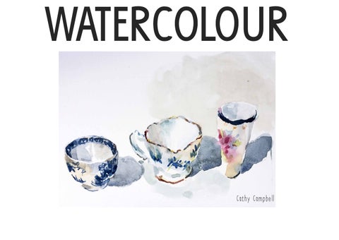
WATERCOLOUR
Cathy Campbell
PAPER
paper Watercolour paper comes in many weights and surfaces. It is available in loose sheets and in various types of pads of varying bindings. Each serving a different purpose. It can get a little confusing. Generally speaking, the heavier the paper is the less need there is for stretching and the more punishment it can take but this also depends very much on how you use it. The prices range from the almost affordable to the prohibitively expensive. There’s no reason why you can’t use good quality cartridge. It’s wise to familiarise yourself with as many different papers early on and enjoy exploring their various properties. Inevitably you will end up with a favourite that you keep going back to. surface textures • • •
hot pressed(HP) - a smooth, firm surface. Good for detail and controlled technique. some find that loose washes on this surface are less successful than on other surfaces. cold pressed (known as NOT or not hot pressed) - a very versatile paper with a slightly textured surface. rough - a textured surface which can withstand a lot of rewetting and lifting off.
which side to use?
The correct side of the paper is known as the ‘felt’ side and the backside is known as the ‘mould’ side. This refers to the manufacturing process. It is dependent on this process as to whether you can paint on both sides or not. This is because size is added to the pulp without which the paper would be too absorbant. Sometimes there is an additional dip in gelatine to complete the surface finish. It’s best to check with manufactures notes. It sometimes says on the back of a pad but usually this is overlooked. There are one or two ways to check which is the felt side. You can hold the paper up to the light and look for the watermark. The felt side is the side you can read clearly. In the absence of a watermark, you can hold the paper up to the light and the mould side can be detected by a regular pattern - basically the slight imprint of the mesh where the paper was laid out in manufacter. I usually mark a pencil’X’ on the mould side if I’m cutting up a larger piece or tearing sheets from a pad. This avoids frustrating results of working on the mould side by mistake. Having said all this, papers vary and some mould sides are perfectly fine for working on.
A loose and expressive outcome achieved by working on unstretched cold pressed (NOT) surface. It is evident where the paint has pooled in the areas where the paper has buckled a little when the washes were applied.
A detailed and controlled technique achieved by working on stretched acid free cartridge paper.
BRUSHES
brush Brushes vary enormously, as do their uses. Selecting which to buy can become mind boggling.I suggest that you begin by buying three brushes. And add to this as your painterly needs develop. A large wash brush will hold a huge amount of paint but if you’re miserly with your paint, using one of these a lot will lead to wishy-washy paintings. A tiny brush will hold very little paint and can lead to scratchy, broken surfaces and over working if you have a big area to cover. The only steadfast tip I would abide by when thinking about which brush to use and why etc. is - mix the appropriate amount of paint for the chosen brush. some types of brushes • • • •
round - vary in size from super teeny to large. Vary from goat hair to sable and synthetic. Can create a fine point. flat- these vary in size range and bristle content as above. useful for straight edge washes. wash - tend to be large soft brushes capable of holding a lot of paint. Designed to create broad washes fan - for blending edges.
The main thing is that you explore what different brushes can do. Sable or synthetic watercolour brushes hold paint nicely and will do less damage to the paper surface than a hog hair brush for example. But its all about developing your voice and not worrying about constraints, so make sure you are open to experimentation. The fibres which make up a brush will determine the handling. Ideally the more willing the brush is to spring back into shape rather than flop and bend, is key to the handling feeling good. Sable brushes famously handle well but are pretty expensive and often synthetic brushes are great. One of my personal favourites is the Chinese Hake. They are typically flat headed with bare wooden handle. The goat hair is soft and holds plenty paint yet is surprisingly springy.
Barra 2012 Double spread Moleskin Watercolour sketchbook Watercolour and graphite crayon.
paint PAINT
It is perfectly acceptable to use student quality paint. Artist quality is beautiful by comparison but some colours are vastly expensive. You just have to decide what you can afford. Don’t buy all artist quality and then ecconomise by squeezing out microscopic smears of it onto your palette. This is another sure fire way of arriving at wishy washy, far less enjoyable painting. The prices of artist quality paint are categorised by a numbered series from series 1 to 4. The less expensive colours are the earth colours due to the pigment content being cheaper than say, cadmium. The earth colours are yellow ochre, the umbres, raw sienna and burnt sienna. They are in the ‘series 1’ range. Take time to observe these series numbers carefully when purchasing paint as a basket full of series 4 tubes is going to lead to an episode of the vapours at the till! TUBES OR PANS?
As always it boils down to personal choice. I prefer tubes. They save time in mixing, don’t dry out as quickly and I find that you are more likely to mix a decent amount of paint. Pans are certainly practical when it comes to working outdoors. There is no difference in the pigment in tubes and pans. Use some of both and your preference will emerge. WHICH COLOURS DO I NEED TO BUY?
Not too many! Red, yellow and blue are the obvious essentials. Include a couple of earth colours and you’re away. You can mix scores of colours from that range. However, the variety of yellows on offer (and reds and blues) is wide so when you’re standing before this huge array in the shop, choose an alternative primary than the one you have already. If you’ve been buying cadmium yellow the whole time, buy a couple of different yellows to play with. The same with reds and blues. The different mix achieved by using cadmium yellow and ultramarine to mixing cobalt blue and lemon yellow is huge. It’s all a question of experiment and informed trial and error. Don’t be too uptight and rigid though. Some of the permanent roses and green golds can really add life to your work too.
equipment WHAT IS GOUACHE?
OTHER EQUIPMENT
Often called ‘Designers Gouache’ because it was used by designers and illustrators due to its intense, opaque brilliance and its covering power. Also widely used in fine art painting. It is a beautiful fine flowing medium characterised by its high pigment content and reflective qualities.
Candle wax Toothbrush Gummed tape Kitchen roll Masking tape Masking fluid Sea salt Ink and dip pen Water colour pencils The list goes on and on depending on how ou want to explore your work.
It can be used on its own and with transparent watercolours. WHAT PALETTE?
As large as possible. Art shops offer a good range. The kitchen cupboard can also offer an intersting selection. As long as you have plenty room for colour mixing, anything goes. My preference is one with small areas to squeeze out colours and with several roomy mixing areas so that all my pools of paint don’t run in together.