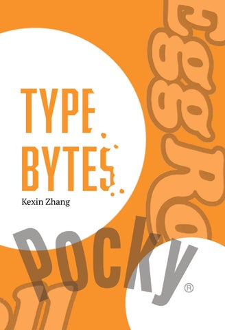
An Introduction In this book, I wanted to explore the different typefaces used in branding for many popular Asian-American snacks. I grew up eating these and they had a large impact on my childhood. Now that I am studying graphic design, I wanted to examine these typefaces in more detail.
contents
1 2
3
4
Type Bytes | 1
Snack #1: Egg Rolls Egg rolls are a snack eaten in many Chinese and Chinese-American households. They usually come in a tin box and not a cardboard box like the one shown; however, these egg rolls are still pretty authentic.
This box of egg rolls from my pantry uses the typeface Cooper Black for the name of the snack. I thought that the R was very interesting because it does not have feet although it is a serif font. The original font has feet on the R so it is likely that the R in this title was just manipulated by the designer.
› Egg rolls are crispy cookie rolls made of egg, flour, butter, sugar, and vanilla extract. Sometimes, a bit of black sesame is added as well.
About Cooper Black Cooper Black is an ultra-bold serif typeface intended for display use that was designed by Oswald Bruce Cooper and released by the Barnhart Brothers & Spindler type foundry in 1922. The typeface was drawn as an extra-bold weight of Cooper’s “Cooper Old Style” family. It rapidly became a standard typeface and was licensed by American Type Founders. Cooper Black was advertised as being “for far-sighted printers with near-sighted customers”, as well as “the Black Menace” by detractors. While very bold, Cooper Black is based on traditional “old-style” serif lettering, rather than the hard-edged “fat face” fonts popular in the nineteenth century, giving it a soft, ‘muddy’ appearance, with relatively low contrast between thick and thin strokes.
Its use in pop culture increased worldwide since 1966, when the Beach Boys used it for the cover artwork of their album Pet Sounds. It was then featured in the Doors’ L.A. Woman (1971) and David Bowie’s Ziggy Stardust (1972), and in the opening credits of The Bob Newhart Show, Garfield, M*A*S*H, The New Adventures of Winnie the Pooh, and other shows. The font is used for the Disney’s Sing Along Songs from the intro. As a result, Cooper Black has become emblematic of late’60s/early-’70s style. It is also known in railroading for its association with the Atchison, Topeka and Santa Fe Railway “Yellowbonnet” paint scheme, also dating to the early 1960s, which had “Santa Fe” in large yellow letters on locomotive sides.
Type Bytes | 3
About Mongoose Mongoose is a condensed sans serif, made for posters, headlines and logotypes. It was designed by Nikola Kostić and published by Kostic. Caps and x-height were made to match the ultra wide Briller, so it could be fun to combine these two highly contrasting type families. Mongoose has narrow counters and closed apertures. It also has a relatively subtle modulated stroke. The tails and the ears are slightly slanted.
Snack #2: Pocky Pocky is another popular snack which I ate a lot of when I was growing up. It was (and still is) one of my favorite snacks and I remember sharing a pack of these biscuits with my friends after school and during break at Chinese school. It is a biscuit shaped like a stick covered in cream. Although there is a large variety of different Pocky flavors, such as chocolate, strawberry, cookies and cream, and much more, my favorite is chocolate.
“Pocky is about sharing happiness and bringing people together. The perfect balance of high quality creamy chocolate and the crunch of a biscuit stick gives Pocky its irresistible taste.” The closest font I can find to the original font used in the branding is called Mongoose. I found this font interesting because it is stretched out vertically and it has a subtle modulated stroke. I think this font is clean and is effective as a part of a logo.
Type Bytes | 5
Snack #3: shrimp crackers Shrimp Crackers are a flavorful traditional Korean snack with a distinctive seafood flavor. These chips are also a staple snack in many Asian-American households. Shrimp Crackers are crunchy, airy, and less messy to eat compared to Doritos or Cheetos. On this bag of Shrimp Crackers, the font used was Jubilee RR Bold. The closest free font I could find was JAF Herb Condensed.
ABOUT JAF HERB JAF Herb is based on sixteenth-century cursive broken scripts and printing types. It features connecting letterforms that are rather tightly spaced. Originally designed by Tim Ahrens in the MA Typeface Design course at the University of Reading, it was further refined and extended in 2010. The idea for JAF Herb was to develop a typeface with the properties of blackletter, without evoking any negative connotations. The design retains the complex, humane character of fraktur without appearing conservative, aggressive or intolerant.
JAF Herb was designed by Tim Ahrens and it was published in 2010. The idea for Herb was to develop a typeface that has the positive properties of blackletter but does not evoke the same negative connotations.
Type Bytes | 7
Snack #4: choco pie Like Pocky, Choco Pie is another chocolatey snack and one of my favorites when I was in elementary school. It is made of marshmallow sandwiched between two layers of cake and covered in chocolate. The combination of chocolate, marshmallow, and biscuit or cake is popular around the world – many countries have their own snacks that incorporate those three ingredients. Choco Pie is similar to the American snacks Moon Pie and Mallomars. The typeface used for the Choco Pie box is ITC Century Std Bold Italic. I thought this was an interesting choice to use on a snack box because I rarely see italicized fonts on food packaging. ITC Century is a serif typeface and the stroke weights of the letters vary, becoming more narrow at the end of the strokes. The letters in ITC Century have circular terminals.
› Choco Pie is a chocolate covered snack comprised of a layer of marshmallow in between two layers of cake. There are a few different flavors of Choco Pie, which include chocolate, green tea, banana, and cherry.
About ITC Century The Century was a popular American magazine around the end of the 19th century. Its publisher, Theodore De Vinne, commissioned a new typeface for the magazine from his friend Linn Boyd Benton. Benton’s creation, simply named Century, included heavier hairlines and an increased x–height.
The Century typeface was successfully introduced in the magazine’s pages in late 1895. Benton’s son, Morris Fuller Benton, continued work on the typeface to bring it into line with the standards of the International Typographers Union. The younger Benton pioneered the concept of typeface families and made the first “superfamily”. The first Century typeface was designed to enhance the readability of magazine text, and a subsequent subfamily was designed for increased readability in school textbooks. This is a typeface made for use in continuous text and is in literally constant use for that purpose, whether in books, magazines or newspapers. It’s also ideal for corporate communication and printed matter such as policy manuals and white papers. It’s considered so readable that the US Supreme Court mandates that all documents submitted be set in the Century family. Hand–tooled variants are very appropriate for use in posters and headlines where an antique feel is desired, as well as book chapter and subheading titles.
Type Bytes | 9