Bluestem
Concept + Branding
Presented To: Brohn Homes Austin, Texas | February 11, 2026
Presented To: Brohn Homes Austin, Texas | February 11, 2026
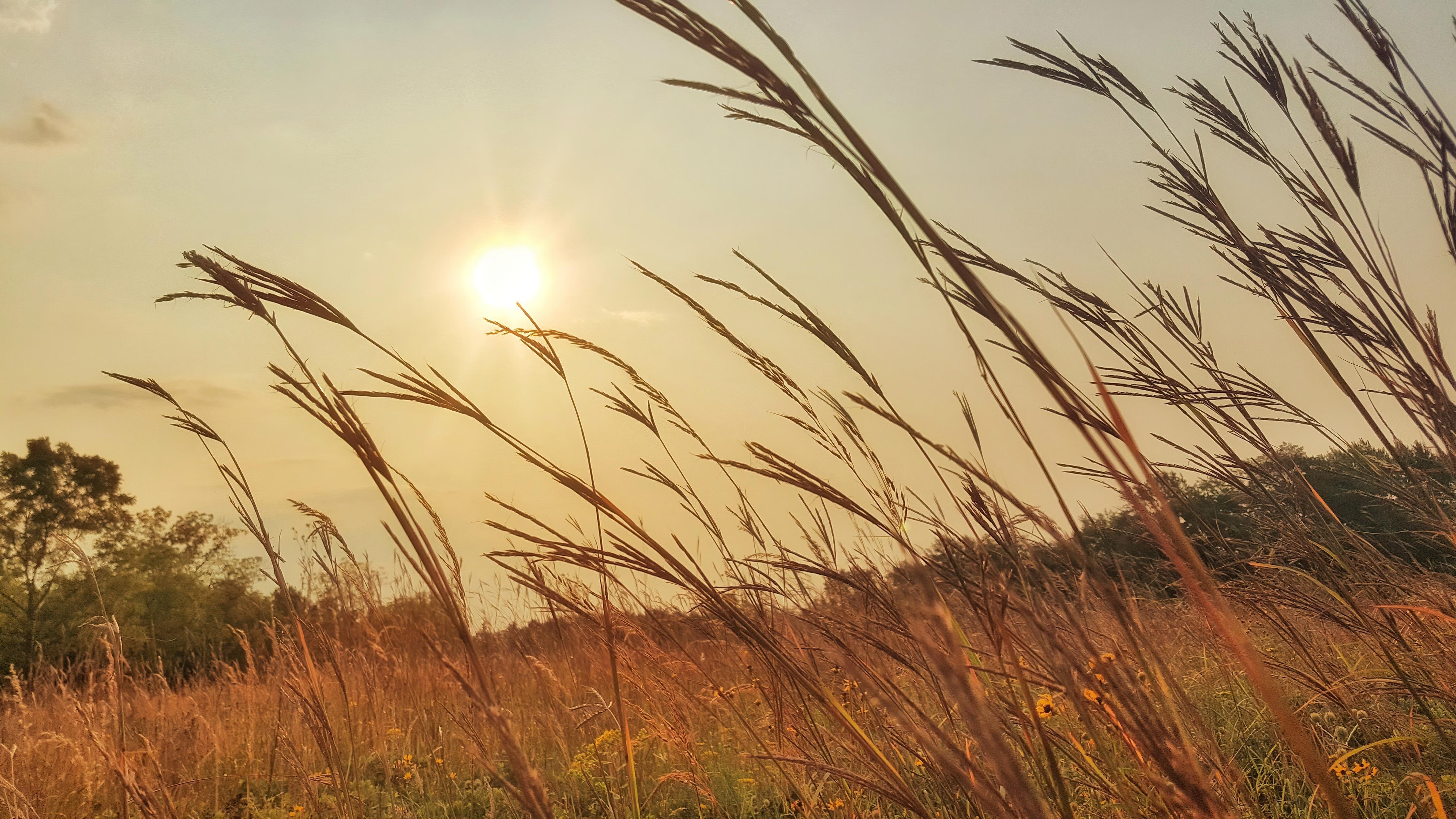
Before roads were drawn and rooftops rose, the land spoke in quieter ways—through wind moving across tall grasses, through the rhythm of seasons, and through the soft call of the bobwhite quail at dusk.
Bluestem is rooted in that memory.
Set in the heart of Central Texas, the community takes its name from the native grasses that have long defined this landscape— resilient, graceful, and ever-moving. Like the bluestem itself, the vision for the community is grounded yet alive, shaped by nature but designed for the way people gather today.
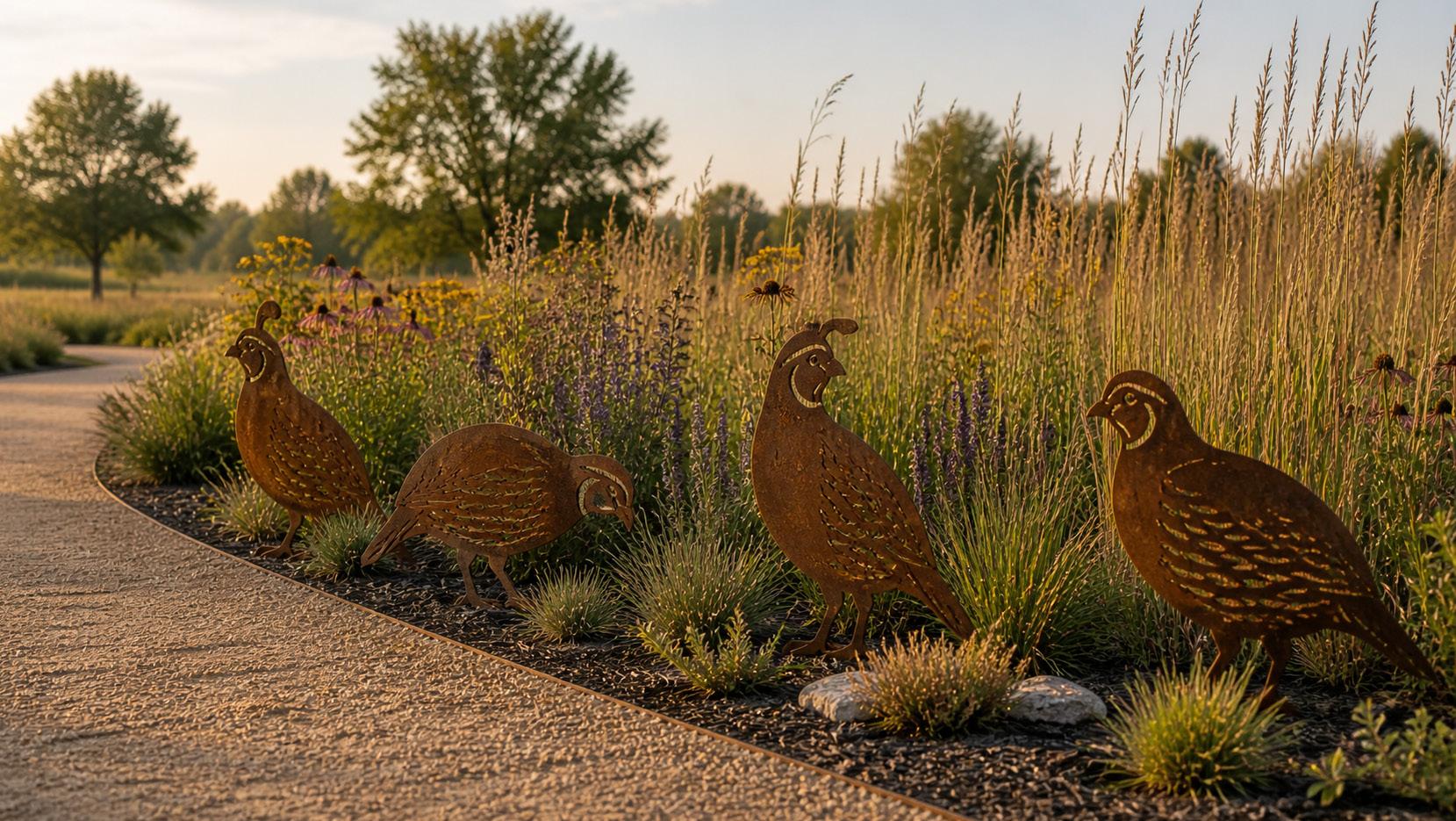
At the center of this story is the bobwhite quail —a familiar presence across the prairie and a symbol of home, connection, and return . Known for its covey call—“bob-white”—the quail doesn’t wander alone. It lives in groups, moves together, and always circles back . It’s a quiet but powerful reflection of what Bluestem is meant to be: a place where neighbors become community, and where life naturally gathers.

Gather Here. Grow Here. Live Here.
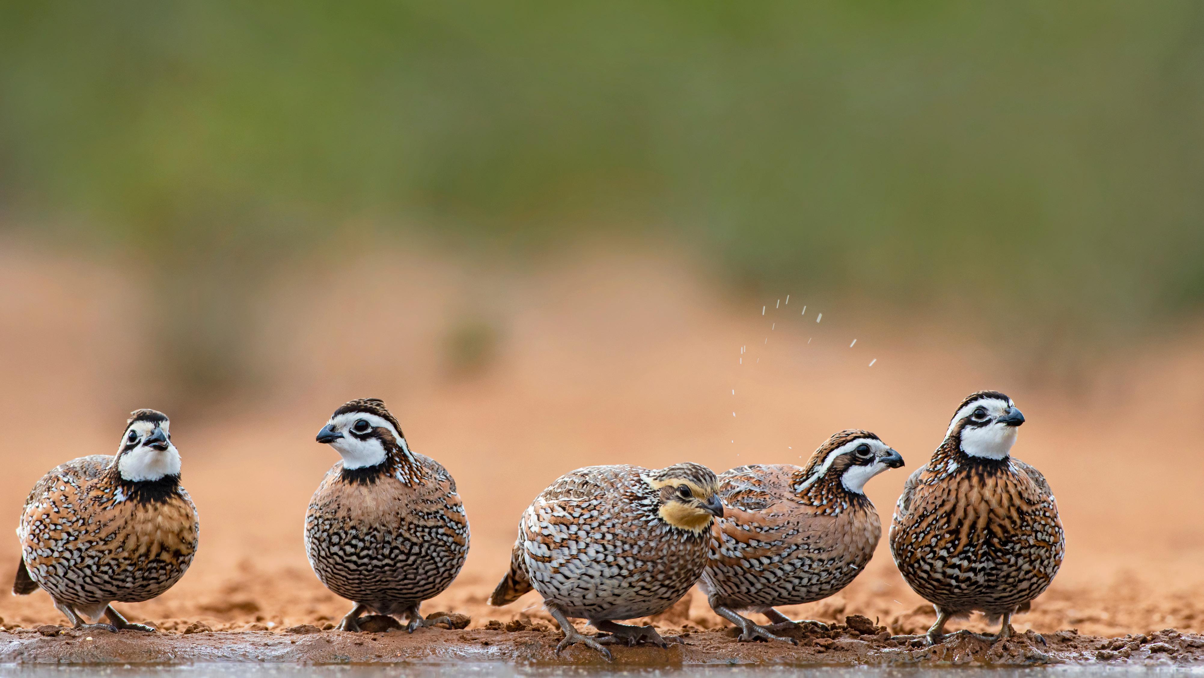
The bobwhite quail is more than a mascot—it reflects how Bluestem is designed to live.
THEY GATHER IN GROUPS CALLED A COVEY
Just like Bluestem, it’s about connection, neighbors, and community.
THEY FORM CIRCLES FOR PROTECTION
A symbol of shared spaces, front porch living, and looking out for one another.
THEIR CALL HELPS THEM FIND EACH OTHER
A reminder of home, belonging, and always finding your way back.
THEY THRIVE IN NATIVE PRAIRIE LANDSCAPES
Reinforcing Bluestem’s connection to the land and natural design.
THEY STAY CLOSE TO HOME
Representing a place to put down roots and build a lasting life.
THEY MOVE ON FOOT MORE THAN THEY FLY
Inspiring walkability and a slower, more intentional pace of living.
AT BLUESTEM, THE WAY THE QUAIL LIVES BECOMES THE WAY THE COMMUNITY FEELS—
A PLACE TO GATHER HERE. GROW HERE. LIVE HERE.
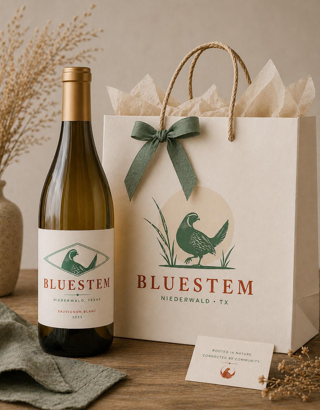
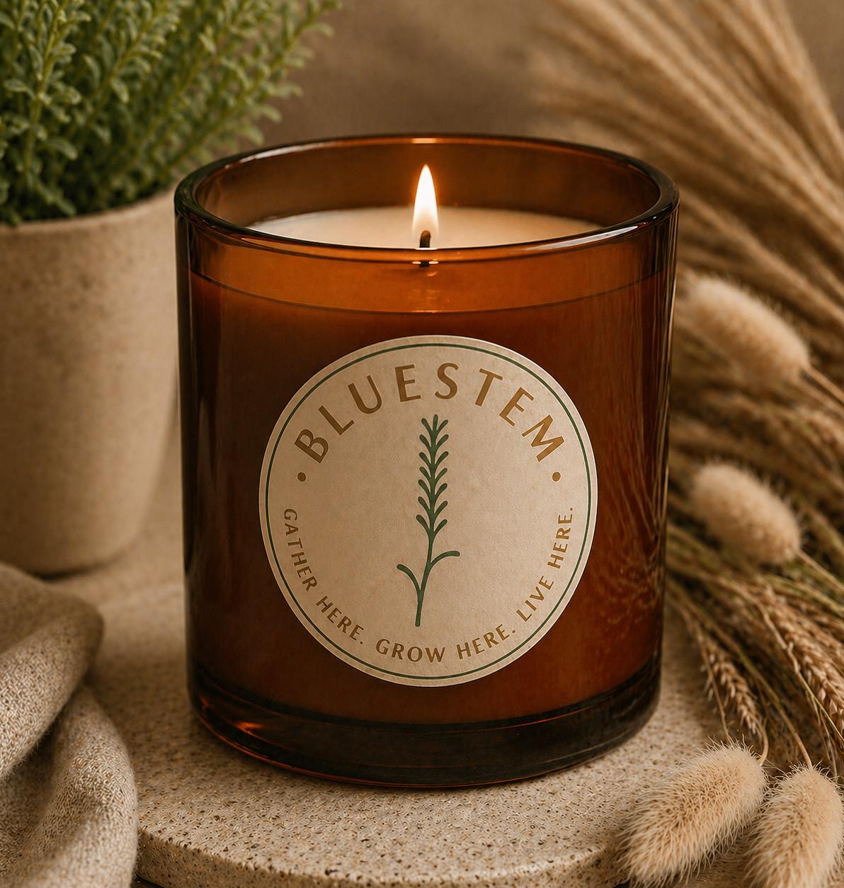
The Bluestem logo is rooted in the natural character of the Central Texas prairie , blending land, wildlife, and heritage into a single, cohesive mark.
At the center, the bobwhite quail serves as a symbol of community —known for gathering in coveys and staying closely connected. Its presence reflects the spirit of Bluestem as a place where neighbors come together and a true sense of belonging is formed.
Surrounding the quail, native prairie grasses ground the design in the landscape itself, reinforcing the community’s connection to the land and its natural rhythms. The soft circular backdrop suggests the warmth of the Texas sun, creating a sense of place and time—evoking early mornings and long evenings on the prairie.
The color palette draws from earthy, authentic tones warm rusts and natural greens—bridging the native environment with the modern farmhouse aesthetic of the community.
Together, these elements create a logo that feels timeless, rooted, and inviting .
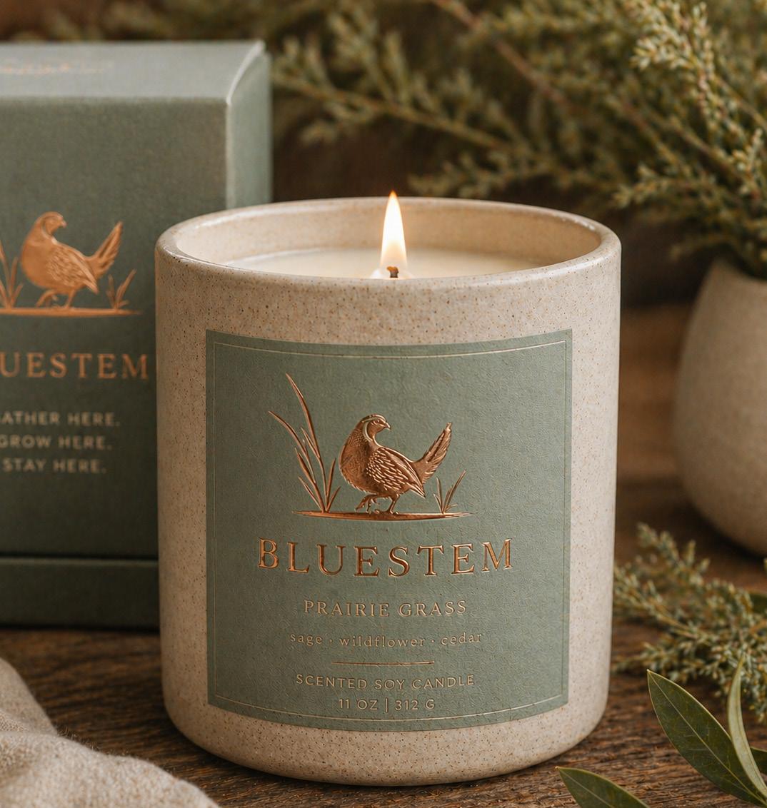

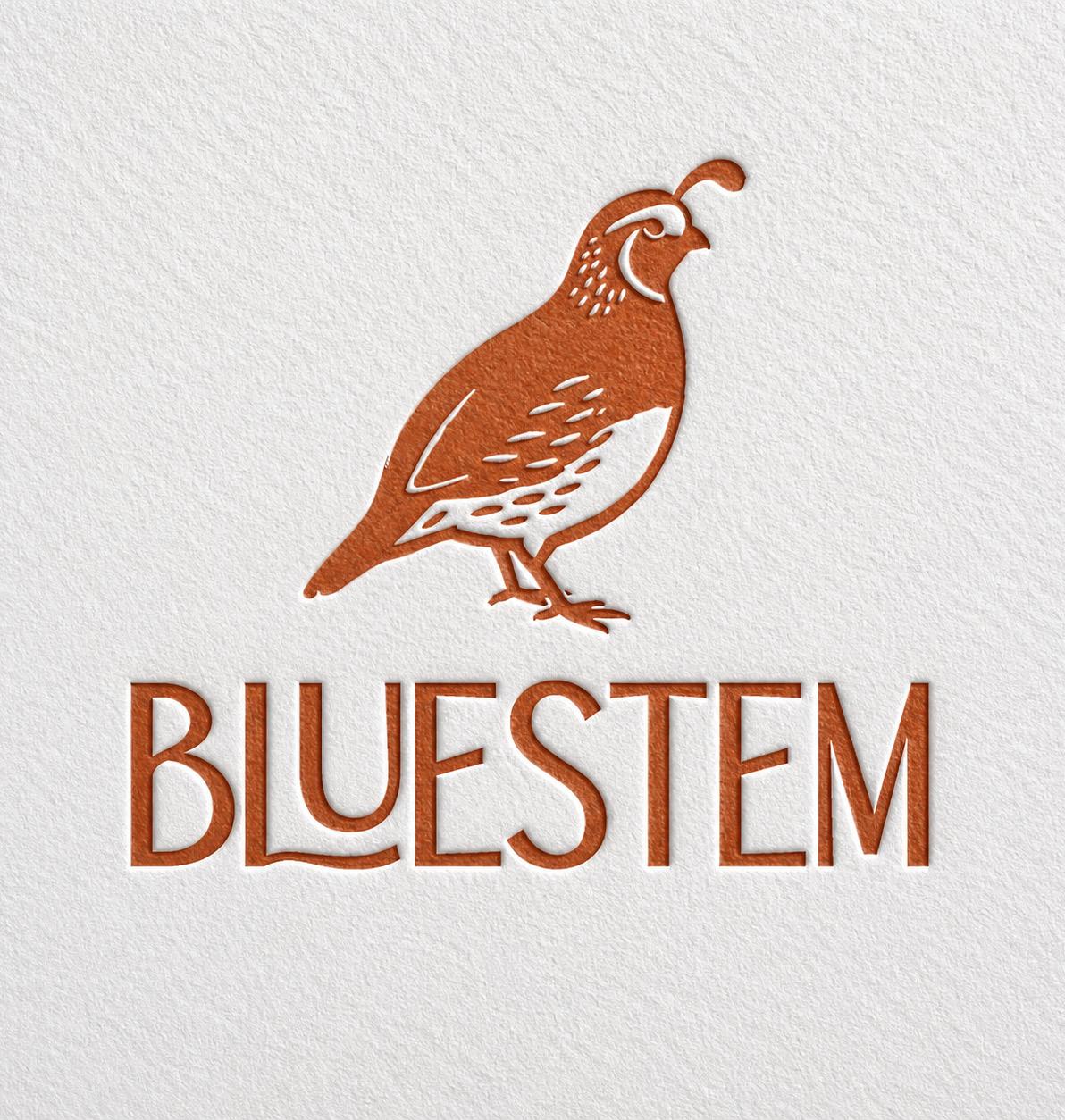
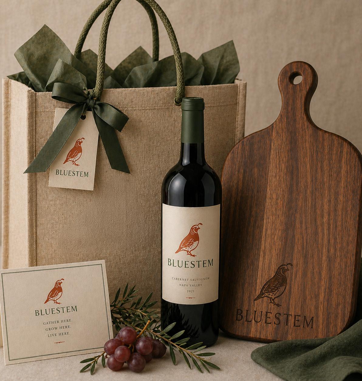
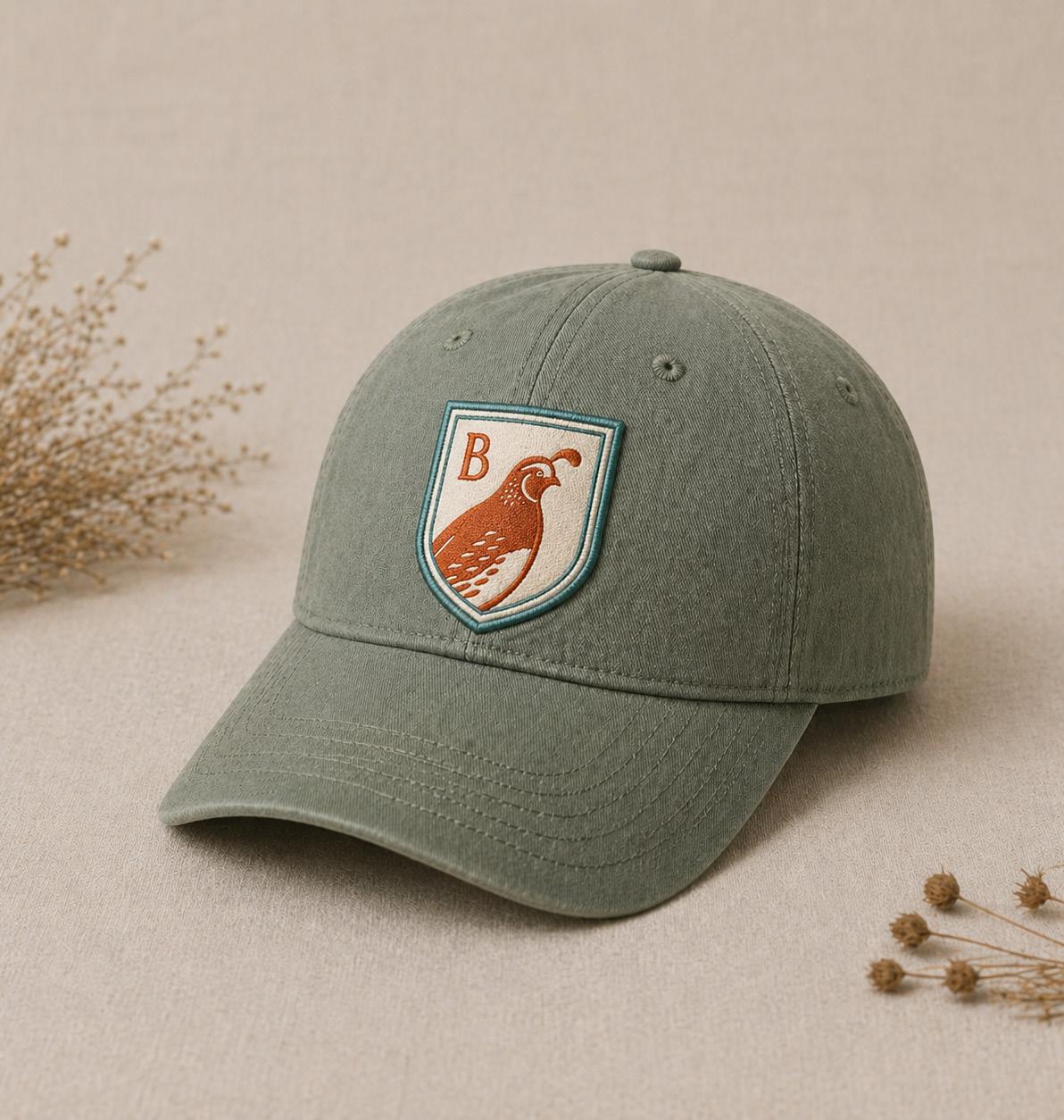
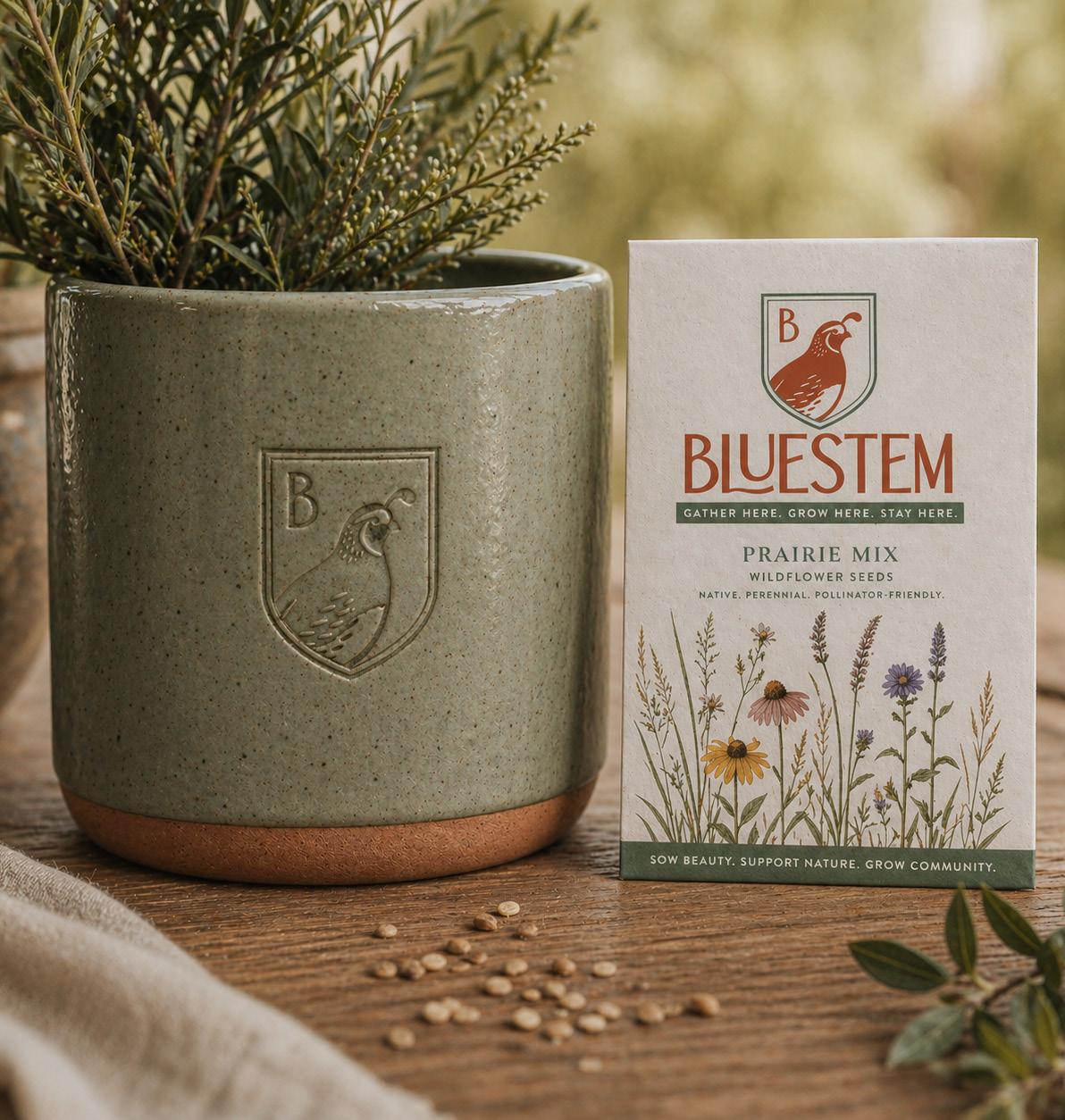
This Bluestem logo takes a more refined and iconic approach, focusing on the bobwhite quail as the central symbol of the community.
The quail is illustrated in a simplified, confident form capturing its distinctive shape and character while keeping the mark clean and highly recognizable. As a species known for gathering in coveys and staying close to home, the bobwhite represents connection, belonging , and a rooted way of life , aligning directly with the vision for Bluestem.
Paired with the quail, the wordmark introduces a modern interpretation of classic forms, with subtle curves and softened details that echo the movement of prairie grasses . The typography balances heritage and simplicity , reinforcing the modern farmhouse aesthetic while remaining approachable and timeless.
The warm, earthy color palette reflects the natural tones of the Central Texas landscape—bridging the land, the wildlife, and the built environment.
Together, the mark feels strong, grounded, and welcoming .
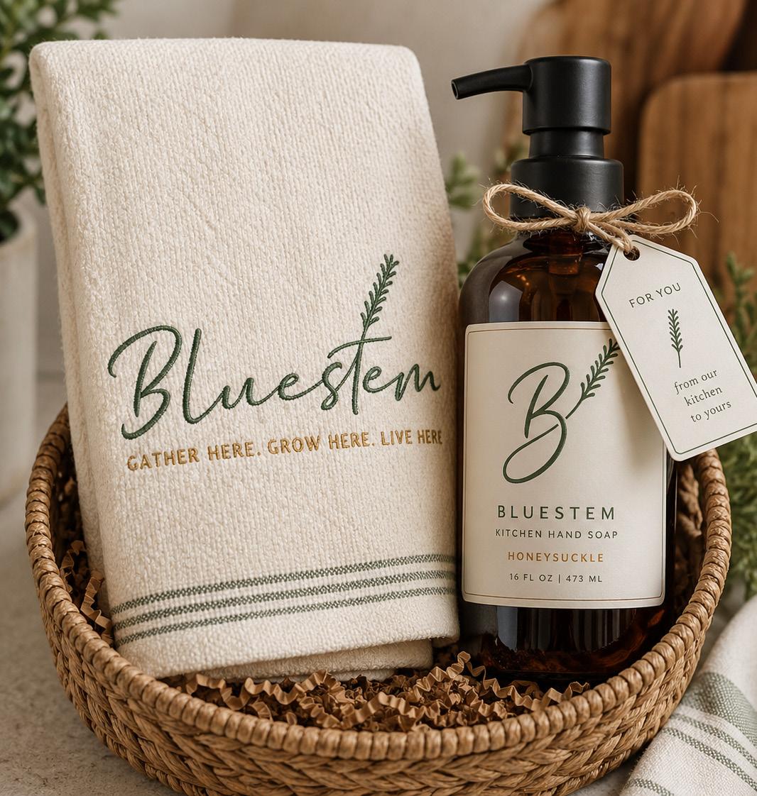
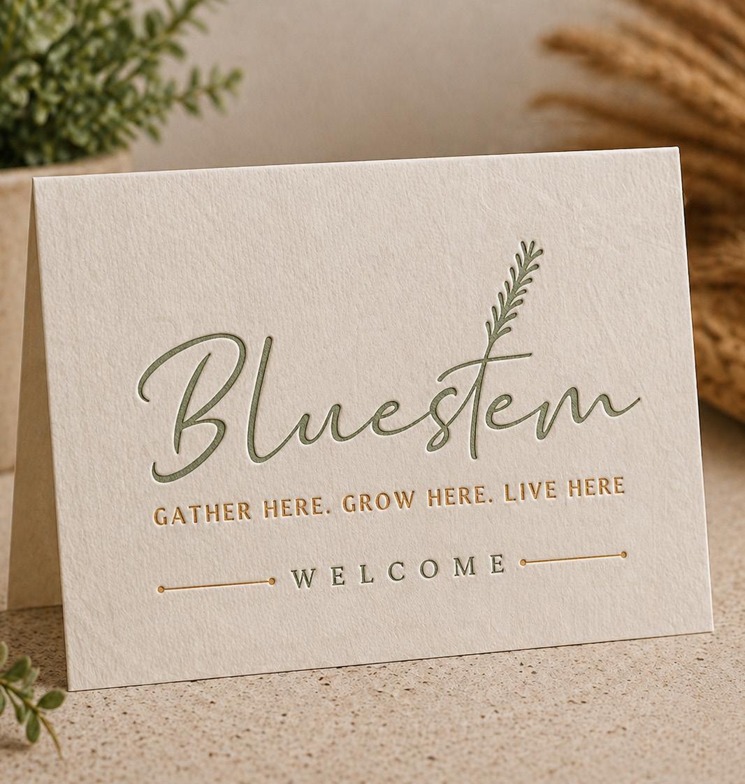
This Bluestem logo captures a softer, more expressive side of the brand—rooted in the natural movement and character of the prairie.
The flowing script wordmark reflects the organic rhythm of bluestem grass , with gentle curves that feel effortless and inviting. Integrated into the typography, the grass sprig forms a natural extension of the letterform, subtly reinforcing the connection to the land without overpowering the simplicity of the mark.
The result is a logo that feels personal, warm, and approachable —echoing the experience of the community itself. It suggests a place where life moves at a more relaxed pace, where details are thoughtful, and where the environment shapes the identity.
The soft green tone draws directly from native prairie grasses, grounding the brand in its Central Texas setting while supporting the modern farmhouse aesthetic through its natural, understated palette.
Together, the mark feels welcoming, lived-in, and authentic.
LOGO MARK

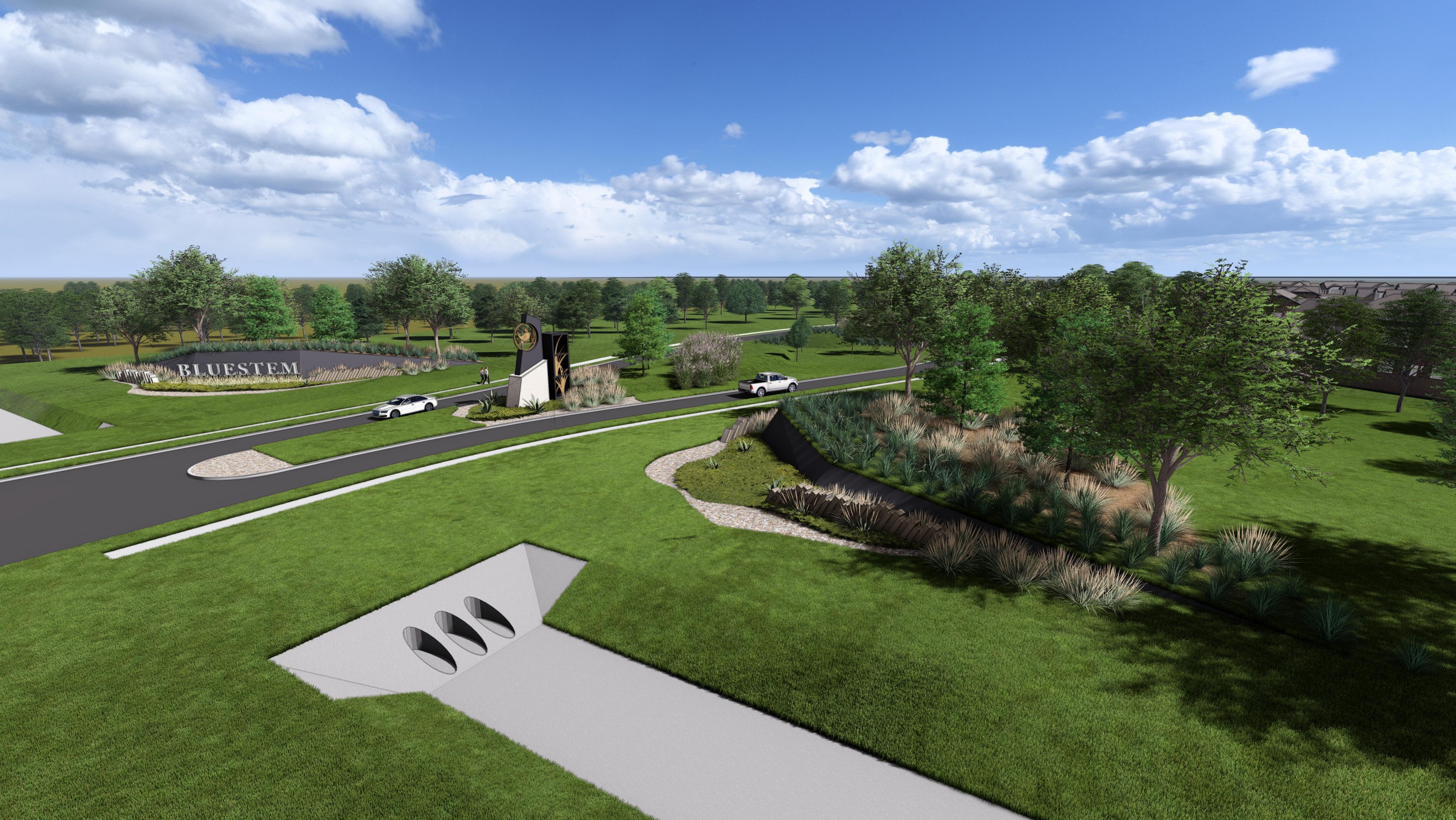
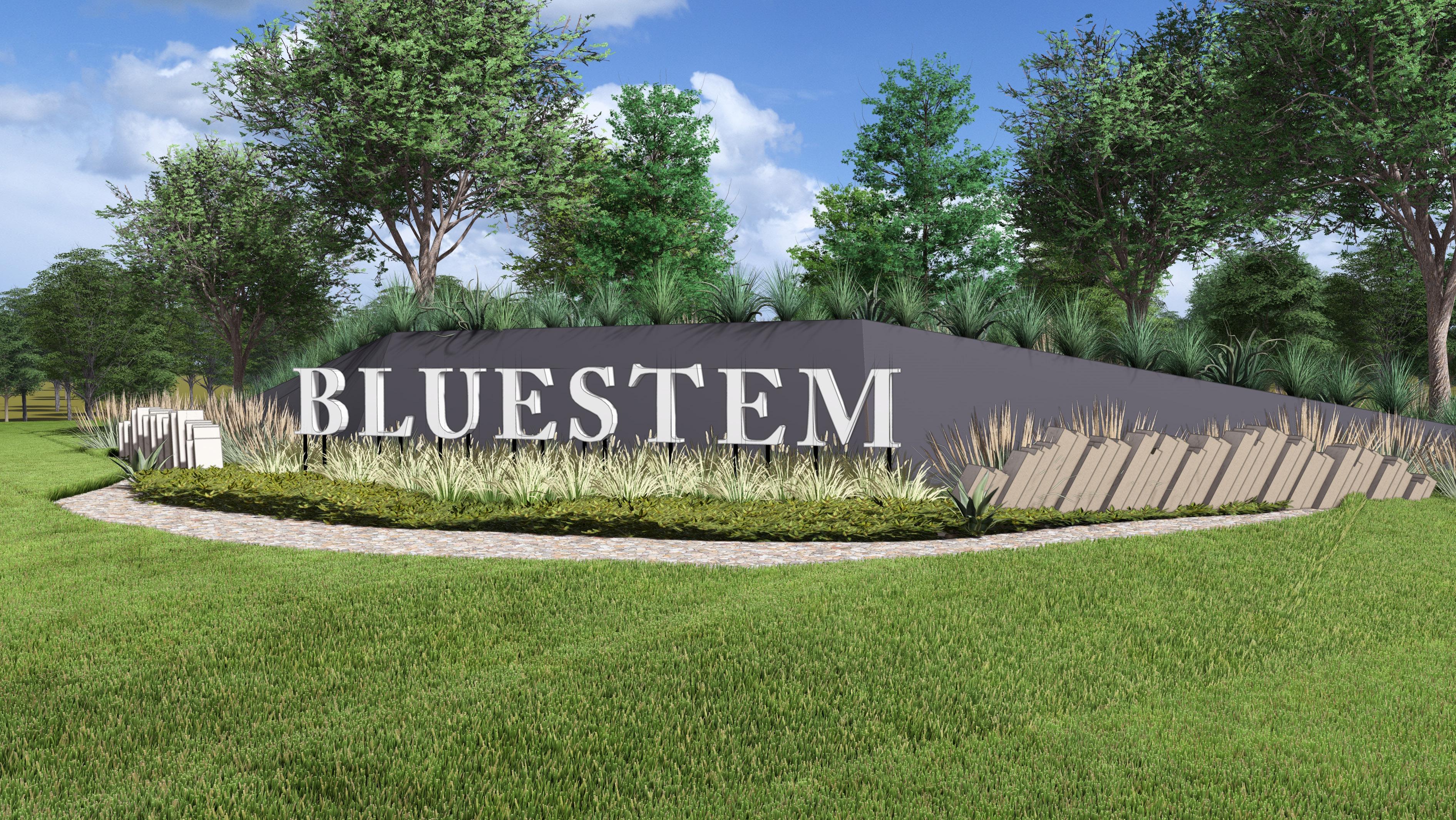
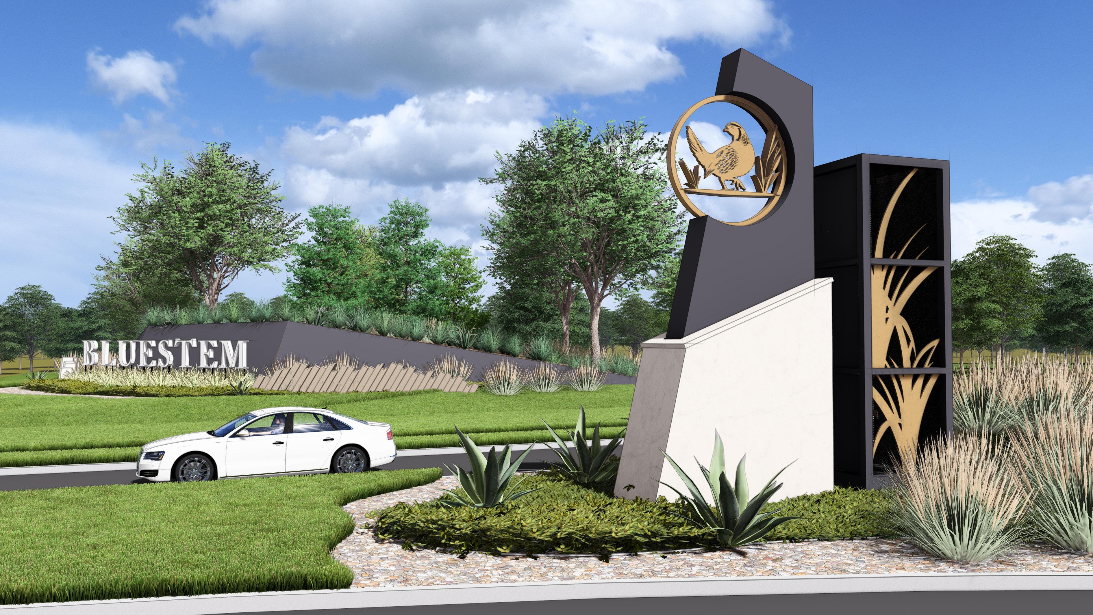
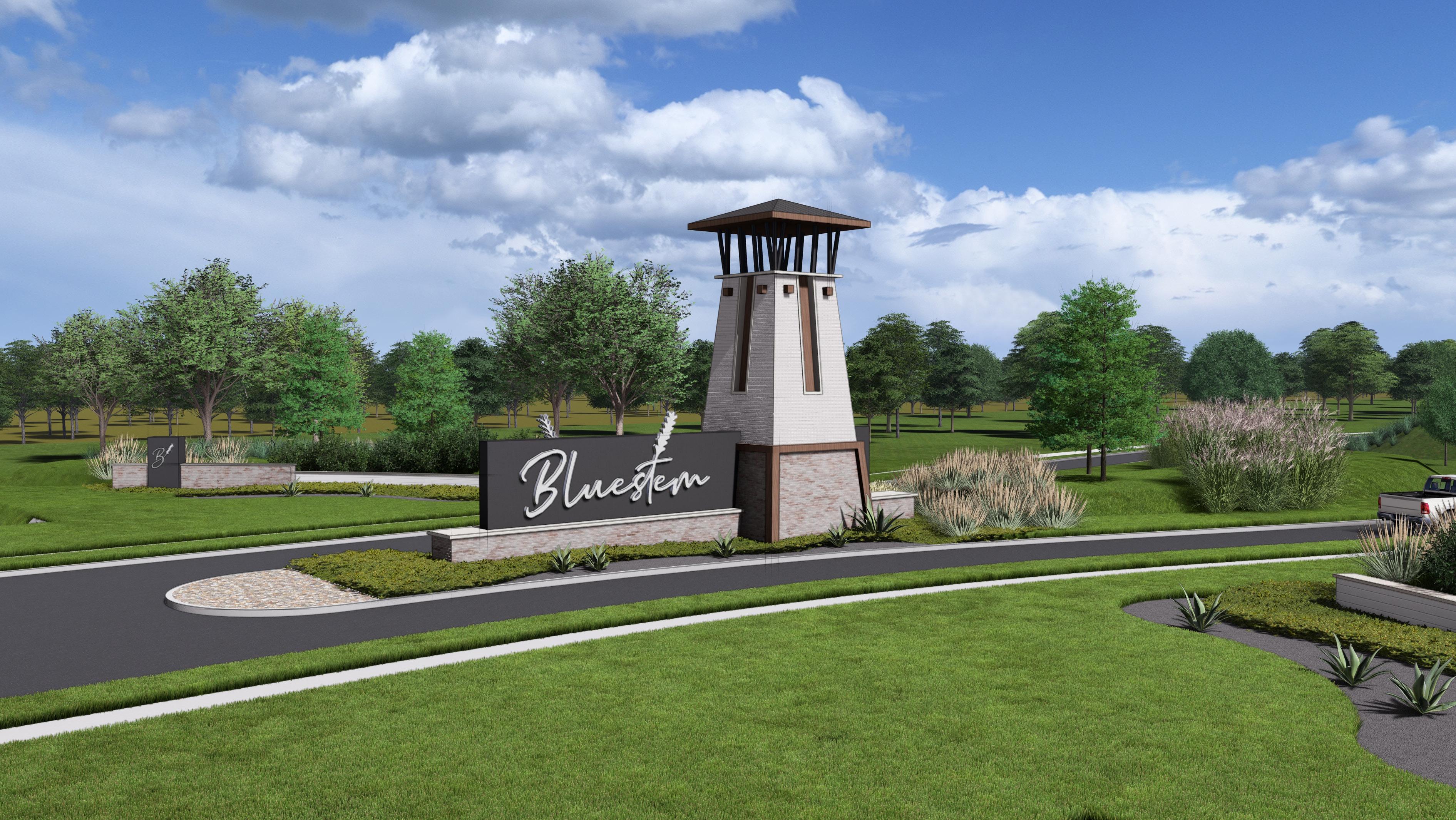
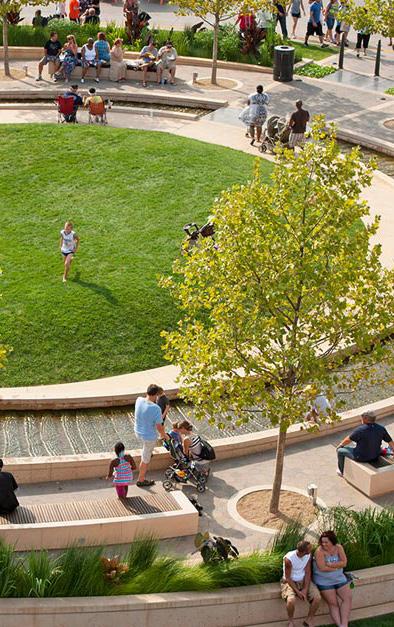
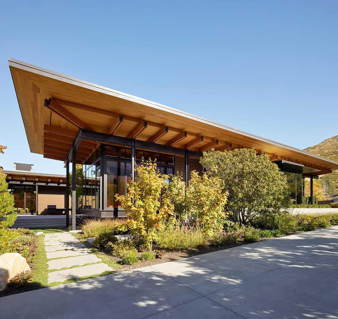

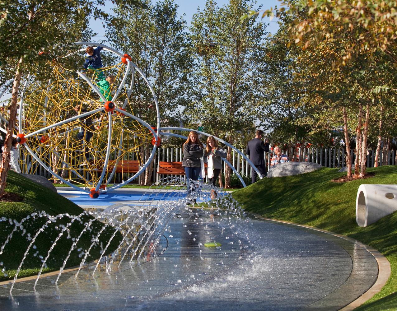
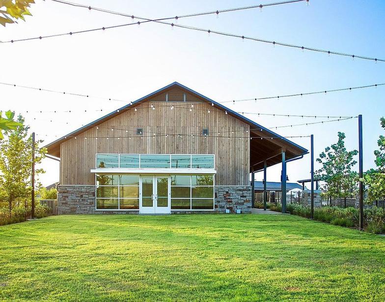
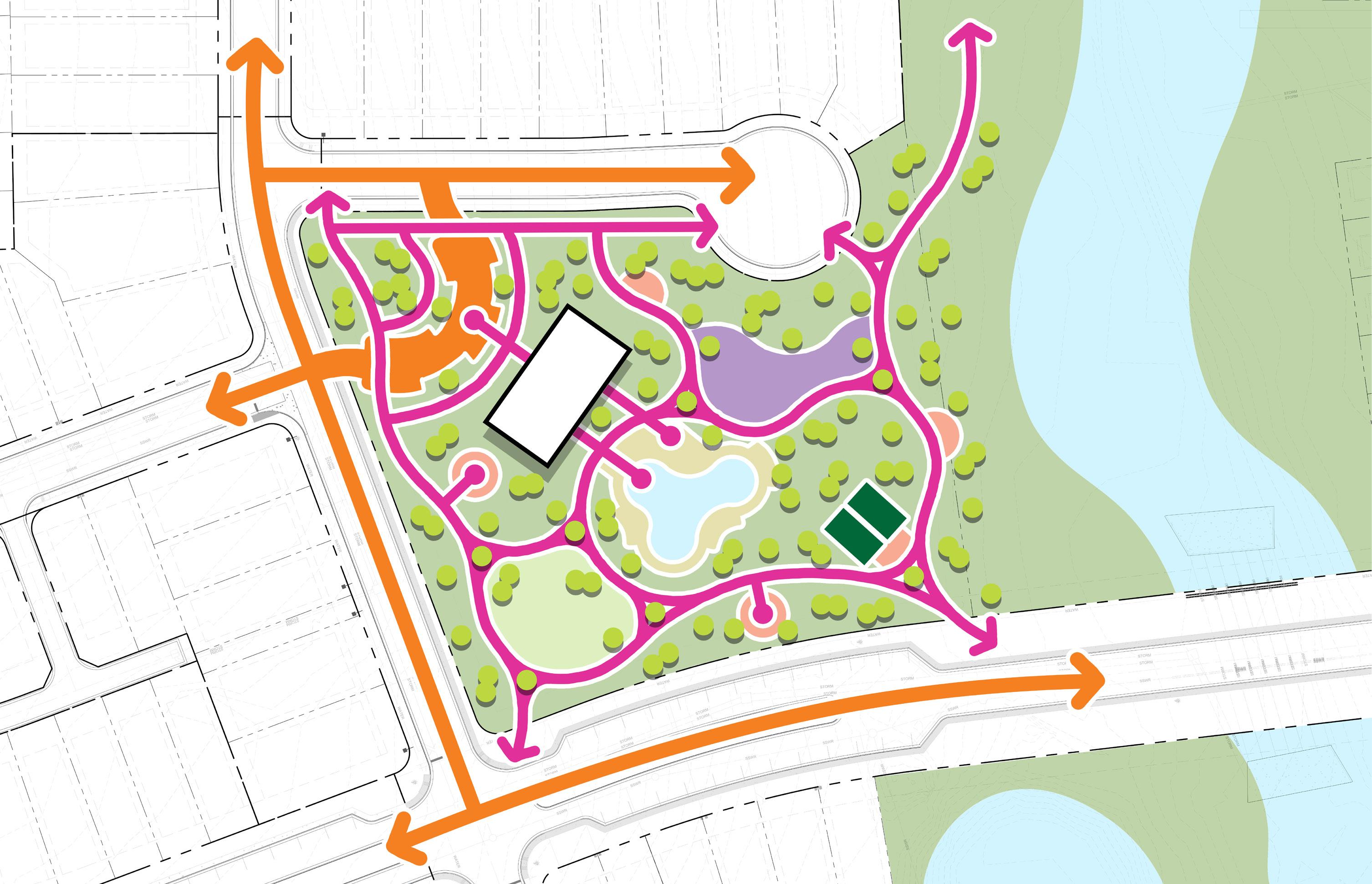
PLAYGROUND
SEATING AREA
PICKLEBALL SITE
MULTI-PURPOSE LAWN
PARKING LOTS
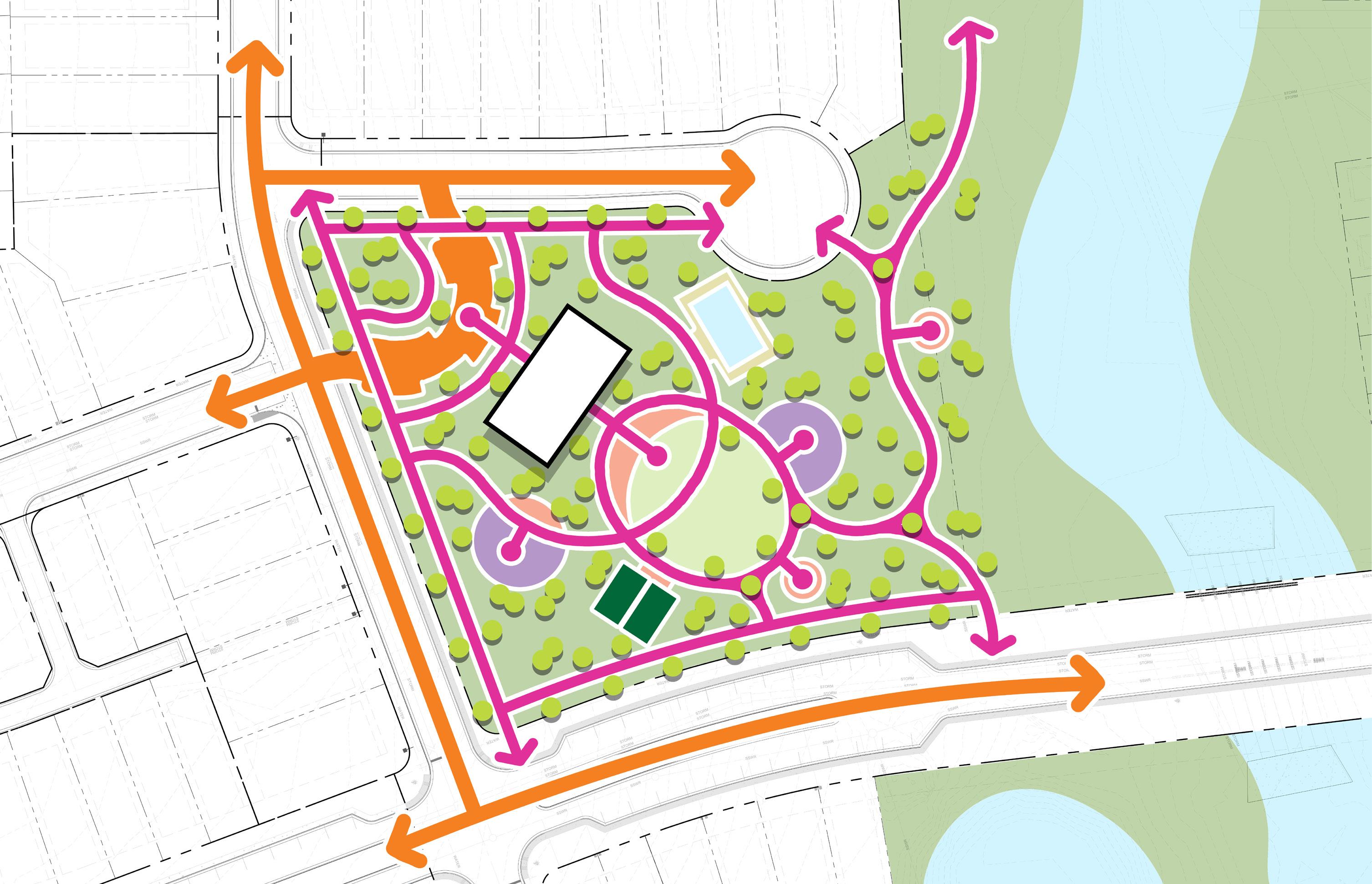
PLAYGROUND
SEATING AREA
PICKLEBALL SITE
MULTI-PURPOSE LAWN
PARKING LOTS
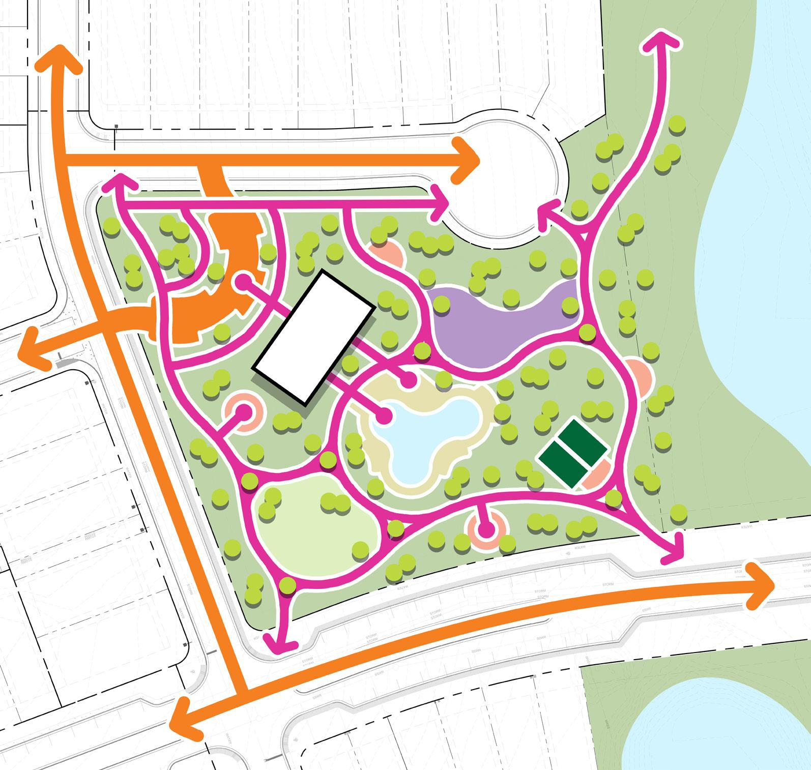
OPTION 1
• Organic pool form allows for multiple gathering spaces
• Views of the pool and other active amenities from the main boulevard
• Playground is protected from the main boulevard
• Clear walking paths around the amenity site
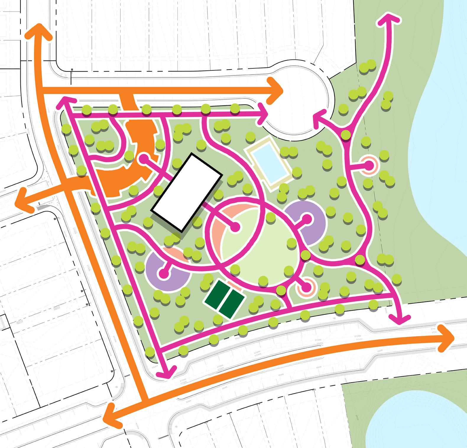
OPTION 2
• Large central green for community events
• Clear sightline from the parking lot to the central green and seating areas
• Rectilinear pool shape could support swim meet practices