4 minute read
Brandmark


BRANDMARKS
Advertisement
Dennis Kuronen.
A logo or brandmark is a symbol made up of text and images that identifies a business. A good logo shows what a company does and what the brand values. Logo design is all about creating the perfect visual brand mark for a company. Although there are no hard and fast rules t determine the best type of visual identifier for a particular type of company, the designer’s process is to examine a range of solutions based on both aspirational and functional criteria. The designers should determine a design approach that best serves the needs of the client and create a rationale for each distinct approach. Designed with an almost infinite variety of shapes and personalities, brandmarks can be assigned to a number of general categories.From literal through symbolic, from word-driven to image-driven, the world of brandmarks expands each day. The boundaries among these categories are pliant, and many marks may combine elements of more than one category.Although there are no hard and fast rules to determine the best typeof visual identifier for a particular type of company, the designer’s process is to examine a range of solutions based on both aspirational and functional criteria.The designer should determine a design approach that best serves the needs of the client and create a rationale for each distinct approach.
TOPOLOGY OF MARKS
•Wordmarks- A freestanding acronym, company name, or product name that has been designed to convey a brand attribute or positioning. •Letterforms- A unique design using one or more letterforms that act as a mnemonic device for a company name.
•Pictorial marks-A n immediately recognizable literal image that has been simplified and stylized. •Abstract/Symbolic marks-A symbol that conveys a big idea, and often embodies strategic ambiguity. •Emblems- A mark in which the company name is inextricably connected to a pictorial element or form.
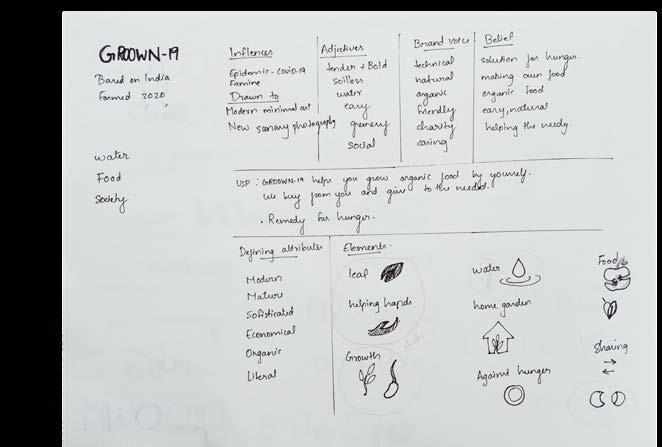
Initial Ideations:
After the research and analysis and the brief is drafted, the creative process is started. Design is an iterative process that seeks to integrate meaning with form. Reducing a complex idea to its visual essence requires skill, focus, patience, and unending discipline. The designers may have to go through hundreds of ideation before finalizing the logo which is going to be interpreted by different kinds of audience. I did ideate both wordsmarks and lettermarks.where the following pages are the wordmarks.
primary stage of idea development.
Logotype:
A logotype is a word in a determined font, which may be standard, modified, or entirely redrawn. If it is freestanding, it is called a wordmark. When a logotype is juxtaposed with a symbol in a formal relationship, it is called a signature. The best signatures have specific isolation zones to protect their presence. A company may have numerous signatures: horizontal, vertical, with and without tagline. The best logotypes are a result of thoughtful typographic exploration. Legibility at various scales and in a range of media is imperative. Each typographic decision is driven by visual and performance considerations, as well as what the typography itself communicates.
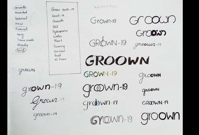
Ideation for logotypes.
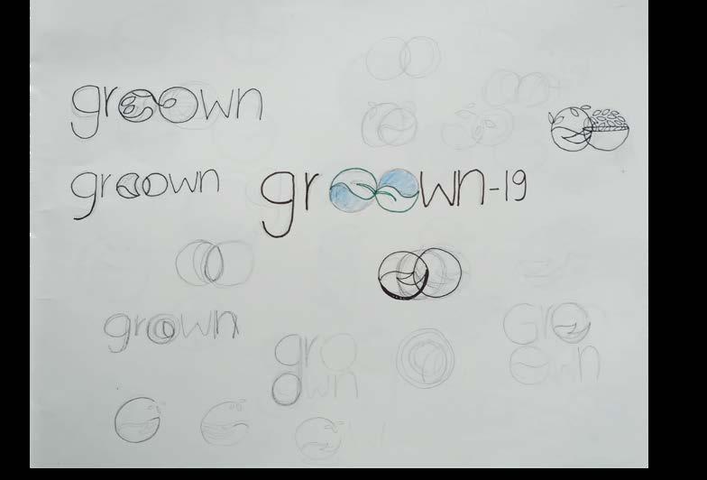
Ideation for logotypes.
Digital Ideation for logotypes.

Initial Ideations:
After sketching the ideas i have selected some of the best and tried it digitally.
Digital Ideation for logotypes.
Symbol Design:
Reducing a complex idea to visual essence requires skill, focus, patience, and unending discipline. Designers examine hundreds of ideas before focusing on one choice. Even after a final idea emerges, testing its viability begins yet another round of exploration.

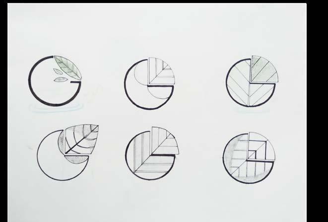
Initial Ideation sketches for symbols.
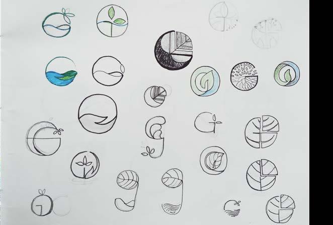
Initial Ideation sketches for symbols.
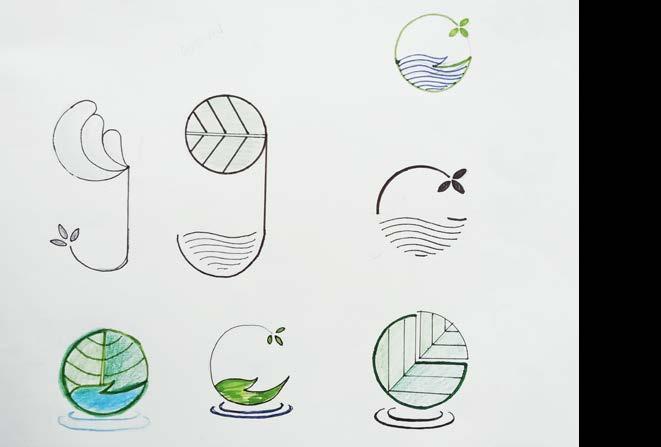
Refined Ideation sketches for symbols.
Refined Ideation sketches for symbols.
Design Concepts:
1. leaf in hand -the concept based on sharing food and the water ripples show the element of hydroponics.
2. the logo says the concept of growing food on roof top. where the parallel strokes shows the roots in water.
3. The leaf parted as a pie chart giving the message of sharing a part of your food to the needed. From this i got the idea of using the letter “G” in the logo.
4. The simple logo shows a plant growing from the hand which can also be depicted as the growing in water which is the concept of hydroponics.
1
Digital Ideation for symbols..
2
4 3
Testing:
I tested the selected logo ideations with my friends and family making sure that they fall under the desired target group. Most of the feedback were that their perseption of the logo was something related to earth and organic. Considering the feedback and test results i finalised one and refined it more.
GROWN
Digital Ideation selected for testing.
GROWN
Chosen
Refining:
I chose the rounded logo in the right images considering the feedbacks after testing. I have made the wordmark and stroke edges as rounded to show it’s playfulness and friendliness. I have omitted the cut leaf part and have reduced the number of strokes to show the veins.made it simpler and easy to recall.
GROWN
GROWN
Refining the logo. Chosen


