This project is all about enhancing the quality of life for all Californians, especially those living in the Central Valleys, through the arts. Our goal is to make an impact and uplift all people through genuine artscentric programs. The KDACC branding, was created to incite hope and cultivate a feeling of encouragement for our future.
• Create jobs in the creative economy
• Increase the ways in which artists engage in public work
• Uplift counties and cities not strongly represented in prior California Arts Council grant making
• Support artists who identify as representing communities residing in the lowest quartile of the California Healthy Places Index
• Help to cultivate a better California for all
OUR GOALS
THE BRAND
BRAND VISION & ETHOS
The KDA Creative Corps (KDACC) is intentional about using the arts to impact all peoples living in the Central Valleys of California. Our identity is used to highlight the ingenuity, creativity, and entrepreneurship stemming from artists, culture bearers, and creative individuals participating in the KDACC.
This serves as a handbook for the KDACC brand and its elements — the logo usage, alternate marks, and color palette. Kindly refer to this guide when incorporating these elements into your partner marketing materials or acting on behalf of our brand.
THE BRAND
COLOR PALETTE
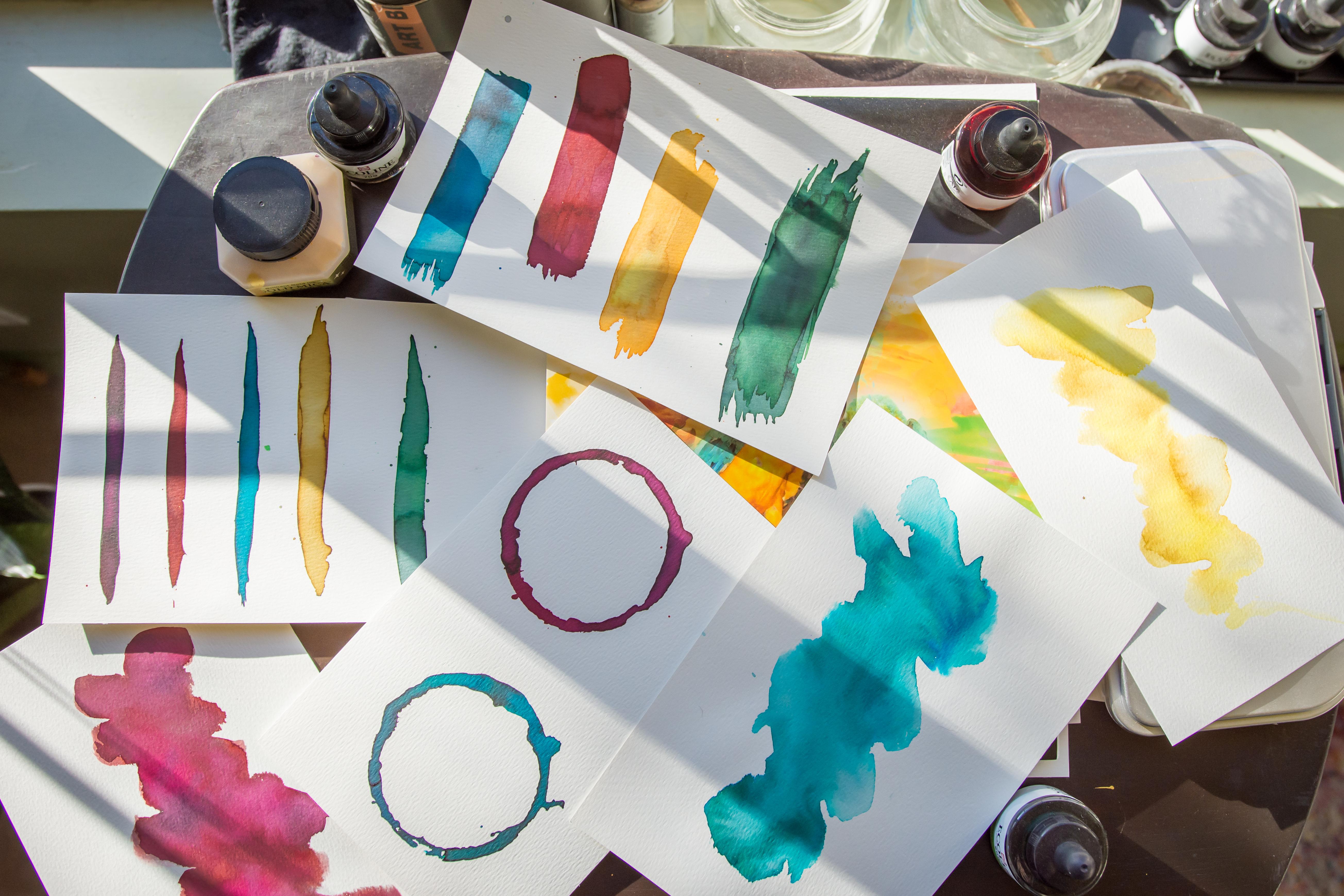
Deep, medium, and light tones are mixed to create monochromatic art that compliments images used.
SAPPHIRES RUBIES PEARLS EMERALDS
PRIMARY
SECONDARY
#0F424D
#6D253C
#143827
#AA9055
#1C6F8A #96BCCA
#A82148 #E9C1CD
#D6C8A6 #EFE0BE
#146341 #97B7A8
#000000 #FFFFFF
LOGO
LANDSCAPE
We have two versions of the logo — “landscape” works well on the header of the website; the “badge” one works nicely in a circular profile pic or anytime we want it to appear more self-contained.
LOGO
sapphires rubys emeralds pearls
Full-color, monochromatic logos are used on a white background only. One-color white (reversed) is used on a solid colored background (can be used over images, as well, if there’s enough contrast). One-color black is used when sent to apparel print or in simple applications, such as on a letterhead.
LOGO
Please scale the logo proportionately. This can be done by grabbing the corner of the object and holding SHIFT as you resize. Do not resize by merely squishing or condensing the logo from one side.
Please do not use an unapproved color.
Please do not apply any effects, such as drop shadow.
TYPOGRAPHY
HEADING
SUBHEADING 1
SUBHEADING 2
J K L M N O P Q R
S T U V W X Y Z
Didot Bold [All Caps] A B C D E F G H I
Didot Regular [Sentence Case]
Helvetica Neue Light
TYPOGRAPHY
BODY 1
A B C D E F G H I J K L M
N O P Q R S T U V W X Y Z
a b c d e f g h i j k l m n o
p q r s t u v w x y z
BODY 2
A B C D E F G H I J K L M N
O P Q R S T U V W X Y Z
a b c d e f g h i j k l m n o p q r s t u v w x y z
BODY 3
B C D E F G H I J K L M N O P Q R S T U V W X Y Z a b c d e f g h i j k l m n o p q r s t u v w x y z