
SEAMLESS SHOPPING THROUGH UX
DESIGN: Human-Centered Design in the
HOMAGE Mobile Shopping Application Experience

DESIGN: Human-Centered Design in the
HOMAGE Mobile Shopping Application Experience
I would like to express my deepest gratitude to Kendra LaPolla, MFA, for her unwavering support, guidance, and encouragement throughout my practicum and capstone project, as well as the entirety of my master’s program. Her expertise, mentorship, and belief in my vision have been instrumental in shaping my research and professional growth. Kendra’s dedication to fostering creativity and pushing the boundaries of design has not only enriched this project but has also profoundly influenced my approach to bridging the physical and digital realms of fashion.
I am also incredibly grateful to my committee members, Dr. Lauren Copeland and Dr. Laura McAndrews Troy, for their invaluable feedback, insight, and support. Their thoughtful critiques and academic expertise have challenged me to think more critically and refine my work to reach its fullest potential. Their guidance throughout this process has been a source of inspiration, and I deeply appreciate the time and effort they have dedicated to my success.
Additionally, I extend my sincere appreciation to Team HOMAGE, Danielle Miller, and Ryan Vesler for allowing me the opportunity to create this project for their incredible brand. Their passion, innovation, and commitment to storytelling through apparel have been a driving force behind my work. I am honored to have had the chance to contribute to HOMAGE’s legacy and to explore new ways to enhance the consumer experience through design and technology.
Finally, to all who have supported me throughout this journey, especially my family—your encouragement, insights, and belief in my work have meant more than words can express. Thank you for being a part of this milestone.

The HOMAGE Mobile Shopping Application is a digital platform designed to enhance the HOMAGE customers shopping experience by seamlessly integrating brand storytelling with human-centric design. This application was developed by a seasoned apparel design director to increase brand awareness, increase brand revenue, build a sense of community, and bridge the gap between physical and digital retail, ensuring an intuitive, engaging, and immersive shopping experience.
This research study documents the design research analysis and overall design approach for the application, ensuring alignment with research findings, and effective design principles with the creation of user personas. The UX process includes research insights, iterative user testing, and strategic recommendations to optimize the final digital design and experience, ensuring differentiation in the market while addressing user needs.
The app leverages foundational and innovative UX principles to deliver a seamless and engaging shopping experience. It offers personalized recommendations through user data analysis, interactive product videos, nostalgic product storytelling trivia, and subtle animations that enhance user flow and brand connection. Customizable setting features allow the app to curate collections tailored to individual preferences, driving higher customer engagement and conversion rates by showcasing products most relevant to the user. Additionally, the platform integrates new initiatives focusing on circularity and exclusive brand content only available within the application, deepening emotional connection while enriching consumer interaction beyond traditional e-commerce. By blending innovative initiatives with the established HOMAGE brand handwriting, this app redefines how customers engage with the HOMAGE brand, delivering a seamless and memorable shopping journey. The HOMAGE Mobile Shopping Application is not just a transactional platform but a storytelling hub that deepens brand connection through community.
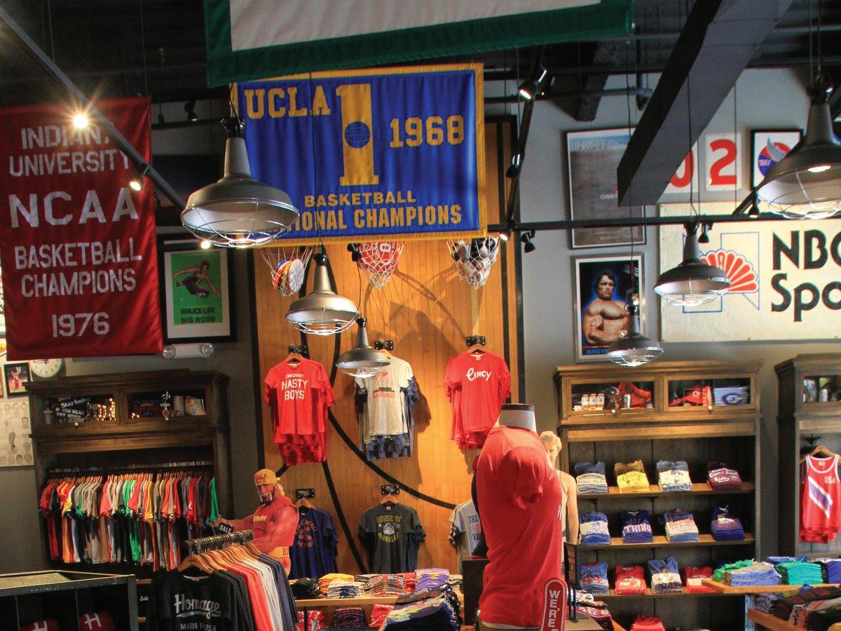
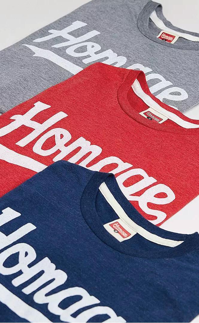
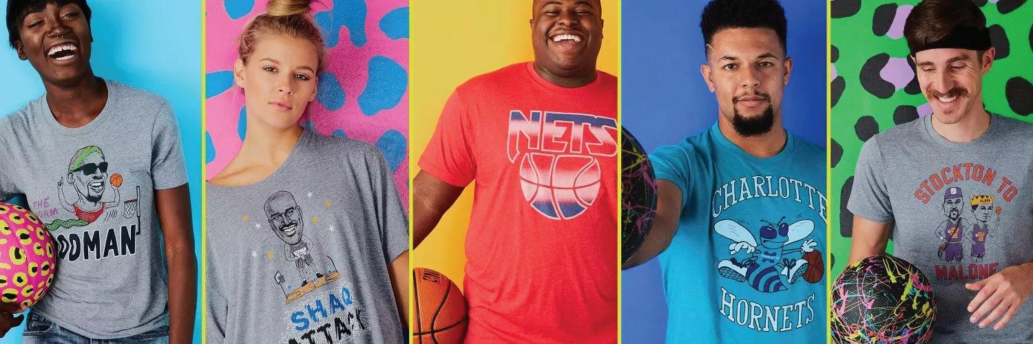
HOMAGE LLC is a Columbus, Ohio-based apparel brand renowned for its nostalgic, storytelling-driven designs. Founded in 2007 by Ryan Vesler, HOMAGE specializes in vintage-inspired graphic T-shirts, sweatshirts, and accessories that celebrate sports, pop culture, and historical moments. The brand has built a loyal following through its commitment to quality, ultra-soft fabrics, retro aesthetics, and emotionally resonant designs all in its signature tri-blend fabrications. Collaborating with major sports leagues such as the NBA, NFL, MLB, and NCAA, as well as pop culture entities, HOMAGE creates unique apparel that connects deeply and emotionally with fans. Each product exists to carry a backstory, honoring legendary athletes, cultural icons, and historic events.
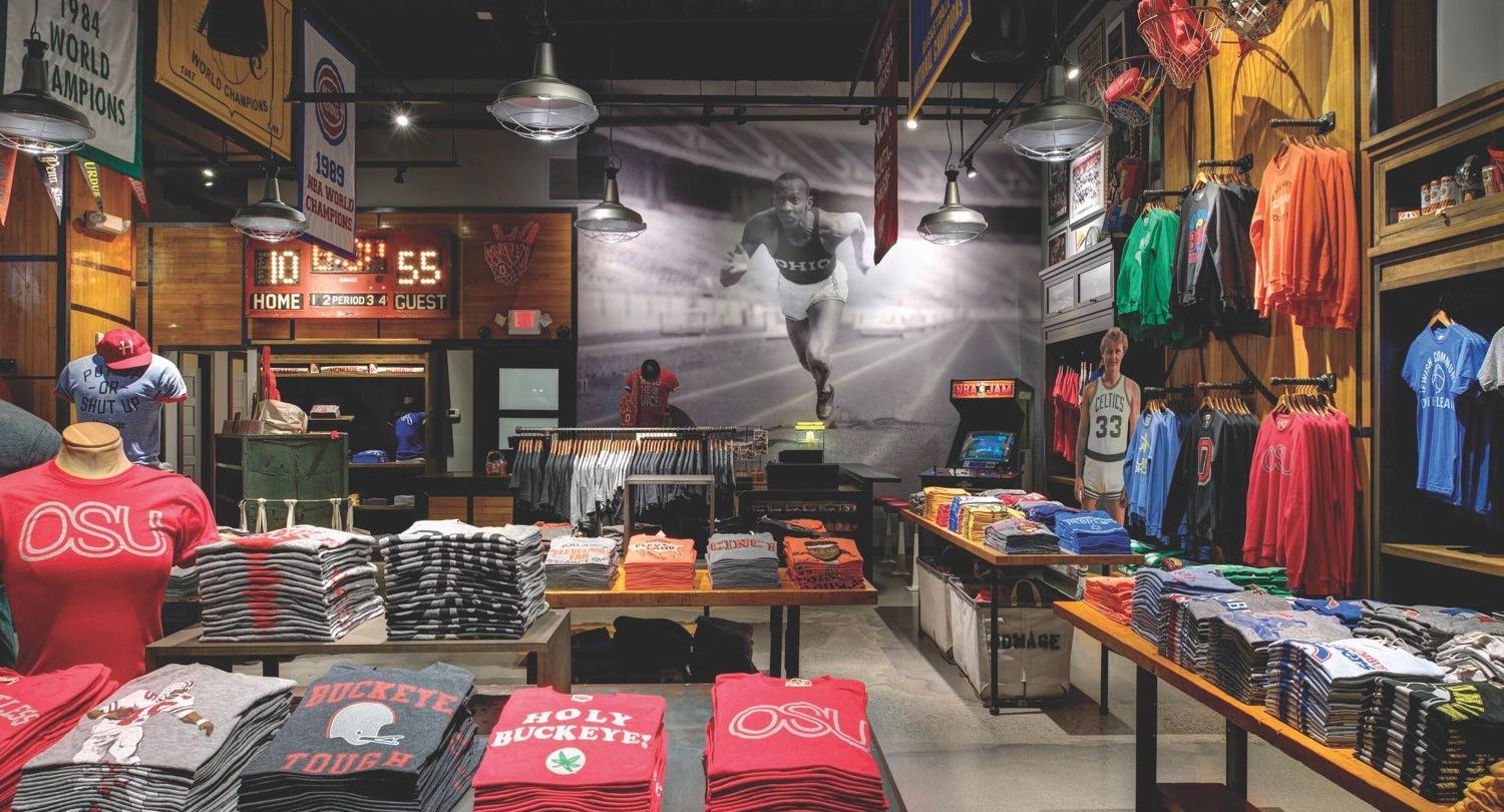
Beyond its e-commerce success, HOMAGE has established a brick-and-mortar footprint, with retail locations in Ohio that bring its brand experience to life. These stores serve as community hubs, allowing customers to engage with the brand in an immersive, nostalgic setting. Whether “Believers” (as the HOMAGE team calls their customers) are buying gifts for their favorite fan or stopping in on game day, HOMAGE blends online and offline retail strategies, continuing to expand its presence while maintaining its deep-rooted connection to storytelling, authenticity, and distinctive design.
In 2024, HOMAGE secured a strategic investment from Maximum Effort Investments, co-founded by actor Ryan Reynolds, to support its growth initiatives (Business Wire, 2024).
Following this, the company attracted additional investments from notable figures and organizations, including Ex-NFL star Jason Kelce's Winnie Capital, actor and entrepreneur Rob McElhenney's More Better, The Athletic co-founder Adam Hansmann, Haslam Sports Group, 35Ventures led by Kevin Durant and Rich Kleiman, and Wheelhouse 360 (PR Newswire, 2024).
HOMAGE’s distinctive apparel has also garnered attention from various celebrities and athletes. Taylor Swift was notably seen wearing an HOMAGE hat, leading to a significant increase in the company’s sales and awareness (NBC4i, 2023). Other prominent figures spotted wearing HOMAGE products include but are not limited to LeBron James, Richard "RJ" Jefferson, and Tucker Barnhart (614Now, 2018).


Ryan Vesler, CEO/ Creator

The HOMAGE research study was conducted to identify white space within the current retail landscape, benchmarking the HOMAGE brand against its competitors. The market analysis revealed a significant gap in mobile applications for emerging brands like HOMAGE, presenting a strategic opportunity to develop a dedicated mobile shopping application that has not yet existed for the brand. This application is designed not only to tell the HOMAGE brand story, highlight products, increase consumer engagement and national awareness, but also to create a seamlessly integrated shopping experience across online and in-store channels.
Findings from the market analysis and design research indicate that consumers are highly interested in mobile shopping solutions, with a well-executed application having the potential to increase national brand awareness and engagement through storytelling initiatives. The study explores the intersection of mobile commerce, user experience (UX) design, and brand storytelling to develop a platform that enhances consumer interaction, fosters brand loyalty, and drives revenue growth.
Key focus areas include optimizing the user interface for intuitive navigation and personalization, leveraging digital storytelling to strengthen
consumer connections through nostalgia-driven branding, and analyzing shopping behaviors to enhance conversion rates. Additionally, the research introduces innovative initiatives such as the Vintage Vault, a circularity program that enables consumers to buy and sell pre-loved HOMAGE items. This program aligns with the rising demand for vintage apparel while reinforcing the brand’s commitment to emotional storytelling and consumer connection.
Beyond the user experience, the study evaluates the broader business impact of a strategically designed mobile application, assessing its role in expanding HOMAGE’s direct-to-consumer reach and enhancing its in-store presence. While primarily centered on HOMAGE’s brand identity and the mobile shopping experience, the research acknowledges potential limitations related to evolving e-commerce trends and biases within user research.
By integrating user insights, market analysis, and digital innovation, this study provides strategic recommendations to optimize the design of the HOMAGE mobile shopping application, ensuring it delivers an engaging, community-driven, and revenue-generating experience.

User Experience (UX) has been an integral aspect of design for centuries. However, it was formally defined in 1995 by Don Norman, often referred to as the “Father of User Experience.” Since then, the concept of UX has profoundly influenced the digital world, shaping how products, services, and systems are designed. Norman’s book, The Design of Everyday Things, has been instrumental in this study, providing a foundational framework through its Human-Centered Design (HCD) philosophy.
HCD focuses on developing solutions that align with the needs, capabilities, and behaviors of real users. Norman claims, “It’s an approach that puts people first.” (p 8.)
As Norman (2013) states, “Good design starts with an understanding of psychology and technology”. (p. 8) Norman’s HCD is an iterative process grounded in design research, observation, prototyping, and usability testing to ensure both functionality and intuitiveness. (p. 222)
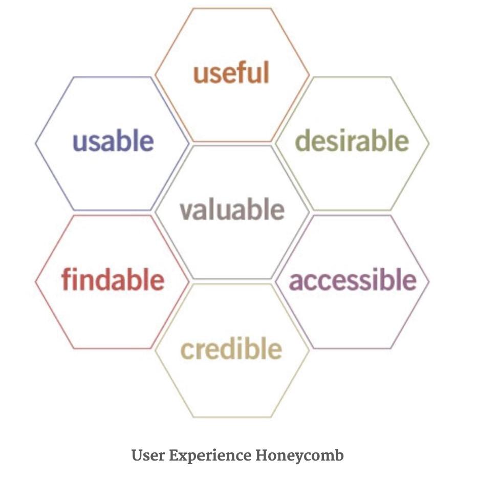
To guide designers with successful mobile application design based on user interactions, Peter Morville created the seven-honeycomb diagram that initiates the goal of “helping people understand the need to define priorities” (Morville, 2004). Key elements of effective UX design in mobile shopping apps state that successful applications must be useful, usable, desirable, findable, accessible, credible, and valuable. (Bufe, 2025) (Morville, 2004)


Both frameworks from Norman and Morville emphasize that design should be created around the user’s needs, ensuring usability and satisfaction. Morville’s model outlines specific areas of user experience that should be prioritized, while Norman’s philosophy provides the process of using those principles through design research, observations, prototyping, usability testing. Morville’s usability directives and Norman’s human-centered approach work together to ensure intuitive functional design. Successful design is born from understanding and applying the key principles outlined in Morville’s diagram, combined with the thoughtful implementation of Don Norman’s process.
Ideas remain just ideas until they are brought to life through a meticulously crafted and executed design process. Both approaches place a high value on creating a positive emotional connection with users, whether through visual aesthetics, pleasant interactions, or the overall user experience that aligns with their expectations, needs, and desired value proposition. Both frameworks ensure that products are designed to be accessible and usable by everyone, not just those with ideal circumstances or abilities. Both philosophies push for designs that allow users to achieve their goals with minimal barriers with lack of friction. The connection between Morville’s Seven Honeycomb UX Diagram and Don Norman’s Human-Centered Design lies in their shared commitment to creating user-friendly, intuitive, and engaging experiences. Morville provides a multi-dimensional approach to UX, outlining specific elements that need to be addressed, while Norman offers a process for how to approach those elements by focusing on understanding and designing for human behavior. Together, they create a robust framework for designing products that meet user needs effectively and emotionally, ensuring usability, satisfaction, and continuous improvement. Mobile shopping applications would not be successful in today's fashion industry without the use of effective UX design principles including Morville’s honeycomb model and Norman’s HCD process. To create an impactful application that offers users value and assists them with their goals, application design must follow these six principles:
Useable: A frictionless and intuitive experience is essential, as mass research indicates that users have limited time and patience for simple tasks. Mobile shoppers expect a fast and efficient browsing experience, and if an app is cluttered, confusing, or requires too many steps to find products, users are likely to abandon it.



A well-structured UX ensures clear category organization, effective search and filter functionalities, and an intuitive navigation system that facilitates task completion. Quick access to the cart and checkout further enhances usability.
Useful: Providing users with personalized experiences—such as access to past purchases, opt-in/out preferences, and content customization—enhances engagement by offering relevant recommendations that align with individual consumer desires and needs. Personalization creates a more tailored shopping experience, increasing user satisfaction and likelihood of purchase. Based on browsing history and past purchases, personalized recommendations can be generated to present users with useful and relevant products that align with their preferences and needs.
Findable: Application and cart abandonment remains a significant challenge in mobile shopping, often occurring when the UX does not facilitate a quick way to discover products and seamless checkout process. Limited attention spans, distractions from notifications, or competing priorities may cause users to forget their original task. A well-designed UX addresses these issues by ensuring the user can find what they are looking for immediately as well as a shopping cart that remains accessible across all screens, minimizing form fields, and providing the information needed to finalize a purchase.
Trustworthy and Credible: Establishing trust with the user is crucial in e-commerce. “Users must trust you and your product.” (Bute, 2025) The user experience should reflect the quality of the products or services offered, reinforcing the credibility of the brand through a professional design that mirrors omni channel experiences. High-quality product images, detailed product descriptions, access to customer reviews, security features, and a transparent return policy all contribute to user confidence, increasing the likelihood of conversions. When users feel assured that they are making informed decisions, they are more likely to complete purchases and return for future transactions.
A slow, glitchy application with broken links and bugs can immediately deter users, eroding trust in the brand and ending up in an abandoned application. Trust and credibility are created through fast loading times, smooth transitions, and minimal disruptions, maintaining a positive user experience, and ensuring continued engagement. Shoppers expect instant responsiveness, and any delays of speed and performance can lead to frustration and app rejection. Prioritizing app performance through efficient coding, streamlined interfaces, and regular updates ensures that users remain engaged and satisfied.
Valuable: A positive user experience fosters a value proposition and repeat engagement, demonstrating a meaningful connection between the consumer and the brand. This translates to higher conversion rates, increased brand loyalty, and organic word-of-mouth marketing. Satisfied customers are more likely to recommend the app to others, further driving growth and retention. By consistently delivering a seamless shopping experience, brands can build valuable, long-term relationships with their customers and their communities.
Accessible: “Ensuring accessibility is no longer optional—it is a fundamental aspect of UX design.” (“The Future of Product Design: Trends and Technologies,” 2024) Designing with inclusivity in mind from inception guarantees a seamless experience for users of all abilities. Features such as voice search, screen reader compatibility, and universal navigation principles should be integrated at the core, preventing accessibility from becoming an afterthought. Intuitive navigation options, including persistent navigation bars and multiple paths to task completion, minimize friction and improve usability. A truly accessible app ensures that all users, regardless of ability, can shop with ease. A universally designed application is more likely to succeed as it enhances usability for a broader range of consumers.
User Experience (UX) design is a critical component of mobile shopping applications, directly influencing how users

interact with and perceive a brand. UX design in mobile shopping applications extends beyond aesthetics—it is about creating a seamless, efficient, and enjoyable shopping experience that reduces friction, drives conversions, and enhances customer loyalty. A well-designed UX fosters a smooth, intuitive, and enjoyable shopping journey, leading to higher retention and engagement, increased brand perception, and greater conversions and revenue. (UI UX Design Company, 2025).
In today’s highly competitive e-commerce landscape, optimizing UX is a decisive factor in determining the success or failure of a mobile shopping app. Brands that invest in human-centric design will not only enhance their digital presence but also strengthen their relationship with consumers, fostering long-term success.
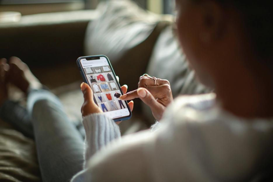
The research on mobile shopping applications provides valuable insights into industry trends, consumer expectations, and strategic opportunities for HOMAGE to differentiate itself. By analyzing commonly found features, standout functionalities, and key reasons for selecting specific apps for benchmarking, the study highlights critical areas for competitive positioning. While researching brands similar to HOMAGE, the study analyzed both small and large companies, categorizing them by download numbers ranging from 50K to over 50M. Since many smaller brands do not have dedicated mobile shopping apps, the research also included well-known brands to provide a broader industry perspective. The findings revealed that while all brands incorporate essential shopping features, some differentiate themselves by focusing on niche markets such as sports, activities, or youth-oriented products.
Common innovative features found across most shopping apps include Search/ Filter, product technology tools (such as sizing assistance and visualization), exclusive promotions, trend feeds, wishlist capabilities, reward programs, in-app product releases, and customer reviews. However, less common features—such as content sharing, personalized recommendations, and advanced artificial intelligence (AI) tools—present opportunities for HOMAGE to create a more customized and engaging user experience. Additionally, standout features like visual search, curated storytelling content, seamless customer care integration, and exclusive content (e.g., behind-the-scenes videos or style quizzes) could enhance HOMAGE’s app experience. Future opportunities include building out customer care initiatives, implementing fit technology, preference quizzes, and social-driven content to strengthen community engagement.
Ultimately, HOMAGE has the potential to blend fundamental e-commerce functionalities with exclusive content and interactive elements, leveraging personalized recommendations, immersive storytelling, and innovative digital tools to create a compelling, brand-driven shopping experience that fosters customer loyalty.
During the selection process for applications to research, HOMAGE’s competitors were the primary focus in determining which apps to review. While analyzing the app marketplace for comparable brands—such as Rally House and other smaller companies specializing in licensed apparel— it became evident that most smaller brands do not have dedicated mobile applications, likely due to brand size, resource limitations, and overall brand awareness. However, given HOMAGE’s current stage of growth and goal of becoming a nationally recognized brand, launching a mobile application presents a significant opportunity to differentiate the brand, increase awareness, drive revenue, and foster community engagement. Recognizing the limitations of smaller brands and their lack of mobile presence, a selection of larger legacy brands—including American Eagle, H&M, and Hollister—were analyzed to gain insights into mobile strategies, app features, and user engagement. Additionally, On Cloud and Homefield brands provided insights into mobile interaction within the sportswear market, while Carter’s was reviewed to uncover trends relevant to HOMAGE’s expansion into the Youth & Baby category.
Common features across these applications touted secure & easy checkout, exclusive promotions, exclusive product drops, scan-in-store functionality, inspiration fashion feeds, wishlists that provide suggestions that users will love, rewards programs, easy to find reviews, technology-driven enhancements such as product videos, sizing/ fit assistance, and visual search capabilities. Some standout innovations included American Eagle’s in-store engagement tools like the ability to access inventory levels at your nearest store, downloadable store playlists, and free curbside pickup; Uniqlo’s one-hour pickup feature, live video shopping, sizing assist feature, and free alterations; and Carter’s curated shopping experiences, allowing users to shop by adventure themes and engage with the Carter’s parenting community. Hollister is one of the few applications that accepts payment through Venmo, a mobile payment system that makes payment transactions between family and friends fast and easy. Hollister, Cotton On and PINK have combined apps, meaning they allow access for a seamless transition to easily shop their sister brands.
Emerging mobile trends such as visual and voice search, in-app customer service chat, campaign videos, behind-the-scenes content, interactive outfit quizzes, and fit technologies highlight key opportunities for HOMAGE to leverage mobile technology and new shopping initiatives in a way that enhances the shopping experience while strengthening customer engagement and brand loyalty.
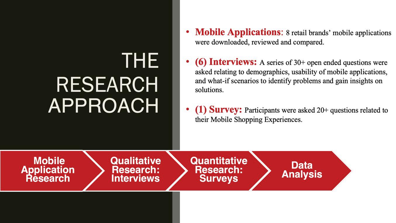
The research process employed a combination of qualitative and quantitative methodologies to gain a comprehensive understanding of user behaviors and preferences for the HOMAGE mobile shopping application.
The research study utilized a combination of interviews and surveys to gain insights into user preferences, behaviors, and expectations regarding mobile shopping applications. Click here for the Interview Research Protocol, Survey Questions and Results. The questions focused on several key areas, including general shopping experiences, mobile app preferences, desired features and functionalities, engagement and retention strategies, user interface and design, emerging technologies, and gamified content. Participants were asked about their favorite shopping apps, the features they find most useful, and aspects that frustrate them. The study also explored personalization preferences, the appeal of in-app exclusives, and the role of push notifications in maintaining engagement. Additionally, respondents provided input on innovative trends such as augmented reality (AR), artificial intelligence (AI), voice assistants, and gamified experiences, assessing their potential impact on user satisfaction and brand loyalty. Finally, participants shared their perspectives on the future of mobile shopping, identifying opportunities for improved usability, customization, and digital storytelling that excites users through innovation. The insights gathered from this study serve as a foundation for developing a seamless, engaging, and user-centric HOMAGE mobile shopping application.
The qualitative research involved six 1+ hour long structured interviews conducted using a predefined research protocol to ensure consistency, reliability, and in-depth insights into user behaviors, preferences, and roles. This rigorous interview process provided rich qualitative insights, forming the foundation for user experience recommendations and aligning research findings with HOMAGE’s mobile shopping objectives. Interviewees were selected to represent a range of ages and genders reflective of the HOMAGE consumer base.
Interviewees identified the most valuable features of current shopping applications as ratings and reviews, robust search and filter functionalities, exclusive promotions and product drops, in-store scanning capabilities for product information and inventory availability, reward programs, wishlists, product videos, and personalized recommendations. While product recommendations received high ratings, a significant portion of respondents indicated they do not actively seek them out; however, when presented with recommendations, they are highly likely to convert. All interviewees were open to gamified content, however, requested to receive rewards for playing. Millennials were more motivated to play if rewards could be earned, however, the Gen Z age group mentioned they prefer to play for enjoyment.
Key frustrations cited by interviewees included slow shipping and limited shipping options, the inability to apply coupons within the app, technical glitches or lagging performance, excessive notifications, security concerns, and a slow checkout process.
When discussing challenges encountered while shopping, interviewees emphasized the need for applications to enhance convenience, with top priorities including speed, time-saving features, timely reminders for sales and promotions,access to customer reviews, exclusive products and sizing, price comparison tools, and seamless return processes.
The quantitative research involved deploying two structured surveys via Qualtrics, distributed through LinkedIn, Facebook, and Kent State University student networks, to collect data on mobile shopping behaviors and essential garment preferences. An initial sample of 20 responses was later expanded to 55, revealing significant behavioral differences influenced by demographic factors such as age and generational trends. The mobile shopping survey aimed to assess the importance of features and innovation within mobile applications, with findings cross-referenced against market analysis and interviews.
Meanwhile, the essentials survey was initially designed to evaluate the potential to showcase a new exclusive essentials product line at the launch of the application. However, data analysis revealed limited consumer interest in the essentials collection, prompting a strategic pivot toward more innovative initiatives better aligned with consumer preferences and market demand.
The survey results identified the top three most valuable features as search and filter capabilities, easy returns and exchanges, and user reviews and ratings. Nearly all participants stated that reviews and ratings play a crucial role in their purchasing decisions. Additionally, the majority expressed interest in features such as gamified content, visual search functionality, fit technology, inspirational feeds, personalization, reward programs, and product videos.
One limitation of the survey was the participant demographic, as the majority were female, whereas HOMAGE's customer base skews more male. Additionally, the survey sample size was limited to 20 participants. The research analysis process started with insights extracted through handwritten notes, video recordings, and affinity mapping to identify behavioral patterns and user goals. The Affinity Model, a qualitative research method used to organize and synthesize large amounts of data by grouping similar ideas, themes, or patterns, was applied using a color-coded sticky note system to capture key insights, behavioral trends, and demographic details. This method facilitated the categorization of interviewee responses, the identification of behavioral trends, and the refinement of UX strategies for the HOMAGE mobile shopping experience.

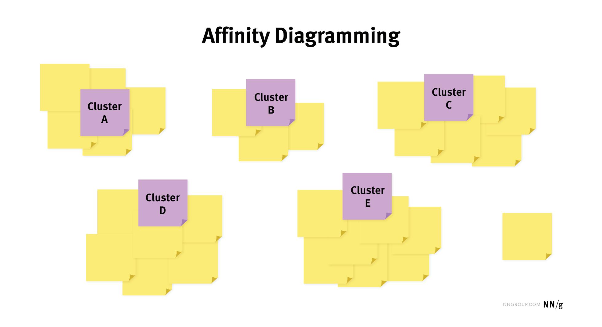

Through affinity mapping and behavioral spectrum mapping analysis, patterns and commonalities in shopping preferences and actions were uncovered. The process involved collecting and reviewing the qualitative data, documenting key insights on sticky notes, clustering similar themes, labeling overarching patterns, and refining priorities to inform product decisions and improve user experience. The Affinity Model proved valuable in identifying hidden patterns, simplifying complex data into actionable insights, and supporting data-driven decision-making. Additionally, interviewees were categorized based on roles, behaviors, and demographics, which contributed to the development of user personas and the definition of distinct consumer needs. The research
identified behavioral patterns, refined UX strategies to align with consumer motivations, and incorporated user priorities and new innovative ideas to enhance the HOMAGE mobile shopping experience, differentiating it from existing applications.
Together, these research methods provided both deep qualitative insights and broad quantitative trends, ensuring a data-driven and human-centric approach to optimizing the HOMAGE mobile shopping experience. The structured survey approach complemented qualitative interview findings, reinforcing a user-centered strategy for enhancing the HOMAGE mobile shopping application.
As it’s known, HOMAGE’s audience is deeply engaged with nostalgia, sports culture, and storytelling-driven fashion. Their customers value high-quality, vintage-inspired apparel that pays tribute to iconic moments in sports, pop culture, and history. The following provides a comprehensive analysis of HOMAGE’s core consumer segments,
their behaviors, and key motivations. Gaining a thorough understanding of the HOMAGE “Believers” was essential in identifying the significance of developing personas to inform the design strategy. The below HOMAGE customers analysis assisted in the creation of personas to ensure sound consumer centric design decisions.



•Primarily millennial and Gen X sports fans (ages 18-45)
•Passionate about their favorite teams, players, and sports moments
•Enjoys collecting sports memorabilia and wearing gear that reflects their fandom
•Engages with fantasy sports, sports podcasts, and historical sports documentaries
Shopping Behavior:
•Prefers licensed and nostalgic sports gear that represents their team history
•Willing to pay for limited-edition or exclusive team apparel
•Shops both online and in-store for game-day purchases
•Responds to push notifications for new team releases
•High-quality, officially licensed sports apparel
•Storytelling-driven designs featuring historic sports moments
•Limited-edition and exclusive drops for die-hard fans
•Gamified experiences (trivia, voting on future designs)
designed application is more likely to succeed as it enhances usability for a broader range of consumers.


•Millennials and Gen Z consumers (ages 18-45) who love throwback culture
•Fans of classic movies, TV shows, music, and gaming
•Engage with pop culture through streaming platforms, podcasts, and social media
•Enjoy wearing conversation-starting graphic tees to connect with others
Shopping Behavior:
•Prioritizes designs that reference their favorite childhood shows or movies
•Engages with brands through social media and viral content
•Enjoys quirky, humorous, and limited-run apparel
•Responds to nostalgia-driven marketing and influencer recommendations
•Iconic pop culture references on apparel (movies, TV shows, music)
•Collaborations with cult-favorite franchises and artists
•Social media engagement (memes, throwback content, user-generated content)
•Exclusive merchandise drops tied to major cultural anniversaries


•Casual shoppers of all ages (18-50) who value comfort, quality, and style
•Appreciate well-fitting, soft, and high-quality apparel
•Not necessarily sports or pop culture superfans but like relaxed, stylish basics
•Works from home or has a laid-back personal style

•Friends, family, and significant others shopping for a loved one
•Looking for unique, thoughtful gifts that align with someone’s interests
•Shops seasonally (holidays, birthdays, Father’s Day, etc.)
•Often unfamiliar with HOMAGE but finds it through word-of-mouth recommendations or ads
Shopping Behavior:
•Prefers simple, versatile clothing that fits into their everyday wardrobe similar to the HOMAGE Go-To Collection
•Will pay a premium for comfort and durability
•Responds well to bundle deals, discounts, and free shipping promotions
•Prefers mobile-friendly shopping experiences
•Super-soft, premium T-shirts that offer all-day comfort
•Neutral and vintage-style designs for casual wear
•High-quality materials that justify price points
•Bundled deals and loyalty rewards for repeat purchases
•Searches for best-selling and nostalgic items that will make an impact
•Prefers an easy and efficient shopping experience
•Responds well to gift guides, product recommendations, and bundled options
•Values fast shipping and easy returns
•Curated gift guides based on sports teams, pop culture themes, or hobbies
•Wishlists and easy sharing options for recipients to drop hints
•Gift-ready packaging and quick shipping for last-minute shoppers
•Personalized recommendations based on browsing behavior ers.

Key insights reveal that nostalgia is a powerful driver for HOMAGE’s audience, with customers drawn to storytelling through sports, pop culture, and comfortable apparel. A seamless mobile shopping experience is essential, as many consumers prefer to shop or browse via mobile devices. Exclusive product drops create demand and a sense of urgency, encouraging repeat engagement and brand loyalty. Community interaction plays a vital role in customer retention, with fans actively engaging through social media, reviews, and exclusive membership perks.
Additionally, convenience and personalization are crucial,with features such as easy returns, wishlists, and tailored recommendations enhancing the overall user experience. Persona development was informed by an in-depth analysis of HOMAGE’s existing customer base, combined with insights from design research. Two distinct personas were created to account for differences in gender and generational preferences, ensuring a comprehensive representation of the brand’s key audience segments to dictate design decisions.



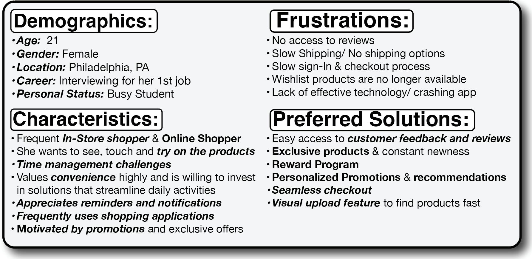
Rachael is a 21-year-old college student who enjoys staying active and socializing with friends. As a frequent online 'browser", yet in-store purchaser, she prioritizes convenience, quality, and value. She heavily relies on customer reviews to ensure her purchases—whether for fashion, sports gear, or essentials—meet her expectations. Always on the lookout for great deals, she is quick to take advantage of sales and promotions.
Rachael also enjoys shopping apps that incorporate gamification, such as rewards and challenges, making the experience fun and engaging. As a modern Gen Z consumer, she values efficiency, social influence, and interactive features that enhance her shopping journey. Whether gearing up for game day or an outdoor adventure, she seeks products that fit her active, on-the-go lifestyle.


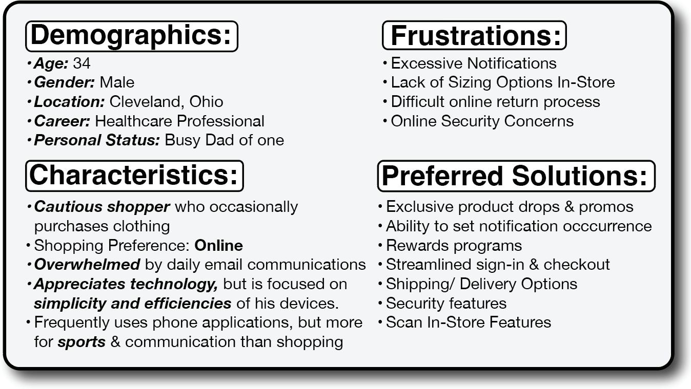



Josh, a 34-year-old father and corporate healthcare professional, values security, convenience, and efficiency in his online shopping experience. While he appreciates digital convenience, he often feels overwhelmed by excessive promotional emails and notifications, leading him to disengage from brands. He seeks a more streamlined communication approach that respects his time. Josh also prioritizes access to a wide range of products, particularly extended sizing, and prefers high-quality, comfortable clothing that fits well. A hassle-free return process is essential to his shopping decisions, allowing him to try new items with confidence.
Additionally, a meaningful rewards program would enhance his loyalty and encourage repeat purchases. Ultimately, Josh desires a secure, efficient shopping experience that aligns with his lifestyle—offering great products while minimizing digital clutter and maximizing convenience.



The initial application design was divided into two phases, Part 1 Designs, Part 1 Design Iterations, and Part 2 Designs. Click here for all Wireframe Designs.This structured approach not only helped distribute the workload but also allowed for insights from usability testing to inform the design of Part 2. Additionally, it enabled the development of innovative features aimed at exciting stakeholders and securing buy-in for the HOMAGE practicum presentation through storytelling initiatives.
The design of this application was crafted to enhance and reflect the established brand identity of HOMAGE. Prioritizing user convenience and aesthetic; the color scheme, typography, branding elements, and graphic icons were directly inspired by the brand’s handwriting. The goal was to create a seamless, fast, and intuitive experience that engages both existing and intices future HOMAGE customers in a fun and inventive way, all while staying true to the UX and Human Centric design principles.


The key areas of focus in Part 1 include: 1. Sign Up/Login & Account Creation 2. Dashboard 3. Shop All
Promotions & Notifications
New Arrivals & Exclusive Drops
PDP Pages & Reviews
HOMAGE Headlines / Product Showcase
Score Trivia
The Vintage Vault
Cart/ Checkout
Usability testing is essential in refining mobile app design by addressing user pain points, enhancing navigation, and improving overall ease of use. Insights from testing informed key updates to streamline the HOMAGE account setup, optimize product visibility on product detail pages, and enhance the checkout process through reduced form fields and a restructure of information hierarchy—reducing friction and abandonment. Navigation and UI improvements, such as restructuring category layouts, relocating filters, and simplifying innovative features, ensure a more intuitive and accessible experience.
Checkout optimizations, including refined cart flows and clearer order summaries, align with user expectations for efficiency. Additionally, storytelling elements were reimagined to integrate product-related trivia without disrupting the shopping journey. These UX-driven refinements foster engagement, boost conversions, and reinforce brand identity by prioritizing clarity, efficiency, and user trust. This section will highlight the original wireframe design alongside design iterations considered to improve the application using the feedback suggestions.

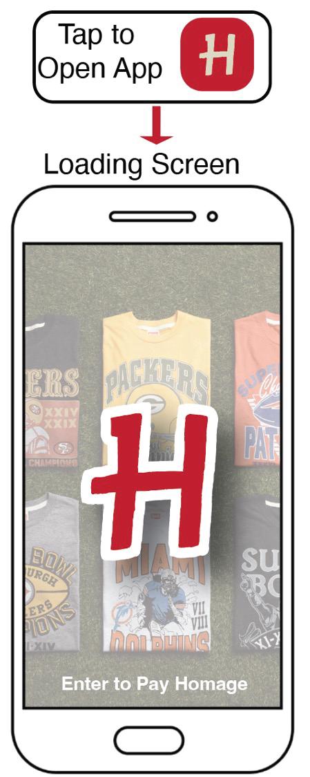
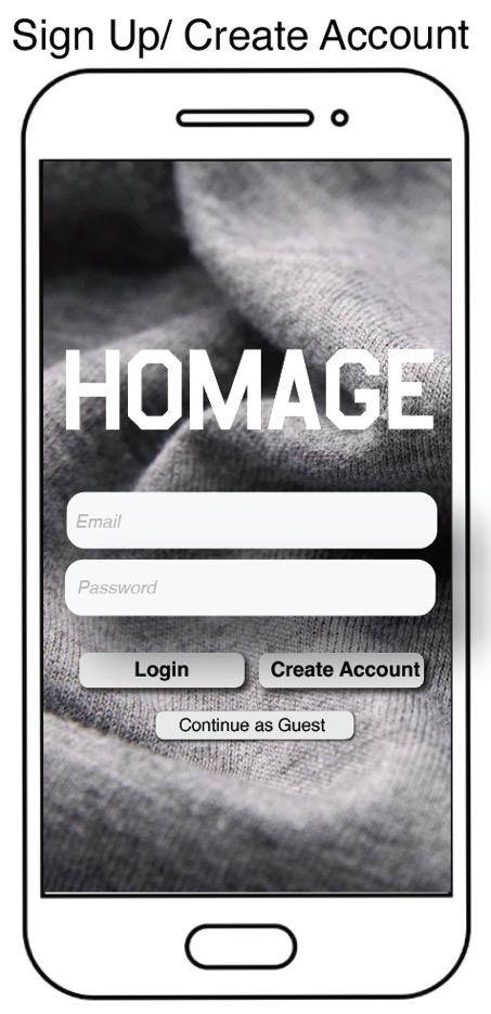
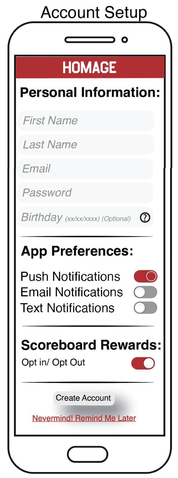
Part 1 began with the development of a Sign Up/Login & Account Creation wireframe, leading users to the homepage, or “Dashboard” as referred to in this study. Given its critical role in user acquisition and retention, this process was designed to be simple and intuitive.
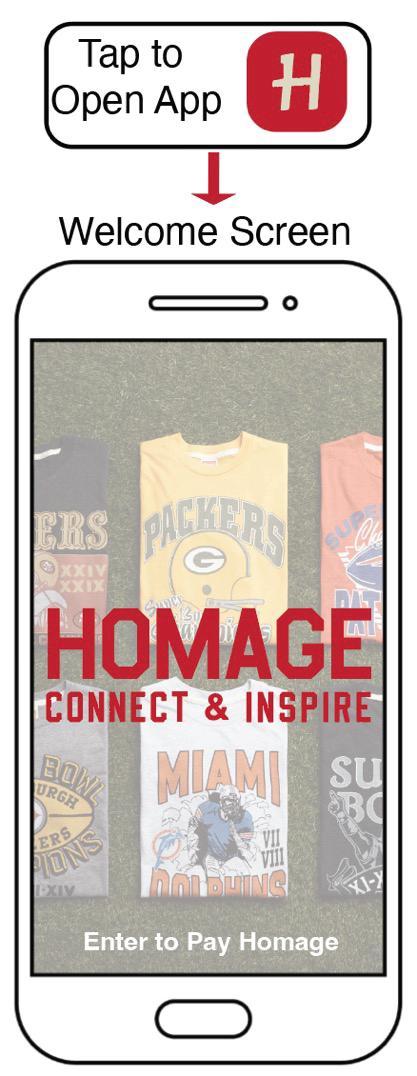
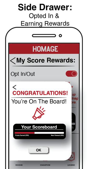
To enhance engagement, an optional tutorial was initially included to educate users about the app’s features and capabilities. Additionally, the Score Rewards program features an easy Opt-In/Opt-Out mechanism, allowing users to earn points simply by signing up. Interactive confetti serve as a visual cue to signify successful sign-ups and reward program enrollments. Iterations based on usability testing were incorporated to optimize the UX and ensure seamless interaction.
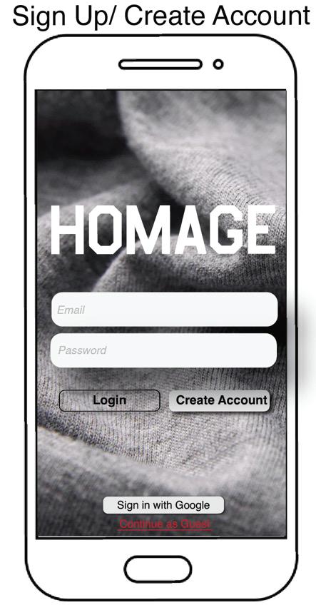
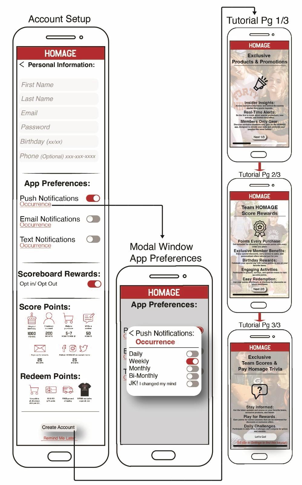
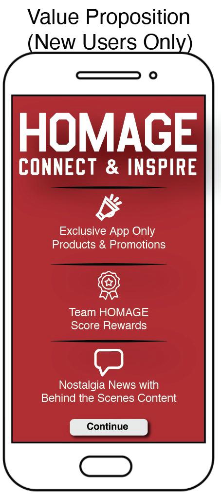
In efforts to increase motivation, value proposition and ease of use to the sign-in window, the tutorial was transformed into one value proposition screen at sign-in, clearly communicating the benefits of downloading and utilizing the HOMAGE application.This screen highlights exclusive product offerings, Team HOMAGE rewards, and access to Nostalgic News, featuring behind-the-scenes content to motivate users to engage with the app. The screens were also streamlined from 3 down to 1 making it a faster transition for the user.
To reduce user drop-off, the initial sign-up fields within the account setup were simplified to only email and password. The collection of additional user details was moved to Part 2 “Settings”, ensuring a smoother user journey, and promoting higher sign-up conversion rates. Additionally, friction was further reduced by streamlining the notification settings. The occurrence settings were eliminated, replaced with a simple opt-in/opt-out button, allowing users to easily manage their preferences and further personalize within the settings later.
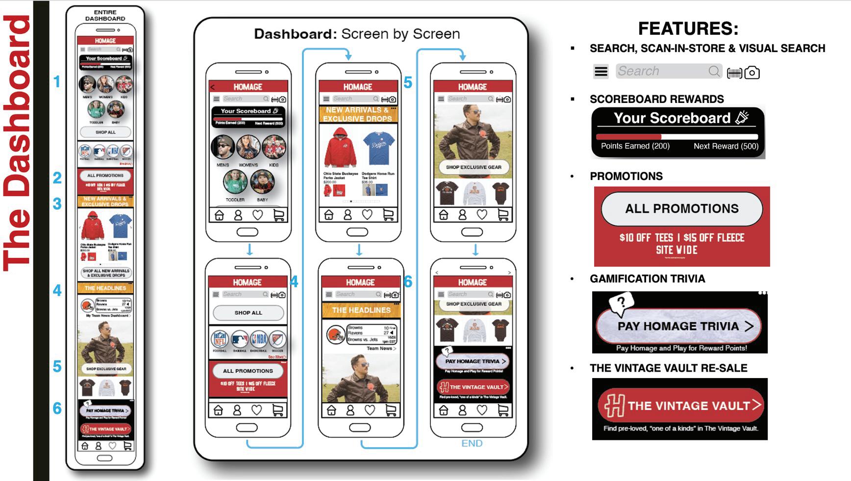
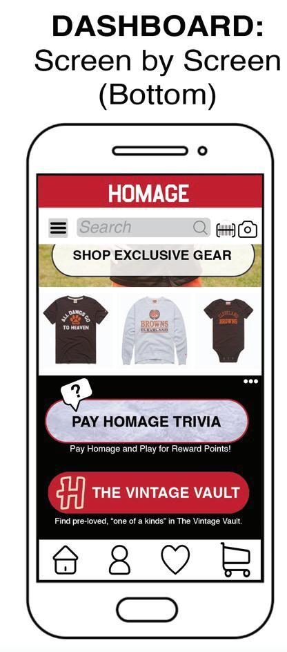
The Dashboard was designed by integrating top features identified through design research and UX best practices, serving as the central hub or “homepage” for user engagement. It incorporates key functionalities such as:
•Shop All
•Promotions
•New Arrivals & Exclusive Drops
•Innovative Storytelling Features:
•The Headlines
•Pay HOMAGE Trivia
•The Vintage Vault

Each section of the Dashboard seamlessly directs users to various areas within the app, ensuring a smooth and intuitive navigation experience. Due to design research and market analysis, these critical features became the foundation of the dashboard with users sharing information of must have features: search bar, rewards status, wishlist, and exclusive drops as well as new exciting features that allow for engagement and enhance the brands story telling directives.
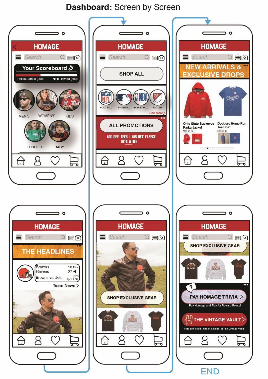
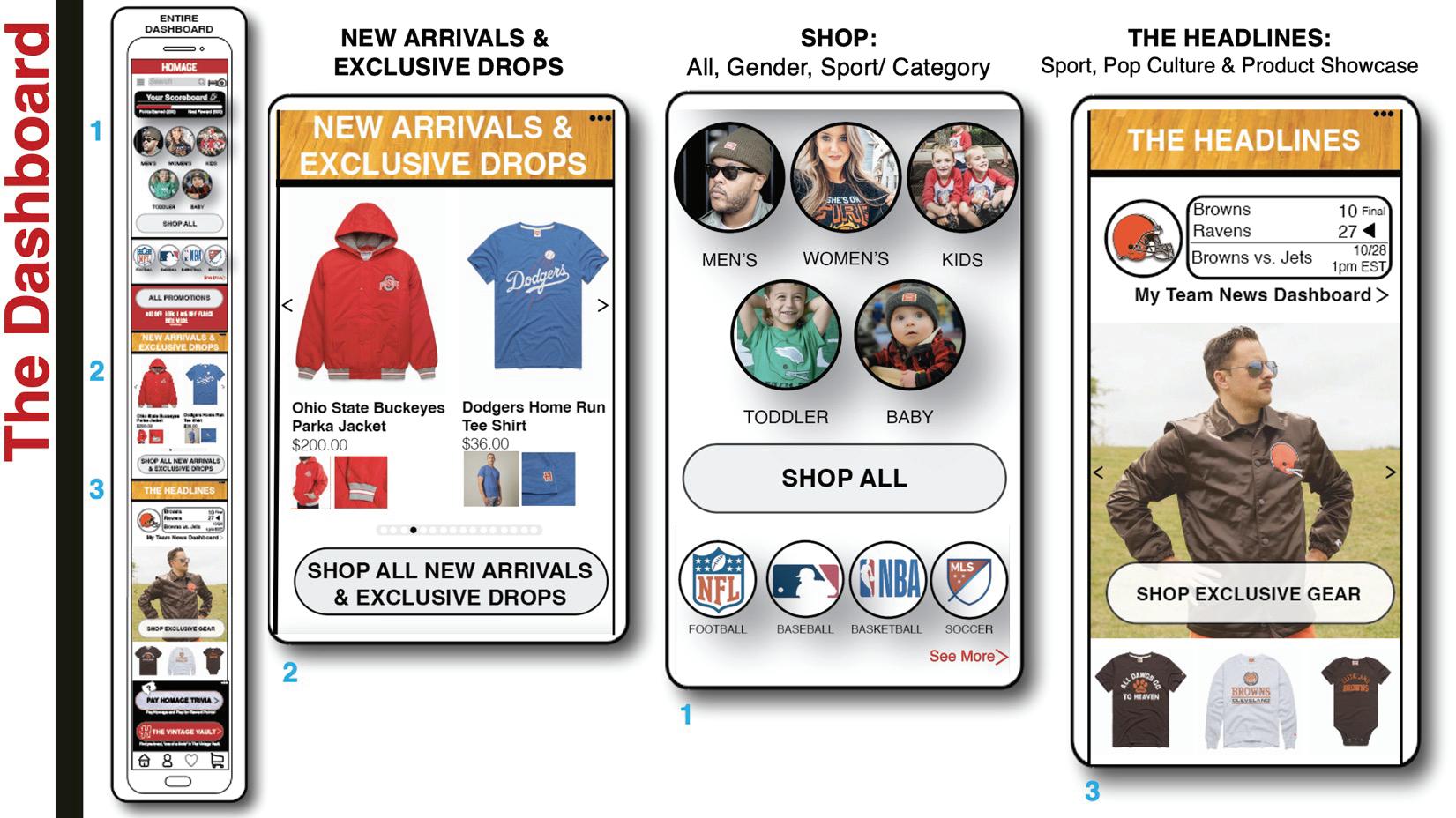
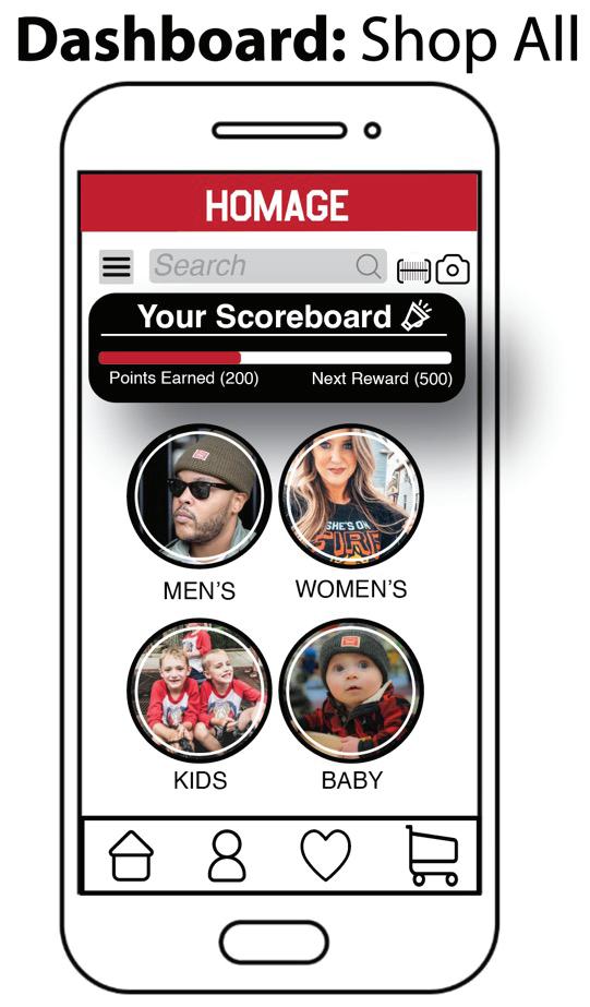
The category structure, organized by Men’s, Women’s, Youth, Toddler and Baby, was designed to provide clear product signifiers to the user, however, to streamline the navigation, the distinction between “youth” and “toddler” was removed, as this distinction was not applicable to all users. As a result, the toddler category has been consolidated under the broader “Youth” category for a more cohesive and efficient browsing experience.
To maintain focus on the primary goal of shopping, various new initiatives were reassessed. Trivia, originally featured prominently, has now been repositioned as a sub-feature within the iterated Nostalgic News & individual product page locations. This allows users to engage with product stories while earning rewards toward their purchases and enhancing storytelling while they are shopping. It is not the main reason people will come to the application, so maintaining a focus on the product is imperative for a higher conversion. Although this Trivia feature provides an additional layer of engagement and brand storytelling, the feature was deemed unnecessary to be highlighted on the dashboard.
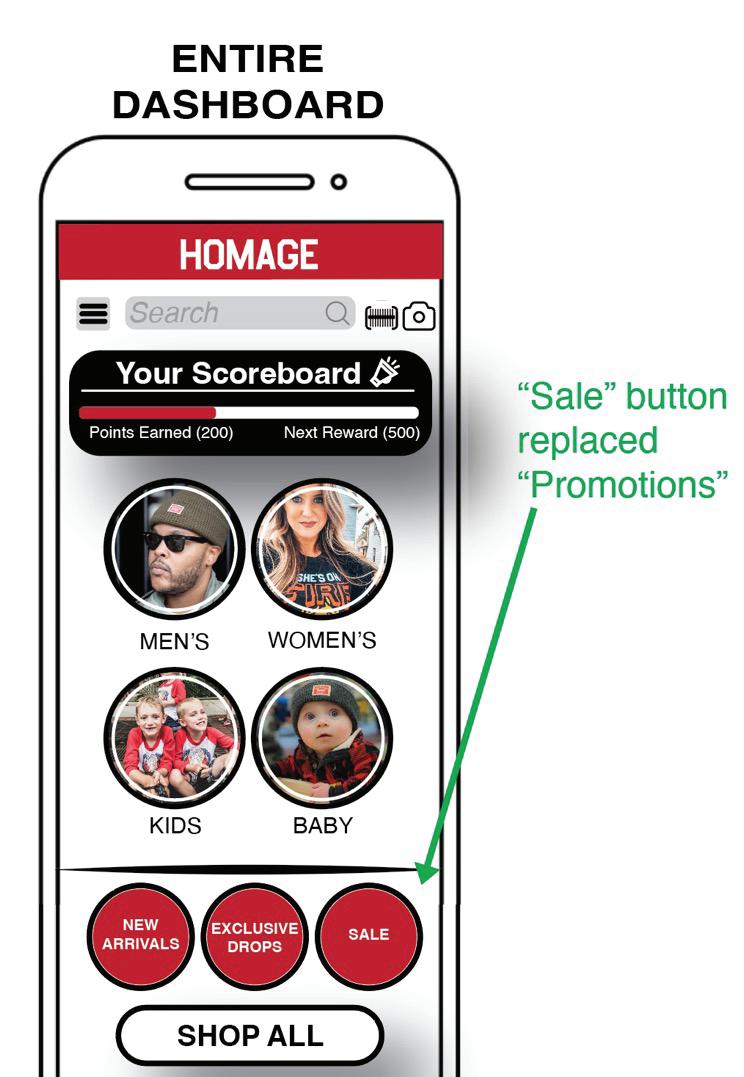
Promotions were also removed from the Dashboard, as noted in Wireframe D below. User feedback indicated that promotions did not align with the brand’s aesthetic and felt disconnected from the surrounding shopping categories.









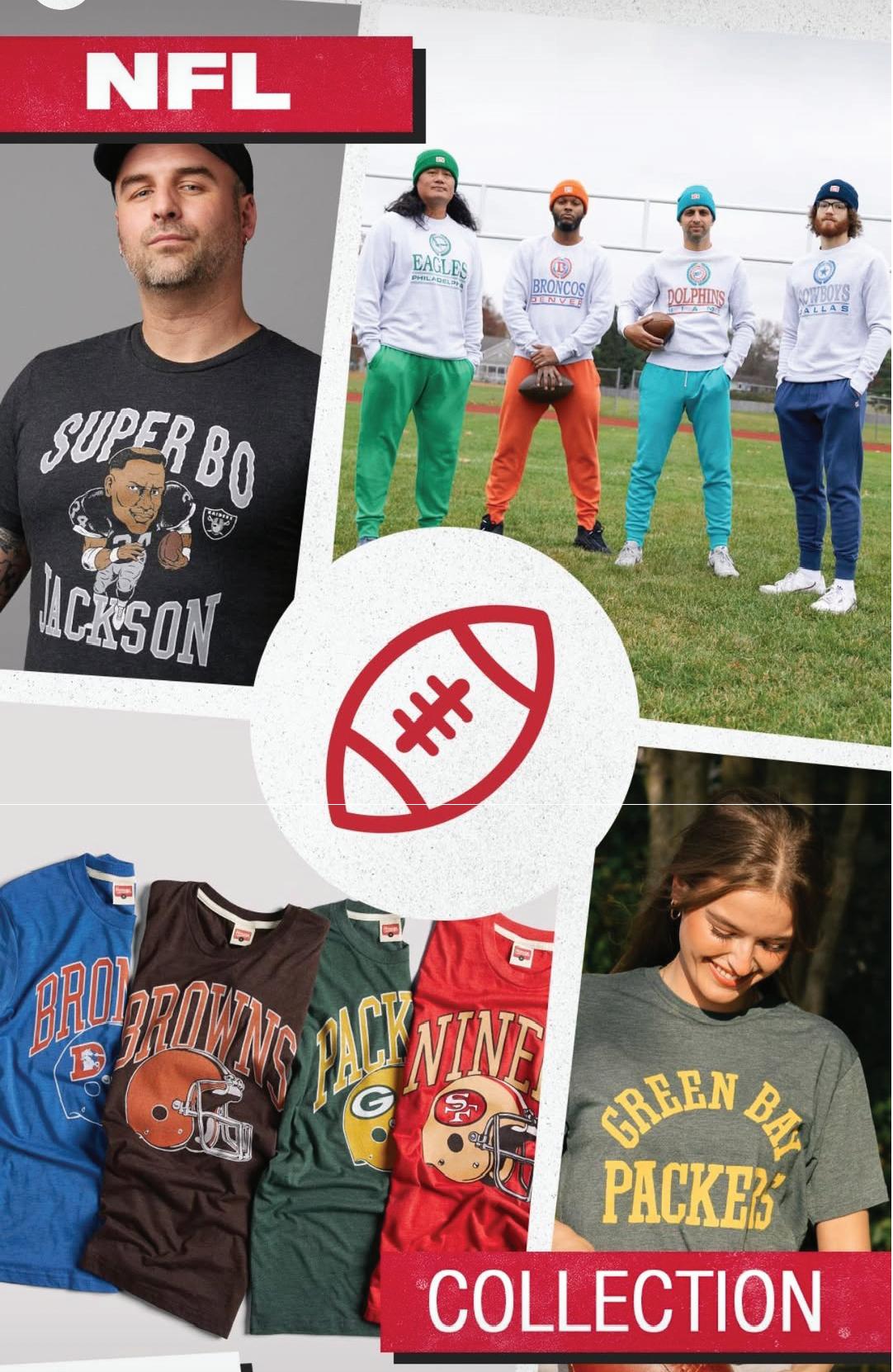





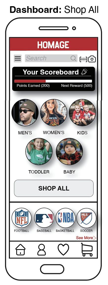
As shopping is the app’s primary function, the “Shop All” button is a key focal point on the Dashboard. This section allows users to browse products through multiple filtering categories, including:
1. Gender
2. Age
3. Sport
4. Pop Culture

To reinforce brand authenticity and engagement, customer photos were incorporated into this section, providing a sense of community, and reinforcing HOMAGE’s aesthetic and personality.
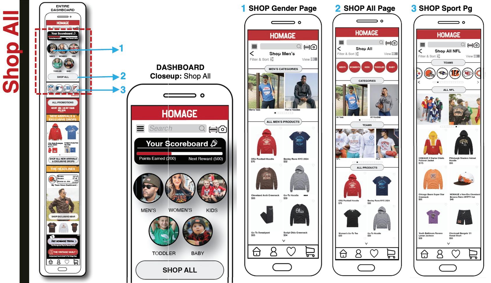
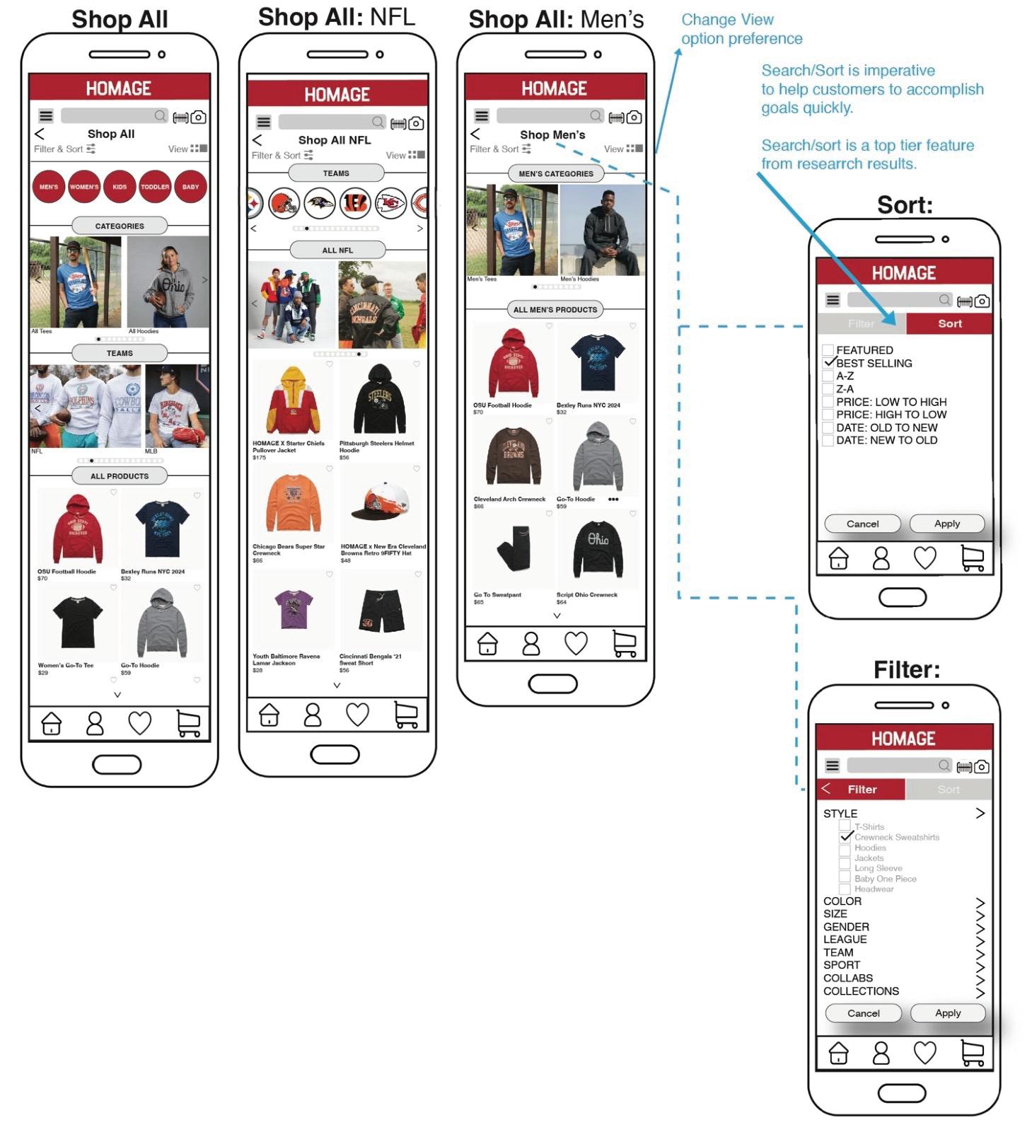
Again, the category structure, originally organized by Men’s, Women’s, Youth, Toddler and Baby, was iterated to remove “Toddler,” as this distinction was not applicable to all users.
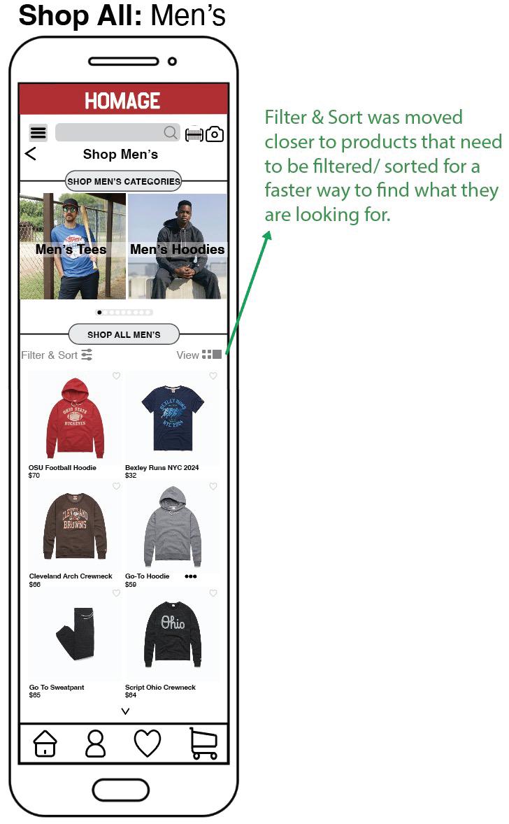
The filter and sort bars have been repositioned closer to the product grid to establish a stronger visual connection between the filters and the products being searched.
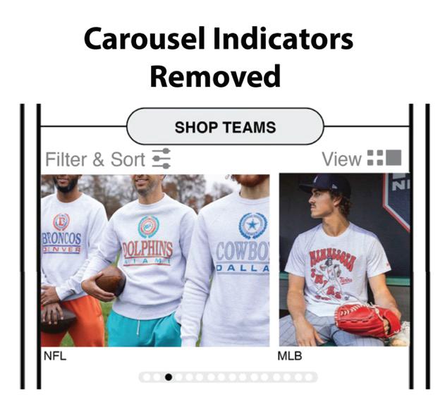
Additionally, the carousel indicators that previously indicated the ability to scroll left or right were deemed unnecessary and caused clutter. Since the partial display of images clearly suggests scroll ability, removing the carousel indicators results in a cleaner and more concise user interface.
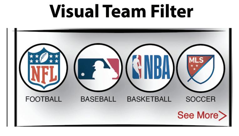
User feedback confirmed that the visual team filter is both effective and intuitive, offering users a more streamlined and efficient way to locate the products they are looking for.
User research revealed a strong preference for promotions and notifications, leading to the inclusion of this feature in the app. The initial design allowed users to apply specific promotions to their cart automatically. The promotions page also provided a “shop by category” opportunity, so after the user added promotions, they could more easily start shopping without having to go back to the dashboard or shop all screens. However, as HOMAGE is not a highly promotional brand, usability testing feedback led to iterations—evolving this section into a dedicated “Sale” button.
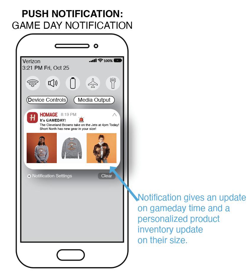
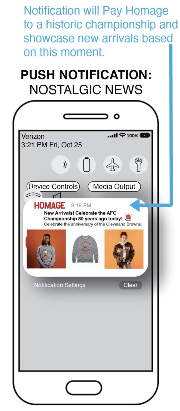
Additionally, push notifications were introduced here, ensuring users stay informed about upcoming sales or promotions, increasing the likelihood of timely purchases. Push notifications are also indicative of exclusive drops and nostalgic news.
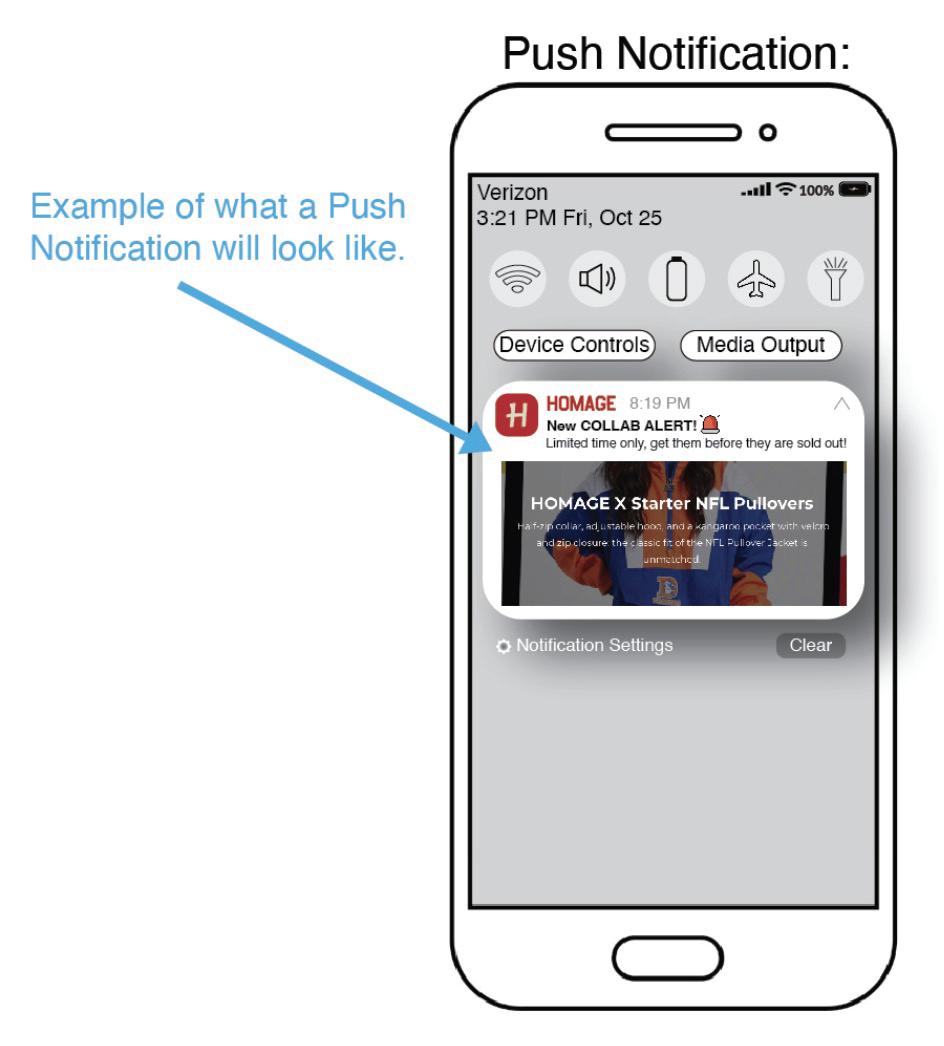
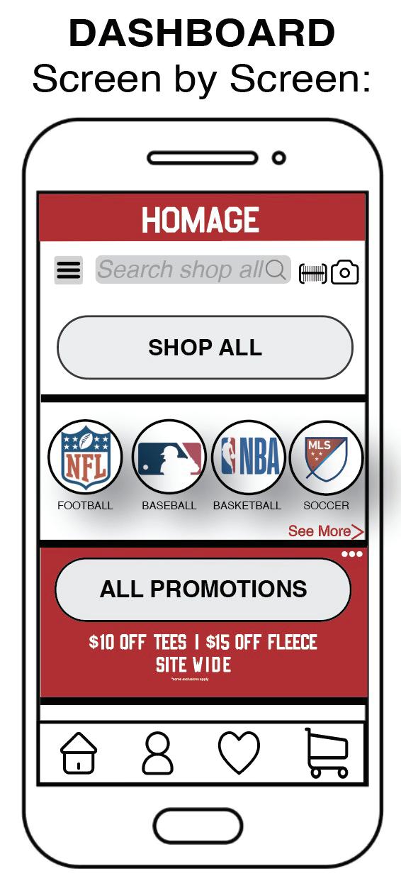
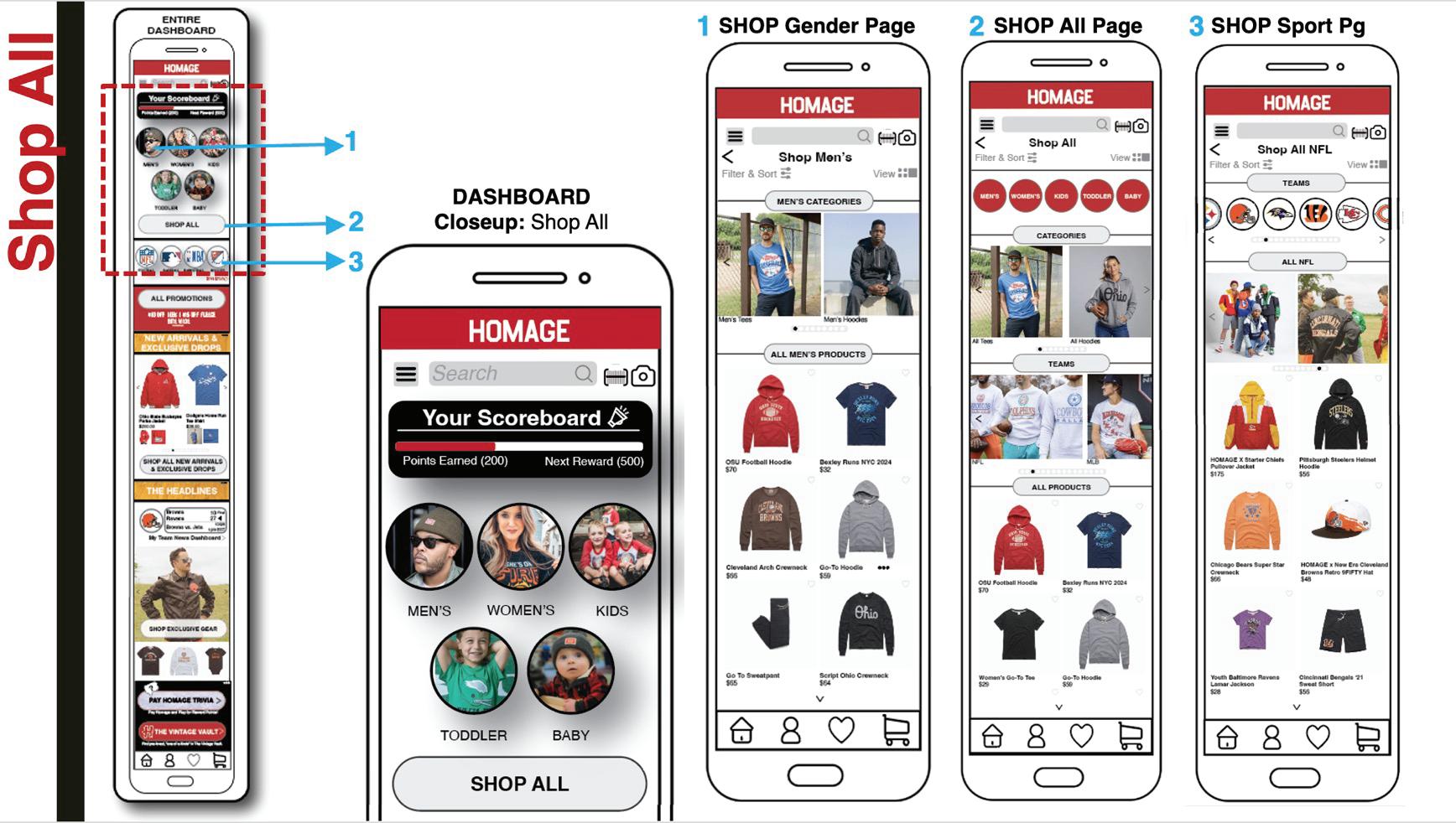
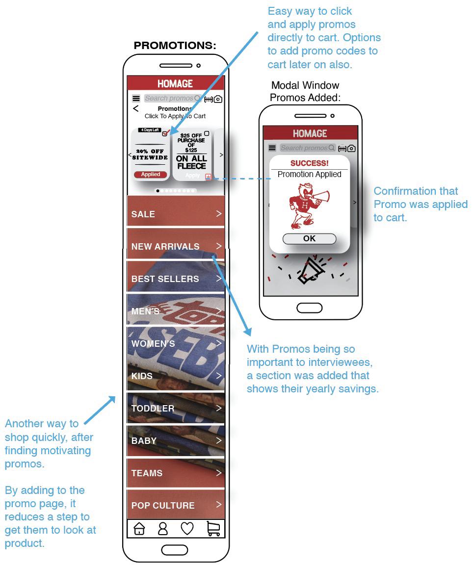
The placement and overall approach to promotions did not align with the brand's tone, as HOMAGE does not typically emphasize heavy promotions. This section was initially introduced to address a challenge identified in design research, but it detracted from user trust and credibility, leading to its removal entirely.
User feedback indicated that, while the promos section had strong positive visibility, it did not align with the brand’s aesthetic and felt disconnected from the surrounding shopping categories. To maintain a solution for users who emphasized the importance of promotions in the design research, the "Promotions" section has been replaced with a "Sale" button on the Dashboard next to the “New Arrivals” and “Exclusive Drops” button.
Promotional codes issued by HOMAGE’s marketing team, distributed via email as a strategic marketing tactic, remain readily accessible within the shopping cart.
Moving forward, future considerations could focus on creating a refined, elevated promotional design approach that stays true to HOMAGE’s brand values of quality, craftsmanship, and storytelling, ensuring the promotions feel cohesive with the overall brand identity.
This feature, identified as a top priority through design research, was strategically placed on the Dashboard to create excitement and urgency. New Arrivals and Exclusive Drops provide users with:
• First access to products not available anywhere else
• Incentives for app downloads and return visits
Initially, the design included a toggle tab function to switch between New Arrivals and Exclusive Drops, but usability testing led to refinements ensuring clarity and ease of use.
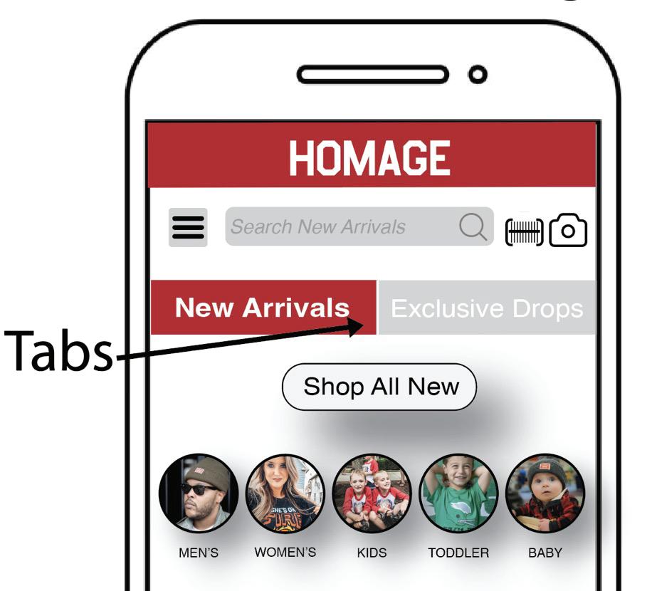
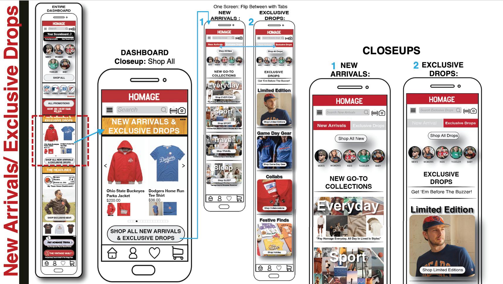
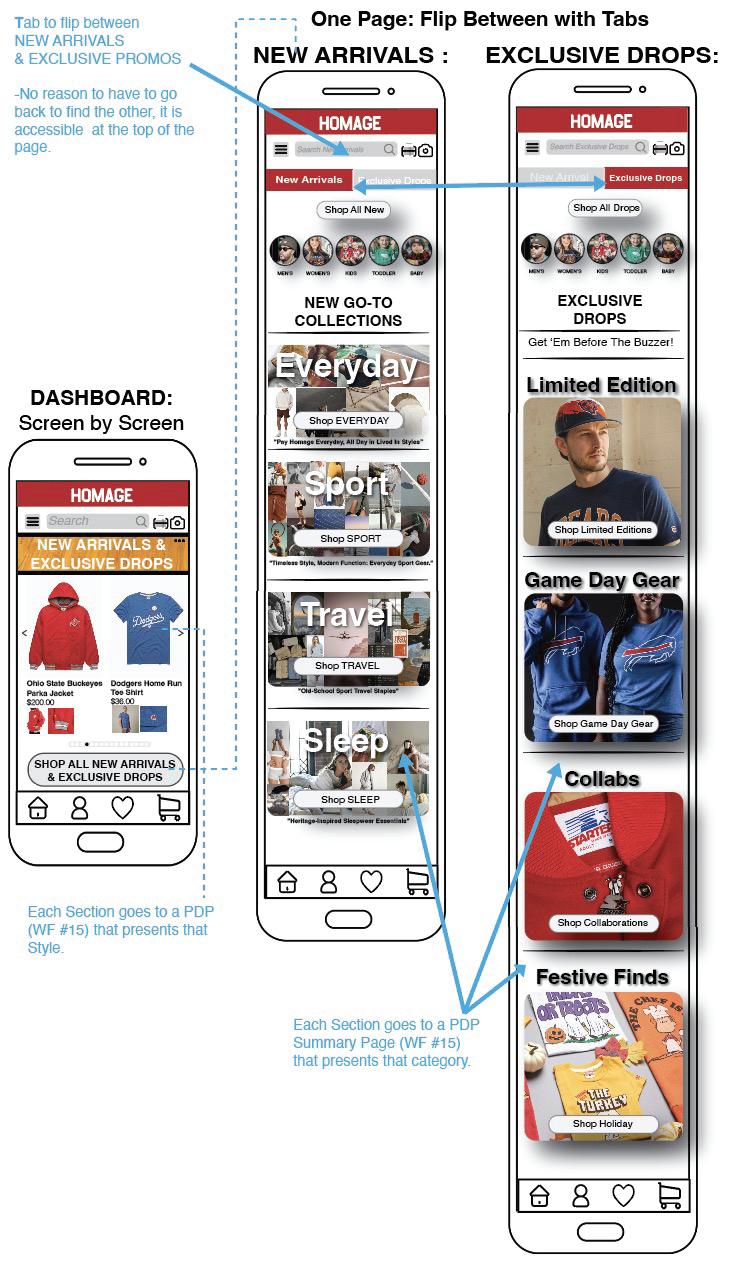
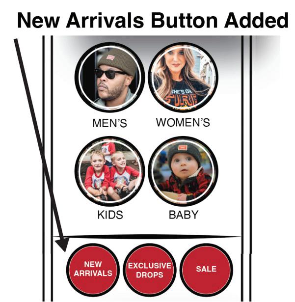
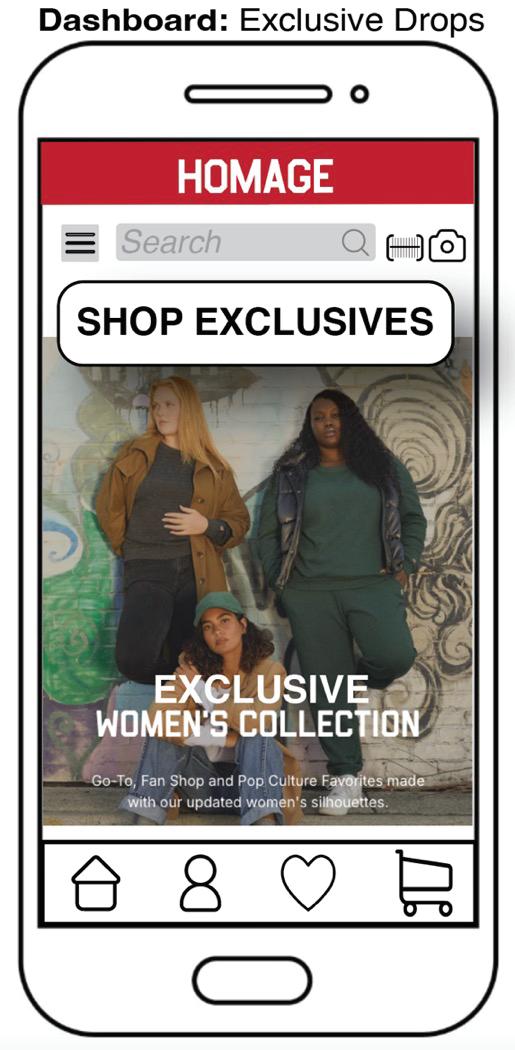
The tab structure and interfaces have been reworked to reduce confusion and prevent users from losing their place within the app. User feedback indicated that these tabs were often overlooked, so the sections have been reorganized to bring users closer to the products, eliminating unnecessary steps in the discovery process. The Exclusive Drops remained a focus on the main page to instill excitement, but the New Arrivals are still present with a “New Arrivals” button added to the top category section.
The "New Arrivals" and "Exclusive Drops" sections have been separated into distinct categories to enhance user motivation. Both sections represent distinctive features that warrant their own dedicated spaces, ensuring easy and intuitive discovery for the user.
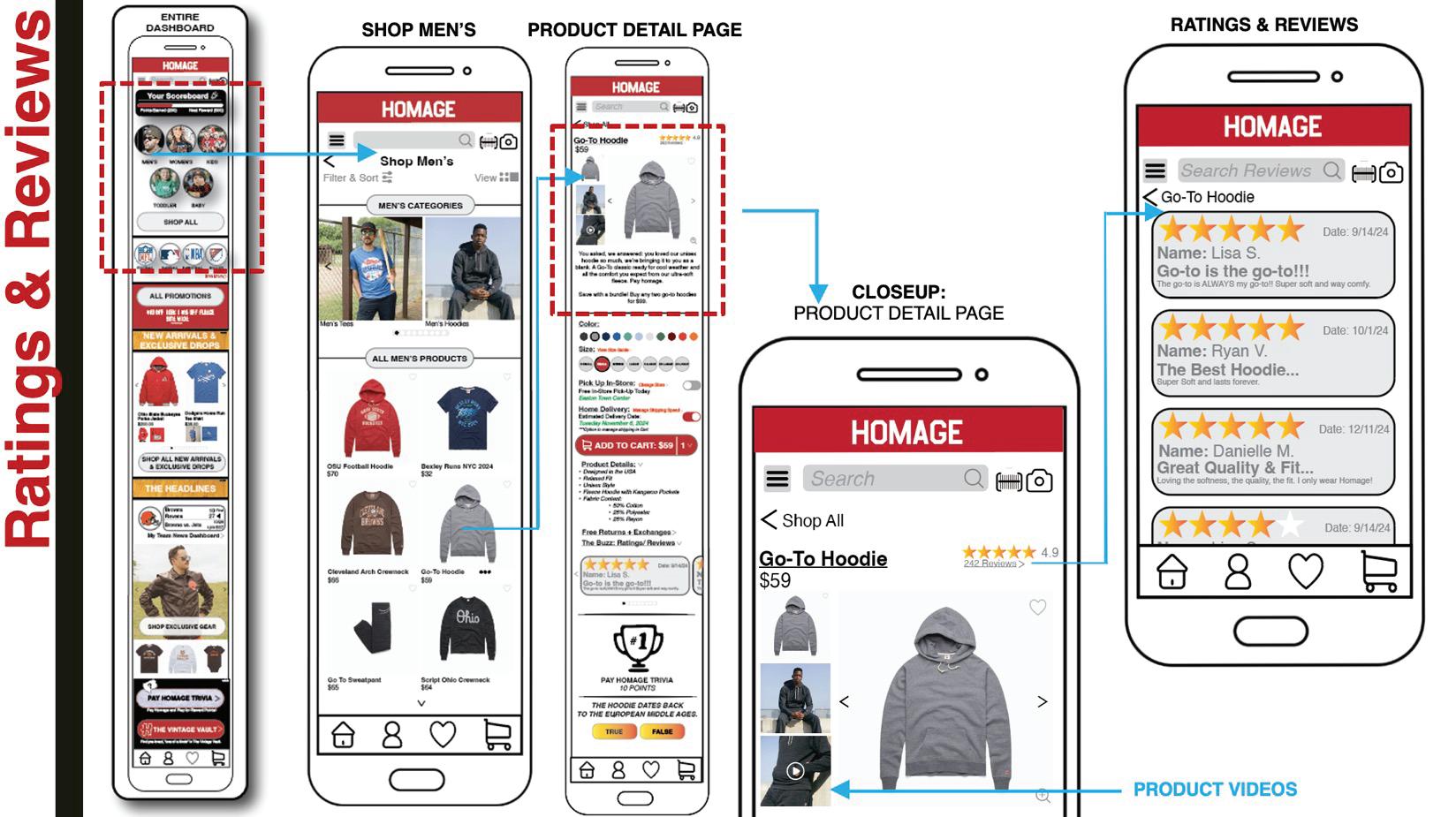
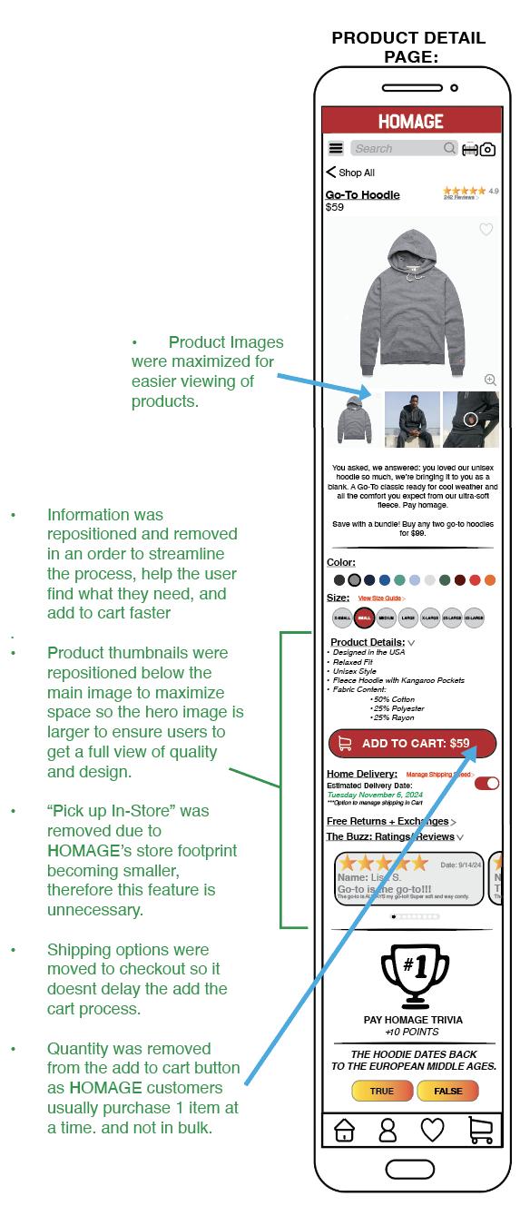
The Product Detail Page (PDP) is one of the most critical components of an e-commerce application, as it directly influences purchasing decisions and is where produvcts are added to cart for purchase. A well-structured PDP ensures users can:
•Easily access product details
•Watch product demo videos
•Utilize size guides & measurement tutorials
•Read and leave reviews
•Add to cart
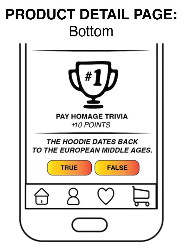
Innovative storytelling elements were also integrated, such as scoreboard trivia, which connects specific products to their unique backstories, further enriching the user experience.



Save with a bundle! Buy any two go-to hoodies for $99.
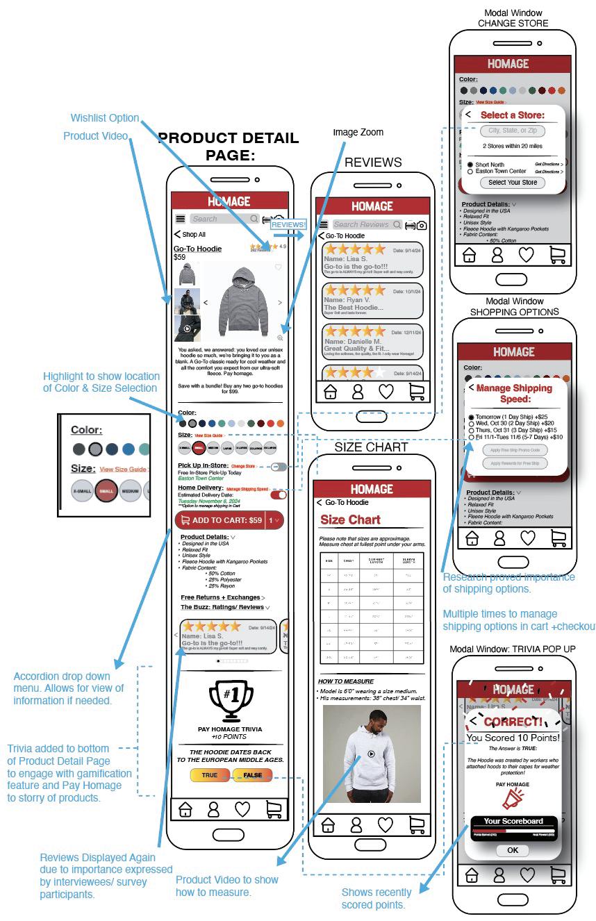
Due to user feedback, Product images have been reorganized to enhance visibility, allowing users to view the product’s quality and design more clearly. User testing also highlighted the original designs effectiveness of incorporating product videos, providing an innovative way to highlight the details and quality.
User testing also revealed that while the inclusion of quantity options on the "Add to Cart" button was clever, it was unnecessary for HOMAGE, as customers typically do not purchase in multiples. As a result, the "Add to Cart" button has been simplified by removing the quantity field for quicker access. Users can still change the quantity.
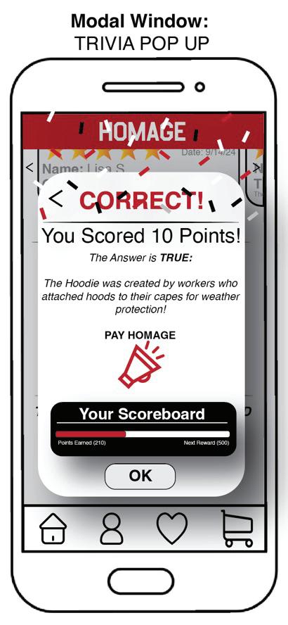
Feedback indicated that, given HOMAGE's small store footprint, the in-store availability information on the PDP page may not be essential now. This feature can be revisited as the brand’s physical footprint expands in the future as a consideration. Design research emphasized the importance of shipping options for the Millennial generation, as faster delivery often motivates purchases. To streamline the process, the shipping options have been relocated to the cart section, optimizing the user experience. Initially, user feedback suggested that the trivia section lacked relevance. However, by aligning trivia directly with product storytelling, it now enhances the shopping experience. The trivia, which was previously removed from the Dashboard, now adds a fun, engaging element that can be tied to rewards, further deepening consumer engagement while reinforcing the brand's narrative from the PDP page.
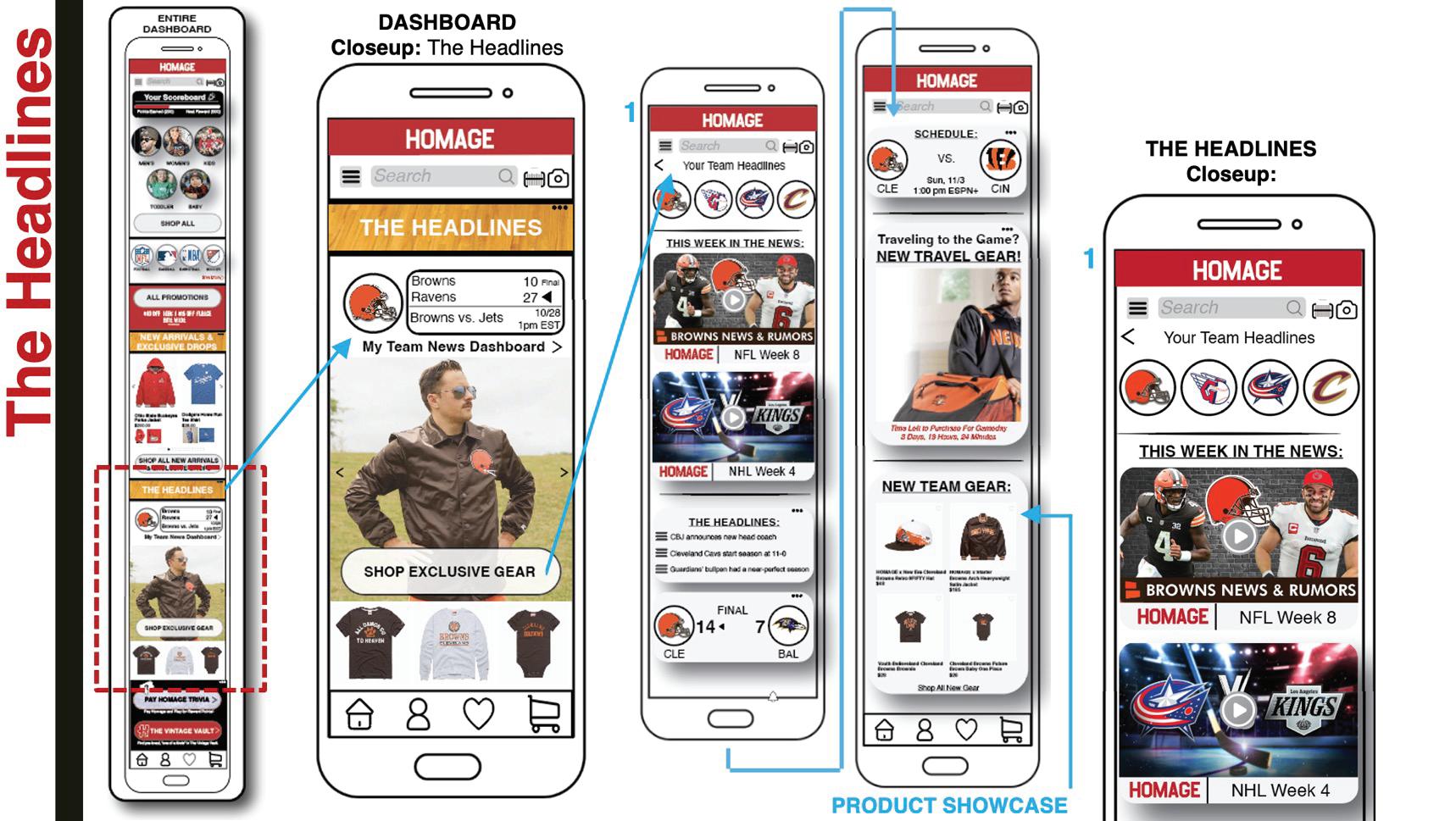
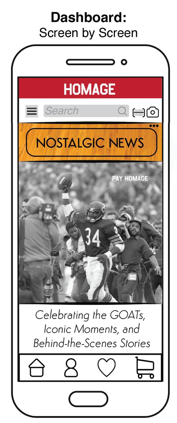
At the bottom of the Dashboard, users can engage with HOMAGE Headlines, a new feature designed to combine:
• Sports team news and updates
• Upcoming game schedules
• Articles and pop culture insights
Each news story is paired with a relevant or new product, strengthening HOMAGE’s storytelling-driven commerce approach. This news section also delivers a personalized experience, displaying users’ preferred teams or content while encouraging seamless product discovery and cart additions. Users can opt-in for push notifications to receive alerts before a game starts, enhancing engagement and product awareness. This initiative was further refined to align with HOMAGE’s core brand objective: immersive storytelling.













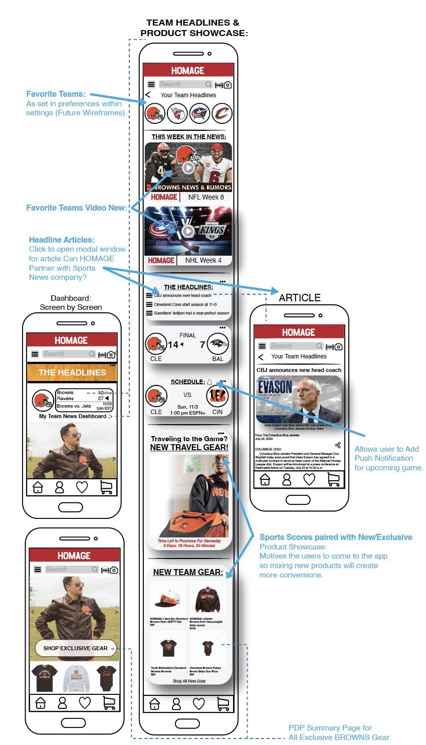
User feedback suggested removing this idea entirely, due to the relevance and possibility to distract users from their main goal of purchasing products. The "Current Sports Headlines" section has been replaced with HOMAGE’s storytelling of past moments, shifting the focus from current events to the brand’s heritage of past moments in time. This change aligns with HOMAGE’s brand identity and enriches the overall narrative, allowing the brand to tell both its own story and the individual stories behind iconic moments. Therefore, new articles and sports updates will be replaced with articles honoring players, coaches, and moments from the past.
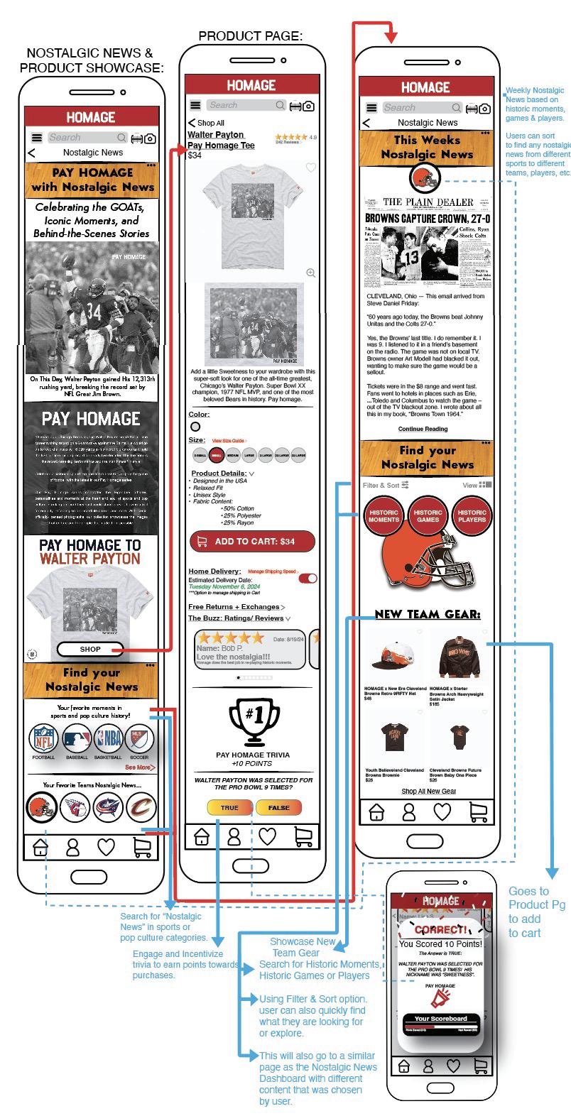
User testing highlighted the need for a distinct approach to differentiate HOMAGE from traditional sports apps like ESPN while maintaining credibility. One tester posed the question, "Would a user turn to HOMAGE for this information instead of opening a sports app?" In response, the design was refined to integrate “Nostalgic News,” articles, and trivia—curating the most memorable moments from the past. The Nostalgic News feature not only enhances storytelling but also serves as a platform to highlight products with deep emotional connections to users. Additionally, it enables users to search for content based on their favorite teams or pop culture references, making it easier to find nostalgic products. This feature offers a unique opportunity for users to relive iconic moments while discovering merchandise that celebrates legendary athletes, coaches, and historic events.
Designed as a gamified engagement tool, Pay HOMAGE Trivia was initially introduced with three main formats:
1.Pay HOMAGE Trivia – Play all to earn rewards
2.Daily Brain Buzz – Daily trivia for incentives so user returns often
3.Trivia Showdown – Multiplayer trivia with friends to instill a sense of community and achieve additional downloads
While the concept was well received, usability testing revealed a lack of clear pathways connecting trivia to product purchases. As a result, this feature was redesigned and integrated differently to enhance its effectiveness, with further details to be discussed in Wireframe F (PDP Page) & Wireframe G (Nostalgic News).
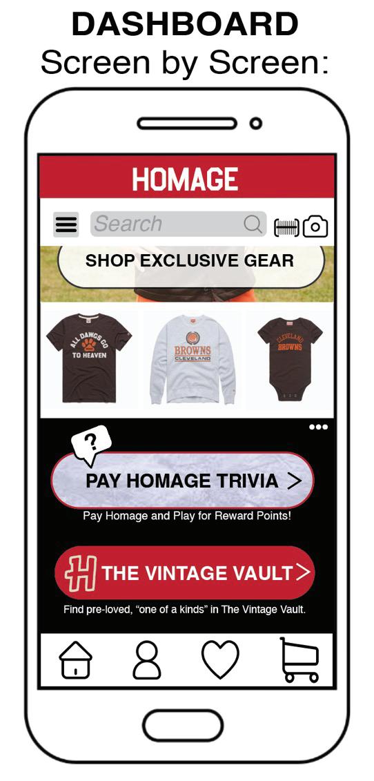
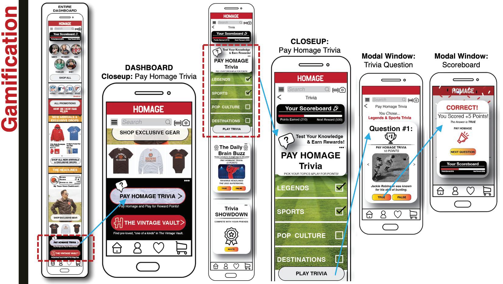
User testing raised concerns about the relevance of trivia, as the primary focus of the app is apparel shopping. The trivia feature was never intended as the main draw for users; rather, it was designed to support the brand story, foster engagement, and build a sense of community. In response to feedback, the trivia wireframe has undergone a significant overhaul to better align with product-related storytelling. It has become a lighter touch within the app to add value and retention. To prevent any negative impact on conversion rates, and a streamlined user experience, trivia was removed from the Dashboard. It is now accessible on Product Pages or within the Nostalgic News section, both of which offer valuable storytelling opportunities relating back to products that “Pay Homage.” The trivia feature at the bottom of the product page adds an extra layer of product detail, enhancing the nostalgic and emotional connection that HOMAGE customers expect. Future considerations may include integrating trivia into post-purchase engagement or email marketing to avoid disrupting the user's flow within the app.
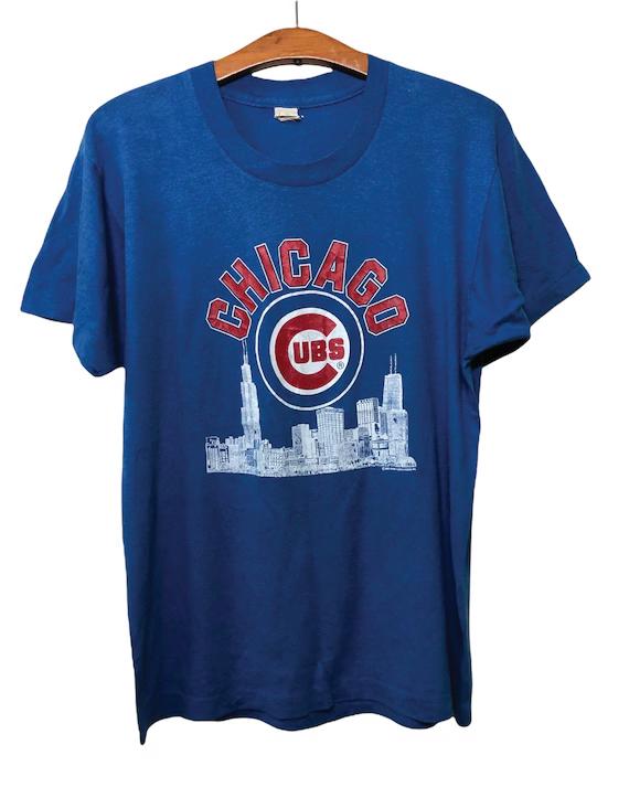
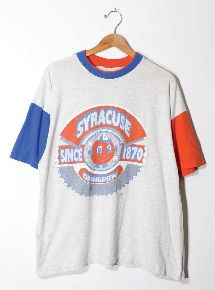
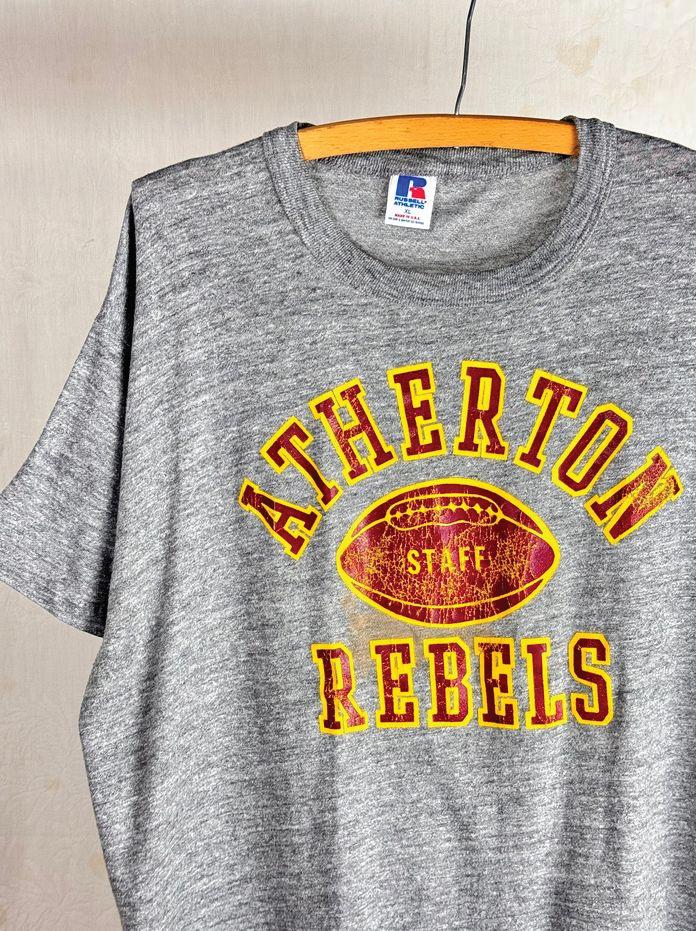
The Vintage Vault is a groundbreaking initiative introduced in Part 1, aligning with the growing trend of circular fashion, the vintage second-hand industry boom, and sustainability. This feature serves multiple purposes for the hand industry boom, and sustainability. This feature serves multiple purposes for the HOMAGE brand:
•Allows users to sell their old HOMAGE purchases by uploading photos of the current state of the garment for the brand's approval. This ensures only the best products are being re-sold.
•Strengthens brand authenticity through a curated collection of rare vintage tees, hand-selected by HOMAGE’s graphic artists.
•Encourages community engagement, as customers contribute to a shared marketplace of HOMAGE’s most iconic pieces.
This initiative positions HOMAGE as a player in sustainable commerce, an area currently underdeveloped within the brand’s portfolio.
This Phase 1 application design successfully establishes a foundation for innovation, engagement, and storytelling, setting the stage for further refinements in Part 2.
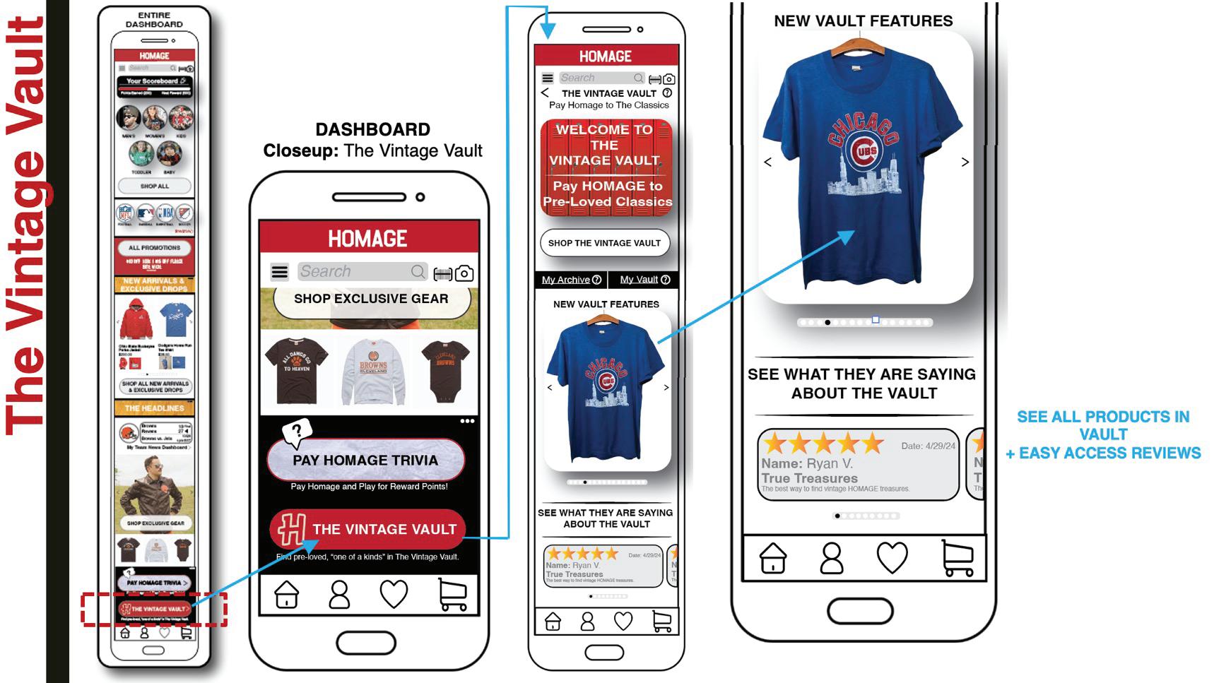
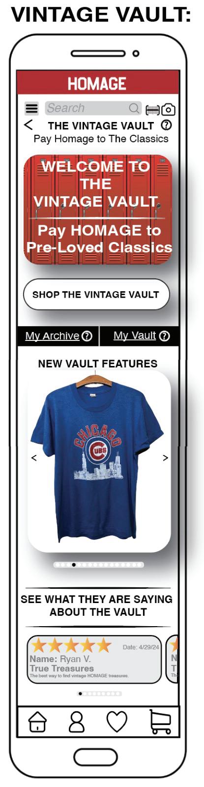
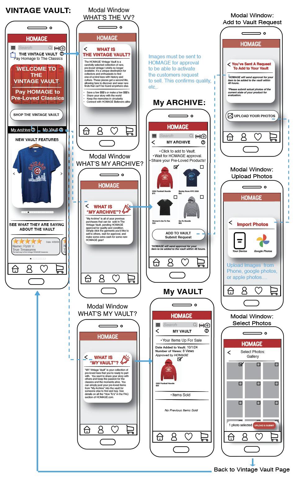
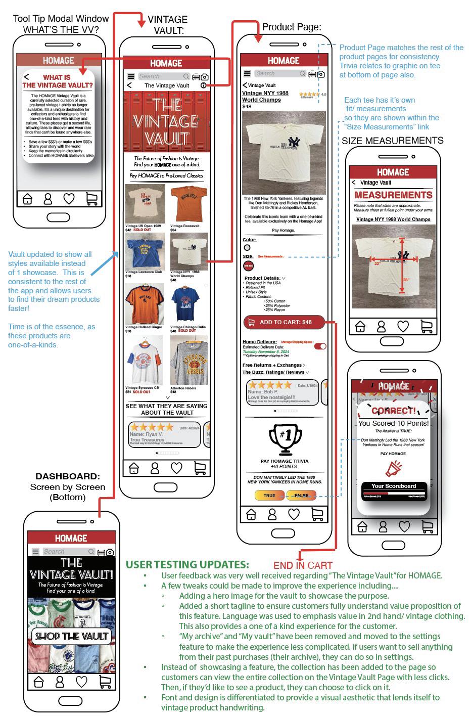
User testing confirmed that this concept is an excellent strategy for establishing a presence in the secondary apparel market, thereby enhancing the brand’s value and reputation for quality. Several adjustments were made to ensure the value proposition of the Vintage Vault is clear and easily understood by users. Aesthetic design changes were implemented to emphasize this original initiative.
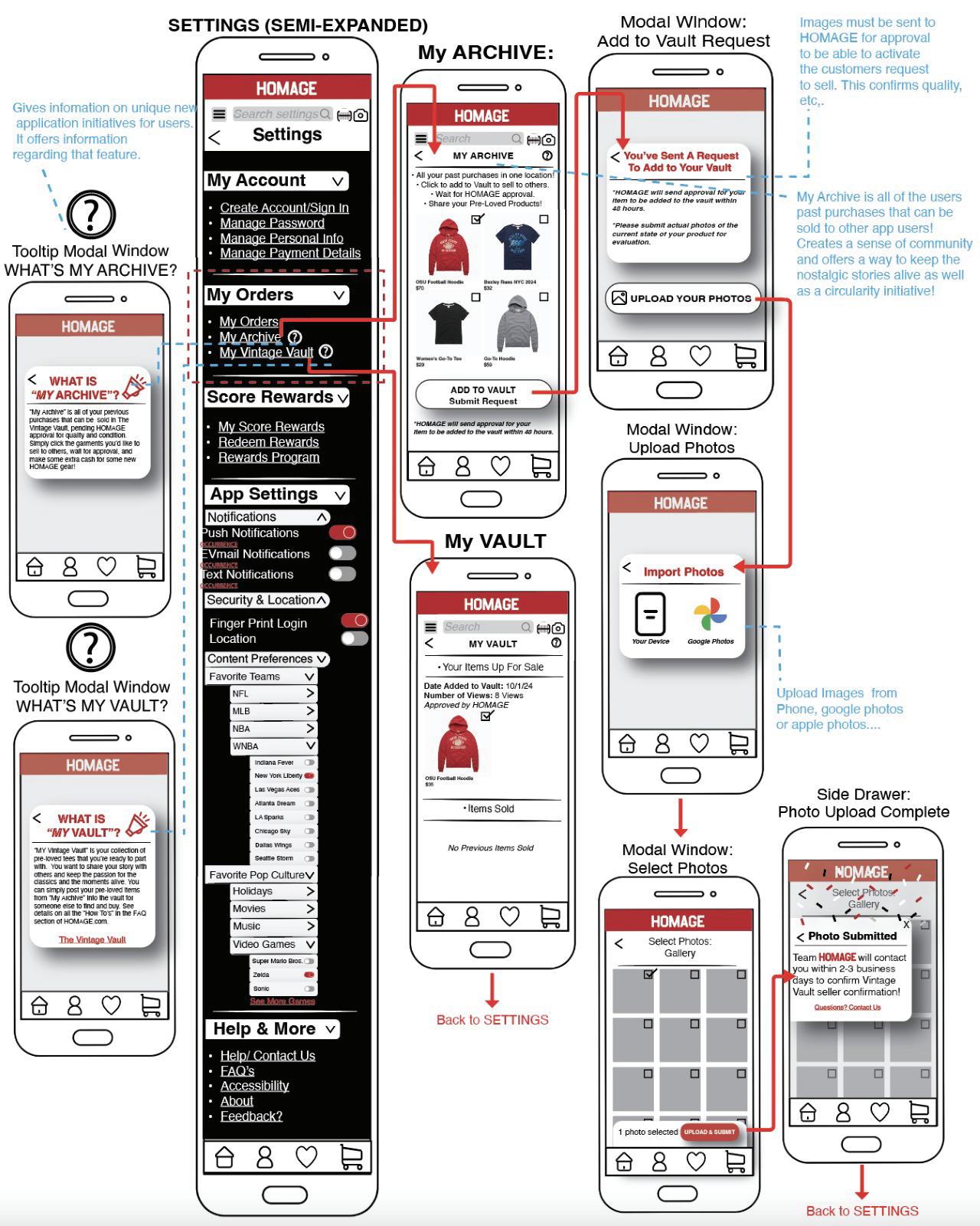
The verbiage on the main page below the hero image was refined to highlight the unique value of the Vintage Vault. The tooltip remains available for users who wish to explore further details about the feature. Additionally, “My Archive” and “My Vault” were removed from this section and relocated to the settings to reduce complexity and reduction of confusion. Tooltips for these sections are now accessible within the settings, providing users with an explanation of their purpose.
The visual design of the Vintage Vault incorporates vintage-inspired typography and distinct product photography, creating a memorable experience that aligns with the Vault concept. This differentiation ensures that the Vintage Vault stands apart from the “Shop All” section as a unique section of its own.
Ensuring that each feature has a clear value proposition, is easily understandable, and provides utility is essential for building trust and credibility with users.
•The Vintage Vault section was designed to highlight its distinct value proposition and provide obvious reasons for its existence. •Font choices, hero images, and authentic verbiage were purposefully selected to help users differentiate this feature from the rest of the app.
•The UI was streamlined to showcase the entire vault in one view, eliminating the need for extra clicks.
•Retention is a key focus, as the Vintage Vault offers exclusive, one-of-a-kind products not available elsewhere, which serves to drive customer loyalty and enhance the perceived value of the offering.


As highlighted in the literature review, a seamless checkout process is a fundamental aspect of UX design principles. The checkout flow was strategically designed to guide users smoothly toward the “Place Order” button while instilling confidence by providing essential information to support informed decision-making.
To enhance usability, collapsible form fields were implemented, allowing users to view only the necessary details, minimizing cognitive overload. Clear visual signifiers were incorporated, with green light indicators and text transitions from italicized grey to standard black, confirming successful field completion.
Recognizing security as a top priority in UX design, users are given the option to save or not save their confidential information within the application based on their preferences.
As also shown, additionally, the checkout process includes a notification opt-in feature for exclusive drops, new arrivals, and special promotions for users who have not yet subscribed at the create account process or in the Part 2 Settings. A gift receipt option is also available allowing users to email a digital gift receipt to themselves or directly to the recipient.
At the final stage of checkout, a “Review Order” accordion dropdown provides a consolidated summary, allowing users to confirm their order details, payment method, shipping address, and total payment amount before proceeding with order. This provides the user with the ability to update anything needed at the last minute, providing ease of checkout, brand loyalty and retention.
To optimize this critical aspect of the user journey, multiple iterations and refinements were conducted, with further reviews and enhancements planned for future development.
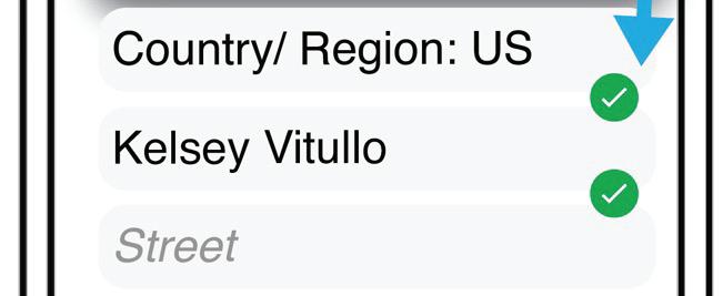
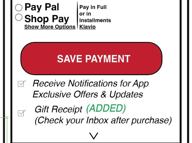
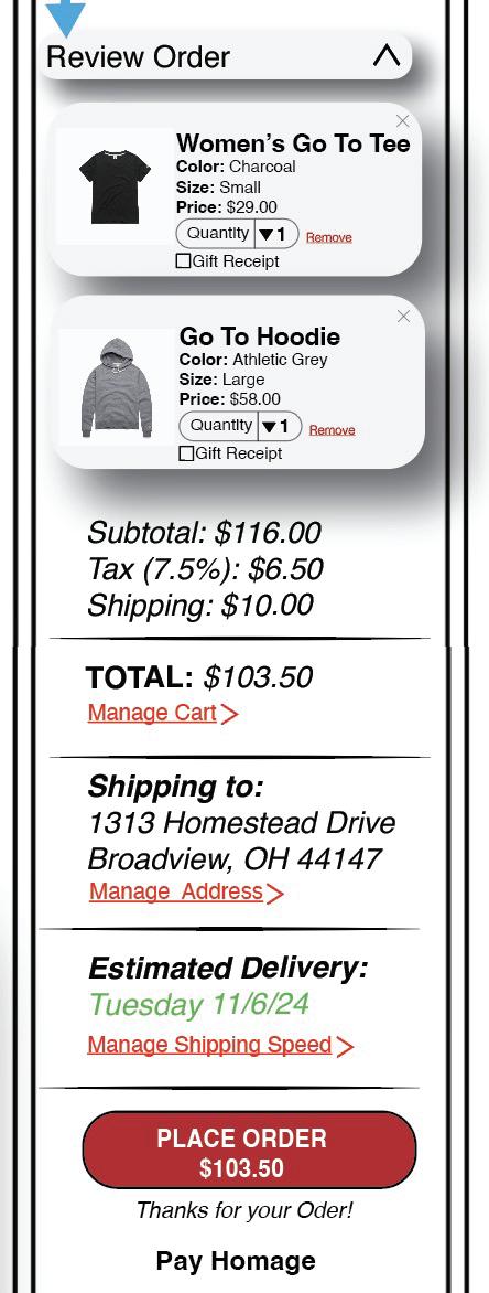
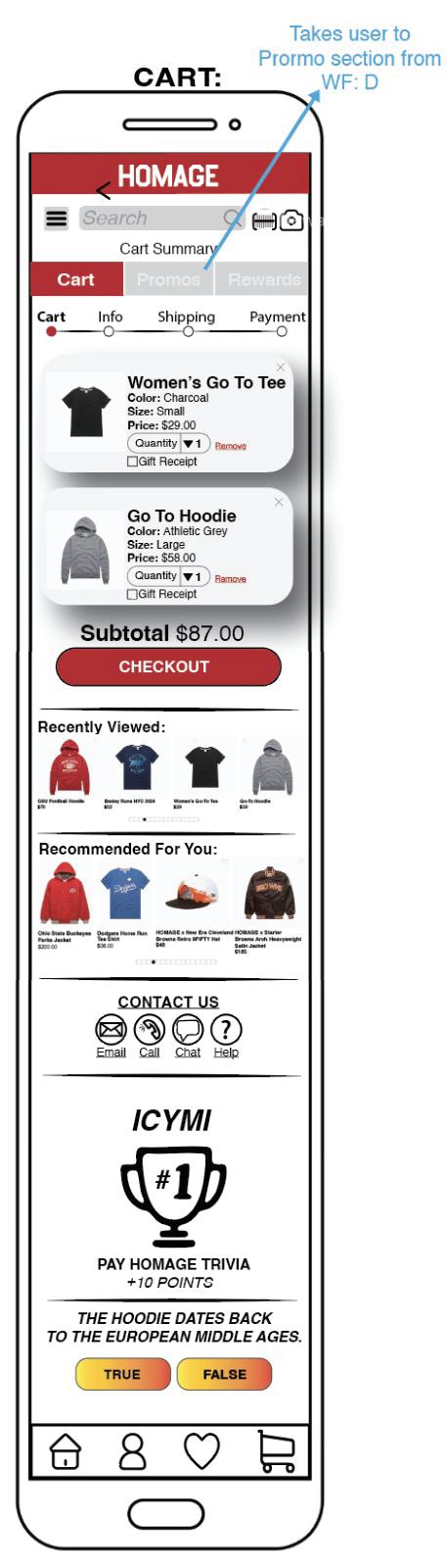
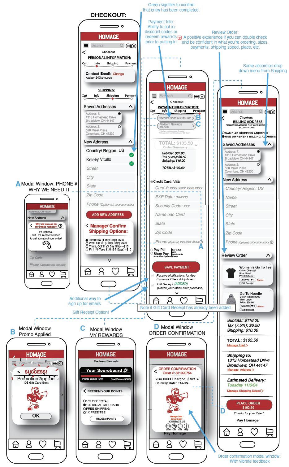
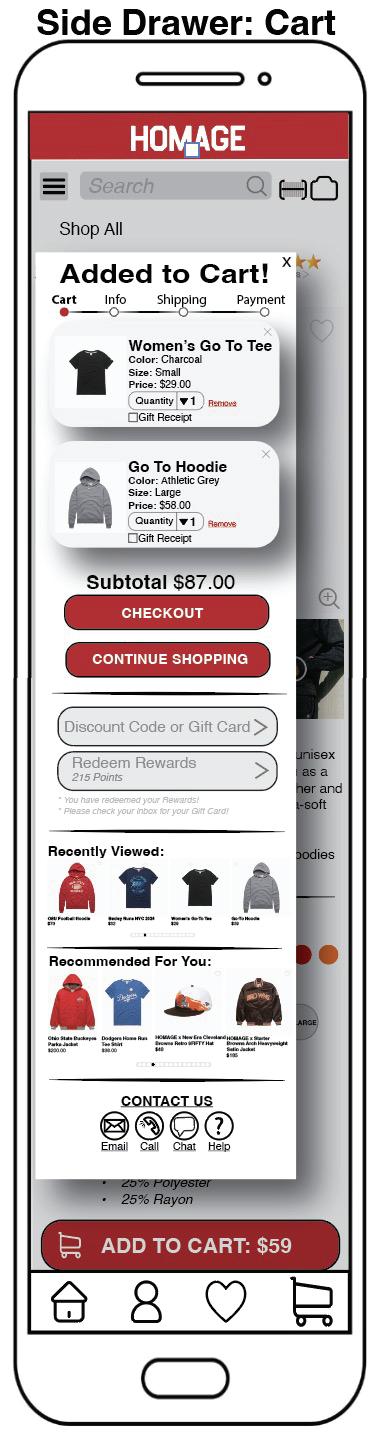
To ensure a speedy checkout process, the modal window was replaced with a side drawer to maintain the browsing flow, encouraging continued shopping, and increasing units per transaction (UPT). Specific content within the checkout process was repositioned for a smoother transition between sections:
•Shipping options were moved from the cart to the checkout page.
•Personalization settings, such as notification frequency, were relocated from the account setup to the settings page. This adjustment allows users to complete their setup faster and begin using the app immediately.



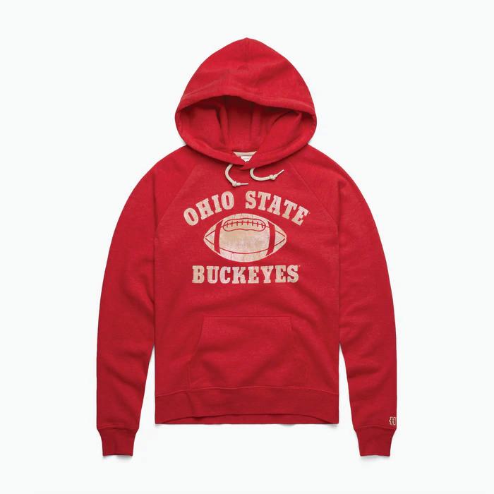
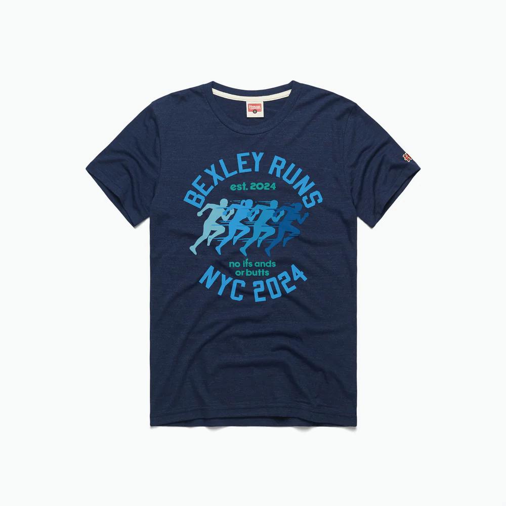
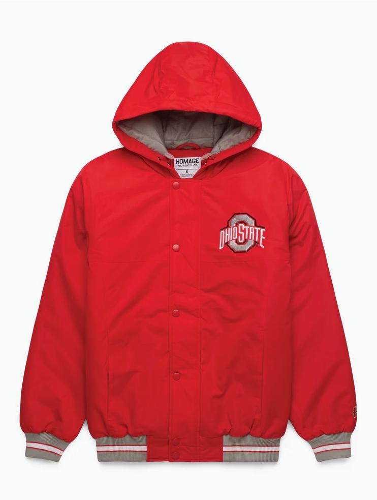
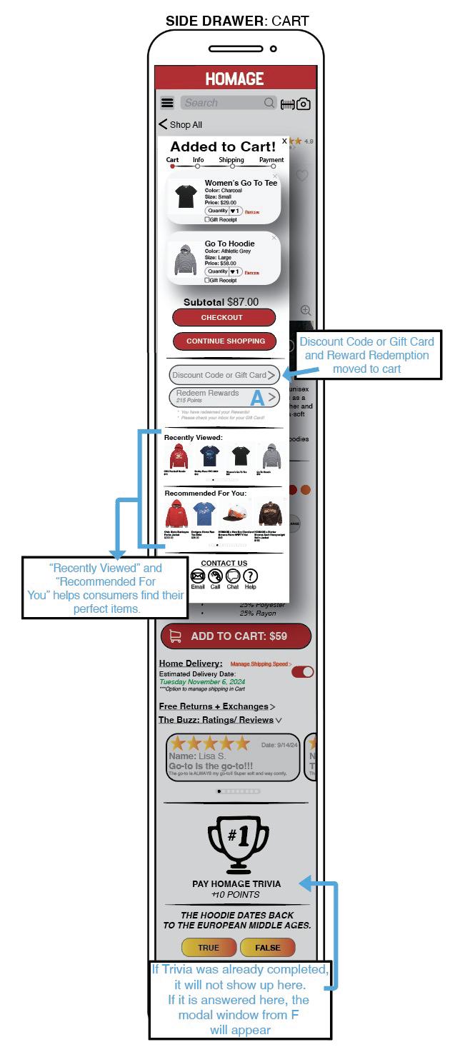
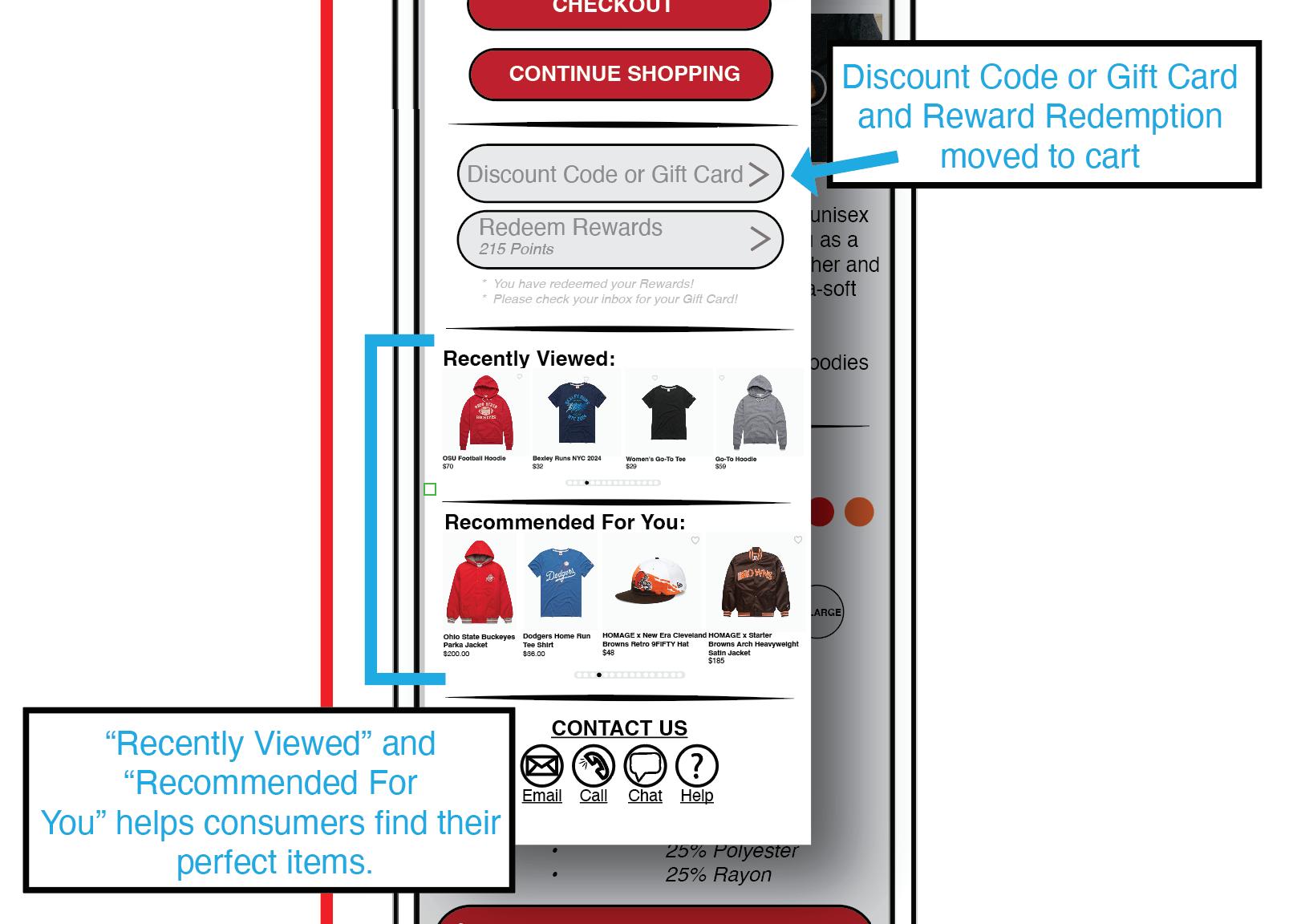
Feedback indicated that the "recommended products" and “recently viewed” feature within the cart is a highly effective strategy for encouraging additional purchases and boosting Average Order Value (AOV).
The tabs for “Order Summary,” “Promos,” and “Rewards” within the cart have been removed, as the features are often overlooked. These features have been integrated into the checkout flow:
•The “Order Summary” now appears at the end of the checkout process.
•The “Promo” and “Rewards” form fields have been added to the cart to allow users to view savings prior to deciding to complete their purchase. This also creates incentives for users as they can see their savings upfront, potentially motivating users to purchase more.
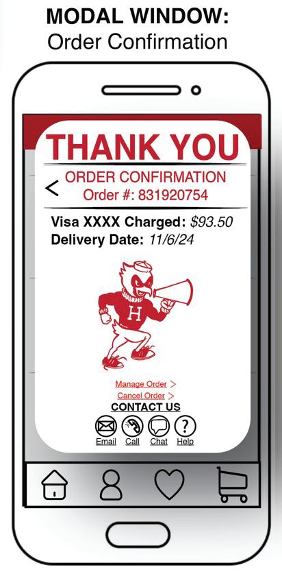
A "Thank You" message was added to the Order Confirmation modal window to enhance brand loyalty and trust.

Part 2 of this application is critical as it establishes the core UX design principles necessary for fundamental functionalities, including Settings, Search, and Navigation. While these functions do not directly accomplish the user's primary goal of shopping, they play a crucial supporting role in enabling a seamless and intuitive experience. Key UX principles such as usability, usefulness, findability, credibility, and accessibility ensure that users can navigate the application efficiently and with confidence. A well-structured design fosters trust while implementing best security practices to protect user data. Optimized performance enhances responsiveness, minimizing friction in the browsing experience, while inclusive design considerations accommodate a diverse range of users.
As the foundational experience of the application, Part 2 must align with HOMAGE’s brand identity while adhering to Human-Centered Design principles. By ensuring smooth navigation, intuitive settings, and efficient search capabilities, this section indirectly supports the user’s shopping journey, creating a more engaging and frustration-free experience. It is important to know that future considerations of usability testing could be completed with Part 2 of the application design.

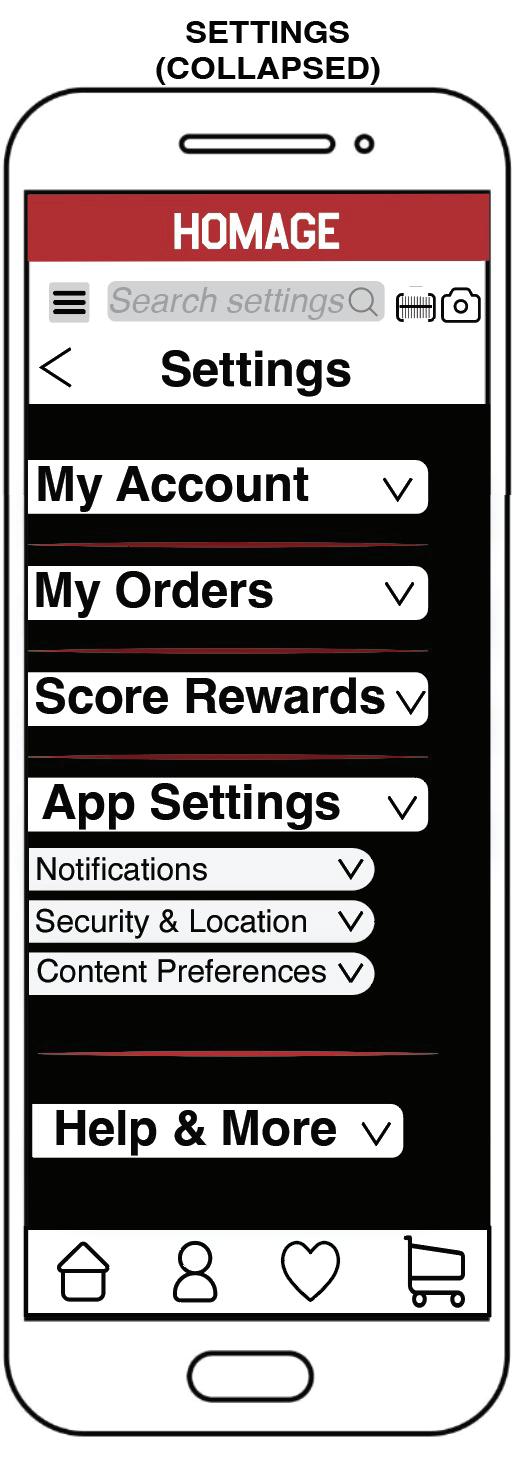
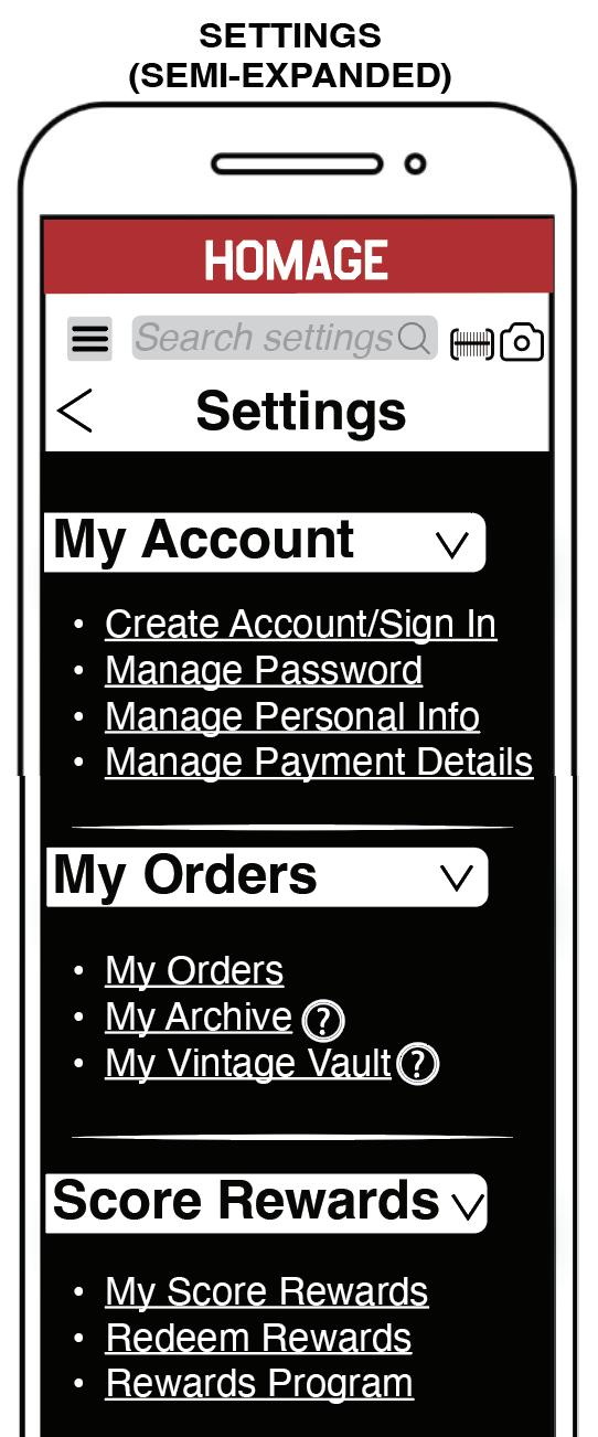
The newly iterated dashboard from Part 2 of the wireframes establishes a robust foundation for the application, emphasizing a seamless user experience that enhances usability and fosters long-term engagement. The Settings section incorporates intuitive dropdown navigation bars, allowing users to expand or collapse content as needed, ensuring they interact only with relevant information to efficiently achieve their objectives. This approach creates a cohesive connection between the Settings and Cart sections, delivering a consistent and intuitive experience throughout the application.
Within the Settings area, users can perform a wide range of essential tasks, including accessing order details, modifying or canceling orders, managing rewards, customizing notification preferences, and enabling security features such as fingerprint authentication and location-based settings. Additionally, users can tailor content preferences to enhance personalization. To optimize usability and streamline navigation, multiple interaction pathways, or "double exposure,"
have been strategically integrated, allowing users to complete tasks through various intuitive routes, ultimately improving efficiency and accelerating conversions.
Visually, the Settings section is distinguished from the main shopping experience with a black background with red accents, effectively signaling to users that they have entered a separate functional space within the application. This deliberate use of color enhances orientation, reinforces navigational clarity, and ensures a structured, user-friendly journey.
• Dropdown Navigation
• My Account
• My Orders
• Score Rewards
• App Settings
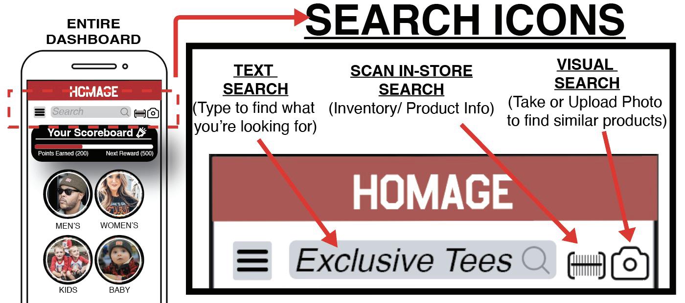
The Search Icon and Navigation Bar are fundamental UX components designed to support users in efficiently completing their tasks. These elements are non-negotiable in creating a seamless and intuitive user experience. Design research has consistently highlighted that search functionality is one of the most critical features within an app. It is also a natural safe–fail if users are not able to find their way through the “Shop” category sections. To ensure accessibility, the search bar is prominently placed at the top of nearly every screen, minimizing the chances of users feeling lost or abandoning the application. This strategic placement increases the likelihood that users will quickly find what they are looking for—or determine if the product is unavailable—enhancing overall satisfaction. Additionally, the search bar includes a dynamic text transition from italic gray to standard black, serving as a visual signifier when users engage with the field.
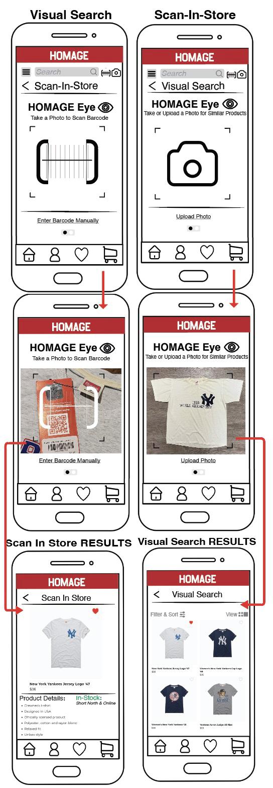
Beyond the traditional search feature, placed directly near it, the application introduces two innovative search features:
• The HOMAGE Eye (Scan-in-Store): This feature bridges the in-store and digital experiences by allowing users to scan a product, instantly retrieving real-time inventory levels, detailed product specifications, and brand storytelling initiatives. Given that most study participants belong to digitally native generations, this feature enhances engagement and accessibility.
• The HOMAGE Eye (Visual Search): A cutting-edge tool increasingly adopted by legacy brands, determined by the market research, Visual Search enables users to capture or upload an image—whether a live photo, screenshot, or saved image—to locate equivalent products within the app. This functionality is particularly valuable in the Vintage Vault section, where every product is a one-of-a-kind piece that sells quickly.
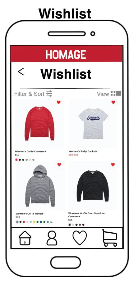
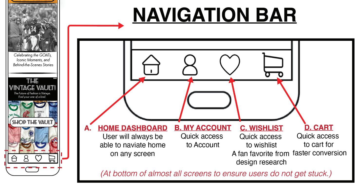
The Navigation Bar ensures a seamless browsing experience by providing quick access to essential sections, including Home, My Account, Wishlist, and the Cart. While users have multiple ways to access these areas, the always-visible navigation bar serves as an effortless shortcut, enabling quick navigation without requiring conscious effort. Notably, user research identified the wishlist feature as an essential, high-priority function. Participants reported using Wishlist for comparing favorite products, tracking potential gift purchases, and monitoring sales. By integrating these UX-driven features, the application enhances both usability and engagement, ensuring a streamlined and enjoyable shopping experience.
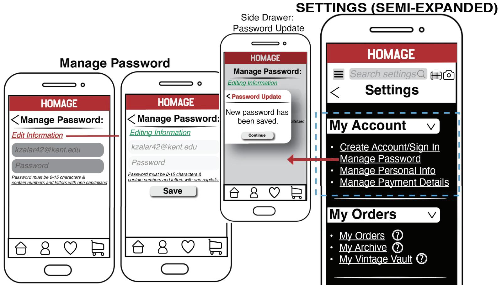
Within the Settings section, users will encounter the first accordion menu, "My Account," which serves as a central hub for managing their personal information and preferences. This section provides four key links, allowing users to create an account or sign in (if they opted to skip the create account at the beginning), enabling access to rewards, wishlists, order history, and personalized recommendations. Once signed in, users gain full visibility into their preferences and past orders, enhancing engagement and providing a more tailored shopping experience. However, those who choose not to log in can still browse and shop, ensuring accessibility and flexibility.
To support seamless interaction and user control, the My Account section allows users to update passwords, manage personal details, and adjust payment methods with ease.
A side-drawer confirmation system has been implemented to notify users of successful updates without departure from their current screen, reinforcing a sense of continuity and efficiency. This design approach, which builds upon insights from Part 1 wireframe iterations, aligns with core user experience (UX) principles, such as minimizing friction, maintaining workflow efficiency, and enhancing user confidence. By integrating these intuitive features, the My Account section fosters a streamlined, user-friendly environment that prioritizes clarity, ease of use, and positive interaction.
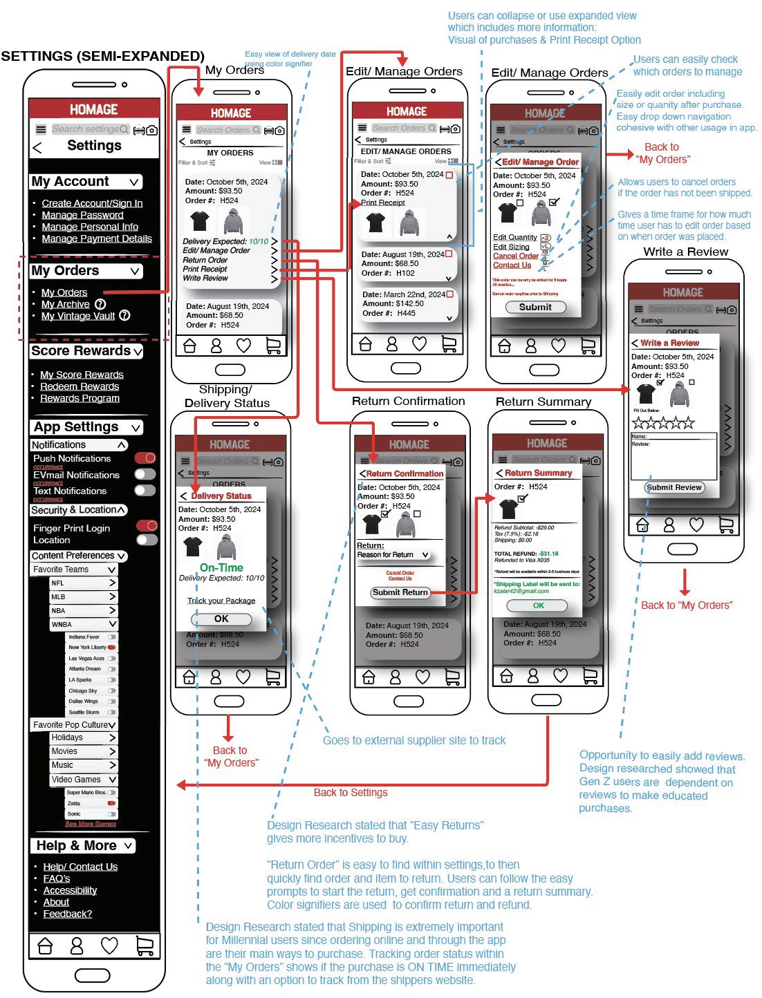
The second accordion dropdown menu, labeled “My Orders,” provides users with the ability to review, manage, and cancel their orders, among other functionalities. This section is designed for users to easily view their past purchases, make updates to their orders, and submit product reviews. Reviews are an essential feature, particularly for Gen Z consumers, who often rely on them to make informed purchasing decisions. A future consideration could be to have reviews on its own link within the drop down, so if users' goal is to write a review, they do not have to go into the orders to find it, the interface will route the users’ to directly choose the products to review.
Within the "My Orders" section, users can expand or minimize each order for greater control over the amount of information displayed. Initially, orders display key details such as the order date, total amount, and order number. When expanded, additional information such as the delivery date and tracking details become available. Users also can print receipts and write reviews for specific products in this view.
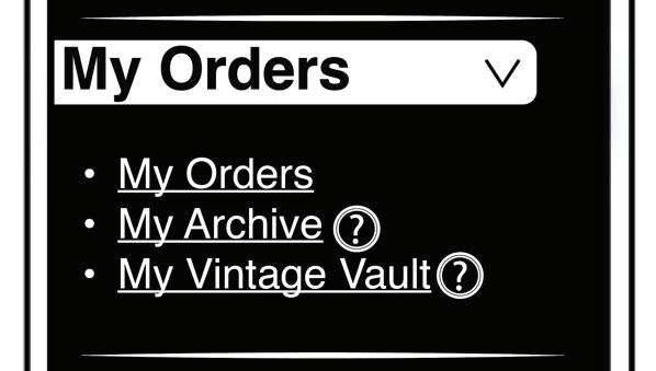
Additionally, two secondary features within the “My Orders” section relate to the Vintage Vault. The “My Archive” section allows users to view their past orders that are eligible for resale in the Vintage Vault. A toolkit button is provided to guide users through the process or understanding these features. This feature enables users to resell pre-loved products, after receiving approval from the brand, creating an opportunity to refresh their wardrobe, earn some extra income, and discover the latest items from the brand. Reference the Vintage Vault
Wireframe I from Part 1.
Finally, this section also includes the settings for the Vintage Vault, allowing users to manage their vault, check the status of their submissions to HOMAGE, and view and update the products currently in their Vintage Vault.
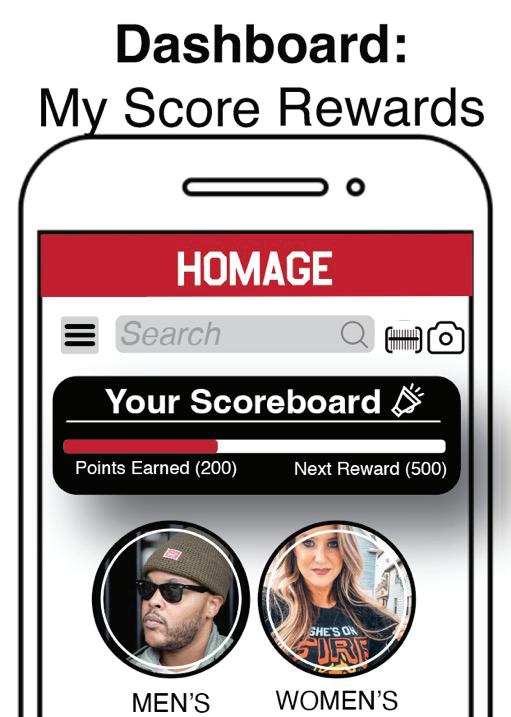
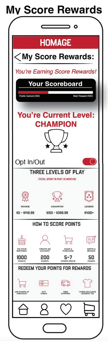
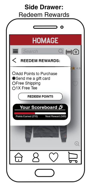
The “My Rewards” section within the application settings is a key feature that enhances the user experience (UX) by offering transparency, accessibility, and motivation. Positioned prominently within the app as a reward status bar, it is also located at the top of the Dashboard due to its critical role in user engagement, as highlighted in design research. This placement ensures that users can easily view their rewards status, which helps increase retention and fosters a sense of value for their continued use of the app.
The “My Rewards” section allows users to review their accumulated rewards, in a secondary location, providing them with a clear overview of what they have earned. This transparency is crucial in building trust and keeping users engaged, as it allows them to track their progress and feel more in control of the reward process. Additionally, users can seamlessly redeem their rewards, whether through this section or directly during the checkout process, enhancing convenience and reinforcing the importance of rewards in the overall user journey.
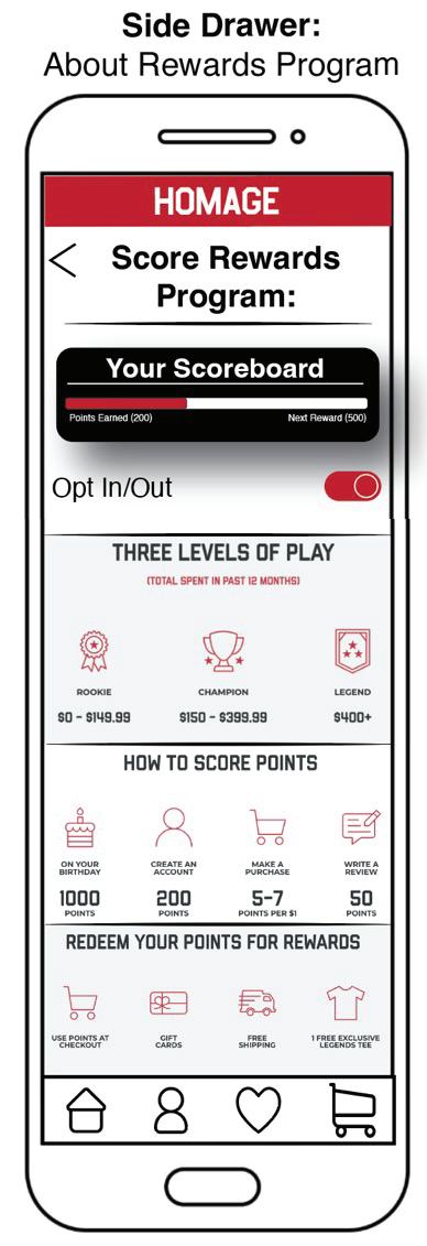
The ability to review the rewards program itself is another key aspect. Users can see how they earn rewards, which incentivizes further app usage, and understand how to best utilize their rewards for future purchases. This feature is particularly important in UX design as it not only adds value to the app but also encourages users to make purchases or engage with the app more frequently, ensuring they feel rewarded for their loyalty and interaction. By streamlining the rewards process within both the “My Rewards” section and the checkout process, users enjoy a frictionless, satisfying experience that boosts overall user satisfaction and long-term retention.
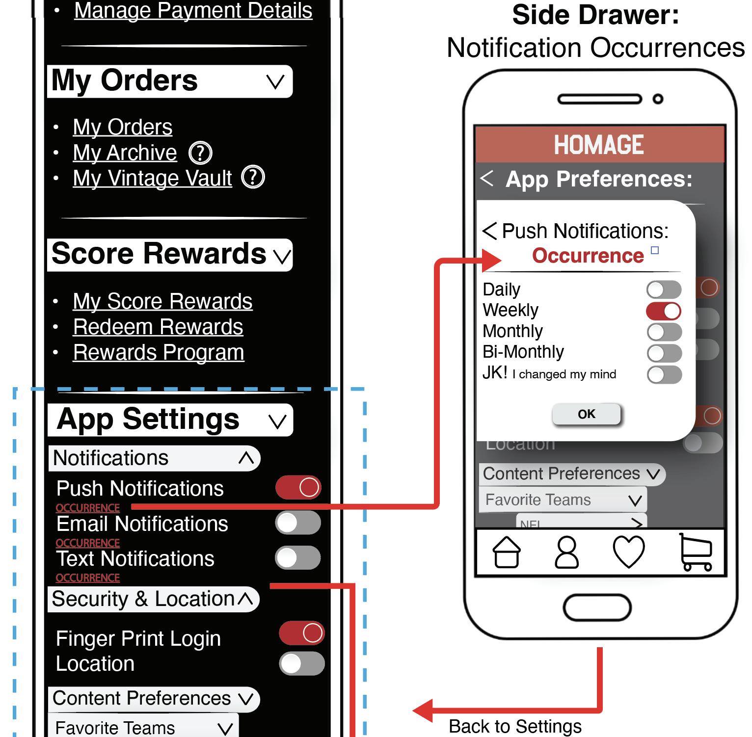
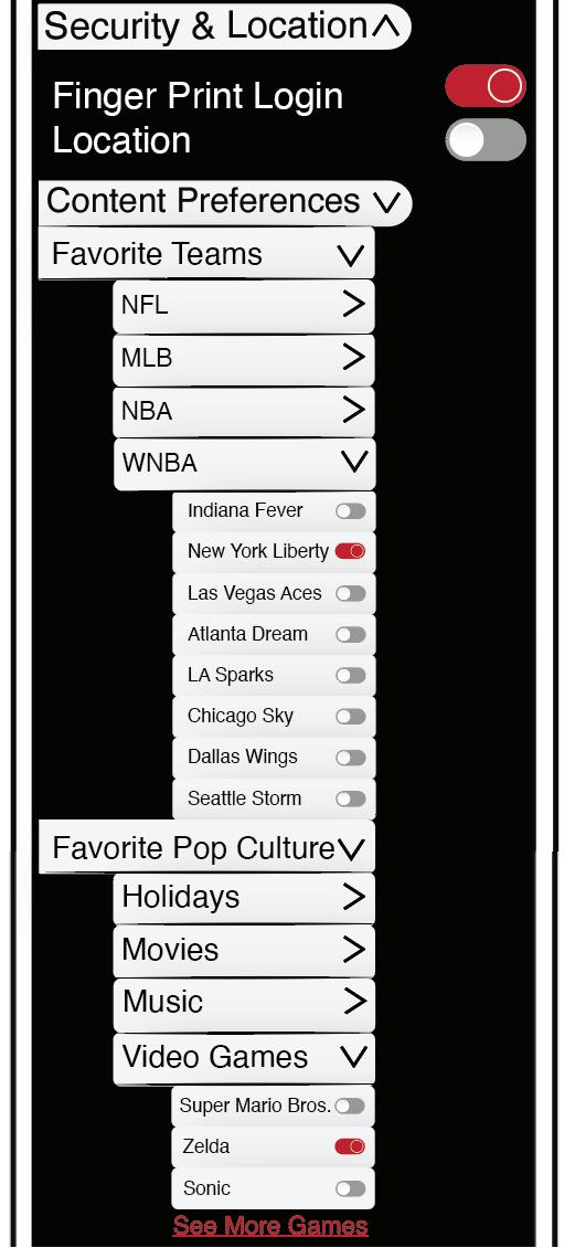
Application settings within mobile apps play a crucial role in personalizing and enhancing the user experience to tailor it to their shopping habits and needs. Content preference settings allow users to select their favorite teams and pop culture choices, offering a customized experience to allow for personalization and recommendations. The drop-down accordion navigation bar keeps the process streamlined, with expandable and collapsible categories to cater to user goals, eliminating the need for extra side drawers or modals.
Based on design research, notifications are helpful but can become intrusive if overused. To address this, users are given the option to control the frequency of notifications, with the ability to adjust push, email, and text notifications for consistency.
For those who prefer fewer interruptions, notifications can easily be turned off. Security is another key aspect, as research revealed that users prioritize safety. An optional fingerprint authentication feature was added, alongside the traditional username and password, to provide users with peace of mind. Future iterations will focus on refining the "Help & More" section and ensuring full accessibility compliance as the application moves into development.


Through the observation, prototyping, and usability process centered around don norman’s human-centered design (hcd) philosophy, valuable insights emerged alongside key lessons learned.Norman emphasizes that successful design begins with a thorough understanding of users—their goals, challenges, and contexts—obtained through observational research and direct engagement. A goal of HCD is to accurately define the problem by exploring and refining multiple solutions through testing and iteration, leading to an optimized and user-centric design. (p. 9)
This study adhered to core HCD processes and principles, beginning with extensive design research conducted through interviews and surveys along with design iterations and testing. Participants provided insights into their experiences with their favorite applications, enabling valuable observations on usability. Based on these findings, prototypes (wireframes) were developed and tested by industry professionals, who provided critical feedback on design functionalities for a mobile shopping application. Iterations of the wireframes were refined to align with UX best practices while also integrating brand-specific content reflective of HOMAGE’s identity.
To ensure relevance, participants in this study were selected to align with HOMAGE’s customer demographic, maintaining a representative distribution of age and gender. This approach was intended to accurately reflect the brand’s existing consumer base, ensuring that insights gathered would directly inform design decisions. The primary objective was to develop a comprehensive understanding of user needs, pain points, and expectations to provide a relevant mobile shopping experience.
By maintaining a user-centered approach, the study aimed to create solutions that are not only visually appealing but also highly functional and accessible to all.
By prioritizing how people naturally think and behave, rather than forcing them to adapt to poorly designed systems, Norman’s HCD approach minimizes friction due to insights of user’s previous experiences that were considered prior to the initial design phase. When users encounter unnecessary obstacles, they often abandon or reject a product altogether. Surveys and interviews played a critical role in accurately identifying key issues such as convenience, speed, and ease of use. Survey responses were collected through Qualtrics and analyzed using Excel charts to compare the data with the affinity model analysis. This process was repeated twice to incorporate additionval completed surveys, revealing valuable insights into generational differences. Interview data was gathered through in-session notes, a review of session recordings, and the use of the affinity model to identify patterns and themes related to largest problems and best potential solutions fueled by colored sticky notes. The data was organized by participant and categorized into similar themes to pinpoint common frustrations and innovative ideas.
In human-centric design, Norman (2013) talks about the flow state referring to a smooth, uninterrupted experience that a user has while interacting with a product or system. When a human is in the flow state, “they are at one with the task they are performing”. (p. 56) This application was designed to seamlessly walk users through each process to achieve that flow state, whether they are repeat customers with intentions to purchase, or new users browsing in the discovery phase. The flow concept is crucial because it minimizes cognitive load, enabling users to navigate and complete tasks with ease and efficiency. The flow should feel natural and intuitive, aligning with the user's expectations and needs at every step.
To enhance usability with a consumer-centric approach and achieve a flow state, back arrows were incorporated on nearly every screen, while modal windows were replaced with side drawers to maintain a seamless experience without interrupting the flow by navigating to a new screen. Additionally, the search function was made accessible on every screen, responding to unanimous feedback from interview participants who consistently stated that, when in doubt, they rely on the search function as their go-to tool.
The human-centric design philosophy was applied by observing interview participants' body language and reactions, which provided deeper insights into their experiences. In-person interviews helped establish a baseline for understanding how successful applications add value to users' lives, as well as how poor designs hinder goal achievement.
Given that HOMAGE’s consumer base spans multiple generations, comparing age ranges was not initially planned for the survey. However, the results revealed unexpected generational differences, leading to design choices aimed at ensuring usability across all age groups.
This insight prompted a re-analysis of the survey data, with a particular focus on younger, Gen Z (18-24), participants. A limitation of the survey was its heavy weighting toward female respondents, which did not fully represent HOMAGE’s significant male following. In hindsight, including upfront questions about generational preferences would have been valuable for more targeted insights and interviewees could have been more weighted towards men.

The findings highlight key differences between Gen Z and Millennials in their shopping habits. Gen Z (ages 18-24) tends to purchase more clothing than Millennials, preferring to shop in-store while utilizing digital platforms for convenience. They are less concerned with shipping and delivery and enjoy gamification for entertainment, heavily relying on customer ratings and reviews. Millennials (ages 25-44), on the other hand, favor online shopping, using apps to
access a broader selection and prioritize shipping and delivery options for efficiency. Both generations are motivated by convenience, simplicity, and exclusive offers, with younger shoppers appreciating features like search filters, scan-in-store, and wishlist functionalities, while older shoppers value loyalty rewards and quick delivery. Promotions, ratings/reviews, and gamification are important for both groups, though younger shoppers use them more for entertainment. For shopping platforms, catering to these differences means providing a seamless digital experience with features like promotions, rewards, and personalized recommendations, while also enhancing in-store experiences with integrated technology. By aligning with these preferences, platforms can engage both age groups effectively.
The design of the HOMAGE mobile shopping app was meticulously informed by extensive design research, drawing on valuable insights derived from a shift in survey participant demographics and data analysis that compared and contrasted Gen Z and Millennial shoppers. By recognizing the distinct behaviors of these two groups, customer feedback and data was leveraged to create an experience that addresses their shared preferences for simplicity, convenience, and intuitive functionality. This research-driven approach not only ensured the app's appeal to a wide demographic but also allowed it to feel deeply personalized and relevant to both the users' needs and the HOMAGE brand. Interestingly, the differences between these generations emerged organically in the data as a surge of new survey participants joined in the weeks following the initial analysis, providing even richer insights into their unique preferences.

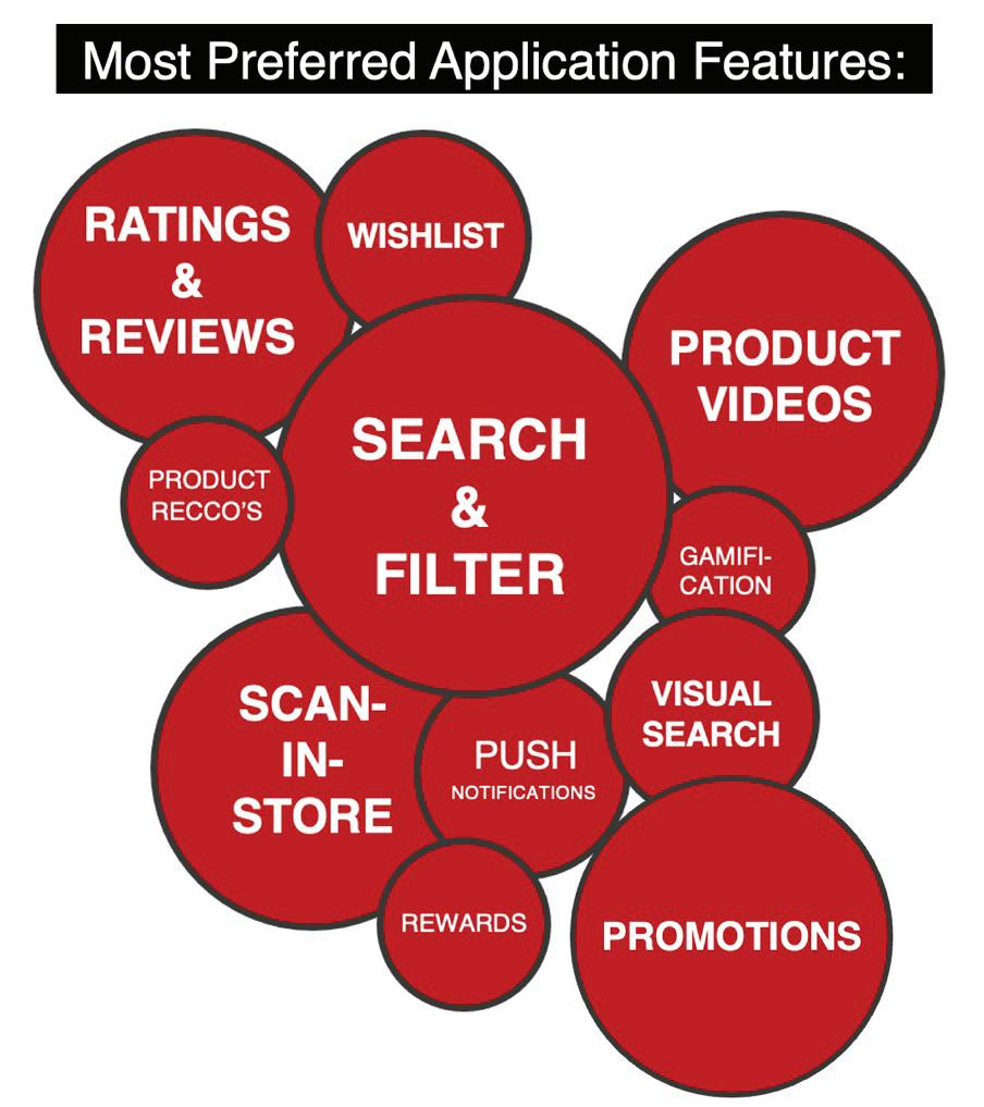
Most interview and survey data aligned on the most valuable features, highlighting that despite generational and age differences, human-centered design is crucial. By focusing on the user’s needs, behaviors, and preferences, this approach ensures that the design fosters usability, accessibility, and emotional connection. It creates a seamless, intuitive experience that resonates with all users, making the app not only functional but also personally relevant. Ultimately, human-centered design prioritizes the user at every touchpoint, delivering an experience that appeals to a wide range of individuals. Because of this, the application design was able to cater to both generations,
but also the age range, making it relevant, motivating and user friendly. Focusing on the participants and their needs made creating the foundational designs of the application into a more streamlined experience. After all the foundational directives were fused together between the data analysis and UX principles to create the design, there was still small space left for the innovative features. Users alike mentioned that they could not successfully use a shopping application without exclusive promotions and drops, a strong rewards program, a wishlist feature, ratings/reviews, and the most mentioned feature, search and filter.
Taking inspiration from Don Norman’s Human-Centered Design philosophy, the HOMAGE app places the customer at the core of its development. Every design decision, from feature prioritization to interface layout, reflects the desires of the users identified within the design research to improve the experience.
Lastly, the app’s design reflects the HOMAGE brand's identity, blending quality, nostalgia, and comfort, while keeping the user’s needs at the forefront. The integration of visual elements like confetti, created as a signifier for confirmations, combined with features like the pre-loved product section in the Vintage Vault, offering additional ways of emotion connection through nostalgic storytelling, further personalizing the experience and fostering brand connections. This commitment to combining brand consistency with responsive design means that HOMAGE’s app isn't just another shopping platform—it’s a tool built around human centric design and the unique preferences of its users, designed to drive engagement, satisfaction, and long-term customer loyalty. By ensuring that each design feature serves the user’s needs and aspirations, this new HOMAGE application creates a dynamic and compelling digital shopping experience that will resonate across generations and HOMAGE customers.
A limitation of this study is its relatively small participant pool, which does not fully represent a broader consumer base. Future considerations of additional user testing and observations would further refine insights into consumer needs, including that of persons with disabilities.

This study revealed several key learnings that highlight the importance of thoughtful design iterations and the challenges of creating a truly seamless user experience. Even slight adjustments to design can have significant positive impact on usability and flow, particularly when considering the intuitive nature of users who have grown up with technology. For example, the need for carousel arrows was deemed unnecessary through user testing, indicating that simplicity and ease of navigation are often more effective than overcomplicating the design. The reduction of the dashboard features was also a helpful iteration to keep users focused and on task.
The study also highlighted that while there are multiple approaches to application design, the fundamental features that seem simple to implement are often more complex than anticipated. Despite living in a technologically advanced era, users expressed a preference for a straightforward, seamless shopping experience, showing little interest in overly innovative features. This finding underscores the value of a user experience that prioritizes simplicity and ease of use over unnecessary complexity.
One of the largest lessons learned was due to the Human-Centered Design (HCD) philosophy, including design research, prototyping, and testing, that cannot be overstated as it takes the guesswork out of the design process. Through a structured, research-driven approach, human-centered design (hcd) ensures that designs align with user needs and behaviors, increasing the likelihood of success. Rather than relying on a single designer’s vision, hcd fosters a collaborative, user-focused process that leads to more effective and impactful outcomes.The interviews, surveys, and market analysis provided a solid foundation for shaping the design process, offering valuable insights into which features and sections were essential for the app’s success. These findings guided the development of wireframes, helping to outline a logical and user-friendly structure from the outset. By incorporating direct feedback from real users and continuously refining the design based on testing, HCD allows for the creation of more intuitive, functional, and impactful products. This iterative process not only minimizes risks but also leads to more informed design decisions that cater to the needs of the end user, ensuring a stronger, more relevant user experience. Finally, the study revealed the complexity of crafting an outstanding user experience that balances simplicity, efficiency, effectiveness, and value. The level of detail involved—ranging from design aesthetics to the functionality and flow of the application—proved to be far more intricate than initially expected, with every interaction impacting how users perceive and engage with the product.

An implication of the HOMAGE mobile shopping application is the ability to create an experience that not only culminates in a purchase but also fosters a lasting connection with the user is something that many brands struggle to achieve. Emotional bonds are formed through positive experiences, but true value lies in the connection to the product after the transaction, as well as the enhanced quality of life these products provide. The fashion industry has long been focused on increasing sustainability, implementing circular initiatives to prevent clothing from ending up in landfills. Offering consumers the option to sell their pre-loved items and discover pieces no longer available in the market creates a unique demand, encouraging repeat engagement. This nostalgic connection between the digital purchasing process and the physical wearability of both new and pre-loved garments has the potential to revolutionize the fashion industry and reshape how people shop and perceive clothing. The Vintage Vault aligns with the growing trend of second-hand fashion, but with sustainability as a fundamental principle for modern brands, this initiative is poised to transform the fashion landscape by keeping pre-loved styles in circulation.
This approach implies that businesses must adopt generationally informed strategies to ensure their digital products and services meet the diverse needs of their target audience. The app is designed to cater to the distinct shopping behaviors of Gen Z and Millennials. By understanding these differences—such as Gen Z’s preference for in-store shopping and Millennial’s focus on efficiency (shipping, fast delivery)—HOMAGE can offer tailored features that satisfy both generations.
Future considerations for the platform could be to leverage age segmentation to develop targeted marketing campaigns, personalized offers, and promotions to drive engagement across these age groups.
Future considerations could also include additional features like style quizzes and fit technology, alongside customizable shipping options such as expedited delivery or in-store pickup, appealing to diverse shopper preferences. Additionally, the fashion industry would benefit from conducting design research focused on generational differences to ensure that as new generations emerge, brands evolve to address shifting preferences and maintain customer loyalty.
The HOMAGE application’s design underscores the importance of understanding user preferences and designing experiences that meet those needs in a seamless, intuitive way. The implications extend beyond user experience to include targeted marketing, cross-channel integration, and personalized customer engagement. By embracing these principles, businesses can create more engaging, loyal, and satisfied customer bases, leading to higher conversion rates and long-term success.

.

In conclusion, the HOMAGE Mobile Shopping Application exemplifies how thoughtful, human-centered design (HCD) can transform the digital shopping experience into a successful, meaningful, and engaging journey. By integrating user-centric principles from Peter Morville, the app enhances the HOMAGE brand’s connection with its customers, blending personalized experiences, nostalgic content, and easy navigation. The application’s design process—rooted in research, user feedback, and iterative testing—ensures that every feature serves to meet user needs, providing a seamless flow that enhances both usability and emotional engagement.
Through the innovative use of product storytelling, personalized recommendations, and a focus on increasing demand through the Vintage Vault, the app not only fosters a deeper connection to the HOMAGE brand but also creates a space for users to engage in ways beyond traditional retail experiences. By applying HCD principles, HOMAGE has succeeded in bridging the gap between physical and digital retail, offering a platform that enriches the customer journey while driving brand loyalty and revenue growth. This approach underscores the importance of aligning design with user insights, creating an application that is as impactful as it is user-friendly.



Norman, D. A. (2013). The design of everyday things: Revised and expanded edition. Basic Books.
Interaction Design Foundation. (n.d.). Don Norman. Interaction Design Foundation. https://www.interaction-design.org/literature/topics/don-norman
The Future of Product Design: Trends and Technologies. (n.d.). Stan Vision. Retrieved from https://www.stan.vision/journal/the-future-of-product-design-emerging-trends-and-technologies
Business Wire. (2024, May 2). HOMAGE announces Ryan Reynolds’ Maximum Effort Investments as lead strategic investor in growth capital round. https://www.businesswire.com/news/home/20240502442051/en/HOM-
AGE-Announces-Ryan-Reynolds%E2%80%99-Maximum-Effort-Investments-as-Lead-Strategic-Investor-inGrowth-Capital-Round
PR Newswire. (2024, January 30). HOMAGE closes growth capital round with notable investors including Jason Kelce and Rob McElhenney. https://www.prnewswire.com/news-releases/homage-closes-growth-capital-round-with-notable-investors-including-jason-kelce-and-rob-mcelhenney-302263183.html
NBC4i. (2023, December 15). Ohio company’s sales soar after Taylor Swift seen wearing apparel. https://www.nbc4i.com/news/local-news/columbus/ohio-companys-sales-soar-after-taylor-swift-seen-wearing-apparel/
614Now. (2018, October 10). Paying HOMAGE: 15+ stars sporting Columbus’ fave T-shirt brand. https://614now.com/2018/explore-columbus/adventures/paying-homages-15-stars-sporting-columbus-fave-t-shirt-brand
Moorville, P. (2004, June 21). User experience design. Semantic Studios. https://semanticstudios.com/user_experience_design/
Bufe (2025, January 3). Mobile UX: Best practices for designing a great user experience on mobile apps. UXCam. https://uxcam.com/blog/mobile-ux/
UI Design. (2025, February 19). The importance of UX in mobile app design: Tips for success. Medium. https://medium.com/@uidesign0005/the-importance-of-ux-in-mobile-app-design-tips-for-success-4f478be1d209
The Future of Product Design: Trends and Technologies, https://www.stan.vision/journal/the-future-of-product-design-emerging-trends-and-technologies.
Vecteezy. (n.d.). Eye vectors. Retrieved from https://www.vecteezy.com/free-vector/eye
Vecteezy. (n.d.). iPhone keyboard vectors. Retrieved from https://www.vecteezy.com/free-vector/iphone-keyboard
Vecteezy. (n.d.). Scoreboard font vectors. Retrieved from https://www.vecteezy.com/free-vector/scoreboard-font
Fields, S. [Stefanie Fields]. (n.d.). Vintage ringers [Pin]. Pinterest. https://www.pinterest.com/pin/896216394596061526/
Pluto, T. (2024, December 15). Browns' distant past reminds fans how they deserve much better today. Cleveland.com. https://www.cleveland.com/browns/2024/12/browns-distant-past-reminds-fans-how-they-deserve-much-better-today-terry-pluto.html
NY Coart. (n.d.). Question mark artwork. Vecteezy. Retrieved November 14, 2024, from https://www.vecteezy.com/free-vector/answer
HefNY25. (n.d.). Bell artwork. Vecteezy. Retrieved November 14, 2024, from https://www.vecteezy.com/free-vector/bell
Psychoche9. (n.d.). Play button. Vecteezy. Retrieved November 14, 2024, from https://www.vecteezy.com/free-vector/play-button
Flatart. (n.d.). Cog- settings button. Vecteezy. Retrieved November 14, 2024, from https://www.vecteezy.com/free-vector/question-mark-icon
Astrit Lindawati. (n.d.). Sound button. Vecteezy. Retrieved November 14, 2024, from https://www.vecteezy.com/free-vector/question-mark-icon
MD. Monirujjaman Melon. (n.d.). Wifi buttons. Vecteezy. Retrieved November 14, 2024, from https://www.vecteezy.com/free-vector/question-mark-icon
HOMAGE website. (n.d.). www.homage.com
THE FOUNTAIN INSTITUTE. (n.d.). Human-centered design workshops. The Fountain Institute. https://www.thefountaininstitute.com/blog/human-centered-design-workshops
D'Angelo, C. (2024, November 30). Black Friday online sales on track to hit record high. ABC News. https://abcnews.go.com/Business/black-friday-online-sales-track-hit-record-high/story?id=116330137
ISTOCK. (N.D.). Cheerful young woman receiving a gift from her boyfriend. iStock. https://www.istockphoto.com/photo/cheerful-young-woman-receiving-a-gift-from-her-boyfriend-gm1301844614-393770828
ISTOCK. (N.D.). Total relaxation. iStock. https://www.istockphoto.com/photo/total-relaxation-gm540861476-96670633
HUFFPOST. (N.D.). 5 super easy ways to become. HuffPost. https://www.huffpost.com/entry/5-super-easy-ways-to-become_b_12220374
NIELSEN NORMAN GROUP. (N.D.). Affinity diagramming: Collaboratively sorting UX ideas. Nielsen Norman Group. https://www.nngroup.com/articles/affinity-diagram/