8 minute read
Something of the night
Something of Noted film photographer and darkroom expert Mike Crawford talks us through his Nocturne project, shooting cities after dark on film
Some photographic projects seem to be easy to start and finish. It always helps if there are plans for an However, my series Nocturne, is one best classed as ‘ongoing,’ and one I keep returning to with new ideas and images. exhibition or publication, while other work may be produced primarily to see if an idea or theme might develop into something interesting. I also appreciate the immediacy of photographing a small series, producing a hand-made artist’s book, or using online printers, considering the project complete. While based on the urban landscape at night, it would be difficult to present it as a text book example of how to shootphotograph the city after dark. I purposely limit myself in the equipment and materials used, making things as basic as possible. Indeed I don’t even use a tripod!
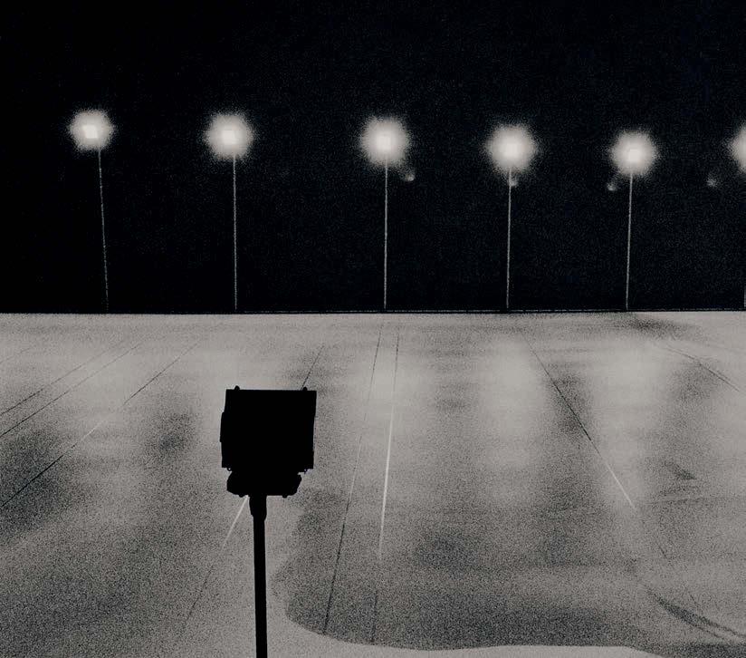
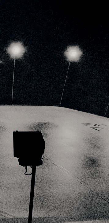
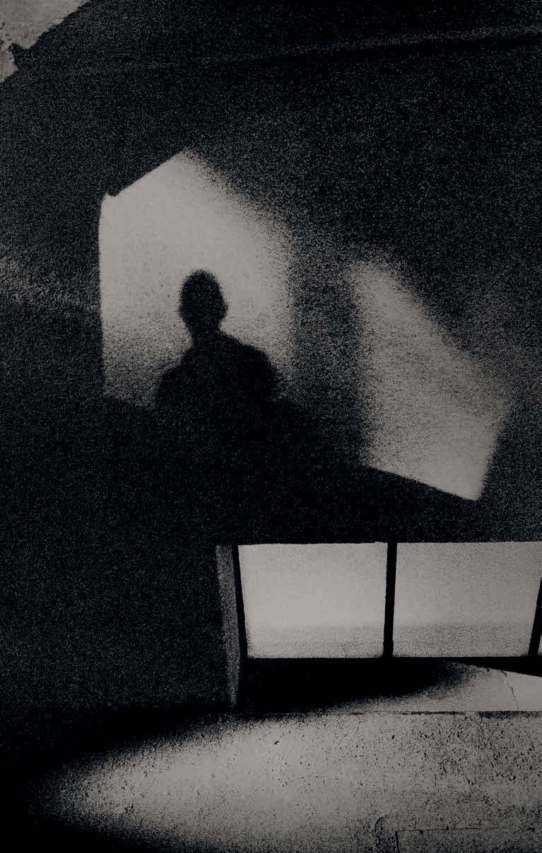
the night What I do want in the work, if not technical perfection, is a sense of mystery, atmosphere and narrative. I want the viewer to be taken on an anonymous walk, exploring hidden corners of cities, brief glimpses observed as darkness encroaches on their streets and buildings. The images are often multilayered, reflections and shadows used to suggest stories within a story. Others are purposely diffuse, unwanted details subdued to leave just shape and form. The series has been photographed in different cities, though initially just London and Berlin, and presented so the viewer is taken on a nocturnal journey through an imagined city.


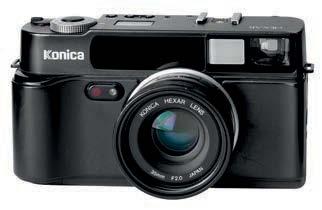
I have used the Konica Hexar for over 25 years. It is small, quiet and inconspicuous compared to larger SLRs, with an excellent 35mm f/2 lens. Perhaps a limitation, though I appreciate it for this simplicity
Process and printing
The visual characteristic of the work is determined by the process. I use a Konica Hexar AF 35mm camera loaded with Ilford Delta 3200. It’s a relatively simple camera, first produced in 1993, which handles like a rangefinder (except that it is autofocus), with a high-quality, fixed 35mm f/2 lens. When I first bought one in the mid 1990s, it had a certain cult status amongst photographers like Peter Lindbergh, and was sometimes referred to as the ‘poor man’s Leica.’
I rate the film at 2000 ISO, processing accordingly to lower the contrast, and as I shoot handheld, I’m usually working on low apertures and shutter speeds. I want to be able to photograph with a sense of spontaneity and the camera is small enough to take with me on trips and not feel burdened with having to carry a tripod and extra lenses. The film is high grained and also prone to a slight amount of irradiation. This gives a glow to the brightest highlights, ideal for emphasising lights within a cityscape.
This is accentuated by the lith printing process I use in the darkroom which intensifies contrast and tone and enhances the texture and grain. To add more limitations, I print on outdated and discontinued Seagull Oriental paper. Originally manufactured in Japan, it became a favourite for lith printing in the late ’80s, popularised by Anton Corbijn and his printer Mike Spry. While a version was later produced outside of Japan for many years, the original Oriental was considered one of the most suitable and adaptable papers for the process. Luckily I was able to buy a large stock, though this is slowly being reduced over time. For exhibitions, I subsequently scan the prints to produce larger, digital prints. While there is a purity to
the original work, I am limited to the paper size I have (9.5x12in), and I appreciate the further possibilities of working digitally for final print production.
I have been asked why I shoot on film when high ISO digital and post production in Photoshop could provide a similar result. A fair question, and while I use digital for a lot of work, I don’t see the point of replicating the grain of film and the texture and colour of lith printing through filters and manipulation. That is the inherent outcome of my choice of materials and would see a digital version as only a recreation of an analogue process rather than a natural process in itself. However, digital does have so much to offer low-light photography. Looking through The Guardian’s Photographs of the Year, 2021, it is noticeable how many were photographed at night or in subdued lighting, and how impressive the selective use of colour is in this work.


Proof prints and editing
Initial edits of possible images are selected from contact sheets, though I find it invaluable to then make 10x8in proof prints to further the editing process. These are prints made quickly on resin-coated paper, certainly not to exhibition quality, but just to see the image and which ones to lith print. I usually wait till there are several rolls to proof and then spend a good day in the darkroom. With these I can take my time to edit and consider which might be suitable for the project. Some may be obvious while others are filed away for future consideration. It is interesting how some images initially rejected may later be considered after time, though most will not get past the proofing stage. Visual influences
Aside from techniques, I think it’s important to consider the creative influences for the project. My original intention had been just to photograph the River Thames at night, having experimented with lith prints from Delta 3200 negatives. Their muted, monochromatic tones and luminous, sparkling highlights reminded me of the work of 19th century artist James Whistler and particularly his nocturnal portrayal of the River Thames. My project title acknowledges Whistler’s influence and the series of paintings he named Nocturnes, which in itself referenced musical compositions from the 1700s evoking the atmosphere, moods and melancholy of the night.
On reflection, perhaps I should have chosen a less popular title, as I have since learnt of similarly named projects. What I did soon find was the limitation of London as the only subject and soon started to combine photographs from other cities. The first exhibition of this work was in Germany. The gallerist had particularly wanted to show just photographs of London, and while it worked very well, I thought it would be too restricting to continue this theme and wondered if some of the subjects were too recognisable. From then on I looked for more anonymous images, purposely drawn from a variety of locations. Film noir
An additional and perhaps more distinctly visual inspiration, is the 1965 Jean-Luc Godard film, Alphaville, that placed contemporary 1960s Paris at night as the supposed setting of a future, dystopian city. This gritty, black & white film noir featured Lemmy Caution, a character taken directly from French B-movies, re-cast into Godard’s imaginative, yet sometimes preposterous Nouvelle Vague classic. I noticed in the film certain similarities to photographs I was taking, particularly in the use of shadows, reflections and the ominous presence of architecture seen at night.
For a short while I tried to take photographs directly referencing themes and visual motifs from Alphaville, but soon realised these were too derivative and simply trying too hard. In watching this film, the viewer must accept the director’s conceit that this is the future, despite no props, costumes or sets normally associated with science fiction. Lemmy Caution takes photographs throughout the film with a cheap, 1960s Instamatic camera (an Agfa Iso-Rapid), and is told his camera looks old. ‘I don’t like new technology,’ is his sarcastic reply, which again resonated with myself and my use of film and obsolete papers. A further coincidental


Above: Nocturne 12, Berlin, 2012 Konica Hexar, Ilford Delta 3200
reference from Alphaville is the brief title on the opening scenes stating that the film was shot on Ilford HPS Negative. This was a 400 ISO movie stock that cinematographer Raoul Coutard uprated to 800, a 1960s equivalent of my contemporary use of Ilford Delta 3200.
While the choice of film used for my project allows for low-light photography, and gives the work an initial texture, I feel it is the lith prints on Seagull paper which provides the overall atmosphere and character. It also unifies the work, allowing photographs taken at different times and places to flow together with a sense of narrative. However, as mentioned previously, I have a finite amount of material, so perhaps when finished, this will be a fitting time to call the project complete?
I have had four opportunities to exhibit parts of the work so far, but not yet a complete show. Ideally that would happen should I get the chance to make a publication. Until then, I will continue working on Nocturnes as time and resources allow. There are processed films, proofed and still waiting to be printed, and always new ideas for places and locations to shoot.

Print sizes
Print size can make a big difference depending on the exhibition. The most recent show was in Ljubljana, Slovenia, at the Cankarjev Dom, a prestigious arts venue. My preferred print size is usually 49x31cm in a 70x50cm frame. As it was a relatively large space, the curator thought I should print larger at 73x47cm, displayed in 100x70cm frames. While I appreciated the visual impact of the work larger, and it certainly worked in the gallery space, I think that for future exhibitions I’ll revert to the smaller size.


