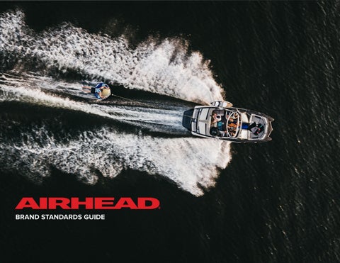
BRAND STANDARDS GUIDE
1
WHAT’S INSIDE
01
07
17
22
THE BRAND
LOGO STANDARDS
VISUAL ELEMENTS
PACKAGING GUIDELINES
28
34
56
PHOTOGRAPHY GUIDE
VIDEO GUIDELINES
COPYWRITING STYLE
THE BRAND
1
WHO WE ARE
WHO WE ARE Airhead is a premium watersports brand focused on creating high-quality fun products for families and their friends. Innovative, well-designed products that encourage kids and adults to get outdoors, be active, and most importantly have FUN. Airhead offers equipment that is bold-yetrefined, innovative-yet-approachable, and made for making memories, season after season.
2
OUR VALUES
Fun Every Airhead product is about delivering one simple albeit ever-elusive thing—family fun. The kind that can only be experienced in the great outdoors surrounded by the people you love.
Originality Airhead doesn’t create “me-too” products, but original designs that bring something new to the table or improve upon an existing product or product category.
Quality Airhead offers high-quality watersports products designed to last season after season.
Innovation Airhead develops product innovations that help families get the most out of the great outdoors.
3
OUR WHY
We make high-quality fun products for families—both kids and adults. We make unique and original products that get families excited about spending time together outdoors; we innovate so that families experience maximum enjoyment while participating in watersports-related activities.
4
IS VS ISN’T
Airhead Is • • • • • • • •
Bold Modern Distinct An Outdoor Lifestyle Brand Family Fun Accessible Inventive Collaborative
Airhead Is Not • • • • • • • •
Hesitant Dated Generic A Faceless Manufacturer Enthusiasts Only Intimidating Imitative Siloed
5
ELEVATOR SPEECH Airhead offers premium watersports products that make it easy for families to get more out of the great outdoors. Our original designs, industry-first innovations, and commitment to quality exist to d eliver season after season of family fun and a l ifetime of memories.
6
LOGO STANDARDS
7
PRIMARY LOGO RED
This is the preferred logo for Airhead. Minimum printed size for this logo is 1.5”, when this minimum width is not allowed in the space: the favicon is preferred. The use of the outlined version should only be considered when the black, red, or white versions are impossible to reproduce on the selected medium, or to stand out on a busy background. While the logo depicts the brand name in all caps, in common writing usage only the “A” should be capitalized in Airhead.
8
SECONDARY LOGO BLACK
Use the secondary logo when the primary logo is impossible to use. Minimum printed size for this logo is 1.5”, when this minimum width is not allowed in the space: the favicon is preferred. The use of the outlined version should only be considered when the black, red, or white versions are impossible to reproduce on the selected medium, or to stand out on a busy background. While the logo depicts the brand name in all caps, in common writing usage only the “A” should be capitalized in Airhead.
9
TERTIARY LOGO WHITE
Use the tertiary logo when the primary and secondary logos are impossible to use. Minimum printed size for this logo is 1.5”, when this minimum width is not allowed in the space: the favicon is preferred. The use of the outlined version should only be considered when the black, red, or white versions are impossible to reproduce on the selected medium, or to stand out on a busy background. While the logo depicts the brand name in all caps, in common writing usage only the “A” should be capitalized in Airhead.
10
FAVICON 2-COLOR
The favicon should never take the place of the logo unless space does not allow for the full logo. For example, social media icons. There are four color options available for use. As a complimentary logo, the selection of color should be made in conjunction with the main logo.
1-COLOR RED 1-COLOR RED
1-COLOR BLACK 1-COLOR BLACK
If the favicon is used independently of the logo, the 1-color favicon is considered primary: first try red, then black, and last white. The use of the outlined version should only be considered when the favicon is placed on a busy background.
1-COLOR WHITE 1-COLOR WHITE
When placing the logo on apparel, the favicon must be within visible proximity of the logo.
2-COLOR 2-COLOR
1-COLOR RED
11
FAVICON DESIGN ELEMENT
The favicon can also be used as an additional design element to reinforce the logo, but should never be placed next to or appear as the logo itself. Tints of the red, black, and white favicons may be used when the favicon appears as a large graphic element in layout. For legibility, no more than 25% of any two sides should be cropped off.
FAVICON SAFE ZONE
12
CLEARSPACE
It's important to maintain a minimum between the logo and other text and graphics. It keeps the logo from being crowded and ensures visibility and impact. As a unit of measurement, “x” equals the height of the AIRHEAD name. There should always be clear space around the logo equal to the distance of “x.” These rules apply to all versions of the Airhead wordmark.
13
UNACCEPTABLE LOGO USAGE
Proper use of the Airhead logo creates a consistent presence across all materials and touch points. Please avoid altering the Airhead logo in any way that lessens this consistency or makes the logo less recognizable.
Do not change the color or tone outside of the specifications on page 15.
Do not add effects such as drop shadows or bevels.
AIRHEAD Do not stretch or squeeze, always scale in original proportions.
Do not change the typeface or re-create the logo in any way. Only use provided logo files.
Do not place the logo on an angle.
Do not create a stroke or keyline version of the logo.
14
PRODUCT NAMES
Product names are featured alongside the Airhead logo as a secondary element. They are typeset in all caps using the Campaign font. The sizing can vary depending on the application and overall legibility. The height of the product names should never be larger than 3/4 of the Airhead logo height or smaller than 1/2. They align with the interior corner of the left stem of the character “A” and their length should never exceed the width of the logo. The space between these elements is equal to 3/4 of the Airhead logo height.
MA XIMUM HEIGHT
MINIMUM HEIGHT
ALIGNMENT
SPACING
15
PRODUCT NAMES COLOR
When in use outside of packaging, the paired Airhead logo and product name should always assume the same color. The color hierarchy follows the lead of the Airhead logo. As the primary color, red should be used unless there are printing limitations or contrast issues leading to bad legibility.
PRIMARY COLOR
SECONDARY COLOR
TERTIARY COLOR
16
VISUAL ELEMENTS
17
COLOR PALETTE
The Airhead color palette features bright, bold colors that convey a quality experience.
PRIMARY COLORS
Red and black are the primary brand colors, but complementary grays can be used in backgrounds, overlays, copy and subheads, or accent graphics. The accent color palette should be used sparingly; the color in a design should come first from the photography and primary colors. Use the accent color palette as a starting point for graphic and product design.
PMS: 2035 C
PMS: Black C
#E71B25
#000000
SECONDARY COLOR PALETTE PMS: Cool Gray 11 C
PMS: Cool Gray 9 C
PMS: Cool Gray 7 C
PMS: Cool Gray 4 C
PMS: Cool Gray 1 C
PMS: White
#53555A
#757679
#959798
#BBB9BA
#D8D7D6
#FFFFFF
Legibility and contrast should always be considered when applying color. ACCENT COLOR PALETTE PMS: 2627 C
PMS: 2084 C
PMS: 7694 C
PMS: 306 C
PMS: 2197 C
#3C1151
#80298F
#0C426B
#00B2E2
#72C9D2
PMS: 368 C
PMS: 2297 C
PMS: Yellow C
PMS: 1375 C
PMS: 1655 C
#75BB21
#BDD971
#FDDC00
#FF9E18
#FF4D00
18
TYPOGRAPHY
There are two primary typefaces that represent the Airhead brand. Campaign is a bolder, stylized typeface used in prominent applications to draw the attention of the viewer. It is best used for headlines, subheads, and key product information on packaging (product names, key facts, section titles). Proxima Nova is a refined typeface used to communicate longer amounts of information or subtle details. It is best used for intro and body copy on the website and marketing materials as well as detailed information on packaging.
H1
H1 Header Campaign Black 26pt/32pt.
H2
H2 Header Campaign Bold Italic 18pt/26pt.
H3
H3 Header Proxima Nova Condensed Semibold 16pt/24pt.
P1
Paragraph Style 1: Proxima Nova Regular. Larger intro copy to grab the reader’s attention and draw their eye deeper into the body copy. 14pt/20pt with tracking at 20.
P2
Paragraph Style 2: Proxima Nova Medium. Body copy is optimized for easy reading while also providing a nice texture on the page. 12pt/18pt.
P3
Paragraph Style 3: Proxima Nova Regular. Smaller paragraph style used to add details. 10pt/14pt in Cool Gray 7 C.
Typography shown here should be used as a starting point and scaled appropriately for each application.
19
ICONOGRAPHY OVERVIEW
Iconography is used in select instances on product packaging and the website to quickly call attention to key benefits or product features. The selection and creation of icons should be limited to a core set that creates a consistent and recognizable visual language for buyers and owners. When applying icons, it is important to practice restraint, limiting use to no more than 6-10 at a time. The icons shown are examples of the Airhead iconography style, showcasing the importance of a consistent design that is scalable and repeatable.
Diameter at 0.75” Outer Circle Stroke = 2.5pt Inner Icon Stroke = 1.75pt Stroke Caps = Butt Cap Stroke Corners = Round Join
ZIPPERS
COMPRESSION MOLDED
KWIK-CONNECT
WELDED SEAMS
PADDED HANDLES
PROGRESSIVE RAILS
BOLSTER FINS
BUCKLES
PATENTED SPEED SAFETY VALVE
FREEDOM OF MOVEMENT
0.75”
20
ICONOGRAPHY COLOR
Iconography should be represented in one of two color options, black or white. While Airhead red is the prominent brand color, red iconography can be perceived as a hazard warning by the consumer.
21
PACKAGING GUIDELINES 22
PRODUCT PACKAGING OVERVIEW
Airhead packaging utilizes a clean, distinct design centered around brand recognition and easy-to-read product information. The following are significant elements that remain consistent across Airhead product packaging. These elements are further defined in the subsequent pages. Prominent Logo Product Name Trilingual Product Details Studio Still Action Image Features & Iconography Product Families
23
PRODUCT PACKAGING
Prominent Logo The Airhead logo is prominently displayed on the lower third, in white, and runs horizontally along the box's entire width for easy and consistent recognition.
Product Name Product names are secondary to the logo. The name is placed below the logo, set in red using the Campaign font with all caps.
Trilingual Product Details All product details are translated into three languages; first listed in English, next in French, and last in Spanish. We "try for tri" but will consolidate to English and French if space is limited.
Studio Still The product's studio image is displayed to offer buyers a comprehensive view of the item they are purchasing.
24
PRODUCT PACKAGING
Action Image The action image highlights the product's intended use. In addition, the photo allows customers to have greater context into how the product performs. For more details on action imagery, please reference page 32. Action imagery is placed on most, not all, packaging.
25
PRODUCT PACKAGING
Features & Iconography Airhead devotes a portion of its packaging to showcase the features and benefits of each product. As a standard, the four most beneficial features are selected and listed in order of importance and relevance. They are vertically stacked, shown in the color white, and translated into the three standard languages. Each feature is also visually communicated through an icon. For guidelines on iconography, please reference page 20. The features must remain the same size across a family of products to ensure consistency when displayed together. Therefore, use the smallest box as a guide for the entire family. Three features are permitted when four features are not available. In addition, the features may be presented horizontally if the box is too narrow for vertical display.
26
PRODUCT PACKAGING
Product Families Products offered as a family are showcased on Airhead packaging for consumer education and to highlight product assortment. Each product, including the product inside the box, is listed horizontally with its name and distinguishing difference. The product family graphic is the only instance in which the favicon can be used on packaging.
27
PHOTOGRAPHY GUIDE
28
OVERARCHING VISION CANDID & CAREFREE
A style best described as authentic, playful, and lighthearted, Airhead photography should capture the pure joy that comes from spending time on the water with your favorite people. The value and quality of the product is reinforced by the value and quality of time spent together.
29
PHOTOSHOOTS MODEL CRITERIA
Model Selection We strive for diversity within model choices and selection — such as gender, race and ethnicity, and age groups. Model selection is made within the scope of availability and an individual's capability to physically perform on shoots. Placement on product is also determined in consideration of the criteria mentioned above.
Appearance Apparel should not detract attention from the focal point of our products in use. Therefore, our models are to wear swimsuits that are ideally solid colors or have minimal design — acceptable prints are up to the photographer's discretion. Additionally, all swimsuits need to be selected within the parameters of good taste and family appeal. Our goal is to minimize the visualization of tattoos. Models will not be removed due to tattoos but their participation may be selective.
30
PHOTOGRAPHY DIRECTION STUDIO
The focal point of studio photography is product exclusive. These images are primarily used on the web as they provide closeups of features and benefits, highlighting the product's unique value proposition. We have established a consolidated shot list that meets customer image requirements of angles and features for our inline product assortment.
31
PHOTOGRAPHY DIRECTION ACTION
The focal point of action photography is the product in use. Action images are primarily used on our packaging to give context to the product's performance and appearance. For example, the images provide a better perspective on product size and riding style, to list a few. Our goal is to show the product in action, staying mindful of the intensity of the product. The enduser should be considered when capturing the experience. For example, airborne images may cause consumers looking for a mellow experience to stray from a product due to the misconstrued message that the product is high-intensity. The photographer is expected to maintain a standardization between the life jackets and the product being ridden. Life jackets should not distract from the focal point of the shot—the product itself. Ideally, a strong action image captures the Airhead logo on the product in prominent view.
32
PHOTOGRAPHY DIRECTION LIFESTYLE
The focal point of our lifestyle photography is capturing the fun and carefree lifestyle that our product supports. The products, in these instances, are secondary to the experience shared between family and friends. Rotating model groupings, swimsuits, and products within one photoshoot provides diversity and imagery volume. Consider using multiple swimsuits and various products to accomplish this goal.
33
VIDEO GUIDELINES
34
VIDEO GUIDELINES The video guidelines help Airhead videographers create production consistent with our brand. In addition, these guidelines help create standard footage that reflects the company’s marketing identity and communication.
35
OVERARCHING VISION CANDID & CAREFREE
A style best described as authentic, playful, candid, and lighthearted, Airhead videography should capture the experience that comes from spending time on the water with your favorite people. The value and quality of the production is reinforced by the value and quality of time spent together. When shooting and producing video content, strive to capture the moments as they naturally happen. Allow the moment to drive the narrative.
36
LOGO USAGE
Only use the latest high-res logos provided by Airhead’s Marketing Team. The logo should not be included in any lower thirds. The use of an outlined version should only be considered when the red, black, or white versions are impossible to reproduce on the selected medium or to stand out on a busy background.
37
TYPOGRAPHY
Two primary typefaces represent the Airhead brand, Campaign and Proxima Nova.
H1
H1 Header Campaign Black 26pt/32pt.
H2
H2 Header Campaign Bold Italic 18pt/26pt.
H3
H3 Header Proxima Nova Condensed Semibold 16pt/24pt.
Campaign is a bolder, stylized typeface used in prominent applications to draw the viewer's attention. Proxima Nova is a refined typeface used to communicate longer amounts of information or subtle details. While most typography applications are defined in the subsequent pages, best judgment should be used for new applications.
38
COLOR PALETTE
Airhead's primary colors should be used consistently and meaningfully in elements like lower thirds, intro backgrounds, and outro backgrounds.
PRIMARY COLORS
The accent color palette is mainly used in product video thumbnails.
PMS: 2035 C
PMS: Black C
#E71B25
#000000
SECONDARY COLOR PALETTE PMS: Cool Gray 11 C
PMS: Cool Gray 9 C
PMS: Cool Gray 7 C
PMS: Cool Gray 4 C
PMS: Cool Gray 1 C
PMS: White
#53555A
#757679
#959798
#BBB9BA
#D8D7D6
#FFFFFF
ACCENT COLOR PALETTE PMS: 2627 C
PMS: 2084 C
PMS: 7694 C
PMS: 306 C
PMS: 2197 C
#3C1151
#80298F
#0C426B
#00B2E2
#72C9D2
PMS: 368 C
PMS: 2297 C
PMS: Yellow C
PMS: 1375 C
PMS: 1655 C
#75BB21
#BDD971
#FDDC00
#FF9E18
#FF4D00
39
PRODUCT VIDEOS INTRODUCTORY & CLOSING SCREENS
Introductory The product video introductory graphic includes photos of current products, the Airhead logo, the product's name, and the product category. All text is in Campaign Black and Proxima Nova.
Closing The video ends with the screen fading to white and the appearance of the Airhead logo. The Facebook, Instagram, YouTube, and Pinterest favicons are positioned at the bottom of the screen approx. 0.5" apart, followed by Airhead.com. Social icons and website URL are removed from the closing and exported exclusively for Amazon. This version is not available for mass use.
40
PRODUCT VIDEO YOUTUBE THUMBNAIL
Thumbnail guidelines create consistency and allow viewers to find the video that best meets their needs quickly. The YouTube thumbnail for the Product Videos consists of the product action image, typically the packaging shot. The product name is placed within the lower third of the image using Campaign in white. The color box behind the product name utilizes our accent color palette and is consistent within product categories. The color representation is as follows: Purple — One Rider Towable Light Blue — Two Rider Towable Lime Green — Three Rider Towable Light Orange — Four Rider Towable Dark Blue — Wakesurf Boards
41
HOW-TO VIDEO INTRODUCTORY & CLOSING SCREENS
Introductory The how-to video opens with the narrator introducing the topic being covered. Following the opening scene, the introductory graphic for the how-to videos matches the introductory graphic for product videos with two exceptions: it replaces product photos with lifestyle photos and only includes one title—the video name.
Closing The video ends with the screen fading to white and the appearance of the Airhead logo. The Facebook, Instagram, YouTube, and Pinterest favicons are positioned at the bottom of the screen approx. 0.5" apart, followed by Airhead.com. Social icons and website URL are removed from the closing and exported exclusively for Amazon. This version is not available for mass-use.
42
HOW-TO YOUTUBE THUMBNAIL
Thumbnail guidelines create consistency and allow viewers to find the video that best meets their needs quickly. The YouTube thumbnail for the how-to Videos is the same as the introductory graphic for that video.
43
LIFESTYLE INTRODUCTORY & CLOSING SCREENS
Introductory For the lifestyle video introduction, the Airhead logo is present as soon as the video begins. The logo stays on the screen for 0:05, then fades as the frame transitions.
Closing The video ends with the screen fading to white and the appearance of the Airhead logo; the logo size is the same as the intro logo. The Facebook, Instagram, YouTube, and Pinterest favicons are positioned at the bottom of the screen approx. 0.5" apart, followed by Airhead.com. Social icons and website URL are removed from the closing and exported exclusively for Amazon. This version is not available for mass-use.
44
LIFESTYLE YOUTUBE THUMBNAIL
Thumbnail guidelines create consistency and allow viewers to find the video that best meets their needs quickly. The YouTube thumbnail for lifestyle content features a vibrant photo from inside the video or a lifestyle photo taken at the same shoot. The thumbnail image selected should be exciting and entice the viewer to watch the rest of the video.
45
DOCUMENTARY / CINEMATIC SERIES OPENING CREDITS
The opening of a docuseries must contain the name of the producer, who it’s presented by, and the title. The opening scene also must start with a clean video and be accompanied by music or background noise. The producer can then add the film intro and logos throughout the subsequent frames.
A Crow Production Series
Presents
46
DOCUMENTARY / CINEMATIC SERIES SERIES TITLE AND CLOSING
Series Title The series title is intended to stand out and have a clean and sleek look. After the title, the film officially kicks off.
Closing Following the closing scene, the video will fade to black with the necessary credits if they are to be named. All credits will be set in Proxima Nova. The video will fade to black showing only the Airhead logo after the credits. Upon request, Airhead allows flexibility with introductory, closing, and coloring of scenes.
47
DOCUMENTARY / CINEMATIC SERIES COLORING
Desaturation The coloring of all docuseries will have a desaturated look. Desaturation is often used to portray honesty and add drama to a scene. It also enhances the cinematic experience and creates an upscale feel.
Film Grain Digital Noise Film grain is often used in action series and advertising. It adds a cinematic and authentic quality to the subject and production as a whole. Upon request, Airhead allows flexibility with introductory, closing, and coloring of scenes.
48
DOCUMENTARY / CINEMATIC SERIES LOWER THIRD
Introductory text in the lower thirds is necessary to introduce information in a docuseries. The lower third is left-justified and starts on the edge of the frame. Lower thirds always utilize white text, and the fonts are set in Campaign Black and Proxima Nova. A red line separates the primary information from the secondary information—for example, the name and the individual's title.
JAKE NOBLE
WOODSFIELD OHIO
PROFESSIONAL WAKESURFER NAME AND TITLE
LOCATION
Lower thirds are to be used sparingly and never incorporate a logo.
JAKE NOBLE
PROFESSIONAL WAKESURFER LOWER THIRD IN USE
49
DOCUMENTARY / CINEMATIC SERIES YOUTUBE THUMBNAIL
Thumbnail guidelines create consistency and allow viewers to find the video that best meets their needs quickly. The YouTube thumbnail for a docuseries is an interesting shot from the video. The image is darkened so viewers can read the episode's name clearly across the frame. The text will always feature Campaign Bold and Proxima Nova with a hint of a drop shadow.
50
VIDEO SPECIFICATIONS ASPECT RATIO
16:9 Ratio
Ratio Exception
Tech Specs for Final Export
Aspect ratio is an essential factor in a viewing experience. The more a video fills the screen, the more immersive an experience it provides. Most modern screens are set to a 16 by 9 ratio, and Airhead videos should follow this standard.
If possible, archival footage shot in a 4:3 ratio should be scaled to fill a 16:9 frame. Exceptions to the 16:9 rule can be made on a case-by-case basis.
Container: MP4 or MOV Audio Codec: AAC-LC Sample Rate: 48khz Video Codec: H.264 Frame Rate: 24fps
51
VIDEO SPECIFICATIONS VIDEO QUALITY
Resolution
Frame Rate
Bitrate
Videos produced for Airhead should be recorded at a minimum of 1080p and exported at the same or higher quality.
All final videos should be output at 24fps (true 23.98fps). Exceptions can be made for extenuating circumstances.
All footage should be recorded at the highest possible bitrate available. High bitrate allows for better color, detail, and video quality in the final product.
No footage below 720p should be used unless it is archival footage.
52
VIDEO SPECIFICATIONS AUDIO
Background Noise
Quality
Music
If background noise is needed, please keep it at a reasonable level in the video. Avoid locations with distracting background noise. Wireless lavalier mics should be set to frequencies that avoid frequency noise.
Please avoid any distortion or clipping. If audio includes incidental background noise, remove it if possible. Compression may be used to normalize audio levels without artifacts or distortion.
All music must be royalty-free or purchased, absolutely no exceptions.
53
VIDEO SPECIFICATIONS FILE NAMING & DELIVERY
File Naming
Completed/Edited Videos
Delivery
From the start, all files should be named in an intelligent manner and include dates.
Use the following naming format for completed videos:
All edited videos must be delivered via one of the following:
Airhead_Wakesurf_Fraction_2020_SpencerJ Airhead_Lifestyle_Towables_2020_HaydenS Airhead_HowTo_Kwik-Connect_2020_SpencerJ
DropBox WeTransfer Google Shared Drive Hard Drive (Mac & PC Compatible)
54
VIDEO SPECIFICATIONS SOCIAL MEDIA
As social media platforms and algorithms are ever-evolving, social video specifications are likely to change. Should a party require updated details, a separate resource guide will be provided upon request.
55
COPYWRITING STYLE
56
BRAND VOICE
Brand Statement The Airhead brand is relatable, encouraging, playful, trustworthy, and family-friendly. We are experts in outdoor recreation and pioneers in high-quality, innovative watersports.
Mission The Airhead is to foster and promote a fun watersports lifestyle in a family-friendly manner that creates a premium experience.
57
BRAND VOICE DO'S AND DON'TS
Do
Do Not
•
Be a champion for the Airhead brand and its products.
•
•
Leverage storytelling to illustrate the kind of experiences the brand's products can create.
Stretch the truth on a product’s capabilities or take an overly promotional approach.
•
When appropriate, illustrate exactly how products can and should be used, including what they aren't meant for.
Use industry jargon without explaining it, unless it's a hyper-specific product.
•
Pass up opportunities to illustrate expertise or paint a picture of a product’s capabilities.
•
Assume the customer knows what specific brand name or jargon terms are.
•
Be condescending, overly casual, or egotistical.
•
Use excessive humor or offensive language, like swear words.
•
Specify male/female products according to color or pattern.
•
•
Use inclusive and appropriate language across platforms.
•
Foster inclusion and equity in the outdoors.
•
Speak with confidence about our product and industry knowledge.
•
Take a gender-neutral stance on products.
•
Use complete sentences.
58
BRAND TONE
Use a family-friendly, relatable tone. Be inspiring and uplifting. Encourage themes of fun, relaxation, making memories, enjoying life, playing with friends, and being carefree. Illustrate environments where a product is used. Employ imagery like sunshine, heat, summer, cooling off, lounging, and vacation. Use colloquial language where appropriate, for example, "shred the gnar." Target pain points only when you offer a clear solution—for example, tired of losing your rope? X product can help. When possible, bring attention to product safety, and be sure to spotlight Airhead's unique patented products. When necessary, get into the nitty-gritty of product details to emphasize capabilities and benefits.
59
BRAND TONE GRAMMAR
Use active language, except when varied sentence structure is important for clarity. For example: Use: “Patented Speed Safety Valves and a Kwik-Connect tow point make this towable tube easy to inflate, deflate, and attach.” Instead of: “Inflating, deflating, and hook-ups couldn’t be faster with Patented Speed Safety Valves and the Kwik-Connect tow point.” Follow AP style, with a few exceptions: Use the Oxford comma for clarity Use the em dash without spaces Use single exclamation points to illustrate excitement. Speak in second person when posting on social channels to help the customer envision using the product. Speak in first person when describing products. Don’t write brand names in all caps—Airhead should be used instead of AIRHEAD.
60
BRAND TONE PRODUCT MEASUREMENTS
When defining product specs in written copy, use the rules below to ensure consistency. •
Use apostrophes or quotation marks when referring to measurements in a product title.
•
Add spaces between numbers and units of measurement (e.g., 5 feet not 5ft.)
•
Add spaces between x’s in measurements (e.g., 5’’ x 5’’ not 5’’x5’’.)
•
Put measurements in parentheses after text for clarity.
•
Be aware of the spelling of foot when it acts as a modifier (e.g., 10 feet tall, 10-foot tree.)
•
Hyphens are only used when the measurement modifies the noun directly (e.g., 1500-pound break strength.)
•
Spell out numbers one through nine, except in headlines, where the numeral supports SEO and succinctness.
•
Spell out 12-volt pump, or 12 volts, rather than 12v.
61
We are proud to be the industry leader in towable tubes and championing fun, originality, quality, and innovation in and on the water. For more on our brand, please visit airhead.com.
62