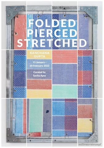
FOL D E D P I ERC E D STR ETC H E D KANCHANA G UPTA 15 January 20 February 2022 Curated by Savita Apte
02
05 Introduction: Savita Apte
06-16 Artworks
18-26 Hyperreal Ecstasies: Savita Apte
28-39 Artworks
40-53 Material to Metaphor: a conversation with Lourdes Abela Samson
54-57 Artworks
58 Biography
60-64 Curriculum Vitae
66 Acknowledgements
03
04
Folded Pierced Stretched chronicles Kanchana Gupta’s approach to the industrial medium of tarpaulin and encapsulates her exploration of new and repurposed commercial materials that proliferate in urban construction sites. Intentionally shifting between flatness and three-dimensionality, these works extend her meditations on sculpture and her ongoing investigations into materiality and process: incorporating non-traditional and unconventional art-making techniques. Gupta layers, overlaps, folds, stacks, stretches and pierces an accretion of paint skins reflecting the complex relationship between their natural plasticity and their newly acquired identity. Gupta focusses on the junctions between visual culture and socioeconomics, connecting urban geographies and migrant experiences to offer more nuanced perspectives on being and belonging. In showcasing under-represented narratives and questioning pre-conceived notions of value through the use of scale, Gupta collapses the distance between ordinary and precious, intimate and monumental, real and fabricated.
By Savita Apte
05
Folded Pierced Stretched #001 : Blue White Blue, 2021 Oil paint skins with silk screen printing Galvanised Steel Frame Unistrut 40 mm x 40 mm x 41 mm thickness Steel Eyelets and suspension cable 202 cm x 182 cm x 4.1 cm
06
Folded Pierced Stretched #001 : Blue White Blue, 2021 (Details)
07
Folded Pierced Stretched #002 : Blue Red Blue, 2021 Oil paint skins with silk screen printing Galvanised Steel Frame Unistrut 40 mm x 40 mm x 41 mm thickness Steel Eyelets and suspension cable 180 cm x 196 cm x 4.1 cm
08
Folded Pierced Stretched #002 : Blue Red Blue, 2021 (Details)
09
Folded Pierced Stretched #003 : Blue Red Grey Blue / Blue Green Blue, 2021 (Front View) Oil paint skins with silk screen printing Galvanised Steel Frame Unistrut 40 mm x 40 mm x 41 mm thickness Steel Eyelets and suspension cable 178 cm x 194 cm x 4.1 cm
10
Folded Pierced Stretched #003 : Blue Red Grey Blue / Blue Green Blue, 2021 (Back View)
11
Folded Pierced Stretched #010: Red Blue Red / Blue White Blue, 2021 Oil paint skins with silk screen printing Galvanised Steel Frame Unistrut 40 mm x 40 mm x 41 mm thickness Steel Eyelets and suspension cable 127cm x 172 cm x 4.1 cm
12
Folded Pierced Stretched #010: Red Blue Red / Blue White Blue, 2021 (Details)
13
Folded Pierced Stretched #006 : Blue Blue Red Yellow, 2021 Oil paint skins with silk screen printing Galvanised Steel Frame Unistrut 40 mm x 40 mm x 41 mm thickness Steel Eyelets and suspension cable 142cm x 176 cm x 4.1 cm
14
Folded Pierced Stretched Stacked #001 : Red Blue Red, 2021 Oil paint skins with Eyelets 35 cm x 42 cm x 30 cm
15
Folded Pierced Stretched Stacked #004 : Yellow Green Pink Green Yellow Purple Pink Blue, 2021 Oil paint skins with Eyelets 42 cm x 45 cm x 30 cm
16
17
Hyperreal Ecstasies The simulacrum is never that which conceals the truth. It is the truth which conceals that there is none. The simulacrum is true. Ecclesiastes1
Baudrillard argued that a simulacrum is not a copy of the real but becomes a truth in its own right, expounding the concepts of simulacra and semiurgy in a provocative combination of social and cultural critique in which examined the positional relationship between reality and symbol in contemporary society.2 Baudrillard suggested that the contemporary world is so distorted by an over-abundance of images, information and illusion, that it offers art makers the possibility of exploring a new terrain of experience: one which allows the viewers to escape from “the desert of the real” to the ‘ecstasies of hyperreality’.3 It is this assertion that informs Gupta’s artistic intervention. Originally from India, Kanchana Gupta currently lives and works in Singapore and her practice deliberately delineates connections between the two nations. Linking the two megacities of Singapore and Mumbai, both of which she has
called home, Gupta’s works offer a personal exploration of and a thoughtful response to the urban environments she inhabits. Under the guise of flux, almost every global metropolis appears to reverberate with real estate developments, trending towards residential gentrification together with a concentration of phototropic skyscrapers bracketed within the parameters of newly imagined business districts. The rapid urbanisation of Singapore, articulated by the swathes of tarpaulin that colour the city state’s skyline, echo Gupta’s memories of Mumbai’s momentous building spurt and consequent proliferation of tarpaulin covered urban slums spreading into a fragmented and collaged blue horizon. In Gupta’s mind, the patch-worked tarpaulins evoke barriers – barriers against the elements, against people, against homelessness, against the physical, social and metaphysical. Their tactile presence chronicles patterns of
1 Quoted from Baudrillard. J. 2001, Selected Writings. Cambridge: Polity. P169. The quote is itself a simulacrum as it does not occur in Ecclesiastes. See "Ecclesiastes 1 (New International Version)". BibleGateway. Retrieved 1 January 2022. 2 Baudrillard, Jean. 1994. Simulacra and simulation. University of Michigan Press. 3 Kellner, Douglas, "Jean Baudrillard", The Stanford Encyclopedia of Philosophy (Winter 2020 Edition), Edward N. Zalta (ed.), URL=<https://plato.stanford.edu/archives/win2020/entries/baudrillard/>. Retreived 3 January 2022.
18
transformation, underscored by the current epoch’s preoccupation with accumulation, consumption, mobility and urbanism. Urbanism which was once defined as the art, science and technology of developing human settlements, now describes the inherent shift in the fundamental framework, conditions and values embedded in urbanisation and tarpaulin may be seen to archive the character of these transformations. Gupta’s deep investigation into the inherent characteristics and the profound social effect of tarpaulin is assembled in Folded Pierced Stretched (Singapore, 2022).
empires and continental adventures, tarpaulin gradually migrated inland to protect goods and tented accommodations during transit, but it was during the industrial revolution that tarpaulin proliferated. No longer confined to its original heavy canvas but manufactured instead from a variety of man-made materials, mass produced tarpaulin became ubiquitous and was applied across domestic as well as industrial situations. Quotidian and overlooked, recovered and reused, the fabric is an evocative signifier of construction and of conflict; so that the material itself has become contextually documentary.
Gupta’s homage to tarpaulin is a testament not only to her mature and dexterous interweaving of the potentialities of process and materiality, but also to her indomitable spirit to keep pushing against the intrinsic limitations they present.
The word tarpaulin is a portmanteau of palling, a type of heavy cloth, and tar, and was originally used by seafarers to protect goods from salt and water damage during passage. Invoking naval
Over the last decade, Gupta has pursued her fascination with the materiality of paint, approaching it with the excavational zeal of an archaeo/anthropologist. Taking her direction from the physicality of the medium, Gupta continues to explore its transformation through processes like
19
heating, burning and tearing, to create flat, wall-based work and sculptural installations. In so doing, Gupta has exploited a comprehensive understanding of material and process and extended the material and social potentialities of sculpture in innovative and refreshing ways. Gupta’s laborious interventions have harnessed both studio as well as industrial processes, stridently underscoring the tension between deconstruction and reconstruction. Each work she contemplates leads to a series of investigations and each series becomes the foundation for the next.
Every series that Gupta creates, further extends her exploration of the potentialities of studio mediums like oil paint in unexpected juxtapositions with culturally loaded material like vermillion powder, henna, silk and sandalwood powder or quotidian material like jute, canvas and tarpaulin. Gupta’s process involves an unremitting mining of weaves, textures, patterns and structures, through which she mediates an ongoing commentary on the conditions and visibility of social inequities.
20
In Traces and Residues (Singapore, 2017), Gupta’s practice directed attention towards migrant labour which facilitates urban transformation only to be further marginalised by the gentrification.
In 458.32 Square Meters (Singapore, 2019) unexpected appositions of iconic identity and social symbolism were in turn manipulated, to express the accrual of lived experience and the psychological landscapes of rupture. The meticulously crafted works, encoded as metaphors for concealments and revelations, were at once delicate and assertive. Pushing the limits further still, Gupta stacked, heaped and folded, venturing into a series of industrially compressed sculptural forms,
(Compressed And Cut, 2019), which were in turn cleaved to expose a personal geology of loss and longing. Each process betrays the anxieties that torment the artist, a vulnerability that Gupta furiously denies.
The works exhibited in Traces and Residues and 458.32 Square Meters were discrete constructions, singularly complete, unencumbered by the presence of an audience. The titles of the shows, with intentioned opacity emphasised this distance while the works with their signature jagged cracks conveyed a deliberate reserve.
Folded Pierced Stretched, on the other hand, operates on a level that engages the viewer in dialogue, inviting interpretation. Paint becomes a wilful agent within the artistic process, blurring the distinction between reality and its representation.
Gupta adroitly exploits the materiality of paint in its juxtaposition to and interaction with construction materials. Its skilful transformation underscores the importance of Gupta’s process, while the deliberate shifts between flatness and three-dimensionality amplify her earlier meditations on sculpture. Tactility is communicated through material cues.
The artwork’s physicality – those aspects that can be sensed and verified by viewers, is her primary consideration; for Gupta, physicality impacts aesthetic perception, mimetic potential, cultural and social impact, content and, subsequently, meaning. Similarly, Gupta believes that the viewer’s aesthetic experience is evoked initially through the artwork’s physical components, which entangles the audience in a web of connections that expand the notions of space and process, mediated through an intellectual engagement with the work’s materiality. Gupta’s art provides a bridge between ordinary experience and concepts that transcend the seemingly static nature of the work’s physicality. The exhibition Folded Pierced Stretched occupies an art deco white cube space
21
tarpaulin sheets appropriated construction sites.
from
Once the viewer confronts the work however, it slowly reveals itself to be other than what was initially inferred, subverting the notion of reproduction. In re-producing the ‘tarpaulins’, Gupta knowingly distils mass produced material into a unique work of art.
which reverberates with a colonial past: which intentionally amplifies the associations which are implicit in the silkscreen treatment of the surfaces; while significant material undertones layer the meaning and context of each work. There is an obvious and subliminal range of references which allow the exhibition to be apprehended across several registers. Viewed from a distance, this universe of simulations deliberately confounds the senses. At first glance, visually and texturally, the works look deceptively like found objects: mass produced, machine-made commercial products or discarded
Gupta’s works bring a heightened attention to labour – in the laborious methods she employs as well as by the invocation of tarpaulin which is associated globally with menial and migrant labour. Each work is the result of a meticulous studio process through which the artist’s presence is clearly detected in the deposits, suprasemiotic marks, and imperfections that add character and conceptual depth.4 It becomes apparent that the works are a marriage of concept and skill and each work is bestowed with an enantiomorphic aura. Stretched and tethered, the fields of colour exert a primal and mystic power, where colours reverberate, wrapping the viewer in a cascade of interactions. Up close, the precise contours and the abrupt transitions between colour, separated
Mieke Bal. 1991. Reading “Rembrandt”: Beyond the Word-Image Opposition Cambridge. P400 Bal suggests that “the field of signs and meanings” can be divided into “subsemiotic and suprasemiotic or holistic” marks.
4
22
by pristine white lines, contained by the cold edge of metal scaffolding, carry the formal echoes of hard edge painting which extend to the floor sculptures, despite both being contrarily saturated in texture and meaning and the culmination of meticulously controlled transformations.
Materiality as an aesthetic concept evolved out of formalism’s interest and Gupta’s aesthetics can be traced back to influences from the Mono-Ha movement in Japan and its American counterpart of material led practice seen in the sculptural works of Eva Hesse and Richard Serra for example. Gupta deliberately subverts the definition of industry – from a collective word for the general activity of manufacturing and productive institutions – which produce tarpaulin, choosing instead to recover an older meaning which invokes the human attributes of skill, assiduity, perseverance and diligence, which are utilised to produce the simulacra. In Folded Pierced Stretched, Gupta strives to take her art beyond the limits of matter and technique: in order to engage critically with meaning, she processes reality and supersedes it.
Behind each work lies a laborious studio process: paint is manipulated in an unhurried, meditative ritual as it is loaded and layered with studied repetition onto a tarpaulin base to form paint skins. The accumulation, amounting to fifty meticulous coatings and often more, is allowed to dry and then ceremonially flayed. The delicate accretions, with the exposed cutis which now retains the traces, patterns and memory of the tarpaulin substructure, are then grafted onto both sides of a construction canvas support. In the process, the inverted order of the membranes renders the cutis uppermost, exposing the texture and patterning of the parent tarpaulin. These dermal
23
constructs are then industrially screen printed to introduce pigmentations, which in turn archive the spectrum of colour and pattern combinations of contemporary construction site tarpaulin. Finally, the ragged edges of the dermal layers are trimmed and cropped, revealing Gupta’s intense obsession with detail and the selvages are folded to create the dense hems required to receive the eyelets. Throughout, whether employing studio processes or industrial, the handmade-ness is never masked, never suppressed, rather it is allowed to shout from the margins: as for instance, when construction canvas is visible through the tegument. The skin ‘tarpaulins’ are strung up, splayed out, held in place by steel suspension wires which affix them to steel strut-frames. Their monumentality blurs the line between painting and sculpture; softness and rigidity; real and ersatz; high and low art with its inherent exchange value and accentuates the primacy of context and communication.
Gupta’s practice has consistently confronted powerful and evocative themes – urbanisation, labour and migration. With Folded Pierced Stretched, Gupta confronts an even more challenging theme – the relationship between skin
24
and identity. Far from being a simple surface, skin plays a key role in the fundamentals of meaning and identity. In a society of simulation, Gupta affirms, identities are constructed through the appropriation of codes and the emulation of signals, reality recedes although its perceptions of skin weighted with pre-conceptions (of race and ethnicity) can lead to false suppositions and stereotyping as Gupta so accurately asserts through her tarpaulin works.
Even as paint is transformed into a physical and tactile form, the marks and blemishes on the paint skins allow glimpses of imperfections and vulnerabilities drawing the viewer in close, in tacit understanding. The works communicate a heightened sense of fragility and precariousness. While skin ages gradually, identity is in a constant state of flux: cast and re-cast in response to the conscious and unconscious influences of migration, acculturation and assimilation. Migration, whether urban to megapolis, insular to cosmopolitan, or trans-national is implicated in the forming and re-forming of identity while at the same time migration contributes to the richness in diversities and culture.
This re-constructed identity, sharpened through observation and mimicry, etched into attitude, effects the concept of self or personhood, resulting in a constant concurrency of existential authenticity and existential ambiguity. Identity, Gupta suggests, is both externally conferred and internally assembled, and it is the tension caused by the encroachment of one over the other that her work seeks to emphasise. Folded Pierced Stretched explores these questions using a subtle visual vocabulary and a simplicity of form that belies the deeply reflective and introspective thought process that informs Gupta’s practice. With the dermal tarpaulins Gupta commences an interrogation into identity: questioning whether identity is conferred through skin or whether in fact identity is the product of complex social interactions and contexts beyond skin. Folded Pierced Stretched accommodates wall-based sculptures, mounted flat against the wall like Folded Pierced Stretched 001, Blue, White, Blue, (2021), as well as suspended between columns to display a meticulously crafted dermis – recto as well as verso for example Folded Pierced Stretched 003, Blue, Red, Grey, Blue / Blue, Green, Blue, (2021); as well as the more complicated Folded Pierced Stretched 011, Vertical Grey Red Blue, Horizontal,
Blue, Red (2021) where multicoloured printing is undertaken in two planes. In addition, the quatrains of floor-based sculptural accumulation, for example Folded Pierced Stretched Stacked 001, Red, Blue, Red, (2021) comprise screen-printed and precisely folded dermal sheets with contrasting selvages and exhibit an extraordinary palette of seemingly ‘unnatural’ colours. Gupta is quick to affirm however, that each colour used is mirrored precisely in the variety of commercial tarpaulins that are easily available in the market. It is specifically the exploration of the communicative potentialities of this common material, a mapping of its
25
Together, the works present a coherent wholeness, an essential authenticity even a non-narrated documentary. The message, as Marshall McLuhan submitted, is contained in and conveyed by the medium – all we have to do as viewers is look.
The medium is the message.6 Marshall McLuhan
marks, colours and patterns, as a signifier of transitional sites, encumbered with connotation, invested with meaning and inflected with tales of migration, that continues to inform Gupta’s practice. Tarpaulin crafts and contains “the scale and form of human association and action”.5
Copyright Savita Apte January 12 2022.
Savita Apte is an independent researcher and curator.
Image citations 1. Folded Pierced Stretched #001 : Blue White Blue, 2021, Oil paint skins with silk screen printing 2. Traces and Residues : Orange on Sienna #01, 2016, Oil paint burnt and stripped off canvas 3. Compressed and Cut_003, 2019, Compressed oil paint skins burnt and stripped off tarpaulin surfaces and cut manually 4. Folded Pierced Stretched #005 : Red Blue Grey Red, 2021, Oil paint skins with silk screen printing 5. Folded Pierced Stretched #009 : Blue on White/White on Blue, 2021, Oil paint skins with silk screen printing 6. Folded Pierced Stretched #011 : Vertical Grey Red Blue / Horizontal Blue Red, 2021 7. Folded Pierced Stretched, Stacked #001 : Red Blue Red, 2021, Oil paint skins with steel eyelets
5 6
Ibid. p 9 McLuhan, M. 1964. Understanding Media: The Extensions of Man. Canada. McGraw Hill.
26
27
Folded Pierced Stretched #005 : Red Blue Grey Red, 2021 Oil paint skins with silk screen printing Galvanised Steel Frame Unistrut 40 mm x 40 mm x 41 mm thickness Steel Eyelets and suspension cable 126 cm x 173 cm x 4.1 cm
28
Folded Pierced Stretched #005 : Red Blue Grey Red, 2021 (Details)
29
Folded Pierced Stretched #007 : Blue Green Blue Red, 2021 Oil paint skins with silk screen printing Galvanised Steel Frame Unistrut 40 mm x 40 mm x 41 mm thickness Steel Eyelets and suspension cable 132cm x 173 cm x 4.1 cm
30
Folded Pierced Stretched #007 : Blue Green Blue Red, 2021 (Details)
31
Folded Pierced Stretched #008 : Blue Blue Green, 2021 Oil paint skins with silk screen printing Galvanised Steel Frame Unistrut 40 mm x 40 mm x 41 mm thickness Steel Eyelets and suspension cable 127cm x 180 cm x 4.1 cm
32
Folded Pierced Stretched #008 : Blue Blue Green, 2021 (Details)
33
Folded Pierced Stretched #009 : Blue on White / White on Blue, 2021 Oil paint skins with silk screen printing Galvanised Steel Frame Unistrut 40 mm x 40 mm x 41 mm thickness Steel Eyelets and suspension cable 127cm x 172 cm x 4.1 cm
34
Folded Pierced Stretched #009 : Blue on White / White on Blue, 2021 (Details)
35
Folded Pierced Stretched #004 : Blue Red Green Blue, 2021 Oil paint skins with silk screen printing Galvanised Steel Frame Unistrut 40 mm x 40 mm x 41 mm thickness Steel Eyelets and suspension cable 179 cm x 197 cm x 4.1 cm
36
Folded Pierced Stretched #004 : Blue Red Green Blue, 2021 (Details)
37
Folded Pierced Stretched Stacked #003 : Orange Blue Orange Green, 2021 Oil paint skins with Eyelets 43 cm x 46 cm x 30 cm
38
Folded Pierced Stretched Stacked #002 : Blue Red Blue, 2021 Oil paint skins with eyelets 43 cm x 48 cm x 30 cm
39
Material to Metaphor An Interview with Kanchana Gupta By Lourdes Abela Samson
40
LAS: This new series of works revisits your earlier interest in tarpaulin as a material and continues your laborious process of creating layered paintings. How do you situate this series in your artistic practice? KG: I have been fascinated by commonplace urban fabrics like tarpaulin and jute for the last few years, their easily identifiable weaves, patterns, and colours, as well as what they mean socially and metaphorically. I started to combine oil paint and my processes with these fabrics to create paintings and objects, which alluded to their patterns and presence. My earlier series, Edges and Residues, was created using jute as the base material, and the series Works-In-Progress was created using tarpaulin. They became my expression of the urban environments that I have been surrounded by. Though made using these surfaces, those works indirectly hinted at the presence of these fabrics and focused more on their physical attributes. The world has been a very different place in the last two years, and I realised that many of us have started reflecting on the concept of temporariness and home. The fragility and temporariness of life that we knew has not been experienced at such a mass scale since World War II. These observations and experiences drew me to tarpaulin again,
this time more strongly to its social metaphor and associated meanings rather than merely texture and colour. This series signifies a fundamental shift in my artistic practice from aesthetics to society, personal to political, and material to metaphor. A tarpaulin is a cheap and ubiquitous waterproof / plastic fabric that’s representative of the debris, the stuff of the street, temporary and make-shift shelters, migration, temporal existence. It is a separator used to cover under-construction buildings, a temporary memory of a space under transformation and / or demolition etc. It stands for something temporary, cheap, ready-made, affordable, on the fringe, a separator, the periphery. It sometimes connotes statelessness and homeless, but also resilience. A necessity for those living on the margins, it’s a fabric that has become a metaphor for contemporary human conditions and a symbol of a stratified society. It encapsulates ideas of home and homelessness and is an expression of resilience in adversity. It offers the idea of a rudimentary home and a shelter, emphasised in temporary camps and slums. In its easily recognisable and characteristic colours and patterns, it embeds the narrative of the stateless and the underprivileged.
41
The word tarpaulin is derived from two words, tarp (tarred canvas) and palling (fabric), a 17th century name for sheets used to cover objects on ships. Historically it was a crucial material in the rise of the great naval empires from the 16th to 19th centuries, and of trade, as it offered protection from rain and sea waves to people and goods on ships. Production of its current synthetic form started in the 21st century, and during the 2nd World War, it carried the symbols and flags of various nations.
This series also marks my tryst with the ideas of representation, appropriation, and recontextualization, unlike my earlier works which were situated in the realm of abstraction. Series such as Traces and Residues and Edges and Residues also explore the idea of ‘presence through absence,’ which has been reversed in this series.
Here the presence of tarpaulin is intentionally made obvious by mimicking its patterns, colours, and artifacts such as eyelets, suspension wires, metal frame, etc. I am keen to talk about its apparent associations in this series rather than simply alluding to those, as in my earlier works.
42
LAS: In this series, you’ve moved slightly away from the aesthetic language of abstraction in that there is a deliberate mimetic intention in your work. Ian Woo described your earlier paintings in the Traces and Residue series for instance as “not pictorial imitations of a scene but tinted evocations” of the colours of the sky at the end of a day. But in this series, you wanted your paintings to look like the tarpaulin sheets used in construction sites. Can you elaborate on why this was so important for this series?
about the displaced and marginalised. In Singapore, it acts as a separator, used to cover something to shield and protect it and hide it from our views, playing a game of visibility and invisibility.
KG: In the Folded Pierced Stretched series, my artistic intention is to copy the imagery and information of standard tarpaulin, commonly seen in the urban slums of my native India and the gentrified skyscrapers of the place where I live - Singapore. Singapore and Mumbai are the two megacities that I have called home for the last twenty-five years. Both these metropolises use swathes of tarpaulin, at once seen and unseen, recalling massive construction and development, as well as the labourers who create the transformation but are neglected by the progress.
My intention here is to blur the lines between the actual and its representation to talk about how we perceive the value of ordinary objects and how their value becomes aspirational once artistically manipulated.
In Mumbai, these are the materials of slums, repurposed from their original use as the materials of temporary shelter and protection from elements of nature. It is also a material of the illegal construction on the periphery, talking
I took on the idea of abstracting the presence and absence of jute and tarpaulin in my earlier works; however, the intent and the concept behind this series required an almost perfect representation of the tarpaulin.
Both my earlier abstract works and these mimetic works are meant to create evocations, albeit of different nature. As described by Ian, while the former is of hinted evocations, these current works are straightforward in their deliberate intention of conjuring an image of daily tarpaulin - its meaning and the people it represents - for viewers. My artistic strategy here is a direct one, rather than indulging in perceptions. These works straddle the line between abstraction and representation. They
43
are created by silk screening the patterns of typical tarpaulin. While silk screen printing imitates an image, it is more like a metamorphosis, as the process of transferring an image on a surface always leads to some sort of abstraction as well. Further, in placing the works in a white cube gallery space, the tarpaulin is appropriated as a material and then re-contextualised by shifting it from the fringe to a space meant for cultural consumption by a privileged group of society who have access to such spaces. These spaces are typically not accessible to the people that tarpaulin represents, hence the appropriation of its surface, texture, patterns, colours, and support structures such as eyelets and scaffoldings, using the artistic material of oil paint and a combination of studio and semi-industrial processes, intends to bring out its obvious and direct associations. A deliberate mimetic approach is crucial to the artistic intent here.
These paintings are like a vocabulary of symbols that I have encountered in my urban milieu. LAS: One of the most striking aspects of this series is its strong social narrative and its engagement with prevailing notions of value. Paintings and tarpaulin
44
lie on extreme ends of the spectrum. In creating paintings that look like industrial materials, are you underscoring their differences or in some way trying to bridge that gap in our perceptions? KG: In terms of ascribed or perceived value, both painting and tarpaulin lie on the extreme ends of the spectrum, one being an object of cultural significance to the privileged class and the other being a material of daily survival for those on the fringe the society. Many philosophers considered painting as a closer representation of the truth. They regarded it as a very high form of art along with poetry and music for its symbolic, spiritual, and intellectual purposes. It has been equated with the artists’ search for truth, and its monumentality evokes an aura of greatness, a sense of power and gravity that demands attention and recognition. Painting enjoys that space in culture and art history as a symbol of exclusivity, curated access, patronage, and privilege. I started my art journey as a painter, and oil paint is the key material in all my works. Hence it is crucial for me to contextualise my works in the framework of painting and its history. By creating prints and patterns of tarpaulin on a base of oil paint skins and presenting
them in the same monumental way ascribed to painting, I am attempting to emphasise their differences and comment on prevailing notions of the value of art and objects. Here works resembling the cheap plastic readymade are elevated to a monumental level by presenting them as paintings in a white cube gallery space, in contrast to the dirty and under-construction places where tarpaulin is used and displayed. Access to paintings is carefully curated for an exclusive group of people, unlike the commonly visible tarpaulin.
By appropriating a material considered as trash and from the fringe and presenting it in a white cube space, I attempt to ask questions about the hierarchy of artistic materials and representation. When represented through art materials and processes, can a cheaply available material become something of value and be worth collecting as art? It is like lending visibility to something invisible and on the periphery. LAS: Your work has always engaged with the idea of labour not only in your very physically-demanding artistic process but also in the choice of materials which you use, such as jute and tarpaulin
which are industrial materials. In this series, however, your artistic process also entails collaborations with other craftsmen to create the tarpaulin paintings. How did you manage to find these collaborators, and can you tell us what this process was like? Did working on this during the pandemic pose challenges for you and your collaborators? KG: My studio process is physically demanding, reflective, and meditative, developed through repetitive actions such as layering, tearing, burning, peeling, stacking, folding, bundling, heaping, arranging, compressing, and cleaving. These actions and my artwork themselves may be read as metaphors for the concealment and revelations of accumulated experiences, as well as an ongoing social commentary on the condition of labour. In my studio, I layer oil paint repetitively for a few weeks on the surface of the tarpaulin. It is transformed into skins over time, and then I actively detach the skins using fire and allow them to dry as an organic fabric. Delicate and transient skins of oil paint, created through these processes, are then printed with various patterns of typical tarpaulin, using silk screening method, and fitted with metal eyelets. The skins retain a memory of the tarpaulin they have been disconnected from, and they
45
embody a hidden presence. My studio is in an industrial area, and I have been fascinated with various light industrial processes that I observe in my neighbourhood. My studio is also situated next to a dormitory of migrant workers.
The patterns and rhythms of their work reflect how labour is a necessary condition of production in an urban society. I started collaborating with small industries in my last series of works, Compressed@@ and Compressed and Cut, when I used hydraulic machines to compress large volumes of oil paint skins
46
in wooden moulds to create very dense sculptural works. In this series, I collaborated with multiple industrial processes partners to produce paintings and the custom-framing and hanging of these works. The base material is created in my studio, which is then silk screen printed on by a small printing press owner. Once printed on, the works are transported to King George Avenue, an area of Singapore replete with many shops selling various types of tarpaulin and those creating tents and other temporary shelters. The works are fitted with eyelets there by experts who have been doing that for generations. I enjoy going there and observing various processes such as stitching, folding, eyelet fixing, etc.
The frames used for these works are fabricated in a steel factory, and finally, the works are stretched in the frame using steel suspension cables in my studio by migrant workers. Hence, the production process spans various industrial set-ups and people who have been doing this for generations, as well as migrant workers, who are a transient population in Singapore. The pandemic made me realise that I was very dependent on all collaborators to create this series. Changing regulations of lockdowns and restricted visits heightened the associated uncertainty with the overall production cycle. There was a time when my frame supplier told me that the particular steel I had been using was out of stock, and new shipments were not coming. It was a very anxious moment for me as an artist, but then I realised that these vagaries and uncertainties are very much part of the concept I am trying to explore. After all, tarpaulin is about the temporariness and uncertainty of a home.
the meaning of the works in any way? KG: I use colour differently in each series according to the concept and the material that I am using. Traces and Residues had a bold and bright colour palette as they were reminiscent of the vibrant colours of the evening sky in Singapore, a time that carries traces of day as well as of night. Singapore sky is the most dramatic between 7 PM and 7.30 PM when it displays magnificent oranges, yellows, blues, greys, pinks, and purples.
LAS: Colour has always been a key element in your works. While some works closely follow the colours of commercially available tarpaulin, you haven’t limited yourself to those for your paintings and sculptures in this series. What role does colour play in these works? Does colour enhance or change
47
White colour was crucial to the concept of presence through absence and using jute as a material in the series Edges and Residues. I needed to work with a colour that is amenable to tracing, which could have highlighted the weaving pattern of various jute surfaces. It was also needed to create a contrast with the edges of the layers beneath. The colours in Compressed Slabs and Compressed and Cut are derived from the various shades of blue and grey that one encounters in most urban and industrial environments. They are a commentary on the physical and emotional compression one experiences in a city. Works-In-Progress borrowed the colour scheme of the ubiquitous blue tarpaulin as a direct reference. Blue tarpaulins are typically the lowest grade and the most affordable ones, and that is why they are the most common.
Like Works-In-Progress, for Folded Pierced Stretched, I decided to directly borrow the colour scheme and patterns of the commercial tarpaulins that I have encountered in the city because I wanted a more direct association with the material that I am referencing.
48
Blue tarpaulins, with their solid colour and pattern, are widely popular because of their affordability and versatility, to the point of becoming symbolic. These days, I come across tarpaulin in vibrant colours such as ultramarine blue, orange, green, yellow, purple, red, silver, grey, pink, etc., being used for various purposes in my surroundings. My colour choices for these works are borrowed from these encounters. I have taken the liberty of mixing and organising these colours differently in a few works to weave in more painterliness in works; however, primarily, I have restricted myself to using the colours of tarpaulins in shops. This is the first time I have worked with a limited and solid colour palette, to borrow the language of cheap industrial colours of tarpaulins. A few distinct features of a commercial tarpaulin are pattern, colour, surface, eyelets, and suspension support. I wanted to borrow all these in my work as a straightforward process of imitation. While in my earlier series, colour was needed to create a language of indirect evocations, the role of colour here is paramount as the primary agent of association with the fabric of tarpaulin. LAS: Another interesting aspect of this series is its monumental scale. The “smaller” pieces in this show are similar
in size to the largest paintings in your last solo exhibition, 458.32 Square Meters. And when you add the steel frame to the works, then that adds to their impressive size as well. What was the idea behind presenting works of this larger scale? Did you have to modify any aspect of your process to create these larger pieces?
hence plays a crucial role in ascribing meaning to work. Artwork that is larger-than-life may be considered monumental and stupendous, while a smaller work is considered intimate. It directs attention to the relationship between the work and the viewer, and defines the meaning and significance of a work of art, particularly painting.
KG: Scale is a crucial aspect of an artwork and an essential element for the viewing experience. It is one of the aesthetic considerations central to making art and its presentation and reception. Scale refers to the size of the artwork relative to the viewer’s body and
It is also a strategy to create distance between the work and the viewers. The small scale is used to draw the viewer closer to work, while the big scale creates a sense of wonder and relative insignificance.
49
I have used scale as a strategy here to underline the importance of the object being represented in these works. It was vital for me to make every work bigger than me in this series, to emphasise the material I am referring to.
I intend to shrink the viewer in front of the significant works to highlight the idea of making an insignificant tarpaulin significant. It is a fabric that is often ignored, and by lending a larger scale, I wanted it to be visible. It was physically challenging to create these big works. Each piece is heavy and the process of tearing pieces as big as 2 x 1.8 meters and transporting them from one contractor to another was physically exhausting. I had to devise various creative ways to roll them to transport so that skins don’t get stuck to each other. This time I needed to let the paint skins dry for longer so that the printing is more effective. The scale, combined with the intense physical process involved, is also a commentary on labour, which is very integral to my process and the concept. LAS: In your previous exhibition, your compressed sculptures were intended as metaphors of a “geology” of lived experiences in urban life, that feeling of
50
being compressed within the spaces we inhabit. In your current series, the layered sculptures are created from stacked tarpaulin paintings. How do these expand on, or diverge from, the meanings that your other sculptural works seem to allude to? KG: In the series Compressed@@ and Compressed and Cut, large volumes of paint strips are subjected to duress in an industrial setting, where these are condensed into dense, solid blocks using a hydraulic press machine and specially fabricated moulds. The process transmutes paint into sculptural forms to reflect the process of labour, time compression and production conditions. Subsequently, sculptures are manually cut open to expose the compression level, as if they are marks of the accumulated experiences. The materials themselves, and the industrial processes they are put through, are a testimonial to use and disuse, ends and means, presence and absence.
These dense and heavy sculptures are a metaphorical abstraction of urban experiences and existence. The new sculptural pieces created from stacked tarpaulin painting both expand on and diverge from the idea behind compressed sculptures. The expansion of the idea is coded in volume and shape, whereas the divergence is embedded in the process. These new sculptural works are created by folding large pieces of tarpaulin paintings, their folding and arrangements inspired by how tarpaulins are arranged in shops. Like paintings, these new sculptures are not an allusion to the reference material but a direct homage to its aesthetics, shape, fold, forms, and colours. LAS: Besides this series of paintings, you’ve also been very busy with your explorations in the medium of video. I am looking forward to your seeing the video works that were developed during your residency at Objectifs in 2020, which engage with the portrayal of women in Indian cinema and its impact on prevailing perceptions of femininity and desirability. You have also created a platform, vLookUp, which aims at connecting aspiring women leaders with mentors and role models. Can you tell us a little bit more about your interest in women’s issues and how did this translate into this advocacy for women’s mentorship?
KG: The image of a female body sensuously gyrating, hips thrusting, clad in a rain-soaked, clinging chiffon sari, which accentuates her curves and deliberately incites the male protagonist, has been a continuous motif in commercial Indian cinema. Over time, this trope has captured the collective gaze and captivated the imagination of the Indian movie-goer. Indian cinema of the 1980’s and 1990’s offered up a bold incarnation, as well as a formulaic attribution for this unidimensional image of women. Song sequences replete with unmistakable suggestiveness were entirely detached from the film's storyline. They became autonomous, titillating narratives in themselves. This image had a significant influence in my growing years and I contemplated my own inadequacy compared to this codification of what should be a desirable woman. This image became a symbol of patriarchy that I yearned to break free from. My video works are intimate and they dissect the construct of this overly-sexualised presentation of the female body. Deconstructing cinematic paradigms of femininity, I investigate the deployment of the female body as a signifier of both cultural identity and as spectacle. This is a deeply personal series of works, as I assessed my own desirability, especially in my vulnerable teenage years, against these exemplars
51
of the feminine. Determining that they were a hollow construct permitted me to confront the image and reclaim it for myself in what I consider a subversive reversal of the very modes and artifices of seduction that were codified within culturally specific and socially manipulative commercial Indian cinema. The female characters enacting the songs performed solely to sell fantasies and arouse desire - idealising certain base misconceptions of femininity. Both performer and viewer were complicit in this relationship, but the power clearly lay with the viewer. My intention is to shift the power to the performer.
Issues of women’s representation, conditioning, social frameworks are important to me. This is my attempt to talk about the traps and tropes of constructed images that we find ourselves compared to. My experiences in both corporate and art ecosystems taught me the importance of finding the right mentors and role models. I have been there myself as a young professional and a late-starting artist, and I was fortunate to find people who helped me shape both careers and manage various transitions. Through vLookUp, I am trying to create that path for other women.
I feel that finally, I have reached the place in my life where I no longer feel bound by any constructed image of a woman, and I would like to challenge such tropes and constructs. As an artist, I also feel more confident now to take up such intimate subjects and attempt to challenge and subvert what I grew up with.
Women go through many transitions in their professional careers and lives, and a little guidance and encouragement goes a long way. I have always been passionate about extending that support to aspiring women leaders in all fields of life. vLookUp is a small attempt to help women find right connections, mentors, and role models in this very connected yet distanced world.
Lourdes Samson is an independent curator and one of the founders of SEED THE ART SPACE, a non-profit art space in Singapore. Honed by years of collecting contemporary art from Southeast Asia, her interest in the diverse practices of artists from the region led her to pursue an MA in Asian Art History at Lasalle College of the Arts. Her academic research centres on video art and moving image, as well as the relationship between
materiality and meaning in the contemporary art of the region. She holds a Bachelor’s degree in Management Economics from the Ateneo de Manila University in the Philippines and an MBA degree from the Kellogg Graduate School of Business, Northwestern University in Evanston, Illinois. She lives with her husband and her daughter in Singapore.
52
Image citations 1. Folded Pierced Stretched #002 : Blue Red Blue, 2021 (Details), Oil paint skins with silk screen printing 2. Folded Pierced Stretched #001 : Blue White Blue, 2021 (Details), Oil paint skins with silk screen printing 3. Traces and Residues : Pink on Blue #02, 2016-17, Oil paint skins burnt and stripped off canvas 4. Artist studio of Kanchana Gupta 5. Folded Pierced Stretched, Stacked #002 : Blue Red Blue, 2021, Oil paint skins with eyelets
53
Folded Pierced Stretched #011 : Vertical Grey Red Blue / Horizontal Blue Red, 2021 Oil paint skins with silk screen printing Galvanised Steel Frame Unistrut 40 mm x 40 mm x 41 mm thickness Steel Eyelets and suspension cable 127cm x 173 cm x 4.1 cm
54
Folded Pierced Stretched #011 : Vertical Grey Red Blue / Horizontal Blue Red, 2021 (Details)
55
Folded Pierced Stretched #012 : Vertical Blue White Blue / Horizontal Blue Red, 2021 Oil paint skins with silk screen printing Galvanised Steel Frame Unistrut 40 mm x 40 mm x 41 mm thickness Steel Eyelets and suspension cable 134 cm x 173 cm x 4.1 cm
56
Folded Pierced Stretched #012 : Vertical Blue White Blue / Horizontal Blue Red, 2021 (Details)
57
Biography Kanchana Gupta | B. 1974, India
Originally from India, Kanchana Gupta currently lives and works in Singapore. Her practice yokes materiality with process and this is both the impetus and structure behind most of her works. The materials which she deploys range from quotidian socially loaded substances like vermillion powder, henna, and sandalwood, to oil paint and canvas, and to construction materials like jute and tarpaulin. Each brings its own particular identity, social symbology, texture, structure and colour, which she manipulates using a combination of studio and industrial processes irreversibly altering the inherent properties and contexts. Her on-going fascination with the materiality of paint has seen her investigate the physicality of the medium in her two-dimensional works, mixed media and more recently through her sculptural installations. Her practice has been described as a process-driven exploration of and response to, urban environments. The pressures of unprecedented migrations, rapid urbanisations and overwhelming globalisation are expressed through the extreme manual and industrial duress that she subjects her medium to. Paint set on a sub structure of quotidian
58
material is ritually ripped, torn, detached, peeled, burnt and compressed to produce works that expose the strata of a deeply personal geology. Her ongoing video explorations extrapolate the absence/presence of the human body which is only subtly alluded to in her earlier works. The videos meanwhile confront the trope of received femininity and its expected attributes. Kanchana received an MA in Fine Arts from LASALLE College of Arts, Singapore where she was the recipient of ‘Dr. Winston Oh Travel Research’ award. Since then, her works have featured in numerous group exhibitions, both in Singapore and internationally, in addition to which she has had three one person shows in Singapore. Her works are in institutional and private collections in Singapore, and in private collections in Indonesia, Malaysia, Thailand, Philippines, Japan, Hong Kong and USA. Her work is recently included in The Sceneries and Portraits of an Era Featuring the Asia Collection of Benesse Art Site Naoshima at the Fukutake House Asian Gallery, Shodoshima, Japan.
59
Curriculum Vitae kanchana.s.gupta@gmail.com | www.kanchanagupta.com
Education 2015 - 2016
Master of Arts, Fine Arts, LASALLE College of the Arts, Singapore / Goldsmiths University of London
2008 - 2010
Diploma in Fine Arts, LASALLE College of the Arts, Singapore
1998 - 1996
Post Graduate Diploma in Personnel Management and Industrial Relations, Xavier Institute of Social Service, Ranchi, India, Gold Medalist
1991 - 1995
Bachelor of Arts – BA (Hons), Geography (Hons), Sociology and English, Patna Women’s College, Patna, India, Gold Medalist
Solo Exhibitions 2022
Folded Pierced Stretched, Sullivan + Strumpf Gallery, Singapore
2019
458.32 Square Meters, Sullivan + Strumpf Gallery, Singapore
2017
Traces and Residues, Richard Koh fine Art, Singapore
2011
Identity II, Institute of Contemporary Arts, Trispace, LASALLE College of the Arts, Singapore
Selected Group Exhibitions 2022
For the House; Against the House: Life Imitates Art Open House - Selections from collections of two collectors, Singapore
2021
Constructing Matter, Appetite.sg, Singapore The Future is Humanity, Sullivan + Strumpf gallery, Sydney, Australia The Sceneries and Portraits of an Era, featuring the Asia Collection of Benesse Art Site Naoshima, Fukutake House Asian Gallery, Shodoshima, Japan
2020
EMERGING: Selections from the DUO Collection, The Private Museum, Singapore
2019
Museum Of Days, Sullivan + Strumpf gallery, Singapore REFORMATIONS: Painting in Post 2000 Singapore Art, ADM Gallery, School of Art, Design and Media, Nanyang Technological University, Singapore
60
2018
Forms Please, 1335Mabini Gallery, Manila, Philippines
2017
Threads and Tensions: Stories from Southeast Asia, Yeo Workshop, Singapore
2016
And the rest of such things, Graduation show of Masters of Arts, Fine Arts, Institute of Contemporary Arts, LASALLE College of the Arts, Singapore
2015
Sweet Spot, Work-In-Progress show of Masters of Arts, Fine Arts, Brother Joseph Mcnally Gallery, Institute of Contemporary Arts, LASALLE College of the Arts, Singapore The Coast is Clear: Dr. Winston Oh Travel Award, Project Space, Institute of Contemporary Arts, LASALLE College of the Arts, Singapore TROPICAL LAB, Praxis Space, Institute of Contemporary Arts, LASALLE College of the Arts, Singapore Phrase I Rephrase, Galerie Steph, Singapore [PURPLE]: Women of Mankind, One East Art Space, Singapore
2014
DRIVE: A Public Art Project, Gillman Barracks, Singapore
2013
Abstract Innovation!, One East Art Space, Singapore The Black Frame Project: YourSingapore, Indigo Blue Art Gallery, Singapore Displacements: A Community Art Project, 13 Wilkie Terrace, Singapore
2010
The Lasalle Show 2010, The Diploma in Fine Arts Graduation Show, Lasalle College of the Arts, Singapore Women in Arts Festival: Poetry in action, Singapore Council of Women Organization, Singapore. ADD+ION, Praxis space, LASALLE College of the Arts, Singapore
2019
Almost Accidental, Praxis space, LASALLE College of the Arts, Singapore
Art Fairs and Auctions 2022
Gallery Benefit | Past. Future. Present. National Gallery Singapore Fundrasing Auction, Singapore
2020
Taipei Dangdai Art fair, Sullivan + Strumpf gallery, Taipei, Taiwan IMPART Awards Charity Auction, Art Outreach, Singapore
2019
Art Jakarta Art fair, Sullivan + Strumpf gallery, Jakarta, Indonesia S.E.A FOCUS Art fair, Sullivan + Strumpf gallery, Gillman Barracks, Singapore
61
Awards and Prizes 2015
Dr. Winston Oh Travel Research Award as part of Masters of Arts, Fine Arts programme
Residencies 2020
6th Annual Women in Film and Photography Programme, Objectifs Centre for Photography and Films, Singapore
Private Collections Singapore, Indonesia, Malaysia, Thailand, Philippines, Japan, USA, Hong Kong
Public Collections Indian Heritage Center (part of National Heritage Board), Singapore
Corporate Collections Capital Group
Selected Publications 2021
Apte, Savita. "Kanchana Gupta - Folded Pierced Stretched". Sullivan+Strumpf Summer 2021 issue. p. 42-43 Tomar, Sonalee. "Beyond the comfort zone". Design India Pool 130p. 58 - 61
2020
Apte, Savita. “458.32 Square Meters : Frayed, Fragmented and Fabricated”. 458.32 Square Meters, Sullivan + Strumpf Gallery, Singapore, Exhibition Catalogue Chiew, Elaine. 458.32 Square Meters, Sullivan + Strumpf Gallery, Singapore, Exhibition Catalogue Fam, Andrea. “Emergent Connections in an Interlocked/Ing Art Ecosystem”. EMERGING: Selections from the DUO Collection, The Private Museum, Singapore, Exhibition Catalogue
2019
62
Apte, Savita. 458.32 Square Meters, Sullivan + Strumpf Gallery, Singapore, Curatorial Essay
Ho, Michelle. REFORMATIONS: Painting in Post 2000 Singapore Art, ADM Gallery, School of Art, Design and Media, Nanyang Technological University, Singapore, Curatorial Essay 2018
Voragen, Roy. Forms Please, 1335Mabini Gallery, Manila, Philippines, Exhibition Catalogue Annual Almanac, Volume 13, July 2017 to June 2018, Richard Koh fine Art
2017
Woo, Ian. Traces and Residues, Richard Koh fine Art, Singapore, Exhibition Catalogue Wee, Jason. Traces and Residues, Richard Koh fine Art, Singapore, Exhibition Catalogue Annual Almanac, Volume 12, July 2016 to June 2017, Richard Koh fine Art
2016
Rojoiu, Anca. And the rest of such things, Graduation show for Masters of Arts, Fine Arts, Institute of Contemporary Arts, LASALLE College of the Arts, Singapore, Exhibition Catalogue Woo, Ian. And the rest of such things, Graduation show for Masters of Arts, Institute of Contemporary Arts, LASALLE College of the Arts, Singapore, Exhibition Catalogue
2015
Sharma, Jeremy. The Coast is Clear : Dr. Winston Oh Travel Award, Institute of Contemporary Arts, LASALLE College of the Arts, Singapore, Curatorial Essay Lawes, Viv. [PURPLE]: Women of Mankind, One East Art Space, Singapore, Exhibition Catalogue Shen, Kimberely. Ellipsis Journal : January / February
2013
Purushotam, Nirmala Srirekam. “THE SHIOK, THE ALMANAC AND THE KIASU”. The Black Frame Project – YourSingapore, Indigo Blue Art Gallery, Singapore, Exhibition Catalogue
Selected Press 2021
Ng, Hsien Hui. “In the studio : Kanchana Gupta reflects on the urban”. Pluralartmag [Singapore], 5 October, https://pluralartmag.com/2021/10/05/in-the-studiokanchana-gupta-reflects-on-the-urban Yep, Vivian. “Walk Walk, Don’t Run”. Art and Market [Singapore], 28 September, https://www.artandmarket.net/news/2021/9/28/walk-walk-dont-run-by-grey-projects Dohadwala, Durriya. “Kanchana Gupta Deconstructs the Representation of the Female Body in Indian Cinema”. COBO Social [Hong Kong Online], 10 March, https://www.cobosocial.com/dossiers/kanchana-gupta-deconstructs-the-representati on-of-the-female-body-in-indian-cinema
2020
“The Trajectory of Kanchana Gupta”. Cartellino Art [Manila : online], 4 June, https://cartellino.com/art/2020/06/04/The-Trajectory-of-Kanchana-Gupta “Residency Recap Artist Interview”. Objectifs Centre for Photography and Films [Singapore: online], 16 April, https://www.objectifs.com.sg/residency-recap-kanchana-gupta/
63
Shah, Frahan. “Blue Is The Warmest Colour”. The Peak, February, p. 72 Pandey, Surabhi. “Emerging: Collecting Singapore Contemporary –Selections from the DUO Collection”. The Lifestyle Collective [Singapore: Online], 16 Jan, https://lifestylecollective.org/2020/01/16/emerging-collecting-singapore-contempo rary-selections-from-the-duo-collection/ Bakchormeeboy. “Exhibition Extravaganza : Emerging: Collecting Singapore Contemporary – Selections from the DUO Collection at The Private Museum”. Bakchormeeboy [Singapore: Online], 7 Jan, https://bakchormeeboy.com/2020/01/ 07/exhibition-extravaganza-emerging-collecting-singapore-contemporary-selections -from-the-duo-collection-at-the-private-museum/ 2019
“The Multifaceted Meaning and Methodologies of Kanchana Gupta”. Cartellino Art [Manila: online], 12 November, https://cartellino.com/shows/2019/11/12/TheMultifaceted-Meanings-and-Methodologies-of-Kanchana-Gupta Tang, Donna. “SG Curators Shaping The Art We Should See: Michelle Ho Aims To Promote Alternative Voices Through Art”. Her World [Singapore: Online], 20 May, https://www.herworld.com/features/gallery-director-michelle-ho-promote-alternati ve-voices-art Ong, Sor Fern. “Finding space for art : A look at studios of five artists”. The Straits Times [Singapore: Online], 13 May, https://www.straitstimes.com/lifestyle/arts/ finding-space-for-art-a-look-at-the-studios-of-five-artists
2018
Toh, Wen Li. “Opening doors to art”. The Straits Times, [Singapore: Online], 7 March, https://www.straitstimes.com/lifestyle/arts/opening-doors-to-art
2017
Featured artist, Art Hop [Singapore: Online], https://arthop.co/events/traces-and-residues-kanchana-gupta Featured artist, Randian [Singapore: Online], http://www.randian-online.com/np_event/traces-and-residues-kanchana-gupta/ Featured artist, Luxuo [Singapore: Online], https://www.luxuo.com/culture/art/artexhibition-in-january-2017-traces-and-residues-by-kanchana-gupta-at-helutrans-sin gapore.html
2016
Chen Junni, “The Appearance of an Exhibition – Space, Things, and Art”. Art Hop [Singapore: Online], 7 May, https://arthop.co/editorials/and-the-rest-of-suchthings-martha-chaudhry-kanchana-gupta-kathryn-kng-justin-lee-grace-tan-silke-sch mickl-lasalle Salleh, Nur Asyiqin Mohamad. “Hour at the Museum: And The Rest Of Such Things”. The Straits Times [Singapore: Online], 29 April, https://www.straitstimes.com/ lifestyle/arts/hour-at-the-museum-and-the-rest-of-such-things
2015
Jingmei, Luo. “A Study in Layering”. design and architecture, Issue 088, p. 97 “Art of the week : ‘16102014’ by Kanchana Gupta”, Coconut [Singapore: Online], 17 September, https://coconuts.co/singapore/lifestyle/art-week-16102014-kanchana-gupta/ Shetty, Deepika. “Art for SG 50”. The Straits Times [Singapore: Online], 04 August, https://www.straitstimes.com/lifestyle/arts/art-for-sg50 “Featured Artist”. Asian Art News, March / April, p. 29
64
65
Acknowledgements This catalogue is published to annotate and celebrate the solo exhibition by Kanchana Gupta titled Folded Pierced Stretched, held at Sullivan + Strumpf Singapore, from 15 January, 2022 to 20 February, 2022.
Image Courtesy Pages 40 and 42: Sullivan + Strumpf Pages 20, 21 and 47: Hong Huazheng All other images: Jing Wei
Cover Image Courtesy Bernadette Lobo
All Images Copyright Pages 40 and 42: Sullivan + Strumpf All other images copyright: Kanchana Gupta
Text Copyright Hyperreal Ecstasies: Savita Apte Material to Metaphor: Lourdes Abela Samson and Kanchana Gupta All other text: Kanchana Gupta
Design Courtesy Bernadette Lobo
Design Copyright Kanchana Gupta All rights reserved under international copyright conventions.
66
67
www.sullivanstrumpf.com www.kanchanagupta.com