Fourth-year Comprehensive Studio Distillery Project
BUENA VISTA
Second-year Studio Interventions on existing sites
20
FLOWER LAMP
Fifth-year building sciences class with material study of metal
FOLDING & FLYING
Third-year Housing Studio Project located in Los Angeles’ Little Tokyo
UNCANNY TWINS
Fourth-year topic studio creating twins through image and object making.
8 TO 80
Internship opportunity for JUST Design, working on an E-sports center 34 LAGI
JUST Design Internship Project for a Land Art Competition
38 STORY DIMSON STUDIO
Story Dimson Studio design work for the firms marketing material
42
AIRLINES LOGO
A rebranding of an Airline Logo for my Logo and Identity class
46
PHOTOGRAPHY
Photographs I have taken during and outside of my photography class
Hello, I’m Kaci Theros, a fifth-year Architecture student at Woodbury University, minoring in Graphic Design. Originally from Honolulu, Hawaii, I moved to Southern California to expand my design perspective and explore how architecture can integrate community engagement and social equality.
Throughout my time at Woodbury, I have developed technical skills in Adobe Illustrator, Photoshop, and InDesign, which have become essential tools for creating compelling visuals that illustrate how users will interact with my designs. I believe that design is a form of storytelling, and I use contextual research and historical analysis to shape the narrative and emotional impact of each project. Narrative-driven design has helped me approach architecture with a deeper understanding of its role in shaping communities and fostering social change.
My interest in Graphic Design complements my architecture studies, enhancing my ability to work with layouts, typography, and visual elements in my projects. I’ve always been intrigued by how graphic design elements—such as type, illustration, and photography—can influence the way we perceive and interact with our environments. I’m particularly interested in how these disciplines can cross-pollinate, and I’m actively exploring ways to integrate graphic design concepts into architectural spaces, blurring the lines between the two fields.
Outside of school, I run an Etsy shop where I create and sell stickers and prints, and collaborate with small businesses on custom designs. This entrepreneurial experience has taught me time management and how to balance multiple creative projects.
Overall, I’m driven by a passion for conceptual storytelling in design and how research and history can inform solutions for a better future.
KACI THEROS
Woodbury University (808) 600-8804
kacitheros2002@gmail.com
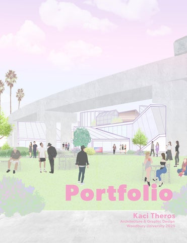
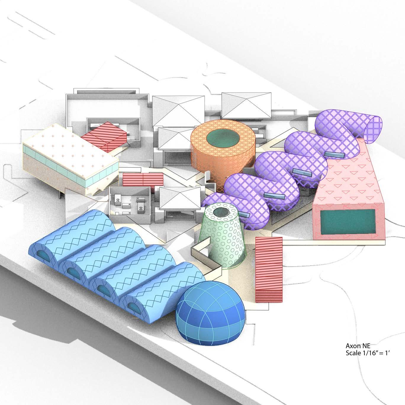
A perspective view of the Kombucha Distillery and its surrounding context near the L.A.
and the existing train line.
Chromatic Kombucha Distillery
River
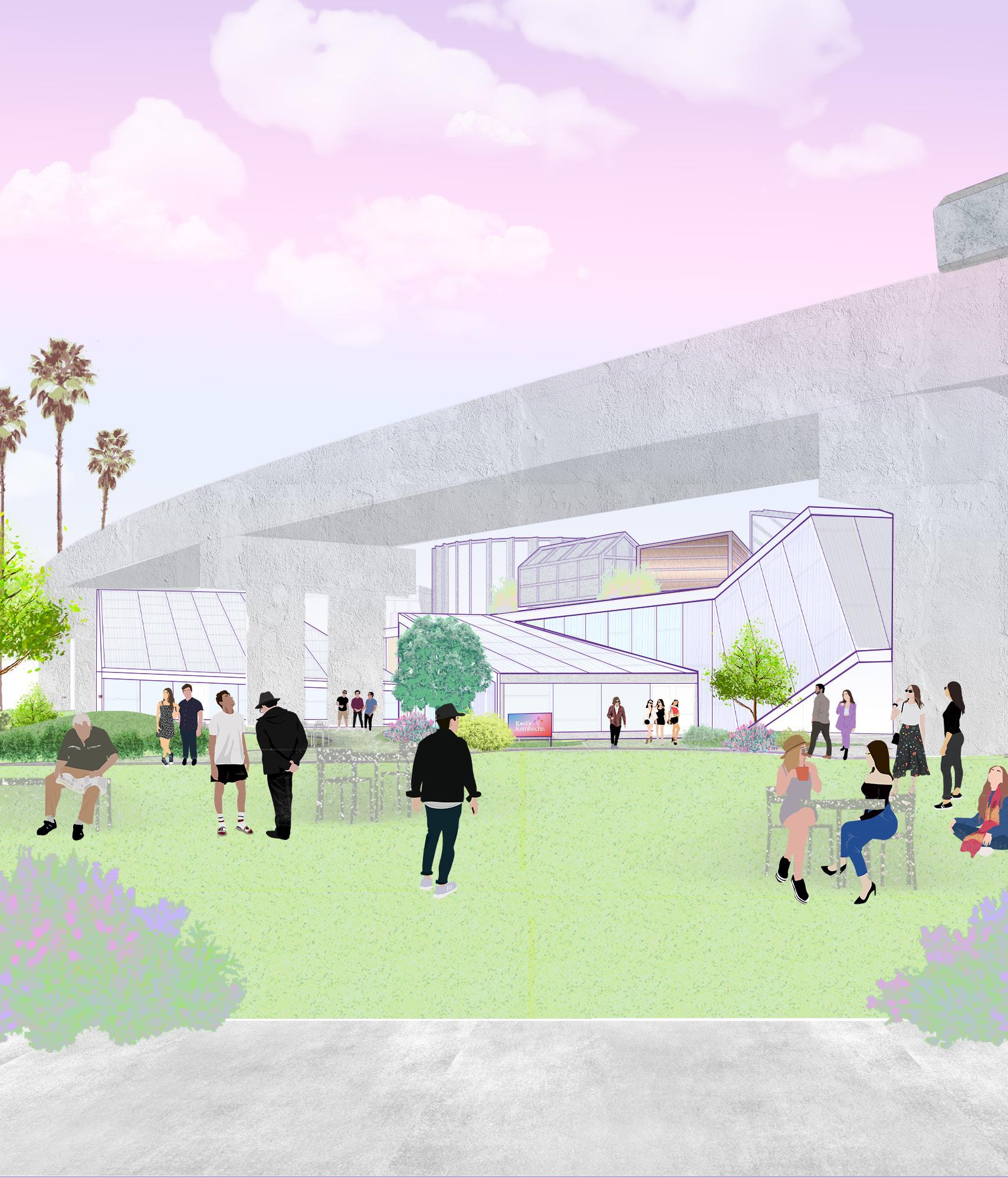
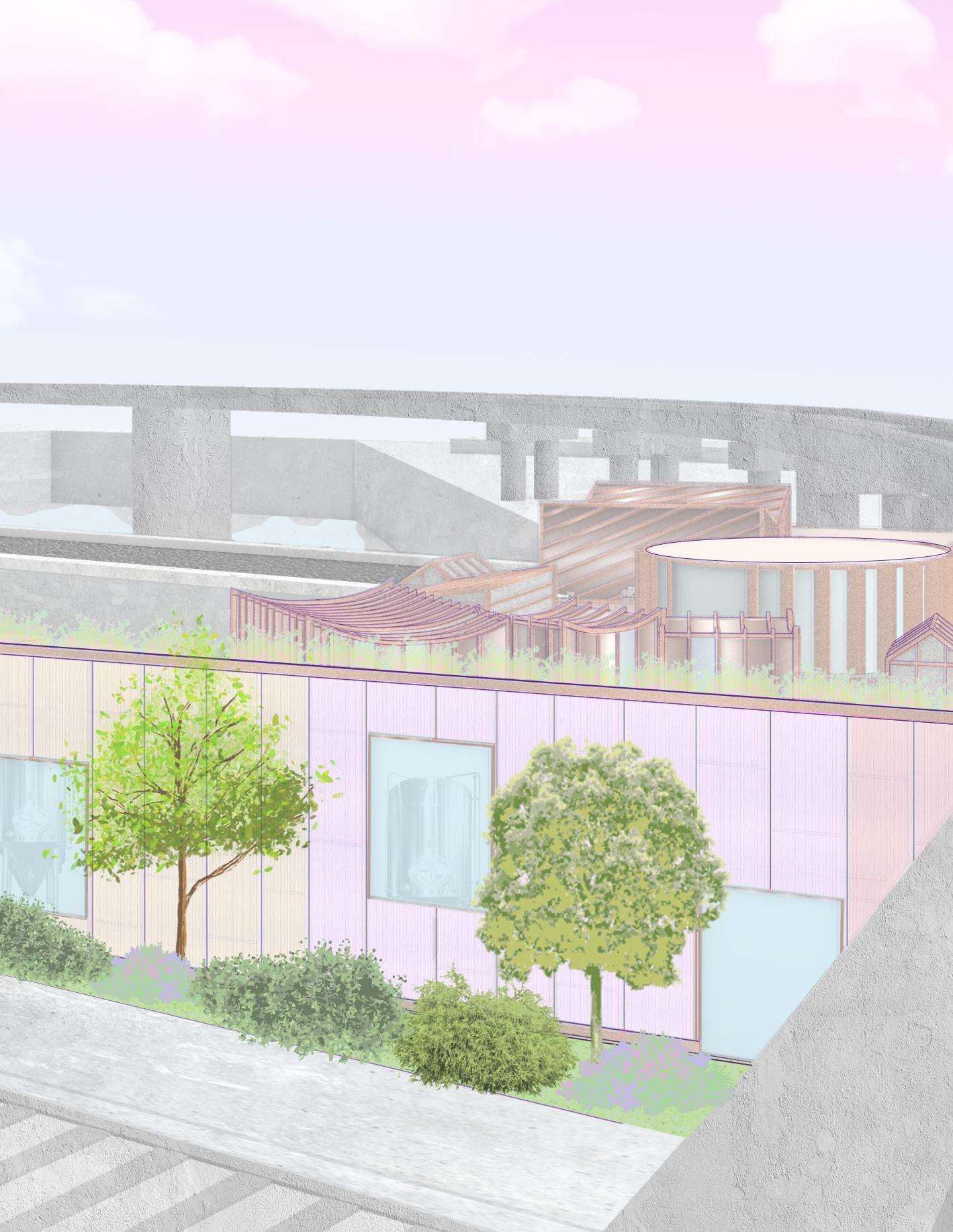
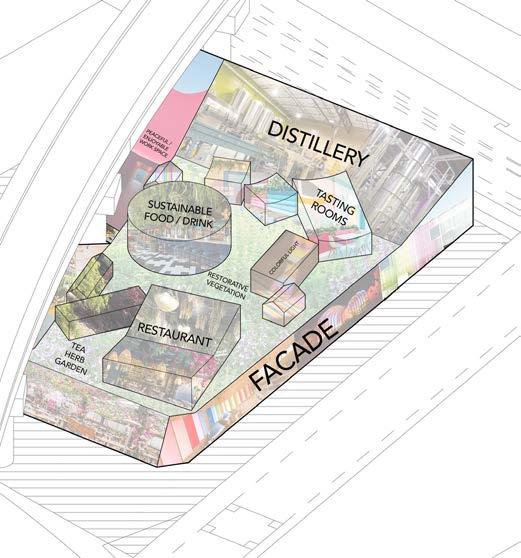
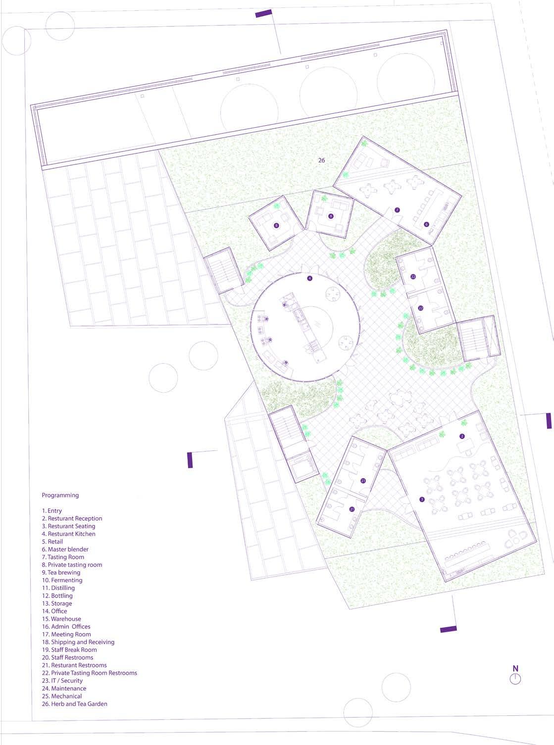
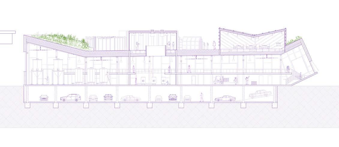
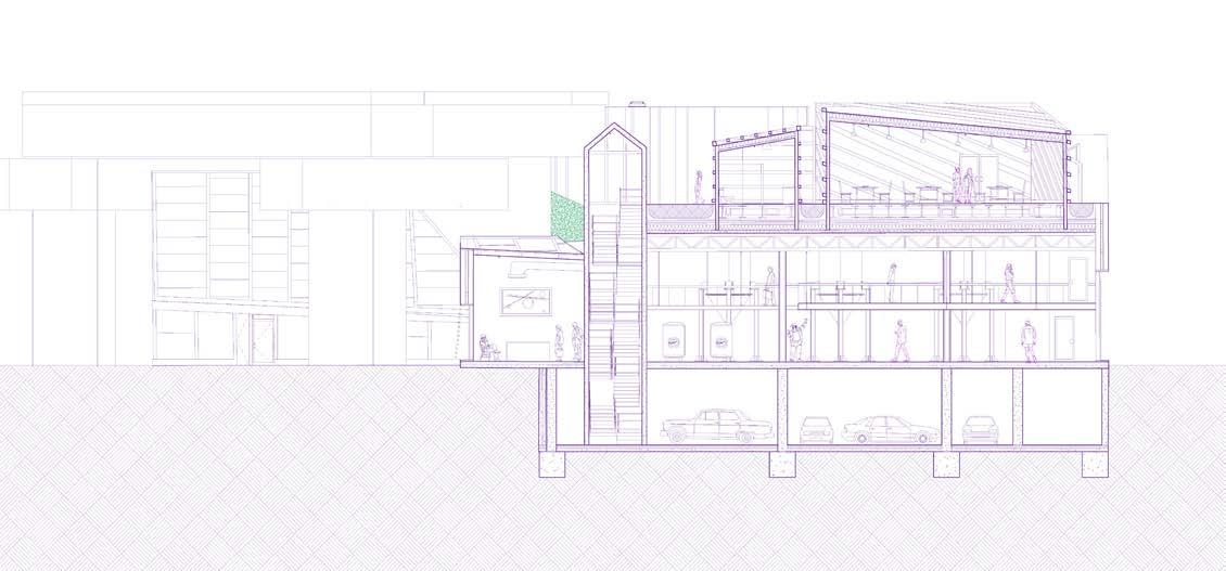
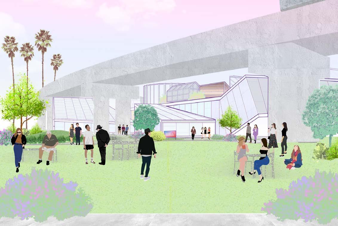
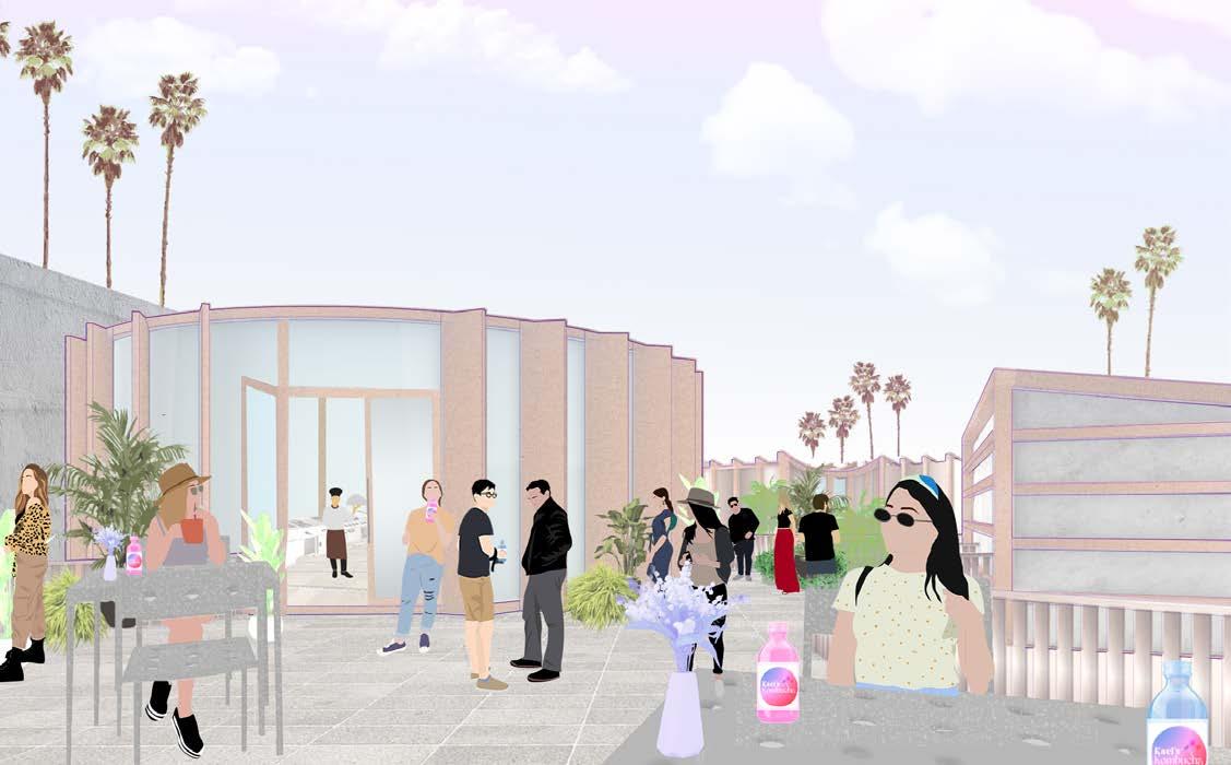
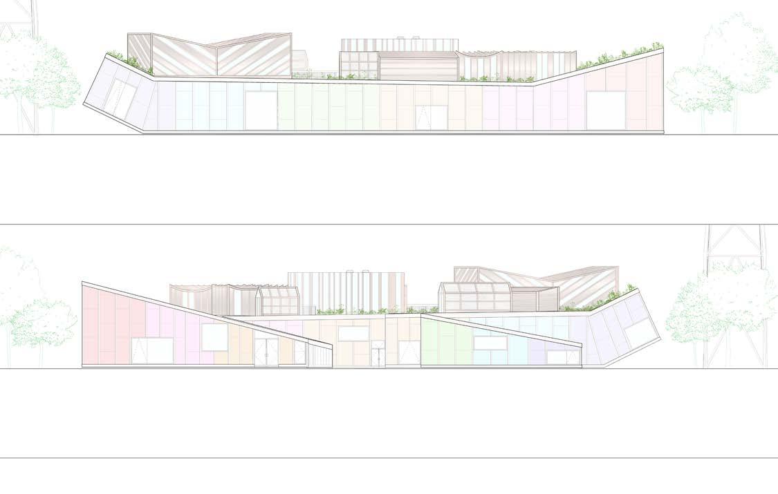
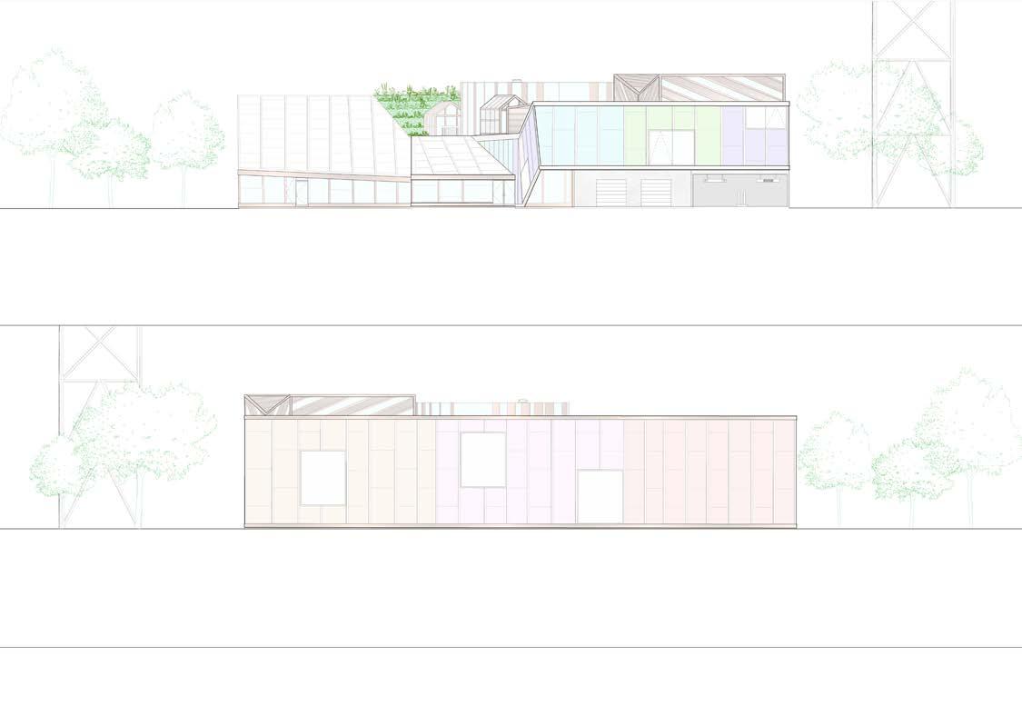
My distillery is a kombucha distillery that powerfully promotes a community where health, wellness, and social interaction can be fostered. Since my distillery produces kombucha, it was important to create a herb and tea garden that produces fresh herbs for the kombucha tea brewing process and the dishes in the restaurant. This herb and tea garden resides on the roof to create a garden oasis above the plentiful concrete city of L.A. Formally and conceptually, the project is about arranging my kombucha distillery parallel to the L.A. river and creating an internal production loop of circulation for the factory. Additional programs are then placed or plugged into the long distillery warehouse to create different roofscape moments that involve chromatic lighting and useable vegetation for the programs on the site. The material for the facade is polycarbonate, which filters out light and provides less heat gain. The chroma placed on the facade is a reflection of the interior of the distillery. Cooler colors are towards the front of the distillery, and warmer colors progress towards the back of the building to indicate where the most production and machinery is to produce the kombucha.
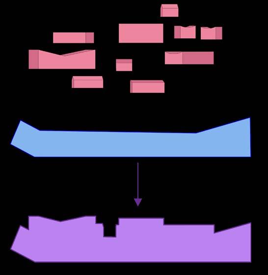
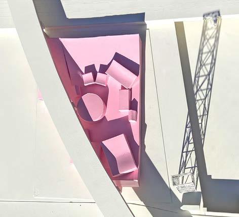
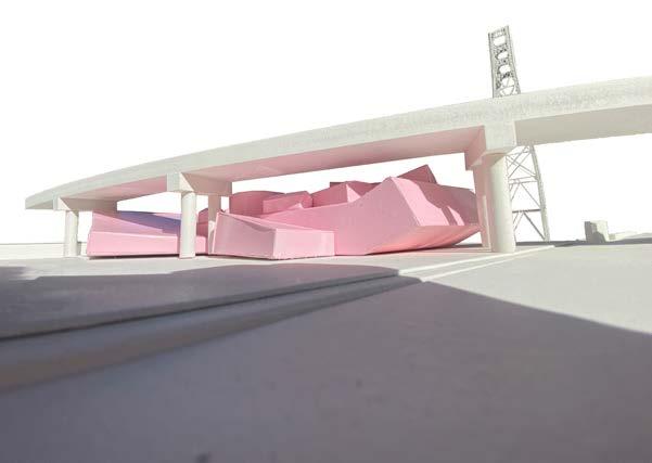
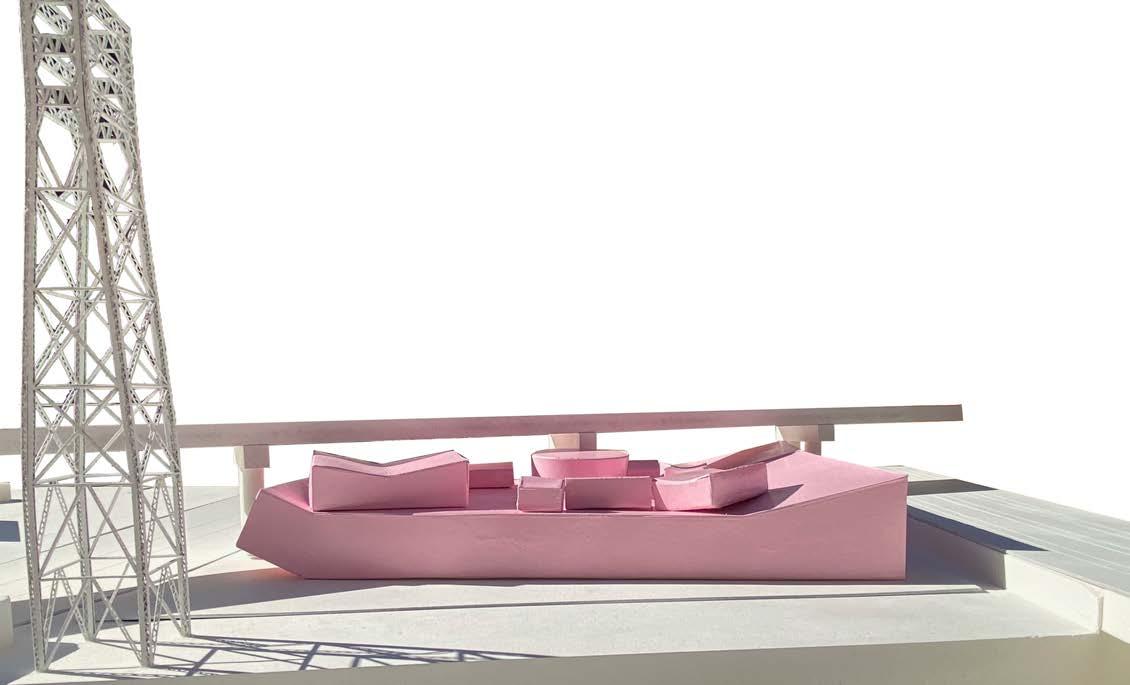
Top Left: Massing Diagram with the red elements as the rooftop garden spaces and the blue being the kombucha warehouse Top Right: Initial concept of the distillery Bottom: Massing Model Made of Museum Board Showing a top view of the distillery with shadows and sun studies and a perspective view of the massing model on a site model with shadows and sun
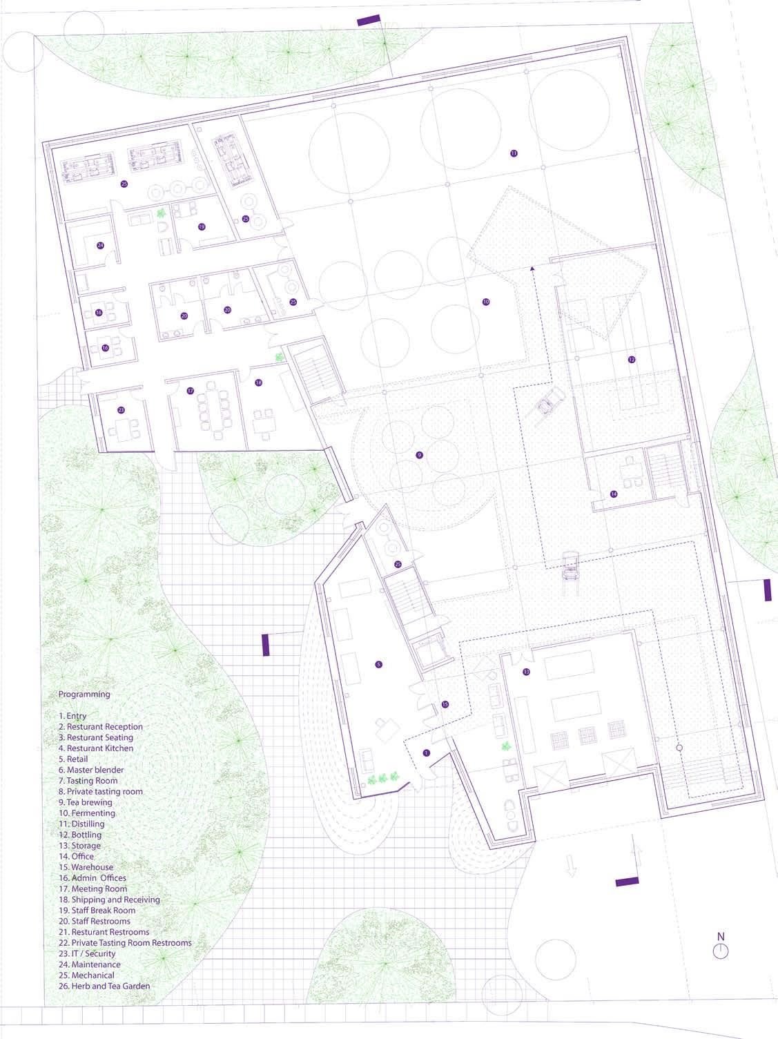
Ground Floor Plan showing the Kombucha Distillery Warehouse
The second-floor plan shows the restaurant, kitchen, and rooftop garden space.
Above: The west section cut of the distillery shows the different layers with the parking structure, warehouse space, the catwalk in the warehouse space for the guided tours, and the rooftop garden area where the kitchen and the restaurant reside. In this section, the long bar-like qualities with the roof massings plugged into the warehouse bar typology are highlighted through this view.
Bellow: Front view Section of the kombucha distillery where the parking structure, warehouse space, restroom, and restaurant are shown. How the green roof is connected to the warehouse space is highlighted to show the depth needed to create a green roof.
Front Perspective Render of the Distillery with people walking around made in Photoshop.
A perspective of the Rooftop Restaurant area surrounded by the herbs that are used to make the kombucha.
East, west, south, and north elevations of what the facade of the kombucha distillery looks like and how the chroma of the facade relates to the internal production loop of the kombucha.
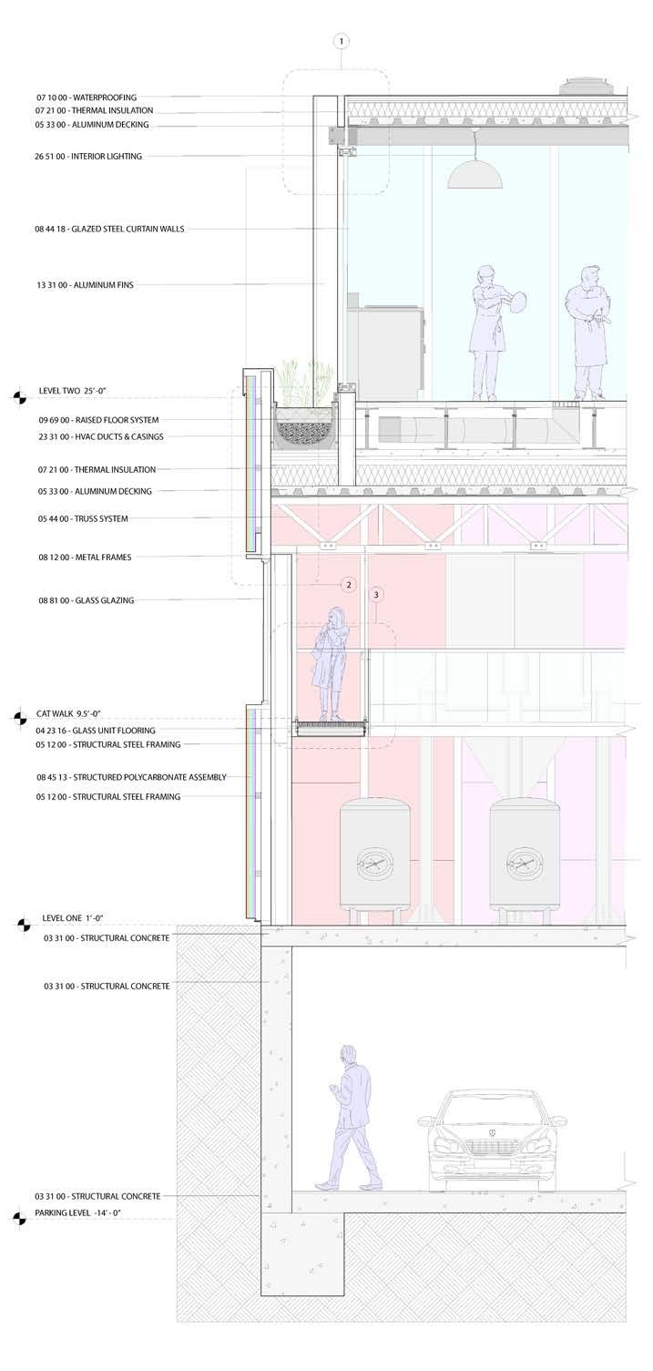
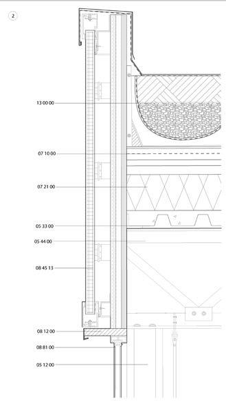
Left Image: Wall section of the kombucha distillery showing the parking garage, the warehouse, and the kitchen space
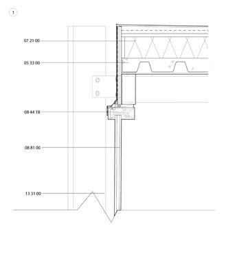
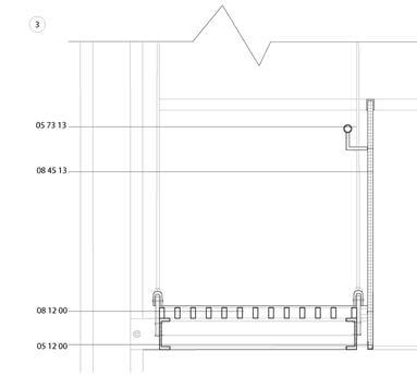
Right Images: A detail of the roof condition for the kitchen, the rooftop garden space, and the handrails for the catwalk for the warehouse tour.
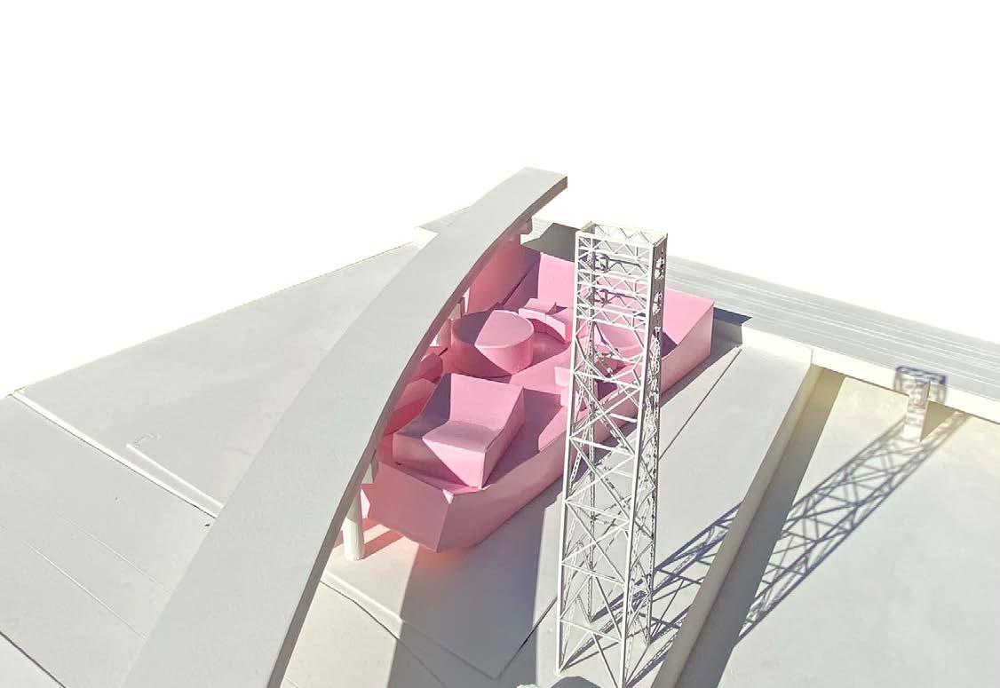
Bottom Images: Photographs of massing models of the Kombucha Distillery highlighting perspective views and the surrounding context of the site. The two images show how the sun and shadows are cast on the building during the afternoon, studying where the roof will get the most shade.
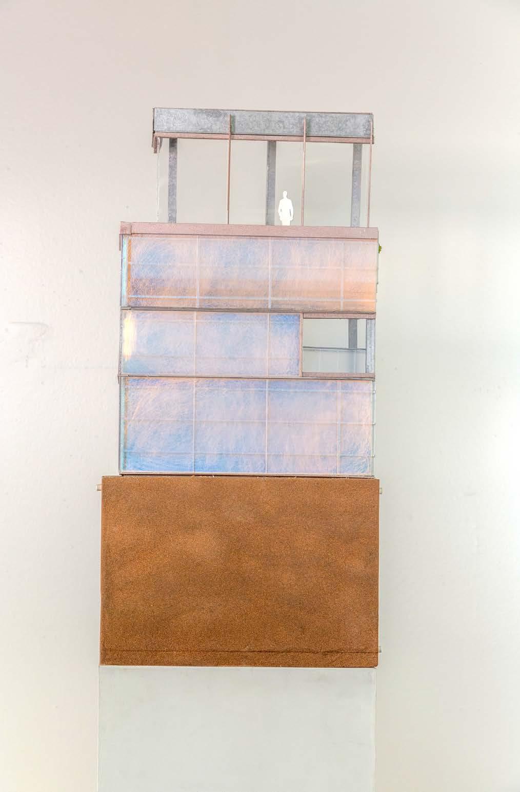
An Elevation Photograph of the wall-section model made based on the wallsection drawing. The scale of this model was 1/2” equals a foot. The model is made from various materials like high-density foam, acrylic, chromatic film, wood, museum board, and spray paint. This image begins to show the dichroic film for the facade and how it is structurally attached.
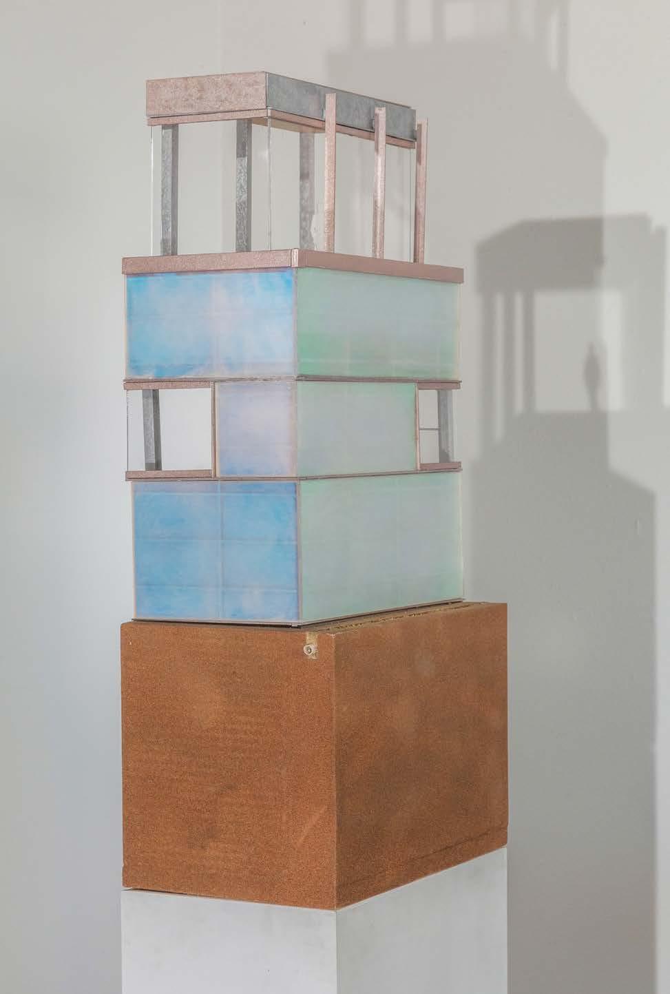
This is a corner image of the wall section model, showing the facade and window placements and the connection to the glass rooftop kitchen space.
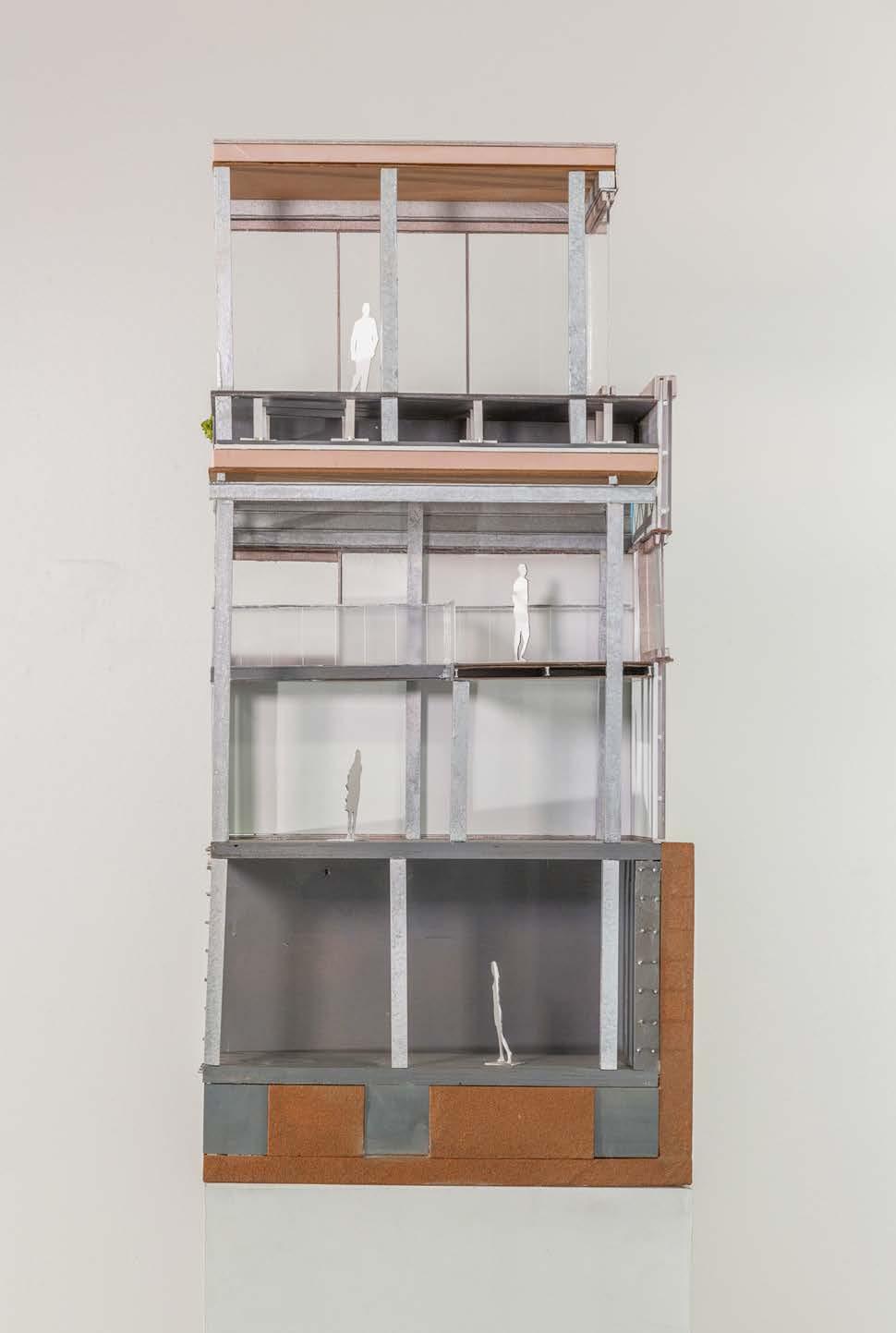
An interior elevation
Photograph of the wall-section model shows the parking garage, the warehouse space, and the kitchen area. The kombucha warehouse space shows the ground level where the production of kombucha would be. The second floor is where the catwalk is located for the guided kombucha distillery tour.
Buena Vista: A Beacon to Imagination
A
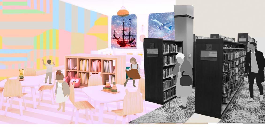
perspective Render of the Buena Vista Library with a childcare center imposed on the library, showing how the childcare intervention is colorful and playful.
The Buena Vista Library was a site that worked with an existing building and required adding a new form to the library. A childcare center was the chosen student program because of the proximity to the Walt Disney Studios. This project adopts the playfulness of Disney in the site through color, art, and the use of meandering paths. Having this childcare center embrace these Disney values helps convey the idea of creating a place that cultivates imagination and creativity. The project uses post-modern ideals and elementary shapes that symbolize the program inside of the space. The most important programs are the art room and classrooms since these spaces foster imagination, creativity, and knowledge for the children of the childcare center. The placement of programs is broad, acting as attractions for the children similar to the Disney theme parks, creating paths that encourage wonderment and discovery.
Ground Floor Plan of the Buena Vista Library and the childcare center integrated into one space, highlighting these different spaces through color and primitive forms.
Top Image: Form Diagram showing how each program for the childcare center has a specific primitive form assigned to that space
Bottom Image: Second-floor plan showing the meandering paths of the center, making it an adventure for kids to get to one place or the next.
Top Floor Circulation Diagram
This Vignette Shows the stark contrast between the library and the childcare center, and how this center becomes a place for kids to explore and let their imaginations expand.
Section of the nap rooms and the cafeteria for the children
Elevation showing the different primitive forms imposed on the library
Section of the Playroom and Art Center, and Classroom
Flower Lamp 03
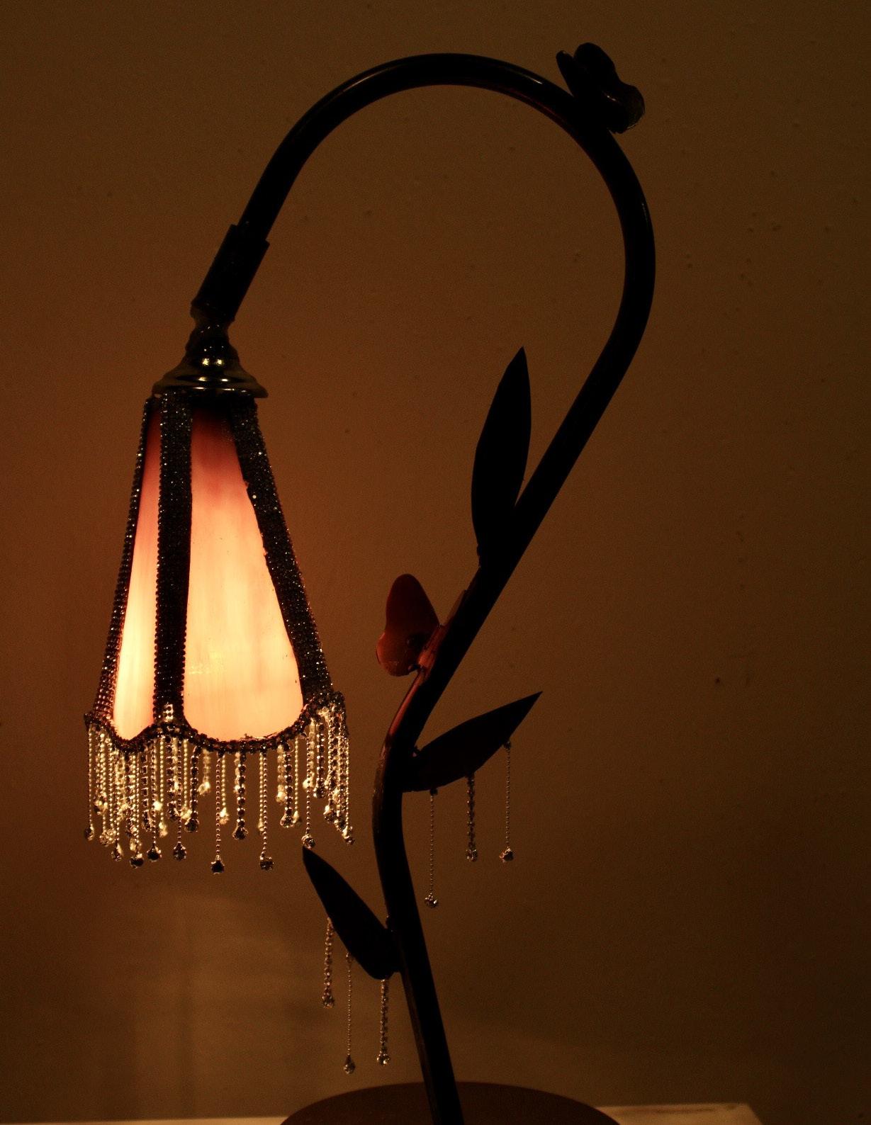
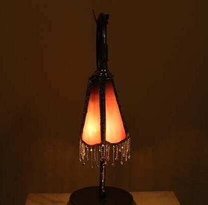
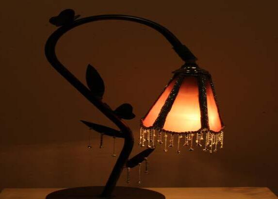
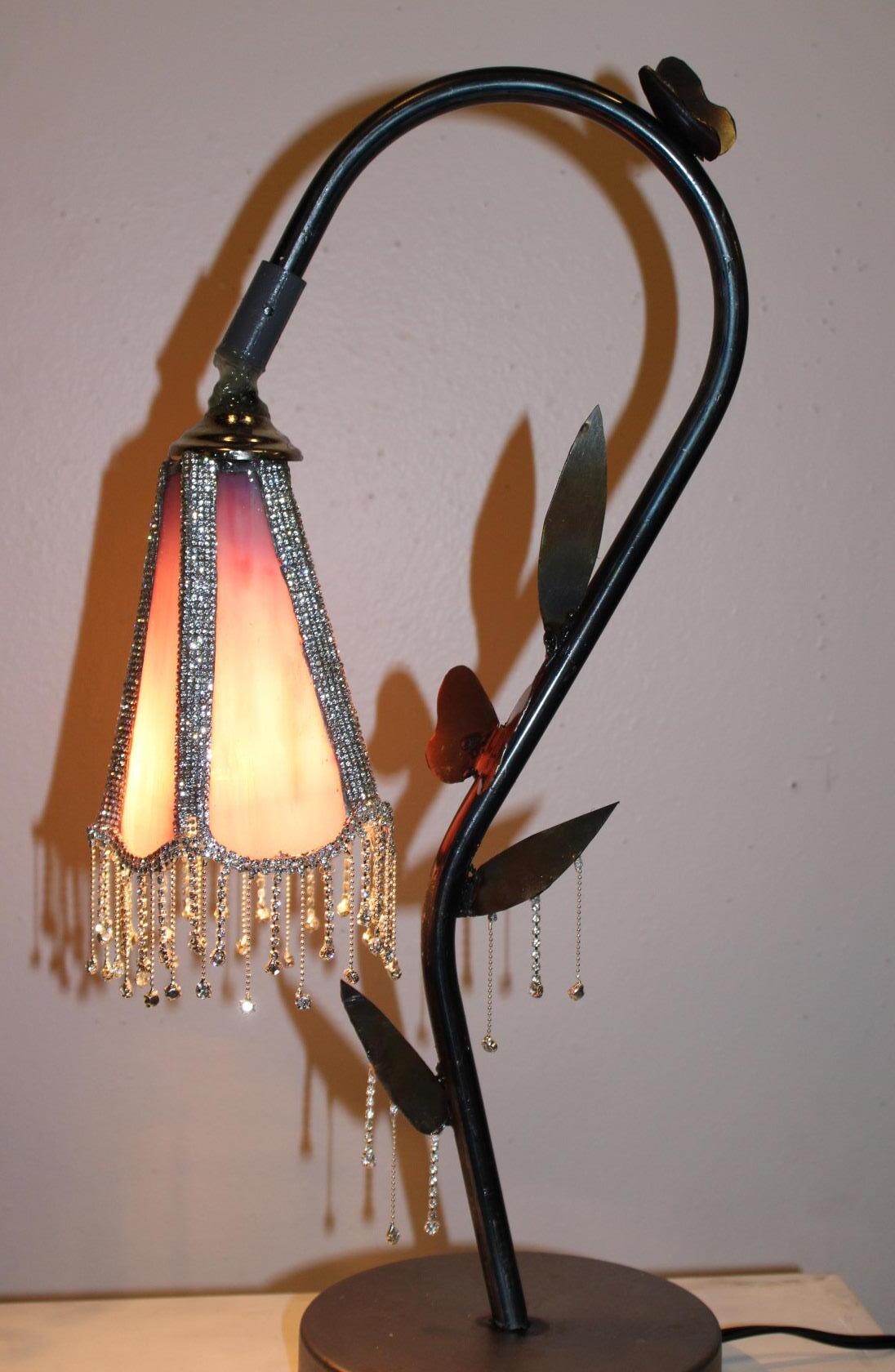
A Photograph of a steel lamp with a soldered glass lampshade.
During a Build 6 class, we were tasked to learn about a specific material and conduct material tests and a final architectural object with that material. This section’s material was metal and at the beginning of the semester, we were able to learn how to cut metal with an angle grinder and weld. It was a challenging and anew task, but it allowed me to be embrace metal. Learning about metal opened the doors to what the material is capable of and how forgiving it is if there is a mishap. The final object is a lamp that is supposed to resemble a flower. The steel tube was bent at Woodbury’s making complex. The elements like the leaves and the butterfly are a thin sheet of stainless steel which was cut by hand with an angle grinder and sanded by myself. The stainless steel material allowed for material tests to expose the heat tint stainless steel has. The base was welded onto the tube. The lampshade is made of glass. The glass was scored, broken, sanded, and then soldered together into this shape. Once the lampshade was put together bejeweled elements were added to create a dew drop effect on the flower.
Top Left Image: Front view of lamp Bottom Left Image: Left view of lamp Right Image: Right view of lamp
Folding & Flying 04
A
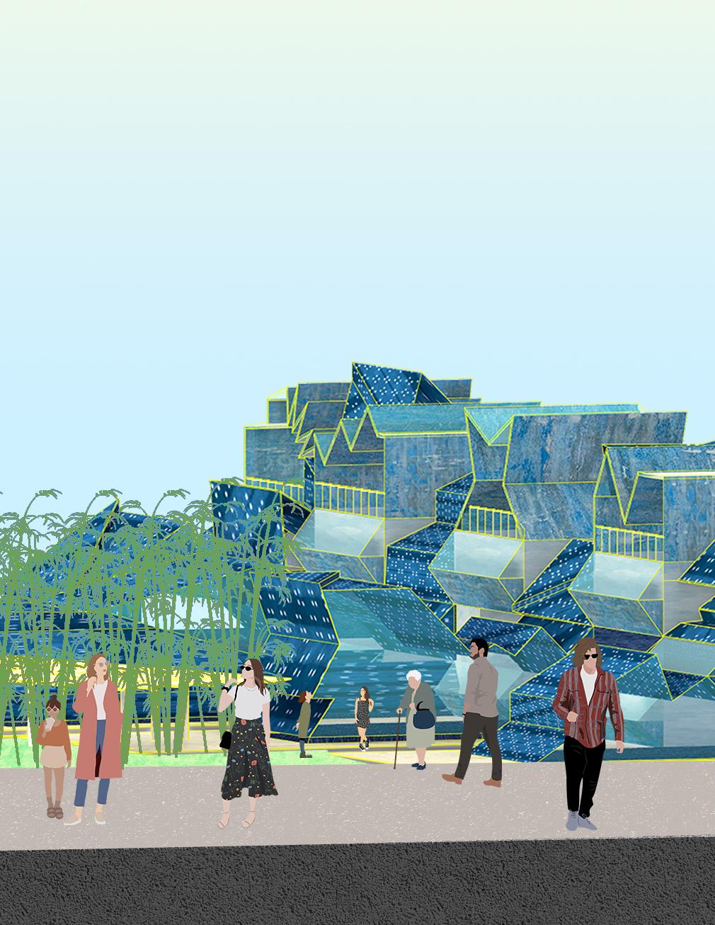
perspective view of the Little Tokyo Housing Complex filled with people coming to the site to enjoy Little Tokyo’s historical culture.
Folding and Flying
the future of housing in Little Tokyo
Folding and Flying the future of housing in Little
Tokyo
Top Right: Site Plan of the Housing Complex
Bottom Right: Circulation Diagram highlighting public and private access to the complex
Left Image: massing image showing the different units available, a one-unit or two-unit apartment
DIAGRAMS: Unit Distribution, Circulation, Massing, Public & Private
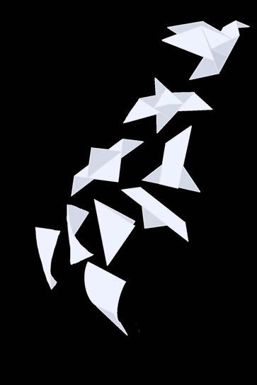
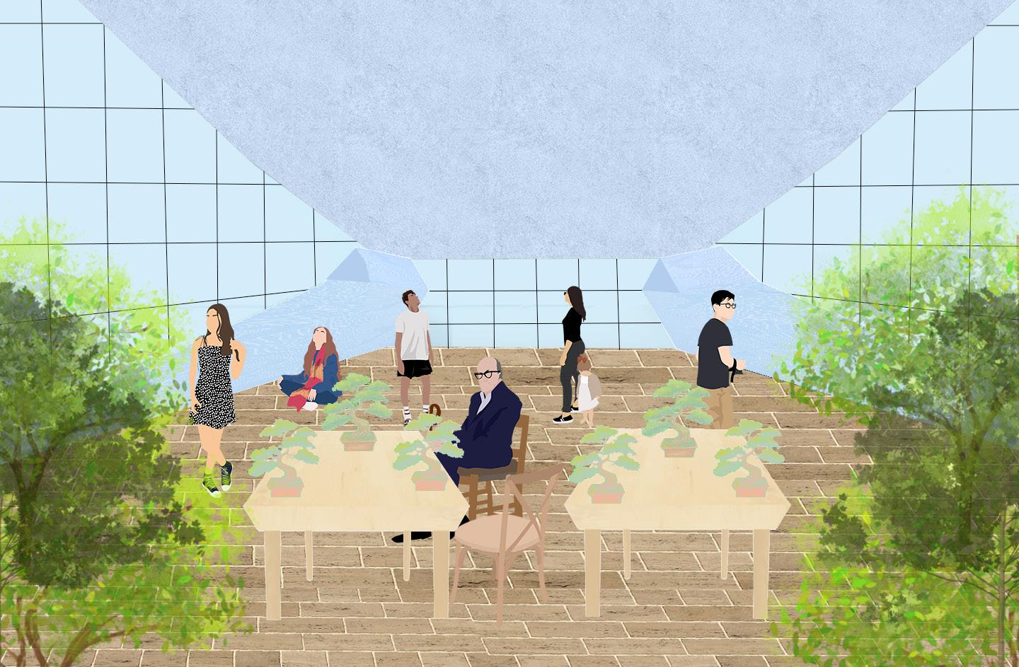
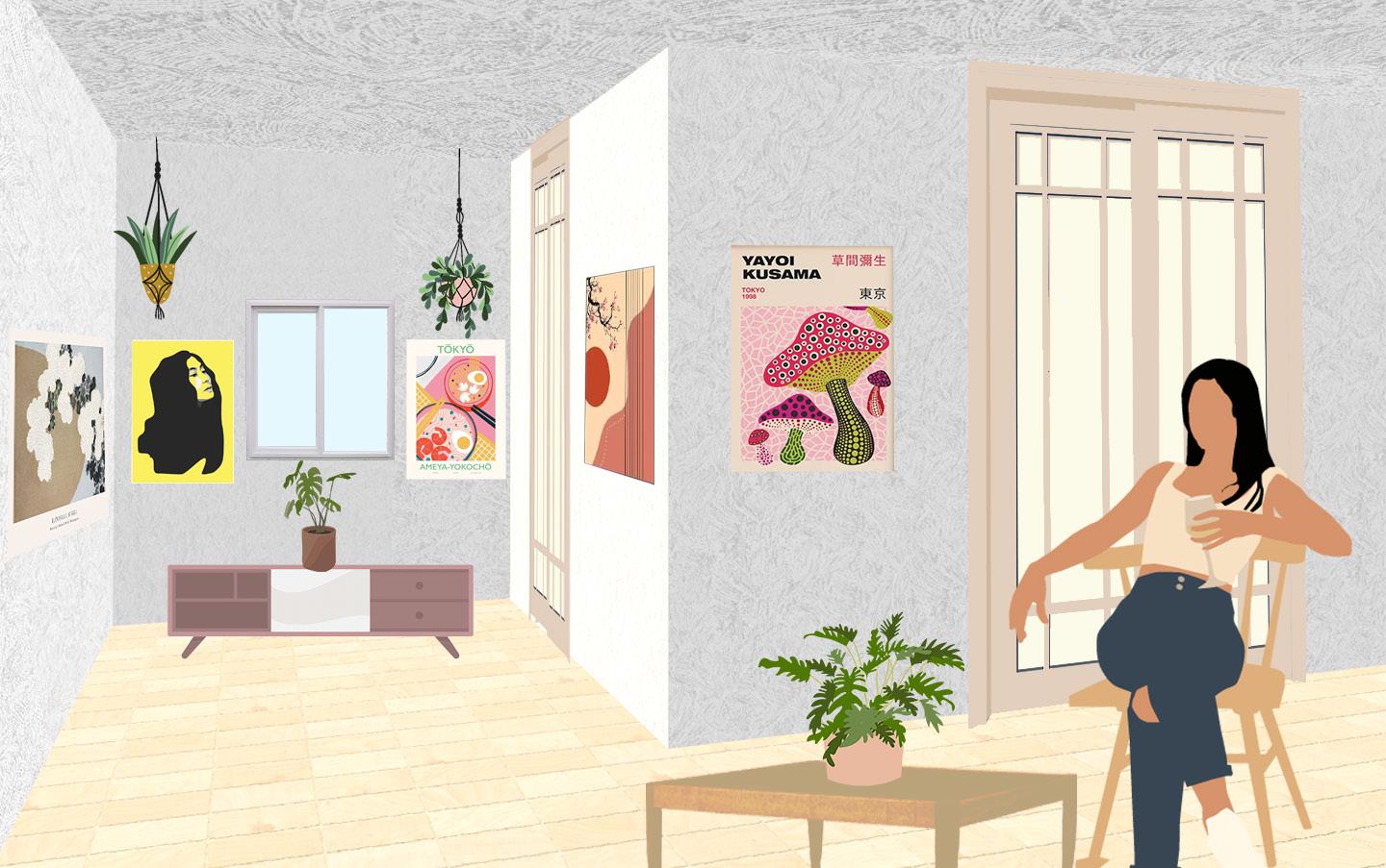
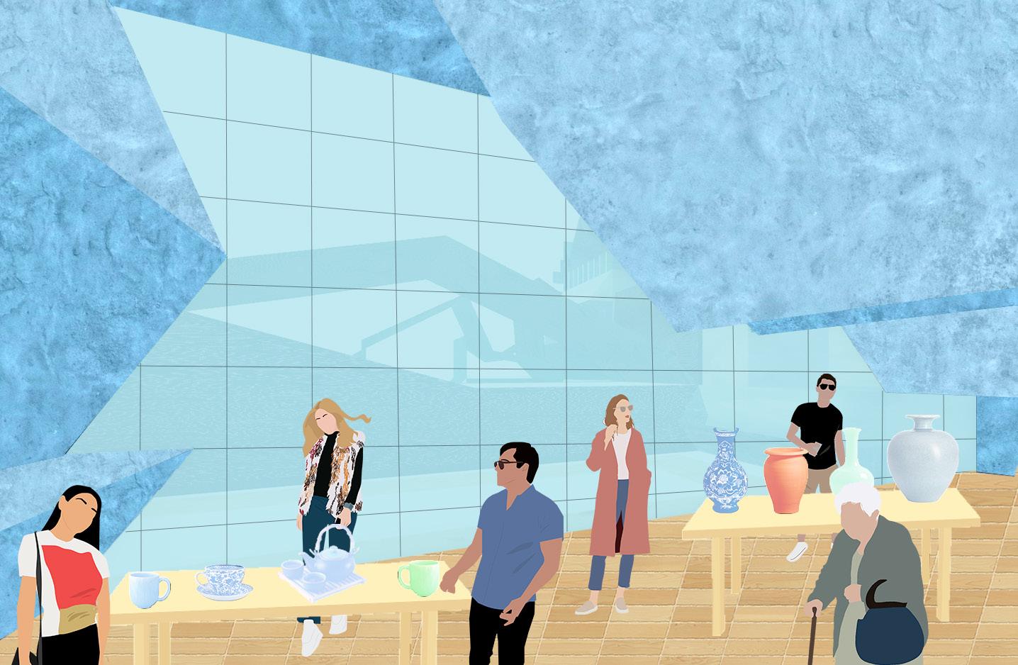
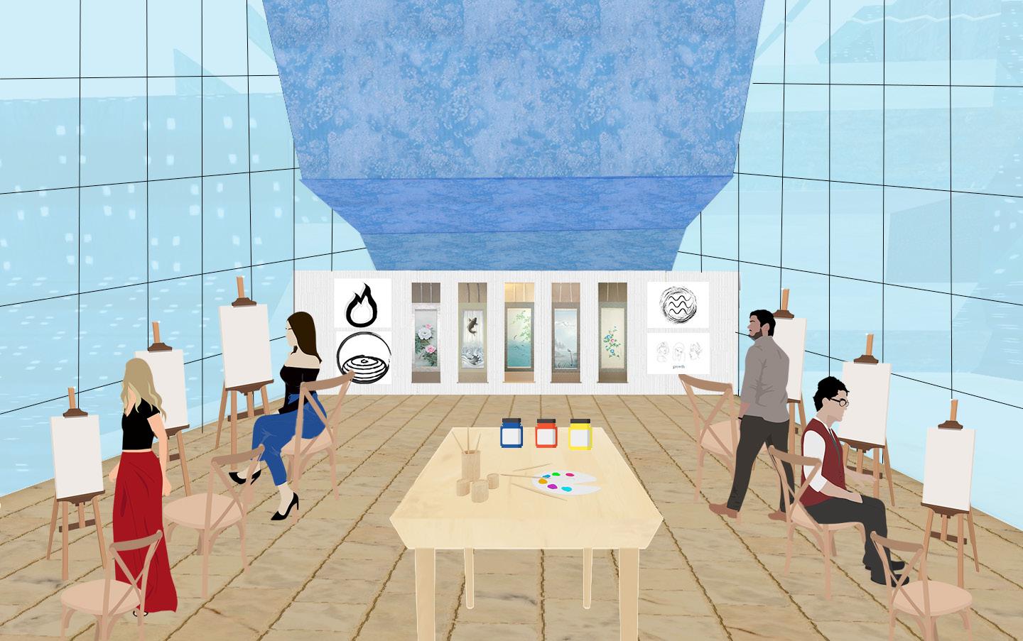
Little Tokyo in Downtown L.A. is diverse in culture, with an acceptance of its past, present, and future legacies. When tasked with building a transit-oriented housing project in the heart of Little Tokyo, it was crucial to honor the Japanese culture. Naturally, the concept of origami folding was adopted for the facade because not only is origami an art, but it is also a symbol. Little Tokyo is an art form and a place where culture and art collide, but it is also a powerful symbol to never forget where we come from and to persist when troubling times are upon us. The apartment units house either one person in a single unit, two people in one unit sharing a bedroom, or two people in one unit having separate bedrooms. These units are naturally small to promote a minimalist lifestyle and for the residents to enjoy the outdoor rooftop community spaces with their neighbors. On the bottom floor, there is space for a pottery center, a small business pop-up space, a Japanese gardening area, and a room dedicated to painting and drawing. All of these rooms teach the public about traditional Japanese art in the forms of pottery, gardening, painting, and drawing.
A ground floor plan of the housing complex showcasing the art room, gardening area, and pottery center to highlight traditional Japanese arts and crafts, teaching the public about how this art is rooted in Japanese history, but also how it can begin to connect people from different cultures and backgrounds
An elevation and section of the origami-like forms in the housing complex and how they begin to fold to create these spaces for living and shopping
Top Image: A section and elevation of what the origami-like forms turn into. This also begins to show the rooftop space made for the residents in the complex where they can gather with one another and enjoy each other’s company with other residents. The folding nature of the form begins to create these unique and geometric spaces and roofscape moments for the residence
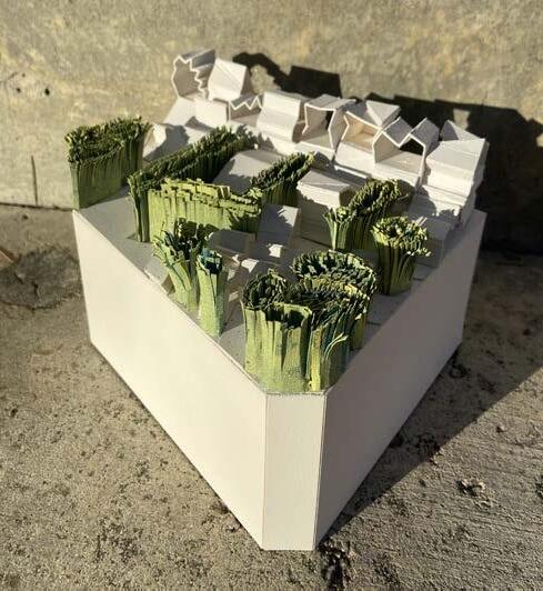
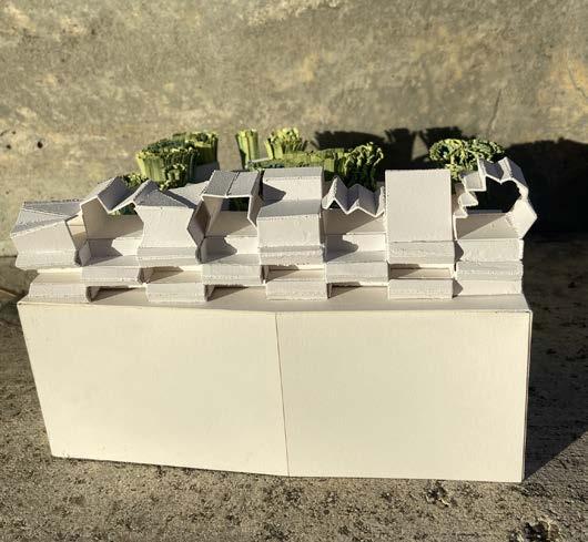
Bottom Images: Photographs of a massing model made of museum board, spray paint, and paper. The white forms represent the massing of the complex and the paper represents the bamboo greenery that helps with the public and private nature of the space. Since security in Little Tokyo can be a concern using greenery as a wall begins to create private moments for the people at the apartment complex
Interior View of Japanese gardening area
Interior View of a one-unit apartment
Interior View of Japanese pottery area
Interior View of Japanese Art workshop for painting, and drawing
Uncanny Twins 05
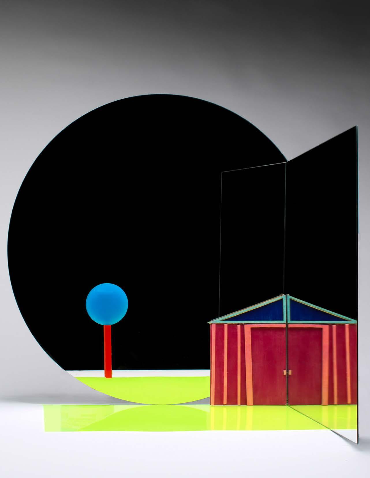
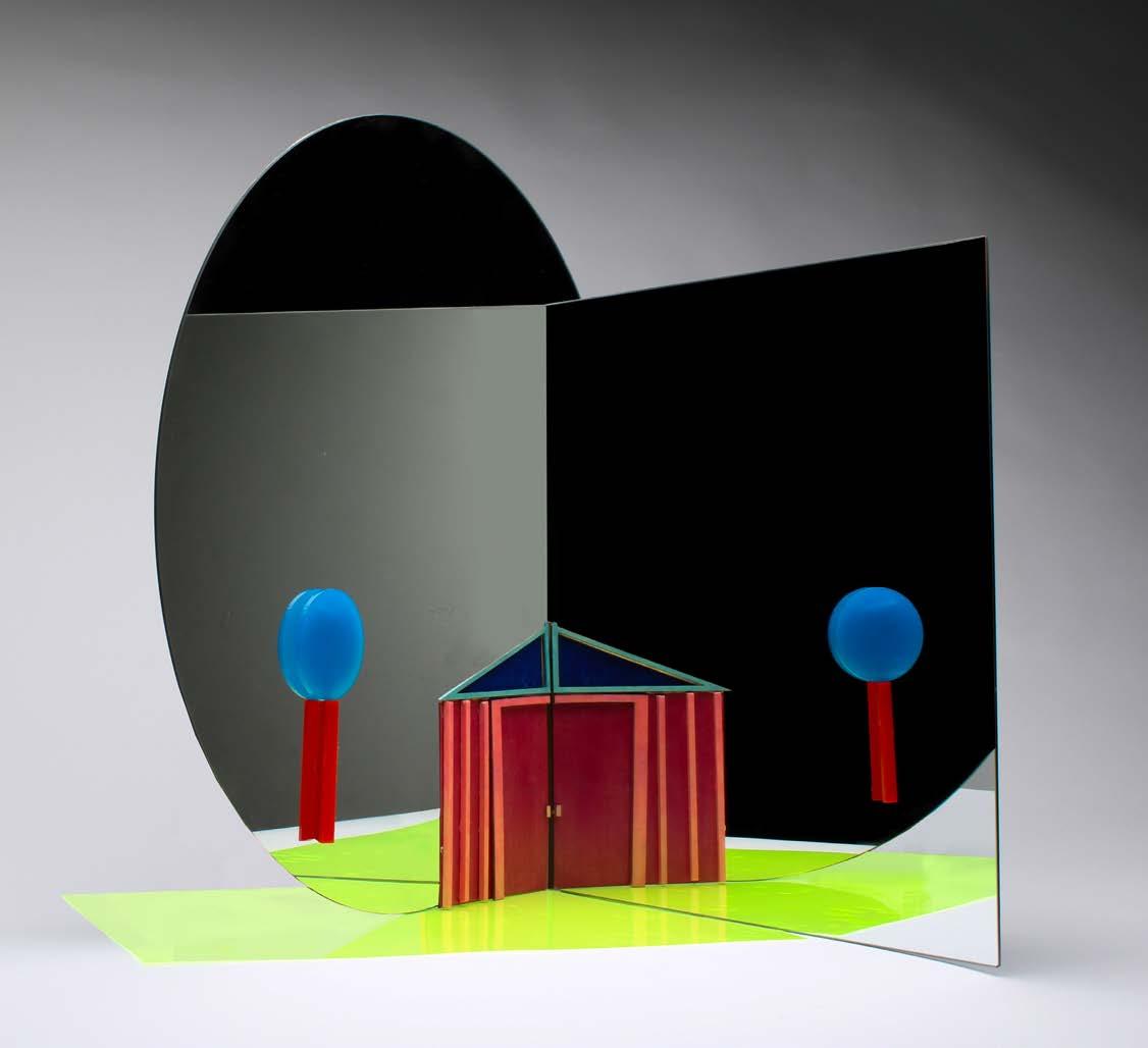
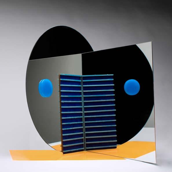
A Photograph using meticulous mirror angles to create an elevation of a shed
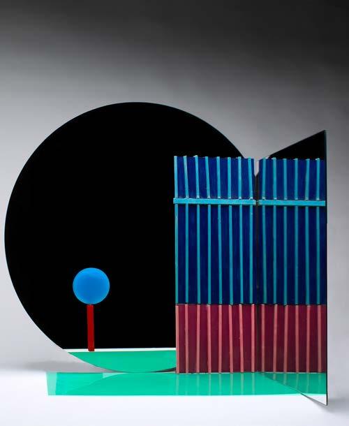
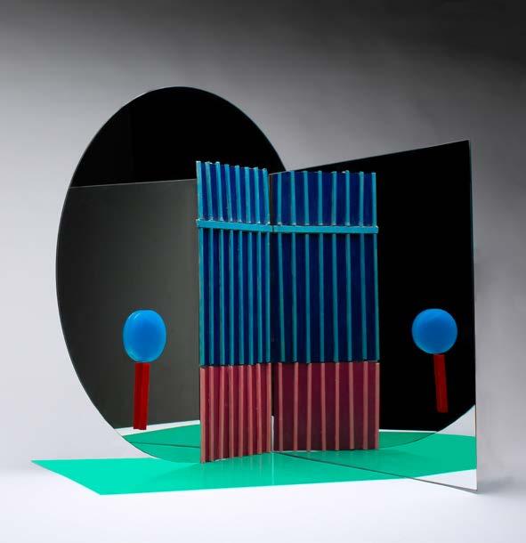
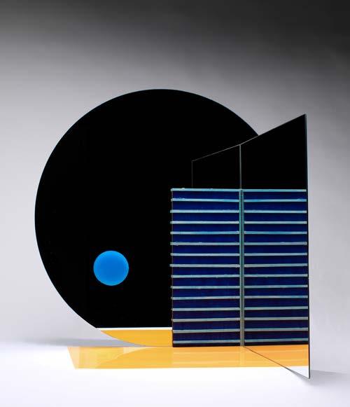
During topic studio, using reflections as a tool to produce a whole from using pieces, was explored through image making and physical models. Removing the hierarchy between the original and the reflected pieces was experimental in both photography and three-dimensional objects. Both reflections and a piece have equivalent importance in the production of a whole. The result of pieces and their reflection creates an inherent distortion. In the images, manipulating the inherent distortion provides either a one-to-one relationship, creating symmetry and identical characteristics, or an asymmetrical relationship, carrying fraternal features. The way the camera angle is placed limits visual access by showing a single moment of reflection. However, the object uses a different technique to restrict visual access. The images create a part-to-whole relationship, and the object is about confusing limitations that begin to expand, producing a world beyond the physical. The object restricts visual access similar to the images and produces four different readings of the same thing.
Elevation of the shed with circular and square mirrors angled ninety degrees toward the camera where half of the shed is rendered, and the other half is a reflection
Top Left Image: Oblique view of the shed angled with mirrors at a ninety-degree angle limiting the view of the shed by only seeing the oblique and the tree
Top Right Image: The oblique View of the shed altered from mirrors angled at forty-five degrees showing a skewed angle of the shed and visibly showing more of the surrounding context like the tree and green film
Bottom Left Image: A Plan view of the shed with half of the shed being rendered physically and the other half being a reflection of the physical model
Bottom Right Image: The Plan of the shed is altered by mirrors placed at different angles, showing a reflection of the surrounding context and an alteration of the plan view
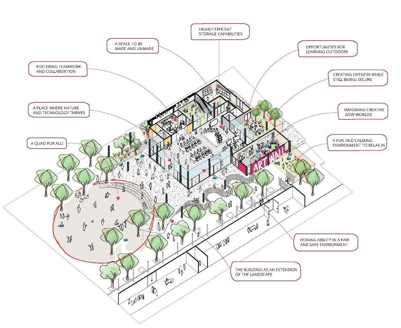
OPERABLE SHADES TO CONTROL LIGHT AND VIEW
ROOF OVERHANG SHADE
PV PANELS
CEILING FANS TO MIX AIR
RAIN WATER HARVEST
PASSIVE COOLING BY CROSS-VENTILATION
TREATED RAIN WATER TO TOILET FLUSHING AND IRRIGATION
INDOOR OUTDOOR SPACES WITH BIO DIVERSE PLANTING
ELEVATED PLINTH TO REDUCE FLOODING RISK BUILDING SHADES COURTYARD
INTERGRATED UNIVERSAL DESIGN
Sustainable Axonometric Diagram highlighting the sustainable strategies and systems in the E-Sports Center
RAIN GARDEN
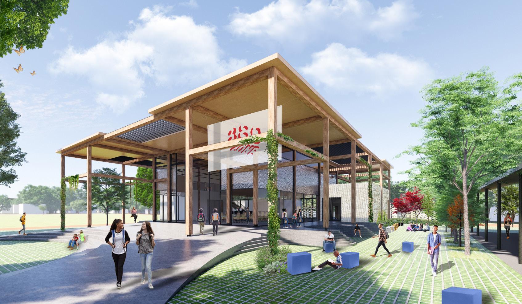
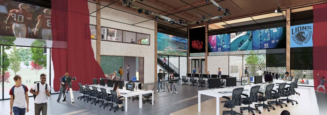
This project was during my internship in 2022 and was a project for a middle school in the Bay Area. Ravenswood Middle School is planning an expansion to honor its robotics, technology, and STEM programs. In this project, it was important to incorporate the ideas of technology and a connection to nature. The equality and inclusion of robotics to become an activity and a sport for girls were also pushed and promoted throughout this project. From 8 To 80, I produced renders and axonometric drawings of the new facility. The renders portray the everyday life of the students from the inside and outside of the building. The axon shows activities and how environmental and sustainable strategies are implemented within the building to maintain a positive contribution to nature. 8 To 80 is a place that will cultivate the young minds of the future all while providing opportunity and access for students to thrive in these technological fields.
Top Image: Exterior Perspective Render
Bottom Right Image: Interior Render of the E-sports Center
Axonometric Diagram organizing the program of the E-Sports center where inclusivity can be implemented in a male-dominated sport, and in what ways nature can begin to be implemented in this technology-heavy space
perspective site moments
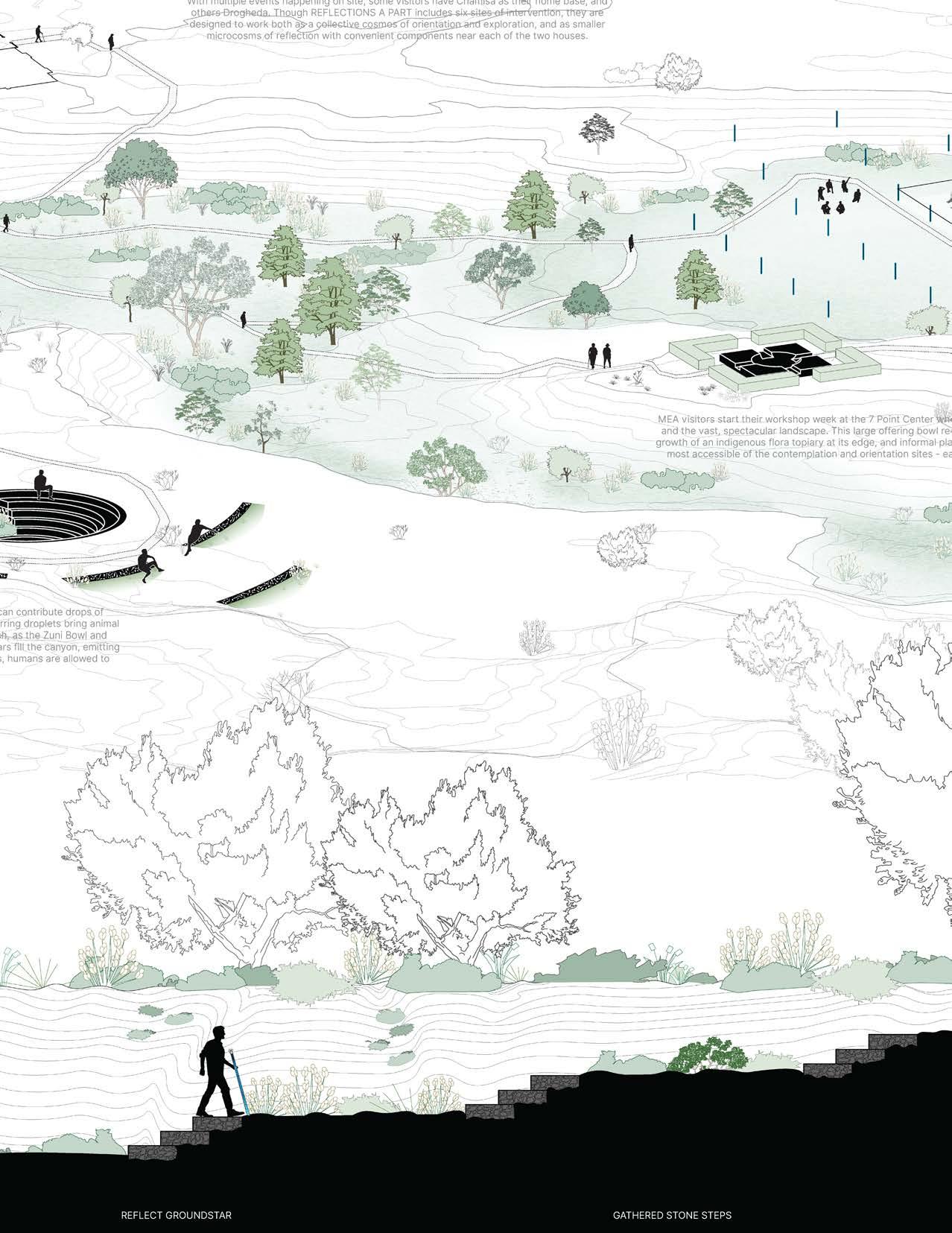
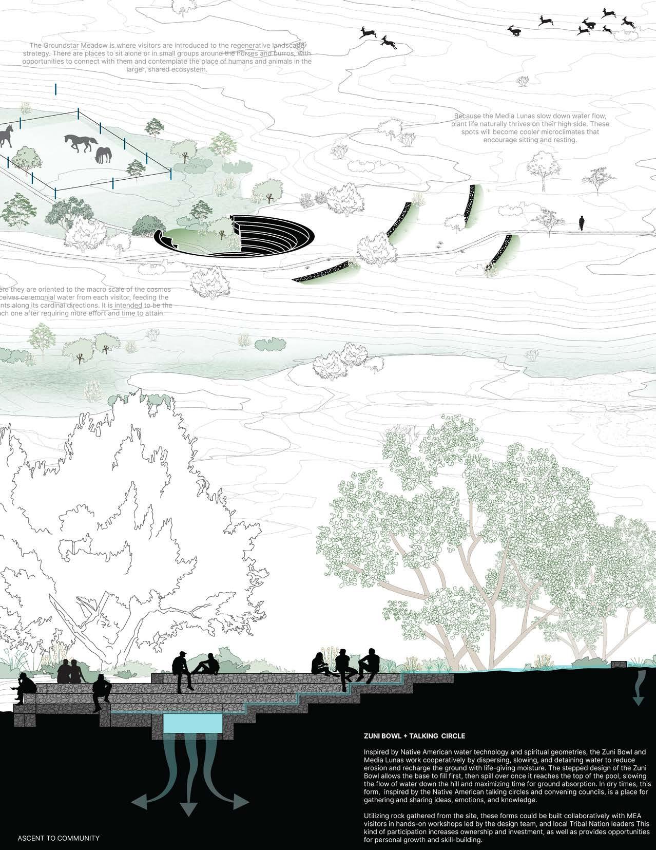
Section and perspective drawing of the site and how moments of self-reflection is being encouraged.
perspective of the site how of self-reflection is being encouraged.
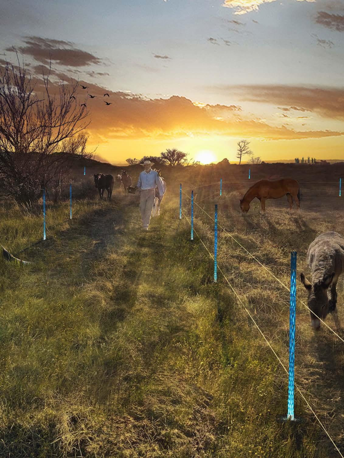
Exterior Render showing Ground Star Land art Implementation and how it compliments the surrounding context
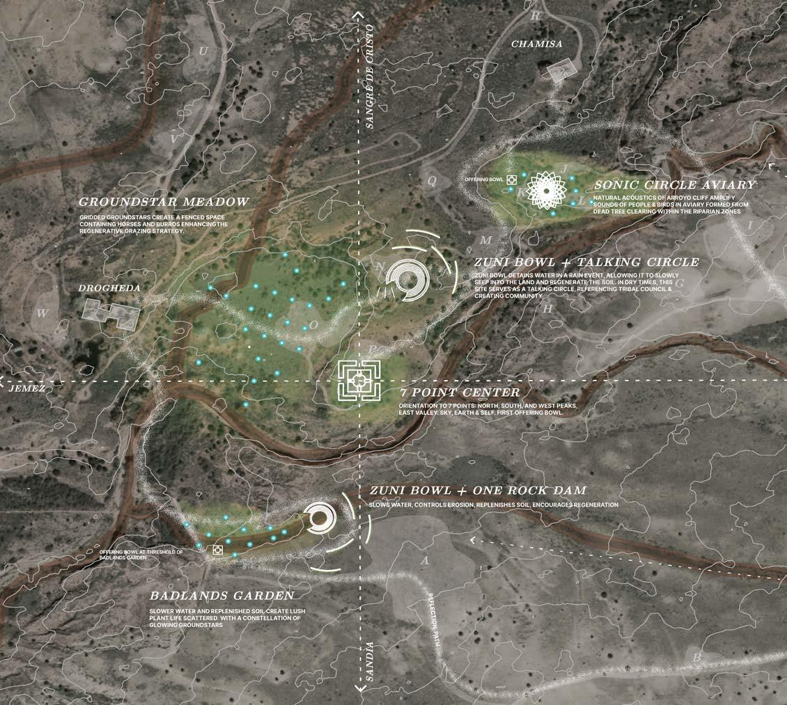
During the summer of 2022, I interned with my former architecture professor, and we worked on a project that was a competition to install a regenerative land art piece in New Mexico. The project was based on this ground star installation that has different typologies that help the land grow and cultivate more ecology and wildlife. The site of the project was a school for those who are older adults seeking a change in their career. These ground stars are to be placed like constellations in the night sky, helping these students find their path and way in life, and honoring them for rewriting the stars for their destiny. In this project, I utilized Photoshop, illustrator, and InDesign, which allowed me to help create the different typologies of the ground stars and how to create a formal booklet of all our design work. My task in the project was working mainly on the ground stars and working on how they would relate to the existing site. The ground stars became a diverse land art installation that gives back to the existing site.
Site Map of Ground Star interventions and how these different places are connected by the Ground Stars
Story Dimson Studio
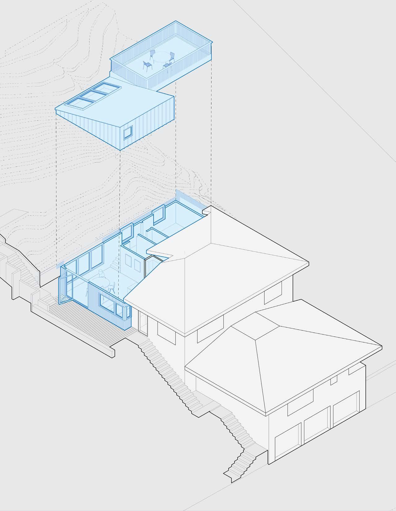
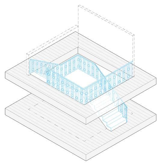
An exploded axonometric showcasing the renovation and the existing house for a client in Sutherland
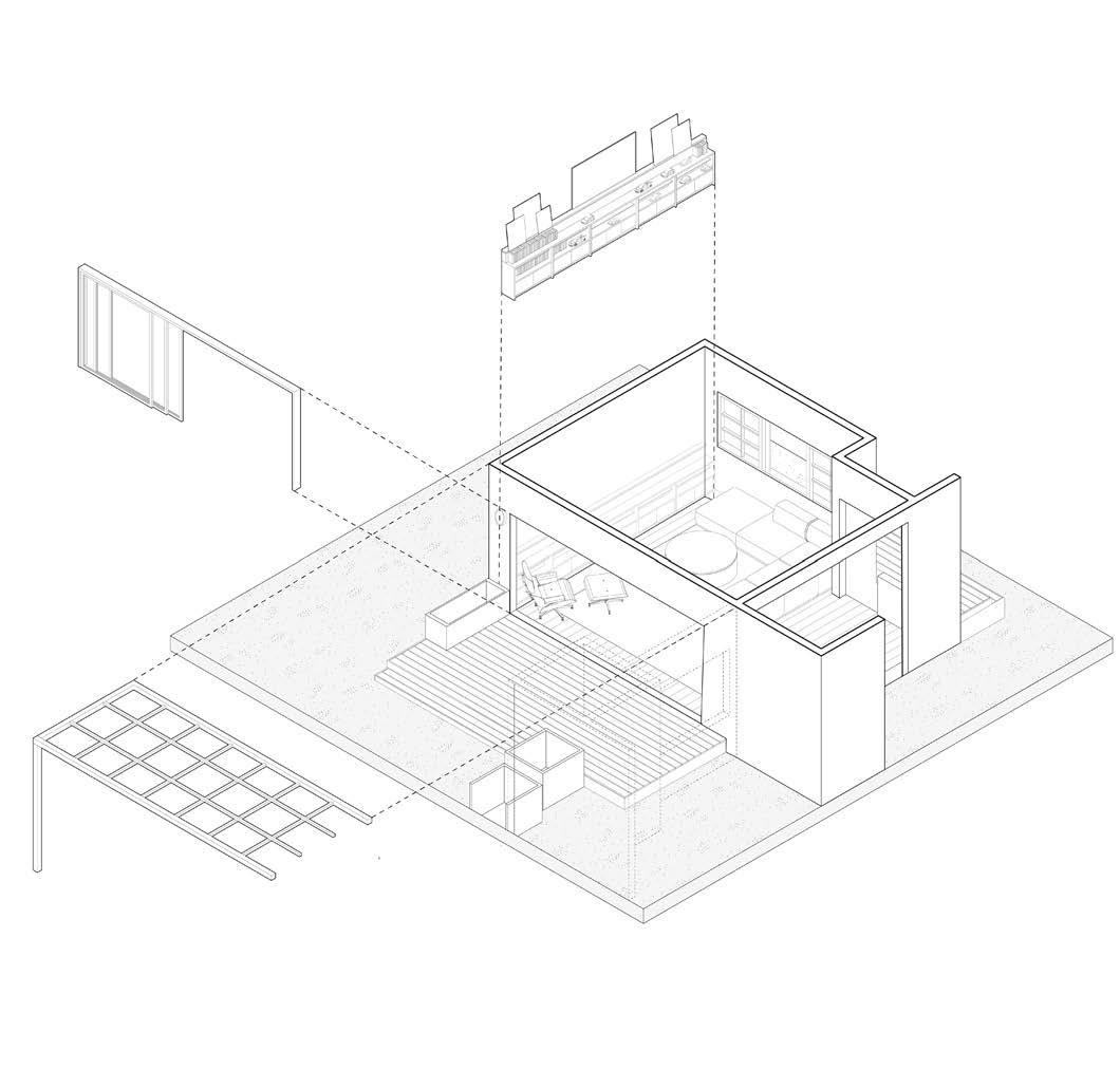
In the summer of 2024, I helped create marketing material for Story Dimson Studio and dabbled in design work for renovations. Working with Story Dimson Studio was a valuable experience in understanding residential-scale projects and designing drawings of plans and axonometrics that catch the eye of potential clients. Architectural drawings in a creative and diagrammatic way are something I am passionate about. Being able to push the boundaries of traditional architectural drawings and make them visually appealing and legible to people unfamiliar with the architectural world is something that we started to do with our marketing material. Adding pops of colors or highlighting specific moments with color begins to create dimension to the project through twodimensional drawings. Using color and simple line weights begins to relate to the brand identity while also making it captivating for clients, showcasing our project capabilities.
Exploded Axonometric for Barret Project renovation showcasing custom bookcase, doors, and shading system
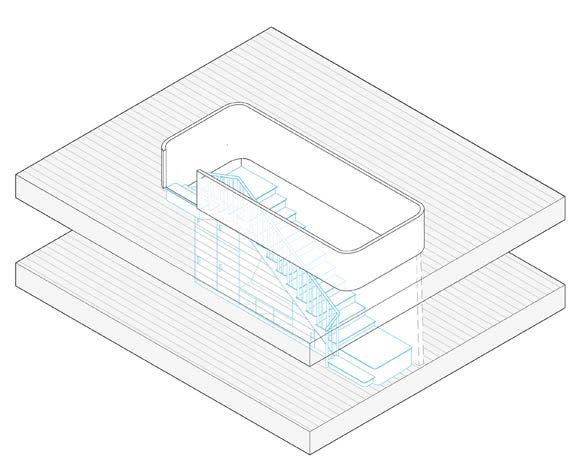
Sandpiper Stair options for a renovation project. The top left and bottom stair options would be steel, and the right top and bottom options would be wood.
Hawaiian Airlines Logo
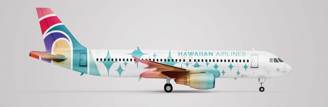
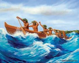
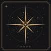
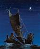
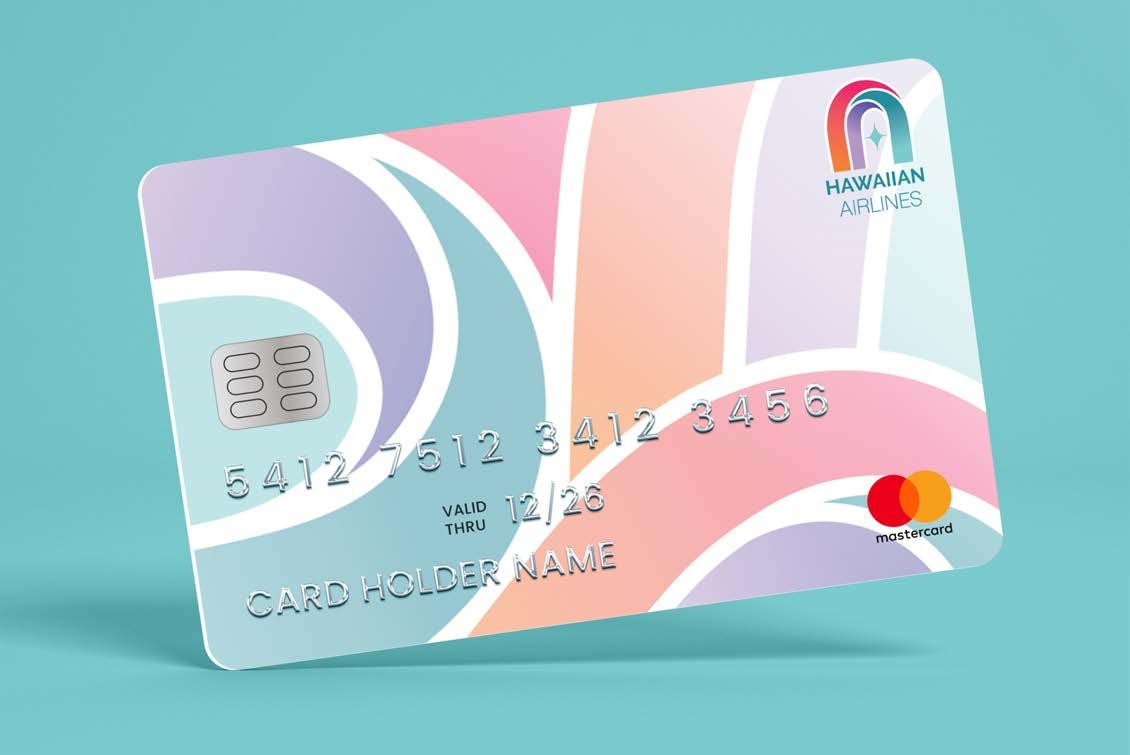
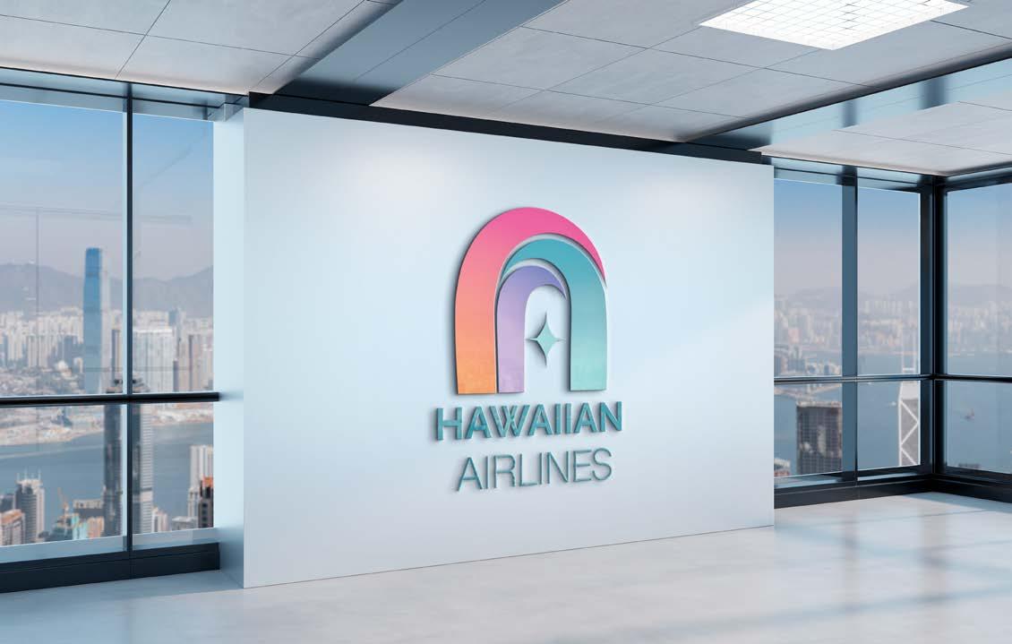
In a Logo and Identity class, I chose to rebrand Hawaiian Airlines. What I was particularly interested in was Hawaiian Airlines’ connection to the world. Hawaiian Airlines acts as a doorway to different places and cultures to learn about the world from a respectful perspective. When researching the history of Hawaii the first Polynesian settlers arrived by navigating the stars and voyaging the Pacific Ocean. My design objective was to create a logo that is a threshold that allows people to experience Hawaii and for people from Hawaii to experience the world. This duality and connection were executed with this archway as it acts as a symbol of hospitality as Hawaii opens the door for others to visit the islands and what they have to offer. I wanted to use vibrant and tropical colors for the logo to begin to be interpreted as an arch but also a rainbow. Lastly, I also wanted to create the element of the stars in the logo to honor the history of how Hawaii’s first settlers used the stars to find the islands.
Top Image: Billboard Showcasing the Hawaiian Airlines Logo
Bottom Image: Airplane Wrap mock-up of the Hawaiian Airlines Logo
Top Image: Hawaiian Airlines Credit Card Mock-Up to promote the company and the new logo
Bottom Image: Rendering of the new logo in the airport and how the logo begins to read as signage
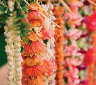
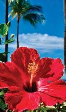
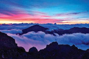
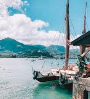
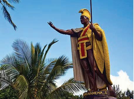
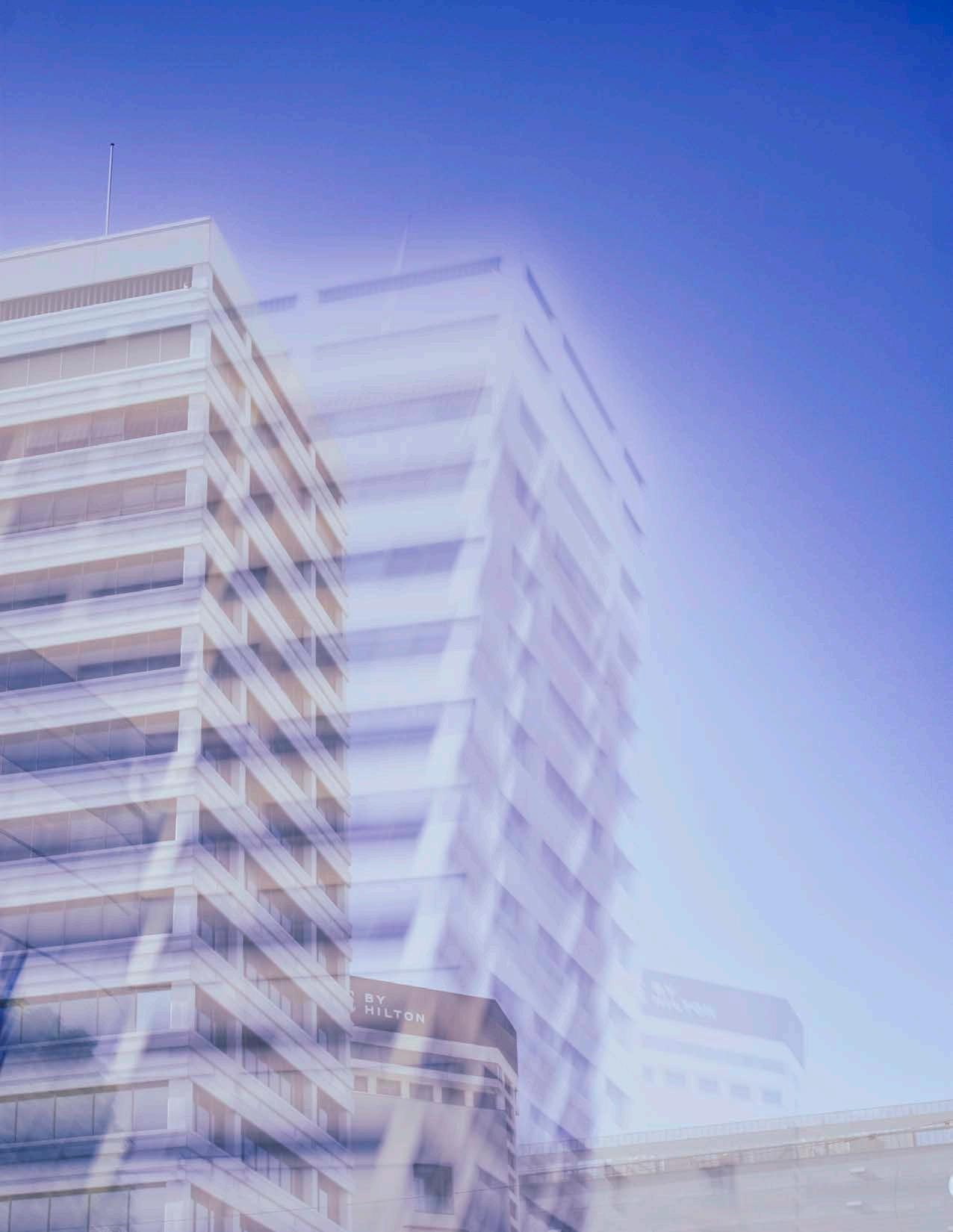
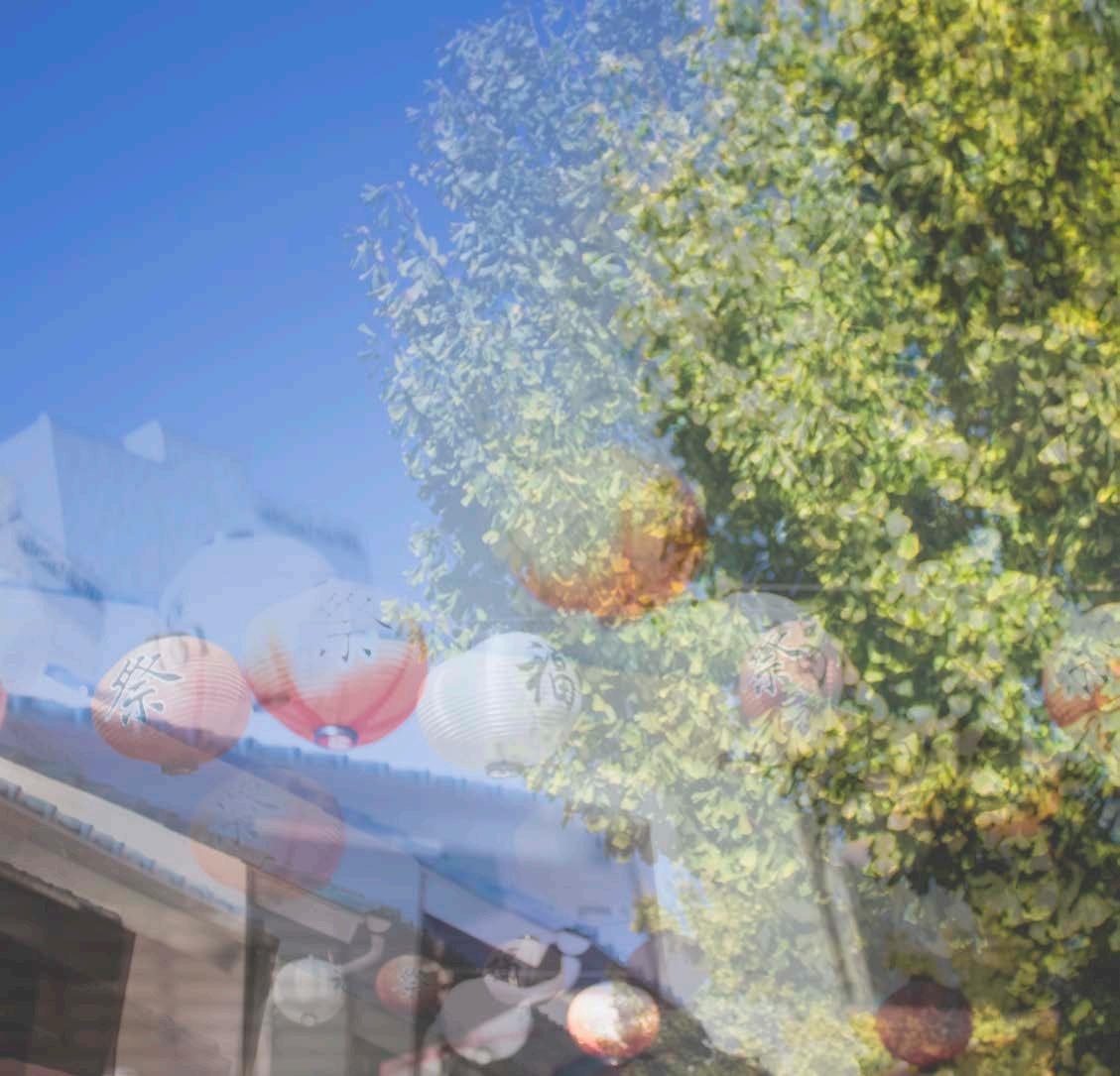
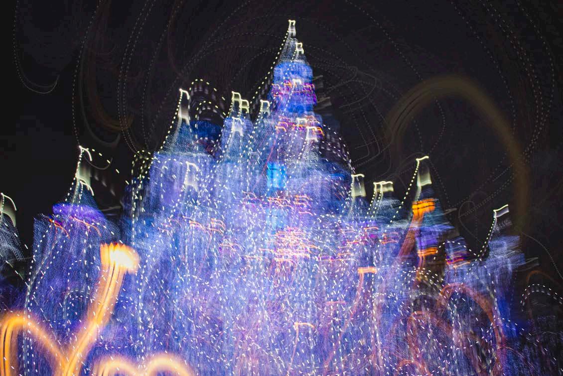
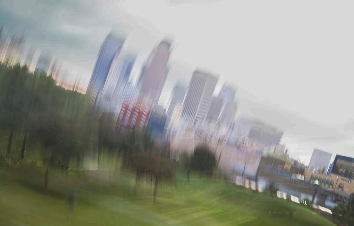
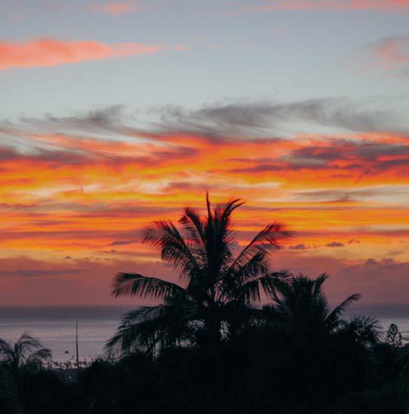
Along with architecture and graphic design, I also find photography as a fun hobby. I took a photography class where I began to be passionate about taking photos and how experimental photography could further be explored. I investigated playing with the exposure and motion while taking pictures in photography class and the results were captivating and exciting. I was fascinated with the idea of taking these photos in the Southern California area and making them feel inter-dimensional. I currently use photography as an entertaining hobby and there are parallels of photography in architecture and graphic design. I like to take photos of places that I go to in California like Little Tokyo and Disneyland that are shown here. I also like taking photos in Hawaii to highlight the beautiful natural landscape. I hope to continue using photography as an artistic medium for myself and I hope that it can be shared with other people that resonate or have emotional reactions when looking at these photos.
High Exposure Image of Lanterns in Little Tokyo
High Exposure Image of Theme Park
High Exposure Image of L.A.’s Skyline at the Los Angeles Historical National Park