9 minute read
INSPIRATION


Advertisement

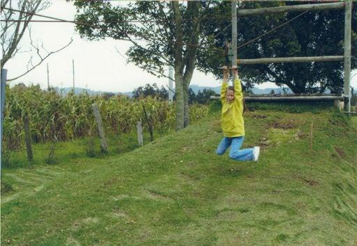
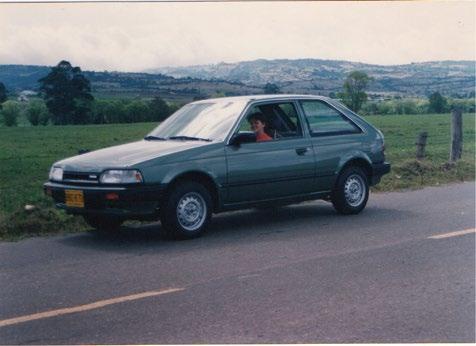
I grew up in Bogota, which is the capital and largest city of Colombia. It presents a remarkable number of contrasts in its geography. Bogotá’s landscape is a juxtaposition of the modern city and Andes mountain range. It has the colors of modern buildings and colonial roof tiles that are from the colonial era but also the green from the mountains at the east where farmers cultivate coffee, potato, corn and other crops. Growing up in Bogotá, I believe I was influenced by the juxtaposition of this contrasts, in my everyday life I was in touch with the chaotic city and everything that came with it: stress, hurry, loudness; but also during the weekends I was in touch with the natural calming landscapes whenever I went to Facatativa (a small town near Bogotá) to visit my grandparents. During the weekends I used to do a lot of natural activities with my family, especially my cousins. A memory that kept repeating in my mind was of my brother, my cousins and me climbing trees. From this memory came the inspiration to the creation of my piece.

Process
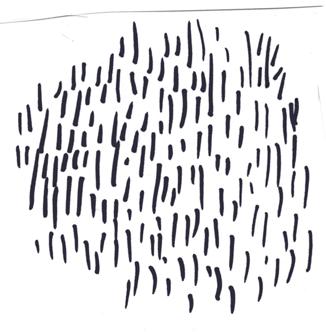
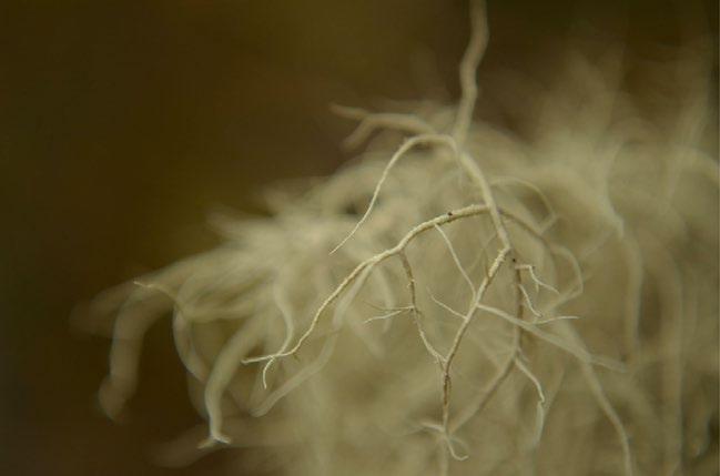
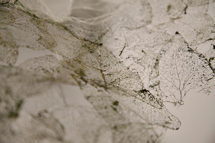
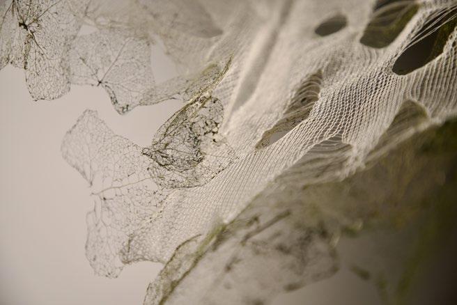
I began my experimentation with leaves because it reminded me of the memory. To represent the fragility and the fading away in my key words, I decided to remove the skin of the leaves, leaving only their skeleton. I accomplished this by boiling them with water and baking soda. At the end I was able to obtain the result I wanted.


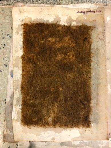
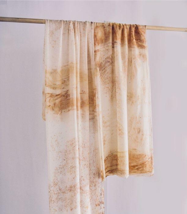
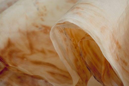
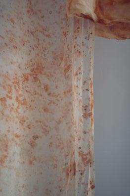
For me, disgust is an emotion that comes from things we do not fully understand. Also, towards something we find dangerous and think may harm us. Microorganisms are things we found disgusting mainly after covid came because we became more aware of their presence even though they’re invisible to our eyes. I wanted to make visible this hidden thing we found disgusting.
Inspiration Process
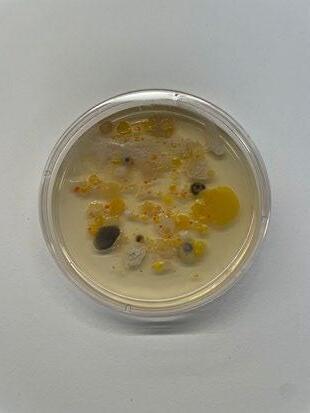
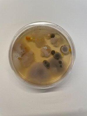
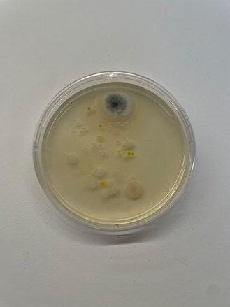
At the beginning of my project, I collected samples from different places in New York (the subway, central park, the street and my room), and I put them on petri dishes with medium agar to allow them to grow and become visible. Bacteria and fungi began to grow, and some fascinating prints appeared. I felt inspired by these prints and decided to replicate them in my piece.


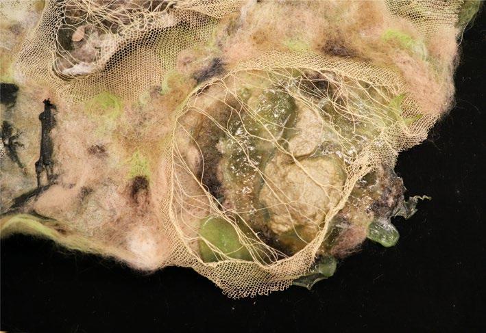
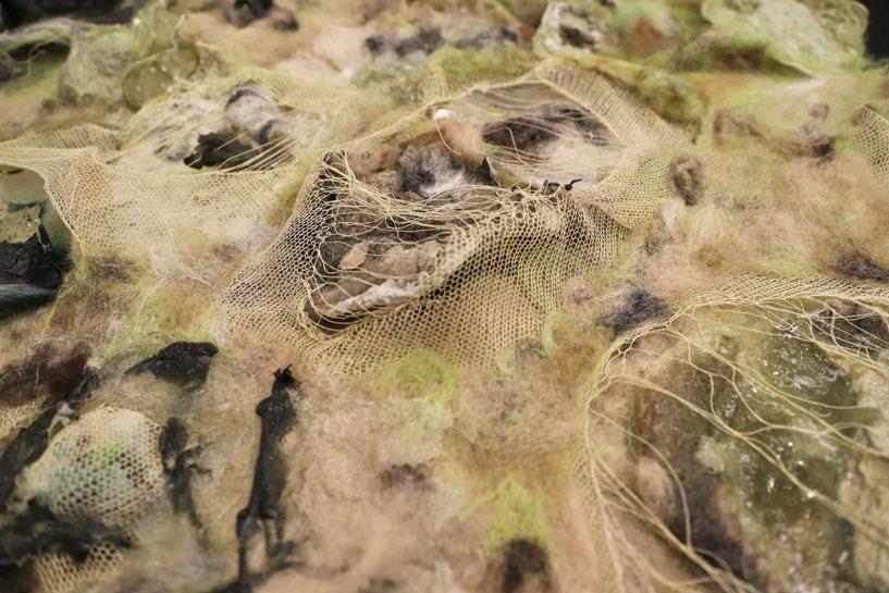
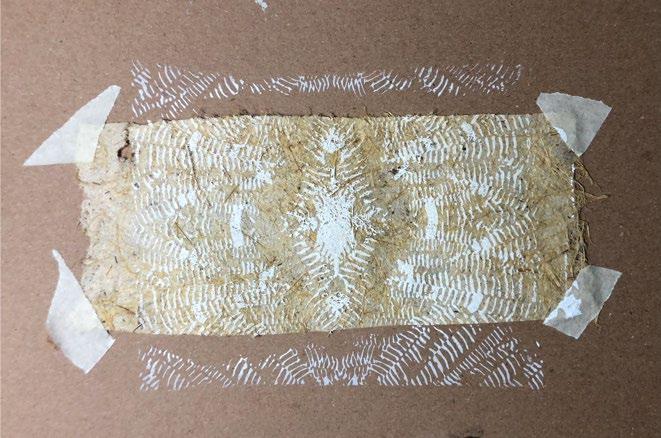
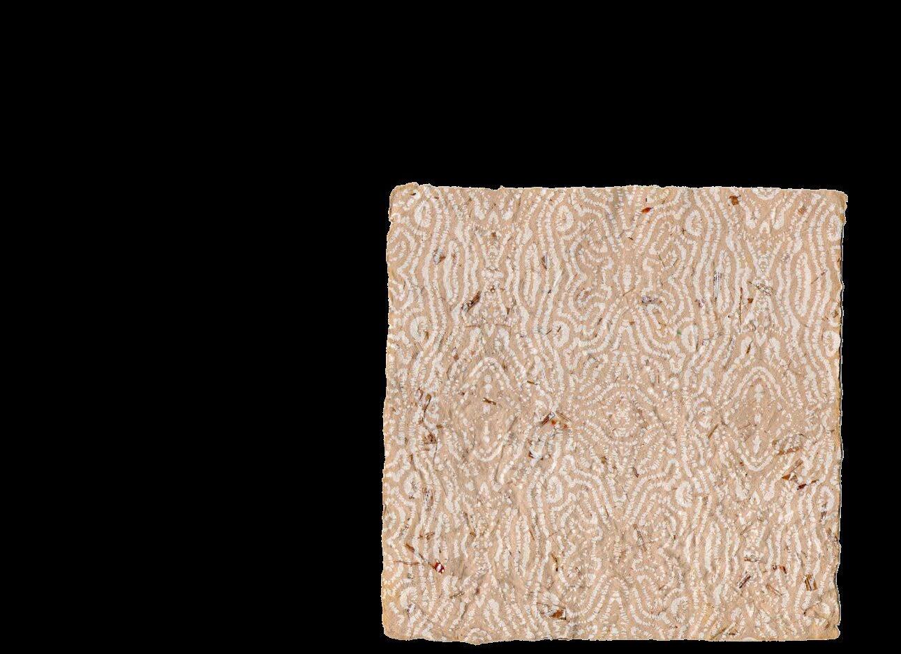
Techniques used: felting (wet and needle), bioplastics (potato starch and Carrageenan kappa), and machine knitting.


Nowadays, most people living in industrialized cities spend up to 90% of their time indoors. According to the U.S. Environmental Protection Agency (EPA), people are exposed to higher levels of pollution in their homes and workplaces than outdoors.
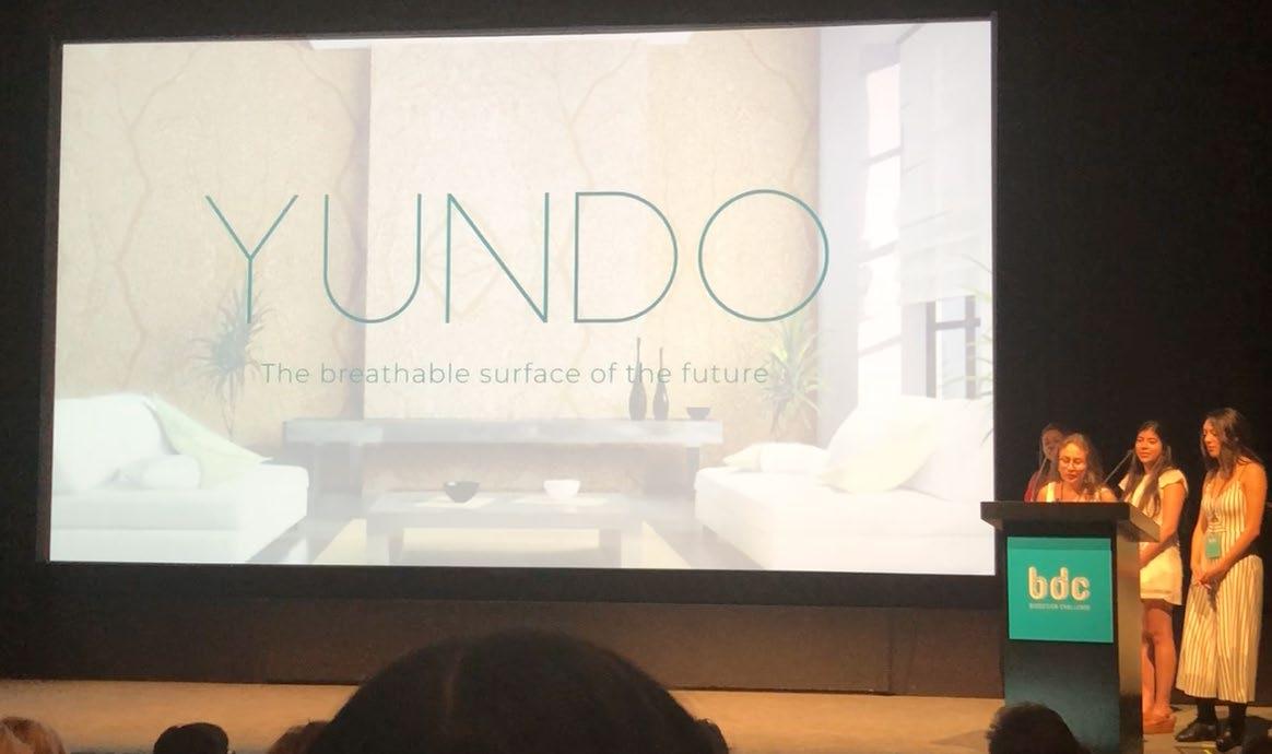
For these reasons we created YUNDO (purity in Japanese), a living surface made of biodegradable materials and living organisms that help improve indoor air quality, with an artistic and sustainable design.

YUNDO is composed of three elements: a surface made from bagasse, cyanobacteria, and a protective plastic.

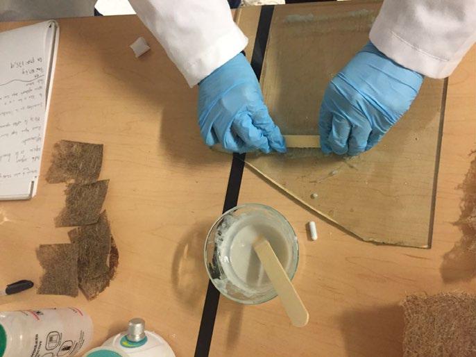
The surface was made from traditional papermaking which led to depulp, mix and form paper. For this process, agricultural wastes were chosen as a raw material, because they are inexpensive, biodegradable, and easy to find worldwide. Depending on the country of manufacture, these wastes vary. For that reason, research must be carried out to make the best use of them to contribute to environmental sustainability. As a result, in Colombia, value was found in bagasse: a waste obtained from sugar cane, one of the crops that generates more waste in the country.

Promotional video https://www.youtube.com/watch?v=vCy-m7ZAG6o
The second element, cyanobacteria, was located within the bagasse surface. To attach them, the silk-screen printing technique was used by stamping the nutrient medium (food for cyanobacteria) on the paper. In this way, we could set the microorganism and generate on the surface an artistic design inspired by the bagasse fiber. Thus, cyanobacteria plays the main role in the project by absorbing CO2 and releasing oxygen to the environment, as a plant increased to 200%.

Finally, the third element, protective plastic (PLA) was used to protect the surface and microorganisms. This material was chosen because its porosity, that allows gas exchange so cyanobacterias can develop their work.


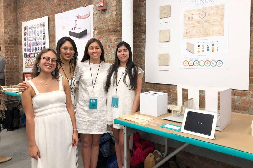
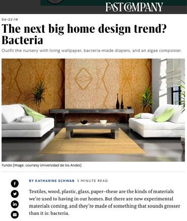
Yundo was a project chosen by Universidad de los Andes to participate in the Biodesign Challenge competition at the Museum of Modern Art (MoMA) in New York, 2018.
Likewise, it was highlighted by:
- Fast Company: https://www.fastcompany.com/90176867/the-next-big-home-desig n-trend-bacteria
- Revista AXXIS: https://revistaaxxis.com.co/estudiantes-uniandes-moma-nueva-york /#prettyPhoto.

Project developed together with:
Maria Camila Gomez
Paula Rodriguez
Estefania Santos
Presenting at Parsons and the Museum of Modern Art (MoMA) in New York, 2018
Nature has always been a source of inspiration for human beings, we observe and analyze it, and we are accustomed to its constant presence in our lives. Within this context, fungi have been under research for quite some time. However, the artistic and creative value of this resource is still undiscovered.
Organicum is a project that investigates the potential of microscopic fungi in a creative context in search of creating environmentally responsible textiles. In this way, it reveals the aesthetic potential of a resource of which we are prejudiced and consider foreign.
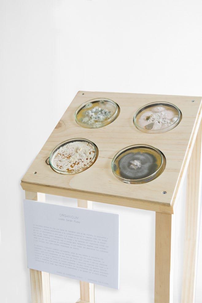


Organicum was born from a long process of experimentation with different types of fungi, nutrient mediums and fibers (silk, cotton, linen, among other).

Process of experimentation


After the process of experimentation, I created a design laboratory composed by two acrylic boxes, which contained nutrient medium, fabric and penicillium. Inside these boxes, the fungi carried out the whole coloring process little by little and after a month the desired results were obtained: fabrics with unexpected and unique designs, suitable for everyday use, since its pigment does not represent any harm to our skin or our ecosystem.


This project allows to create patterns that are not only unique, but also free from the use of polluting elements. It is a new way to design and create without harming our ecosystem, where the results are pieces of art that reflect the delicacy, sensitivity, and transitory beauty of the fungi.


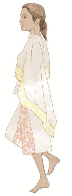
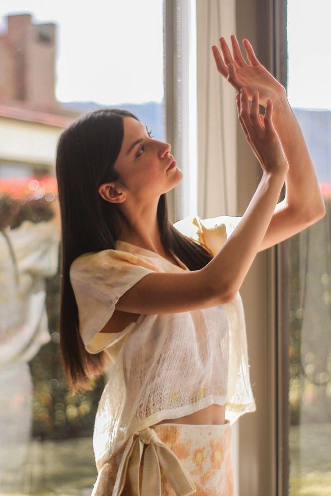
Wuasi is a Colombian brand that designs and produces womenswear that seeks to explore the relationship with our home and our ecosystem. It offers cozy garments (tops, bottoms, dresses, and jumpsuits), which contain a high content of textile design, product of the work of experimentation and intervention with biodesign, and manage to enter the circular economy model thanks to its manufacturing processes and design.


Wuasi emerges from sustainability and the imperative need to combine handmade textiles and biodesign.
Along the way wuasi encounters the disruption posed by the appearance of a virus, which led humanity to a mandatory confinement. Upon returning home, our relationship with this space begins to change and we find new meanings not only with the physical place, but also with habits and reflections that bring along new perceptions, feelings, and ideas about being at home. Wuasi understands this new intimate look as inspiration, rescuing narratives that revolve around this new lifestyle inside the house.
"No doubt. This is my home here it happens, here I delude myself immensely. This is my home stopped in time."
- Mario Benedetti
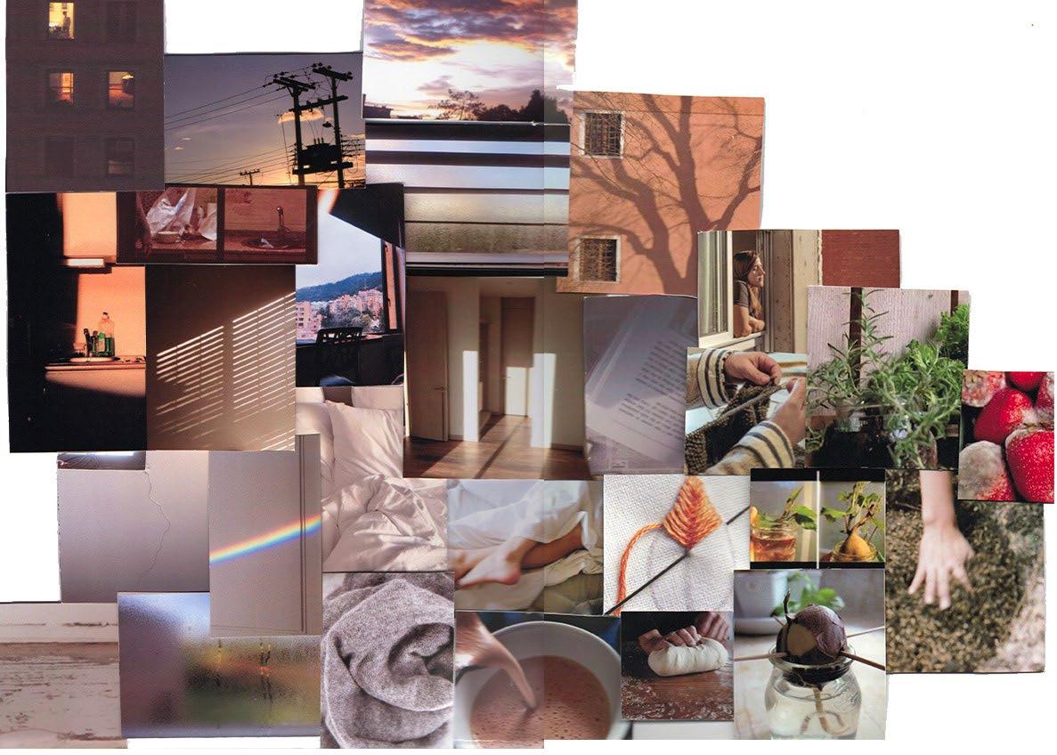
Final moodboard: all the concepts were compiled to visualize the result of this new home and particular lifestyle. From this it was possible to proceed to the realization of the design of the garments and the creation of the brand.
The brand seeks to convey these new narratives that are generated from this landscape of physical isolation. The new relationship with the domestic, the reflections on what is sustainable and the value found in the handmade work. Because of this, it explores with different tools and introduces them into textiles and garment design in order to transmit these new perceptions.
Through the intervention in textile, the brand seeks to position its garments within circular economy, a business model inspired by the natural cycle of the ecosystem, which seeks that the objects and materials in a system maintain their value and usefulness to minimize waste production and the impact on the ecosystem. Thus, the garments are made from 100% natural fibers, which stand out for their quality and longevity, and are woven by hand flat weaving. This traceability of both material and its manufacturing process allows the brand to guarantee its quality and thus be able to extend its useful life to the maximum.


Using three design tools (biodesign, zero waste, upcycling) and a meticulous process of intervention and experimentation, the b rand seeks to turn its garments into communication pieces that transmit narratives that arise from the new relationship with the domestic, while searching for keeping them within the business model of circular economy.
Through biodesign, the brand explores new ways of coloring process without negatively affecting the ecosystem. This is done by microscopic fungi that release and leave pigment on the surface on which it grows. The brand exploits this potential and makes them grow on natural fiber fabrics which, due to the ir properties, absorb the pigment and create unexpected and unique designs suitable for everyday use. The value of this textile laboratory is that it dissociates itself from the use o f polluting elements for our planet and generates a new way of designing and creating with no harm to the ecosystem.

Another of the design tools used by the brand is Zero Waste, which is found within the process of pattern design and elaboration of the pieces and consists of taking advantage of most of the textile, with the purpose of not generating waste. To accomplish this, the brand designs the pattern of its garments from the rectangle, which allows it to reduce its textile waste and make the best use of the material.

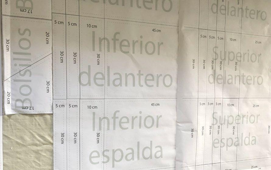
In this way, within the pattern there are no curved lines but only straight lines and it is through the clamps that the pieces are made to fit the body, making them comfortable and versatile.


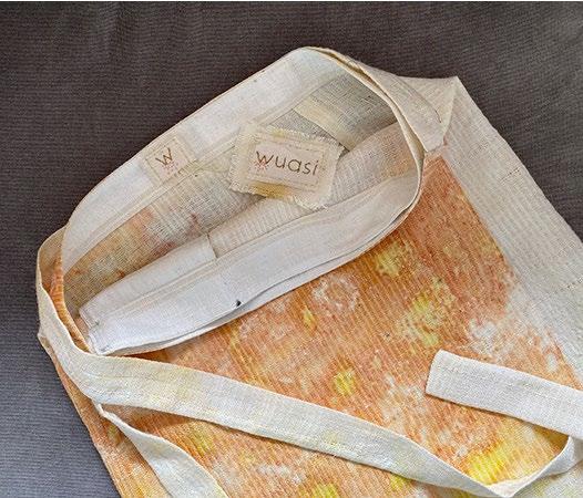
On the other hand, although Zero Waste is intended to reduce textile waste, it never reaches 0%, and for this reason, the waste that may be generated is used to make accessories, packaging, and labels.


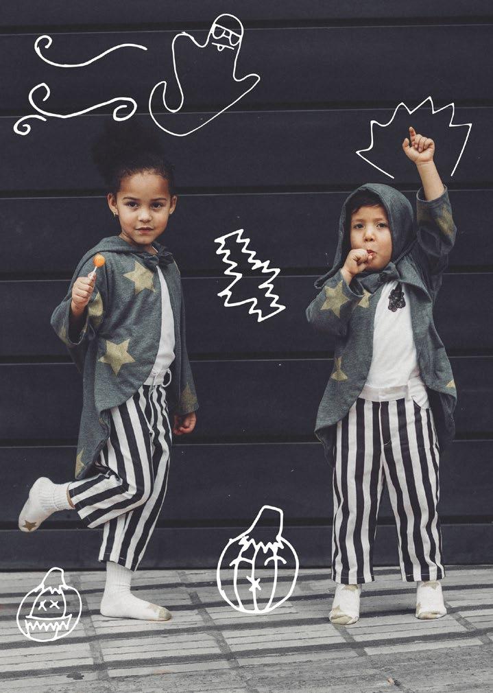
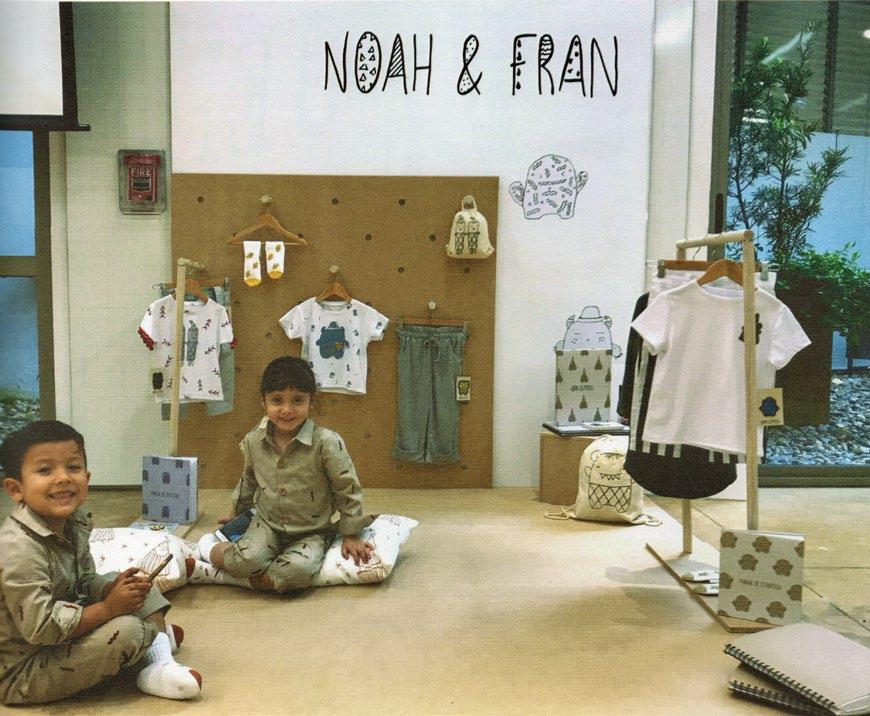
NOAH & FRAN is the design of a children's clothing brand based on the exploration of identity, creating a world in which the parameters and divisions between gender does not exist. This brand evolves from a great emptiness due to the lack of possibilities and the existence of limitations for children, since everything that surrounds them is determined by what society thinks about what we are and how we should look like. Thus, the idea arose from creating something that allows children to freely develop their identity through genderless clothing.
The collection starts from the creation of two characters who are a pair of twins who were raised with a quite different way of thinking than the others. From an early age their parents taught them that things around them should not be associated with a particular gender. They applied this way of thinking to different aspects of their lives, including their wardrobe, which allowed them the freedom to build and explore their identity little by little.
NOAH & FRAN has a main collection designed for children's everyday life and capsule collections inspired by different celebrations (Christmas and Halloween).

Project developed together with:

Nicole Senz
Juanita Vargas
Main collection
Capsule collection: halloween

Capsule collection: christmas

NOAH & FRAN is a brand that was born from a conceptualization work carried out from moodboards. PAINT

Sweet Memory
From all these concepts and moodboards it was possible to proceed to the realization of the design of the garments and the creation of the brand.


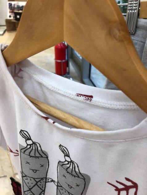
The NOAH & FRAN universe moves within a neutral aesthetic which consists of the use of colors such like gray, black, white, nudes, among others. It has accents of color that bring life to the garments with shades such as yellow, orange and red. On the other hand, it presents different illustrated characters in its clothes, with which children can feel identified. The silk-screen printing technique was used to print the garments.


Colombia is one of the most biodiverse countries in the world and thanks to its location, it is full of diverse and unique ecosystems. We rarely enjoy these landscapes because we consider them part of our daily life.
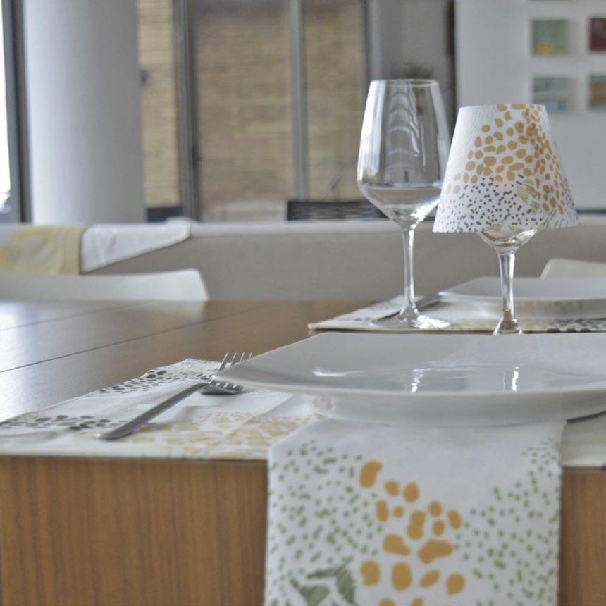
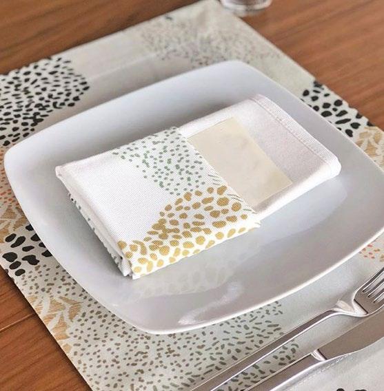
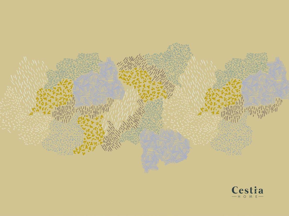
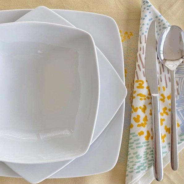
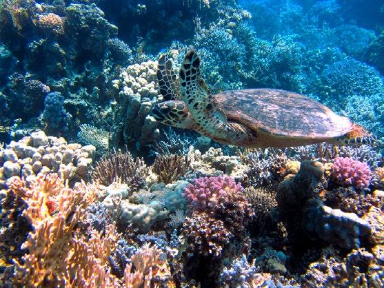
Bruma is a home collection made for the brand Cestia inspired by the natural ecosystems of Colombia and seeks to raise awareness of the natural wealth of the country. Its creation arose from the study of three ecosystems: paramo, Andean forest and coral reef. From this inspiration, a series of patterns were created and placed on placemats, napkins, and wine glass covers.
Project developed together with:
@cestiahome (instagram)
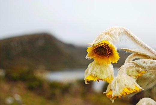
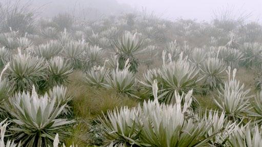
Paramo: The paramo is an Andean intertropical ecosystem with arid vegetation where frailejones and scrubs predominate. Opaque colors s uch as indigo, olive-green, mustard and beige represent this type of landscape.


Finished prints with the color palette

Coral reef: Coral reefs are extraordinarily diverse underwater ecosystems which are formed in warm, shallow waters of tropical seas. In it s landscape there are corals and algae that create the characteristic colors of the ecosystem. The color of the sea contrasts with warm ton es such as orange, coral, and mint green.
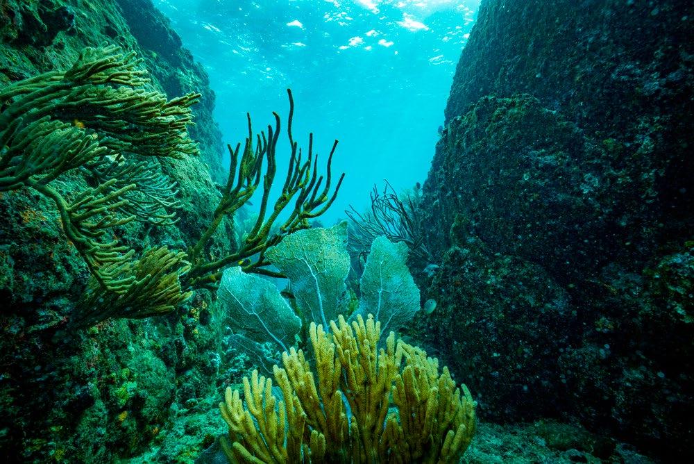
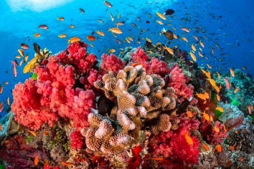
Coral reef


Moodboard with illustrations inspired by the ecosystem


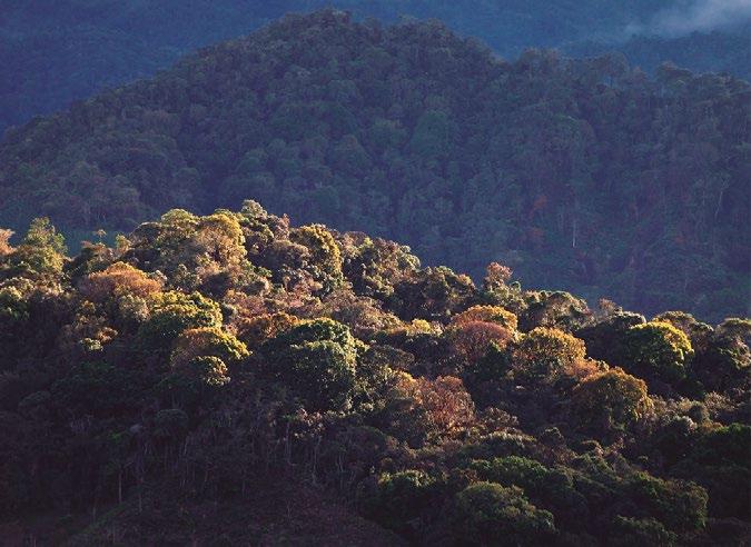
Andean forest: The mountain forests of the northern Andes, better known as Andean forest, are cold, rainy, cloudy and temperate. In its ecosystem predominates cool tones such as brown, army green, emerald green, beige and autumn orange, which represent the rusticity and ro bustness of forests.


Andean forest Moodboard with illustrations inspired by the ecosystem