3 minute read
CONTENTS
UK Vogue photoshoot: ‘New Begginings’
Briefing the client: Principles in communicating the concept
Advertisement
9. The elements of styling
The legacy of Oliviero Toscani
Re-branding Bershka: differentiating the brand from the Inditex stable


Here I have used the Pantone colour system to identify the shade of red that Supreme use. However, there are other colour systems that identify colour calibration for example, RAL.


Colour and typography are two key components used within visual communication affecting the way brands are identified and perceived by consumers (Elliot et.al, 2007; Reyna, 2013). The popular streetwear brand Supreme optimises its use of colour and typography in its logo by using a modern sans-serif font and paring it with a bright red-and-white colour scheme to capture the attention of its young target market (Todd and DeCotes, 2023). Supreme’s use of a minimalistic sans-serif font mirrors its brand identity of modern youth and skateboarding culture emulating its products which are effortless, contemporary and clean (Todd and DeCotes, 2023). Supreme also uses a much heavier font which makes its logo more eye-catching as it has a much stronger existence both in print and online (Saltz, 2009). Its bold use of red-and-white colour in its logo helps translate its brand message of rebellion to their customer as it almost resembles a protest sign (LogoMyWay, ND). Colour helps create brand imagery and convey mood (Best, 2017), for example, the colour red is a bold colour associated with power and strength supporting Supreme’s idea of rebellion (Lischer, 2022). Paring this with white, a core colour, in the lettering, continues this minimalistic look while creating the illusion of space and producing high contrast in the logo (Best, 2017; Lischer, 2022).


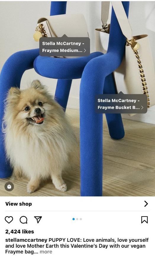
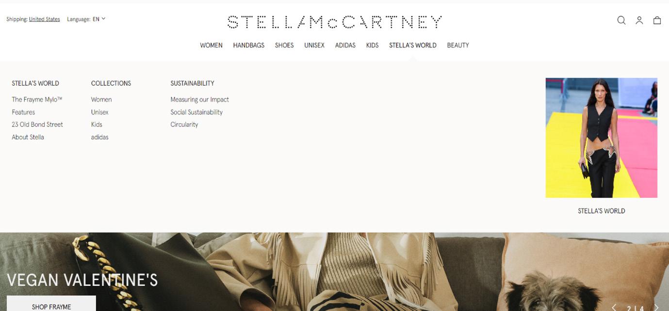
Visual marketing channels come in two main formats, offline channels for example, a physical shop and direct mail, or online channels including websites, apps, and social media platforms (Winkler, 2019; Team SoftwearSuggest, 2023). The use of visual channels is a fundamental marketing tool used by companies to reinforce their brand values by effectively interacting with their customers (SoftwearSuggest, 2023; Rowley, 2009). McCartney’s brand uses an omni-channel marketing strategy providing an integrated shopping experience for her customers while providing a seamless transition of her values from her physical shops to her digital presence extending a strong brand identity to her customers (Winkler, 2019). McCartney’s brand vision is focused on making sustainable luxury fashion, while caring for the environment through material innovation, protection of workers, and animal welfare by supplying solely vegan products (Stella McCartney, 2023). The vision of sustainability and transparency is clearly translated through McCartney’s selected use of visual channels, for example, minimal use of print advertising to reduce her carbon footprint and instead maximises the use of her social media, digital advertising campaigns and e-commerce platforms reinforcing her focus on sustainability (Aaker, 1997; Jones, 2019). McCartney’s Instagram is often where she promotes animal welfare through posts of Vegan and cruelty-free products. These posts link to her website, where you can purchase them, whilst offering additional information about her social and environmental commitments.

Providing sustainability information allowing customers to connect with the brand on a personal level as they know they are shopping consciously.
Stella McCartney’s Instagram shows a seamless blend of brands values from website to social media, promoting animal welfare and innovation of new vegan materials. Also provides links to the website for purchasing


The drop-down, ‘Stella’s World’ enables customers to learn about the sustainable practices, reinforcing McCartney’s brand value of transparency.


Nowadays in modern living, brand identity and perception are almost more important than the products a brand is offering. Currently consumers wish to buy into a lifestyle while developing a relationship with that brand and through successful marketing, this is made achievable (Slade-Brooking, 2016; Hashem, 2021). Imagery is a key component influencing a brand’s identity: for example, its logo, choice of typography, colour pallet, and tagline are all important because when put together they give the brand’s name meaning as it elicits emotion in the mind of the consumer (Slade-Brooking, 2016; Thimothy, 2021). For instance, Nike uses a simple symbolic badge, the ‘Swoosh’ internationally associated with its company, which conveys speed and motion two characteristics associated with its sportswear brand (Aaker, 1997; SladeBrooking, 2016). Alongside this its use of the imperative tagline ‘Just do it’ helps to establish their core values of empowerment, inspiration, and courage (Slade-Brooking, 2016; Hashem, 2021). As most buying decisions are made subconsciously, creating a narrative is fundamental when visually communicating with customers for example, through Instagram posts, website links or even advertising campaigns (Mahoney, 2003; Stine, 2013). Nike specifically uses its advertising campaigns to articulate its brand values for example, in 2008 they released a campaign portraying athletes’ success and comparing it with how they struggled when achieving their goals, this particular ad resembled courage (Aaker, 1997; Hashem, 2021).


