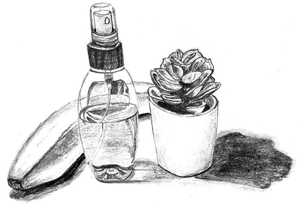
Interior Design Portfolio 2024
Judy Medrano
Interior Design Portfolio 2024
Hello! My name is Judy Medrano and I am a recent Virginia Tech graduate with a B.S. in Interior Design. I’ve been passionate about design from a young age, and through my time at Virginia Tech, I have become drawn to mixed-use, multifamily, and hospitality design. I strive to design spaces that are optimally functional while also creating an ideal experience for the users. In my spare time, I enjoy sketching, listening to music, and dabbling in new languages.
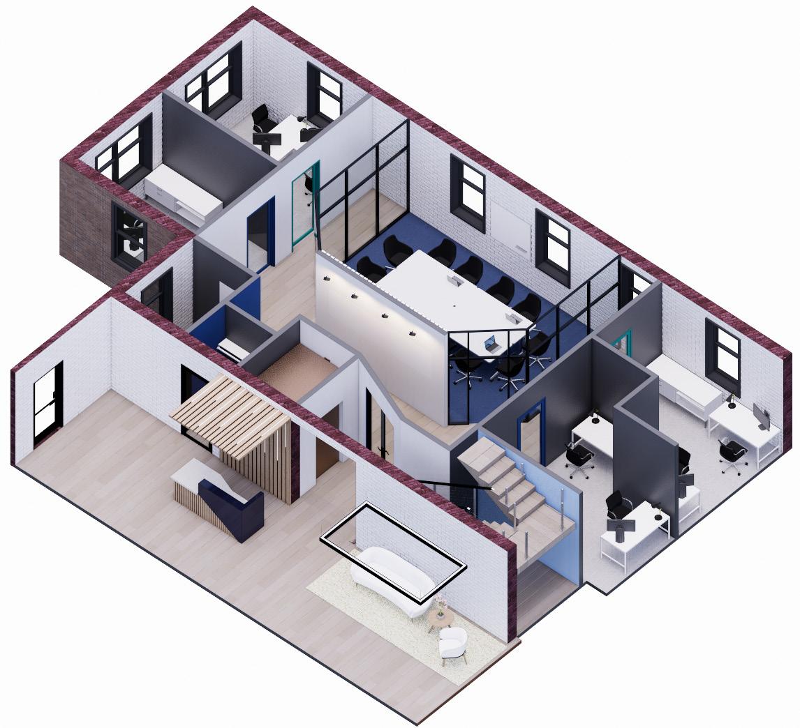
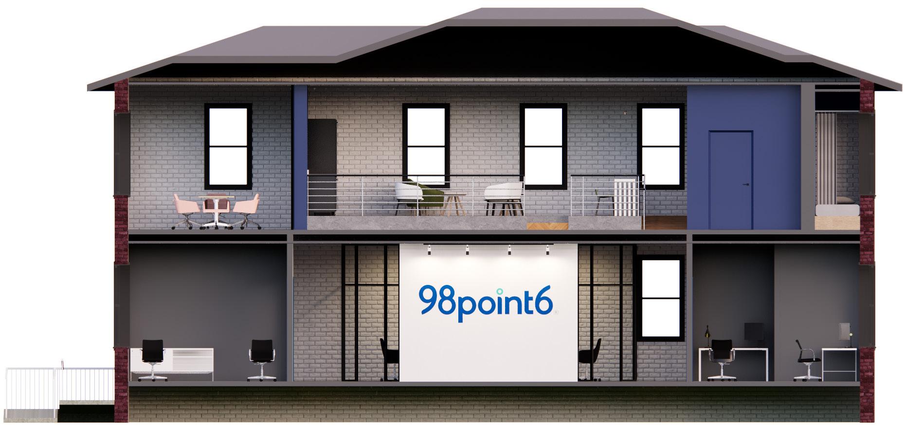
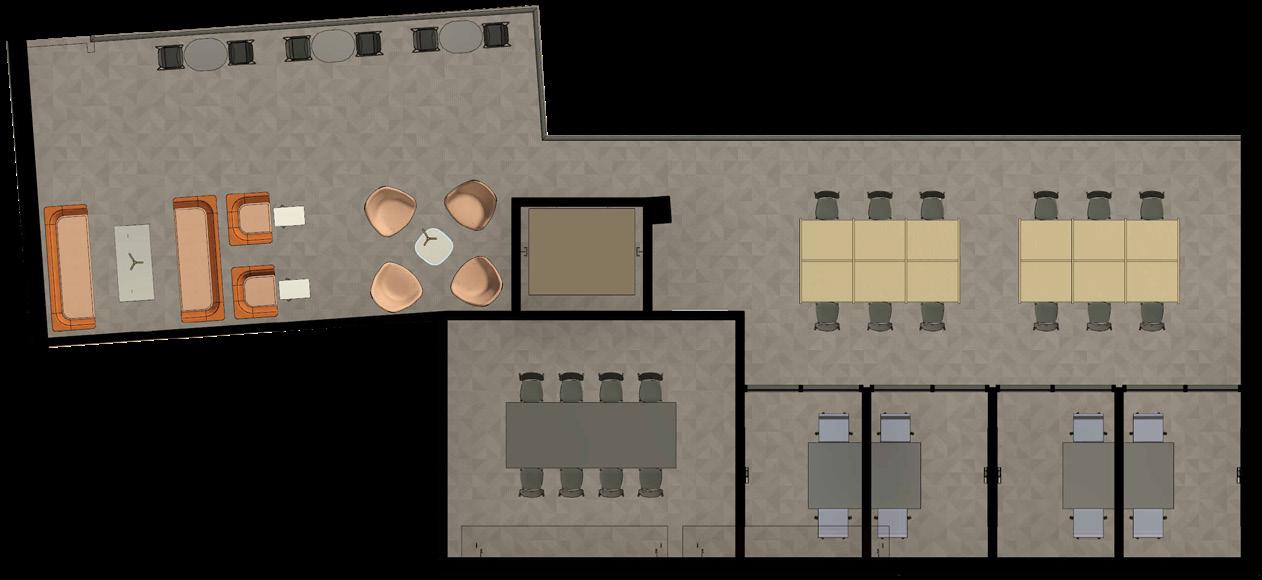
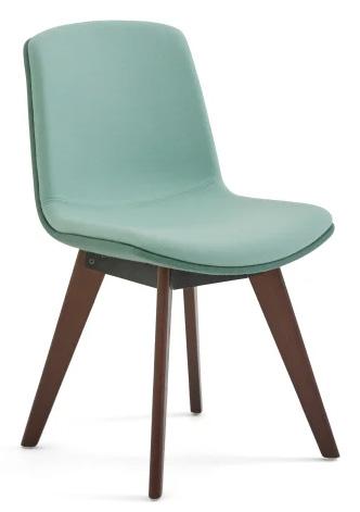
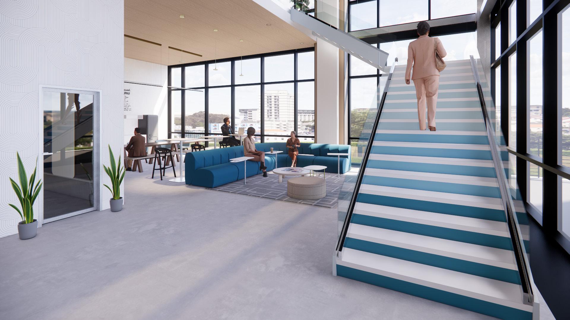
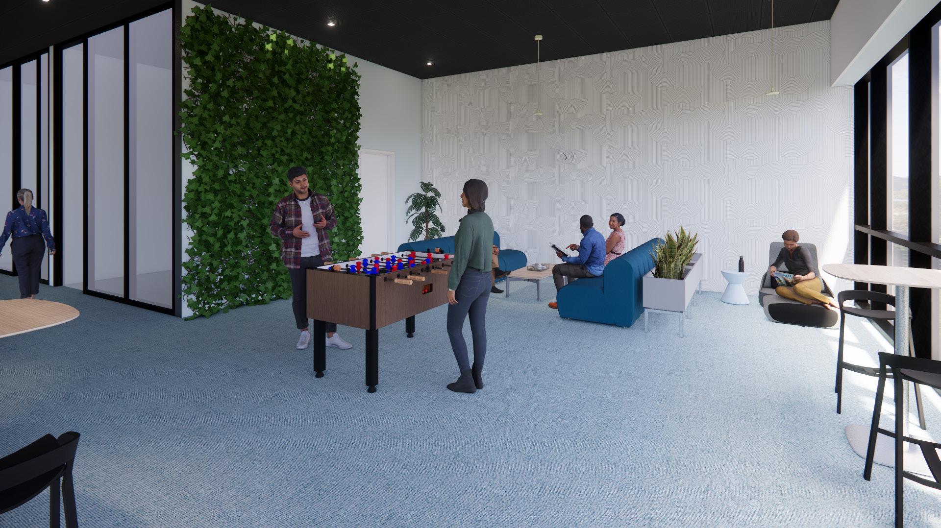
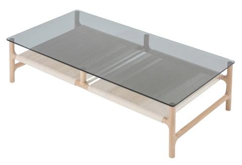
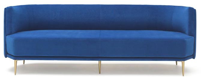
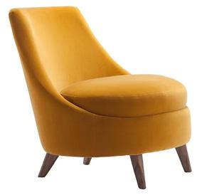
Coworking Office | Fall 2022 | 7,500 SF | 9 Weeks
Revit + Enscape + Photoshop
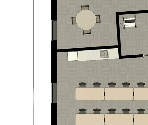
Inspired by 98point6, a tech startup that focuses on making healthcare accessible by connecting patients to medical professionals at an affordable rate, this coworking space incorporates the ideas of network and connectivity. The various types of spaces are each connected through color, line of sight, and repetition.
The dark blue color from 98point6’s logo is used all throughout the building’s design, serving as a sense of connectivity and continuity throughout the space.
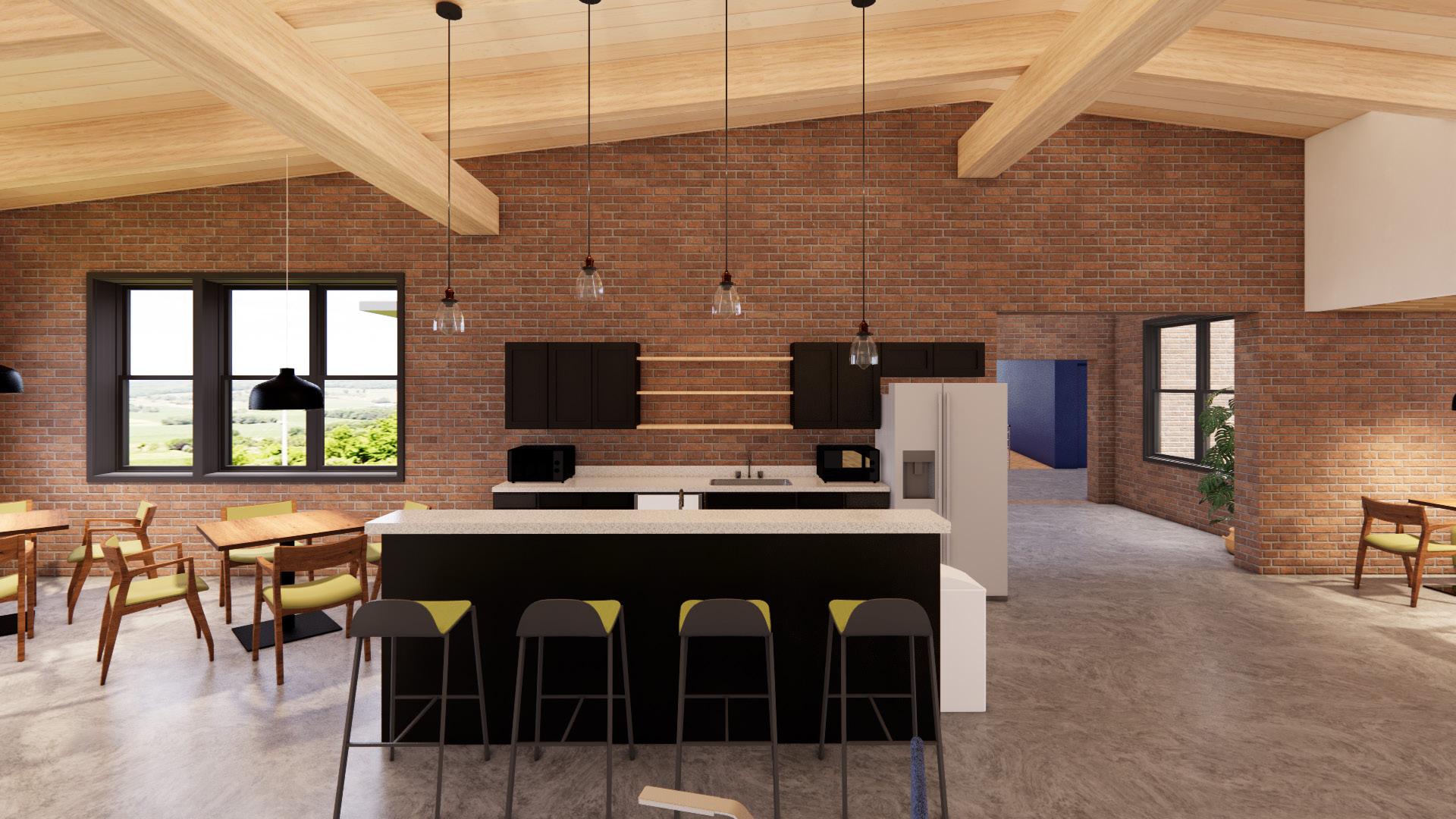
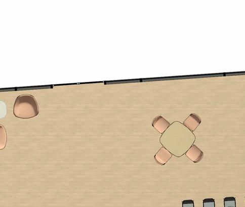
The second floor large area focuses on line of sight by keeping an open space concept between the kitchen and hot desks, while encasing the central lounge in glass partitions. This allows a visitor to easily scan the room upon walking in.
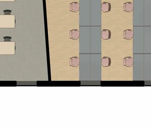
Repetition of material, color, and form is incorporated all throughout the space, seamlessly connecting different axes and different zones.


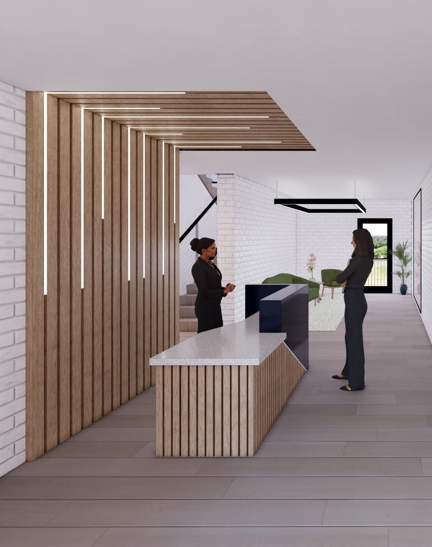
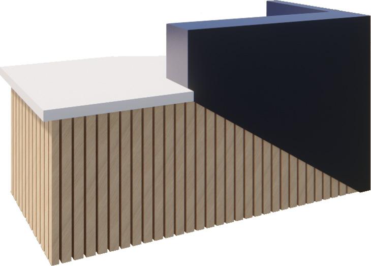
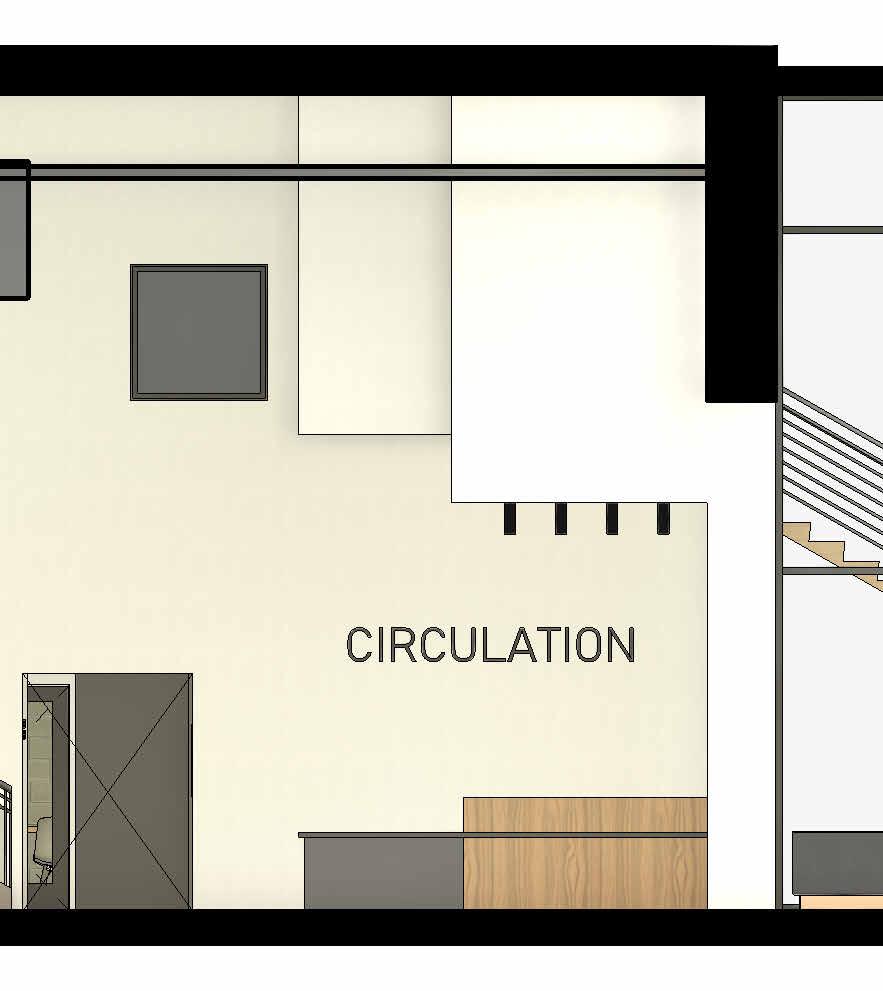
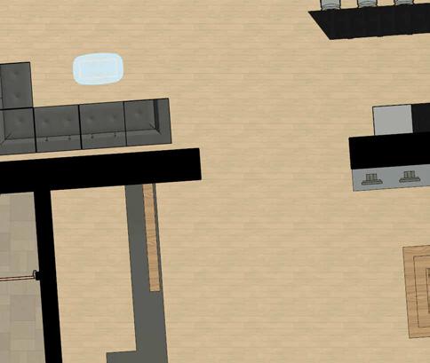
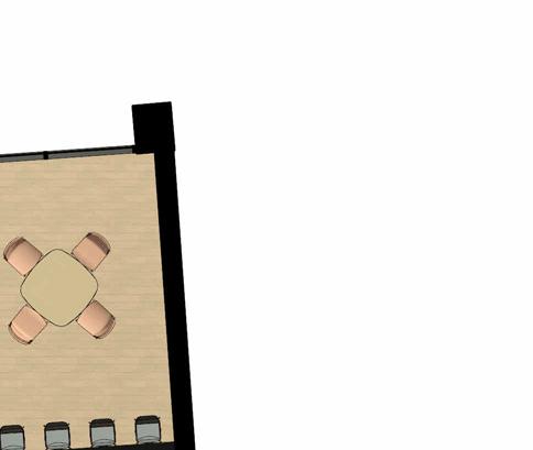
Reception Area + Lobby

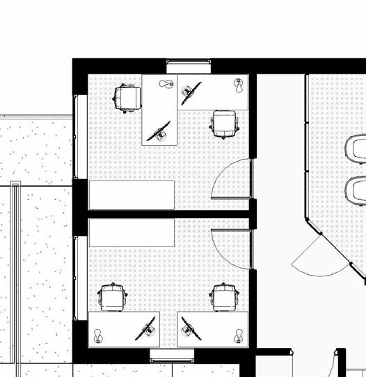
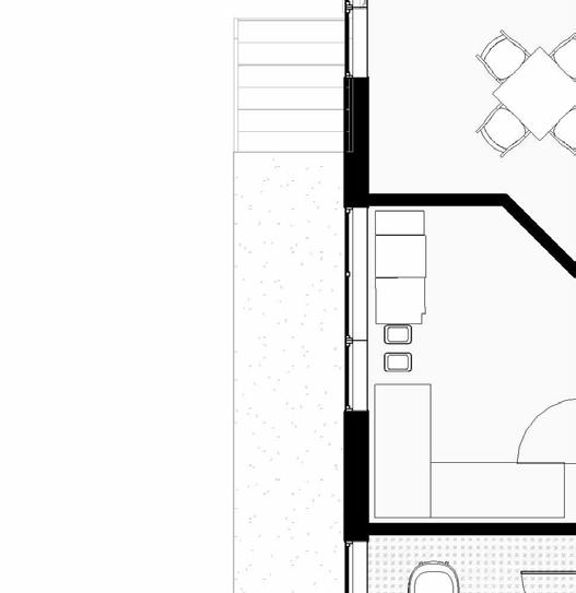
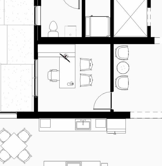
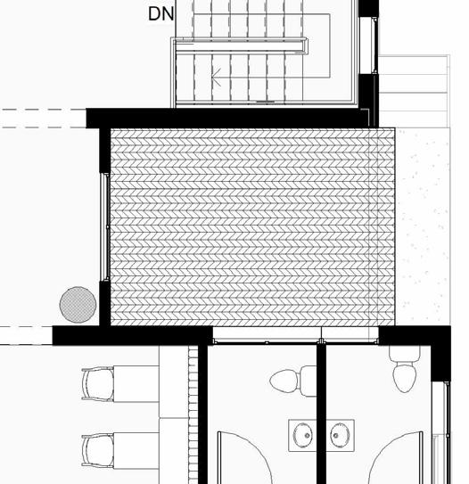
First Floor
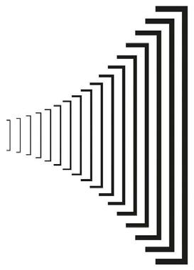
CONNECTIVITY THROUGH REPETITION
The wooden panels use the same wood as the reception desk.
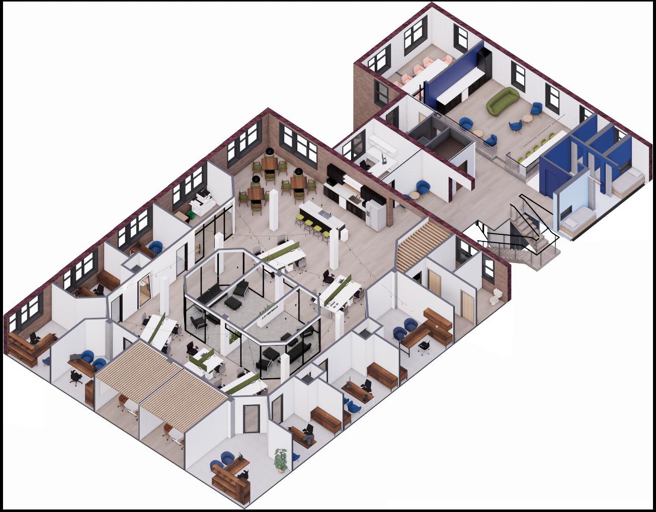
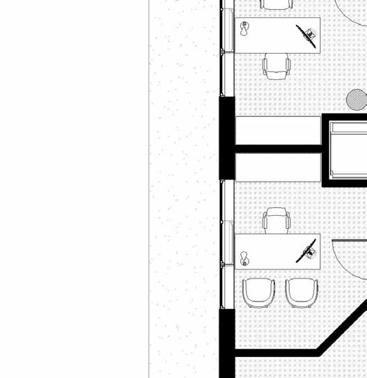
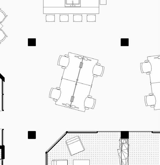
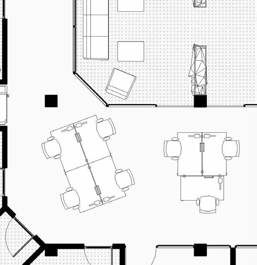
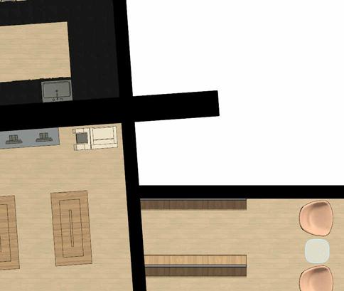
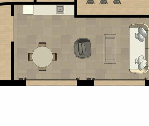
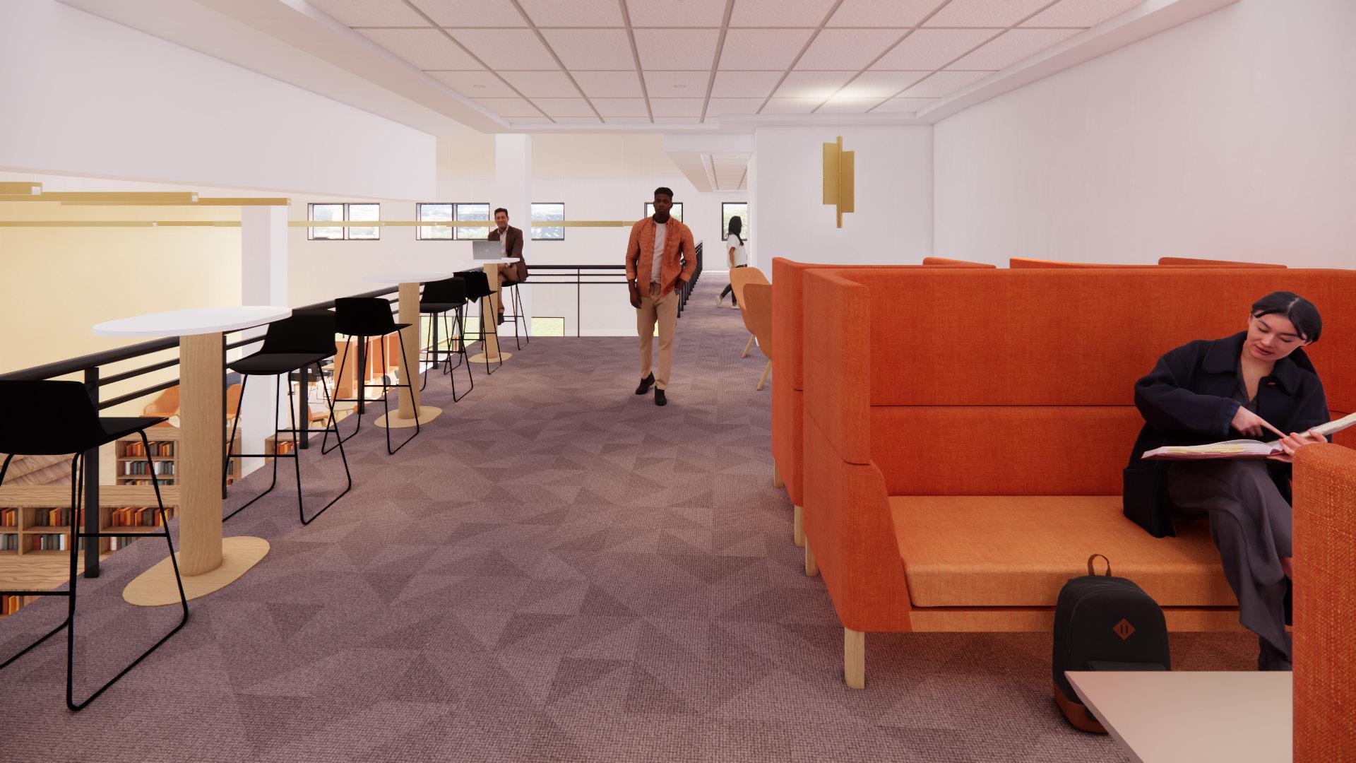
Second Floor | Large Space
CONNECTIVITY THROUGH REPETITION
The outer walls that connect to the private entrepreneurial offices encase the central area, while mimicking the inner walls that enclose the lounge.
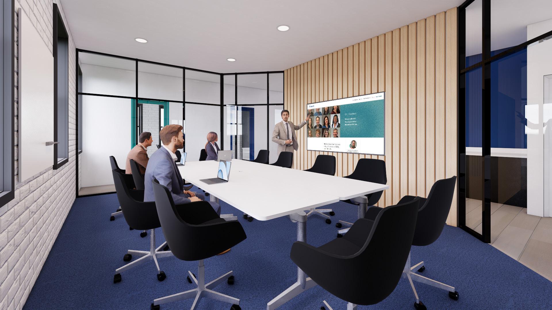
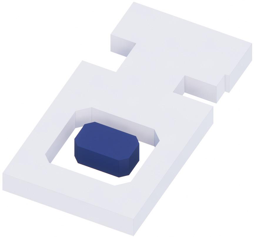
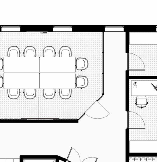
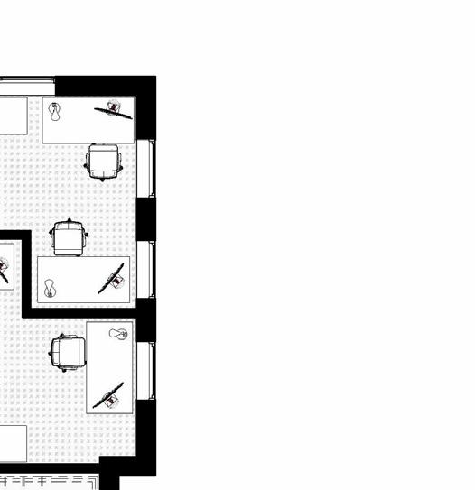
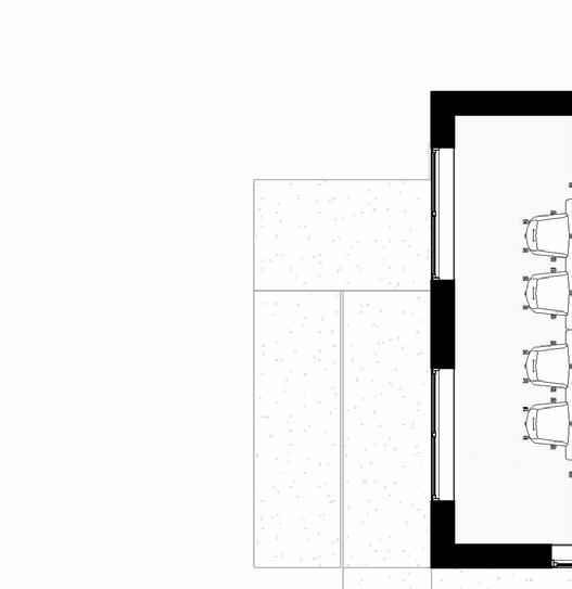
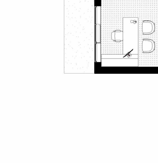
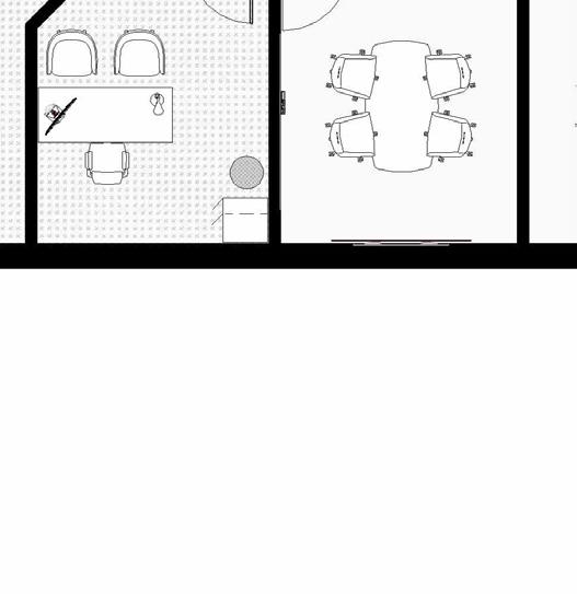
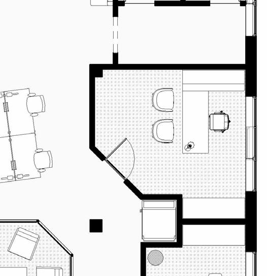
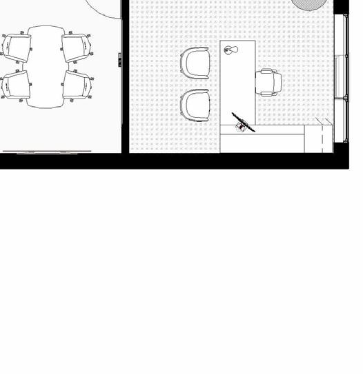
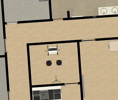
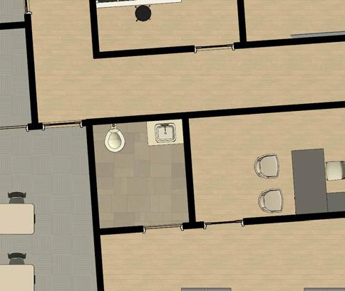
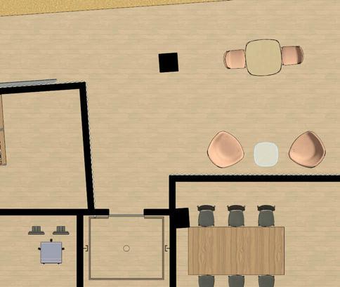
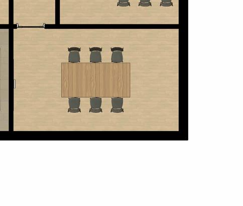
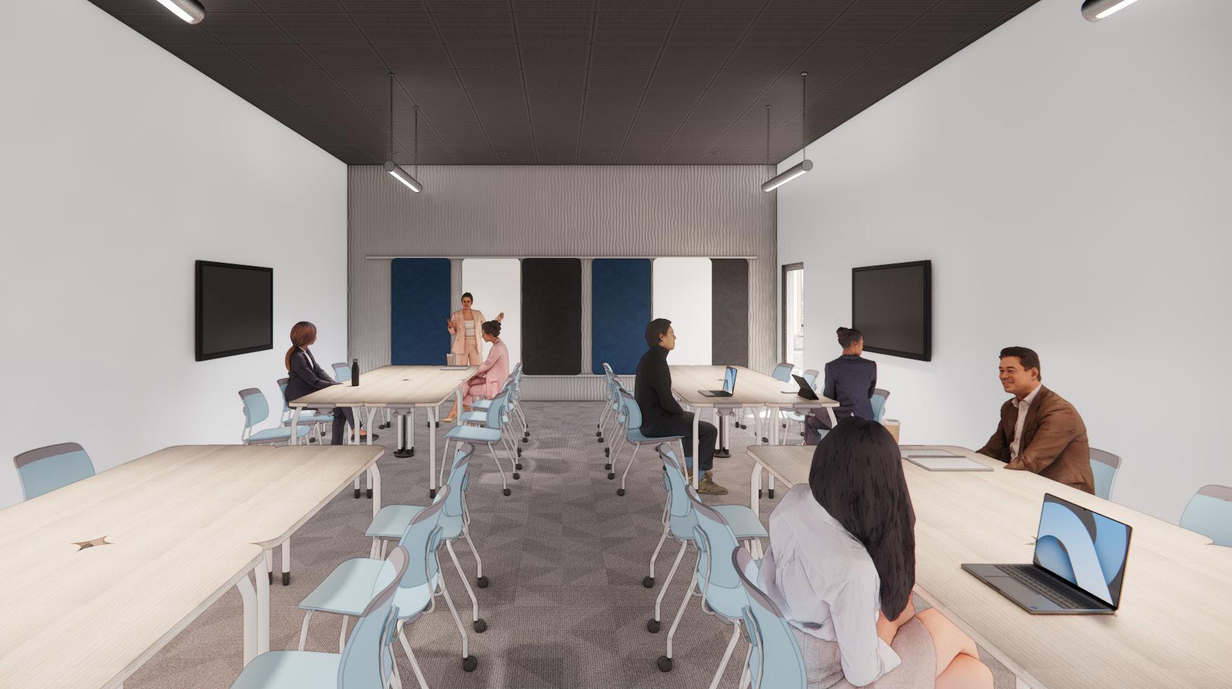
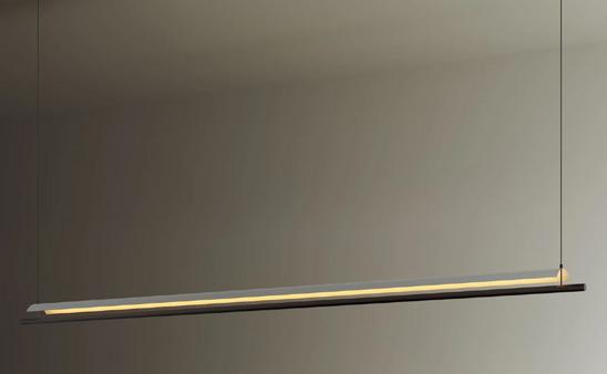
Tech Startup Conference Room
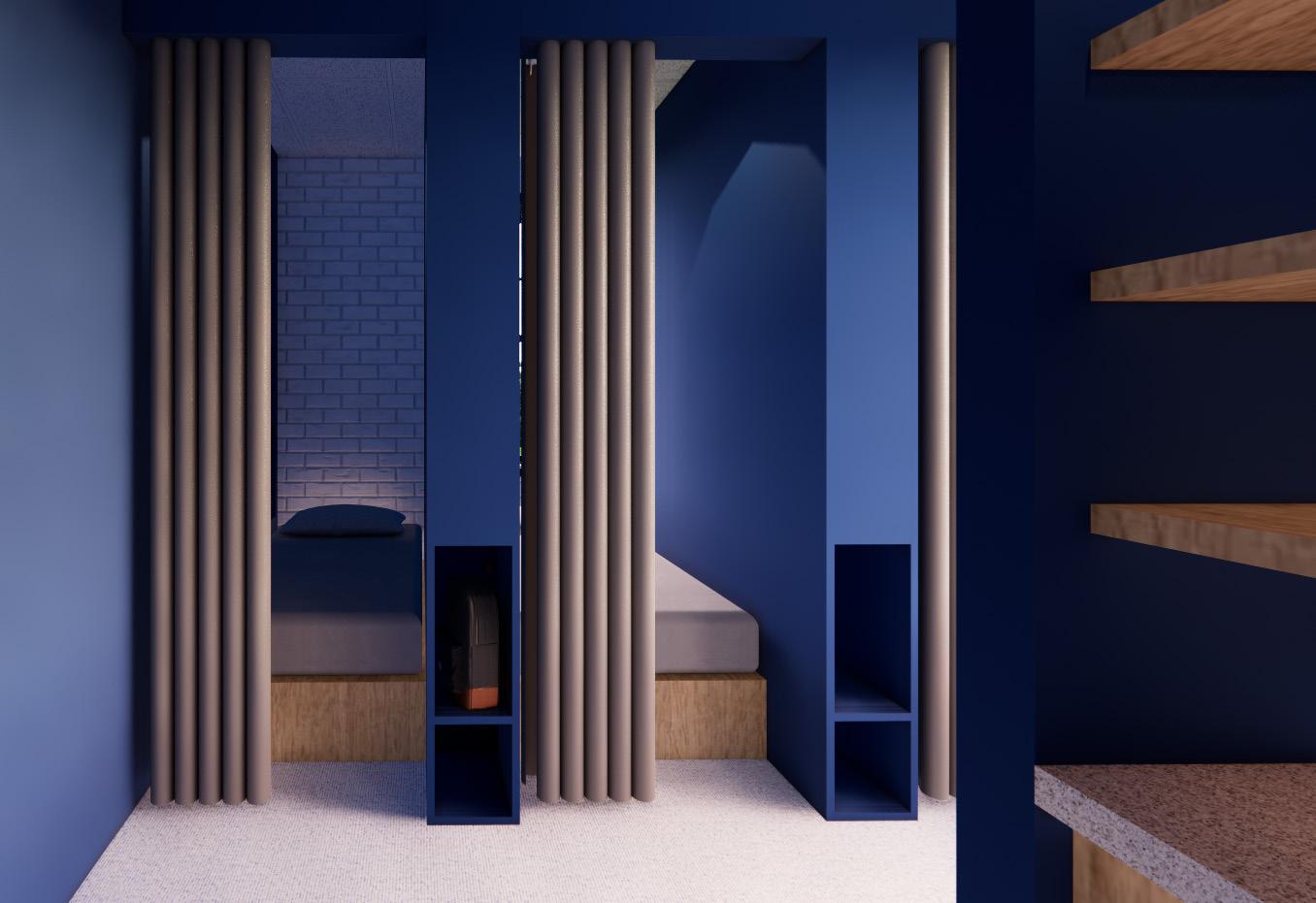
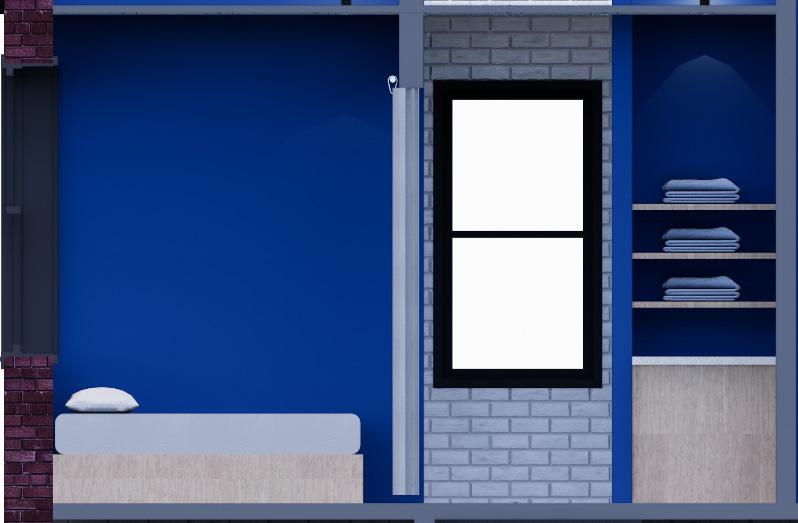
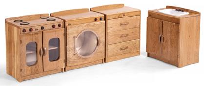
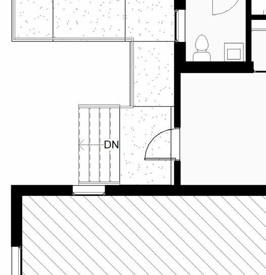
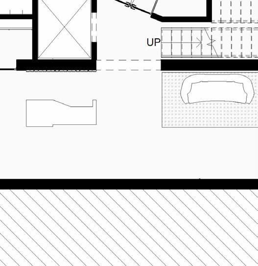
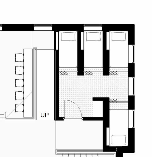
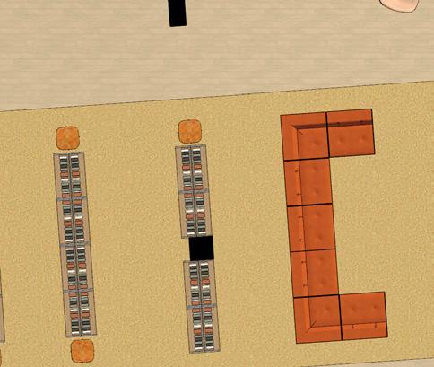
Sleep is an important factor in maintaining proper mental and physical health. To contribute to this necessity, the small area on the second floor contains a room with four (4) napping pods.
Each napping pod has a twin sized bed with a pillow. There is a thick curtain for privacy, and there are shelves outside of each pod for storage such as shoes and/or a bag.
For cleanliness purposes, there is a set of shelves upon entering the nap room that holds clean blankets. Below the shelves is a counter with an opening to place the blankets after usage to be washed.

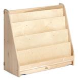
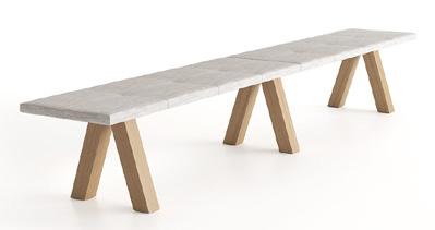
Academic Library| Spring 2023 | 13,000 SF | 6 Weeks
Revit + Enscape + Photoshop
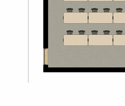
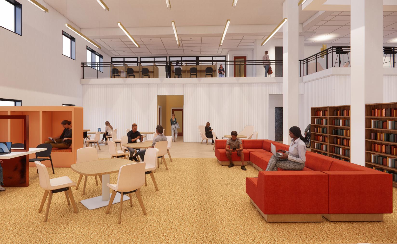
The library is a hub of knowledge that attracts people of all types, to do various activities that stimulate the mind. However, a common problem in academic libraries is the lack of balance between spaces for individuals and for groups. Taking the ideas of harmony and overlapping layers, this design seeks to find that balance through flexible spaces, the careful interweaving of different zones, and different extrusions on all axes. This design also use examples of overlap in its analogous color scheme and through overlapping patterns.
The red, orange, and yellow hues draw inspiration from Arizona’s landscape, while the analogous colors also symbolize gradual differences between the various users of the space.
The design also creates lightly distinguished zones between groups/individuals and loud/ quiet spaces.
Overlapping forms mimic the building shell to create the mezzanine shape.
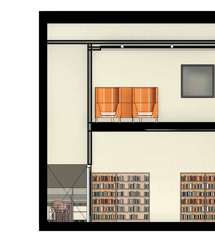

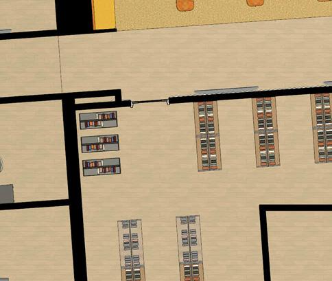
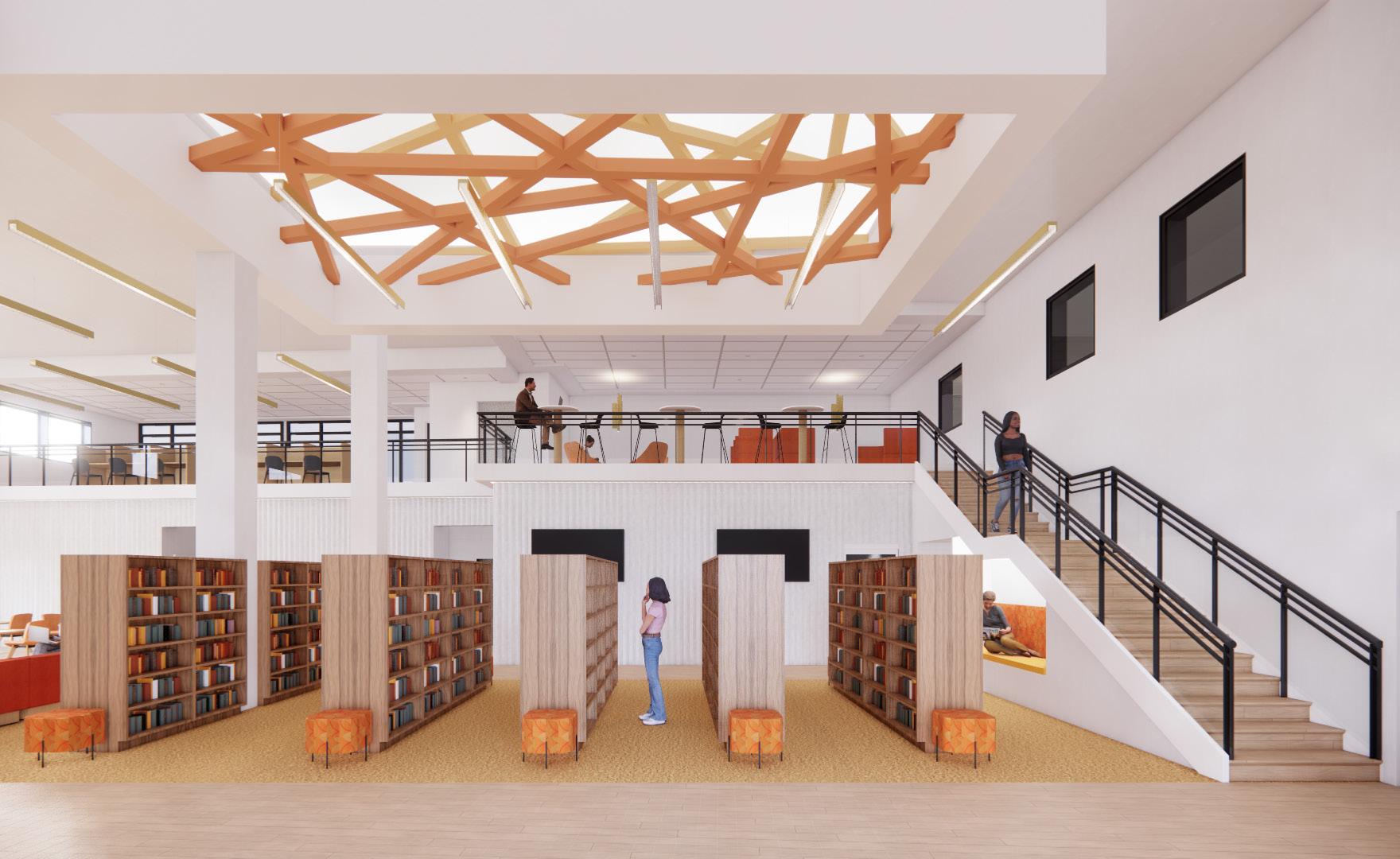
Book Collection + Seating
1. Cafe + Vestibule
2. Circulation + Self-Check-Out
3. Collection + Seating
4. Magazine Area
5. Group Study Rooms
6. Collaborative Spaces/Labs
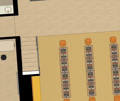

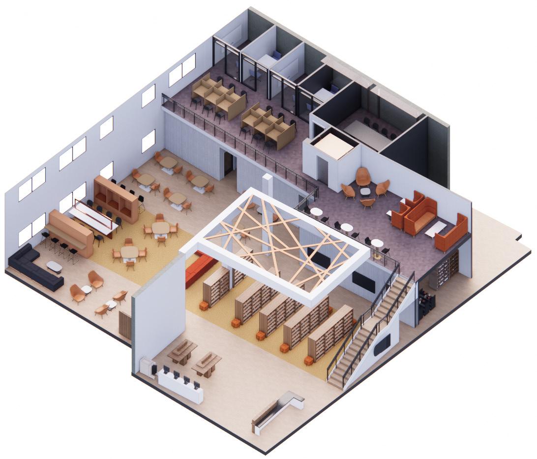
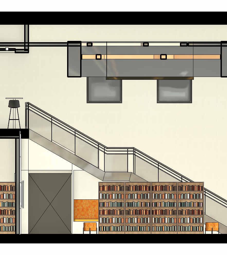
Above the bookshelves is a ceiling intervention in which wooden beams of different colors overlap each other in a random, yet cohesive fashion.
Collection
1/8” = 1’-0”


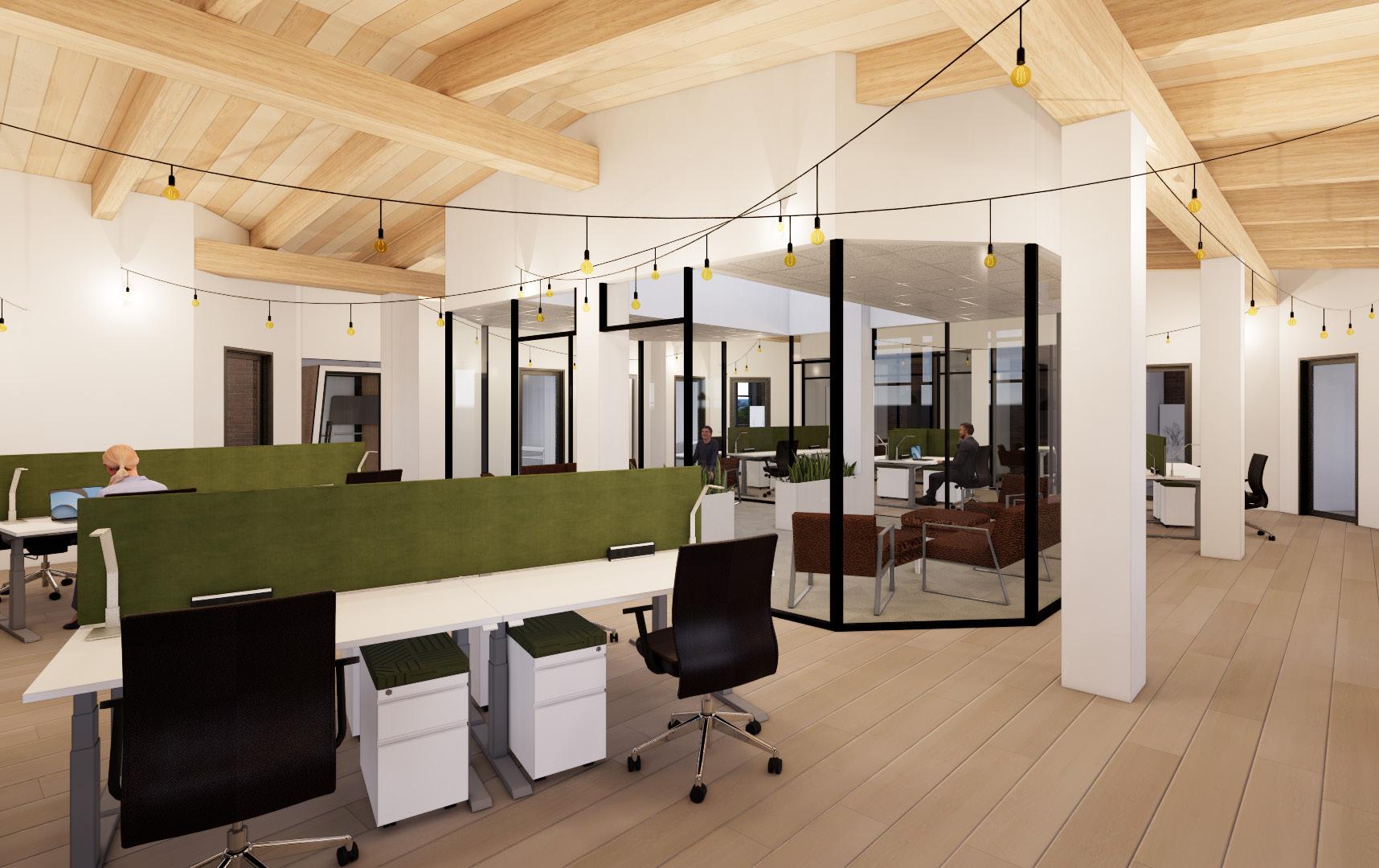
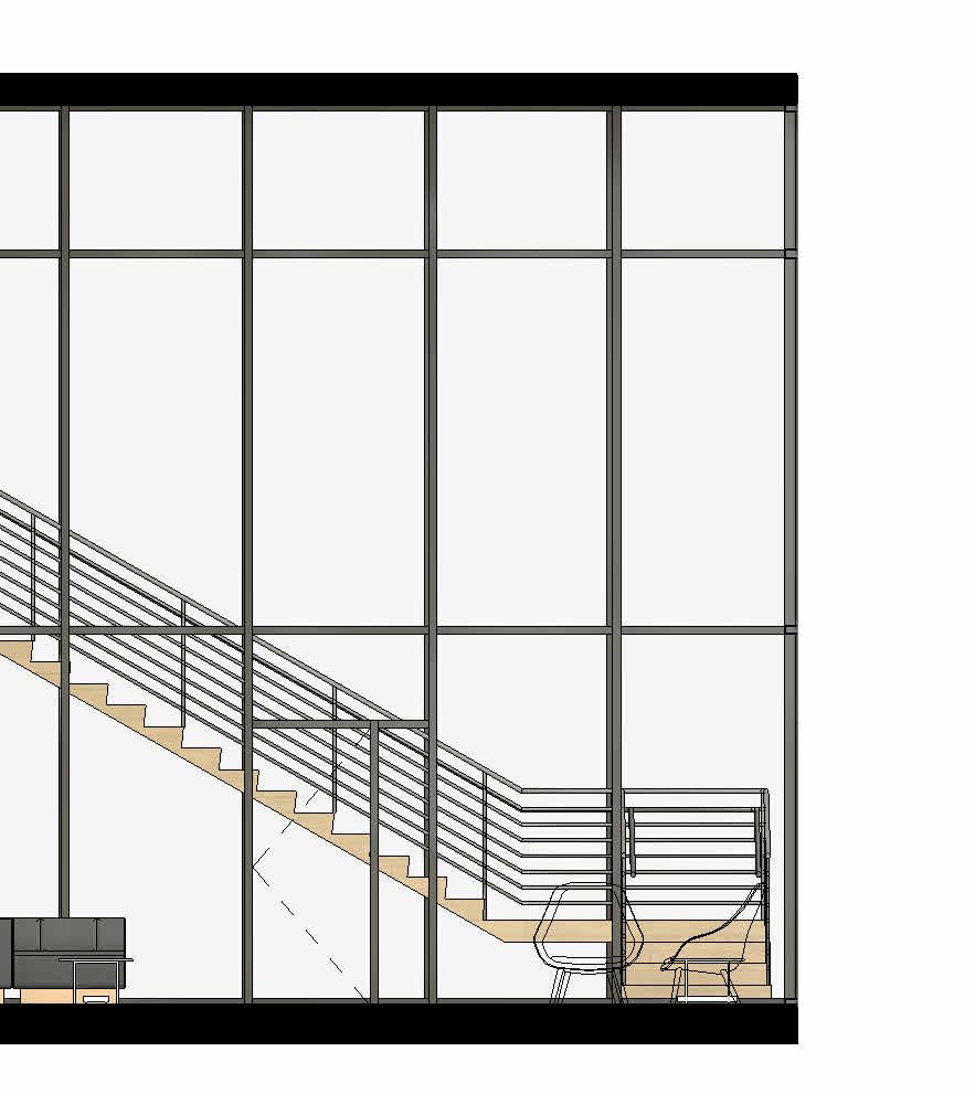
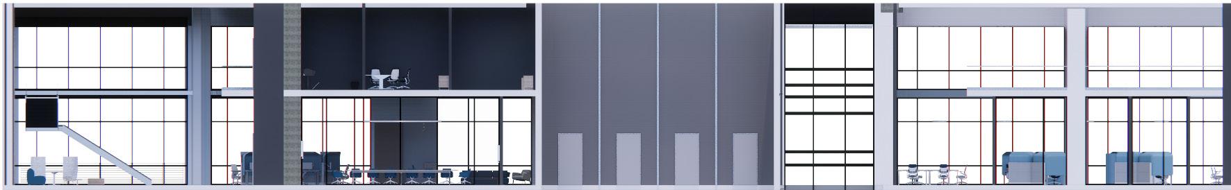
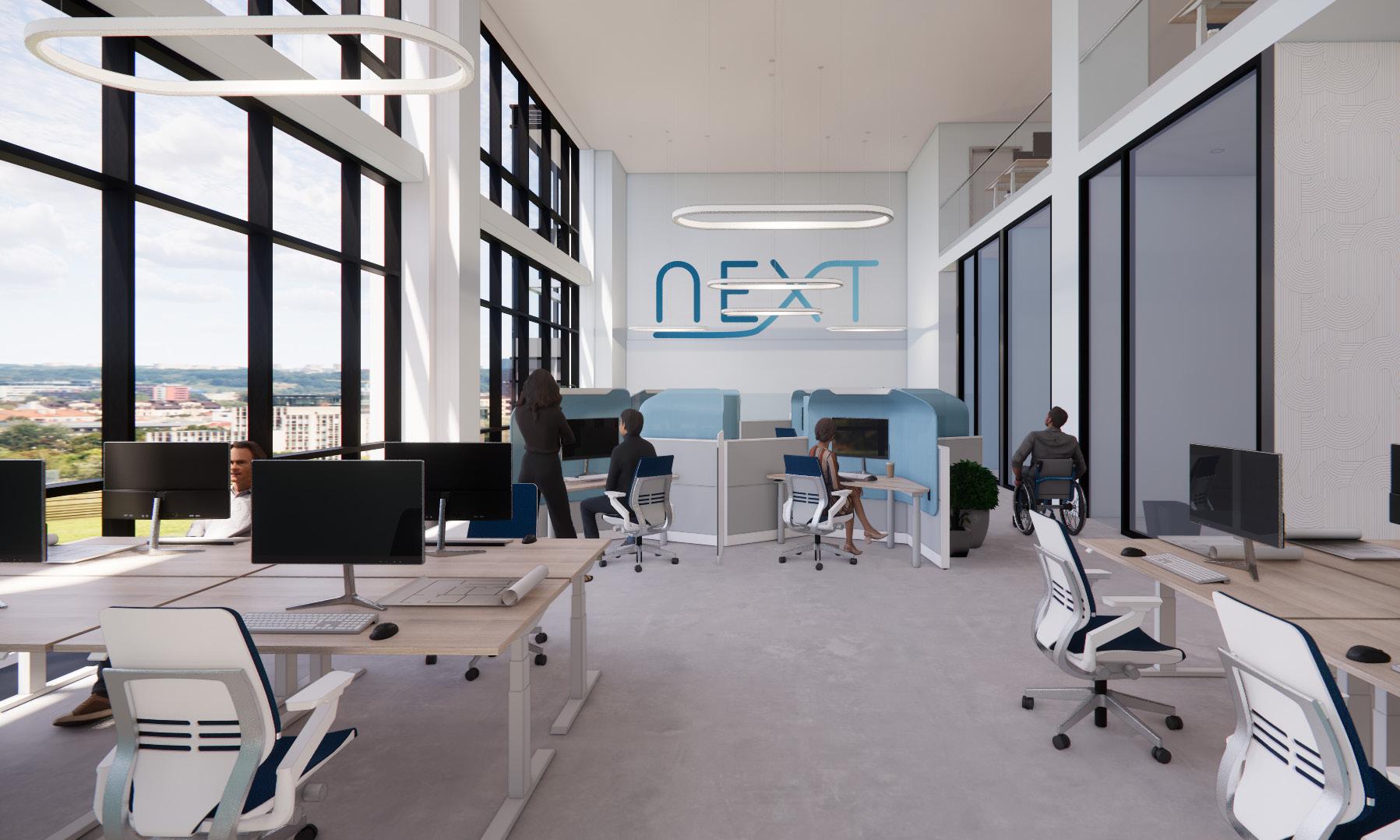
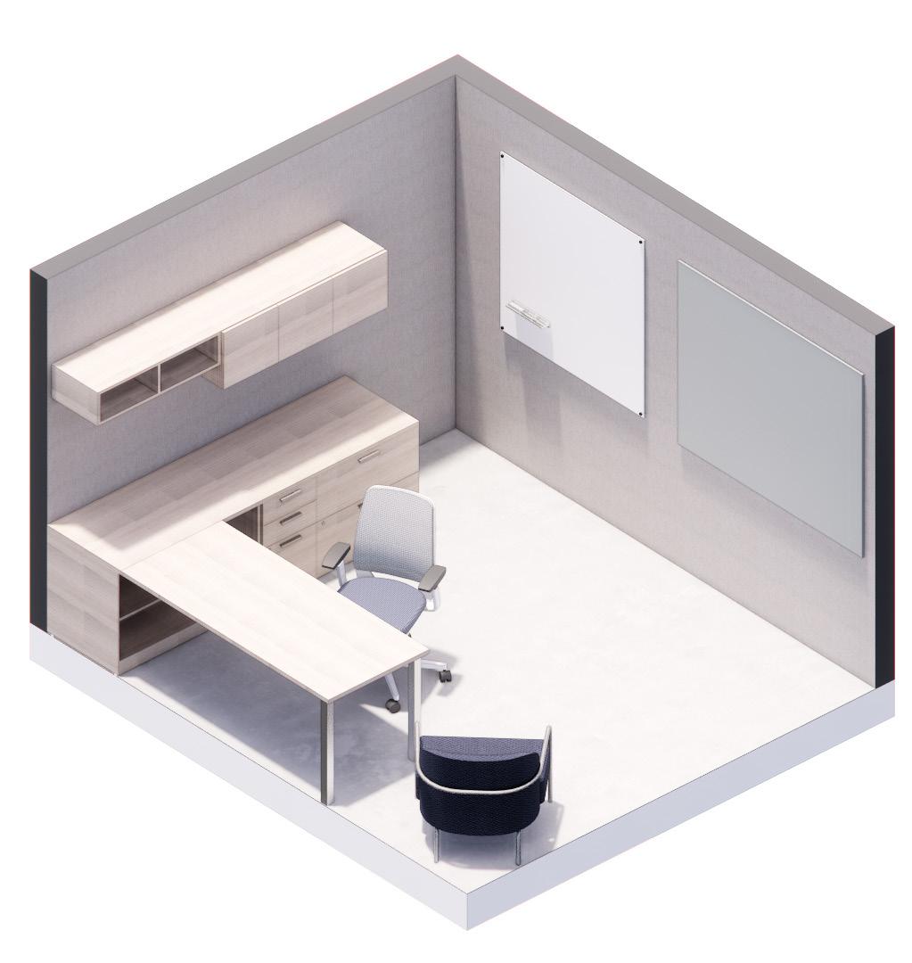
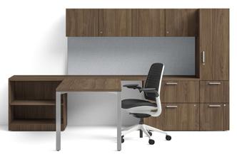
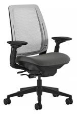
Workplace + Steelcase Competition | Fall 2023 | 14,500 SF | 10 Weeks
Revit + Enscape + Photoshop
NEXT is an architecture and interior design firm that celebrates the evolution of design through the fusion of designers from various generations in one team. The new NEXT office intends to create a connection between generations that benefits all, while finding ways to nourish and uplift the emerging generation of designers (Gen-Z).
The office design seeks to maintain balance between open and enclosed, individual and collaborative, public and private, as well as remote/online and in-person. The balance among these considerations is meant to create a workplace that prioritizes and successfully caters to the wellbeing of the employees in the space.
The design goals are carried out through seamless transitions between colors and elements of one zone that feed into the next, and also by implementing past, present, and prospective design trends. These trends, some of which overlap in timeline, include emphasis on sustainability (future), technology (present), and repetition (past).
The color choices take inspiration from the main brand color of the building, Victory Commons One. The design uses different shades of a consistent blue hue, in which the darker shades “evolve” in the lighter shade. These colors are complimented by cool wood tones and a light gray, all of which allow the saturated blues to shine.
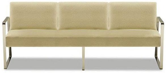
The furnishings in the NEXT office have soft, slightly rounded features to symbolize the subtle transitions of design and the workplace over the years. This also promotes comfort and a welcoming atmosphere for the employees and guests in the space.
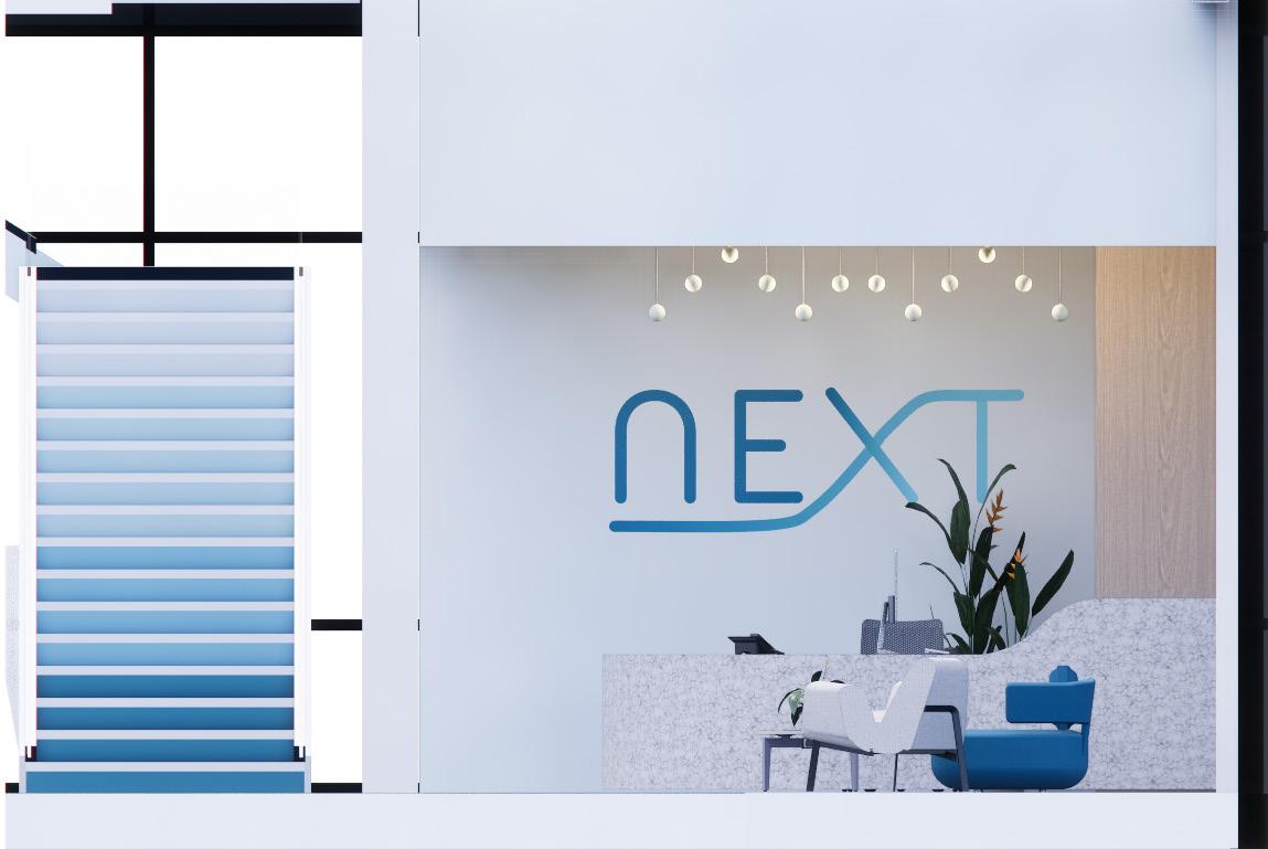
The color gradience from the logo was incorporated into the monumental staircase, in which each couple of steps become a lighter hue of blue. This gradual change in color is meant to symbolize the evolution or gradual shift in trends of the design industry over time.
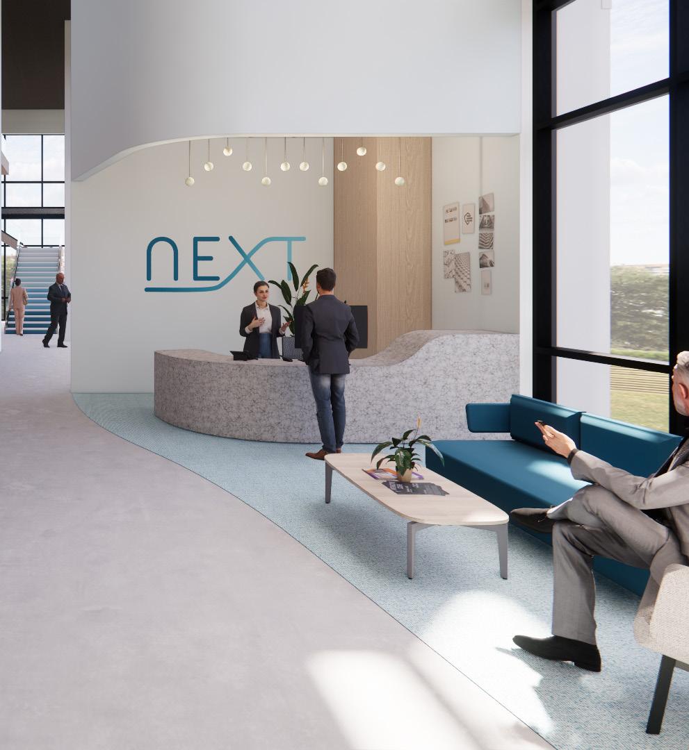
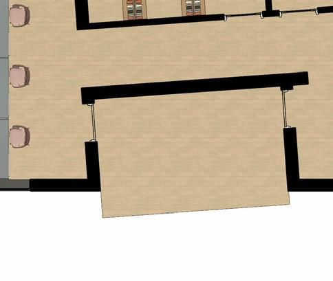
Reception Area + Lobby
Level 3 Reflected Ceiling Plan
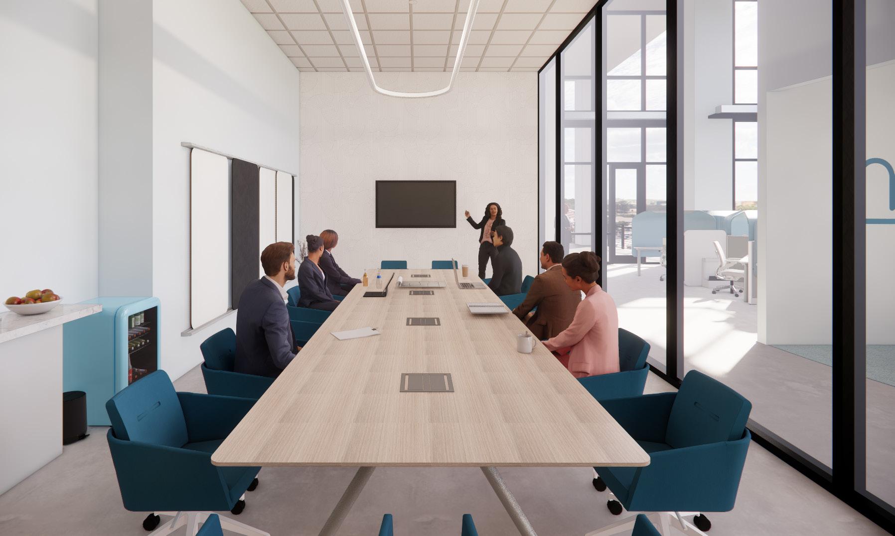
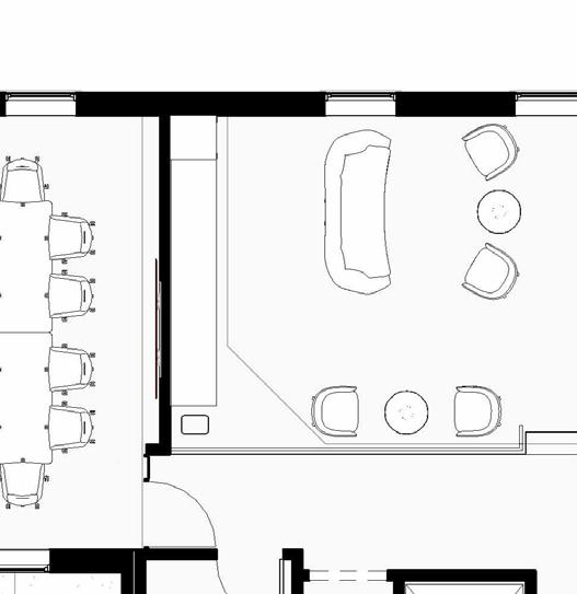
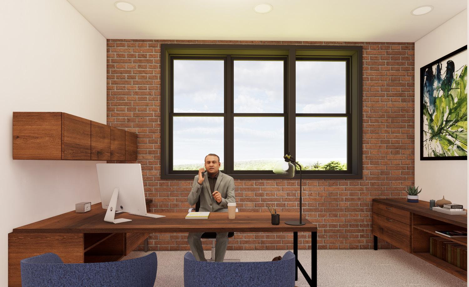
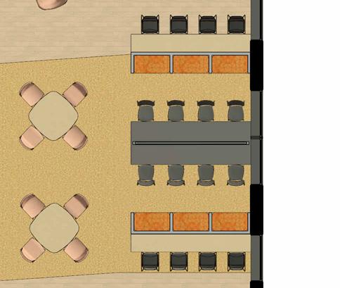
Client Presentation Room Training Classroom

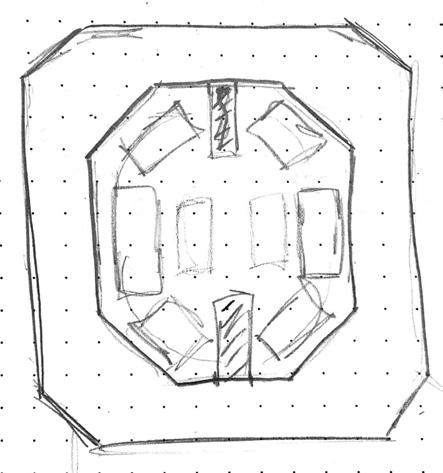
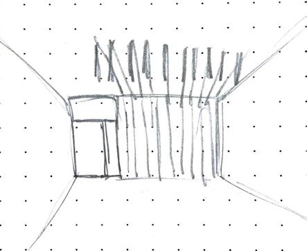
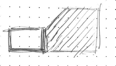
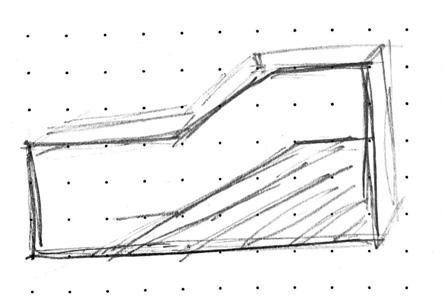
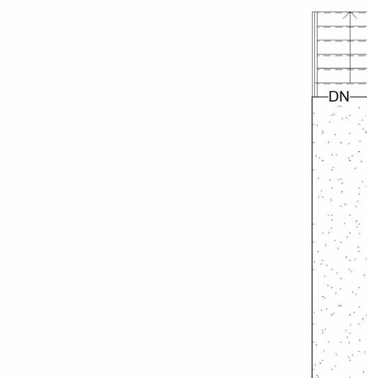
IDEC Competition | Refugee Shelter | Fall 2022 | 500 SF | 1 Week
Revit + Enscape + Photoshop
Judy Medrano, Vanny Vaquerano, Riley Manetz, Grace Osman
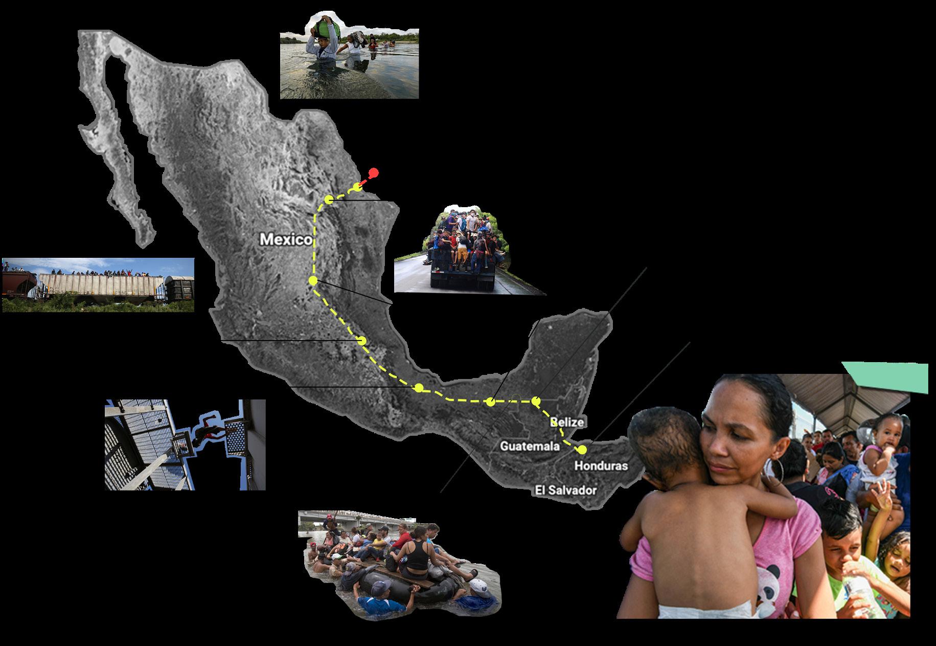
The phrase “Hilo de la Vida” means thread of life. It is representative of the passage to a new life. The thread is symbolic of the migrant’s journey and pays homage to Mayan weaving. The design of the space is an expression of continuity and fluidity, and it seeks to meet the need for constant adaptation.
Senda de Vida “path of life” is an organization in Reynosa, Mexico that helps newly expelled migrants apply to seek asylum in the US with the help of immigration lawyers. The site is located on the Rio Grande, where over 1,200 migrants live along the bank in tents. The proposed design is set to replace these tents with more permanent and private structures.
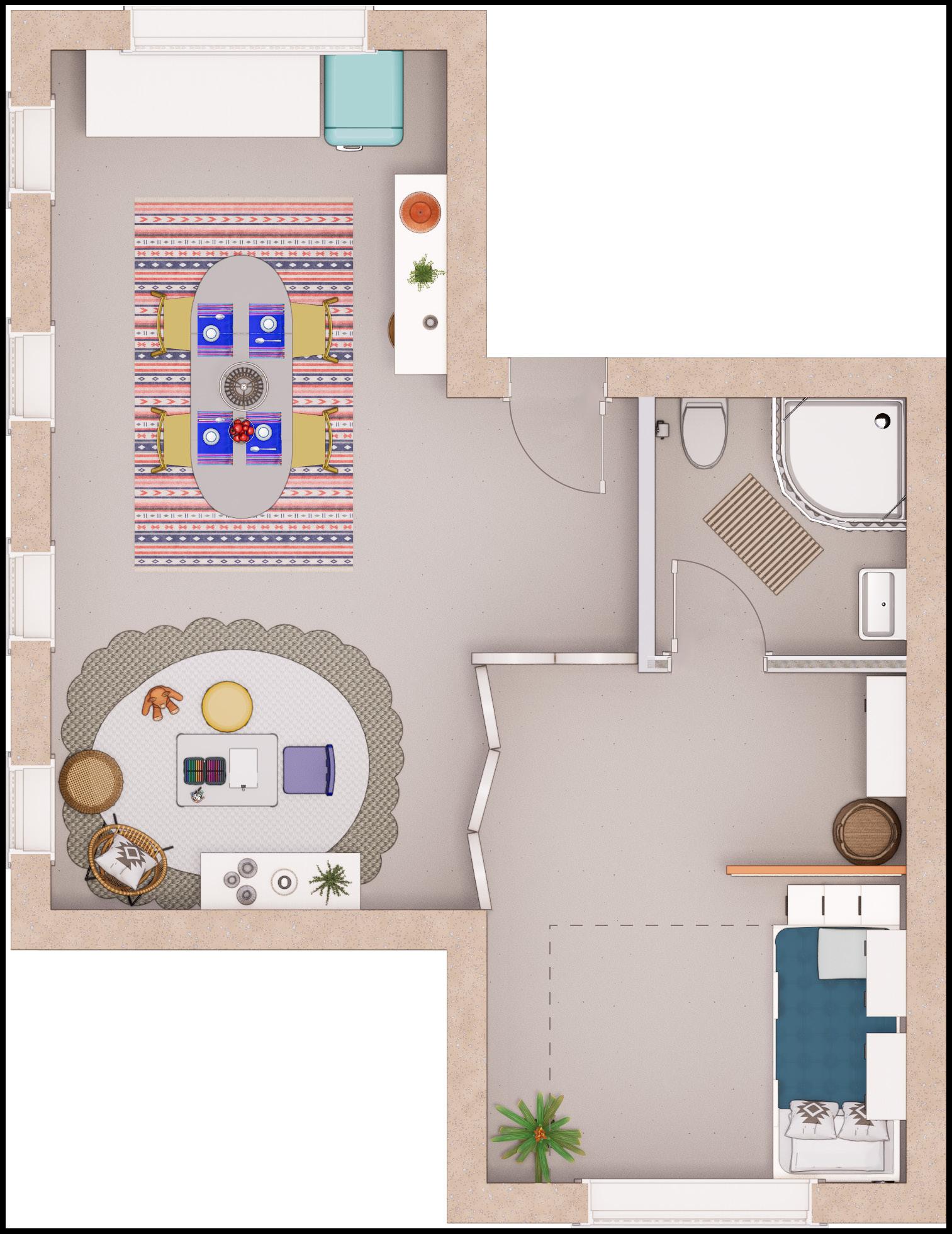
This specific refugee unit is designed for Suyapa, a single mother, and her two children, a 6-year-old girl and a 2-year-old boy. They fled from their hometown in San Pedro Sula, Honduras with a goal to reach the U.S. for a better life.
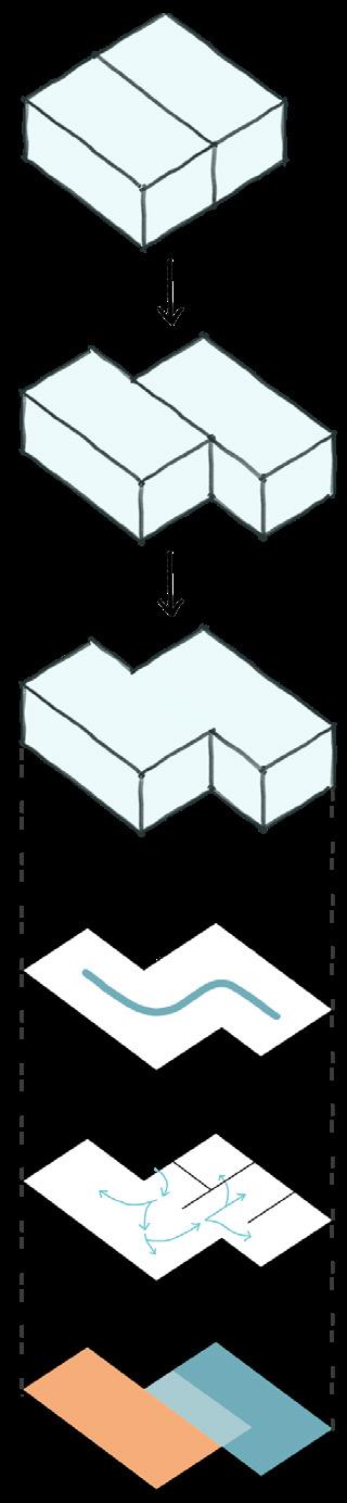
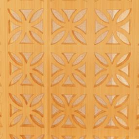
This shelter has moveable lattic screens in order to create an adaptable environment, visual transparencies that connect the spaces, and proper air flow. Additionally, it uses local materials for affordability and sustainability purposes.
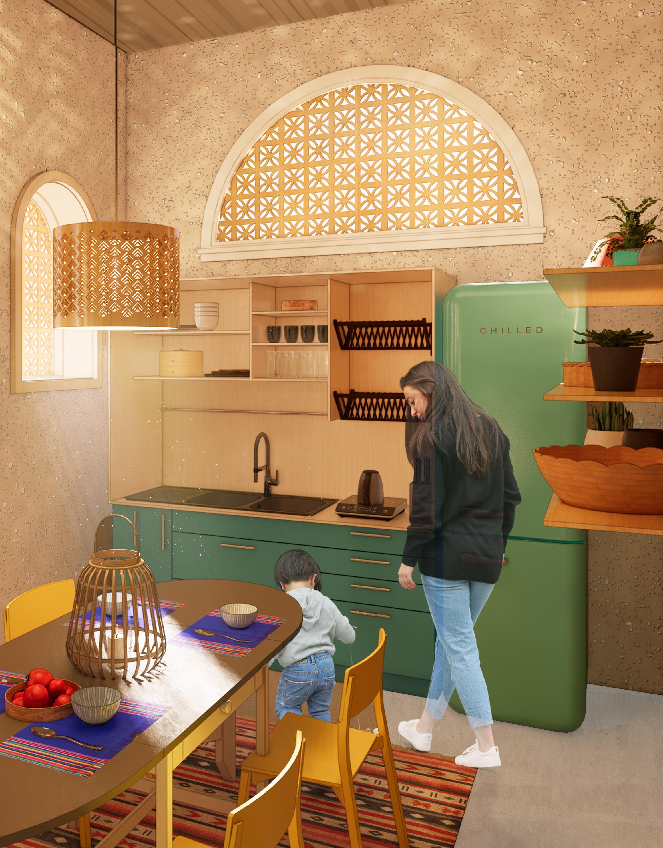
Kitchen + Dining Area
Axonometric
Alternate Orientations
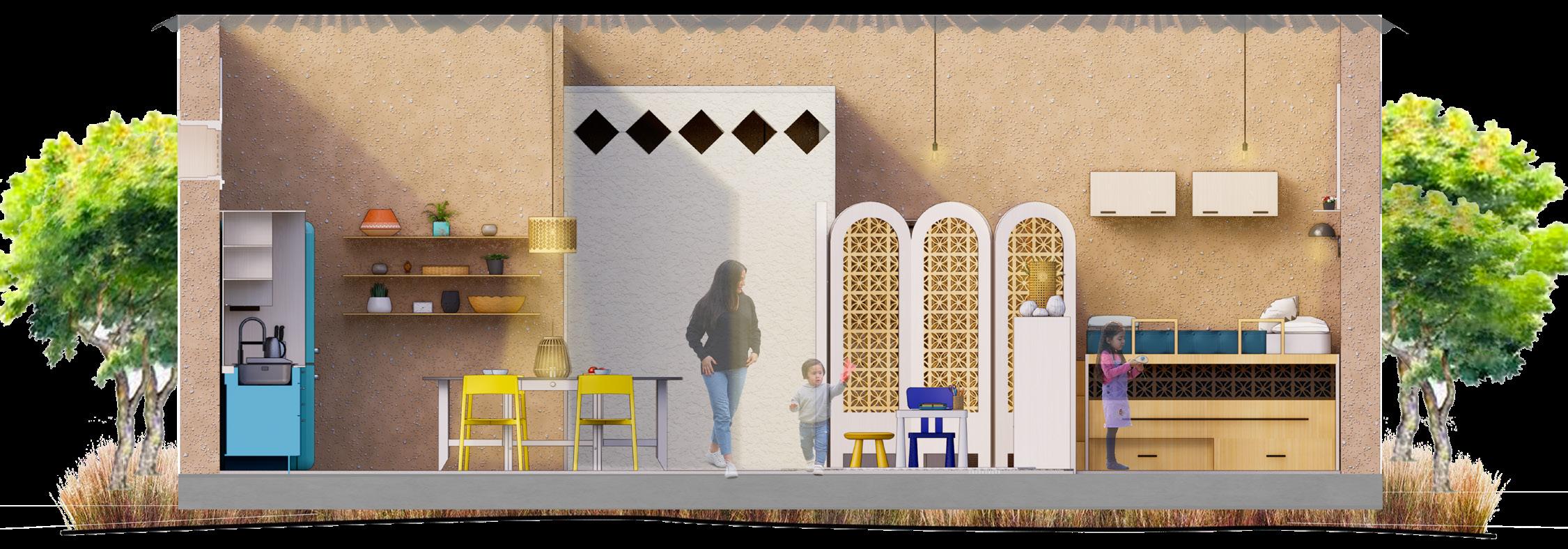

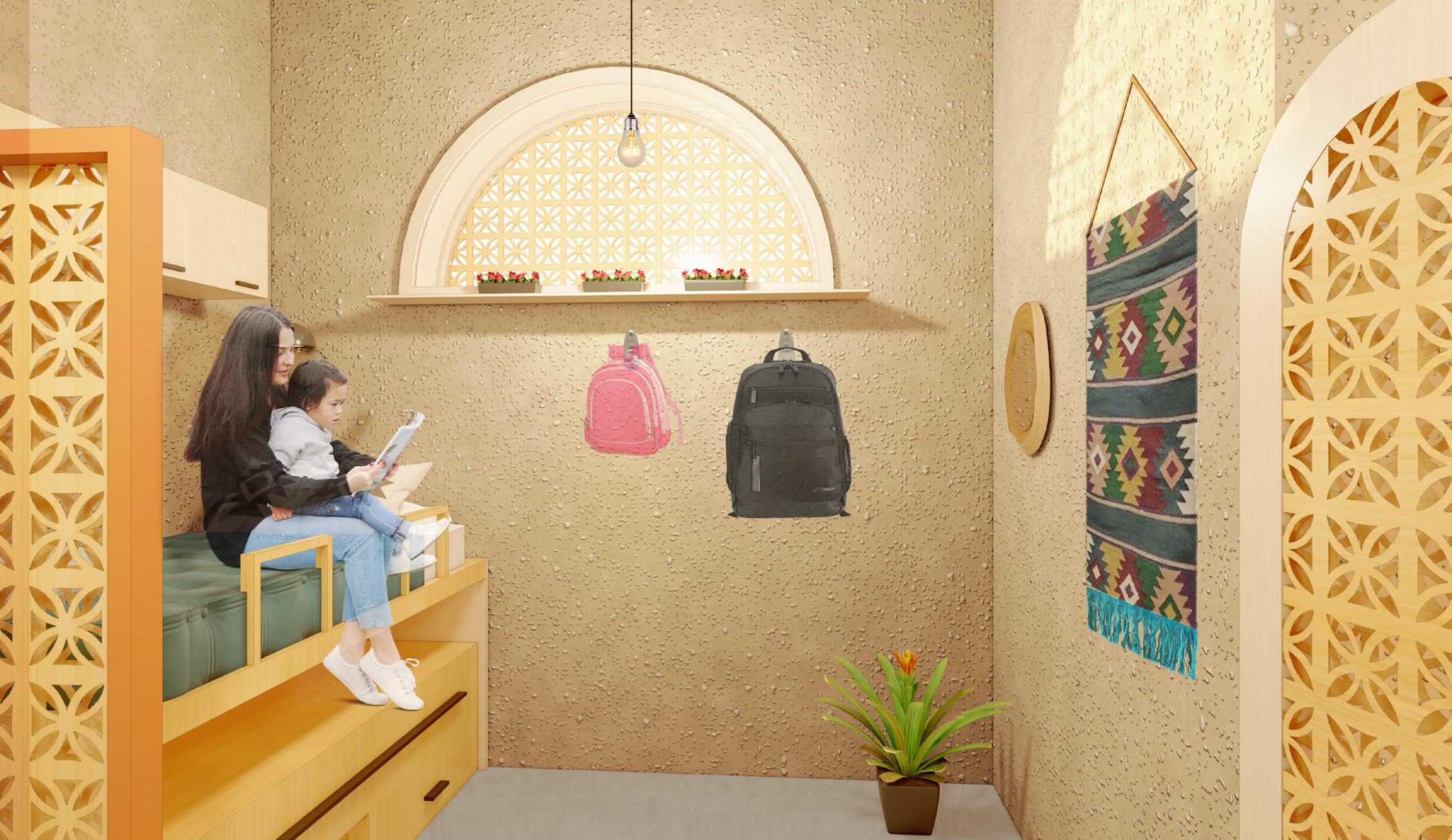
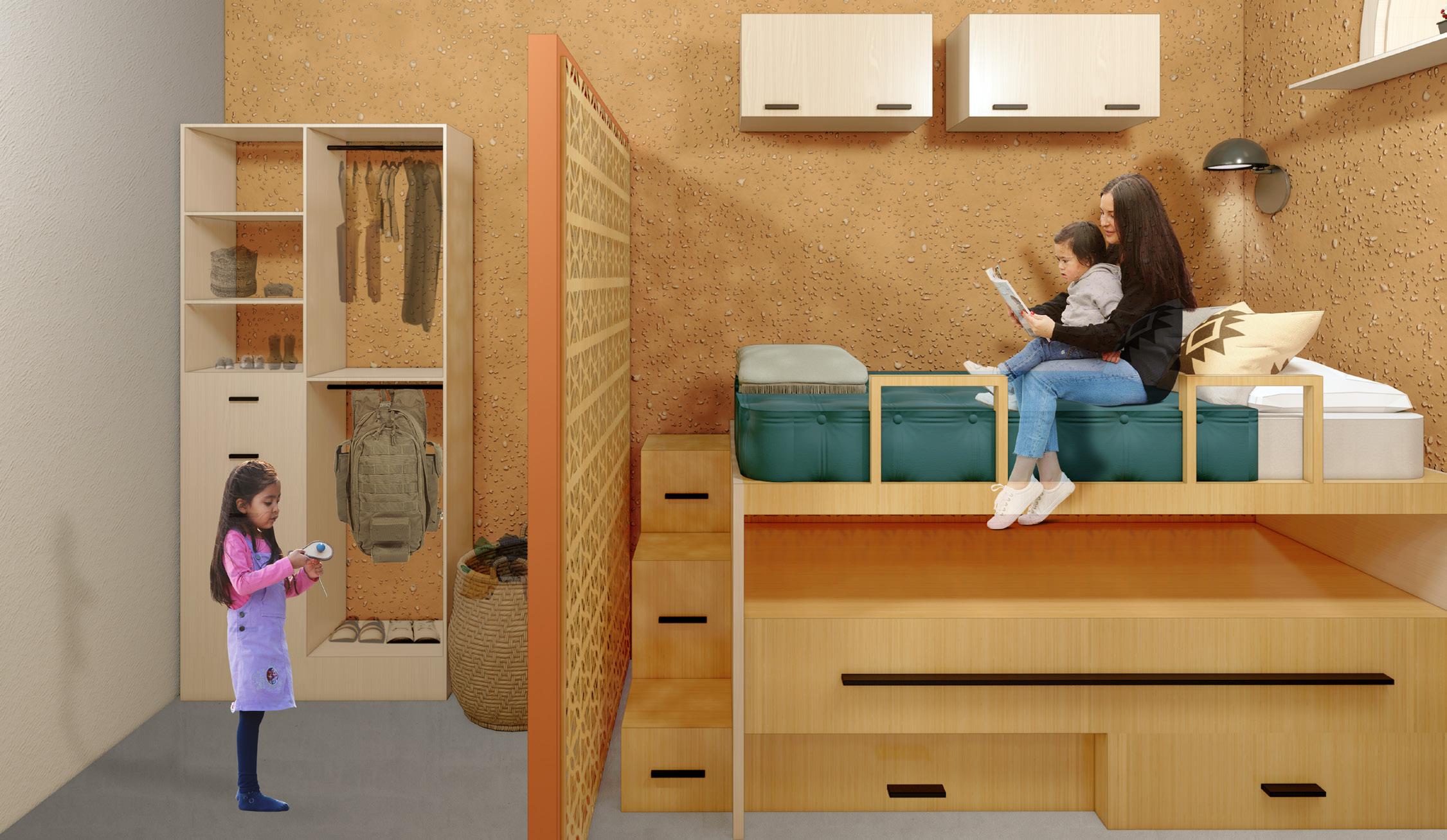
Sleeping Area + Storage Area
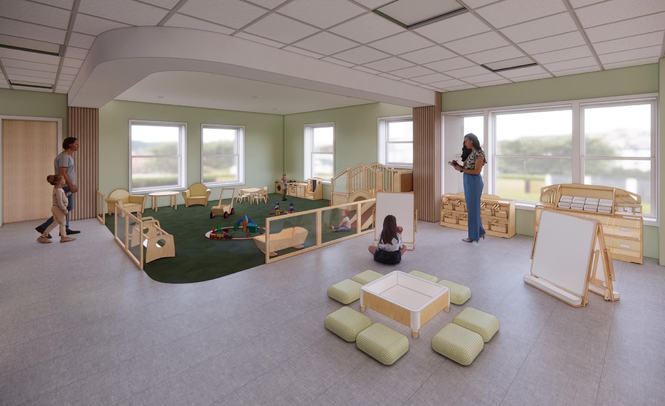
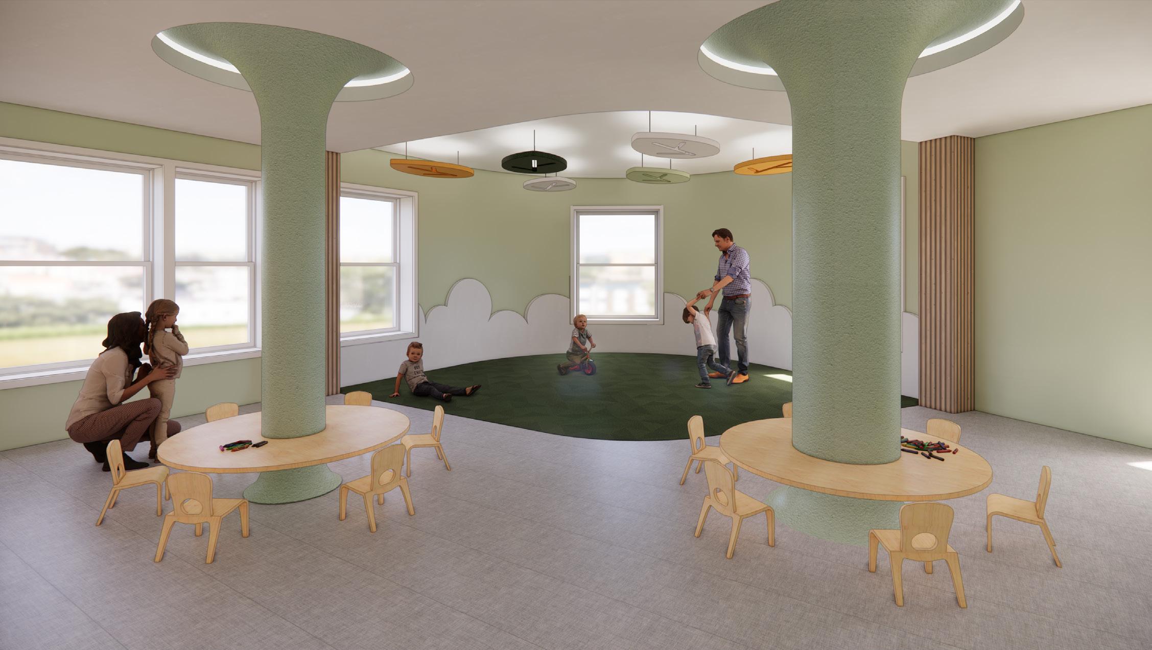
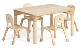
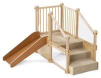
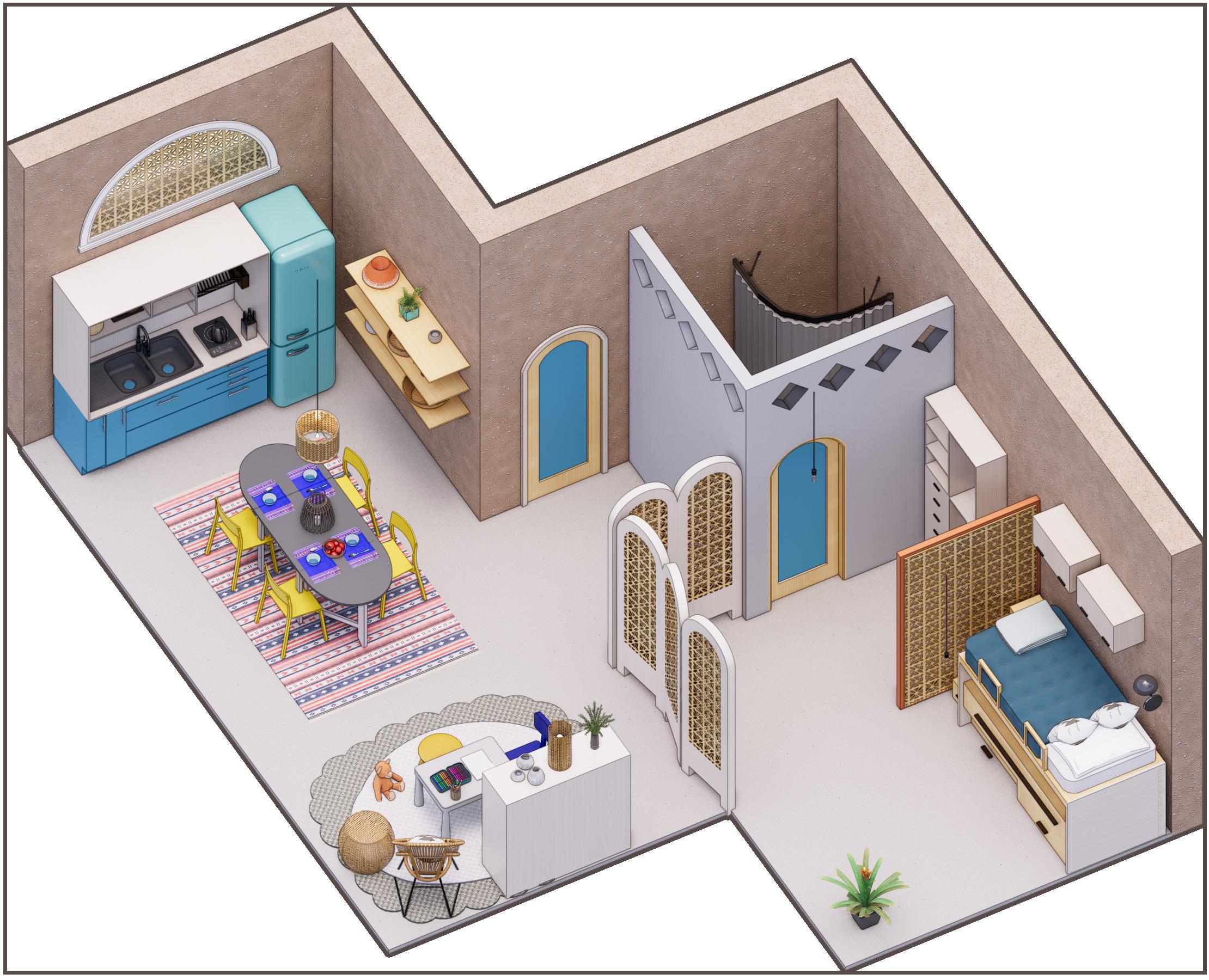
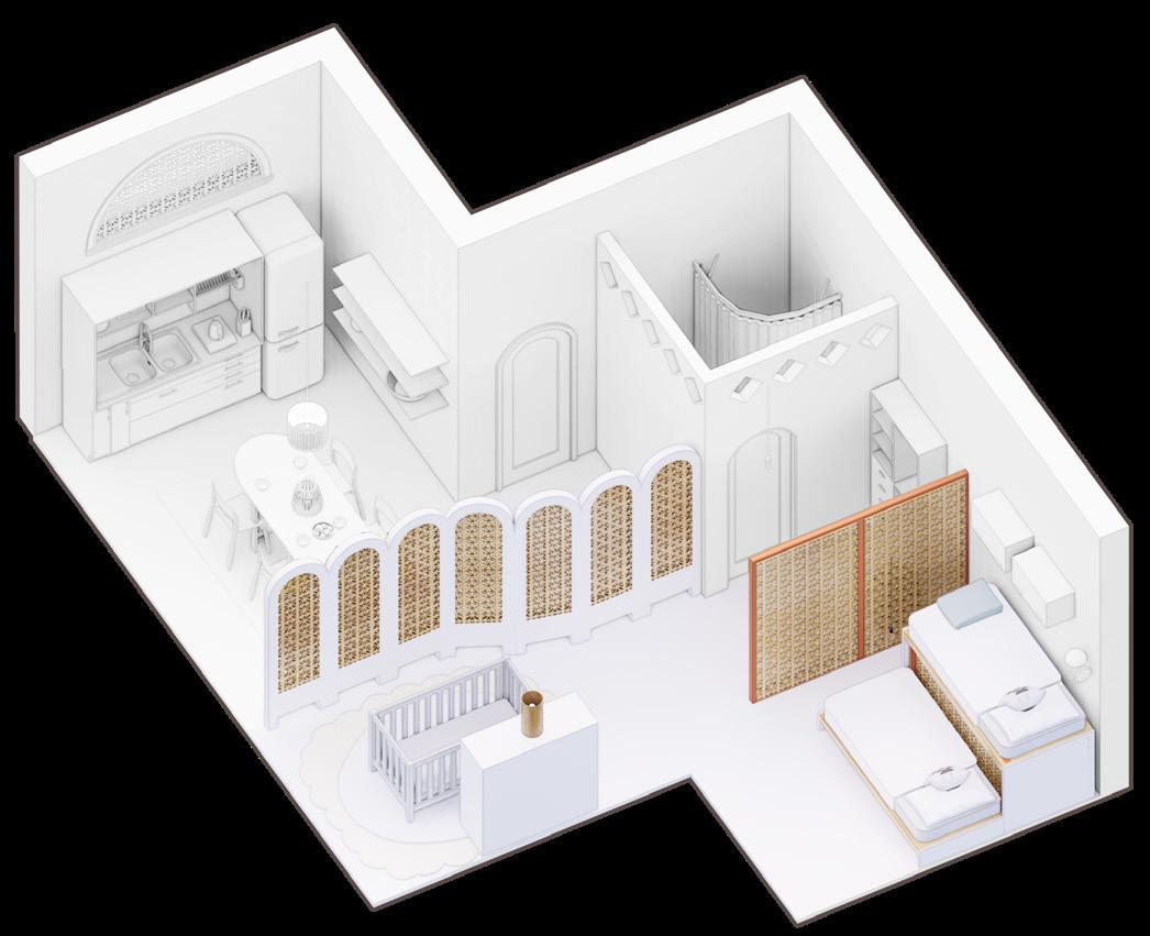
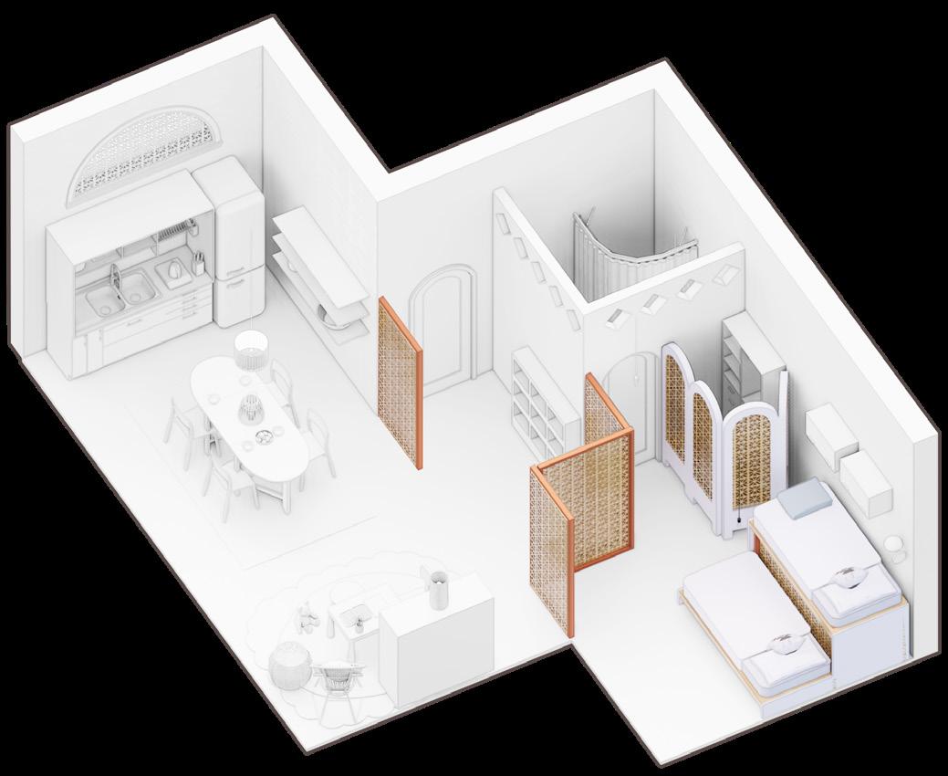
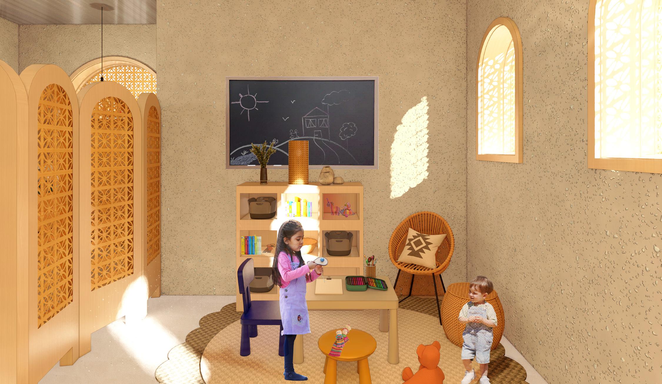
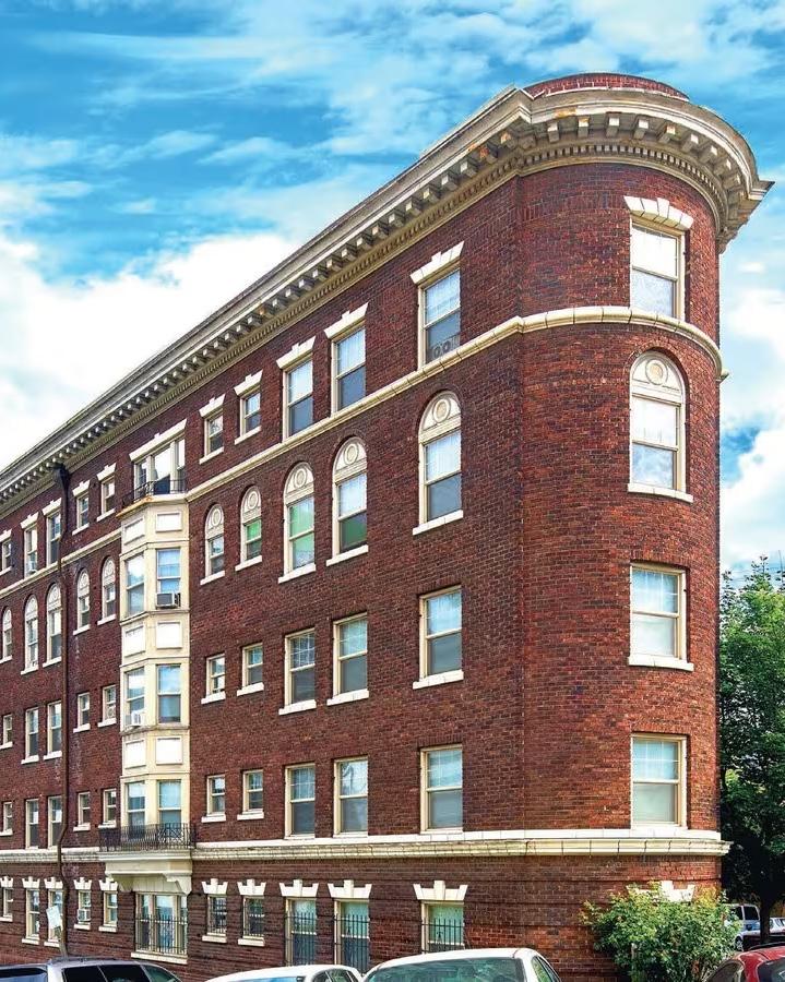
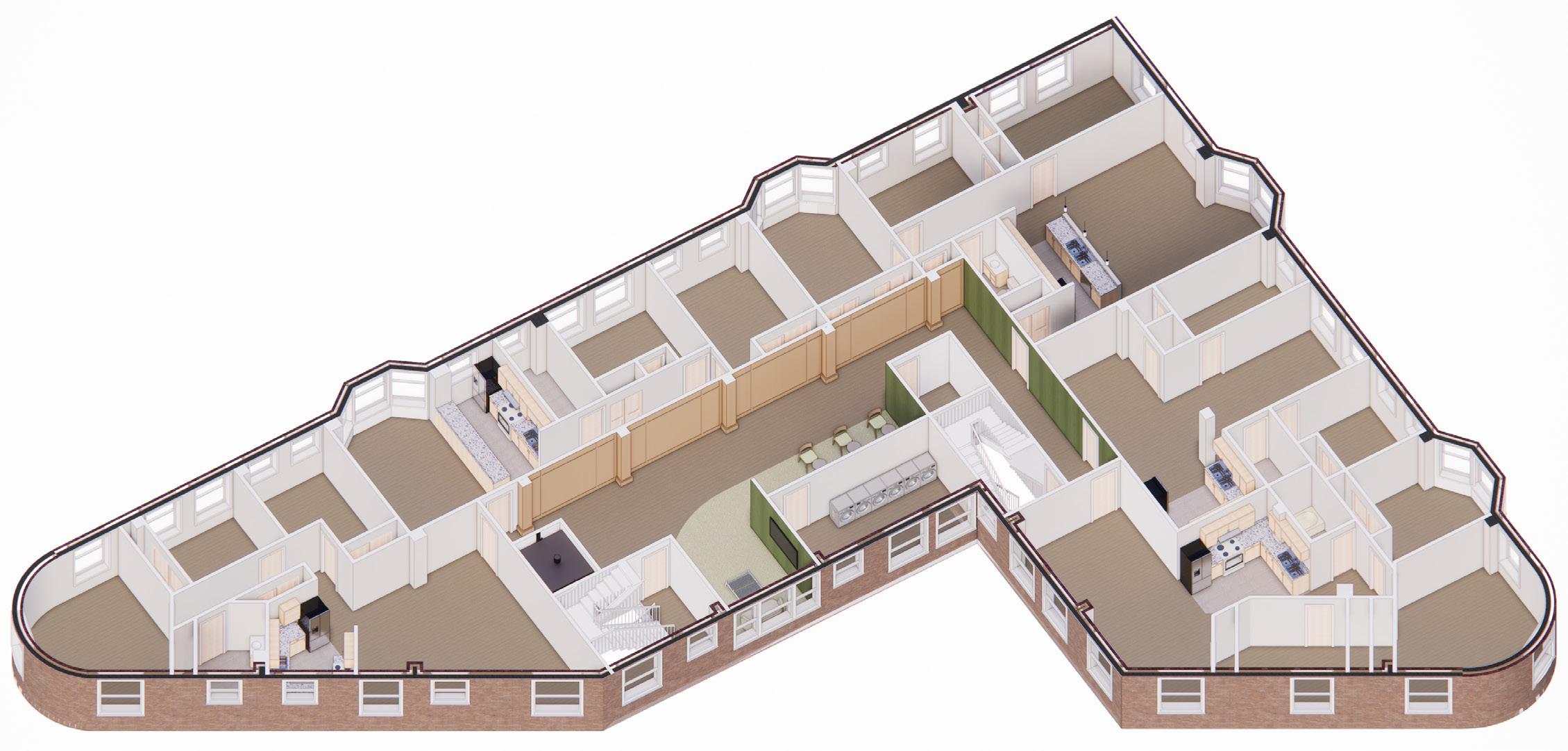
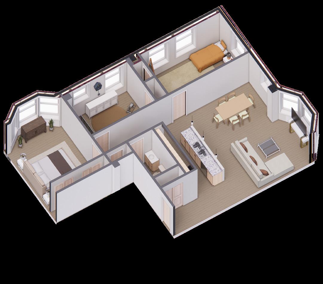
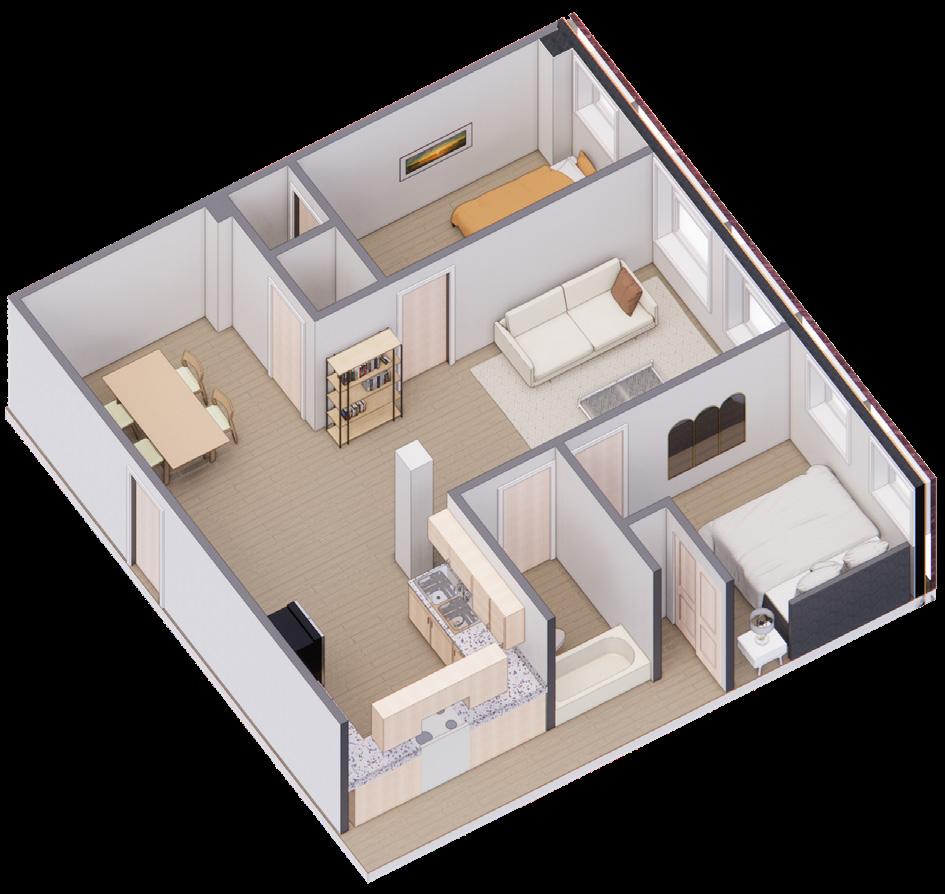
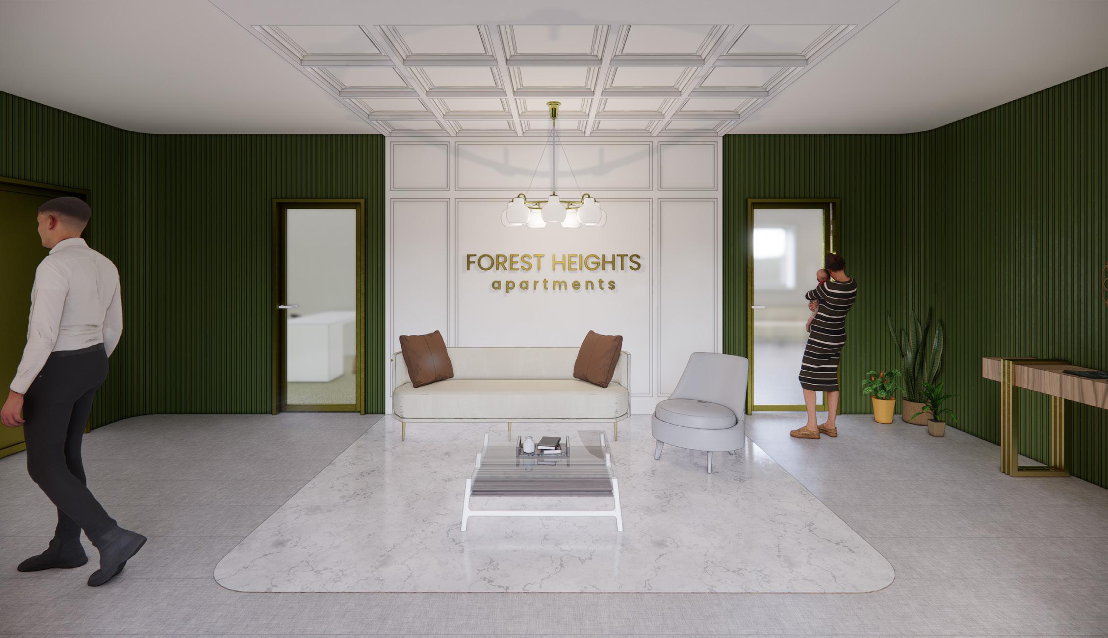
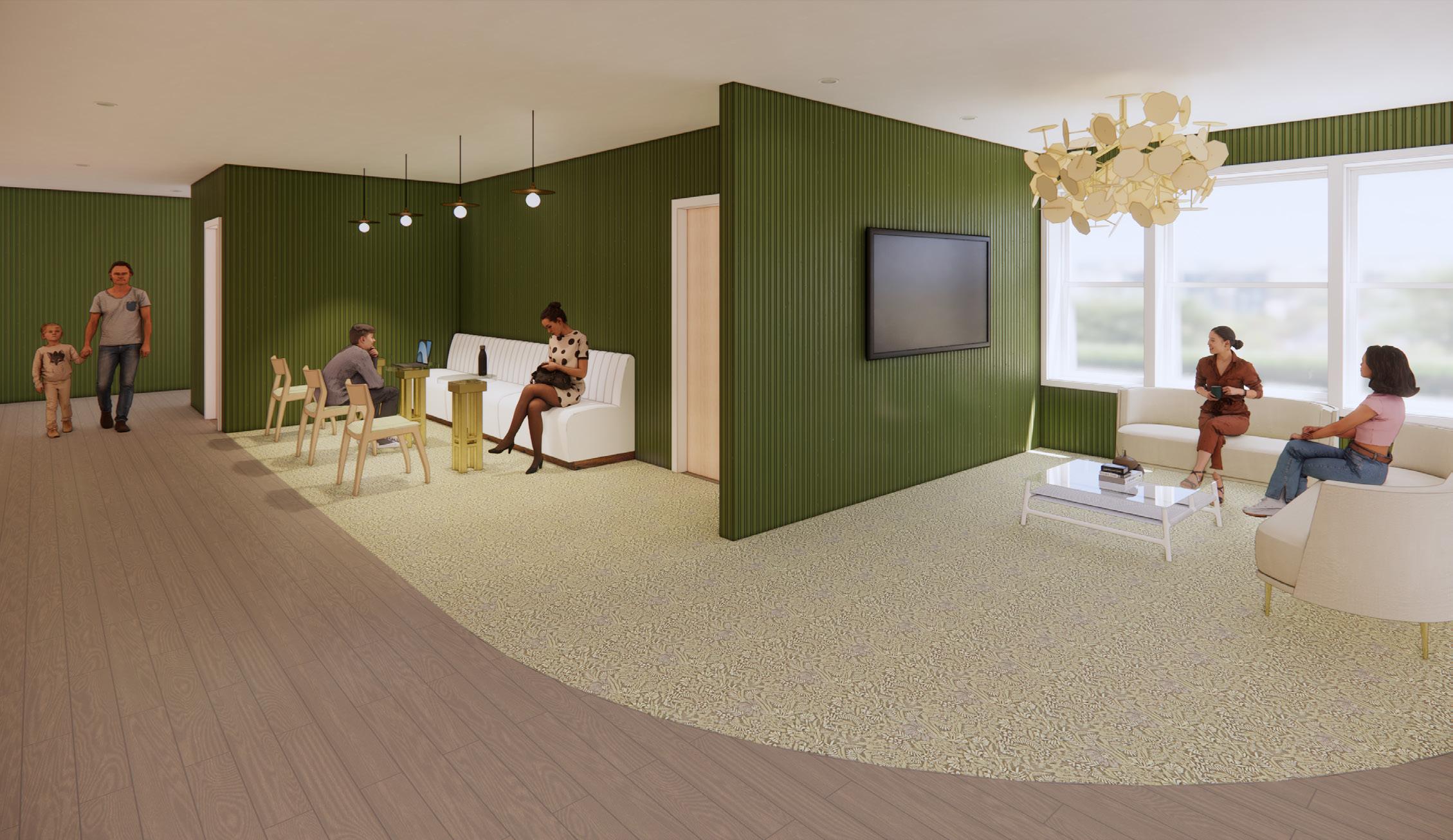
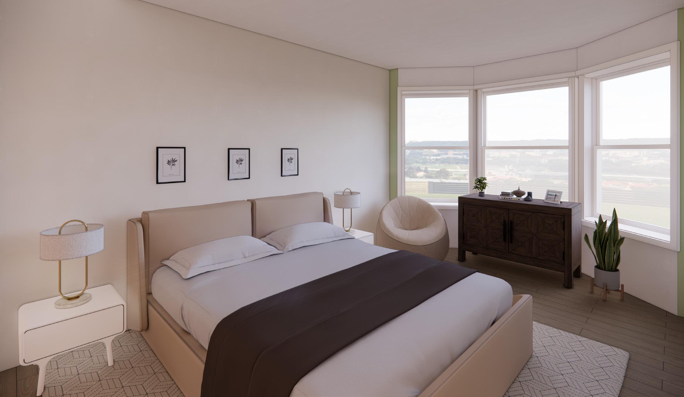
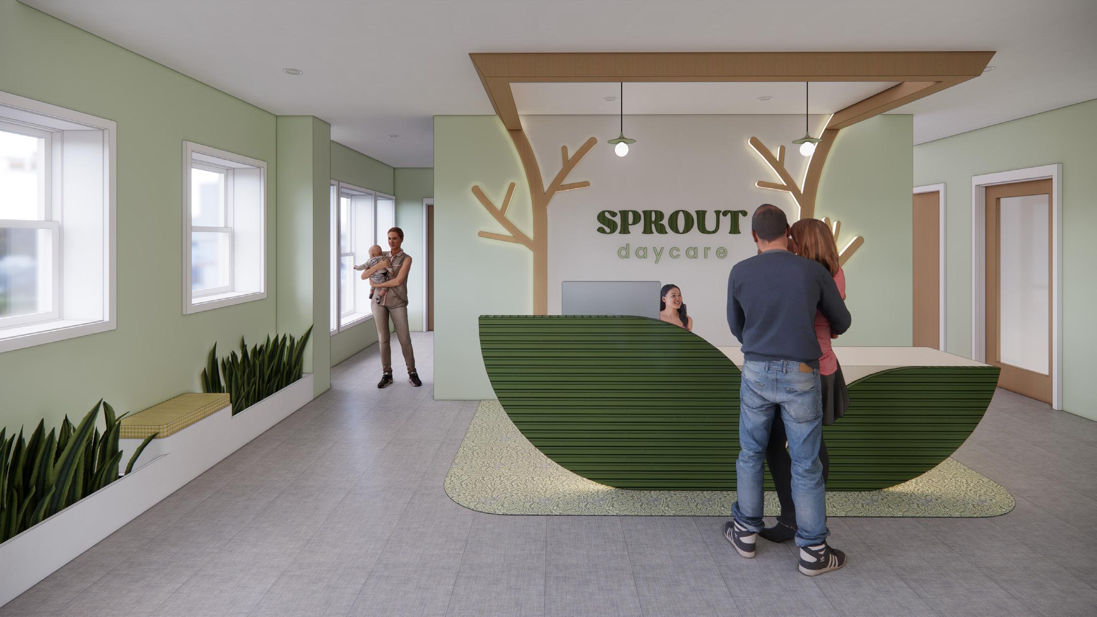
Mixed-Use: Multifamily Housing + Daycare| Spring 2024 | 35,000 SF | 15 Weeks
Revit + Enscape + Photoshop
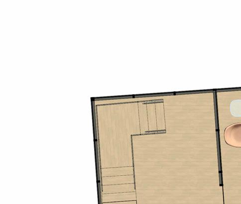
This project transforms an existing 5-level apartment building into a mixed-use building with affordable apartments and a daycare center. The design serves to provide a comfortable space for large families in need of affordable housing, while providing them with the option of childcare right in their building. The aparment building will accomodate families of up to six by implementing 2- and 3-bedroom units. The daycare will foster an active and safe community of children in the building/neighborhood by giving them ample space to explore and learn.
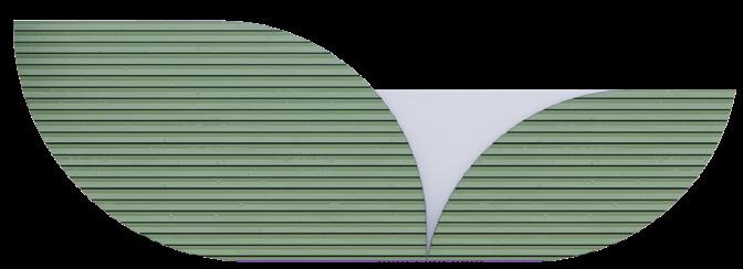
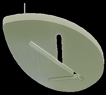
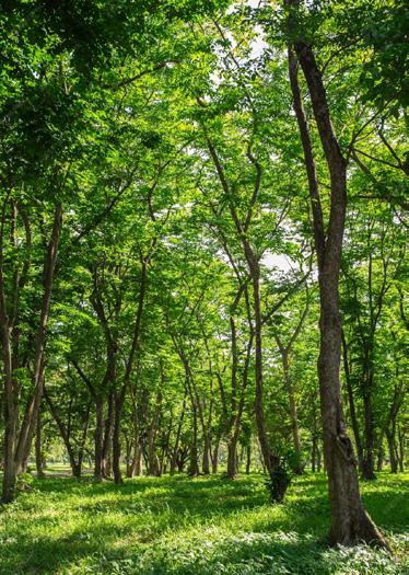
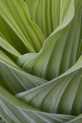
The design intends to emphasize family, community, and the nurturing of children by taking inspiration from a forest and the stages of tree growth. The overall design looks to bring the families in the building together, like trees in a forest. The daycare design focuses on tree sprouts as a symbol of the children being cared for as they grow through their early formative years. This idea can also be supported through the buildings base design in which two masses overlap, which can symbolize the overlapping of branches/stems, whilst the center would symbolize a tree trunk. The project highlights elements of overlap, progression, and connectivity. This is done through the zoning of the plan, ceiling elements, an analogous color scheme, and wall-to-ceiling designs.

This structure is geometrically made up of two overlapping volumes, with an emphasis on an overall triangular shape. This space is divided in a way that highlights each end of the building as well as the overlapping point, also calling attention to the different rectilinear and curvilinear forms.
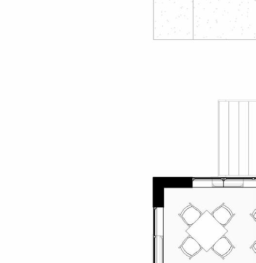
Reception Area + Lobby
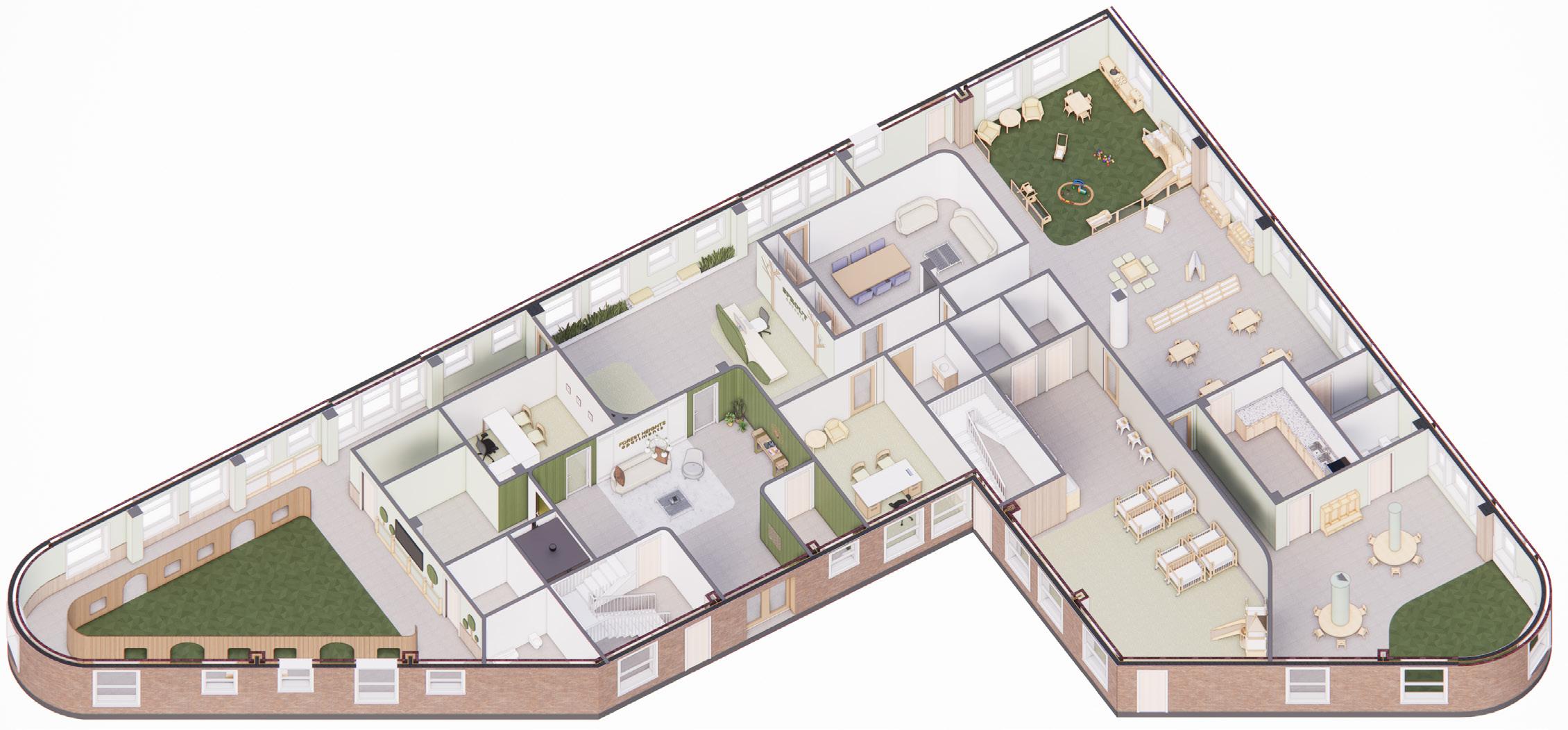


Daycare Reception Daycare Play Area