PORTFOLIO GRAPHIC
JEAN-PAUL
LECLAIR
Education
High School Graduate Degree
Bachelor’s of Sociology Degree
Associate’s Degree of Communication Design
Adobe Illustrator
Adobe Photoshop
Adobe InDesign
Adobe XD
Adobe After Effects
Auto CAD Software
Skills Contact Info.
leclairjp15@gmail.com
https://www.behance.net/jean-paleclair
CONTENTS
BRANDING/LOGO DESIGN
La Belle’s Seafood Kitchen 6-7 8-11 16-19 20-21 22-25 28-31 32-33 36-37 38-39 12-13
Roadmap.Co Craft Beers
The Chromosome 18 Registry & Research Society
TYPOGRAPHY
Wizard of Oz Stationery
JAZZ SA Campaign
Don Quixote & Sapiens Book Covers
POSTERS
“How To” Posters
San Antonio College Poster
WEB & APP
Liviqon E-Commerce App
San Antonio Pets Alive! App
BRANDING/ LOGO DESIGN
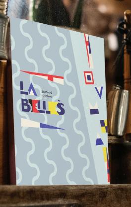
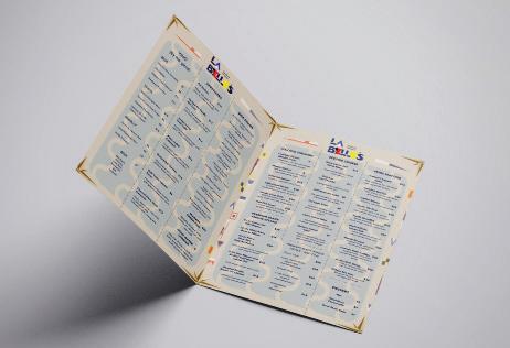
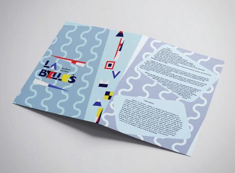
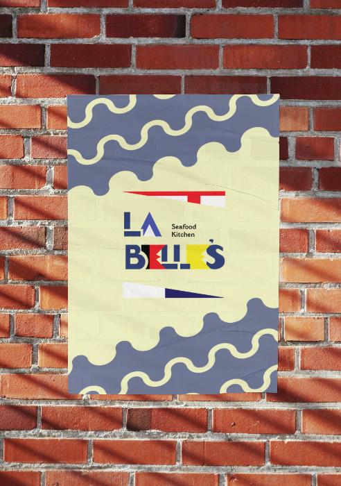
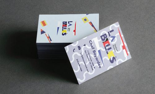
LA BELLE’S SEA FOOD KITCHEN
A project involving the creation of a logo, menu, business card and poster for a restaurant named “La Belle’s Restaurant,” themed around a 17th century, French shipwreck named the “La Belle,” found in the depths of the Texas Gulf Coast.
ROADMAP.CO CRAFT BEER:
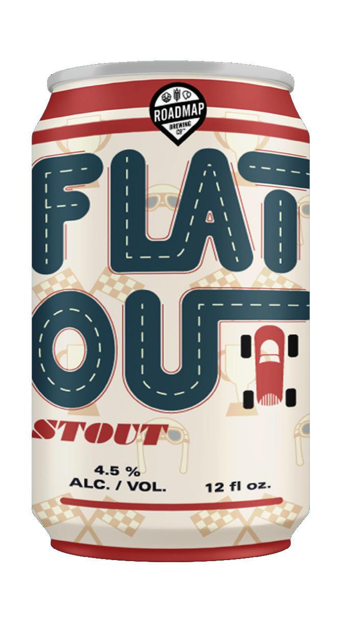
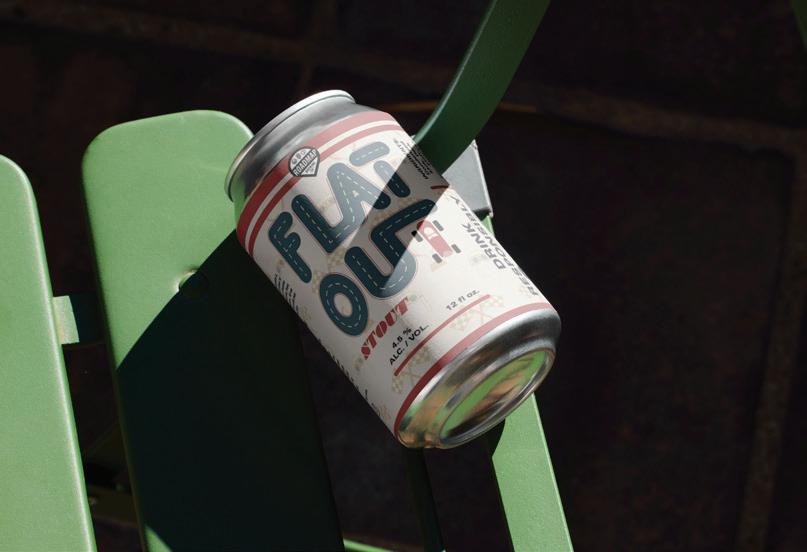
FLAT OUT STOUT
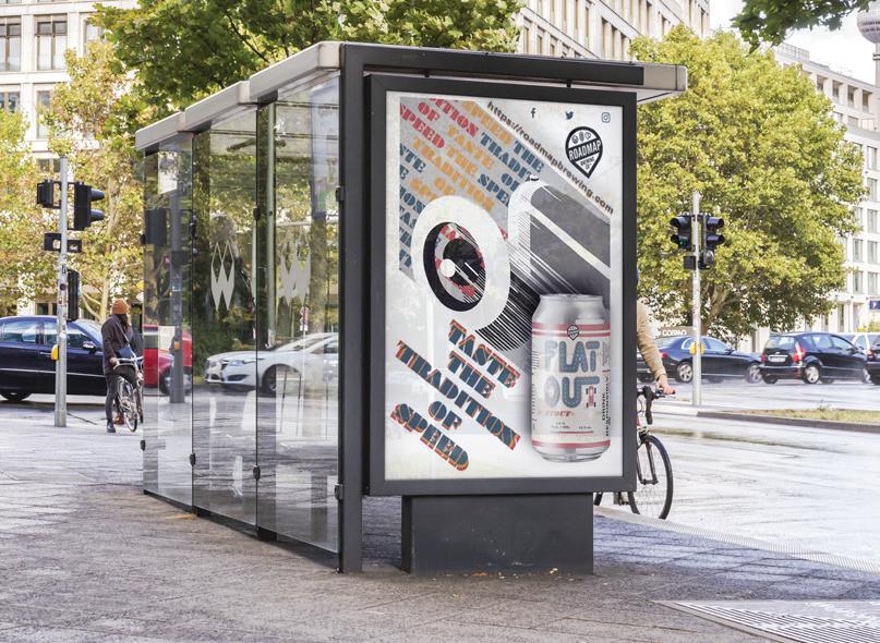
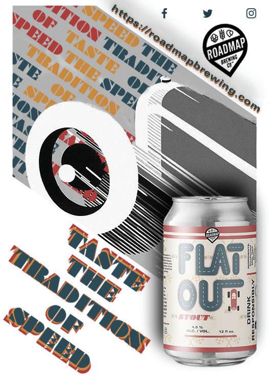
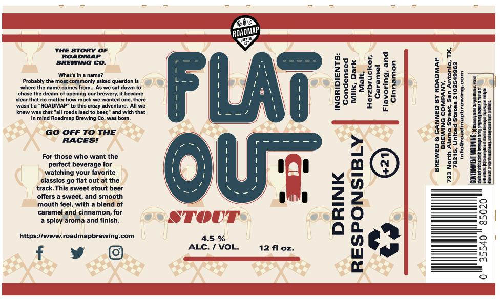
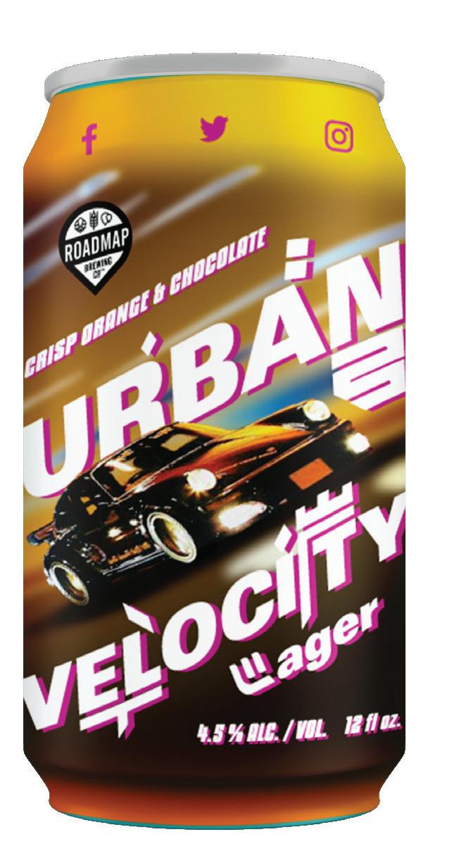
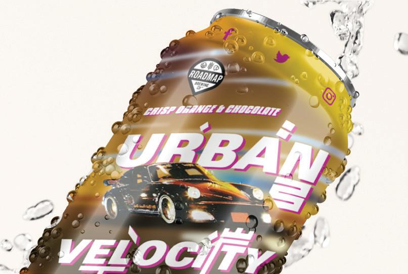
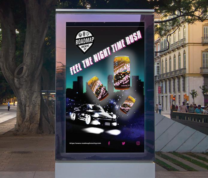
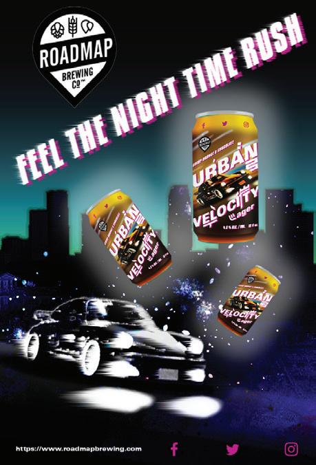
This project involved finding a craft beer company, (in this case Roadmap Brewing Co.), and creating 2 new craft beer flavors for the company; this involved creating the beer can labels, as well as posters for each new flavor.
This flavor, FLAT OUT STOUT, was themed around the vintage racing posters of the 1940s-1950s; while maintaining a theme of modern simplicity.
ROADMAP.CO CRAFT BEER:
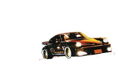
URBAN VELOCITY LAGER
This flavor, URBAN VELOCITY LAGER, had inspiration based on the underground racing culture of Japan in the 1990s, and the subsequent magazine designs/photos to come from it.

















THE CHROMOSOME 18
REGISTRY & RESEARCH SOCIETY
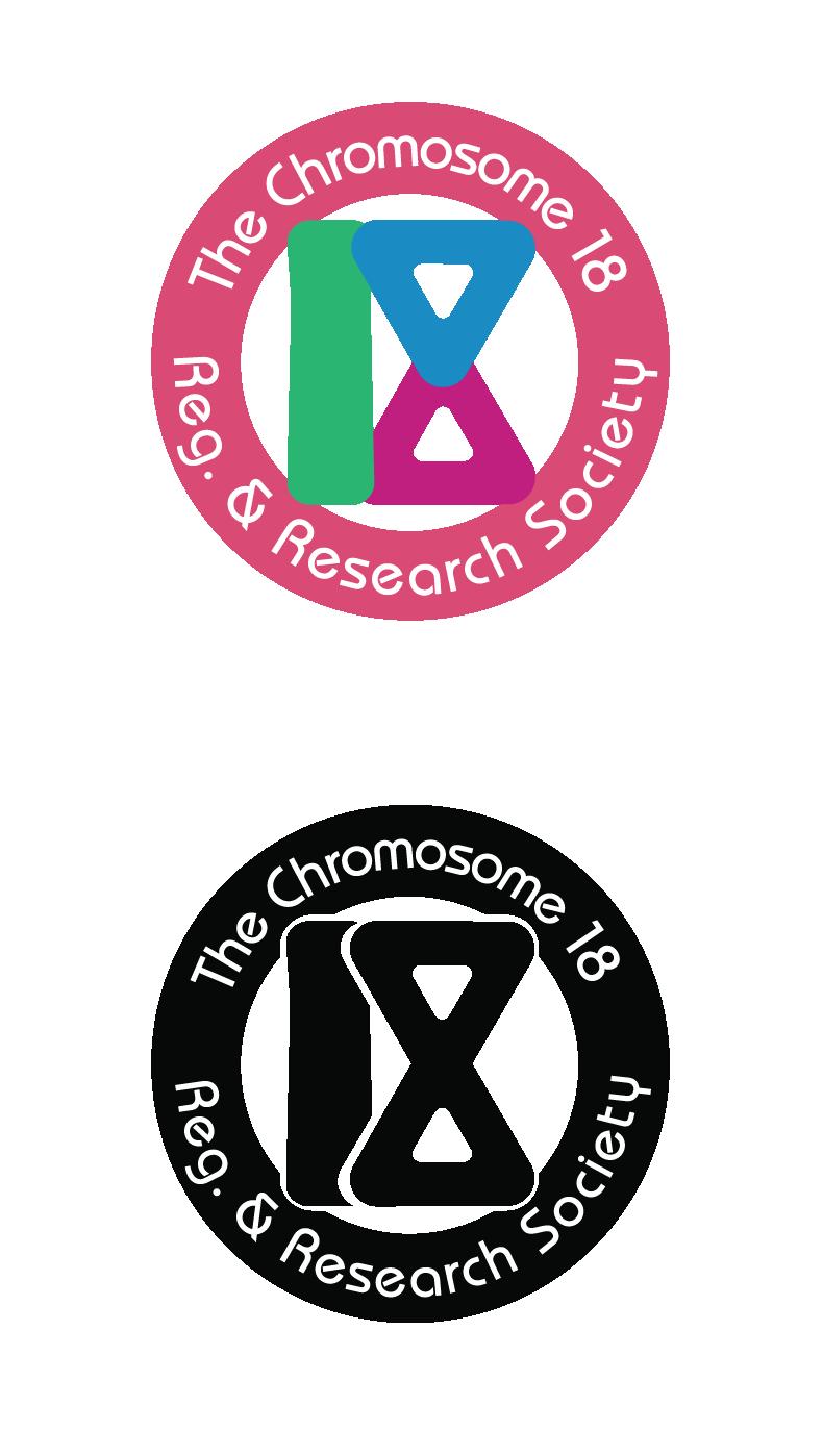
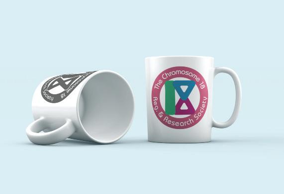
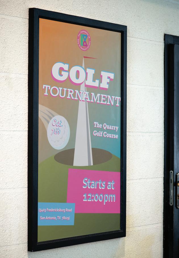
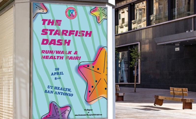
The obligations of the project were that a re-designed logo for The Chromosome 18 Registry & Research Society be created, along with two posters, (with the new logo included), advertising two of their annual events; the “Starfish Dash Run/Walk & Health Fair” and “Golf Tournament” charity event.
TYPOGRAPHY
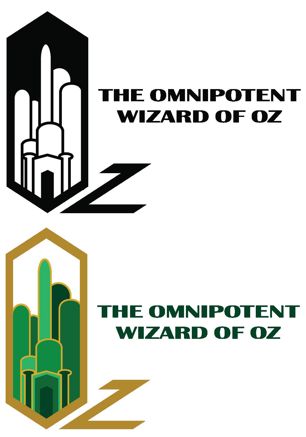
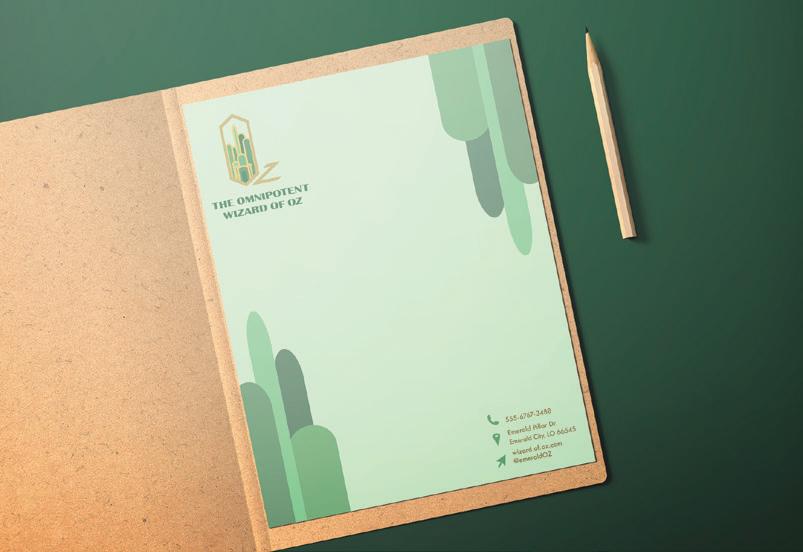
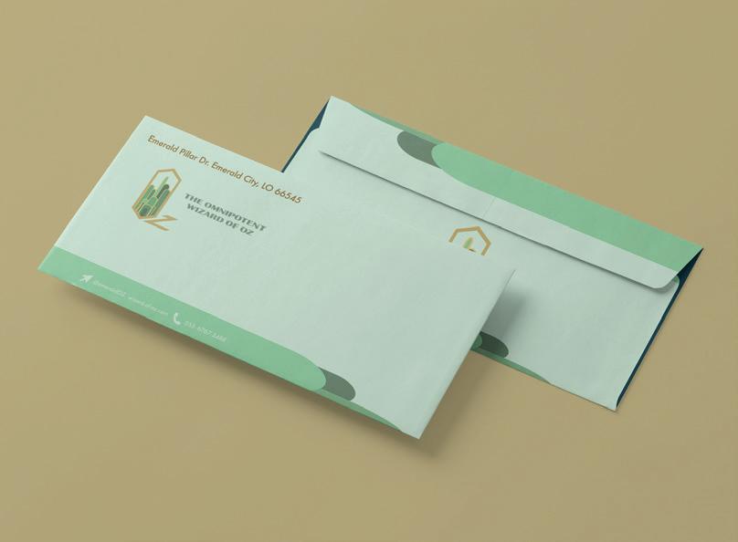
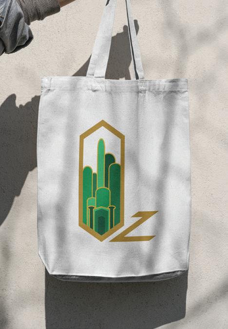
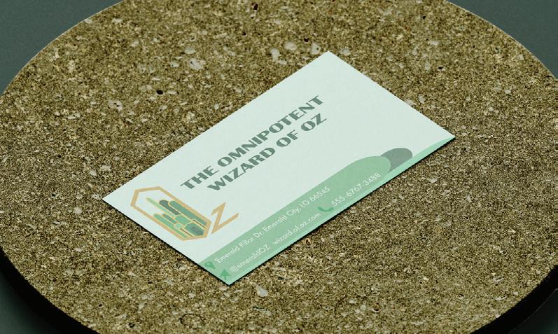
WIZARD OF OZ
STATIONERY: OZ
This project had the goal of creating a unique logo based on two of the characters from “The Wizard of Oz,” and creating a set of stationery, i.e. an envelope, letterhead and business card design.
In this case, using the colors of the Emerald City, in the movie, along with adding a sharp, geometric design to the letters ‘Oz’ to create a more modern aesthetic.
WIZARD
OF OZ
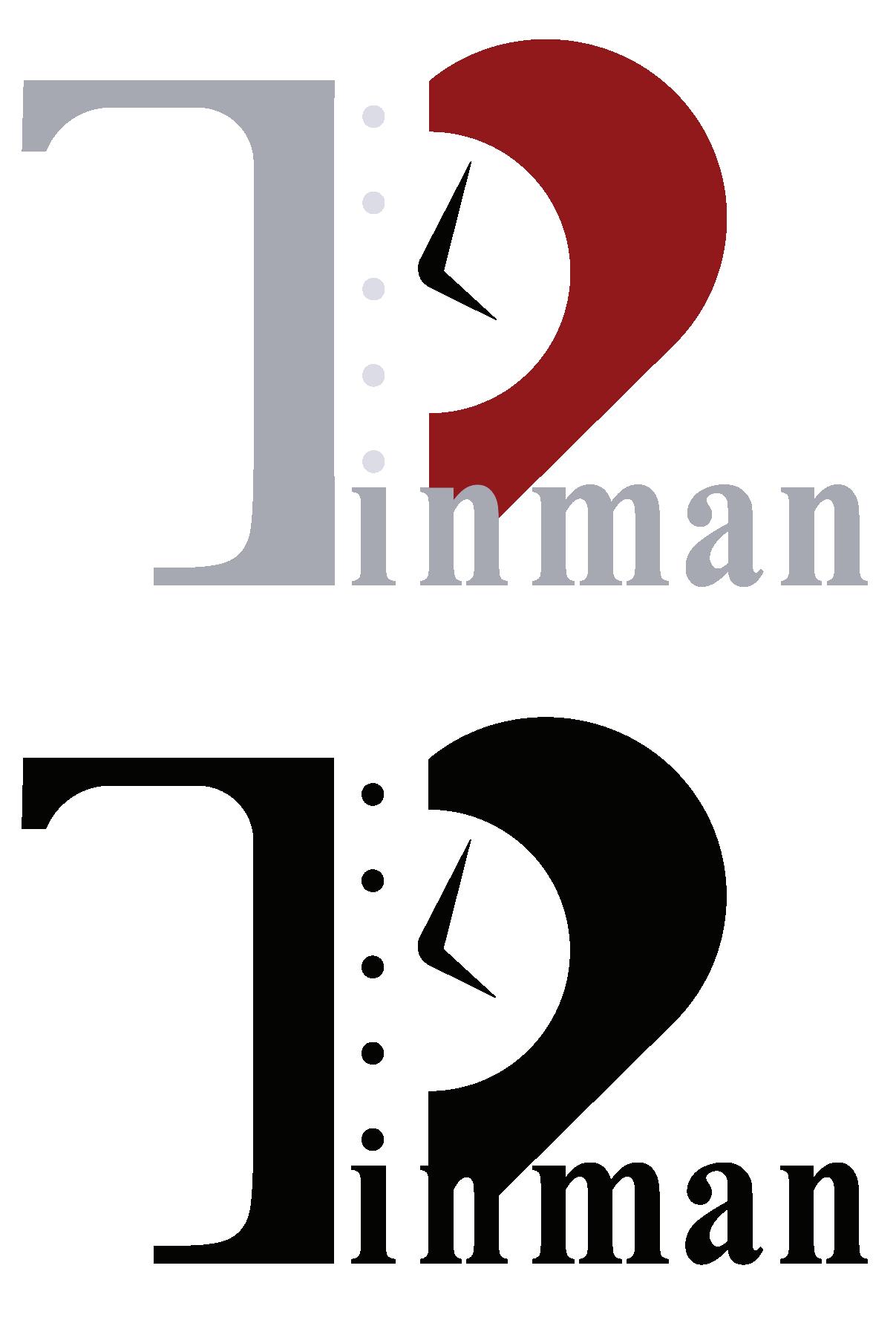
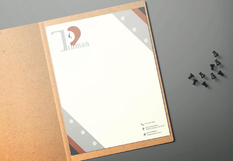
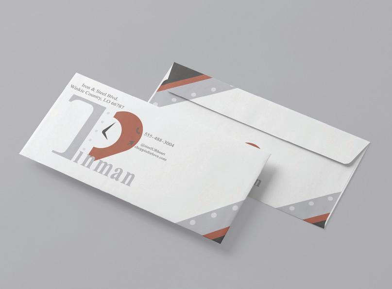
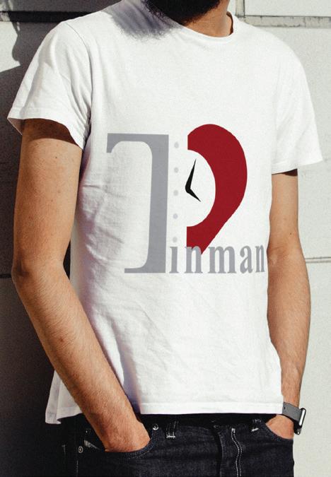
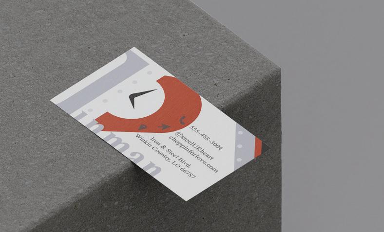
STATIONERY: TINMAN
This project had the goal of creating a unique logo based on two of the characters from “The Wizard of Oz,” and creating a set of stationery, i.e. an envelope, letterhead and business card design. Inspired by the cumbersome, metal man design of the film, along with using gray, metal tones, with a strong emphasis on the red heart the character receives in the movie, used alongside a simple, serif typeface to keep it tied to modern trends.
JAZZ SA CAMPAIGN
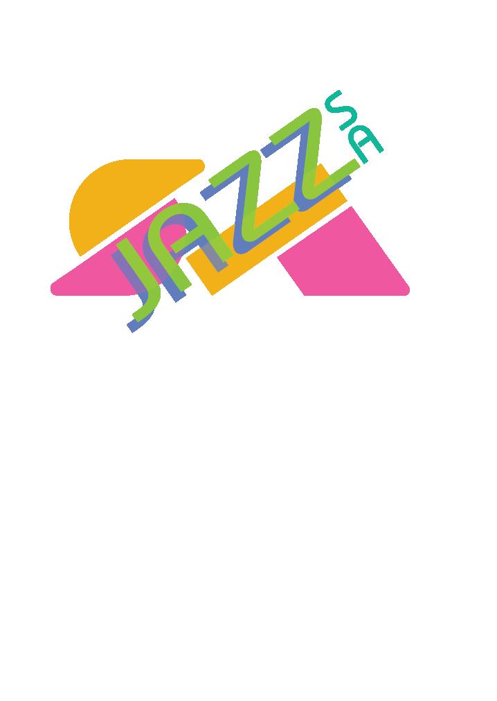
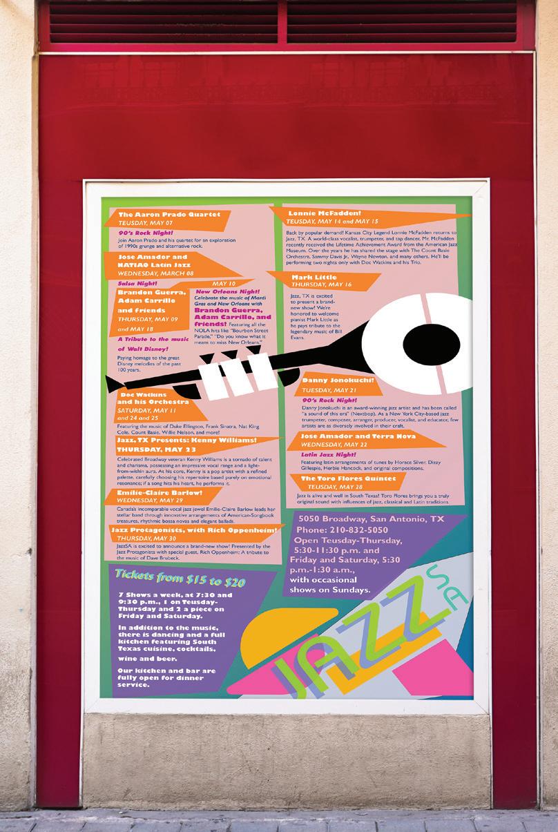
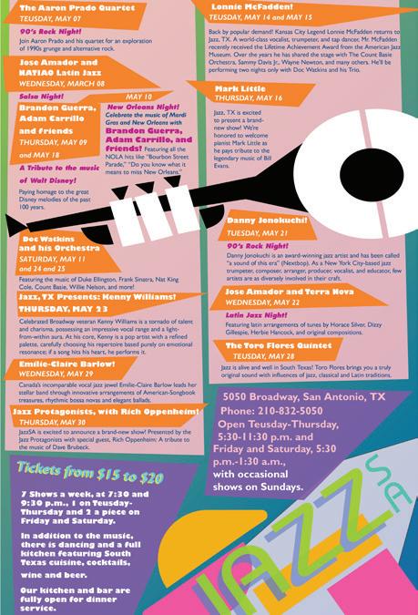
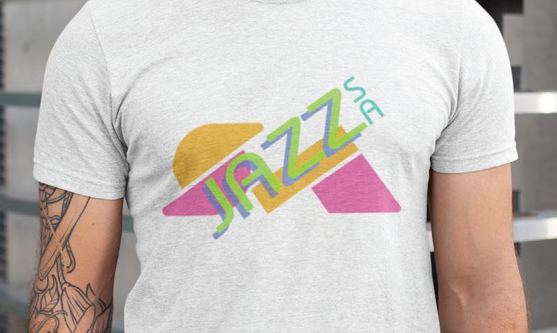
The ad campaign for this project involved creating a new logo for the Jazz SA Festival, including a unique logo, as well as a poster with all of the events and information listed.
The logo, as well as the poster itself, were inspired by the Art Deco period, combining with blocky, geometric typography and details.

mockup provided by @berlionemore_contributor on Freepik
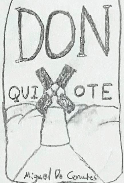
DON QUIXOTE BOOK COVER
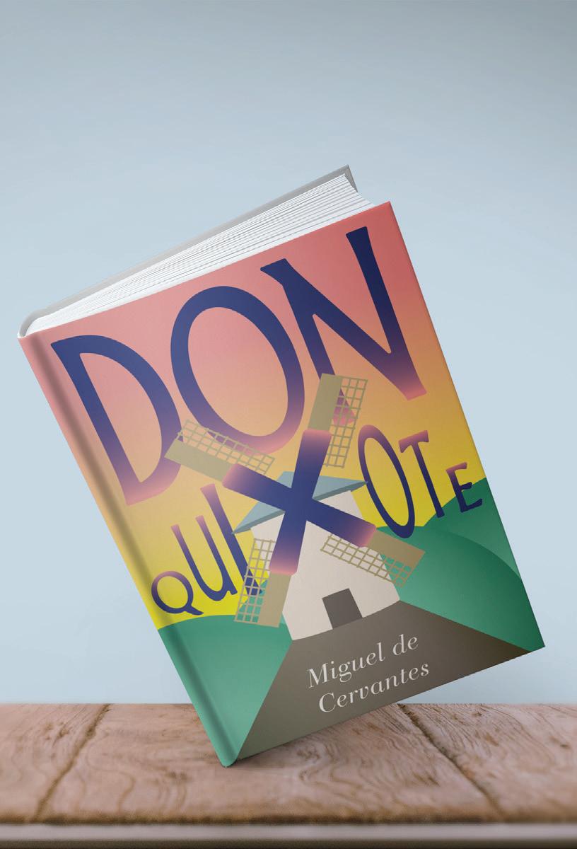
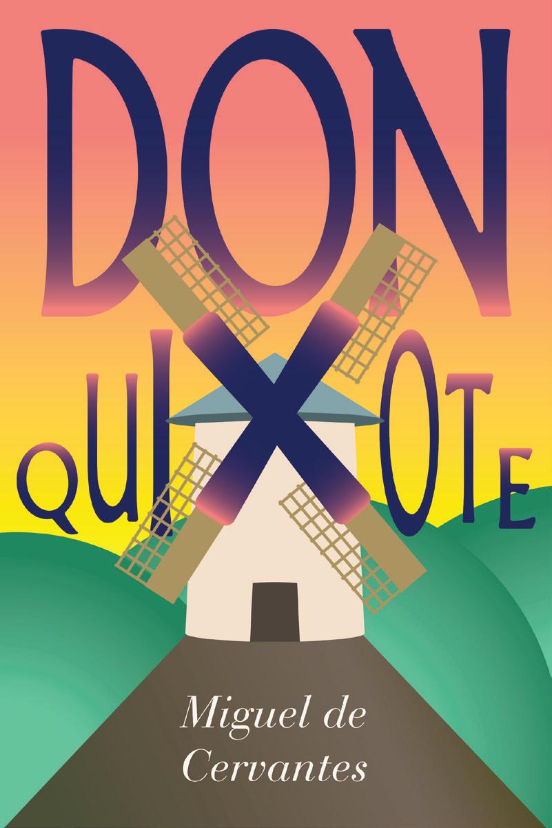
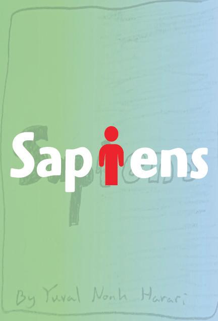
This project involved creating an entirely new design for a choice of two books, in this case; Don Quixote by Miguel de Cervantes, and Sapiens by Yuval Noah Harari.
With the cover for Don Quixote, an emphasis was made on the iconic windmill from the story itself, even taking the rare opportunity to incorporate the “X” in Quixote, as well as incorporating soft gradients to tie into the lighthearted nature of the story.
SAPIENS BOOK COVER
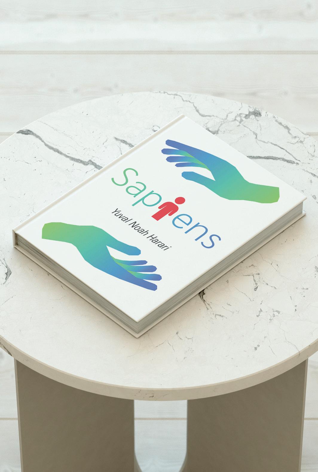
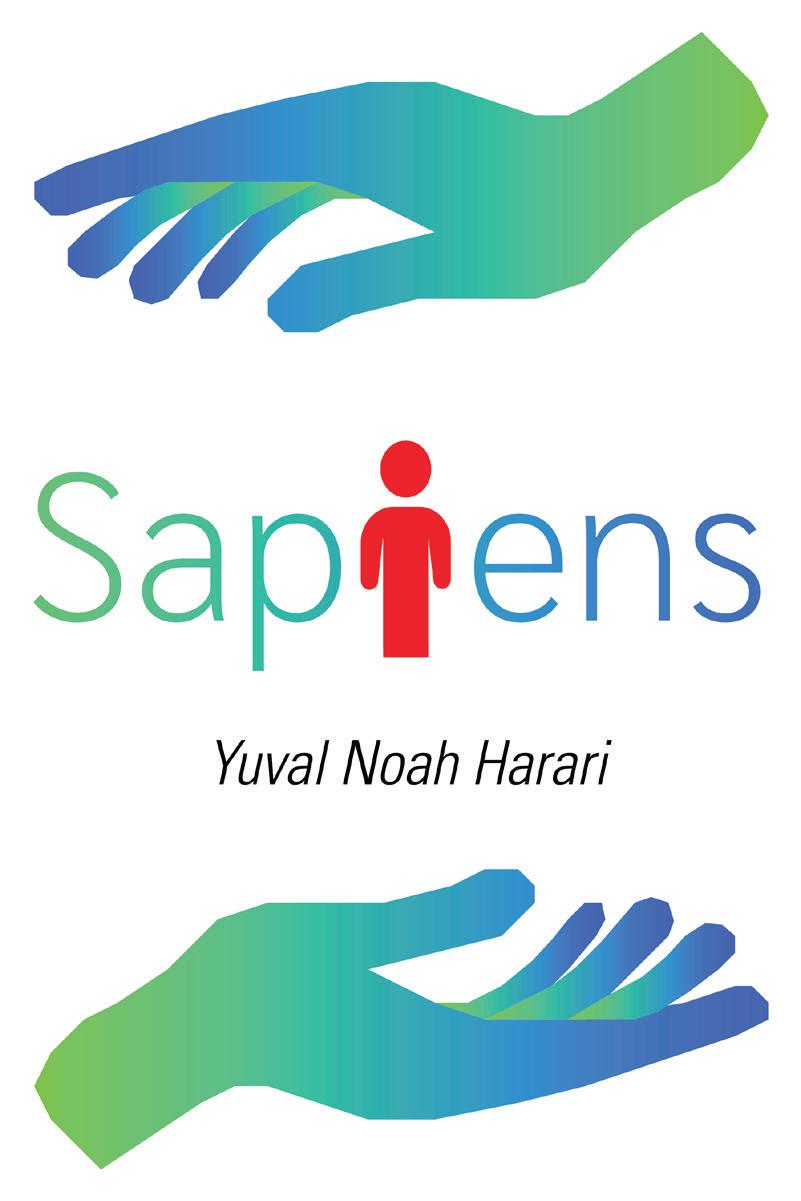
This project involved creating an entirely new design for a choice of two books, in this case; Don Quixote by Miguel de Cervantes, and Sapiens by Yuval Noah Harari.
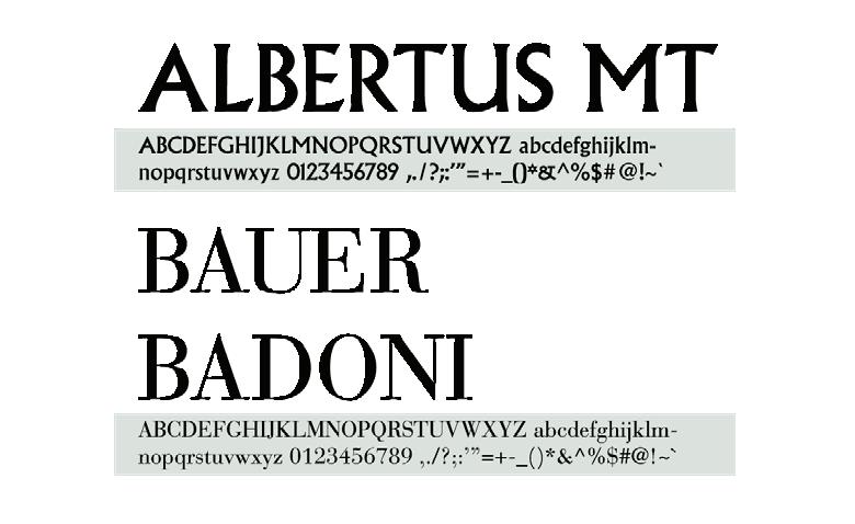
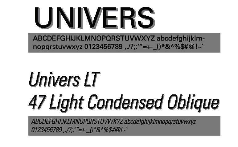
Only one typeface was needed for this simplistic, yet almost “textbook-like” Univers font.
The red humanoid figure emphasized the book’s focus on humanity’s past, present and future, with the green and blue, geometric hands emphasizing the encapsulation of humanity’s potential future.
POSTERS
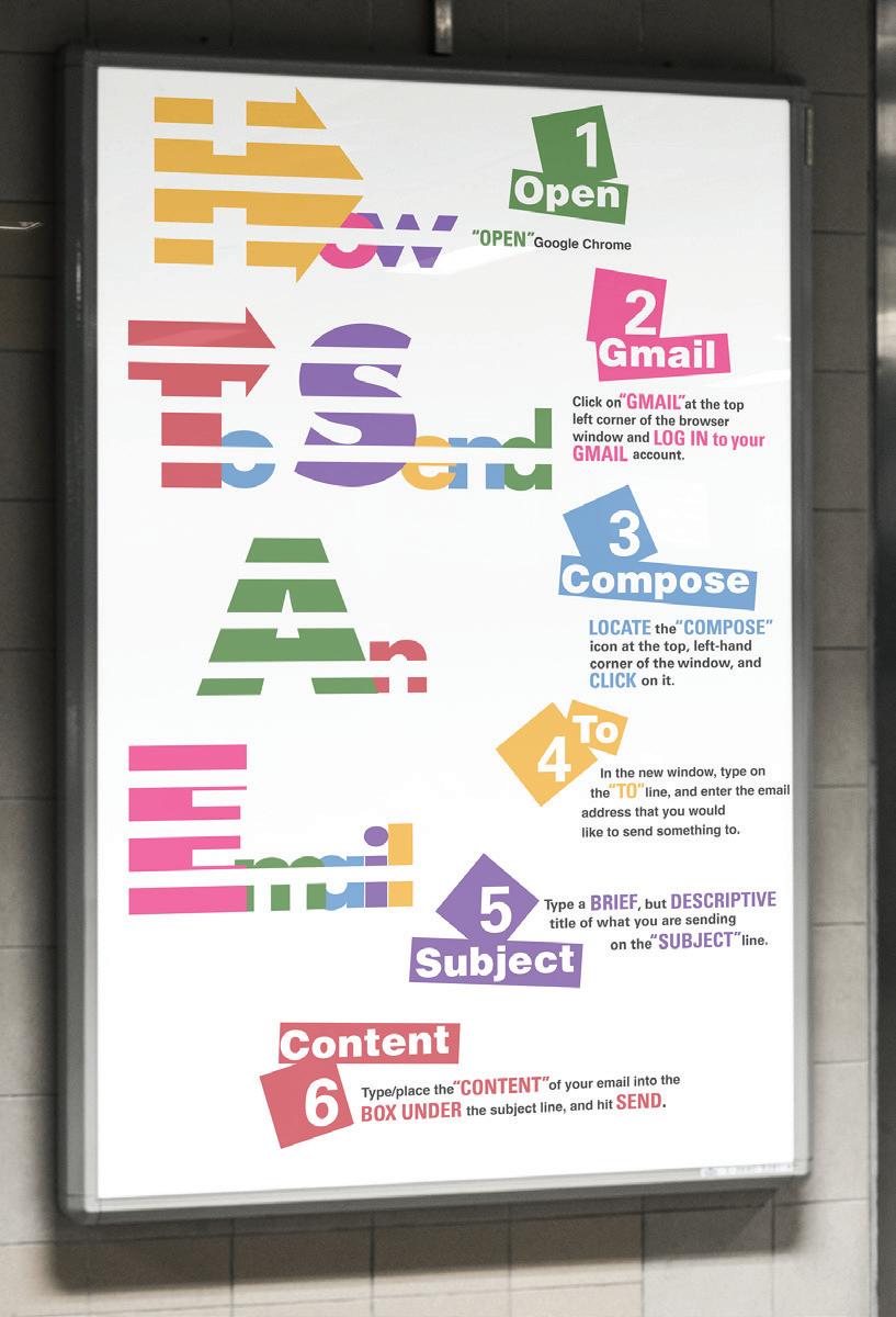
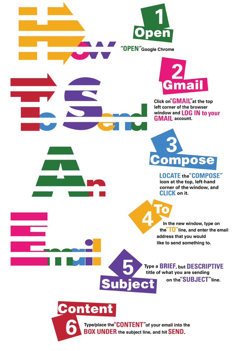
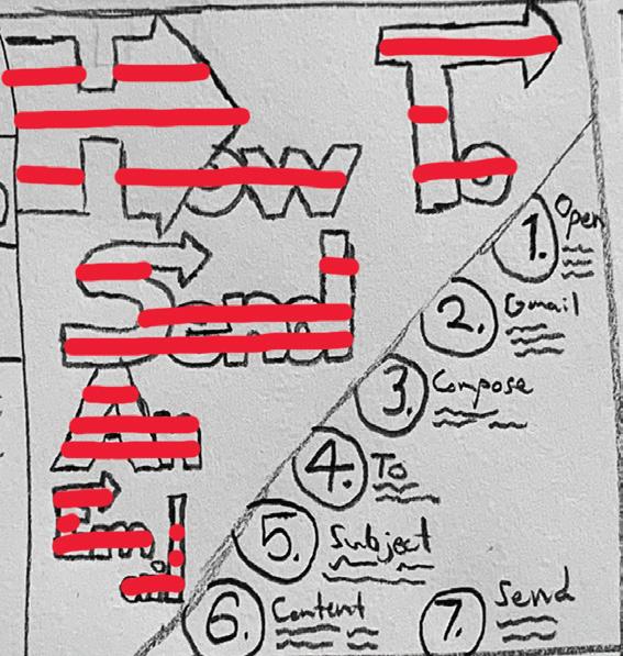
HOW TO SEND AN EMAIL
POSTER
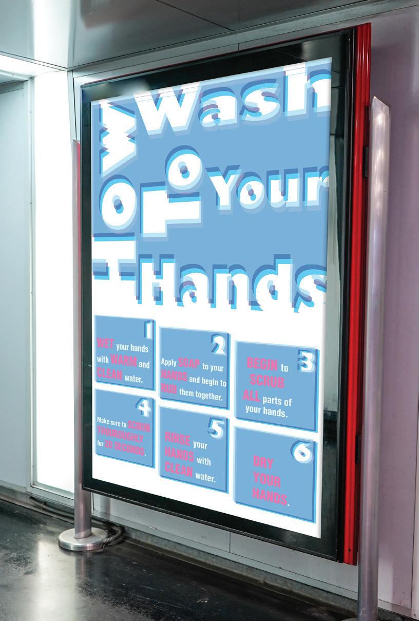
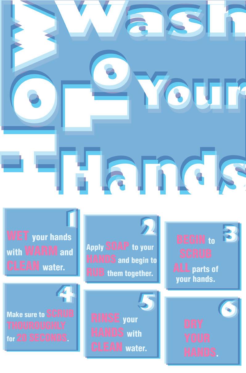
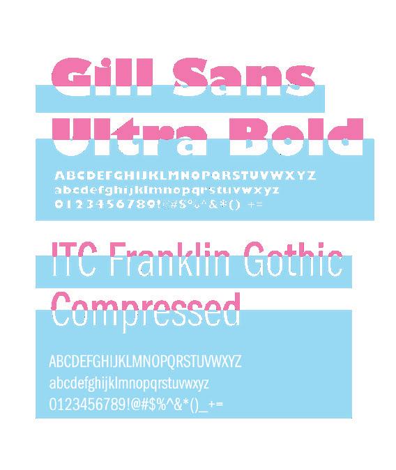
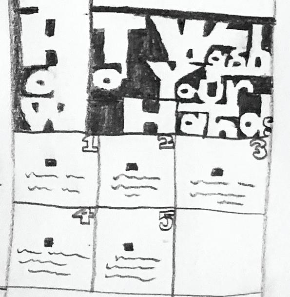
These posters were created as a means of explaining how to do a simple task, in a step-by-step process; portrayed by typography, and a layout inspired by a contemporary, well-renowned, different graphic designer for each poster.
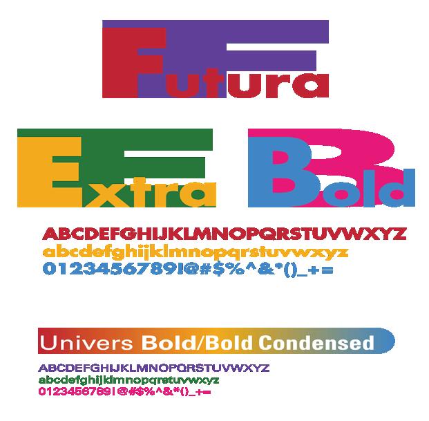
The “How To Send An Email” poster was inspired by Paul Rand; specifically, his design for the “abc” logo, his creation of the “IBM” logo, as well as his poster for the Tokyo and Osaka Communication Arts Institute.
HOW TO WASH YOUR HANDS POSTER
These posters were created as a means of explaining how to do a simple task, in a step-by-step process; portrayed by typography, and a layout inspired by a contemporary, well-renowned, different graphic designer for each poster.
The “How To Wash Your Hands” poster was inspired by Massimo Vignelli, and his design of the “bloomingdales” logo, as well as his designs for the furniture company “Knoll.”
SAN ANTONIO COLLEGE
LIBRARY POSTER
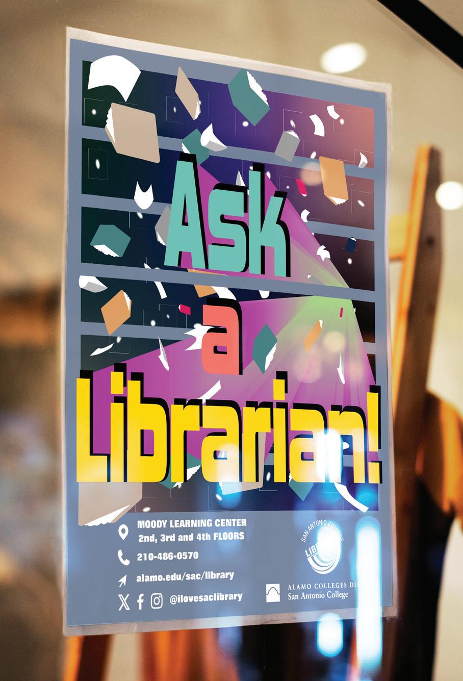
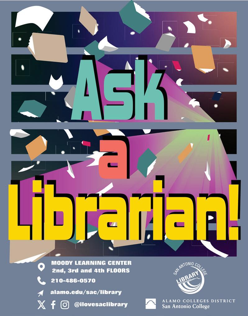
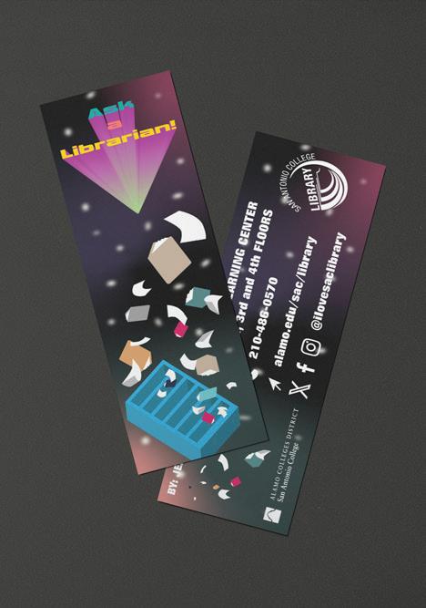
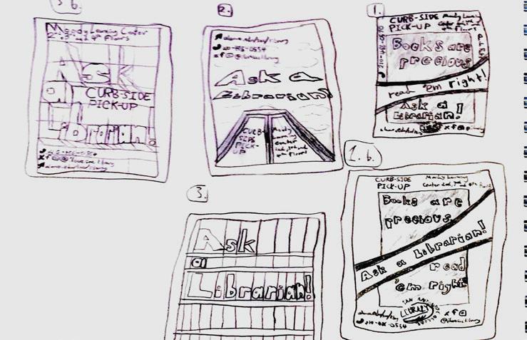
The San Antonio College Library requested that a poster and, similarly themed bookmark be created, with the intention of drawing attention towards the updated features of the library.
This poster and bookmark had the subtle inspiration from scenes from the movie Interstellar, involving a bookshelf in another dimension, while combining inspiration from the 1980s and 1990s-era, educational tv shows, such as The Reading Rainbow.
mockup provided by @yeven_popov on Freepik
WEB & APP
LIVIQON
E-COMMERCE APP
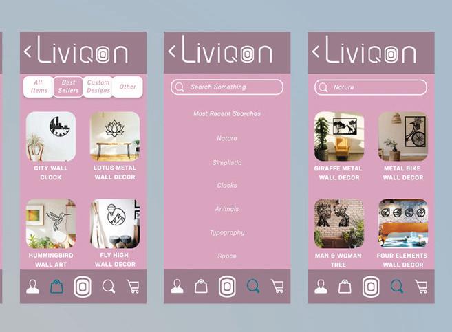
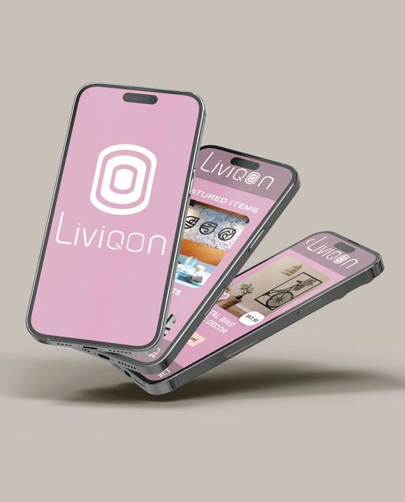
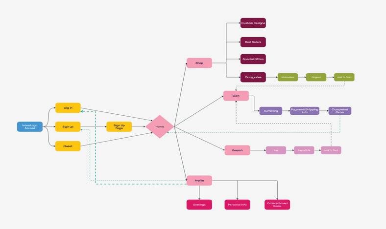
This project required creating an app for a pre-existing, e-commerce website, including UI elements, app page layouts, and a functioning prototype.
The site “Liviqon” was chosen, a storefront website that sells metal, indoor wall art designs. Looking at the website, and its limited color palette, with only occasional splashes of red, a soft, floral color palette was chosen for the app. The logo itself was also modified to create softer edges, and reduce complexity overall, fitting for a more modern aesthetic.

SAN ANTONIO PETS ALIVE! APP
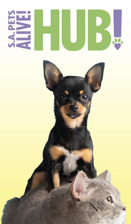
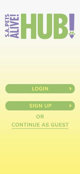
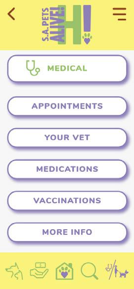
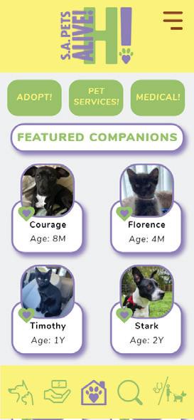
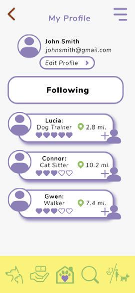
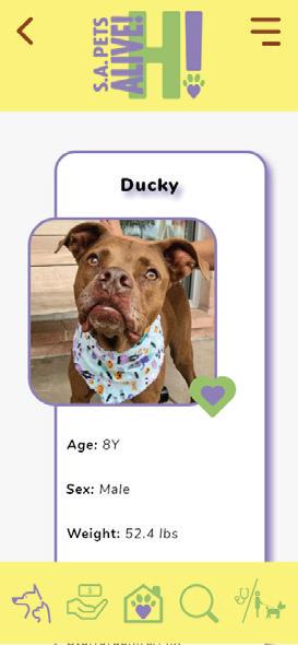
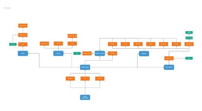
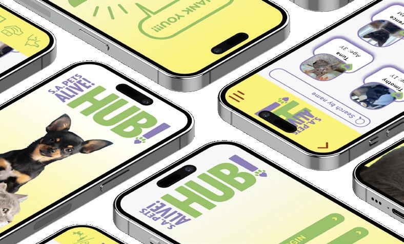
This project involved developing an entire app, with the function of becoming a simplified, more user-friendly, and ergonomic way to interact and take advantage of the tools provided by the San Antonio Pets Alive! organization.
The development process also lent itself to creating an entirely new, app-specific, logo, as well as a host of accompanying icons to work with the app’s overall design.