Writing for the Web
By Jim Norrena & Nica Lorber


By Jim Norrena & Nica Lorber
Human beings consume content differently online than in print. In print, readers delve deep and are not easily distracted by things to click on.
People online:
› Read 25% slower versus print.
› Are task-focused, eager to find an answer or take an action.
› Scan the page, rather than read every word.
In short, don’t expect your content to be effective if you simply copy and paste from print.
Begin by defining your content goals. Goals help focus your efforts and inform what you should create, keep, delete, or move.
The CCA website has a lot of legacy content that needs to be edited and curated more effectively for the Web. Answer the following questions to guide this process. It’s best to answer all of these questions with the key stakeholders present.
› What are the communication goal(s) of the page?
› Who is the audience?
› What are the key calls to action?
› What is the utilitarian function of the page?
› Can this content be shorter or more skimmable?
› Can redundant content be eliminated?
› What content belongs in the right-hand column?
› Is all content relevant?
Example goals for Undergraduate Admissions:
Communicate differentiation
Provide overview of admission process
Communicate application deadlines
Show the CCA experience through student profile videos
Outline next steps (apply, attend an event, etc.)
Content governance defines who is in charge of your site’s content, who has input, and how it gets online. While no individual governs every page on the site, teams of individuals often manage sections, with designated persons assigned to a specific page(s).
› Who writes or edits content?
› Who are the stakeholders?
› Who approves content?
› How are content requests made?
› When is this content due?
› Who uploads the content?
Answer these questions and share them with your team. This will clarify roles and responsibilities. Defining this system empowers all team members to enact changes on your site by contacting the correct person(s).
Sheri McKenzie approves all Admission section content.
Minor content changes may be published by section owners without Sheri signing off.
Section owners are responsible for soliciting feedback from Sheri when changes are significant enough to necessitate approval.
The best solution to keep folks apprised of the proper content-management process is to use a chart to illustrate who is responsible for different phases.
Such a system, as illustrated in the chart below, ensures an effective understanding of the content process is shared by all users.
Undergraduate Section Sheri McKenzie, Robynne Royster Robynne
Admitted
Robynne Royster
Graduate section Sheri McKenzie, Noel Dahl
Admitted Graduates Section Sheri McKenzie, Noel Dahl
Financial Aid Section Sheri McKenzie, Scott Cline
Tuition
Orientation Section Sheri McKenzie, Noki Seekao
Tips for Educators Sheri McKenzie, Robynne Royster
Enfollment Counselors Sheri McKenzie, Robynne Royster Robynne Royster
Researchers have proven readers scan content in an F-shaped pattern.
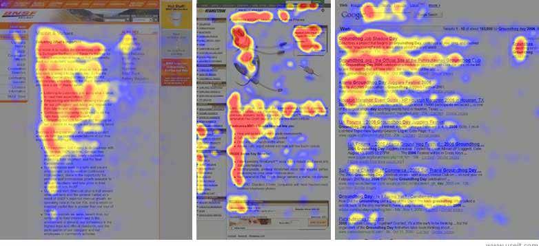
The three different pages above show an F-shape. Heat maps indicate where users focus first. Readers focus more on the left side of the page as well as on the first part of paragraphs.
What does this mean? It means you should:
› Put your most important content at the top of the page.
› Use subheaders throughout your text for improved scannability.
› Make the first two words of your headers the most important.
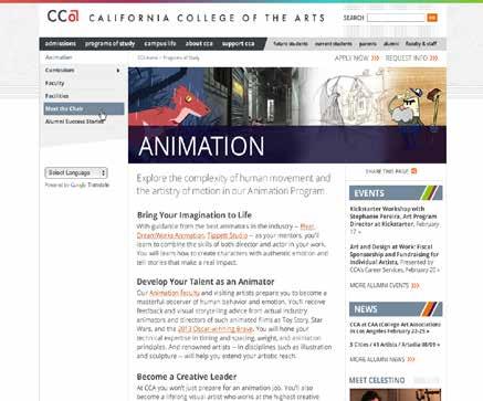
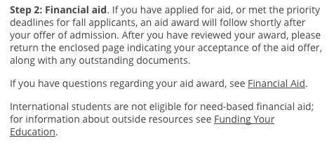
This CCA page is structured correctly for F-shaped reading.
n Large intro text
n Concise subheads
n Short paragraphs
› Start with your most valuable information
This supports reader’s F-shaped scanning practices.
› One main idea per sentence
Avoid multiple clauses and lots of information stops and commas.
› No sentences without a fact
Every line you write needs to advance the story.
› Write compelling but clear headlines
Front-load your headers and subheaders with keywords your audience scan. Put the most important words within the first two words of a header.
› One idea per paragraph
Readers will jump to the next paragraph if they can’t quickly find what they’re looking for.
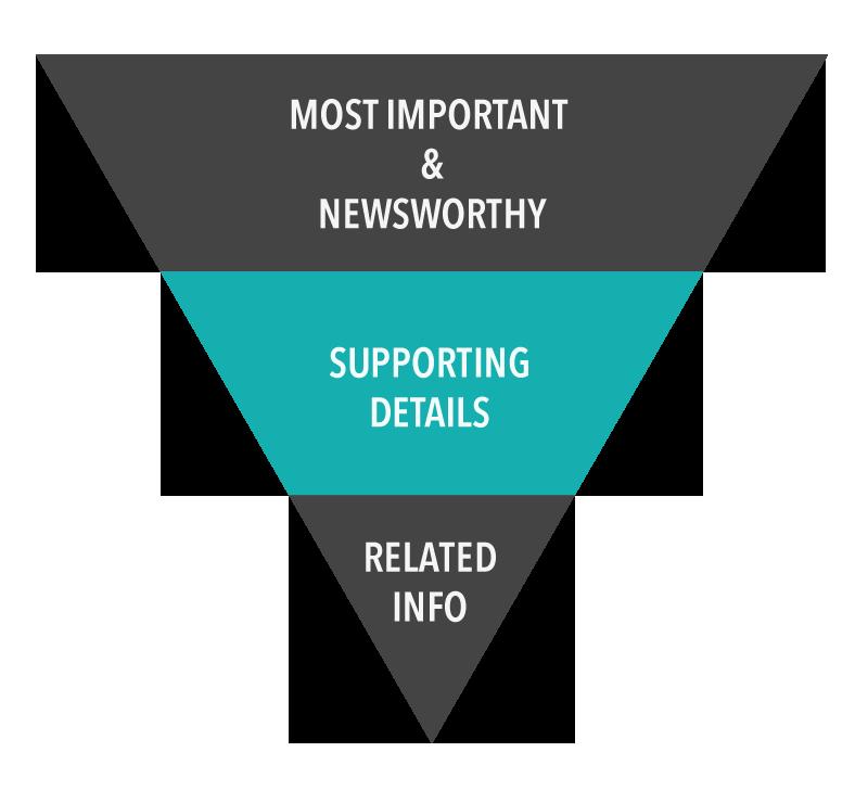
› Use the inverse pyramid (as shown below)
For pages longer than 400 words, use anchor links to improve navigation within the page.
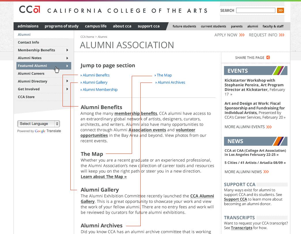
n DO
n Make anchor link titles match the title of section headers
n Put anchor links at top of the page
n Use on long pages (more than 400 words)
n DON’T
n Don’t put intro text before anchor links
n Don’t put anchor links in the middle of the page
n Don’t use anchor links to link to a different page
n Don’t use on short pages (fewer than 400 words)
Longer pages are sometimes unavoidable. For long pages, use anchor links, structured formatting, and lists to improve scannability.
For most other pages, follow these guidelines:
› Average page: 500 words
› Headers : 8 words or fewer
› Sentence length: 15–20 words or fewer
› Paragraphs: 40–70 words or fewer
› For pages of 400+ words: use anchor links
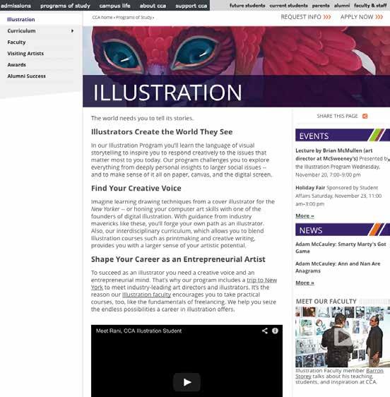
Calls to action (CTA) should be highlighted in the right-hand column.
Except for video blocks, avoid using graphics and images in this column because of “banner blindness,” which is a phenomenon in web usability when visitors to a website consciously or subconsciously ignore banner-like information. They look like ads.
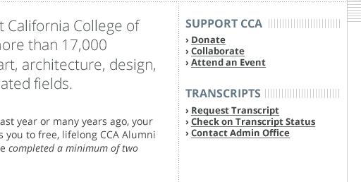
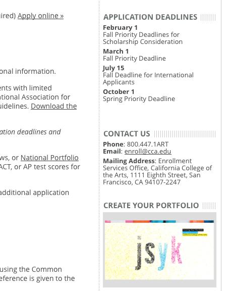
n Do
n Put CTAs in the right-hand column
n Make CTAs concise – ideally they don’t wrap
n Repeat CTAs that exist in the body copy
n Make links skimmable
n List CTAs in order of importance, not alphabetically
n Don’t
n Don’t create blocks of text as calls to action
n Don’t use graphics and images. People have “banner blindness” and will skim right over them. Video is the exception if you add a play button.
n Don’t create more than 5 CTAs under any one header
Tips for creating effective web content:
n Do
n Place most important information first
n Focus on the reader’s needs
n Keep content short and to the point
n Avoid duplicating content; instead link to the source content
n Spell-check before posting
n Test all links
n Revisit your content regularly
n Don’t
n Don’t copy and paste from print materials without editing text for web readability
n Don’t use “click here”. Instead, use keywords in linking text that are active (e.g., “view our admission guidelines”)
n Avoid posting content whose audience is internal staff or faculty; instead, seek an alternative way to make the content available (e.g., Google docs)
n Instead of . . .
All things being equal, what I am trying to say is that in my opinion all students should, in the final analysis, have the right to vote for all intents and purposes.
despite the fact that in the event that under the circumstances in which with regards to it is important that has the opportunity to it is possible that due to the fact that
n Use . . .
Students should have the right to vote. although, even, though if when about must, should can may, might, can, could because, since, why
n Instead of . . .
The Graduate Student Alliance (GSA) provides an easily accessible and organized forum where graduate students pitch, plan, and produce their ideas. GSA sponsors initiatives that strengthen community among graduate departments and promotes constructive dialogue between students and the administration and faculty. Every graduate student has the opportunity to be informed and active without the hassle of applying for membership or paying fees. Student voices fuel our efforts and direct our focus at every stage of activity.
As an alliance of graduate students, we achieve concrete and visible improvements on campus that stimulate and enrich the already vibrant culture at the college.
The goals of GSA are:
Sponsor graduate student events and initiatives that foster community, discourse, and entertainment across departments.
Provide convenient venues for open communication between individuals and departments on the student, faculty, and administrative levels.
Maintain and publish an updated record of student opinions about classroom, department, and school wide issues.
Advocate for student interests ranging from greater curriculum diversity to improved campus accessibility.
n Use . . .
CCA’s Graduate Student Alliance (GSA) provides an easily accessible and organized forum wherein graduate students pitch, plan, and produce their ideas.
We believe student voices fuel the college’s efforts and direct our focus at every stage of activity.
We achieve concrete and visible improvements on campus that stimulate and enrich our vibrant culture at CCA.
GSA Goals
› Sponsor graduate student events and initiatives that foster community, discourse, and entertainment across departments
› Provide convenient venues for open communication among students, faculty, and administration
› Maintain and publish an updated record of student opinions about classroom, department, and capuswide issues
› Advocate for student interests ranging from greater curriculum diversity to improved campus accessibility
n Instead of . . .
advanced notice at the present time collaborate together end result extra bonus completely unanimous new beginning past history repeat again totally unique unintended mistake protest against plan ahead written down final outcome still remains usual custom
n Use . . . notice at present collaborate result bonus unanimous beginning history repeat unique mistake protest plan written outcome remains custom
Lists empower readers to quickly find what they’re looking for. Use lists for terms, resources, procedures, instructions, and collections.
practices
› Use numbered lists for instructions, or when order is necessary (e.g., step-by-step instructions)
› Punctuate bullets consistently
› Avoid lengthly explanations
› Avoid ending bullets with semicolons
› Be sure bullet items are related
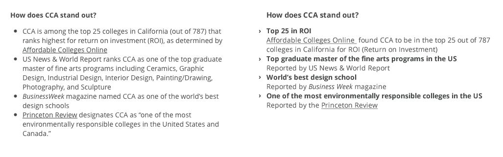
n Before
n Bullets are too long and hard to scan
n After
n Headers added for better scanning
n Headers highlight most important communication points
n Length of copy decreased for improved readability
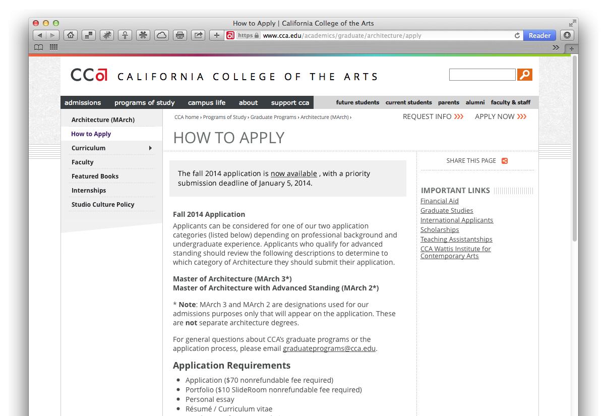
The WYSIWYG call-out style adds a gray box to the text. It’s specifically intended to be placed at the top of the page, as an important message, or occasionally within the page, but only when absolutely necessary.
› Time-sensitive information that needs emphasis (e.g., deadline, change in program, canceled event, new feature)
› An item that does not conform to the norm and needs more emphasis (e.g., exceptions to an application process requirement)
n Do
n Use this style for deadlines, changes, or critical updates
n Don’t
n Don’t overuse (this style is more effective the less frequently it’s used)
n Don’t use in place of parenthetical mentions
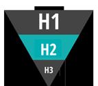
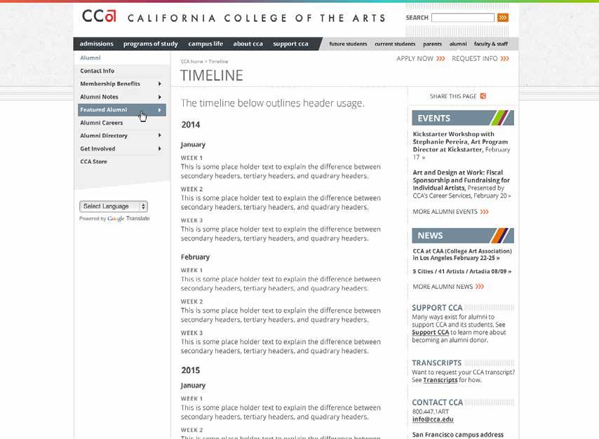
Content editors can improve the readability of their pages by adding section headers such as H2s and H3s.
n Do
n Use headers to organize content
n Put most important words in the first two words of the header
n Use plain language, not clever language
n Use headers in order of prominence
n Don’t
n Don’t use headers as call-outs
n Don’t wrap headers
n Don’t make your header a sentence
n Don’t add formatting such as bold, italic, or underline to your header
Less is more.
Use formatting sparingly to attract your readers attention. A conservative approach will ensure formatted words draw focus. Avoid treating a single element with more than one formatting style.
› Italic
Use for titles of artwork, exhibitions, books, and journals. (See also CCA style guide)
› Links For jump pages, use title, description, and “learn more” to link to target page. All other links can be action-oriented contextual links, or in-line links.
› Bold
Use for emphasis.


anchors or anchor links: Hyperlinks at the top of the page that link to specific areas on the page. Used to help navigate long pages.
“banner blindness”: The result of tuning out content in the right-hand column due to excessive elements — often perceived as ads.
callout style: Used to emphasize important information either at the top of the page or in the running the text.
content editor (or page owner): A role that allows faculty and staff to edit web content.
content governance: A hierarchy of who’s responsible for content on the website: who does what.
content manager (or stakeholder): Person responsible for content, but who may or may not have editing access.
headers (H1, H2, H3 . . .): Formatting used to separate page content in a hierarchical order for easier reading.
homepage: A website’s introductory page — the first page of the site’s architecture.
IA (information architecture): The structural design of a website.
jump page: A navigational page that directs visitors to related subsections (see also Landing page).
keywords: The terms used to search for specific content.
landing page: The first page of a specific section on the website (see also jump page).
metadata: Keywords, page description, and other data that help define content for search engines and screen readers.
skimmable, or scannable: Refers to web content that is formatted for easier readability using headers and subheaders, bulleted or numbered lists, short paragraphs, and concise language.
sustainable practice, or best practice: The planning of web content that incorporates future needs in a way that is manageable, effective, and user friendly.
URL or Uniform Resource Locator. A web page’s address — a string of characters, typically beginning with “http:// ”.
UX (user experience): How a person reacts to a website’s utility, ease of use, and efficiency.
WYSIWYG: An initialism for what you see is what you get, this editing tool allows you to manipulate the layout of a page without having to type or remember names of layout commands.