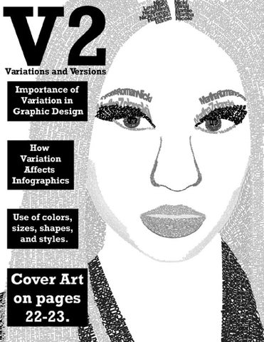
V2 1
PART One: VARIATIONS
Sign on the LINE! Pages 4-5
Bam! Batman! Pages 6-7
OH!NIKA Pages 24-25
You can QUOTE This! Pages 10-11
Creating different variations and versions of an artwork is an important skill to use when creating art. It can be applied to all types of art-drawing, painting, etc.-but it is especially important (and easy to do) when it comes to graphic design and graphic art. Creating variations and versions of a work of art is simply using a range of different features or parts of an artwork to create a desired visual effect. Variations of an artwork can be as simple as changing the background color a couple of times, or moving around features of the artwork to create a different compositional effect. Variations involve different colors, shapes, and arrangements. Creating different variations and versions is easy to do with graphic art, unlike it could be with drawing or painting. Creating different versions of an artwork when drawing or painting t involves remaking the painting or drawing over and over, changing some of the features for the final desired version. In Adobe Photoshop or Illustrator, however, one complete version only has to be made once. Then, the colors or shapes can be quickly and easily changed with the necessary tools, and multiple versions can be completed and saved in a very short amount of time.
The use of variations to design a final version of an artwork with the desired compositional and visual effects is necessary. Some colors do not always work well with others, some images can be placed erratically, and lines, text, and shapes can be disorganized. If one version of an artwork is made, then that is all there will ever be. However, recreating the artwork multiple times using different colors and different words or shapes of different sizes can give a different compositional and visual effect. Through variations, it can be seen which colors work well together, or how well text and shapes can be balanced and organized. Creating multiple variations of an artwork gives the artwork more potential. Each artwork in V2 includes multiple versions of the original artwork. Each includes different changed aspects of their own, including different lines, text, colors, and shapes. Each art piece has been made better, in the end, through the use of variations and versions.
MARKER My Words! Pages 12-13
There’s No MAGIC to This! Pages 14-15 What Box? Pages 16-17
The Icing on the CAKE! Pages 18-19
26 Letters! Pages 20-21
Alter Ego!!
EYE See You! Pages 8-9
AlphaBED Time! Pages 26-27
The 14th Letter! Pages 28-29 Mic Drop! Pages 30-31
Sign On the LINE!
Art and Text By Jill Augustine
4 V2
Using Adobe Photoshop, two very similar yet very different pieces of art have been created. They were both composed using the same tools. They both have the same colors. They both contain a a similar sense of balance. They both have the same concept. Even some of the lines are the same size. Yet, they are also very different from each other. The left piece uses multiple lines, with almost equal positive and negative black and white space. The lines are vertical and parallel to each other. In the right piece, however, there are much fewer lines, and the larger lines seem almost to be more of a shape than a line. There is less white space and much more black space in this piece. And these lines are horizontal, instead.
The variation of these two pieces is ultimately one of composition. Although they are composed similarly of lines of black and white colors, each piece controls the eyes in a different manner. The left piece has vertical lines, controlling the eyes to look from top to bottom. It does not draw the attention to one line specifically. However, in the right piece, it controls the eyes to the center of the artwork, and pulls the eyes from left to right, because of the horizontal lines. Both pieces seem similar at first glance, yet they are compositionally different. It is how one takes the first glance at these pieces, and how one’s eyes are controlled during that glance, that sets these pieces apart.
V2 5
BAM! BATMAN!
Art and Text by Jill Augustine
6 V2
These four variations of the Batman logo were created using the same tools on Adobe Illustrator, and they all contain the same color scheme. The level in which these the colors do or do not well work together, however, sets these variations apart from each other. The first version of the Batman logo (top of page 6) uses a soft orange color for the bat and the outer circle, and a soft gray for the fill. Because these colors have a similar value, the gray and the orange colors almost mix and get lost among each other. There is not one color bolder than the other to help this problem. Similarly, the gray bat and the orange fill in the second version (top of page 7) do not work well with each other, either. The black outline is definitely bolder, but the middle parts do not work well together. The last two versions of the logo contain
the same colors. The first (bottom of page 6) has a black bat and outline with an orange fill, and the second (bottom of page 7) is the opposite, with an orange bat and outline, and a black fill. Because the orange and black colors have different values, they work better together than in the other versions. Therefore, both of these variations are much better than the first two. Whichever the viewer prefers is up to them-whether they like the third version with the usual black bat and outline, or if they prefer something a little different in the fourth. Colors are important parts of artworks, and some colors work better with other colors. The use of many variations can help to learn which colors may or may not work well with each other in a certain piece of artwork.
V2 7
OH!Nika
8 V2
Art and Text By Jill Augustine
Four simple versions of Nicki Minaj (Onika) have been created using adobe Photoshop for the Infographic on pages 42 and 43. They have all been created using the exact same tools and all convey the message that this shape is to be Nicki Minaj. Each one is styled differently, however, using different colors, lines, and shapes, giving each version a different compositional feel. The first version is as simple as it gets-it’s black and bold and simply conveys Minaj’s body shape. The second version is altered only by the fact that instead of black, it is pink. This color pink, because of its preconceived notion of being a woman’s color, adds to the feeling of femininity. Although one can easily tell by the way the figure ‘stands’ that the shape is one of a woman, the color pink continues to add to that feeling. The third version is pink as well, but is outlined in a skinny black outline. It still contains the same color scheme of the first
two versions, yet because of this outer line, this shape of Minaj seems more cartoon-like. It is similar to many of the cartoons that are drawn or animated on the T.V. in which they both contain a visible outline around the shape. The last version of Minaj has two shapes, the pink one in the front, and the black one placed in the back and to the side a bit. This placement adds an effect that this shape appears to be almost as though she has a shadow, or is popping off the page a bit, because of the contrast of the black and pink colors. It seems to also carry a bit of a pop art feeling with it. Depending on how a shape is styled, a different compositional feel comes along with it. Each version of Nicki Minaj was created the same and had the same color scheme, yet eachportrays a different compositional effect.
V2 9
You Can QUOTE This!
Art and Text By Jill Augustine
10 V2
Using Adobe Photoshop, three variations of the same quote were crafted. They were all crafted using the same tools and are all organized in the same way. Most of the fonts used are similar and the color schemes do not vary greatly. As similar as these three artworks seem, they contain small variations that control the way they are each read in a big way. The first quote piece is all in black letters. They eye is not drawn to one single word at first. One would read this quote from top to bottom, beginning to end, as one would read a book. This first one seems to be the least appealing because of its lack of color. One could pass this quote in an everyday situation and not stop to read it because it does not do a sufficient job of pulling the reader’s eye towards it. The second one does a slightly better job at that. It pulls the eye immediately to the center where the yellow color is. The reader may even emphasize the word with the yellow background as they read.
The third variation does the best job at grabbing a reader’s attention. Because it uses a balance of soft yet bright blue and yellow colors to add to the black, one’s attention is quickly grabbed. It makes the reader actually want to read what the piece has to say. Again, the reader may even emphasize the words in blue and yellow while reading. While all three quote pieces have exactly the same message to share, they each do so at a level of varying sufficiency. While the black-only quote could be easily missed and the quote with only a little bit of yellow color added may be less appreciated, the third variation with the good balance of blue and yellow help to catch the reader’s attention and convey the message with a stronger emphasis.
V2 11
MARKER My Words! Art and Text By Jill Augustine
12 V2
Three versions of the same shape of a marker and words have been created with Adobe Illustrator. They all contain the same colors and convey the same message. The level of easiness in which they are able to be read and way they control the eyes, however, is what sets these variations apart from each other. The first version of the marker (top of page 12) has a thicker gray outline around the words than the second version (bottom of page12) does. Because the sizes of the letters are small, the thicker outline around the words of the first version leaves it to be a little harder to read. It almost seems fuzzy, and that the viewer needs to squint a bit in order to clearly see the words. Therefore, the second version is easier to read, but the gray outline is almost invisible. The third version (page 13) is different from the other two in the way that it controls the eyes. Instead of being written horizontally and being read from left to right, it is written vertically, forcing the viewer to read it from top to bottom. Because everyday words are not written as such and not meant to be read from top to bottom, this version calls for the viewer to read the words in an unnatural way, which is a slight hassle to the reader. These three variations all had their differences, yet they each seem to come with their disadvantages, as well. It is important to create multiple versions of an artwork, until the disadvantages or mistakes disappear. On the next page, further variations of this same artwork were created, eliminating the disadvantages that these variations came with.
V2 13
This Isn’t MAGIC!
Art and Text By Jill Augustine
These three variations of the artwork from the previous page were, again, all created the same with Adobe Illustrator. These three versions are very different from the three versions before. Therefore, they control the eye and are read differently, as well, and because they are further variations of the original version, come with more advantages than before. These three markers have been given color-red, yellow, and blue; the original primary colors. The letters of the words have stayed white, yet the words, as well as the parts of the marker, have been given a black-colored outline. The problems with the level of easiness of reading the words have been corrected in these variations. These words do not have a thick outline that causes the letters to be difficult to read, and they do not have a too-skinny outline that disappears
14 V2
into the background. All the shapes and words are horizontal, as well, naturally ensuring that the words are easier to read. The use of the colors changes the way the viewer’s eye is controlled, as well. The different colors cause the viewer to see them more quickly. If there was a black marker next to a red one, the first one the viewer would see would be the red one. Therefore, the red, yellow, and blue colors demand that the viewer’s attention is caught, and that the artwork is seen. When completing multiple variations of a work of art, the kinks and problems are eventually sorted out. These variations from this page and the previous one stand as an example.
V2 15
Art and Text By Jill Augustine
What Box?
Using Adobe Illustrator, four variations of the same quote have been created. Each version includes the same words and the same colors. However, based on the ways the words are arranged, each version has a different level of readability and a different level of conveying the message. The first quote (top left of page 16) is simply arranged. The words begin at the top left and end at the bottom right, which is naturally how one reads. Despite its easy readability, this version of the quote does not convey the message well. The message is to think outside of the box, yet all the words are inside the box. This version contradicts the quote, simply because of where the words have been placed. The second version (top right of page 16) is arranged exactly the same, except that the last word “box” has been placed on the outside of the box. Again, the majority of the words are inside the box, contradicting the message. The third variation (bottom of page 16) is completely different from the first two. Some of the words have been placed on the top outside,
16 V2
and some in the center on the inside of the box. The words in this version are not well arranged. Upon first glance at this version, the viewer may not know where to look first, and which word to begin reading first. The words are not arranged for the way one would naturally read a sentence. The final variation (page 17) does a good job of both arranging the words for clarity and conveying the message well. The beginning three words have been placed outside of the box, helping to send the message to think outside of it. They are set at the top left, where one naturally begins to read a sentence. The word “box” is still inside the square, which helps send the message that that square is, indeed, a box. Although it is still inside the box, it helps to keep the balance of words at the top and bottom, inside and outside of the box. Each version of the quote was made the same and intended to send the same message, but each did a varying degree doing so. Something as simple as the placement of words can impact the message and clarity of the overall work of art.
V2 17
The Icing on the Cake! Art and Text By Jill Augustine
18 V2
A simple drawing of a cupcake using lines was created in Adobe Illustrator. Then, the brushstrokes were stylized, giving each cupcake a different look to it. The first version of the cupcake line drawing was stylized to be fairly simple. The lines are darker and bolder in the center, and fade out at the ends. This cupcake, though it was of course drawn using computer software, resembles a drawing done by a simple pen or paintbrush, because of the way it has been stylized. The second variation seems to have the same type of lines, but the ink is gray instead of black. Therefore, this cupcake’s ink is less bold and seems to be washed out. The third one is gray as well, and also seem to be bolder in the center of the lines and fade towards the ends. However, it looks instead to
have been drawn using a rough paintbrush, rather than a nice pen or paintbrush, like the other two versions. The last variation of the cupcake drawing is the most drastically different of them all. It has thicker and bolder lines that do not lose their boldness and color towards the ends. The lines are sharper and more angled. This stylization makes it appear as though it was drawn using an angled ink pen. Although each drawing was composed using computer software, the way the lines have been stylized can imitate other tools of creating art. With many different ways to stylize a line, smaller variations can be created, as seen in the first three cupcake versions, or much more rapids variations, as such with the last cupcake drawing.
V2 19
26 Letters! 20 V2
Art By Seth Archer-Helke Text by Jill Augustine
Using Adobe Illustrator, three variations of the same set of letters of the alphabet have been created. The first two versions, in comparison with each other, are largely different from each other. The second and third versions, however, are not. How different each variation is from each other depends on the amount of stylization that was given to each version. The first version of the letters of the alphabet is simple letters with a skinny outline and no fill color. They are common letters, with little style to them at all. The second version, though, is immensely different. The lines have been manipulated to have points and curls and flares. Each letter has little diamond shapes as accents, and lines running through them for decoration. The
letters have also been given a black fill color to them. It is almost hard to believe that this set of letters is the same as the first, just stylized differently. This is because of the amount of stylization that has been added to this version of letters. The third version of letters, compared to the second set, is not much different because not much has been styled differently. The only difference is that instead of a black fill color, a red fill color has been added, keeping a heavy black outline, as well. Depending on how much stylization is added to a version of artwork, it can almost be unbelievable that they are variations of the same artwork. It can almost be as though they are two completely different works of art.
V2 21
Alter Ego!
22 V2
Art and Text By Jill Augustine
Four versions of the same image of Nicki Minaj have been created using Adobe Photoshop. Each image is made up entirely out of words. Each variation has the same grayscale color theme. However, each image has had its words stylized a bit differently to give the overall image a different effect. Each stylization, however, is only small, resulting in very slight changes. These slight changes, however, impact the way in which the image is viewed. The first version is the original version of the image. Words were typed out, and transformed and arranged again and again until the words formed a shape that resembles the rapper. Each word, in fact, is typed out to be one of her many alter ego names. Dark black color has been given to make the eyelashes, pupil, hair part, and clothes darker than the rest. Therefore, because the black is bolder against the other gray and white colors, the parts of the image that are black are seen first. Immediately, the viewer will see most likely the eyes before any other body part in the image. The second version has been stylized so that all the colors have been lightened a bit. The parts in the first image
that were bold and black are now dark gray, yet still bolder than the other parts of the image. Therefore, again the viewer will see most likely the eyes or other darker parts first. However, the lighter parts of the image, such as the light gray-colored hair, almost get lost among the white background because there is not a good contrast between the white background and gray type. The third version is almost exactly the same as the first, but a slight variation has been changed. The color of the type of the hair has been stylized so that it goes from light to dark from the top to bottom, creating a gradient effect. This slight change makes the hair more interesting, as though there is a shadow effect. The last version has been changed so that the lightest text has been given a grainy effect. While it helps with the contrast to have the darker text stand out, the light, grainy text has been lightened too much, again, so that it gets lost among the white background. Only single, slight variations were given to each version of the Nicki Minaj text image, yet each small variation impacted the overall image in a great way.
V2 23
EYE See You!
Art and Text By Jill Augustine
24 V2
These four simple eyeball drawings were created using Adobe Illustrator. They were all crafted in the same manner and all portray the same concept. But each has a different color to the eye, some with ordinary color, and some with no-so-expected colors. The eyes that are green and are blue immediately appear to be eyes. Though not realistically shaped, of course, one can tell instantly that the art piece is an eye. This is because of the fact that ordinary eye colors are used. The tiny glint in the eye adds to the effect. The red eye, upon first glance, however, may not be immediately recognized as an eye. The color scheme for this one is red and black. With these colors added to a circle, it may come with the preconceived notion that this may be a drawing of a tar-
get, rather than an eyeball. And the last eyeball, the purple one, may be the most confusing of them all. Where the black color should be there is the purple color, and where the purple color should be there is black. Not only is the color purple not easily associated with the idea of eye color, but because the colors are switched, this piece may be much more difficult to associate with being an eyeball. The importance of choosing the correct color to convey the message that this art piece is an eyeball is important. While it is always fun to think out of the box and use different, not-soordinary colors, the message as to what the art piece is may be construed.
V2 25
AlphaBED Time!
Art By Jesus Varela Text By Jill Augustine
Using Adobe Illustrator, a set of the letters of the alphabet were created and then stylized to create a personal font. Then, the font was given a name. Here, it was named “Cover Up.” To further personalize the font, it was joined with an image. Three different variations of this font name and image were created, and each one conveys the message of this font name at different levels of success. Because the font name is “Cover Up,” the image of a bed was chosen to help convey the message of the font. In the first version (top of page 26) of the artwork, however, the message that this shape is a bed is not immediately clear. It lacks the necessary details that go into the image of a bed, such as pillows and blankets. Without these details, this variation does not adequately convey the message of a basic image of a bed. The following two variations, however, include a blanket and pillows,
26 V2
and therefore make this image much more easily recognizable. The only difference between these two variations is the placement of the font name. The first one (bottom of page 26) has the font name placed at the head of the bed, and the second (page 27) at the foot of the bed. The first font, because it is placed towards the back of the image and is smaller in size, is not as large and bold as the final variation. In the final variation, the first thing the viewer should see is the name of the font, because it is bigger in size. When using the concept of variations with artwork, details can be added along the way where they were originally missed, and small details, such as word placement, can be changed. Then, the final artwork will be able to contain the necessary details and convey the artwork’s message effectively.
V2 27
The 14th Letter!
Art and Text By Jill Augustine
28 V2
Four variations of the letter “n” have been created in Adobe Illustrator. One original “n” was drawn, and then stylized four different times, to achieve a different styled brushstroke look. The first stylized “n” is bolder than the rest. It is thick and looks like an “n” that would be drawn using a thick marker, yet it has been drawn on the computer. The second “n” is much less filled in with ink than the others. It has a scratchier style to it. It looks similar to an “n” quickly drawn with not enough paint on a scratchy paintbrush. The third version of the letter is bold, yet
skinny. It has a fancier feel to it, almost like it was drawn using a fancy ink pen. The last version is the messiest of them all. It is dark and bold in some places, and less so in others. It appears as though it was scribbled quickly with a pen. All of the “n” letters were stylized using different brushstroke looks. The way they appear to be drawn can be easily connected to being drawn with different tools, such as an ink pen or paintbrush. However, these letters were drawn only on the computer, and then stylized to look otherwise.
V2 29
Mic Drop!
Art and Text By Jill Augustine
30 V2
Three variations of a title for the Women in Hip-Hop Infographic have been created using Adobe Illustrator. (See pages 42 and 43-ultimately, however, the title was not used for the infographic artwork). They were all created using the same tools and they all contain the same colors, yet the way the words and image are arranged in each version makes one a better fit to be a title work than the others. The first version (page 30) has placed the microphone shape vertically on the left, and then the words stacked from top to bottom. Although it is easy to read, a lot of empty negative space has been left around the words and image. A lot of empty space around a title is not a good thing to have, because the title can get lost among the work of art. In the second version (top of page 31), the words and image have been completely arranged
differently. The microphone shape has been placed horizontally, and half of the title sits atop of it, while half of it is contained it in. This version contains much less empty negative space, but the best way to eliminate all of the empty space would be to have the complete title placed inside of the microphone shape. And the third variation (bottom of page 31) does just that. All of the words are contained within the shape, and therefore there is no negative space, and the words will not be lost among the work of art. Creating a title that stands out is an important part of any work of art. If it is not arranged correctly, the title will be lost among the artwork, as seen with these variations. Simply arranging the words and images of a title so they are contained into one space helps to make sure that the title will stand out.
V2 31
PART Two: INFOGRAPHIC VARIATIONS
Body Count! Pages 34-35
Criss-Cross! Pages 36-37
SelenAH! Pages 38-39
Using different variations and versions in any artwork is important, but especially important when making infographics. Infographics use both images and words to convey a message, with a larger emphasis on the images and graphics. In infographics, it is important that the information can be understood by the images first and the words second. The words should only enhance the text. Simple examples of infographics include charts, diagrams, and pie charts. However, rather complex and interesting infographics can be created using a wide range of information and graphic images. Because it is easier and better-known to convey messages with words, creating infographics can be difficult. That being said, the first versions of infographics often rely heavily on words, and not much on the representation of the images
32 V2
themselves. Creating multiple versions helps to eventually put a better emphasis on the images, rather than the words. Then, the infographic will be much more effective. Also, with every other artwork, the kinks in the ways the colors, shapes, and texts work together will eventually be smoothed out through the multiple versions, as well. The following infographics each contain different information and a different way of conveying it. While each contains different information, images, shapes, and colors, each one includes different versions demonstrating the ways that using variations and versions helps eventually make the infographic an effective one.
Smile! Pages 40-41
Let’s RAP This Up! Pages 42-43 V2 33
Body Count! 34 V2
Art By Dominic Sanchez Text By Jill Augustine
Three variations of the same infographic on the effects of serotonin on the body have been created using Adobe Illustrator. Each one contains the same information placed in the same area of the artwork. Color, however, plays an important role in these three variations, affecting the level of readability and the attention-grabbing factor. The first two versions lack two important key factors that the final variation contains. The first two versions of the infographic contain a background color that is dull and not attention-grabbing. The first is a light gray color, and the second is a light blue color. Both are not bold colors and do not grab the viewer’s attention. Also, and most importantly, the center graphic of the human body is not bold among the other smaller graphics. It is the center of the infographic and the center of the provided information, yet it is washed out among the other information
and background color. These two factors cause these first two variations to possibly be overlooked by the viewer. The third version, however, contains what the first two lack. This version of the infographic has been given a bolder background color. Although it is still a light blue color, the value of this blue color is much more attention-grabbing. In addition, the center body figure has been given an even lighter blue fill color, setting it apart from the background color, and making it bolder among the other presented information. Although every version of the infographic was presented effectively, the artwork lacked the necessary attention-grabbing factor that certain colors provide. Using the concept of variations helps to learn which colors would work better for this art piece, and even which ones would not.
V2 35
Criss-Cross! 36 V2
Art By Tahze Grace Text By Jill Augustine
Two very different variations of an infographic regarding the evolution of the Christian cross among the world were created using Adobe Illustrator. They both use the same information, but both convey the information indifferent ways. The first variation, according to the principles of infographics, is not effective. Instead of showing the information through graphics, the information is conveyed through words. In order to understand the information provided, the viewer must read the information in the box and the chart. The second variation, however, is much more effective than the first. Instead of having to read the information in written words, the viewer can
easily connect the information to the graphics and understand the presented information visually. The viewer can connect the colors to the timeline. Additionally, extra information has been provided graphically, as to where to origin of the cross is, and how it spread to other countries. This version of the infographic does a much more effective job at conveying the message graphically. Infographics can be difficult to create, especially when conveying messages through words, rather than images, is the more common way of communicating. Through varying versions of the infographic, the words can be changed to images, and the infographic can become more effective.
V2 37
SelenAH! 38 V2
Art By Jesus Varela Text By Jill Augustine
Two versions of an infographic have been created using Adobe Illustrator. Both include the same information about Selena Gomez’s number of plays on Spotify from her album Stars Dance. They both graphically represent the information effectively with bar graphs and pie charts, but the way in which the information is arranged and the colors that are used in each infographic sets the versions apart from each other. The first version uses the colors red and yellow. While these colors are definitely bold, they do not immediately give off the vibe that this is a piece of artwork about Selena Gomez. Because Selena Gomez usually is connected with darker and cooler colors, used in her existing albums, the viewer might have that preexisting knowledge, and not easily associate this variation with Selena. The second version, however, uses different shades of purple, which is easier to connect to the idea of Selena Gomez. The information has been arranged differently in both
versions, controlling the eyes differently. In the first version, the bar graph has been placed at the top, the title in the middle, and the pie charts and album on the bottom. The eye, to read the title, is then pulled to the center of the artwork, and then travels outward in every direction to see the following information. The second version has the album and title on the top, the pie charts in the center, and the bar graph on the bottom. Therefore, the eye is controlled much more systematically, because the eye is brought to the top of the artwork to find the title, and then simply drawn downward to the bottom to find the following information. While the information was effectively presented through graphics, the way the graphics were arranged in each variation of the infographic controls the viewer’s eye a different way. Likewise, the colors chosen for each version helps or hinders the viewer to connect the infographic to the central theme.
V2 39
Smile! 40 V2
Art by Rebecca Cano Text by Jill Augustine
Two infographics have been created using Adobe Illustrator. Both contain the same information as to what a dentist and orthodontist do, how many years it takes for each to graduate, and how much money they will earn in their professions. However, in both versions, there are small changes in the colors and layout that change the infographic drastically. In the first variation of the infographics, it is almost difficult to know what the viewer should be looking at first. The charts and the pictures are large, and the title is small and longworded. There are so many different images of teeth, and they all almost become distracting. The graphics on this infographic are not well arranged, leaving the viewer bombarded with information, but not knowing where to look first. The second version is very well organized. Immediately,
the viewer can distinguish between the information regarding dentists and orthodontists. This is because each profession has its own side of information separated by different shades of the color green. The title has been shortened in words but been made larger in size, making it more apparent. The images and information have been lined up from each side, making the graphics and information less jumbled than in the first version. Fewer images of teeth have been used, and rather stacks of money have been used for the information portion regarding how much money each profession earns, making the graphic stronger. The organization of an infographic’s images and words is important to keep the conveyed message clear. Making different variations of an infographic helps to see different ways of organizing the material, and which ways are beneficial or not.
V2 41
Let’s Rap it Up! Art and Text By Jill Augustine
Infographics are an important piece of artwork for displaying information through works of art. These two similar-looking versions of an infographic were both created in Adobe Illustrator, both contain the same color scheme and shapes, and both contain the same
42 V2
information. However, the way in which the information is conveyed in these two variations sets them apart, causing one to be a better definition of an infographic than the other. Two topics are being displayed in this infographic: female rapper’s net
worth and their best- selling albums. The net-worth part of these infographics is the same in both, because that portion is accurately presented according to how it should in an infographic. The information is being displayed with art first, and words second, as it should. The viewer
immediately knows that the rapper on the left (Queen Latifah) has a higher net worth than the rapper in the middle (Missy Elliott), who has a higher net worth than the rapper on the right (Nicki Minaj). This is because of the graphics-the shape of Queen Latifah is on top of the highest pile of money, Missy Eliott on the second highest, and Nicki Minaj on the shortest. The viewer is easily able to see who has a higher net worth, based on the graphics alone. If the viewer wants to know exactly how much their net worth is, they can read the words. But the graphics do an excellent job of displaying the main message of whose net worth is more than the others. The second part of the info-
graphic of how the information of these artists’ best-selling album is conveyed, however, is better represented graphically in one infographic than the other. In the first variation, the words describing which artist’s album sold better than the others is simply written on the shape of a CD. The viewer is then forced to read the information, rather than understand the information through the graphics, like with the information of the net worth. It also leaves a gap of information, such as just how many albums the artist made. Did Queen Latifah make more than the others, since her networth is more? The first version calls for more information. The second version then, does a better job of filling
in the missing information. Using CD graphics, the number of how many albums each artist sold is stacked next to the artist. It is easy to see that Queen Latifah has 7, Missy Elliot has 5, and Nicki Minaj has 3. Now the viewer can connect the written information of which album sold the best and compare it to how many albums they sold, which is represented graphically. The graphic representation of written words is the most important aspect of an infographic. By creating multiple variations, it is easier to better represent the information the correct way, as seen here.
V2 43
44 V2