4 minute read
New SEMO Logos


REDHAWK TRACK & FIELD
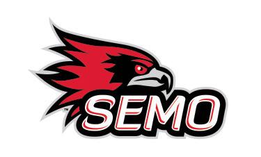
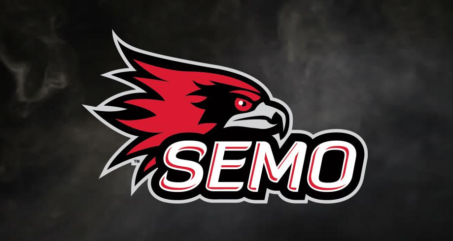
On July 1, 2020, Southeast Missouri State University unveiled refreshed spirit marks, including a new primary logo, wordmark and variations for its 15 athletic programs.
Advertisement
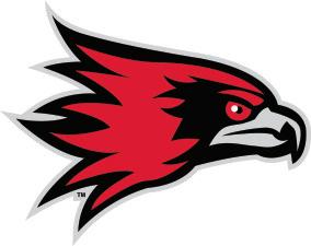
The redesign features an official brand font to complement the marks, and a focused emphasis on ‘SEMO’ as the preferred reference for the University in Athletics and less formal communications. These logos are the first update to the University’s spirit branding since the Redhawk was introduced in 2005.
The new brand identity, which will allow SEMO’s athletic teams to display consistent logos, lettering and numerals, is independent of the existing University marks featuring the depiction of the Academic Hall dome which remain unchanged.
“We are excited to reveal our refreshed series of logos and wordmarks,” said Director of Athletics Brady Barke. “Having a strong and recognizable brand is essential as we continue to elevate the profile of the University and Redhawk Athletics, and continue towards our vision of being the premier athletics program in the Ohio Valley Conference. These new marks complement our existing Redhawk logo and help us establish a strong regional and national identity by embracing the SEMO nickname.”
SEMO started the process of creating its new brand identity following a 2018 brand refresh study completed by Ologie. A higher education branding and marketing firm based in Columbus, Ohio, Ologie helped launch the University’s “Will to Do” brand platform.
As part of the refresh, Ologie closely studied the use of “SEMO” vs. “Southeast”.
Through extensive surveys and interviews, Ologie concluded that audiences like the personality, uniqueness and familiarity of “SEMO” when referring to the University and its athletic programs, except in official institutional communications. Their recommendations included embracing the SEMO acronym by establishing parameters for usage and creating the wordmark.
Following the study, the logos were designed by the University Marketing team, in collaboration with the Department of Athletics and campus leadership at no additional cost to the University.
“I want to thank Tonya Wells and her team in the University Marketing office for their hard work on this project,” said Barke. “Working collaboratively over a number of months, I think we have developed something everyone associated with Southeast Missouri State can be proud of.”
With the addition of an official brand font, sport-specific logos for each of SEMO’s 15 Division I sports and sub-brand lock-ups can be used across the University. It also presents a more consistent branding over all platforms.
Along with the new logos, fans will notice a more frequent use of “SEMO” in reference to the University and its athletic teams on uniforms, apparel and other materials. Official social media usernames for Redhawk Athletics, including Facebook, Twitter and YouTube have all been changed from @GoSoutheast to @SEMORedhawks.
The announcement signifies
REDHAWK TRACK & FIELD
a local launch of the branding and refreshed spirit logos. Certain digital platforms, including University and athletic websites, and social media will adopt the new logos immediately. Signage and publications on SEMO’s campus will use the updated logo over the coming months. Athletic uniforms and apparel will reflect the updates as teams enter the next purchase cycle. Fully rebranding the campus and athletic facilities is a time-consuming and costly endeavor. Therefore, this process will be completed giving priority to highly visible locations and only as funding is identified.
“It’s an exciting time for SEMO Athletics,” said Southeast President Dr. Carlos Vargas. “We are entering the new school year as defending OVC champions in five different sports and we finished the COVID-19 shortened season at the top of the OVC Commissioner’s Cup standings. We are Southeast Missouri’s Division I athletics program and our refocused identity represents our institution’s strong connection to serving our region.”
What They Are Saying . . .
“I’m really excited about our new wordmark. When you think about Southeast Missouri State, you think about our region and our area, you think, ‘SEMO.’ SEMO is what makes us different. There is only one SEMO. We are the regional institution. I can’t wait to see this new wordmark in the Fall.”
Tom Matukewicz Head Football Coach
“As a SEMO alumnus, it was exciting to work on this project alongside the team in University Marketing which did an amazing job developing the visual identity. The ‘SEMO’ nickname is truly unique in the college landscape and these new marks will help strengthen our brand locally and nationally.”
Nate Saverino Associate Director of Athletics for External Affairs
“Remembering where you come from is an important part of shaping where you are going. Our campus identity as ‘SEMO’ is intrinsic to who we are. It is ingrained in Southeast Missouri State University’s history. Much like SEMO’s landmarks – the dome, cardiac hill and the gum tree – ‘SEMO’ is unique to who we are and inspires an incredible sense of community. In terms of recruiting, the new SEMO logo is huge! We are the only NCAA athletic program in the nation with this acronym and it pinpoints our campus location. It is truly a unique identifier and the only wordmark that ties our present to our past. It also instills that sense of pride in remembering where we came from.”
Heather Nelson Head Women’s Soccer Coach
“It’s a great new look in comparison to the older logo. It shows a great depiction of the SEMO rebranding and how important the community is to helping SEMO become the best in the region.”
Omardrick Douglas