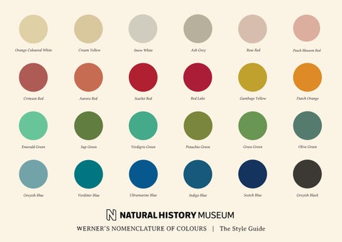
Orange Coloured White
Cream Yellow
Snow White
Ash Grey
Rose Red
Peach Blossom Red
Crimson Red
Aurora Red
Scarlet Red
Red Lake
Gamboge Yellow
Dutch Orange
Emerald Green
Sap Green
Verdigris Green
Pistachio Green
Grass Green
Olive Green
Greyish Blue
Verditter Blue
Ultramarine Blue
Indigo Blue
Scotch Blue
Greyish Black
WERNER’S NOMENCLATURE OF COLOURS | The Style Guide © The Trustees of the Natural History Museum, London 2020. All Rights Reserved.
Introduction First published in 1814, Werner’s Nomenclature of Colours is a taxonomic guide to colour which has been cherished by naturalists and anthropologists for over two centuries. In the pre-photographic age almost all visual details had to be captured using the written word, and scientific observers could not afford any ambiguity in their descriptions. These included Charles Darwin, for whom Werner’s Nomenclature proved an indispensible tool during his seminal voyage on HMS Beagle. In the late 1790’s Abraham Gottlob Werner devised his own standardised colour scheme, which allowed the writer to describe even the subtlest of chromatic differences with consistent terminology. His scheme was then adapted by an Edinburgh flower painter, Patrick Syme, who traced the actual minerals described by Werner, and used them to create the colour charts found in the book. Every colour in the book evokes a vision of the natural world. The language used to characterise each colour is a large part of what makes the book so unique. These elegant descriptions, chosen using ‘like colours’ from the animal, vegetable or mineral kingdoms, provide a practical guide to the colours you find in nature, and an insight into the foundation on which our understanding of colour systems was built. Werner’s Nomenclature of Colours is a charming artefact from the age of explorers, which continues to be treasured by artists and scientists alike.
© The Trustees of the Natural History Museum, London 2020. All Rights Reserved.
The Colours
© The Trustees of the Natural History Museum, London 2020. All Rights Reserved.
Reds With comparisons to red cobalt ore, shrubby pimpernel and red coral, the descriptions for Werner’s red palette take inspiration from some of the earthiest and fiery colours found in the natural world.
7598C
7601C
7621C
Tile Red
Hyacinth Red
Scarlet Red
7620C
7618C
7623C
Vermillion Red
Aurora Red
Arterial Blood Red
7514C
482C
7513C
Flesh Red
Rose Red
Peach Blossom Red
© The Trustees of the Natural History Museum, London 2020. All Rights Reserved.
Reds (contd) With comparisons to precious garnet, the red tulip and the breast of a bird of paradise, Werner’s extensive red palette evokes some of best examples of nature’s rouge.
198C
201C
7523C
Carmine Red
Lake Red
Crimson Red
7421C
7609C
Black 5 C
Purplish Red
Cochineal Red
Veinous Blood Red
7615C
497C
7624C
Brownish Purple Red
Chocolate Red
Brownish Red
© The Trustees of the Natural History Museum, London 2020. All Rights Reserved.
Oranges With comparisons to dark Brazilian topaz, the style of the orange lily and the streak from the eye of the King fisher, the descriptions for Werner’s orange palette take inspiration from some of nature’s warmest hues.
7564C
7411C
1595C
Dutch Orange
Buff Orange
Orpiment Orange
7627C
7583C
7597C
Brownish Orange
Reddish Orange
Deep Reddish Orange
© The Trustees of the Natural History Museum, London 2020. All Rights Reserved.
Yellows With comparisons to sulphur, yellow jasmine and the head of a golden pheasant, the descriptions for Werner’s yellow palette take inspiration from some of the brightest shades found in nature.
7751C
614C
7754C
Sulphur Yellow
Primrose Yellow
Wax Yellow
617C
7753C
459C
Lemon Yellow
Gamboge Yellow
Kings Yellow
7563C
Saffron Yellow
© The Trustees of the Natural History Museum, London 2020. All Rights Reserved.
Yellows (contd) With comparisons to the polar bear, the body of a silk moth and the stamina of honeysuckle, Werner’s yellow palette takes inspiration from far-reaching corners of the globe.
167C
7510C
115C
Gallstone Yellow
Honey Yellow
Straw Yellow
4515C
7508C
156C
Wine Yellow
Sienna Yellow
Ochre Yellow
7501C
Cream Yellow
© The Trustees of the Natural History Museum, London 2020. All Rights Reserved.
Greens With comparisons to the ripe pound pear, beryl and the brimstone butterfly, the descriptions for Werner’s extensive green palette borrows from some of the most lush and dense corners of the natural world.
7490C
5605C
575C
Grass Green
Duck Green
Sap Green
7491C
5787C
5555C
Pistachio Green
Asparagus Green
Olive Green
7760C
617C
Oil Green
Siskin Green
Colours to be used as a guide when matching painted artwork
© The Trustees of the Natural History Museum, London 2020. All Rights Reserved.
Greens (contd) With comparisons to emerald, the leaves of cayenne pepper and the beauty spot on the wing of the Teak drake, the descriptions for Werner’s green palette take inspiration from wide-reaching parts of nature.
559C
5793C
7494C
Celandine Green
Mountain Green
Leek Green
5615C
7723C
558C
Blackish Green
Vedigris Green
Bluish Green
344C
346C
Apple Green
Emerald Green
© The Trustees of the Natural History Museum, London 2020. All Rights Reserved.
Blues With comparisons to blue sapphire, the wings of small blue Heath butterfly and the flax flower, the descriptions for Werner’s blue palette borrow from some of the more unusual parts of nature featuring deep and watery tones.
534C
2768C
7700C
654C
Scotch Blue
Prussian Blue
Indigo Blue
China Blue
7694C
7462C
7690C
7697C
Azure Blue
Ultramarine Blue
Flax flower Blue
Berlin Blue
7474C
7473C
5493C
Verditter Blue
Greenish Blue
Greyish Blue
Colours to be used as a guide when matching painted artwork
© The Trustees of the Natural History Museum, London 2020. All Rights Reserved.
Purples With comparisons to porcelain jasper, plum, and the wings of the peacock butterfly, the descriptions for Werner’s purple palette mimic tones found in some of the richest and most striking elements of nature.
428C
5405C
533C
532C
Bluish Lilac Purple
Bluish Purple
Violet Purple
Pansy Purple
7667C
5265C
5115C
669C
Campanula Purple
Imperial Purple
Auricula Purple
Plum Purple
5305C
431C
7546C
Red Lilac Purple
Lavendar Purple
Pale Bluish Purple
© The Trustees of the Natural History Museum, London 2020. All Rights Reserved.
Greys With comparisons to limestone, breast of the long tailed Hen Titmouse, and the bark of ash tree, the descriptions for Werner’s grey palette compare to some of the nature’s smokiest tones.
7535C
7537C
7538C
Ash grey
Smoke grey
French Grey
415C
452C
444C
Pearl Grey
Yellowish Grey
Bluish grey
5625C
446C
Greenish Grey
Blackish Grey
© The Trustees of the Natural History Museum, London 2020. All Rights Reserved.
Browns With comparisons to mountain wood, hazelnuts and the light brown spots of the Guinea pig, the descriptions that form Werner’s brown palette borrow from some of the heartiest, earthy colours found in the natural world.
484C
7600C
4625C
7594C
Deep Orange-coloured Brown
Deep Reddish Brown
Umber Brown
Chesnut Brown
464C
465C
Black 4C
871C
Yellowish Brown
Wood Brown
Liver Brown
Hair Brown
7504C
7532C
412C
Broccoli Brown
Olive Brown
Blackish Brown
© The Trustees of the Natural History Museum, London 2020. All Rights Reserved.
Blacks With comparisons to berry of deadly night shade, the largest black slug and basalt, the descriptions for Werner’s black palette borrow from some nature’s most shadowy and inky corners.
Black 7C
433C
5535C
Greyish Black
Bluish Black
Greenish Black
Black 2C
4975C
Black 6C
Pitch or Brownish Black
Reddish Black
Ink Black
532C
446C
Velvet Black
© The Trustees of the Natural History Museum, London 2020. All Rights Reserved.
Whites With comparisons to French porcelain clay, the white of the human eyeball and white geraniums, the descriptions for this white palette borrow from some of the nature’s most delicate and creamy hues.
7534C
7528C
7527C
Snow White
Reddish White
Purplish White
454C
7500C
5807C
Yellowish White
Orange coloured White
Greenish White
7535C
5803C
Skimmed milk White
Greyish White
© The Trustees of the Natural History Museum, London 2020. All Rights Reserved.
Product Ideation
© The Trustees of the Natural History Museum, London 2020. All Rights Reserved.
Art Supplies
© The Trustees of the Natural History Museum, London 2020. All Rights Reserved.
Copyright & Legals
© The Trustees of the Natural History Museum, London 2020. All Rights Reserved.
Copyright & Legals
Copyright Line: © The Trustees of the Natural History Museum, London [year of publication]. All Rights Reserved.
Contacts: Maxine Lister - Head of Licensing m.lister@nhm.ac.uk Georgie Britton - Creative Development Manager g. britton@nhm.ac.uk The Natural History Museum Cromwell Road London SW7 5BD
© The Trustees of the Natural History Museum, London 2020. All Rights Reserved.