2 minute read
How Not To Produce
BoringGraphicDesign
Advertisement
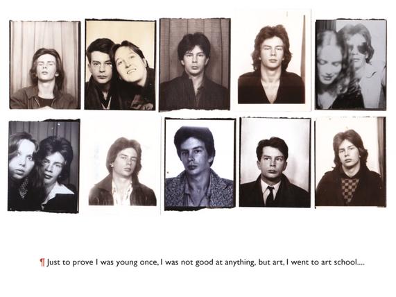
In this captivating seminar, Prof. Phil, a multi-talented writer, graphic designer, and artist, shared his inspiring life journey from ch ldhood to adulthood, revealing his profound passion for graphic des gn and art stic creation He astutely addressed the undeniable truth that art fic al intelligences can never supplant the graphic design industry, passionately elaborating on the reasons behind this assertion. Furthermore, he delved into the creative possib lities and ideat on processes that arise when presented with a design br ef, explor ng the realms of brand systems and benchmarks
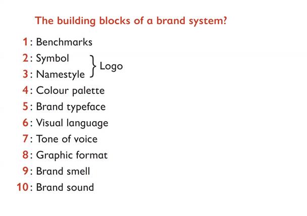
During his enlightening presentation, Prof Phil enumerated ten fundamental points essential to constructing a robust brand system These points encompassed creating a benchmark aligned with the g ven brief, crafting a symbol or logo that aptly represents the client, designing a un que name style, met culously plann ng a harmonious color palette, select ng a fitting brand typeface, brainstorming the desired visual language sought by the client, defining the appropr ate tone of voice, choosing a su table graphic format, considering the atmospheric qualit es of the brand, and incorporating a distinctive brand sound.

Having thoroughly examined these ten crucial facets, Prof. Phil proceeded to illuminate the audience with an elucidation of the eight straightforward stages crucial to effective branding These stages included comprehensive research and familiar zation, the formulation of a design brief and benchmarks, the generation of initial concepts, the iterative process of concept development, the subsequent refinement in design development, the creation of artwork, the establishment of guidelines and implementation strategies, and ultimately, effective communication of any changes
Eager to showcase his expertise and creative prowess, Prof. Phil shared a selection of his past projects. Throughout the presentation, he sk llfully highlighted the keywords and sources of inspiration that fueled his unique design solutions, effectively communicating his clients' messages to their intended audiences. Prof. Phil stressed the importance of color usage in accentuating key elements and the significant role of typography in translating the design language.

Particularly captivating were two examples he presented The first involved an organic shop where Prof Phil brilliantly incorporated two olive leaves into the logo, symbolizing both nature and the brand itself His involvement extended to the eco-friendly packaging design, where he ensured the use of fully sustainable materials The second example featured an art gallery in Edinburgh seeking a symbol uniquely representative of their location Through careful brainstorming, Prof Ph l identified the shape of Edinburgh within a map, ultimately d scovering the image of a dog, resulting in a distinctive and captivat ng design.

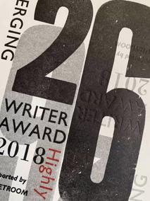
Additionally, Prof Phil shared his innovative approach to designing the Writer's award trophy and certif cate. Drawing inspirat on from the rich history of letterpress, he repurposed letterpress chops to create a visually stunning trophy Each certificate was individually des gned using the same letterpress-inspired elements, yielding a remarkable and varied effect.

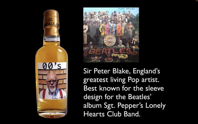
Another fascinating project discussed was the design of a liquor collection box centered around the theme of Sir Peter Blake Prof Phil ingeniously ncorporated various elements representative of S r Peter Blake's story, enabling buyers to engage w th and understand the artist's narrative on a deeper level


Overall, this talk proved to be an exceptional and enjoyable experience Prof Phil's engaging and humorous delivery, accompan ed by v sually captivating sl des, left a lasting mpression The opportunity to explore graphic design through the lens of h s past works and witness his distinctive approach to diverse design br efs was truly enlightening. Undoubtedly, one of the most remarkable talks thus far.
