
6 minute read
the link between imagination and your wine glass

Being a winemaker, designing a wine label and remaining sane is surprisingly difficult. This is why there are so many average labels around and why so few designers make this a niche speciality.
Advertisement
Written by: Bruce Jack Art: Lady Margaret Tredgold
Wine-producing countries often have a kind of label look – France is dominated by the Bordeaux and Burgundy look, and these are entrenched by so many wannabe wines from elsewhere (including the south of France) copying said look. They are staid, conservative and predictable. That works for them. Italy also has a specific look and feel, as does Germany – all have developed over many years and in a specific direction. I love the Spanish idiom that has emerged in the last 20 years – Spanish producers generally have excellent taste when it comes to wine label design. The bold colours and balanced negative space of that sun-baked, flavourful, generous country seeps into the language of their wine label design.
Of the New World countries, South Africa is developing a confident, cuttingedge label visual language. This has some thing to do with a growing confidence in the wine producers, but probably has more to do with a handful of exceptionally talented designers who have established a minimum standard of excellence in South Africa over the last 30 years – Anthony Lane, Brian Plimsol and Rohan Etsebeth spring to mind, but there are others.
When labels are produced that fall short of this standard, they stand out terribly, like amateur floundering. As a result, it is rare to see badly designed labels from South Africa – a commonplace occurrence in the rest of the world. Just one long walk past the thousands of stands at Prowein (the world’s biggest wine show) will prove my point.
‘Never judge a book by its cover’ and ‘You can’t taste the label’ are both aphorisms I live by, but I am a wine nerd, so I guess that comes with the territory. The reality is that you can’t survive at the sharp end of the wine business with badly designed labels. And anyway, I like well designed things – it indicates that the whole project has been properly conceived. It is unusual to find a crap wine in a beautiful design. It is commonplace to find ordinary wine in an ordinary package.
I only ever wanted to make one wine on my estate. I have had a name for this wine since I was a youngster – Moveable Feast. The name is borrowed from the author Ernest Hemingway’s snapshot autobiography set in Europe when he was a young, recently married, emerging writer.
Kingdoms of critique have been built around Hemingway – as though his personality, failings, idiosyncrasies, sexuality, etc. manifest like a rare metal worth extracting. None have detracted from, or added to, his writing for me.

At 20 years of age a university lecturer called Stephen Watson opened a small, hitherto unnoticed trapdoor in my mind and introduced me to Hemingway who was asleep next to a river. A long hike into the mountain, good fishing and a lunch of cheese and jamón were behind him. He lay on his back with his hands under his head. Alongside him in the cool shade of the tree the trout glistened on his canvas bag. In the slow-running shallows of the river, an unlabelled bottle of true wine had been wedged between two almost round, white stones. The river widens here, leaving fine, brown sand banked up in the bend. The sun was coming in low through the willow and small yellow birds were weaving their homes in the branches that hung over the cold, clear water.
I am obsessed with crafting that wine in Hemingway’s half-drunk bottle wedged between those stones in a shining mountain river.
My wife, Pen, envisioned a feast procession. We do feasts here. Family and friends were invited to a photographic session by the Cape Town photographer Daniela Zondagh. I brought a decanter and glasses. Catherine Searle (who runs the Bruce Jack Wines office) brought her little daughter, Bailey. Mike Hoole, a brilliant guitarist, brought his guitar … etc. With the subjects caught in profile, the calligrapher and land artist, Andrew van der Merwe, joined Pen to pull it all together.
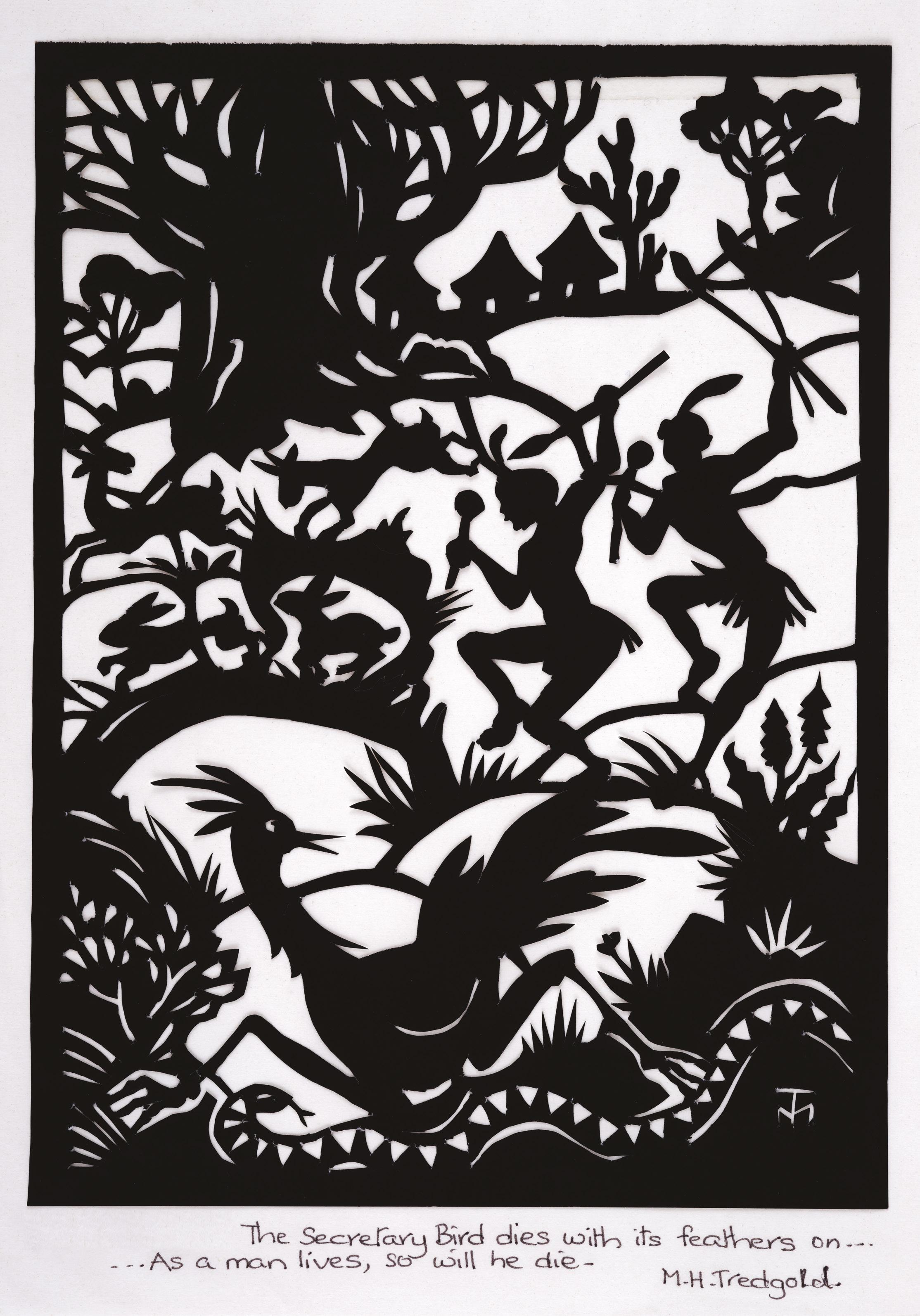
The profiles were inspired by the silhouette artworks I grew up with, which were given to my mother by the artist Lady Margaret Tredgold.
Born Margaret Baines in 1910 in the far outpost of Lady Gray (about as selfreliant as it gets), she grew up in the country village of Aliwal North, where she remembered the diamond transport stagecoach, protected by armed outriders, passing in a cloud of dust at sunset.
A celebrated African artist, she loved creating intricate silhouette artworks, a technique she used to illustrate the many children’s books of traditional African fables she wrote. Her research proved that Aesop’s Fables had their origins in Africa.
I met Andrew van der Merwe on Muizenberg beach one autumn evening while heading out for a surf – he was cutting a happy birthday message into the sand for an enthralled child. It struck me that he was some sort of rare genius and, my board under my arm, I asked him if he wanted to help design a wine label.
Witnessing the label design progress through its many iterations was like watching an artwork explore its own possibilities – like a rivulet dancing to the alluring tune of gravity. It developed a life beyond the control of the design duo. The hidden meanings and messages in the design are part of the intrigue, and, along with the balance and beauty, draw people in like a treasure map.
Moveable Feast is the antitheses of a practical business proposition. I don’t care if anyone likes the label. Weirdly, I can’t even bring myself to care if anyone likes the wine. I don’t even care if anyone buys it. It is simply an obsession with that wine cooling in that river. It is an obsession with a certain truth – a perfect moment, which I know exists in dreams. It is about trying to craft a perfect wine from vineyards I have planted around my home and in these mountains. It is an improbable goal –which, by definition, all obsessions are.
Like life, disappointment is an essential ingredient in making it real. And if I am disappointed by Moveable Feast it means I am still sane. As for the label, I fear I love it too much.
