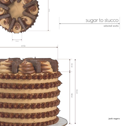
sugar to stucco sel ec t ed w ork s
ja c k roge rs
“The fine arts are five in number: painting, sculpture, poetry, music, and architecture, the main branch of which is pastry pastry.” .” — Antonin Carême
about .
I came to architecture through pastry. Long before I had the language for spatial logic or material systems, I was learning how small decisions shape an entire composition through cake decorating. Working in sugar taught me patience, precision, and an obsession with detail. Every ingredient mattered, every piping detail was intentional, and nothing existed in isolation. I learned to think through my hands, refining and adjusting until something felt resolved rather than finished. Architecture gave that instinct a larger scale and a deeper purpose. What began as layering buttercream became layering space, structure, and material. Across my work, I return again and again to the same questions: how form is assembled, how people move through it, and how details quietly shape experience. I am drawn to projects that ask for care, whether designing public infrastructure, rethinking domestic space, or working at the level of ornament. This portfolio traces my evolution from sugar to stucco, stucco, not as a shift in interest, but as a continuous way of thinking carried across materials, scales, and time.
page
content
2 - 10
FORMING GROUND
12 - 16
BUNKER HOUSE
18 - 2 0
TAILORED DOMESTICITY
2 2 - 24
GENSLER INTERN PROJECT
26-30
FLOW THROUGH FUNCTION
32-38
s e n i o r f a l l 2 02 5
j u n i o r s p r i n g 2 02 5
s e n i o r f a l l 2 02 5
s u m m e r 2 02 5
j u n i o r f a l l 2 024
JACKED UP CAKES/STUDIO KITCHEN s u m m e r 2 024
01.
FORMING GROUND w e s t p h i l a d e l p h i a | s e n i o r f a l l 2 02 5 task: design a stormwater research and education center that manages its own runoff through the integration of multiple Stormwater Management Practices (SMPs). The building and site must support research, teaching, and public engagement through indoor and outdoor labs, classrooms, exhibition spaces, and a walking path that demonstrates stormwater strategies in use.
course: architecture design i instructor: elizabeth lovett software: adobe: indesign, photoshop, illustrator, d5 render, rhino key influences: a feeling of history by peter zumthor skills: SMP integration, material selection, site research, space planning + circulation
Forming Ground is a stormwater research and education center that makes visible the hidden infrastructures shaping Philadelphia’s Mill Creek landscape. Rather than repeating the historic act of leveling land to conceal stormwater systems, the project inverts this logic by introducing topographic variation that allows water, people, and program to move in parallel. Green roofs and stormwater basins are embedded within circulation paths and public spaces, positioning research and education within everyday use of the site. Drawing from the material history of Philadelphia’s brick sewer systems, the architecture frames stormwater as an active and legible component of the public realm, transforming infrastructure into a shared civic experience.
2
SITE ANALYSIS This project was rooted in research of the historic Mill Creek sewer beneath the site. Deliverables included a historical sectional drawing used to interpret the site’s transformation over time, a physical model embodying the spatial difference between these states, and a companion analytical drawing documenting the model through measured, orthographic representation. Key ideas that emerged from this exploration included the use of multiple diverse materials, brick orientation, the puzzle-like assembly of the sewer, and the leveling of land to accommodate hidden infrastructure.
ABSTRACTION The physical model explored the sewer by extrapolating its structural elements into discrete pieces, extruding them and assembling them to collectively support an acrylic volume filled with layered material representing the earth above. Each component depends on the precise placement of the others; if one element is removed or misaligned, the entire system collapses, echoing the real-world consequences of sewer failure. Through the analytical model drawings, this logic was extended by extracting additional elements from other portions of the original drawing and testing their arrangement through an order-of-operations framework, where each piece must be placed in a specific sequence to maintain structural and spatial coherence.
sewer elements
prism symbolism
4
GROUNDING IN HISTORY
The site was originally composed of a collection of buildings with distinct purposes and a s character. In response, I extracted the initial building forms, exploded, reconfigured, and them to create three separate yet related structures that house the new project’s program: a s research building, a classroom, and a gallery. Each façade and interior articulates varying d private, semi-private, and public space through the strategic use of glass and brick.
The elevation illustrates the interactive nature of the space. The site includes the Lee Cultural Center, a historic civic achievement demanded by community members seeking a public gathering space. Building on this legacy and the history of the Mill Creek sewer, Forming Ground inverts the process of sewer-driven land leveling by introducing a raised landscape, allowing stormwater basins to occupy the foreground. Green roofs atop each building are fully accessible to the public, functioning as outdoor classrooms with views overlooking the Lee Cultural Center’s sports fields. Public seating is distributed throughout the site to invite locals, while the gallery’s fully brick façade and skylights draw visitors inside. The education wing features a glass façade framed by brick arches, creating a semi-private condition that is defined by masonry yet animated by visual exchange between interior and exterior. The stormwater research building, while programmatically private, is expressed through a fully glazed façade that allows the public to observe research activities from outside. All buildings incorporate brick-like wooden grids that support vegetation while echoing Philadelphia’s brick construction history.
segmented d rejoined stormwater degrees of
N
6
SITE SMP’S
This project utilizes two Management Practices (SM stormwater basins. The gree purpose, providing accessib in an urban setting while a and filtering rainwater to re flow into the sewer system. St manage runoff by collecting water on site, acting as a against flooding (an increasi in Philadelphia) while making visible as part of the public la
N
primary Stormwater MPs): green roofs and en roofs serve a dual ble public green space also slowing, retaining, educe runoff and peak tormwater basins further g and infiltrating excess preventative measure ingly frequent condition g stormwater processes andscape.
8
BRICK AS PROGRAM When designing the interior spaces, I focused on using brick as a marker of program. I was drawn to how the primary distinction between inside and outside is defined by glass panels, allowing the concrete floor to remain continuous throughout. To further reinforce spaces intended for interaction, I introduced brick inserts that extend across thresholds, strengthening the connection between interior and exterior.
10
02.
BUNKER HOUSE n o r t h e r n d e n m a r k | j u n i o r s p r i n g 2 02 5 task: design a small secondary vacation home in northern Denmark for a unique fictional character developed through a collaborative profiling exercise. Each student was randomly paired with a classmate who authored the fictional client profile and served as the client throughout the design process, requiring ongoing consultation to translate specific psychological traits, habits, and needs into architectural form. The project emphasized client-driven design, environmental response, and spatial precision, using the domestic scale to explore how architecture can support highly individualized ways of living.
course: architecture design studio instructor: leslie lorimer software: adobe: indesign, photoshop, illustrator, enscape, rhino key influences: atmospheres by peter zumthor, design for the real world by victor papanek skills: iterative geometric design, user-specific design, representational experimentation
The Bunker House explores architecture as a psychological response to paranoia and fear of collapse. Designed for a female writer who trusts only her sister and niece, it transforms isolation into clarity and control. The home embeds itself in the earth, balancing visibility with protection: eye-level windows maintain outward awareness, while an elevated bed allows full visual command of the compact plan. A sunken conversation pit offers reprieve and reflection—a space for poetry and calm. Inspired by Carlo Scarpa, layered concrete forms an architecture of weight and precision, where fear meets stillness through crafted thresholds of light, material, and depth.
12
INSPIRATION: CARLO SCARPA This project was deeply influenced by Carlo Scarpa, whom my professor encouraged me to study. In designing a house intended to function as a bunker, I was drawn to Scarpa’s Brutalist approach and his nuanced use of concrete. I began by mirroring his process, working through loose, exploratory sketches before moving into iterative studies that layered, interwove, and refined architectural elements. Scarpa’s work reframed my understanding of concrete, inverting its common critique as rigid or unwelcoming. Through careful articulation and detail, concrete becomes intricate and engaging, and when paired with greenery, it can create spaces that feel both beautiful and inviting.
PROCESS DIAGRAMS
build 4 prism masses
scale prisms
arrange prisms
raise connector prism
MANIPULATING GROUND My client was an imagined woman writer who experiences maladaptive daydreaming and extreme paranoia. She receives only two visitors: her sister and her niece. In response, I researched behavioral patterns associated with this condition and found that a concise, tightly controlled program was most appropriate. The house is designed to be fully self-sustaining, organized around a central interior garden, and includes spaces such as a hidden panic room and an expansive bedroom. The design relies heavily on sectional and elevational strategies. The garden entry is located at ground level, while the kitchen and bedroom on either side are sunken. This configuration is intentional, allowing clear sightlines across the entire house from both the kitchen and bedroom, addressing the client’s need to visually confirm that no one is concealed within the space. The interior remains largely open, with architectural complexity expressed through shifts in elevation and geometric structure rather than enclosed rooms. The bed is raised to maintain uninterrupted views across the house, and a conversation pit at the front of the plan offers the same visual access, creating a place where the client can write while remaining grounded in her surroundings. Exterior windows are strategically placed at eye level when she is in bed or working in the kitchen, reinforcing a sense of control, visibility, and comfort. 14
CONTINUOUS LO
LOOK-THROUGH
16
03.
TAILORED DOMESTICITY s o c i e t y h i l l | s e n i o r f a l l 2 02 5 task: Investigate a Society Hill housing project through archival research and environmental analysis, synthesizing historical, spatial, and material findings into a single exhibition-ready axonometric (isometric) drawing supported by curated archival content and concise written descriptions.
course: theory i instructor: vanessa grossman software: adobe: indesign, illustrator, rhino key influences: philosophy of the home by emanuele coccia, archival documents + research skills: working with architectural archives, redrawing plans, archival research, curatorial analysis
This project examines Hans G. Egli’s Kellogg House as a counterexample within the highly regulated context of the Society Hill urban renewal project. While redevelopment policies emphasized visual coherence and standardization, Egli negotiated these constraints to design a highly individualized residence shaped by the daily habits of Frances and Howard Kellogg. Environmental concerns are embedded through spatial relationships such as courtyards, gardens, trellised vegetation, and framed views, positioning the house as a lived and evolving environment shaped by both human and non-human actors.
18
HIGHLIGHTING DESIGN DE
The site plan demonstrates how the Kellogg House wa two-story corner window was intentionally oriented to landscape part of everyday domestic life. Rather than views, proximity, and orientation shape how the house i
WORKING WITH THE ARC
This project involved working closely with the Architect University of Pennsylvania. I reviewed hundreds of arch plans, reconstructing an isometric visualization of the sele from these physical documents, which required repea analysis, and a site visit. The curatorial process then ex additional sources on the building’s occupants and arch the Kelloggs, examining their patterns of living alongsid on Society Hill and the broader context of urban renew
FINAL EXHIBITION BOARD
ECISIONS
as carefully positioned in relation to its surroundings. The oward St. Peter’s Churchyard, making the church and its treating the site as a backdrop, the drawing shows how is experienced.
CHIVES
ural Archives at the hival drawings and ected building solely ated measurement, xpanded to include hitect, Hans Egli and de class discussions wal.
20
04.
GENSLER INTERN PROJECT n e w y o r k c i t y | s u m m e r 2 025 task: contribute to a team-based redesign of the 33rd and Rawson Street subway station, focused on improving circulation, public space, and user experience within a high-traffic transit environment. Working as part of a multidisciplinary group, the project emphasized research-driven design, community engagement, and detailed development of public amenities. The work explored how human-scale interventions can enhance safety, clarity, and comfort within existing transit infrastructure.
course: n/a mentors: tyler mudge & tiffany england software: adobe: photoshop, illustrator, enscape, rhino key influences: design for the real world by victor papanek skills: multidisciplinary team collaboration, user-focused design, on-site interviews
This project reimagines the public realm beneath the 33rd and Rawson Street elevated subway station as a clear, human-scaled environment embedded within existing transit infrastructure. The design organizes circulation, seating, and amenities into legible zones that respond to passenger movement and moments of pause, prioritizing safety and comfort. Food kiosks and seating consoles reference the site’s material and infrastructural history through arched forms, metal elements, and reinterpreted glass block language that echo the elevated tracks and underpass conditions. Designed for flexibility, the kiosks accommodate rotating local vendors, reinforcing the station’s role as both a transit node and neighborhood gathering space.
22
SUBWAY AS COMMUNITY HUB Our team divided responsibilities across the various aspects of the 33rd and Rawson Street Station, working within a multidisciplinary group that included architecture, HR, graphic design, social media, and design technology interns. I was responsible for designing the public space beneath the station, including developing the plan, producing renderings, and detailing key elements such as food kiosks. These kiosks connect directly to the site’s history by reinterpreting glass blocks from the upper level, incorporating metal arches and poles that reference subway cars, and adopting arched forms that echo the underpass created by the elevated tracks. This level of detailing extended to the design of seating consoles, allowing the public realm to read as a cohesive environment rooted in the existing site conditions. The food kiosks were designed to accommodate rotating vendors, allowing local restaurants to periodically occupy the space; the labels shown here reference actual businesses from the surrounding neighborhood.
DESIGN AT THE DETAIL SCALE The seating consoles were designed as custom elements integrated into the public realm. Their overall form follows a loose “3” geometry, referencing the 33rd Street Station, while the chairs themselves feature arched backings that echo the language of the surrounding kiosks and underpass. Detailed at the level of individual components, the consoles balance functional performance with site-specific references, reinforcing a cohesive material and formal relationship between seating, kiosks, and the broader station environment.
24
05.
FLOW THROUGH FUNCTION w e s t p h i l a d e l p h i a | j u n i o r f a l l 2 024 task: design an architectural addition to the West Philly Tool Library that improves functionality and amplifies its public presence. The proposal introduces an after-hours entrance, secure tool drop-off and storage, and a small gathering space to support the organization’s educational programming. The project required careful analysis of circulation, thresholds, and public identity within a compact urban site. course: design fundamentals i instructor: troy leonard software: adobe: photoshop, illustrator, enscape, rhino key influences: oleg soroko / after-form skills: parametric experimentation, threshold analysis, light studies, programming
The reimagined West Philly Tool Library transforms a utilitarian space into an inviting community hub that merges functionality with organic design. Guided by the director’s vision of inclusivity, the project emphasizes connection between people, spaces, and the natural and built environments, welcoming visitors whether they come for tools, classes, or community. Organic forms echo the fluid nature of social interaction, with a curved elevated surface structuring seating, light, and circulation. Through integrated greenery, warm wood paneling, and clear spatial organization, the library evolves beyond a repository of tools into a vibrant gathering space that fosters collaboration and neighborhood identity.
26
THRESHOLD STUDY As a preface to the West Philly Tool Library project, I selected a campus threshold that exhibited a nuanced interplay of light, program, and sound, using it as an analytical lens to inform later design decisions. This exercise required careful hand measurements of the site in order to reconstruct precise drawings that captured spatial transitions and sensory conditions. The accompanying physical model was intentionally diagrammatic, focusing on how light diffuses through space, using variations in the thickness and spacing of wood rods as a symbolic representation of density, permeability, and transition. This investigation established a sensitivity to thresholds and environmental experience that directly influenced my approach to the tool library intervention.
DIAGRAMMATIC PHYSICAL MODEL 28
LIGHT AS A TOOL A series of analytical diagrams were developed to study the site’s preexisting light conditions, which revealed limited daylight penetration and uneven illumination across the interior. These drawings documented areas of compression and shadow that restricted use and visibility. In contrast, the proposed diagrams reframe light as an active design tool, illustrating how controlled openings, material porosity, and spatial adjustments redistribute daylight to support gathering and circulation. Together, the diagrams visualize a shift from light as a constraint to light as an intentional driver of spatial performance.
PHYSICAL MODEL The physical model was constructed to study how light interacts with the project’s parametric design elements and shapes the experience of the space. The model tests how light is filtered and distributed to create moments of openness, gathering, and transition for the community. Rather than serving as a purely representational object, the model functioned as a working tool, allowing spatial performance to be tested through making. This approach aligns with the mission of the Tool Library itself, where tools are not ends in themselves but instruments for experimentation & learning.
30
0
USING EXPERIENCE TO rethinking the standardized kitchen throug domestic & commercial kitchens
a.
JACKED UP CAKES e d i b l e a r c h i t e c t u r e | 2 016 - p r e s e n t
At 12, I founded Jacked Up Cakes, transforming my passion for baking into a business, creating intricately designed cakes that often mimic real-life objects and foods. From a hyper-realistic macn-cheese cake to elegant tiered wedding cakes, each creation blends precision and creativity. Skills like sculpting fondant decorations, airbrushing for texture, and balancing vibrant colors are essential to crafting cakes that are both structurally sound and visually stunning. What makes this journey most rewarding is being part of people’s special moments. Cakes become the centerpiece for birthdays, weddings, and celebrations, creating memories that last a lifetime. This connection resonates with my passion for architecture, where spaces are designed not just to function but to foster experiences and hold cherished memories. The meticulous attention to detail required in cake decorating mirrors architectural ornamentation. Just as fondant details elevate a cake’s aesthetic, architectural elements like moldings and facades enrich a building’s character. Both disciplines require a balance of structure, creativity, and purpose, shaping the environment in meaningful ways. Through cake decorating, I’ve developed skills that directly inform my architectural practice, blending function and beauty to craft designs that lead to impact.
06.
O INFORM DESIGN h my experience cake decorating across
b.
CONCEPT: STUDIO KITCHEN p r a t t i n s t i t u t e | s u m m e r 2 024 task: develop an architectural proposal derived from a selected grid system. Students were encouraged to rethink accepted programs and typologies, using the grid as a generative framework rather than a constraint.
course: architecture intensive studio - summer instructor: christoph kumpusch software: adobe: illustrator, d5 render, rhino key references: recombinant urbanism by david grahame shane skills: spatial design, program planning, precision detailing
The domestic kitchen has long remained bound to outdated norms and inefficiencies. The Studio Kitchen reimagines this space by merging the precision of commercial kitchens with the intimacy of the home, informed by my lived experience cooking in professional bakeries, my childhood home, and a range of shared living environments throughout college. Developed during the Pratt summer program and continuing as an ongoing investigation, the project introduces a sunken cooking area that positions the kitchen as the spatial and social core of the house, reframing cooking as a communal and performative act. Through the slanted sink, a carved workspace, and precise programming, the Studio Kitchen treats the kitchen as a studio—an active space for creativity, efficiency, and connection.
32
CAKE DECORATING AS FORMAL STUDIES
TYPOGRAPHY FOR SOCIAL MEDIA Through curating a stylized social media feed, I experimented with typography as a primary design tool, using typographic compositions as covers for edited time-lapse videos documenting each cake. This process involved testing color palettes, gradients, typefaces, distortion, and layering to create a cohesive visual identity across posts. Working at this graphic scale sharpened my sensitivity to composition, hierarchy, and rhythm, strengthening my ability to think architecturally by translating spatial logic into two-dimensional form.
34
INSPIRATION Drawing on my background in cake decorating and experience with kitchens across multiple contexts, I used this exercise to question the inefficiencies of the domestic kitchen, especially informed by a site visit conducted at Penn: the Margaret Esherick House. This informed a key aspect of the project’s approach to spatial organization and efficiency: the sculptural form of the counter to create centralized workspace.
This project used grid-based topography as a foundational design tool to generate form and circulation. Through iterative cuts and spatial interventions, the layout was refined to guide movement through the kitchen in a clear sequence, from entry and cooking to cleaning, storage, and exit, emphasizing efficiency and intuitive flow.
36
A FAMILIAR ROOM, REWORKED :
EXISTING VS. PROPOSED Shown side by side and color-coded by program, this comparison reveals the inefficiencies of the traditional kitchen, where circulation and work zones overlap without intention. In contrast, the Studio Kitchen organizes space through clear segmentation and flow, transforming culinary movement into a deliberate sequence that promotes efficiency.
storage area
cutlery, cooking utensils, pots/pans
THE STUDIO KITCHEN
cleaning area
slanted sink, drying area, dishwasher
preparation area
innovative inverted counter, stovetop
seating area
elevated above kitchen to allow observing
appliance area refrigerator, ovens, pantry
38