Brand Design
Graduation portfolio Brand Design / Packaging Design Group of six
adc merit award
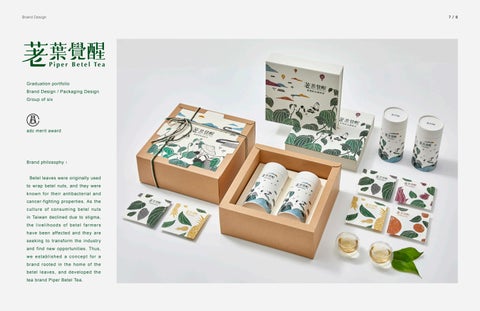
Brand philosophy:
Betel leaves were originally used to wrap betel nuts, and they were known for their antibacterial and cancer-fighting properties. As the cultur e of co n suming bete l nuts in Taiwan declined due to stigma, the livelihoods of betel farmers have been affected and they are seeking to transform the industry and find new opportunities. Thus, we established a concept for a brand rooted in the home of the betel leaves, and developed the tea brand Piper Betel Tea.
7 / 8
Brand Design
9 / 10
The product combines Taitung's specialty with local cultural symbols, and the black nets used in the planting process are recycled into a part of the packaging to further the connection between the product and its place of origin.
Layout Design
11 / 12
Bazaar Magazine Layout Design / Photography
This is a magazine about Taichung's bazaars. In the process of creating this magazine, I visited many bazaars in Taichung and experienced the beauty of human interaction in those bazaars. As I interviewed the vendors, I saw their confidence and enthusiasm as they talked about their products, and I was moved by them after I learned of their stories. This magazine was a great learning experience, since I started from scratch. I not only learned about layouts and editing but also did the copywriting and the photography by looking up information and traveling to those destination myself.
Layout Design
13 / 14
Posters and Artworks
Get Shertock Design for Movie Poster acrylic painting A3
Design Concept:
This is a poster designed for the British series "Sherlock".The wallpaper of Sherlock Holmes' house is used as the background for the poster, and silhouettes of the characters have been added to echo the theme of finding Sherlock in the hopes of bringing a sort of interactivity to the poster.
21 / 22
Posters and Artworks
23 / 24
cat and sea horse
Great fortune and great favor
Negative space
Illustration to welcome the Year of the Pig
A4
Markers
A3
linocut
3D Paper Structure
Night Lamp Paper Lamp Light Design 20 * 60 * 20 cm
Design Concept:
While I was making this lamp, I wanted it to be aesthetically pleasing and to have the best possible performance, so I made its appearance similar to that of a Taiwan’s tradition window gratings. That way, when the lamp is turned on in a dark place, there are variations in the patterns as well as the amount of light shining through the cut-out gaps, giving the lamp a more unique and aesthetically-pleasing appearance. The lamp uses a warm-coloured light bulb, and makes for a great night light to help people relax before going to sleep.
25 / 26
3D Paper Structure
Boundless 3D paper cut structure
Design Concept : This paper sculpture was the first thing I made for a course on 3D structures. Squares sized 3.5 cm x 3.5 cm are repeated over and over to fill an A4 sheet of paper. The squares have two different designs since I wished to depict the aesthetics of having things placed together in great numbers, as well as the sense of relief that comes with seeing things neatly arranged. My favourite part is the curvatures of the paper structure in both designs.
27 / 28
Animations
Shake it animation design Length: 90 seconds
The animation was inspired by a dance video that I really like. Both the dance and the music in it were so beautiful that I made an animation of the video in the hopes of reliving the experience that I had when I saw it, but in a different way.
29 / 30
Fonts and Logos
31 / 32
1
2
3
5
4
6
7
1, 2, 3, 4 are all fonts and logo created during my graduation portfolio process 1.This font was designed for a
2. This font was designed for a
3. This font was designed for
4. This proposal was
5. A logo design for
6. This is the title of a Chinese
7. Design for an
proposal I had for a beverage brand.
proposal I had for a mouthwash
a proposal I had for a brand
for a tea product, and is
a rice noodle brand,
song, with a stroke omitted
English font.
It has a rounded but bold look, which
brand. The style of the illustration
selling dental care products.
presented in the style of
which incorporated
to bring out the meaning of
was the style of illustration at the time;
is more abstract and geometric,
It has a fresh, magical
a landscape illustration,
an image of a pair of
the third Chinese character
the brand's main focus was on bubble
with the intention of conveying
illustration style look to, so
so I add details of the font
chopsticks holding the
'jian' (cut), and to evoke the
tea, so the circles were incorporated
strength and excitement, hence
the font is thinner and has
strokes , especially in the
noodles.
moonlight part of the song title
into the font as decoration.
the heavy feeling of the font.
a more spacious feel.
spacing between strokes.
with the curved line.