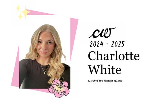
2024 - 2025
Charlotte White Designer and Content Creator
About Me
Hey!!
Education & Perspective:
Name: Charlotte White Birthday: 06/02/2006 Email: charlottewhiteuk@gmail.com Number: 07715100550 Education: GCSES, A-Levels, AUB University Student Passions/Hobbies: Photography, Swimming, design and drawing Socials: @charlottewhitecreative
My studies in Sociology and Psychology have given me a strong understanding of human behaviour and society. This informs my design approach, allowing me to think critically about audience, interpretation, and impact.
About me: I am a designer with a strong interest in branding, advertising, and social media, and how they influence the way people think and feel. I aim to use design to communicate meaningful messages and create positive impact. I am particularly drawn to the use of language, imagery, and typography to shape perception and challenge social norms. I believe design should have purpose and play a role in shifting negative narratives.
Experience: I have experience supporting the launch of a handcrafted jewellery brand, where I created flat-lay photography and helped build an Instagram presence. This introduced me to visual identity, content creation, and how brands connect with their audience. I am actively seeking further opportunities to develop my creative practice
@charlottewhitecreative
Additional Experience: As a qualified swim teacher and with experience working in a nursery, I have developed strong communication, organisation, and teamwork skills. These roles have built my confidence and ability to work with a wide range of people.
Skills: Research & critical analysis Branding and Visual Identity
Photography
Time managment & Organisation
Communication & Teamwork
Typeography Social media and content creation
Creative direction
Contents
1 2 3 4
1. Packaging
Bliss
Litora
Bliss is a self-love-focused beauty brand developed as part of an A-Level project. This project is particularly meaningful to me because, through extensive research into beauty standards, self-perception, and consumer culture, I recognised the importance of promoting self-confidence and body positivity. Inspired by brands such as Dove and Benefit, I wanted to create a brand that encourages people to celebrate themselves and embrace individuality, while demonstrating how design can be used to communicate positive social messages.
Litora is a sustainable beverage brand designed to address coastal pollution through behaviour-led design and lifestyle branding. Developed for environmentally conscious young adults, the project explores how design can bridge the gap between environmental awareness and action by making sustainable choices feel effortless, desirable, and integrated into everyday life.
The visual identity uses a bold pink and red colour palette, informed by colour theory to evoke feelings of confidence, femininity, passion, and self-love. Typography combines playful, bold sans-serif typefaces with elegant serif fonts, creating contrast and hierarchy while drawing attention to key messaging such as “SELF LOVE.” The packaging design incorporates illustrations, vibrant graphics, and carefully considered layouts that mirror the appearance of products within a retail environment, helping to create an authentic and engaging brand experience. Alongside developing the brand identity and packaging concepts, I produced physical prototypes including product packaging, a promotional leaflet, badges, and presentation boxes. Creating tangible outcomes allowed me to test the effectiveness of my designs beyond the screen and gain valuable insight into the production process. Through this hands-on experimentation, I learned how colours, materials, scale, and print finishes can differ significantly in real-world applications, reinforcing the importance of prototyping and iterative design within the creative process.
Inspired by the calming qualities of coastal environments, Litora combines recyclable aluminium packaging with a soft, beach-inspired visual identity that promotes wellbeing, mindfulness, and escapism. The project extends beyond traditional beverage branding through the introduction of the Petal Cup Holder, an innovative reusable accessory designed to stabilise drinks on sand, collapse for portability, and encourage responsible disposal by securely storing crushed cans after use. Through strategic branding, packaging design, campaign development, and user-centred innovation, Litora demonstrates the potential of design to influence positive behavioural change. By positioning sustainability as an aspirational lifestyle rather than an obligation, the project aims to foster stronger connections between consumers and coastal environments, encouraging small everyday actions that contribute to cleaner beaches and healthier marine ecosystems.
2. Branding
SunriSe Sunrise was one of my first projects at University and I realised how much I love creating and designing in this way. We were briefed to create an design company and I went down a bright new futuristic path through SunriSe was intended to create new things in a beautiful way. I learned a lot about branding within this project which has only pushed my skills furthur. The Sunrise spread embraces a warm palette of peaches, yellows, and pinks, drawing directly onto colour psychology to convey positivity, brightness, and energy. The Typography combines a sophisticated serif for the “Sunrise” logotype with modern sans-serif text for smaller text which therfore gives a balancing professionalism with approachability. I used mockups, packaging, and store visuals to show real-world application. The sun is shown throughout, unifying the layout and the brand as it has signature that people notice and accociate with the brand.
ebay rebrand For my eBay rebranding project, I conducted a full brand audit and developed a modern strategy aimed at appealing to Gen Z and millennials while reinforcing eBay’s core values of trust, community, and sustainability. My approach combined updating the visual identity with a brighter, more engaging color palette and the introduction of new symbols such as a handshake to represent connection, alongside a heart, shopping bag, and present to highlight passion, commerce, and gifting. I also focused on improving customer trust through stronger data protection and customer service, while proposing an in house delivery system to enhance buyer security. Finally, I recommended expanding eBay’s social media presence through influencer collaborations and sustainability focused campaigns, ensuring the brand remains relevant, competitive, and impactful in the digital age.
3.Social Media
Moneyment Moneyment is a student-focused budgeting app designed to make financial management more accessible and less intimidating for young adults navigating financial independence. Created in response to increasing financial pressures faced by students, the app simplifies budgeting through an engaging and user-friendly experience that promotes positive financial habits and reduces money-related stress. The visual identity combines calming blues, earthy greens, and warm yellow accents to communicate trust, growth, and optimism, positioning Moneyment as a supportive guide rather than a traditional financial service. Contemporary sans-serif typography and a simplicity-first interface enhance readability and usability through intuitive navigation and clear visual hierarchy. The project explores both branding and user experience design through dashboards, budgeting tools, and visual planners that transform complex financial data into digestible insights. Features including spending trackers, pie charts, and goal-setting tools encourage engagement and improve financial literacy, demonstrating how thoughtful design can empower students to manage their finances with confidence.
Christchurch community partnership This project focused on developing a strategic social media campaign for Christchurch Community Partnership (CCP), a charity supporting vulnerable and older adults experiencing loneliness and isolation within the Christchurch community. Through extensive research into CCP’s services, audience behaviour, social media usage and issues surrounding social isolation, I identified families and carers as the most effective target audience, as they are more likely to use social media and seek support on behalf of loved ones. The final outcome repositioned CCP’s social media presence into a trusted and reassuring platform that encourages families to confidently refer loved ones to community support. Using warm storytelling, calming visuals and informative content, the campaign aimed to strengthen awareness, trust and emotional connection while modernising CCP’s digital identity. Throughout the process, I developed audience insights, campaign strategy, tone of voice, visual direction and a six-week social media plan. The final outcome successfully created a compassionate and community-focused campaign that aligned with CCP’s values while encouraging real-world engagement and referrals. However, the campaign would require ongoing content management and consistent engagement to maintain long-term impact and visibility.
D&AD NEW BLOOD AWARDS dUOLINGO This project challenged us to create a culturally relevant campaign for Duolingo that engaged younger audiences beyond traditional advertising. In response, we developed “Duolingo Goes Missing,” a global guerrilla marketing campaign where Duo disappeared to rediscover the importance of language, culture, and human connection. Through foreign-language posters, cryptic social media content, and interactive clues placed in travel and public spaces, audiences were encouraged to use the Duolingo app to solve the mystery. Research into guerrilla marketing, Gen Z behaviours, and narrative-driven campaigns informed our approach, ensuring the campaign balanced humour with meaningful messages about identity, belonging, and cultural understanding. Inspired by missing-person posters and immersive public advertising, the visual identity was designed to be disruptive yet recognisable. The campaign transformed language learning from a passive digital activity into an engaging real-world experience, encouraging participation, social sharing, and authentic interaction. A key challenge was balancing Duolingo’s playful brand personality with a deeper message about communication while creating a concept that remained visually cohesive and globally scalable.
4.Posters
DISPLACMENT
AMSTERDAM
This project challenged us to create a poster inspired by a single assigned word. I was given the word “Displacement” and chose to explore it through the lens of personal identity and self-discovery. Rather than focusing on physical displacement, I interpreted the concept as the feeling of uncertainty many people experience while growing up and trying to understand who they are. This allowed me to create a design that was both conceptually driven and personally meaningful.
This project was developed as part of my final A-Level examination and focused on creating a series of posters celebrating Amsterdam through destination branding and visual storytelling. Using my own photography alongside typography and graphic elements, I captured the city’s culture, character, and atmosphere from a personal perspective.
My aim was to produce a poster that felt informative, engaging, and visually accessible while communicating the theme clearly. The design balances a clean and structured layout with expressive visual elements, creating a composition that invites the viewer to explore the concept without overwhelming them. Careful consideration was given to hierarchy and readability, ensuring that information could be processed quickly and effectively. Typography plays a key role within the design, combining bold display type with more understated supporting text. The title, “DISPLACEMENT,” is positioned prominently at the top of the composition, immediately capturing attention and establishing a clear visual hierarchy. This helps guide the viewer’s eye through the content in a logical and intuitive way. The colour palette was intentionally restrained to maintain clarity and support the overall concept, while the structured composition ensures that key information such as dates, locations ex remains highly legible. Through this project, I developed a stronger understanding of how typography, hierarchy, an conceptual thinking can work together to communicate a message effectively while being a engaging visual experience.
The visual identity features playful blue tones to represent exploration and discovery, contrasted with bold pink accents that create energy and draw attention. Typography combines handwritten-style fonts with classic serif typefaces, balancing authenticity with clear visual communication. Through this project, I developed skills in poster design, visual hierarchy, and branding, learning how photography, typography, and layout can work together to create an engaging and cohesive collection of travel-inspired designs.
contact me Name: Charlotte White Birthday: 06/02/2006 Email: charlottewhiteuk@gmail.com Number: 07715100550 Education: GCSES, A-Levels, AUB University Student Passions/Hobbies: Photography, Swimming, design and drawing Socials: @charlottewhitecreative