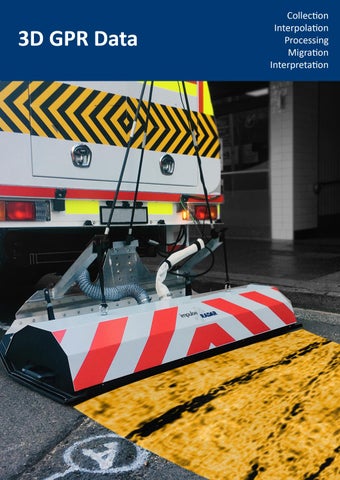
Data Collection with Modern 3D GPR-Arrays People new to GPR-Arrays may think that array-data means more of the same thing. While this is partly true, there are other details, which, if considered, may ease the following stages of loading, processing, and interpretation of such data. This note aims to give a few hints on the data collection process and the subsequent management of collected data. Data volume & density:
Figure 1, Typical environment in which GPR-Array data is gathered
A small 3D project can hold some 5 GB of raw data in total. Not a big file by modern standards and easy enough to transfer using a memory stick. However, from a data security and processing perspective, it's not wise to put all that data into a single file. Why? Cheap memory sticks are prone to file corruption during transfer, and this can be especially problematic if the data is in a single file and affected in any way not immediately noticeable by the operator. Consequently, we recommend dividing even small projects into several parallel swaths (if possible). Also, the data volume is linear to the point distance, where half the point distance means double the data volume. It is usually of no benefit to collect data with a higher density than half the array channel spacing. Therefore, an array with 8 cm channel spacing equates to a point distance of 4 cm. Navigation (in the data):
Figure 2, A small project, with respect to raw radar data, but note; the square holding the data is about
Figure 2 above shows a rather small project, as far as the raw radar data is concerned (approx. 4.5 GB), but the interpretation of a project like this means navigating from a km-scale down to a few meters, which puts quite a high demand on the processing software in use. Positioning: Positioning is, by far, one of the biggest talking points concerning the collection of array data. The use of high precision RTK-GPS is the most convenient and efficient positioning method and, for those reasons, takes preference over the use of total stations. However, this convenience becomes ineffective in areas where the signal is interrupted, e.g., by tree cover, tall buildings, or other overhead obstacles. Ultimately, it is the survey environment itself that determines the positioning method to use. For the descriptions that follow, it’s important to note that only RTK-fix is sufficient and that any loss of RTK-fix will cause extra work in the data management. Sometimes, it’s possible to salvage a project with poor positioning; however, if the project is large with a high percentage of positioning errors, it may be more economical to re-survey with better positioning than to expend valuable time trying to fix it. Another important consideration that may later ease processing is the choice of positioning density during data collection, since too high a density may
www.impulseradargpr.com
1
cause extra work. If you don’t have adequate control over the positioning process, it makes little sense to deploy to the field for data collection. Sharp turns during data collection: When collecting data in the field, it’s perfectly feasible to move the array in a manner that produces a sharp turn, or radius, along the collected swath. However, it’s a good idea to think about what this kind of maneuver will do to the subsequent data management. As illustrated in Figure 3, such a radius results in data that is significantly stretched along the outer perimeter, while being compressed along the inner perimeter. How this may affect the Figure 3, Sharp turns should at best be final image depends on how the data was collected. For example, avoided during data collection if the point distance is set to 4 cm during data collection and 8 cm during interpolation, then it may work, but interpolating to the same bin-size as the point distance will definitively impact the data. Therefore, it’s important to consider such factors when planning a survey; if such turns are unavoidable, structure the survey so that data collected at these points is not the most important to the overall survey. Holes in data What happens with areas not covered by radar data? Well, modern software offers some ability to interpolate data into such empty spaces, but sometimes applying regularization may be a better choice. Regardless of the theoretical function employed, if the empty spaces are too big, no software can fix it, and those areas will be useless for interpretation. Another less obvious issue is that Figure 4, Project with areas not the interpolation/ binning function takes up memory space on the covered by radar data processing computer, but to what extent is dependent on the chosen processing software. A project like that shown in Error! Reference source not found. may be difficult to process due to the very large, unfilled, and closed areas. Of course, if opting to process by manually defining the areas to interpolate (‘chunking’), it may always be possible, but that’s rather old fashion. Figure 5 shows a project with 4.5 GB of raw radar data, the same as the project shown above in Figure 2. However, the layout of this project is much better concerning data Figure 5, This project is of the same size, with regards to raw radar data as the management, because it’s project in figure 2, 4.5GB. However, this one will be easy to navigate in as well as easy to navigate, has no having no artefacts from polarizations or turns. sharp turns, nor holes in data. Takeaway Even with the best planning, a real-world project could contain data that is less than optimal. Therefore, when dealing with the data volumes from a modern GPR-array system, it’s always advisable to get rid of problematic data as early as possible. The next note in this series will deal with the topic of data QA/ QC and will discuss useful tools for the selection and management of data imports. www.impulseradargpr.com
2
Geometry Clean Up and QA/QC of Raptor Data The introductory note in this series offered advice on the collection of GPR array data. The key takeaway of which was that a real-world project could contain data that is less than optimal. Therefore, this note focuses on the topic of data QA/ QC and will discuss useful tools for the selection and management of data imports into processing software. The primary objective being the import of quality data and efficient workflows. Figure 1 shows a project containing 2800 individual GPR-profiles, which combine to form 175 input files for easier management, although, still a substantial number to handle. Further, the original data contains over 70000 positioning points, a large percentage of which are Figure 6, A project, with 175 input files, containing 2800 problematic — consequently, data sets such as individual radar profiles these require practical tools to sort out problems early on before processing. Figure 2 shows a close up of one part of this project, where the zoom function reveals clear positioning errors (self-intersecting swaths) as well as data swaths that don’t make sense. Swath statistics Figure 3 shows the swath statistics tool, which is a useful first step to identify essential data readings outside the project norms. In the example shown, the average position density is approx. 3-4/m, but some read as low as 0.06/m. It is safe to assume that these swaths will cause a problem if they import, so uncheck to ignore. Another noticeable variation is in swath length, where some files indicate only a few meters versus an average of 125 m; again, a simple uncheck of the problem files will omit them from import. Colour coding statistics
Figure 7, Zoomed picture revealing erroneous data
Figure 8, Statistics showing positioning and data density and total length of profiles
Colour coding is a simple way to highlight swaths with problematic positioning density. Easy to identify visually, a simple cursor mouse-over reveals specific information concerning the swath file name and position, as per the example in Figure 4.The density of radar data may be treated in a similar way to highlight problems with the odometer values and wheel slip.
www.impulseradargpr.com
Figure 9, Identifying outliers by colour coding
3
Removal of positioning data Continuing with the same project example, a lot of data on the perimeter will not process well in 3D, so removing such points will speed up the data processing and reduce the amount of PC storage space required. Figure 5 shows an example of a simple tool to mark and remove such positioning points. Reducing the positioning density
Figure 10, means of effectively mark and delete positioning points, may significantly reduce workload in later stages
As indicated earlier, swaths with a very high density of positioning will be problematic upon import, which is due to the self-intersection of swaths, an effect typically caused by the GPS antenna swaying side-to-side. Reducing the positioning density by half from 3-4/m to 1-2/m will decrease this problem. Although it does mean removing some data from the project, it will simplify and speed up the processing time. Final clean-up and radar data import Even after observing the preceding steps, there may still be some cause for errors in the data. Modern processing software should be able to warn the user of this and guide them on where to search for such errors, as per the example shown in Figure 6. Figures 7 and 8 illustrate how this project will look after following the methodology described above, both as a
Figure 11, Additional statistics showing selfintersections in data
Figure 13, whole project, radar data shown
Figure 12, Zoomed section
whole project and a section close up using zoom. An important takeaway from this exercise is that the geometry requires cleaning as much as possible before the import of radar data. Processing radar data takes up a lot of computer memory and can slow operations down. In this instance, none of the geometry was moved as that would be very difficult since we have no references, before radar data import. The next note will show how we may use visible object in the radar data to correct for some positioning errors, besides some other hints.
www.impulseradargpr.com
4
Interpolation and Positioning Correction of Raptor Data In the previous note, we covered some steps for cleaning up geometry before loading radar data; the main idea was to save time by not going through the process of loading a large amount of compromised data. This note will deal with the possibilities to edit geometry after loading radar data and explain why, in general, positioning needs to be very good in 3D-projects. Loading of radar data When we load radar data, we must specify the interpolation distance the software will use internally. As mentioned before, it’s usually of little use to make this distance shorter than half Figure 14, Data import parameters, reduction of positioning the channel spacing. points and interpolation distance
Another factor is the memory needed for managing the data, and this distance directly dictates that. In Figure 3, we show a small project, with raw data of 55 MB. During data collection, the point distance was 2 cm, with a channel spacing of 11 cm. The images show data interpolated to 2 cm, 4 cm, and 10 cm bins. As can be seen, to locate the utilities, any one of those settings would be just fine. However, the disk space needed to accommodate all steps in the post-processing up to the stage shown is quite different – 0.25 GB for 10 cm Figure 15, a small project, raw data takes up 55MB, interpolated to 2cm, 4cm and binning and 3.8 GB for 2 cm 10cm bins binning. So, in this case, by interpolating to 2 cm, we ended up with 70 times the original data size. However, any visible benefit is negligible, so interpolation with 10 cm binning seems a suitable choice, given that it only requires 5 times the disk space for the raw data. Do we need some fancy filtering for importing the data? No, dc-adjustment, de-wow, or bandpass, combined with threshold and compensation for the Rx-Tx distance, is all that’s needed – assuming, of course, the raw data is of good quality. Correcting bad positions Figure 3 below shows a section from a survey conducted with a vehicle-mounted array. Not even the most erratic driver could create the track A-B-C as shown. This type of positioning error is typical when
www.impulseradargpr.com
5
you allow for variations in RTK-coordinates between fix and float. When the fix is lost, the output from the GPS jumps unpredictably. We don’t know whether the positioning before B and after C is good, but we can conclude from the anomaly at A that we’re not entirely lost. At A, we have a continuous anomaly crossing over two swaths, so at least the relative position between these two swaths is good at that point. In Figure 4, the result of the correcting actions is shown, with some higher gain on the data. We now have a continuous Figure 16, a section with clear positioning errors, marked by red arrows anomaly at B and can be sure that we at B and C did something in the right direction. What we did here was mainly to delete positioning points between B and C, leaving the odometer wheel as the only positioning device between these points. So can we now conclude that it’s possible to fix bad positioning? No, we should not think in that direction. It’s possible to correct minor errors, but if the positioning is bad throughout a project, it will be too time-consuming to fix. Recall the project shown in a previous note, with more than 70,000 positioning points; it would be impossible to correct a large chunk of those. Figure 17, same section as in previous figure but with corrected
positions and some higher gain. Note the now continuous anomaly at B
In practice, we’re limited to deleting some visibly wrong positioning points and moving others, provided we have anomalies to aid in doing so. Having said all this, we should also mention that commercially it’s often ok to live with some minor errors, and the ability to correct some of the geometry may not always be worth the effort. Takeaway Often interpolation distances are chosen too short in the belief that this will enhance the data, while in fact, the channel spacing is the most limiting parameter. We’re not saying that one should always interpolate to the channel spacing, only that one should not overestimate the ability to use the seemingly higher density along the swath to enhance the final images. We haven’t seen any significant benefit in interpolating to less than half the channel spacing. We’ve also noticed that a modern, interactive software makes it possible to correct for some positioning errors, although we also warn for over-optimistic views on this ability. In large datasets, it’s impossible, and when it is possible, it relies heavily on having anomalies visible. In our next note, we’ll cover some of the processing we do before the interpretation and export stages.
www.impulseradargpr.com
6
Processing of Raptor 3D GPR Data In the previous notes, we’ve covered a few steps concerning the cleaning up of geometry and the loading of raw GPR array data. In this note, we’ll deal with some necessary processing steps before data interpretation. Raw data Figure 1 below shows the raw data from one section of a project. The lower image shows the data with an overlay of the geometry. This data set is by no means ideal. Firstly, there are quite some gaps in the data. Secondly, and more striking, is the inconsistent coverage, with different orientations, collection patterns, and overlapping data. Some filtering has been applied in the form of a dc-removal filter, and a threshold level for time-zero alignment. We’ll see now how it looks after a few simple steps.
Figure 18, Raw data (top) with geometry overlay (bottom). Note the crisscrossing of lines and non-symmetrical coverage
Step 1 – pre-processing Figure 2 shows the available pre-processing routines, of which the following three are the most commonly used. • Antenna ring-down (500 traces in background removal) • Bandpass (170 – 600 MHz) • Amplitude correction (spherical divergence correction with no parameters)
Figure 19, Pre-processing routines
www.impulseradargpr.com
7
The defaults for each routine are well defined, so there’s usually no need to change settings, just select and run. The effect of these basic pre-processing routines is shown below in Figure 3. In this case, one may think it’s possible to start the interpretation here. However, we’re only viewing a single depth slice now, and deeper ones may be much more blurred. Thus, we recommend continuing to the post-processing.
Figure 20, Top view after pre-processing with background removal, bandpass and amplitude correction
In the original data from Figure 1, linear (humanmade) features were visible, but the pre-processed data in Figure 3 represents a significant improvement. Striping in the data is gone, and most features are more apparent. Step 2 – Regularization/ interpolation To this point, only 1D and 2D routines have been used. To apply a 3D-migration routine, we need to interpolate the data into regular bins (the size of which (4 cm) was selected when loading the data). At this stage, gaps are also filled by interpolating data from adjacent points.
Figure 21, menu for selecting interpolation
Figure 4 shows the options for the interpolation routine, parameters including the maximum gap the software will attempt to fill. The rationale behind this parameter is that there’s no use in trying to fill in significant gaps with any interpolation algorithm, as it won’t work if the gap is too large. Then we also have the option of slice averaging, which may save some significant disk-space. Figure 5 shows the result after interpolation. Note – this stage is usually the most time-consuming routine applied to 3D-data.
Figure 22, the result after the Regularization/interpolation stage
www.impulseradargpr.com
8
Migration and post-processing of GPR Data Migration is the process during which hyperbolic anomalies are collapsed into points with the help of a known velocity and a selected algorithm. There are a few mathematical algorithms to choose from, each with their pros and cons. However, the key to dealing with 3D-GPR data is to apply a true 3Dmigration after interpolation. The alternative is to use 2D-migration and then interpolate the migrated profiles into a 3D-volume, but this approach does not give the same excellent results. When applying migration, we need to know to which velocity. Instead of guessing, we can use an interactive tool to select the optimal value, and that process will be discussed later in a separate technical note. For now, we jump directly to the post-processing stage. Figure 6 shows the available post-processing routines, the majority of which will be discussed later in a separate technical note. For now, we concentrate on the commonly used Amplitude Envelope. Amplitude Envelope is the process of applying a Hilbert transform to the data. In simple terms, this effectively Figure 23, post-processing routines moves negative data values over to the positive side and draws lines between peaks. It may reduce resolution slightly, but this is generally acceptable due to the more straightforward interpretation that follows. Of course, in modern software, a user can always jump between the different processing stages to make use of higher resolution available in other data instances, although this is rarely needed. Figure 7 displays the impact of migration and the post-processing routines on the working data example. Following a few simple processing steps, we now have data that is much easier to interpret. Again, this is only one depth-slice, so scrolling through the entire depth range, will reveal all targets.
Figure 24, migrated, and post-processed data (at the same depth as in previous figures)
Takeaway Modern and interactive processing software makes Raptor 3D GPR data easy to manage. You don’t need to be a scientist; just follow a few simple guidelines, and the resulting data is significantly more straightforward to interpret than ordinary 2D GPR data, and the ambiguities are gone!
www.impulseradargpr.com
9
Efficient 3D-migration of Raptor Data In the previous note we covered the processing steps up to post-processing, jumping the migration procedure. In this note we'll look specifically at migration and how modern and intuitive software makes this a straightforward process. 3D-migration Migration is the process by which hyperbolic anomalies are collapsed into points using a known velocity and a mathematical algorithm. Nowadays, it's not used extensively in 2D-profiling, since operators learn quickly to recognise the hyperbolic shapes commonly formed by utility lines and other targets. In our view, the value of migration is most pronounced in top views (C-scans) of data, where linear targets and edges spread out laterally in un-migrated data. The process also has the potential to clean up the asymptotes from the sides of ditches or other buried targets, which are not necessarily linear. It's worth noting that in the past it was quite common to migrate 2D profiles and then apply interpolation to the migrated sections, but this is not what we mean with true 3D processing. To make a stringent migration, one must know the wave velocity throughout the whole surveyed site. In 2D-data, it's possible to apply a layered velocity model before migration, while in a large 3D-data set, this becomes very difficult, if not impossible. Add to this that migration is a quite time-consuming process and that we know of no software able to handle variable velocities over large areas effectively. So, we should have some tools and strategies to make this process smooth and effective. It's common to apply hyperbola fitting on 2D sections to estimate local velocity. While this may work well in many cases, we propose a more robust method, via test migration of selected 2D sections. Modern and interactive software will allow the Figure 25, Top: C-scan with marked 2D cuts across four linear targets. Bottom 2D-views user to select and visualise of the cuts marked in C-scan. Horizontal lines in the 2D views shows the depth/time of any 2D cut from the top the C-scan view. As illustrated in Figure 1, we see two lines crossing four linear targets and the corresponding radargrams showing the hyperbolas. While the first three targets may easily be estimated with hyperbolas, although a keen eye will note the variations in the diameters, the fourth does not look that clean at all. It may be the roof of a culvert rather than pipe.
www.impulseradargpr.com
10
Method Since 2D migration is fast enough to make interactive tools possible, we provide a slider for varying the velocities in the radargrams shown in Figure 1. Then we finetune the velocity to find Figure 27, Test migration of the two radargrams from figure 1, left migrated with 75 m/µs and right with 84 m/µs the setting that compresses the anomalies the most. We don't think about this as finding the true velocity in a stringent way, but rather to compress the hyperbolas the most. Figure 2 shows a result when focusing on targets A and D, where the resulting velocities are 75 m/µs and 84 m/µs, respectively. So, which one to use? A variation of almost 10 m/µs is quite significant, and a velocity of 75 m/µs is considered low, in a case like this. Now, it's easy to find out by using the slider to adjust the velocity up to 84 m/ µs, which gives the result shown in Figure 3. Now target A shows the typical 'smiles' characteristic of too high a velocity, while the other targets compress better. Figure 26, first radargram migrated with velocity set to 84
m/µs shows better compression of target A and B, but starts It's possible to delve into a lot of detail to look over-migrated concerning the correct velocity adjustment. For example, the profile doesn't cross each target perpendicularly. However, there's often a compromise to be made, which in reality is not crucial, as long as migration velocity is treated separately to the velocity used for depth calculations and awareness of the compromise is kept.
Figure 4 shows the result of 3D-migration with velocity set to 80 m/µs and the targets compress nicely, regardless of their directions. The latter is the strength of true-3D migration based on proper channel spacing, good positioning, and practical software able to stitch/bin the data into a 3D volume. Takeaway In 3D-applications, the migration procedure shines when it comes to visualising targets in the top-view Figure 28, result of 3D-migration with velocity set to 80 m/µs because when working with interpretation, it's the view most utilised. There's no deep expertise needed for applying it correctly when modern, interactive software makes the process swift and intuitive. In this example, we did not
www.impulseradargpr.com
11
show the full strength of it, and that will be more obvious when we come to AVI-exports and deepslice processing, and those discussions will follow in subsequent notes.
Figure 29, Final interpretation as it might look in the radar software, top. Exports to a dxf-viewer, bottom.
www.impulseradargpr.com
12
Interpretation of Raptor Data In the previous note we briefly covered data collection and the most common processing steps. We concluded that if the raw data is of good quality, especially when it comes to positioning, the following processing can be swiftly done with modern software. That brings us to the most timeconsuming step in managing 3D GPR data – interpretation. This stage is a real bottleneck and where good software can make a significant difference. In this note, we look at the simplest, but a reliable, way of interpreting Raptor data. Top-views are probably the most common when it comes to interpreting 3D GPR data. However, they are not that useful for the precise picking of target depths. Instead, their strength lies in giving the user an overview and the perception of the target layouts. Having 3D data at hand provides us with the ability to view any 2D cut in that data volume. If those cuts are made properly, then picking a target in the 2D view, combined with views and picks in the top-view, Figure 30, Clean top-view at depth slice showing most targets and laid out cutmakes the process more lines(green), bottom accurate. Figure 1 shows a top view where many targets are visible at the same depth slice. The cut-lines suitable for target picking are shown below. Laying out these cut-lines is intuitive, and the ability to scroll up and down in the time-slices makes it straightforward to place them correctly, centred on the targets. Once in place, it is possible to pick a straight utility line in a 2D view in a matter of seconds. Curved and dipping targets will be a little more time consuming to pull out. During this process, the software must support an effective workflow, because, in a complex project, the screen can quickly become cluttered and confusing to understand. Things which may not seem significant, when working a small project, now reveal their importance. For example, having clear positioning indicators, minimizing keyboard inputs, auto-naming, auto-colouring, short-cuts, the ability to switch between different processing instances and views easily, a simple tool for measuring distances, and a Figure 31, picking of a dipping target. A cursor straightforward means to turn such tools on and off, are shows the actual position of the cursor along the but a few to mention.
cut line and a horizontal line in the 2D-view show the actual depth slice.
www.impulseradargpr.com
13
In Figure 2, the picking of a dipping target is shown. The horizontal line in the 2D view keeps the user aware of where the depth slice is located in the top view, with the cursor positions shown in both aspects. Needless to say, modern software must allow interpretation in all the available views, without restrictions. In Figure 3, a slightly more complex situation is shown. Here we are marking a target which crosses under another line. In cases like this, and even more complex ones, the software must give the user practical tools for navigating through the data to manage the views and interpretation features. A user might want to add manholes or other infrastructure visible in the data, assuming they did not bring them into the project as surface features during data collection. This ability can add value for the final touch up, likely done in a CAD environment; it may also be a useful QA/QC of the results. A final interpretation may look like the upper part of Figure 4, where for clarity, we also show a dxf-export with a bounding box. Takeaway
Figure 32,, picking a target along the horizontal cut-line in top view while crossing under a target coming in from 90 degrees.
The combination of 3D GPR array data and modern software removes many of the ambiguities often faced by users of simpler 2D systems. The dense data makes it possible to view the subsurface from any direction and thereby secure a reliable interpretation. Nevertheless, in larger projects, it is probably the most time-consuming part of the whole mapping process, which makes the userfriendliness and workflow support of a modern software critical. We have shown here the most straightforward approach and left out more advanced tools and methods, which we will cover in the next part of this note.
Figure 33, Final interpretation as it might look in the radar software, top. Exports to a dxf-viewer, bottom.
www.impulseradargpr.com
14