EUR 35.00 | USD 45.00 | wonder.ifdm.design
Spring 2026 Secret Safari | a color by Sigma Coatings – brand of PPG Architectural Coatings Italy
worldwide interiors & architecture
Spring 2026
PHOENIX KITCHEN, DESIGN POLIFORM
POLIFORM.IT
ITACACOLLECTION DESIGN BY CARLO COLOMBO
customerser vice@talentispa.com www.talentispa.com
Spring 2026 Features
Next in the world 14 New hotels: slowdown in the Middle
East, growth in Africa, US remains leader
Color stories 22 A tribute to the evocative power of green
108 Palazzo Gironda Ravenna, Italy 112 Nederlands Fotomuseum Rotterdam 126 Mondrian Gold Coast Burleigh Heads, Australia 134 City Hall and Library Brühl, Germany 138 The Carlton Milan 142 PoMo Museum Trondheim, Norway 146 MOI London
People ON COVER
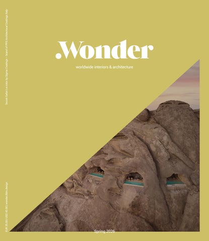
Desert Rock by Oppenheim Architecture Photo © courtesy of Red Sea Global and Oppenheim Architecture Secret Safari | a color by Sigma Coatings – brand of PPG Architectural Coatings Italy
26 Pierre-Yves Rochon
16 Songmont Huaihai Road Shanghai 18 Neon Theatre London 20 Under the Reed Roof Guesthouses Central Ukraine 74 Hopkins Centre for the Arts at Dartmouth
152 Deveron Prague
80 Ed Bakos 122 Tiziano Vudafieri & Claudio Saverino
Projects Wonder
148 ME Barcelona
Portfolio 157 A wide view on major international projects by Sabrina Sciama
30 Desert Rock Red Sea, Saudi Arabia 38 Palazzo Fendi Milan 44 Efteling Grand Hotel Kaatsheuvel, Netherlands 50 Brisa House São paulo, Brazil
Design inspirations 175 A selection of the most innovative products for the contract sector by international brands
56 The Lighthouse Los Angeles
Hanover, New Hampshire, USA
62 Amor à Vida CRN Yachts
Next
76 DEYA Day Care and After-School Center Yantai, Shandong, China
68 Gustave Collection Paris
185 A preview of the upcoming global projects
78 Kunstsilo | New Nordic Art Museum
Kristiansand, Norway
116 House 720 Degrees
La Reserva Peñitas, Mexico
84 Hotel Indigo Nalati China 92 Taichung Green Museumbrary Taichung, Taiwan 96 Thompson Hotel Madrid
118 Printemps New York
100 Konelabra Helsinki
120 Jonojé Luxury Suites Bruges, Belgium
104 The Ostendian Ostend, Belgium
4
Numbers matter 192 Projects that redefine the notion of ‘grand’ in contemporary architecture
Spring 2026 Features
YEAR XI | SPRING
01
Publisher & Editor-in-Chief Paolo Bleve | bleve@ifdm.it
Managing Editor
38
Giulia Guzzini | giulia@ifdm.it
Deputy Editor, Features & Content Curator Alessandra Bergamini | alessandra@ifdm.it
84
Editor-at-Large
Veronica Orsi | orsi@ifdm.it
Contributors
Alessandro Bignami, Matteo De Bartolomeis, Manuela Di Mari, Elena Franzoia, Elena Luraghi, Francesca Oddo, Salvatore Peluso, Marisa Santamaria, Sabrina Sciama
International Contributor New York | Anna Casotti
Digital Editorial Team redazione@ifdm.it
Brand Relations
Matteo De Bartolomeis | matteo@ifdm.it Camilla Guffanti | camilla@ifdm.it Annalisa Invernizzi | annalisa@ifdm.it Spain | Pilar Tendero | pilar@ifdm.it
96
Graphic Department
Marco Parisi | grafica@ifdm.it Maripina Cappelletti | mari@ifdm.it
Closed by the editorial staff 26th February 2026
.Wonder Collectible Book is a brand of
Owner and Publisher
Marble srl | Corso Venezia 8 - 20121 Milano, Italy Tel. +39 02 40701449 - info@ifdm.it - www.ifdm.design
Printed by
Faenza Printing Spa - Faenza, Italy All rights reserved. No part of this publication may be reproduced, stored in a retrieval system or transmitted in any form or by any means, electronic, mechanical, photocopying, recording or otherwise, without the prior written permission of the copyright owner. A record and picture file is available at Marble.
126 6
LET’S KEEP IN TOUCH
ifdmdesign |
Spring 2026 Editorial
PAOLO BLEVE Publisher & Editorial Director
It’s all about colours
T
his Spring edition, which kicks off the 2026 .Wonder Book series, brings together designers to explore the theme of colour, its use and its meaning: many of the projects featured here place colour at the forefront, sometimes with bold and striking choices. And speaking of colour, the .Wonder collections welcome a new partner. The covers of the four 2026 editions and the released Colour Stories are by Sigma Coatings – a brand of PPG Architectural Coatings Italy – which will reveal the trends and variations of colour from every angle. Three interviews, each different from the other, but all three rooted in reality: Studio Champalimaud, Vudafieri Saverino and Pierre-Ives Rochon. For anyone passing through Cologne, we recommend a visit to the town of Brühl, where, in ad-
dition to the museum dedicated to Max Ernst, there is an architectural gem: the renovation of the Town Hall and the construction of the adjoining library. A project that the JSWD studio has executed with great taste, proving that beauty and functionality do not always require a bottomless budget. Anyone who claims that hospitality projects all end up looking rather similar has not seen the Efteling Grand Hotel in the Netherlands, where the bold and distinctive use of colour has been a resounding success; the Indigo Nalati in Kazakhstan, where materials cherished by Kazakh nomads take centre stage to create a historic gem nestled beside the Tian Shan Mountains; and the neoclassical Carlton in Milan. The Netherlands also stands out for the redevelopment of the Nederlands Fotomu-
seum, where images are presented alongside imposing architecture, almost a challenge between 2D and 3D. India Mahdavi’s debut in museum design is sure to make an impression; together with Eric Langdalen, she has designed the unmissable Po-Mo – both for its packaging and its contents – in the Norwegian city of Trondheim. The Creator Economy demands spaces in its own image, and so The Lighthouse has emerged in California, featuring networking spaces alongside private, quiet areas. These are just a few of the 21 design gems you’ll discover as you leaf through the book, alongside an indepth feature – perfectly timed for the season – on the latest outdoor collections, accompanied, as is tradition, by the ‘Madames of Beauty’: the .Wonder Pages. Enjoy the read!
9
THE GUEST EXPERIENCE CURATORS THE GUEST EXPERIENCE CURATORS
IntroducingLa LaBott Bott egaCollective Collective Introducing ega A multidisciplinary collective of excellences: A multidisciplinary collective excellences: La Bottega, Vanity Group, of Palatino, Beltrami, White Privé, and Colosseo. La Bottega, Vanity Group, Palatino, Beltrami, White Privé, and Colosseo. Through our integrated expertise across beauty, textiles, OS&E and our integrated expertise acrossCollective beauty, textiles, OS&E Through design-driven consulting, La Bottega partners withand the design-driven consulting, La Bottega Collective partners partner with the world’s most discerning hospitality clients, from hoteliers to developers world’s most discerning hospitality clients,journey from hoteliers to developers and designers, to transform the guest into memorable experiences. andBecause designers, to transform the guest journey into memorable experiences. excellence is never an accident. Because excellence is never an accident. labottegacollective.com
labottegacollective.com
Spring 2026 Curator’s letter
ALESSANDRA BERGAMINI Deputy Editor
Hybrid and human-centric
A
mong the 21 projects featured in this Spring edition of Wonder Book, we highlight the Taichung Green Museumbrary. Inaugurated in December 2025, it was envisioned by its clients as “an integrated cultural venue,” designed to merge two distinct institutions: the Taichung Art Museum and the Taichung Public Library. Beyond its openness to the exterior and to people, the architecture here appears connected and hybrid, both in form and function. The name itself is a hybrid, a word blending two terms to create a new meaning. Spaces designed for culture, and indeed for institutions in general, are increasingly falling into the category of ‘third places’ – following home and work as first and second, respectively. This concept was identified by American sociologist Ray Oldenburg in his essay The Great Good Place, describing them as “informal public gathering places” such as cafes, bookstores, gardens, civic centers, “and other hangouts.” These are crucial venues for meeting and exchange, fundamental for build-
ing and consolidating a sense of community and belonging. This category can also encompass art galleries, museums, libraries, and theaters, when conceived as cultural/civic infrastructures open to people and their desire for physical, real-world connection. Beyond the Taichung Museumbrary, this Spring 2026 edition also features the Brühl City Hall and Library in Germany, the Nederlands Fotomuseum in Rotterdam, and Norway’s Pomo Museum. Moreover, the aspiration for hybrid functionality – both architectural and service-oriented – is frequently sought and articulated in hospitality projects. For many years now, hotels have aimed to expand and enhance the concept of hospitality, transforming into hybrid venues. These are often inspired by the genius loci and are open to the wider community, not just their guests, offering a range of distinct spaces for various functions (bars and restaurants, co-working areas, event rooms, gardens, and rooftops), or even multi-functional spaces adaptable to different uses depending on needs or times of day.
Examples include The Ostendian in Antwerp, the Mondrian Gold Coast on Australia’s Burleigh Heads coast, the Thompson Hotel in the heart of Madrid, and The Carlton in Milan’s fashion district. This ‘hybridization’ also extends to the design of workplaces, where the most ‘evolved’ examples now offer services typically associated with hospitality, such as gyms and spas, restaurants run by renowned chefs, kindergartens, and informal meeting spaces. The hybrid nature of designed spaces, regardless of category or typology, also stems from the desire of clients and designers to understand people’s lifestyles and rhythms, and how they actually utilize public or shared spaces. There is a strong link between the hybrid character of places and their ability to foster connections and community. If ‘hybrid’ implies openness, integration, and blending, then it represents a decidedly human-centric design approach. As Ed Bakos, CEO of Champalimaud Design, remarks in his interview, it’s about seeking “out of empathy the humanist essence of design”. 11
Spring 2026 Wonder
SHANGHAI | SONGMONT HUAIHAI ROAD | ARCHSTUDIO
The natural elements of mountain and pine are key design metaphors for these women’s bag brand retail spaces. The inspiration drawn from natural rock formations was reinterpreted through a user-centered perspective, stripping away the harshness of untouched nature, evoking instead softness, warmth, and brightness. 16
Spring 2026
© Songmont
Wonder
17
Spring 2026
© uau studio
Wonder
LONDON | BATTERSEA POWER STATION | NEON THEATRE | UAU STUDIO
The venue is transformed into a stage. Conceived as a grand theatre curtain, the dual-layer facade system combines functionality with visual impact. The inner layer forms the building’s core envelope, while the outer “curtain” façade, a flowing, wavy white veil, wraps the building in a sculptural form. 18
Namı. collection
designed by Manutti Design Studio
Spring 2026
© Mykhailo Lukashuk
Wonder
CENTRAL UKRAINE | UNDER THE REED ROOF GUESTHOUSES | YOD GROUP
Set on a private estate, these guesthouses are a contemporary reinterpretation of the traditional Ukrainian rural home Mazanka. The pursuit of light and cleanliness is translated into fully transparent glass façades, while the roof, deliberately oversized, becomes the primary architectural gesture. 20
AD Designwork – Image Nudesign – Copywriting Carter&Bennett
OUTDOOR, CABRIO STYLE
Sant’Eufemia, Italy June 30th, at 9 p.m. Natural balance of light and shade. The most exclusive open-air experience. Carrera bioclimatic pergola.
pratic.it A StellaGroup Company
Spring 2026 Color Stories
A tribute to the evocative power of green It adorns the cover of the book and is called Secret Safari: PPG’s color of the year is a versatile new yellow-green that celebrates freshness, authenticity and inner strength Author: Veronica Orsi
22
The relationship between IFDM and the world of color goes beyond simple communication. Over time, the Wonder Book has evolved into a platform for exploration and research. With its ‘stories about color’ accompanying each edition, the book provides professionals with a tool to explore new ways of living and designing through original and timeless color palettes. In this sense, the book offers a privileged view of color trends and provides inspiration for new ideas. This publication marks the beginning of an exclusive partnership between IFDM and Sigma Coatings, broadening IFDM’s perspective on the color universe in line with the brand’s vision. For Sigma Coatings – a brand of PPG Architectural Coatings Italy – color is understood as a design infrastructure, not merely an aesthetic choice. This approach is realised through the research and technological innovation of its coating products for the architectural sector. Sigma Coatings’ color research follows a dual, parallel and complementary path. On the one hand, there is technical performance, such as color fidelity and stability, reproducibility and measurable sustainability. On the other hand, there is trend analysis, which leads to the definition of a ‘color of the year’. This synergy between color, product, technology and application leads to the creation of an integrated system in which all of the company’s expertise, technologies and processes work together as a single entity. This allows color to become a design element rather than merely decoration. International color research is therefore an integral part of the process, and this study is important for the brand because color information is among the first things processed by the visual system. This contributes decisively to the emotional evaluation of space. Using a research- and observation-based approach to consumer behaviour and emerging trends in different markets, PPG’s team of stylists and color specialists identify the prevailing color orientation for projects and products; Sigma Coatings, as a brand within the Architectural Coatings division, interprets and applies the findings and insights from these studies to generate in-depth analyses that help architects and designers to create welcoming and comfortable spaces that have a strong sensory impact. Research by Sigma Coatings shows that socio-economic changes are reflected in housing trends, which can be matched by a color palette. Therefore, certain events and emerging movements correspond to colors that express people’s needs. So how did we arrive at ‘Secret Safari’?
FOR THOSE WHO KNOW Creators of luxury kitchen appliances. Established 1683.
Experience it
The difference is Gaggenau
Spring 2026
Pierre-Yves Rochon
People | Pierre-Yves Rochon
Pierre-Yves Rochon needs no introduction. A leading Parisian voice in the world of interior design, he embodies the idea of luxury through a constant respect for genius loci and contemporary living. Founder of the PYR studio, Rochon has signed some of the most iconic hospitality projects worldwide, – from the Four Seasons George V in Paris to the recent reopening of the Waldorf Astoria New York – redefining the very meaning of elegance through a refined balance of history, modernity, and stylistic sensitivity. Among his most recent masterpieces is the Waldorf Astoria New York – where we met him – an absolute icon of global Art Deco, which has recently reopened, unveiling once again the grandeur of its golden age. A place where, in Rochon’s pencil, design becomes an authentic cultural gesture. Mr. Rochon, what principles guide your approach to designing luxury hotels and residences? Being fair and being humble. That is certainly part of my philosophy. You have to listen. You need to understand what you are doing for the people who will live in these spaces. Design is not about asserting one’s ego, but about serving those who will inhabit them. My philosophy is 26
THE POETRY OF ELEGANCE Pierre-Yves Rochon shares his vision of luxury through landmark projects that have redefined international hospitality. A profound dialogue emerges, revealing his ethical and aesthetic approach, where memory becomes a tool to reinvent the future Author: Anna Casotti Portrait photo: Philippe Garcia Projects’ photos: courtesy of Four Seasons Hotels and Resorts, The Emory, Waldorf Astoria New York
based on respect, because I have a responsibility toward people. A project can be a success, or it can be a serious mistake. That is why I always try to be “right,” rather than visionary. How do you reconcile classical elegance with contemporary comfort? Contemporary comfort is not a design object or a fashionable finish. It is about functionality, circulation, light, and space. If a project truly works, elegance comes naturally. Design follows later – first comes the guest’s experience. In your work, dialogue with history is always central. How do you approach the relationship between a place’s identity and interior design? The starting point is always the place. When you are in a room, I want you to feel where you are: New York, Paris, London. It must be clear, immediate, almost instinctive. This is fundamental to me. It is not easy, because it means connecting an idea to style, history, and the city itself. But if, for example, you are in the spa at the George V and someone asks whether you feel you are in Paris – and the answer is yes – then the project works.
How do culture, history, and architectural context influence your creative process? If you work in a historic building without understanding its DNA, you are doing the wrong job. I study archives, drawings, proportions, colors, but also the invisible soul of a place. Every city has a different sensitivity. The project must absorb all of this, without becoming mimetic or nostalgic. The Waldorf Astoria is a global Art Deco icon. What was your main priority in reinterpreting its identity without betraying its essence? Respect was the priority. You cannot reinterpret something without first understanding it deeply. The Waldorf’s Art Deco is not decoration – it is structure, rhythm, proportion. I worked to bring back light, fluidity, and functionality without erasing memory. The building had become dark, closed, almost defensive. We needed to bring it back to life. There was also a major issue: the lobby felt more like a service station than a residential hotel space. In addition, the guest arrival sequence was not functional – entering from the back, with luggage, exposed to wind, snow, and rain. That is why we designed a covered portico. This is exactly what I mean when I speak of combining past and future.
Spring 2026 People | Pierre-Yves Rochon
27