VOLUME 19 NUMBER 3 SUMMER 2026
The Magazine of the Fashion Institute of Technology
F
ASHION AND OTHER CREATIVE
industries are always slightly ahead. Fall collections anticipate spring; spring collections hint at fall. Across the industries represented at the college, creatives are constantly building for audiences, markets, and desires that don’t fully exist yet.
At the same time, the past keeps resurfacing. Dior’s 1947 “New Look” borrowed heavily from the 19th century. Flip phones are suddenly back. A mood board works this way too: Fragments from different eras and sensibilities combine until something new starts to emerge. Earlier this spring, we asked the FIT community to send us images, sketches, objects, colors, references, obsessions that spoke to their personal creative direction in an attempt to create a collective FIT mood board out of this issue. What arrived was surprising, funny, personal, and occasionally mysterious. Artist Abigail DeVille, Fine Arts 2
HUE S U M M E R 2 0 2 6
BFA ’09, contributed an homage to a servant’s bell owned by Sally Hemings, the mother of at least one of Thomas Jefferson’s children. Rowthania Moulton, International Trade and Marketing BS ’26, sent nine selfies that together become an exuberant self-portrait. We spoke with three trend forecasters to learn how they think about the future, and asked interior designers to share mood boards alongside finished spaces. Again and again, the same idea emerged: Before something can exist, someone has to imagine it. This magazine belongs to the community that made it. What’s on your mind is what’s on ours..–The Editors
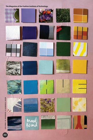
ON THE COVER:
A color exploration board by Lindsay Boehl, Fabric Styling BFA ’08, founder of Elderberry Creative, became the starting point for this issue’s cover. See page 7 for her original board.
ALEX JOSEPH Fashion and Textile Studies MA ’15 Chief Storyteller
“Boro is a Japanese fabric made from old, handwoven cotton indigo pieces stitched together into layers. When I look at this piece, I’m reminded of how old things—textiles, ideas, traditions—can be rediscovered, revalued, and fashioned into something new.”
IN THIS ISSUE
4 FIT’s Mood Board Objects and images from our community 30 Inspired Interiors Environments and the mood boards behind them 34 The Foreseeable Future Trend forecasting through three different lenses
hue.fitnyc.edu HUE
3
Fashion Design Student Digital mood board created in Canva
“This mood board is inspired by fungi and forest biology. I love the organic lines in contrast with the uniform ridges. I researched Madame Grès, and I saw a lot of similarities between the intricate pleating of her work and the ridges on the undersides of fungi.” 4
HUE S U M M E R 2 0 2 6
Fungi mood board, from left: Michelle Honey (@honey_fungi), Barbora Batokova (@fungiwoman), Fred Michel
CHANDRA KUBEREK
AARON DUNCAN
Menswear AAS ’94 Associate Professor and Chair, Global Fashion Management
“I shot this image in the Miyagawa-cho district of Kyoto, Japan. I was mesmerized by the beauty and sophistication of the Maiko in traditional dress, from the layered materials and vibrant colors to the intricacy of her hairstyling. The way she moved, almost gliding along the street, added to the sense of refinement, while the juxtaposition with the tourist highlights the contrast between heritage and modern life.”
CARLOS MIRANDA
Illustration BFA ’23 “Coco” from the series “Ugly Dogs” Oil on canvas, 13 by 20 inches, 2026
“This painting represents my current creative direction. I’m breaking away from my own boundaries by turning brief sketches into art pieces that imply movement and emotion through color application. In an oversaturated world, I’ve been enjoying becoming raw and unconstrained.” Miranda is a visual designer on the Facebook Brand Design team at Meta, where he helps shape the brand expression through illustration, art direction, and design systems.
hue.fitnyc.edu HUE
5
HELENA MINERVA
Manager of Policy and Training, Office of Policy and Compliance, Division of Legal Affairs
“‘The Biophilic Conduit’ challenges the perception of compliance as a rigid boundary. It visualizes our office’s vision: a transparent framework (the structure) that guides essential light (laws, regulations, policies) to a living, growing core (FIT’s creativity), enabling a sustainable and resilient future for our entire community.” This image was created using Google Gemini.
JANIS SALEK
Adjunct Assistant Professor, Illustration Stick and ink drawing with digital coloration
“This drawing represents a genuine desire to have more fresh flowers brought into my home for their beauty and to help ease what is going on in the world.”
6
HUE S U M M E R 2 0 2 6
LINDSAY BOEHL
Fabric Styling BFA ’08, Visual Presentation and Exhibition Design AAS ’06 Adjunct Instructor, Center for Continuing and Professional Studies
“This color exploration is made with a sandwich wrapper and paper and magazine cutouts as as sustainability practice.” Boehl owns Elderberry Creative, providing a range of design services to clients.
hue.fitnyc.edu HUE
7
R O W T H A N I A M O U LT O N
International Trade and Marketing for the Fashion Industries BS ’26, Advertising and Marketing Communications AAS ’06
“My selfies keep a record of every step I take. ‘One step at a time’ is only limiting if I stop moving. And taking time to check in with myself has kept me motivated to go, go, go!”
8
HUE S U M M E R 2 0 2 6
SARAH D. JOHNSON Fashion Design AAS ’94
“I love the stones of Israel. Their colors blend with the surroundings, the sand, and the desert blooms!” Johnson is founder and president of the Jewish-Christian Foundation, a 501(c)(3) organization based in Mississippi that is dedicated to supporting Israel and the Jewish people.
HANNA BAE
Fashion Business Management BS ’26 Digital mood board
“As an international student, it can be challenging to stay connected to my Korean heritage while adapting to a different culture. What sustains me is a strong sense of self, shaped by my roots, which are grounded in family, connection, and tradition.” hue.fitnyc.edu HUE
9
AMY LEMMON
Professor, English and Communication Studies
“This image is one of thousands I’ve gathered while researching the correspondence of Mary Crellin Langdon Down, cofounder of Normansfield Hospital, a residential home for disabled children in 19th-century England [Down syndrome is named after her husband, Dr. John Langdon Down, the first to describe the condition.]. In this letter, the mother of Evelyn Thompson—a young girl
from a prominent Yorkshire family—is anxious for news of her daughter’s health; Evelyn died there in 1883, less than a year after her admission. I’m combing the archives as part of a biographical study of Mrs. Langdon Down, while also writing poems and hybrid nonfiction about care and disability, shaped by my experience as the mother of a disabled person in residential care.”
MIMI PROBER
Fashion Design AAS ’11
“These are our in-process custom textiles. For me, nature, history, art, and textile narratives go hand in hand.” Prober’s sustainable line has been worn by Chloë Sevigny, Misty Copeland, Erykah Badu, and Rihanna, among others. Her work is featured in In America: A Lexicon of Fashion, an exhibition and book from The Met’s Costume Institute, and in the permanent collection of The Museum at FIT.
10 HUE S U M M E R 2 0 2 6
ABIGAIL DEVILLE Fine Arts BFA ’09
TRIPTI LADHA
Advertising and Marketing Communications BS Student, Fashion Business Management AAS ’25
“Small, real moments from my life in New York, like walking through galleries, reflect how I find inspiration in simple, unplanned moments.”
12 HUE S U M M E R 2 0 2 6
only object known to have been hers, and now resides at the Moorland-Spingarn Research Center at Howard University. What would the bell say if it could talk? The sound it makes beckons for justice, solace, freedom, and understanding amid centuries of misinformation. “I have been dreaming of casting Hemings’ bell in carbon and enlarging it to the scale of our Liberty Bell.” DeVille creates large sculptures and installations, often incorporating found materials. Her work, which focuses on themes of racist violence, gentrification, and lost regional history, has been shown at the Smithsonian Hirshhorn, the Studio Museum in Harlem, and The Museum of Contemporary Art, Los Angeles. She spoke at FIT’s commencement this year.
Bell: Courtesy of the Howard University Archives, Moorland-Springarn Research Center, Howard University, Washington, D.C.
“One of the most famous African American women in U.S. history, Sally Hemings (1773–1835) has been linked to Thomas Jefferson as his ‘concubine.’ DNA evidence in 1998 revealed that Sally indeed gave birth to at least one of President Jefferson’s children. She had seven, three of whom decided to live as white people in adulthood. “Hemings was given this servant’s bell by Martha Jefferson, Thomas’ wife and Sally’s half-sister. It is the
GERARD CHAMBERS
Illustration BFA ’18 “Red Head” Digital image created in Photoshop
“I drew this Paul Gauguin sculpture from the Met in the days I stayed home due to the blizzard in February. It’s red like a stop sign because the weather stopped the seasons.”
JENNIFER LEE
Associate Professor, Fashion Business Management “Elysian Fieldwear NYC for Everyday Journeys” Digital mood board created in Adobe Illustrator and Photoshop with garment visualization by CLO 3D
“A new generation of professional women seeks balance, mobility, and meaning in what they wear. This proposed collection layers Central Park’s organic textures, urban structure, and moments of outdoor leisure into a cohesive visual language, capturing a seamless transition between fast-paced city living and restorative outdoor escape.” Lee’s mood board received the bronze award in a CLO 3D digital design competition in summer 2025.
hue.fitnyc.edu HUE 13
MARISOL DELUNA
Global Fashion Management MPS ’21 Silk twill scarf, 36 by 36 inches
“Marking the semiquincentennial in style, this limited-edition hand-illustrated scarf is a love letter to our American history. My intention is to evoke the best memories of our past while enabling a collective hope for the future through thoughtful design.” Deluna is the owner and fashion designer of Marisol Deluna New York, a design company she founded in 1997.
JOSEPHINE JEE
Counselor and Assistant Professor, Career and Internship Services
“I find myself carrying at least five lip balms in my bag these days. Applying lip balm creates a pause, a sensory moment that brings me back to myself. I am starting to think that if everyone were given their favorite lip balm at birth, we might have a better shot at world peace.”
14 HUE S U M M E R 2 0 2 6
WAYNE “ZAK” HOKE
Mo Daoud
Advertising and Marketing Communications Student
“I creatively directed, managed, and executed this Nike retail activation in Harlem, created in collaboration with Atmos, the Japanese sneaker boutique. The concept was rooted in the iconic Nike Air Max “Animal Pack,” originally designed by Atmos, which featured a mix of animal prints. We reimagined the retail environment as a hybrid of urban infrastructure and reclaimed natural habitat. Suspended greenery, animal textures, and sculptural installations, including the
central tiger form, create tension between city and wilderness while guiding the customer through the space. I approach brand environments as living classrooms, where design, behavior, and narrative intersect to shape how people move, feel, and engage.” After almost three decades as a creative marketing executive and experience designer in visual merchandising and brand marketing for Nike and others, Hoke came to FIT to pursue his degree.
hue.fitnyc.edu HUE 15
Anatomy of a Bulletin Board SHANNON MAHER
Dean, Jay and Patty Baker School of Business and Technology
“The bulletin board by my desk is full of memories, meaningful objects, things I find attractive, and colors that I like. Every now and then I’ll add something to it, but I rarely take anything away.”
Supima ad “When you go back far enough in American history, you see that we did not just advertise products, we advertised fibers, like in this Supima ad from the 1940s. They’re always so elegantly done—they’re timeless.”
Clothing labels “Ingrid Johnson was the acting chair of Home Products Development, and when I was going through her files after she retired, I came across these wonderful clothing labels from the Garment District. It was basically a sales tool to show what the company could produce. They are all images of well-known artworks. I have an appreciation for craft and old things.”
Stuffed animal “In the industry, I dealt a lot with filled products. This stuffed animal is from a company that does filled product with alpaca. During spring break one year, I went upstate to go see the alpaca farms. They’re just funky, unique animals.”
Group photo “This is from the 2015 Home Products graduating student breakfast, with my first graduating class. It was a really special group.” 16 HUE S U M M E R 2 0 2 6
Colorful armchairs photo (top) courtesy of Calico (calicocorners.com)
Thank-you card “This is hand embroidery on a card. I think it’s a brilliant idea, very FIT.”
Color palette “I found this vintage color palette in the files of FIT, when we were trying to find a color for the Home Products Development program (we ultimately went with PMS 7467U). I thought this was a really nice palette, and it matches the pictures around it.”
Woven portrait “This was from a trip to India. We had to wake up at three in the morning to get on a flight, then take a connecting flight to the south of India, where all the big sheeting mills are. As soon as we got out of the car, they put leis around our necks and snapped pictures of us. You can imagine how we looked after six hours of travel. After we finished our day, they gave me this picture of me, woven on their sampling machine. We now have one of those machines on campus.”
“Luxury lunch” “This was taken on a design and product development trip to India, when I was working at The Company Store [a bedding and bath textiles company now owned by Home Depot], probably in 2013. My travel partner, Melanie Kaplan, the CCO of the company, is using our hand sanitizer wipes before we eat canned tuna salad we brought with us at an unfinished table that could have given us splinters. Everybody thinks travel is glamorous, but this was our ‘luxury lunch.’” hue.fitnyc.edu HUE 17
LAUREN BELL
Fashion and Textile Studies: History, Theory, Museum Practice MA ’26 Digital mood board created in PowerPoint
“For my 20th-century fashion history class, I styled an object from The Museum at FIT’s study collection. I chose to highlight the playful jazz influences of a 1922 brown silk velvet evening dress. I developed an exhibition titled Dresses and Dance: A Look at Evening Culture Through Fashion. This piece represents one of my favorite eras in fashion history.”
18 HUE S U M M E R 2 0 2 6
CLOCKWISE FROM LEFT:
Brown silk velvet evening dress, c. 1922; black silk velvet cape with gold lamé, chinchilla fur, and beads, c. 1925; crepe chiffon and silk satin camiknickers from Saks Fifth Avenue, c. 1924; illustration from 1920s Fashion: The Definitive
Sourcebook by Charlotte Fiell; silk satin and silk faille shoes with jet beads by Hellstern & Sons, c. 1915; printed silk velvet evening bag with silk cord and glass by Maria Monaci Gallenga, c. 1917; straw hat with velvet ribbon by Caroline Reboux, 1929.
LILI CHU
Adjunct Instructor, Fashion Art Marker and pastel on paper, 11 by 14 inches
Evening dress photo: Lauren Bell; all other photos courtesy of The Museum at FIT except the illustration, courtesy of Charlotte & Peter Fiell Design Archive.
“I drew this fashion illustration as a ‘print on print’ demo for my one-year accelerated fashion program students at FIT this semester. I love how it captured the mood of one of my favorite FIT Fashion Department models, Sophie Stiles. She looks cool, chic, and relaxed.”
MELISSA JOSEPH
“My mood for 2026 is this painting by Maria Lassnig that captivated me at her show at Petzel [a gallery in New York]. To me it is an embodied semi-anxious form, maybe a house, a notebook, or a ribcage, sitting on the edge of an undefined space. It is open, leaving room for possibility. It is not hopeless, but it is heavy with legs unable to support it.” Joseph’s artwork has been shown at the Brooklyn Museum, The Delaware Contemporary, Utah Museum of Contemporary Art, and other galleries and museums. She is the recipient of the Brooklyn Museum’s 2025 UOVO Prize and the 2025 Eden Art Foundation Artists Now Award. She is a regular contributor to Bomb magazine.
20 HUE S U M M E R 2 0 2 6
Maria Lassnig Foundation, courtesy of Petzel, New York
Textile/Surface Design AAS ’06 “Gartenhäuschen” (“Summerhouse”) by Maria Lassnig, oil on canvas, 79 by 57 inches, 1992.
FAWZ KABRA
Curator, Art and Design Gallery
“On my office bulletin board, I mostly keep notes and work schedules, but I also keep things that motivate me and bring cheer to the workday. Here is a fragment from a mosaic, written in Arabic, ‘El sabr jameel,’ which translates to ‘patience is beautiful.’ Next to it is this awesome New York City pigeon, gifted to me by artist Ethan Minsker [adjunct instructor, Film and Media] after working on an exhibition together. These two pieces remind me to find humor and lightness and carry on with grace.” SARAH BONELLO
Fabric Styling BFA ’97, Fashion Buying and Merchandising AAS ’94
“This image of Kate Moss served as the starting point for The Park’s prefall and fall collections. I love that while the mock neck is intentionally oversized, it falls with an effortless, fluid drape, an ease and quiet refinement I aim to capture in every piece.”
Glen Luchford/Art Partner
Bonello is the founder and creative director of The Park, a responsibly sourced brand offering modern, elevated wardrobe staples. Earlier in her career, she worked at WWD and W magazine and co-founded FGPR.
JOE CARROTTA Photography BFA ’17 Digital mood board
“This is the inspiration for an upcoming project featuring Olympic lifters and bodybuilders posing in everyday situations. I’ve always been drawn to these older images because of their posing, lighting, and the expression of the subject.” Carrotta has shot for The New York Times, The Wall Street Journal, The Washington Post, NYU Langone, and FIT.
22 HUE S U M M E R 2 0 2 6
CLOCKWISE FROM TOP LEFT: Estonian
Weightlifter Lydia Johanson, 1907; Joan Barclay with dumbbells, circa 1940; strongman Lawrence Heffernan poses on a pedestal and flexes his neck muscles, 1938; male weightlifter, 1922; man dressed as sailor from Heros athletic club, early 1900s.
LINDSAY ALEXANDER
Advertising and Marketing Communications BS ’06
Johanson courtesy of Estonian Sports and Olympic Museum; Barclay: Alamy; Heffernan courtesy of Mitchell Library, State Library of New South Wales and courtesy ACP Magazines Ltd.; male weightlifter courtesy of Bibliothèque nationale de France (gallica.bnf.fr); sailor: Gävleborg County Museum
“I believe ‘creativity by committee’ flattens good ideas with too many voices, while the best work comes from small, focused teams. Maybe that’s why I keep reaching for this tiny vintage purse that belonged to my grandmother. Only the essentials fit, and the rest stays behind.” Alexander leads the in-house creative content studio supporting some of Mars’ biggest pet brands, including Pedigree, Greenies, and Temptations. Her team brings campaigns to life across the digital ecosystem—which means lots of photo and video shoots with dogs and cats.
hue.fitnyc.edu HUE 23
ADRIAN MUKASA
Technologist, Interior Design
“I took this photograph to capture “The Painteress and Her Paintings.” It was a collaboration with Ayleen Betances, Interior Design BFA ’24, shot on campus. Projects like these remind me to work with artists in other disciplines.”
JIAYI ZHANG
Global Fashion Management MPS ’25, Jewelry Design AAS ’12
“This is a recent piece from my practice, exploring objects that appear soft but are not. It translates the visual language of satin and padded construction into a rigid, 3D-printed form. I’m interested in this quiet tension between illusion and reality, and how fashion can extend beyond the body into everyday life.” Zhang is the founder of Shiny Object Shop, which produces and sells objects like this one.
24 HUE S U M M E R 2 0 2 6
RICH BERRIOS
Menswear Design and Marketing AAS ’87
“Working with the Todd Smith/LL Cool J lines was a sheer pleasure, including working with [Smith, LL Cool J’s birth name]. He is a beacon of creativity and marketing directives, and I learned a lot from him. This bestseller at Macy’s is made of 100% slubbed rib cotton, with multiple embellishments such as Swarovski crystals, embroideries, printing, satin rope drawstrings, inner velour tape trim, skullthemed art, and logoed pocket studs—as well as an inner cell phone pocket.” Berrios contributed garments he designed for the Smith lines, including this one, to the Hip Hop Museum in the Bronx, which reopens in a new space this year.
STEVEN POLITO Illustration AAS ’02
“During COVID, I drew these little green-haired ladies (based loosely on my character Hedda Lettuce) and sold them online. It gave me purpose during lockdown, and people seemed to enjoy them. Green represents nature, growth, renewal, and harmony—energy I wanted to bring into people’s lives during that difficult time. Looking back, I long to return to the calm purity of that period and the sweet simplicity of those drawings.” Polito is a drag performer known for his character Hedda Lettuce, which he debuted in 1991. Hedda has appeared in numerous TV shows and films.
hue.fitnyc.edu HUE 25
EMILY BURNS PERRYMAN
Advertising and Marketing Communications BS ’04
“My life and career have been shaped by movement across cities, industries, and evolving definitions of work, while remaining grounded in purpose. The image of fashion silhouettes from a recent visit to The Museum at FIT (the fall 2025 exhibition, Dress, Dreams, and Desire: Fashion and Psychoanalysis) is a nod to my early career in New York.” Perryman is chief marketing officer of the Invest in Others Charitable Foundation, which amplifies, celebrates, and inspires the charitable work of financial advisors nationwide.
HARSHA RAMESH KANDACKAPPALLI
Textile/Surface Design AAS ’20
“I captured this image at Arthshila Ahmedabad, a resource center for design in India. This made me reflect on how much knowledge there is to capture in a lifetime. The reflection in the glass floor showed the vastness of the resources there. Though we tend to follow the internet and conveniences in this busy world, it made me pause for a while to look at the books and knowledge out there.”
SELENA NG
Spatial Experience Design BFA Student, Communication Design Foundation AAS ’26 “The Lights” Acrylic on canvas, 15.5 inches by 19.5 inches
“Everything seems dark; we don’t know where we’ll go, no matter how we plan. All we can do is follow the light through the tunnel. There seem to be right and wrong ways to go. So by the time I’m at the end of the tunnel, I’d hope to look back fondly with a smirk or a smile.”
ANNA OWENS
Illustration MFA ’26 Cover illustration of Oliver in Winter Watercolor, colored pencil, and ink
“My picture book and MFA thesis, Oliver in Winter, is inspired by my own experiences during the change of seasons and the heavy emotions that winter can often bring. As the sun slips away at 4 pm and the temperatures dip below freezing, I find myself retreating further inward and being less open to new opportunities.
I wanted to create a story that helps people embrace and celebrate winter. While creating this book, I have found myself connecting with the small moments and joys that winter brings.” Oliver in Winter was presented as part of the 2026 Illustration MFA Visual Thesis exhibition, Pick Up the Pieces, in the Goodman Center Lobby June 12–July 12, 2026.
hue.fitnyc.edu HUE 29
INSPIRED INTERIORS Three spaces and the mood boards that sparked them
GREGORY KAHN MELITONOV
Inspiration board
Senior Architect and Co-Founder, Taller Ken Studio Assistant Professor, Interior Design
Melitonov trained with Italian architect Renzo Piano. Taller Ken Studio specializes in singlefamily residential projects, hospitality, and retail, with a focus on color-infused spaces.
30 HUE S U M M E R 2 0 2 6
All photos by Alvaro Fonseca/Depth Lens
C
“
asa Contenta is a 3,500-square-foot, three-bedroom residence in Costa Rica, conceived as a spatial dialogue between architecture, landscape, and horizon. The mood board centers on the heart of the house, where the entry, pool, kitchen, and living spaces converge into a continuous, open sequence. A large circular arched door establishes the project’s formal language at the threshold, introducing a cadence of curves that echo throughout the design.”
Completed residence
hue.fitnyc.edu HUE 31
SUSAN FORBES
Retired Associate Professor, Interior Design
“
T
his mood board reflects my suggestions for The Cove, a fresh, new self-service restaurant in a senior living community at Peconic Landing in Greenport, Long Island. Its new theme reflects Greenport’s history as a whaling village, and includes images of the double-masted schooners and whaling ships that once proliferated. Included are the architectural finishing materials—walls, floor, upholstery, and my sketch of the food service area, which includes a banner I designed, representing stylized ship sails, that frames the food service counter below.” Forbes was a tenured member of the Interior Design faculty from 1990 to 2020 and served as department chair from 1996 to 2000. She lives in Peconic Landing.
32 HUE S U M M E R 2 0 2 6
Completed restaurant
Inspiration board
Garret Rowland
BILL BOUCHEY
Interior Design BFA ’85 Design Director, Gensler
“
T
his 40,000-squarefoot Los Angeles workplace for the white-shoe law firm Gibson, Dunn & Crutcher is both hospitality-infused and future-ready, a shimmering expression of the firm’s culture. “Inspired by West Coast landscapes, canyons, mountains, and coastlines, the space channels a natural, grounded elegance that feels both contemporary and enduring. The mood board conveys a warm, sumptuous sophistication, shaping a highly curated experience through refined design.” Bouchey has designed workplaces for most of his four-decade career. At Gensler, a global design and architecture firm, he has played a role in creating more than 5 million square feet of spaces. He recently became president of the IIDA International Board of Directors.
Completed workplace
EASE
POLISH
WELCOME
C U L T U R E D
Inspiration images
Project team at Gensler: Barbara Dunn, Bill Bouchey, Sarah O’Keefe, Tara Donnelly, Stella Namkoong, Yissa Renteria, and Waika Li.
hue.fitnyc.edu HUE 33
THE FORESEEABLE FUTURE Three experts unpack the mysterious process of trend forecasting I L L U S T R AT I O N S B Y A N I TA R U N D L E S , B F A ’ 1 3
JULIE PANCHU, Textile Development and Marketing faculty member, has analyzed trends and created mood boards for Amazon, Ralph Lauren, and Macy’s
I
t sounds like magic: Trend forecasters somehow predict the future in colors, fabrics, and furnishings. But there’s no crystal ball, says Julie Panchu, who’s worked as a home trend product designer for Amazon, a color and concept color manager for Ralph Lauren, and an R&D and trend manager for Macy’s. You just have to know where to look for data. hue.fitnyc.edu HUE 35
“A good mood board doesn’t just show what you like; it shows why it matters.” —JULIE PANCHU
The site Tagwalk, for example, launched in 2024, analyzes hundreds of thousands of fashion show images across multiple brands and organizes them into a trend “dashboard” and searchable database featuring colors, patterns, fabrics, and more. Fashion runways are still a reliable trend source, Panchu says, but social media influencers, international travel images, and social and cultural factors also deserve consideration. With an exhaustive analysis of what’s “now,” what’s next starts to take shape. For Macy’s, Panchu will do a deep dive into the sales of their private label brands and assemble a color card that displays, for example, all the blues used versus pinks. “Then they can see what their best-selling colors are,” she says. Each brand has tried and true shades that sell reliably each season, but the color card helps them innovate.
36 HUE S U M M E R 2 0 2 6
Panchu teaches how to make professional mood boards in classes in FIT’s Department of Textile Development and Marketing, and the Center for Continuing and Professional Studies’ Color Specialist certificate program. Pro tip: “A good mood board doesn’t just show what you like; it shows why it matters.” So what colors are coming next? Panchu says Cloud White, Pantone’s color for 2026, sets the stage: It’s “a palette cleanser and blank canvas,” she says. “It reflects a world navigating between overstimulation and intentional living.” For 2027, we can expect “a fluid color landscape—restorative neutrals, watery translucence, hyperdigital brights, and saturated earth tones,” reflecting “a collective desire for grounding stability and optimism, balancing comfort with the need for energizing expression.” —Alex Joseph
1. Define the purpose What feeling or message are you trying to convey? 2.Research and gather inspiration Images, colors, textures, materials. 3.Narrow your focus Take out what doesn’t support your story. 4. Build a foundation Choose colors, a key image, or texture that sets the tone. 5.Layer and arrange Play with scale, balance, and contrast. 6.Tell a visual story Communicate a clear concept at a glance. 7. Add details and finishing touches Personalize with typography, quotes, icons, or handwritten notes. 8.Review Evaluate the board’s effectiveness and refine as needed. 9.Present with purpose Ensure it is professional and polished, with a title and keywords for context. 10. Use it as a tool Let it guide color development, product design, marketing, and cross-functional communication.
hue.fitnyc.edu HUE 37
PHILIP FIMMANO, Fashion Design AAS ’99, forecasts trends with Li Edelkoort
T
“
rend forecasting is like creating an archaeology of the future,” says Philip Fimmano, partner and analyst at Trend Union, one of the world’s most sought-after forecasting companies.
hue.fitnyc.edu HUE 39
40 HUE S U M M E R 2 0 2 6
functional and emotional, bringing back codes of dressing up such as button-down collars, buckled belts, pleated rosettes, woolen pompoms, knitted mittens, felted hats, and soft leather gloves.”
Courtesy of Trend Union
From the description of the Trend Union Autumn/Winter 2027–2028 color forecasting tool: “Haberdashery will drive the major style movements and co-design trends that are
“Intuition is a muscle that needs to be trained.” —PHILIP FIMMANO
Fimmano contributes to Trend Union’s predictive studies for international companies in fashion, textiles, interiors, and lifestyle. With Lidewij (Li) Edelkoort, the company’s founder, he also co-launched Talking Textiles, a multiplatform educational textile initiative; co-wrote the design book A Labour of Love (Lecturis 2020), profiles of more than 70 creative studios; and co-created the World Hope Forum, a platform for community building born as a response to COVID-era isolation. This year, Fimmano is co-curating a new exhibition called Inner Child: Playing with Design at Artipelag in Stockholm, looking at how naivete and optimism are influencing
interiors and fashion. He also serves as a mentor for master’s degree students in Fashion Trend Forecasting at Polimoda in Florence, Italy. Trend watchers are everywhere, but Fimmano distinguishes their work from true forecasting. “If trend watching creates a holistic picture of now,” he says, “then trend forecasting is about what the colors and materials will look like two years from now.” To do this work, he immerses himself in aesthetic and tactile output from a range of industries, but he also gives himself breathing room to step back. “Intuition,” he says, “is a muscle that needs to be trained.” —Jonathan Vatner
hue.fitnyc.edu HUE 41
How is the Color of the Year chosen? Pantone VP LAURIE PRESSMAN explains
P
antone’s Color of the Year was meant to be a one-off. It was 1999, and the world was grappling with anxieties over Y2K. To spark conversation and highlight the relationship between color and culture, the Pantone Color Institute conceived a “Color of the Year.” They selected Cerulean from their Fashion, Home + Interiors system—a soothing shade meant to evoke the stability and solace of the sky. Fans of The Devil Wears Prada might recognize this exact color from the iconic monologue detailing how such choices quietly penetrate the global market. Capitalizing on the immense buzz generated by Cerulean, Pantone transformed the experimental campaign into an annual tradition. hue.fitnyc.edu HUE 43
2001 Fuchsia Rose
2002 True Red
2003 Aqua Sky
2004 Tigerlily
2005 Blue Turquoise
2006 Sand Dollar
2007 Chili Pepper
2008 Blue Iris
2009 Mimosa
2010 Turquoise
2011 Honeysuckle
2012 Tangerine Tango
2013 Emerald
2014 Radiant Orchid
2015 Marsala
2016 Serenity
2016 Rose Quartz
2017 Greenery
2018 Ultra Violet
2019 Living Coral
2020 Classic Blue
2021 Illuminating
2021 Ultimate Gray
2022 Very Peri
2023 Viva Magenta
2024 Peach Fuzz
44 HUE S U M M E R 2 0 2 6
2025 Mocha Mousse
2026 Cloud Dancer
Every Pantone Color of the Year from 2000’s Cerulean to 2026’s Cloud Dancer. There have been 29 colors over the 27 years; two were chosen for 2016 and 2021.
Courtesy of Pantone Color Institute
2000 Cerulean
“Influences can come from anywhere.” —LAURIE PRESSMAN Today, a global team of experts keeps watch all year for hues that capture the shifting global mood, surveying consumers and analyzing emerging trends. “Influences can come from anywhere,” says Laurie Pressman, a former member of FIT’s Home Products Development advisory board and the vice president at Pantone Color Institute who oversees the process. “Art and fashion, travel destinations, lifestyles, geopolitical and socioeconomic factors, worldwide sporting events, and social media.” While the team is looking for the quintessential color, they are also looking for one with the perfect name, one that reflects the moment and resonates across cultures. In 2017, the experts loved a particular yellow-green, but its name, Pea Soup, did not transmit the intended message of invigoration and renewal.
Instead, they chose a similar shade with a more inspiring name: Greenery. According to Pressman, the 2026 choice, Cloud Dancer, is a soft, natural white that is both versatile and nonseasonal, with a positive, hopeful name. “We’re in this place that doesn’t seem to be working, so we’re looking for a fresh start. We need the simplicity and clarity to move forward in a better way.” Some critics saw the choice as a stance against diversity, but Pressman insists that the Color of the Year is never about politics but purely about design. White is a canvas; it is negative space. Regardless of the response, Pressman appreciates the lasting appeal of the Color of the Year program. “Maybe they loved it, maybe they didn’t love it, but at least they’re talking about color.” —Jonathan Vatner
hue.fitnyc.edu HUE 45
And finally … inspirations from the creators of Hue
JONATHAN VATNER
Editorial and Managing Director
I took this photo during a beach vacation, when a summer storm was rolling in. It looks ominous, but somehow my eye always travels to the sliver of light amid the darkness, the evidence that the storm would pass quickly.
KIM MASIBAY
Editorial Associate
This is my Alfi Kugel carafe, designed by Ole Palsby. When I use it, I feel transported to a more perfect version of my life.
ALEXANDER ISLEY
Photography Coordinator
My mood is hopeful, even though life has felt like a jumble of chaos on many levels lately. I recently bought this pastel by Bruce Pileggi that feels balanced, bringing a sense of clarity.
46 HUE S U M M E R 2 0 2 6
Art Director
I am inspired by the traditional Japanese concept of Kintsugi (“golden joinery”). Instead of discarding a cracked or broken piece of pottery, a craftsperson mends it with a hard lacquer, dusted with powered gold. The flaw is emphasized and embraced, celebrating the imperfection. It tells a story. In my work, I’ve found that by emphasizing an irregularity, a design can become more interesting and engaging.
Bowl: Adobe
SMILJANA PEROS
The Magazine of the Fashion Institute of Technology
LAURA HATMAKER
HUE is published three times a year by the Division of Communications and External Relations 227 West 27th Street, Room B905 New York, NY 10001-5992 (212) 217-4700
Internal Communications Manager
I encountered this guy on a walk in Harlem and the scene encapsulated my vibe: feeling a bit roughed up but optimistic things will get better.
State University of New York
JONATHAN VATNER
Editorial and Managing Director ALEX JOSEPH , MA ’15
Chief Storyteller
MARIE ROUSSEL
Designer Alexander Isley Inc.
After being lifelong renters, my husband and I recently became homeowners. I have now entered my garden design era; these peonies are from said garden.
LAURA HATMAKER
Internal Communications Manager KIM MASIBAY
Editorial Associate SMILJANA PEROS
Photography Coordinator ALEXANDER ISLEY INC.
Art Direction and Design GOODFOLK AGENCY
Website Design and Production
SHAUN ROUSSO
Project Manager GoodFolk Agency Inc.
This is a still from an immersive horror/mystery play I wrote and directed a few years ago. The audience sat in the living room of an apartment as the play unfolded around them. In 2026, I’ve worked to tap back into that playful energy of experimenting with the bounds of storytelling mediums.
HUE ONLINE hue.fitnyc.edu EMAIL hue@fitnyc.edu
Are you an FIT alum? STAY CONNECTED
@FITAlumni UPDATE YOUR PROFILE
fitnyc.edu/alumniprofile HUE is mailed to donors who give at least $25 per year to FIT.
Donate now at impact.fitnyc.edu.
FashionInstituteofTechnology... @fitnyc Fashion Institute of Technology Printed by GHP Media, Inc. on Accent Opaque, an FSC-certified paper containing 10% postconsumer waste. Please recycle or share this magazine.
State University of New York Fashion Institute of Technology 227 West 27th Street New York, NY 10001-5992
NON-PROFIT ORG. U.S. POSTAGE PAID PERMIT NO. 472 NEW YORK, NY
ELECTRONIC SERVICE REQUESTED
Alvaro Fonseca/Depth Lens
Gregory Kahn Melitonov, co-founder of Taller Ken Studio and assistant professor of Interior Design, created this Costa Rica haven “as a spatial dialogue between architecture, landscape, and horizon.” Turn to page 30 to see the project’s inspiration board.