3 minute read
WORDMARKS
O2 6 THE 7 TYPE OF LOGO DESIGN O3 WHEN TO USE LETTERMARKS AND WORDMARKS LOGOS : THE 7 TYPE OF LOGO DESIGN 7 Consider a lettermark logo if your A wordmark is a good decision if business happens to have a long you’re a new business and need to name. Condensing the business get your name out there, just make name into initials will help simplify sure that name is short enough to your design and likewise customers take advantage of the design. Anywill have an easier time recalling thing too long can look too cluttered. your business and your logo.
A wordmark logo is a good idea if A wordmark is a good decision you have a distinct business name if you’re a new business and that will stick in customers’ minds. need to get your name out there, Having your name in a great, just make sure that name is designed font will make your brand short enough to take advantage all the stickier. of the design. Anything too long can look too cluttered.
Advertisement
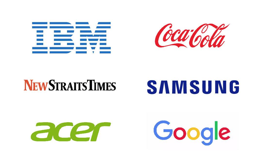
Both lettermark and wordmark logos are easy to replicate across marketing material and branding thus making them highly adaptable options for a new, and developing, business.
Remember that you’ll want to be scrupulous when creating a lettermark or a wordmark. Your business name in a font alone likely won’t be distinct enough to capture the nuance of your brand. So make sure you hire a professional who’ll have an eye for detail.
O4
PICTORIAL MARKS (FOR LOGO SYMBOLS)
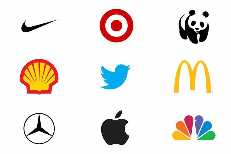
A pictorial mark (sometimes called brand mark or logo symbol) is an icon—or graphic-based logo. It’s probably the image that comes to mind when you think “logo”: the iconic Apple logo, the Twitter bird, the Target bullseye. Each of these companies’ logos is so emblematic, and each brand so established, that the mark alone is instantly recognizable. A true brand mark is only an image. Because of this, it can be a tricky logo type for new companies, or those without strong brand recognition, to use. The biggest thing to consider when deciding to go with a pictorial mark is what image to choose. This is something that will stick with your company its entire existence. You need to think about the broader implications of the image you choose: do you want to play on your name (like John Deere does with their deer logo)? Or are you looking to create deeper meaning (think how the Snapchat ghost tells us what the product does)? Or do you want to evoke an emotion (as the World Wildlife foundation does with their stylized image of a panda—an adorable and endangered species)?

O4

O5
ABSTRACT LOGO MARKS
An abstract mark is a specific type of pictorial logo. Instead of being a recognizable image —like an apple or a bird—it’s an abstract geometric form that represents your business. A few famous examples include the BP starburst-y logo, the Pepsi divided circle and the strip-y Adidas flower. Like all logo symbols, abstract marks work really well because they condense your brand into a single image. However, instead of being restricted to a picture of something recognizable, abstract logos allow you to create something truly unique to represent your brand. The benefit of an abstract mark is that you’re able to convey what your company does symbolically, without relying on the cultural implications


O5THE 7 TYPE OF LOGO DESIGN

of a specific image. Through color and form, you can attribute meaning and cultivate emotion around your brand. (As an example, think about how the Nike swoosh implies movement and freedom).

