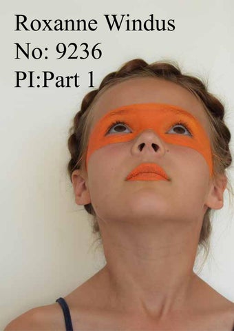
Roxanne Windus No: 9236 PI:Part 1
Summer Work Chosen Photographer 1 Research Page
Summer Work Chosen Photographer 1 Photoshoot Contact Sheet
Summer Work Chosen Photographer 1 Photoshoot Clean Simple Edits - Large
Summer Work Chosen Photographer 1 Photoshoot Clean Simple Edits - Large
Summer Work Chosen Photographer 1 Photoshoot Specific Edits
Summer Work Chosen Photographer 2 Research Page
These were my favourite photos as they have almost created geometric patterns. I prefer these compared to the white light as they are more in focus and have more appealing tones.
I was overall happy with how this edit turned out as it has a clean finish which I was concerned about as the branches on the trees where still moving from the breeze despite me using a tripod. However, to improve this photo I would have the model stand in some more places as there are some gaps in the image where I feel she should be.
To improve this photo, I would experiment with the angles of the mirror and the location. I would also want a more appealing mirror. Another option is to have a shattered mirror with different reflections of her personality in each shard. Locations to have mirror o Dressing room – including the conceal and ravel of make up o Plain background – main focus on the model and her reflection o Shop Window reflection o Woods o Field
There are my two favourite photos edits from the shoot as I think they are very simplistic but with a dramatic effect. The photo when she is looking in the mirror represents your self-image and how people see them self’s compared to how other see them. If I was to extend this for my final piece I would have a bigger mirror for her to stand on, without the grass background. Her reflection would be screaming and she would be looking strait ahead or into the camera. For the second image I don’t think it is as effected as there is not as much focus on the model. However, I am happy with the natural location.
I was very happy this the final outcome of this photo. In this image I explored a different prospective of conceal and reveal which is powers. This definitely make the image naiver however I still think the simplicity makes it effective.
Moon and sky theme- why it relates to conceal and reveal I decided to explore the theme conceal and revile by looking at the relations to it in the sky. I experimented with the idea of the cycle of the moon and how it can be concealed from the shadow of the earth. I did this over a few different times and nights so you could see the difference in the moon. I also took photos of the moon when it was concealed from the clouds. I also did this when the sun set behind the clouds. I took photos mainly focused on the clouds as well as there were also so connections to the theme.
Tags Evaluation Materials: The materials I used for my tag were papers and acetate. I used the acetate to add layers over different images to create different colours and patrons on other images. I think this worked beter on some than others as the glue smudged on some of the photos meaning it did not have as much of a defined image as I would have hoped. Theme: conceal and revile I used the light trail images for my tags as thy relate to the theme.
1. The main focus of this journal is the way the pages are cut at different angles and places. This means you can see through to the other pages, which reviles other parts of the book. I think this is very effective and would relate to my theme, conceal and reveal. I think there is lots of potential for this technique to be presented in different ways. I could also expanded on this idea by using acetate windows to the length of the page showing different perspectives. 2. I like the simplicity of this journal whilst is still has the added detail of the ripped brown paper. I really like the neat, hand written font. In my journal would want to expand of this by having some other details such as pop ups, windows and flaps. I think I would also want some more eye catching colours so it is not as balanced. the overall aesthetics of this journal could come across of a modern interpretation of a vintage look. 3. I like how in this book there is a range in fonts and typography, however I think some of them look a little untidy and naive which does not appeal to me. I think the bright primary colours are what makes it stand out for its pop art feel. This has definitely shown me other options for presenting things other than photos such as typography. 4. I really like the clean cut graphics to this book and would like to interpret it into a scrap book. I like how there is a range of camera angels in the photos and the different ways they have been presented, from how they are cropped to how they are bordered. I like how they have kept the colour scheme consistent throughout the book which makes it have a more editorial finish. However, I think it will be more eye catching and interesting in a journal as you can make it move interactive with flaps and other effects that you cannot do on the computer. Typography Layers Textures Consistency Layout
Ace of Spades – throughout my journal I have subtly manipulated the images to relate to the magic conceal and reveal theme. This is shown on the Ace of Spades page as the spades symbol is subtly edited into the pupil of her eye. I think this was very effective, however, I had to have a close up of her eye to draw your attention to it. The downfall to this was the image became pixilated.
3 of Clubs – I have also physically edited some of my photos. This may be to reflect the playing card or to enhance the image. On this page I have cut the model out and raised part of the image to create a 3D effect and create a deeper perspective. Unfortunately, this effect lost its effect over time as the foam tape got flattened by the weight of the journal.
4 of Hearts- for this image I digitally and physically edited this image. I created this image by taking a picture of just the background on the tripod, I then got my model to pose on a stall to look like she was falling. I then digitally edited this image on Photoshop by putting the images on top of each other and erasing the stall so it creates the illusion of her falling. I also added darker tones underneath her to create a shadow and make it more realistic. I then physically edited this image by adding red thread to the tree branches to the model for it to look like she was hanging. I think this was made more effective and aesthetically pleasing by addition of the red stitching to the playing card diamond symbols. Overall, I think the final outcome of this image was very effective and worked well with the theme of the book.
6 of Hearts- to enhance this image I used each image of the cards falling in the final image to fill the space as the photoshoot weather was damp, meaning the cards kept sticking together
8 of Diamonds- I have also used very simple portrait photos in my journal to keep all the pages different (due to the limitations I had from the photoshoot). I have used physical techniques to still keep the pages interesting. For example, cutting pages and images, or adding stitching to the image.
o o o o o o o o o o
Photo shoot ideas… Floating phone Floating in room Floating out of body With and without makeup Glass or water Reading book Different shadows to figers Flouting with balloons Painted face Floating with umbrella