Megan Goldsmith - 0058 Personal Portfolio Identity
Colour Splash Response: To create my colour splash edits I went outside on a sunny day and took photos of objects which are colourful. I made sure I went out on a sunny day as that would make the colours in the picture stand out. I made them look like colour splash images by making the background or the soroundings of the image black and white and made the object in focus be very bright in colour by increacing the contrast.
Visual Mind
d Map
Concept 1 Personal Identity Mind Map
Personal Identity Response
To make my Personal Identity edits I took photos of a friend doing her hobby for example I photographed her brushing, feeding and tacking up the horse. This relates to identity by taking photos to show the bond between horse and owner and to show what this individual person likes to do for a hobby. Once I had got back to my computer I selected my 16 best photos to put into a grid. After making my first grid I rearranged the photos to make a second grid have a theme for example all the apple ones in a row. After that I edited my first grids by making them black and white and then adding lines onto them. To make my simple edited photos I simply changed the contrast and brightness to add effect.
To make my Jiri David edits I took portrait photos of different people’s faces and mirrored each side of the face. These edits look like individual people however related in some way such as brothers or sisters. I then made one set of photos black and white to make it like Jiri David’s edits.
Ulric College Research
Ulric College Contact Sheet
Ulric College Edits
Ulric College Edits
Ulric College Edits
Ulric College Edits and Analysis
Collette
Ulric
Response To make my Ulric Collette edits I took portrait photos of people (holding my camera at the same level as their face). I then split the portraits in half and made half of the first persons face to be someone else’s. after that, I warped the different sides of the faces to make them equal and line up. I then faded the two faces together by using a rub out brush along the line which they connected by. This relates to identity because the two people would normally be blood related. For example, they could be brothers, sisters, daughter and mother, father and son, daughter and father, ect. By doing this, you can see the similarities in bone structure, hair colour, eye shape, mouth expression, ect. By using this technique, you can combine the different identities of the different people.
Frames contact sheet
more frames edits
Frame Edits I like these frame edits because they create an illusion of the unnatural. I did these by firstly using a tripod to take a photo of the background and then of the person holding the frame. After getting these edits onto the computer, I layered the two photos on top of each other and rubbed out the middle of the frame so that the background shows through. this creates an illusion because it shows something unnatural which shouldn’t be possible to do. I created the sheet edit by taking two photos and layered them on top of each other. I then rubbed out the bottom of the person to create an effect which shows the person floating in mid-air. This creates a supernatural effect.
Maquette
For this maquette I have experimented with rasing different pieces of the geometrical shapes. I have raised some equally and some at different angles. I really like this technicaue as it adds to the complexity of the outcome. I feel angling the peices may become more difficult as you raise more pieces. I also like the idea of raising pieces inbetween my chosen images to continue the flow.
Personal Identity
Final Piece Refinement
Personal Identity
Final Piece
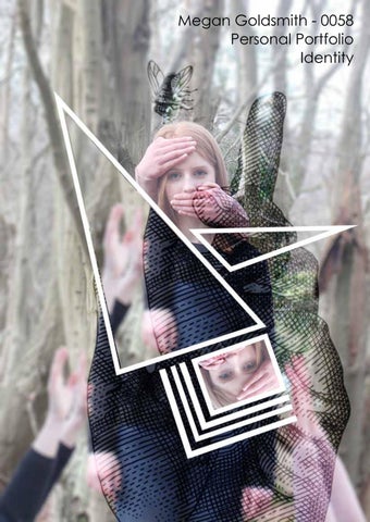
Final Piece Evaluation My final piece relates to identity because the 3D effect draws the attention away from the face and gives the person a more personal environment. The photos are taken in a wood which is an isolated area and makes you feel alone and away from communication. The surroundings of countryside are relaxing and a great place to get away from society. My final piece creates the idea of sadness, by the two end edits, and being pulled down, by mysterious hands in the middle edit. This creates strong emotions about hiding from your problems instead of facing them and how reality of life can put pressure on you to feel like you are being pulled down. It makes us think that the person doesn’t want to be seen by anybody which is why they are faded into the background and almost invisible in a wood while looking down to the floor.
My final piece relates to the style of Lissy Elle Laricchia’s photography. This photography gives you the idea of something being unreal, creepy and almost dream like. I like this style of photography because it’s different and make you feel curious and drawn in by how weird it is. My work relates strongly to Lissy Elle Laricchia’s work because it is very mysterious and has hand coming out of nowhere engulfing the person and dragging her down. Laricchia’s photography is also photographed in a wood which is also a strong link to my work. The most successful elements of my final piece were the geometric shapes that were raised up. This 3D effect gave a powerful illusion to this photography and emphasises personal identity because it is hiding some of the person. Cutting out and raising up the geometric shapes also went well because I didn’t slip and accidently cut off a section of the shape. Therefore, my final piece looks good and well made. On the other hand, to improve my final piece I could have raised up more of the geometric shapes at different heights to create a more 3D effect. This would emphasise the supernatural side of the piece more clearly.
Concept 2 identity of place intro page
Cohen Response To create my Cohen edits I looked at objects with sunlight shadows and unusual meetings of lines, on a road or a path. I made them look more like Cohens work by making them black and white and increacing the contrast. Finally I showed that i’ve been inspired by Alan Cohen by cropping the photos into squares and putting them into grids.
College Identity Response To make my College Identity edits I went around the college and took photos of things in the school for example stairs, lockers and things outside the college. This relates to identity by taking photos to show the key features of the college such as the green on the lockers; the colour makes them go with our school logo. Once I had got back to my computer I selected my 16 best photos to put into a grid. After making my first grid I rearranged the photos to make a second grid have a theme for example all the outside photos going down the side. After that I edited my first grid by adding a photo overtop and fading it. With the second grid I used threshold and then changed the layer settings to make it transparent. To make my simple edited photos I simply changed the contrast and brightness and equalized some of them to add effect.
I have developed one of my favourite edits and made it more abnormal like David Carson’s designs. I have shown techniques by changing the effects on photo shop to make them more like his designs. They relate to his work because I have given them a pencil effect by using thresh hold and over saturated the colours. I like that its different and that it looks abnormal. However, I don’t like that it’s unclear and the colours are adapted to look bright and overpowering.
Brighton Identity Edits These edits to relate to David Carson’s work because I have put glitched lines over them and re-arranged the words. The grainy effect on some of my edits is making the photo less clear like some of his edits. I like that they are creative and how the word across them links to the image yet goes deeper into the detail of the image. However, I don’t like the grainy effect of some of the edits because they make the photo fuzzy.
Layout
Variations
I have tried a few different layouts and I have decided to create the portrait one on a black background. I think this one will look the best because the black makes the writing stand out and it makes it an eye-catching physical piece.
Brighton Identity Final Piece
Brighton Identity Final Piece Evaluation My David Carson final piece edits go well together be-cause they are all relating to the beach, sea and seaside attractions. The colours and lines make them all look the same style as they make them look similar. By using the same font for the typography, it links the images and gives each edit a common identity. The techniques I have used was to keep them very simple by typically only adjusting the brightness and contrast and using similar typography. I like this effect because it reflects the place of Brighton better as the edits are more clear about what is there and what the place is like. I have taken the photos from a tour-ist’s view which shows the positives of Brighton. My photos are very Classic and I like this as its clearer and looks better in my opinion.
Initial Experiments With Double Exposure These are my first multiple exposure edits which were experimental. The animal photos are some of my preliminary photographs which were my original photos before I started the photography course. The backgrounds are photos I have collected from the internet to experiment with. I made the double exposure edits by using Photoshop. Firstly, I opened my animal photograph and carefully rubbed out the background to make it white. I then simply made a layer on top of the animal and pasted a woodland image which I exposed through the animal in the technique of double exposure. The exposure layer is shown through by mainly the screen and soft light filter setting. Finally, to make more of the animal face show through the landscape, I rubbed out on the woodland image so the face was more clear to see. This reflects identity of a place because the animal links to the background/environment it is in. This makes us learn about the animal’s identity and the identity of the place.
This is my own experimental edit so the animal and background are taken by me!
Layout Ideas
Maquette 1
I have tried to raise the dog above the geometrical shape which I like but I feel it is a little too sharp an angle. I feel the piece is stronger with the animal blending into the background. I have then raised the background off of the piece onto a square of foamboard, again I like the technique but feel this may complicate the presentation too much.
Maquette 1
For this second maquette I have simplfied the presentation. I have raised the background onto white foamboard using a similar shape. This, I feel is more successful and communicates the mood and style I feel compliments the edits best. I feel a set of these will work really well to take traditional images but make them more contemporary using the geometrical shapes.
Layout Option 1
Layout Option 2
Layout Option 3
Final Layout
Final Piece
Final Piece