Explain you Journal Concept...
final piece layout
EVALUATION
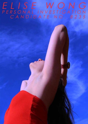
I think these images work well as a triptych, printed in a large size which I then displayed on black card to create thin borders around each image. I like how the colours in the rainbow pattern stand out against the black of her hair and now also the dark border.
Sketch of final piece
Chosen images for final piece
Chosen images for final piece
Chosen images for final piece
Chosen images for final piece
Digital Plan
Technical development
FINAL PIECE EVALUATION Following the overall theme of ‘Order and Disorder’, for concept three I wanted to explore how femininity and women in general have been portrayed in photography which introduced me to the concept of ‘the female gaze’, which I had never heard of before so was interested to research further. I found the way that the views on women have changed from the ideals of being a ‘housewife’ in the 1950s or being expected to act and look polished and flawless all the time has now changed to the modern acceptance of, previously known ‘imperfections’ and ‘ugliness’, such as body hair, stretch marks, cellulite and the growing level of openness that women feel to express themselves truthfully. It has taken a lot to come this far and this has been due to the help of young female photographers such as Petra Collins, Ashley Armitage and many more. I was firstly inspired by the photographers of Cindy Sherman to base a photoshoot around the portrayal of the common housewife to produce a series of traditional-looking black and white images and then used the style of Miles Aldridge to twist this idea into a more colourful and quirky shoot. I then focused on the modern portrayal of women by using Ashley Armitage’s images to inspire a photoshoot showing girls shaving, with minimal clothing to represent the openness and freedom that women luckily have today. I thought that these contrasting styles of images could work together in my final piece to show the viewers how far the views on women have changed through history. I used postcard sized images so that I could display a large quantity of photos at once and used wooden shelves to exhibit them. I really like how this turned out as it creates a very clean and polished look and clearly shows the contrast between the images, for example the black and white housewife images standing out within the coloured ones. I decided to mix the images so that they were not in any particular order to represent the disorder in how we got to these young female photographers being able to express themselves through their photography and to symbolize how it wasn’t an ordered and easy transition from the conservative and oppressive ideals for women to now. I also designed postcards to go along with the images and found that this was effective to tie all the images together using the same colour schemes as the photos and using words to depict the different styles of photoshoots. I think this made the piece more cohesive and clear. If I were to do it again however, I would have wanted to use objects to accentuate the images and create more of an installation, such as using saucepans and lipstick to represent the old views, with objects like bras and tampons to represent the new, more real views. This would have created a more interesting space which I think would have highlighted the contrast in the images more.