PORTFOLIO



GraphicDesigner

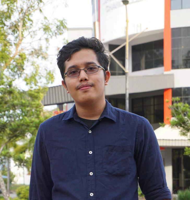
Mynameis MuhammadHaziqDanielbinAbdHalim, a passionate graphic designer who loves visual storytellingandpayscloseattentiontodetail.

EDUCATION
Foundationininformationtechnology
TATIUniversitycollege
2020-2021
BachelorDigitalGraphicDesign
TATIUniversitycollege
2021-2024
SKILLS

SOFTSKILLS

ADVERTISING ILLUSTRATION PACKAGING
4 5 6
PHOTOGRAPHY BRANDING INTERNSHIP PROJECT

ADVERTISING

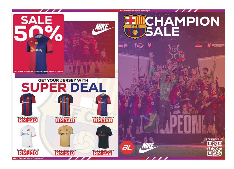
BARCELONAFCJERSEYSALESFLYER
IdesignedavibrantflyerforBarcelonaFCjerseysales, usingablue-redgradienttomatchtheclub’scolors. The front features the team’s image for strong branding,whilethebackhighlightsthejerseysonsale with discount details. A clean, engaging layout ensures the flyer is both visually appealing and informative.
SOFTWAREUSED :

COLORCODE:

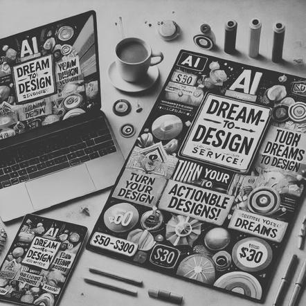
ADVERTISING
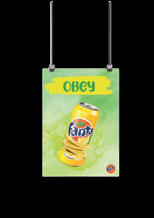
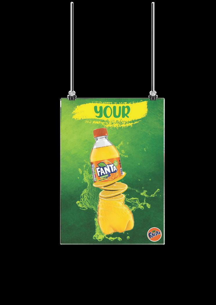
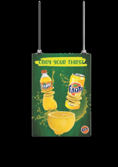
FANTAPOSTERSERIES
IdesignedavibrantposterseriesshowcasingFanta’s tin and bottle packaging. Using photo manipulation techniques, I enhanced the visuals to make the productlookfreshandenticing.Thedesignhighlights Fanta’s refreshing and energetic identity, creating a visuallyengagingexperienceforviewers.
SOFTWAREUSED :

COLORCODE:
ADVERTISING
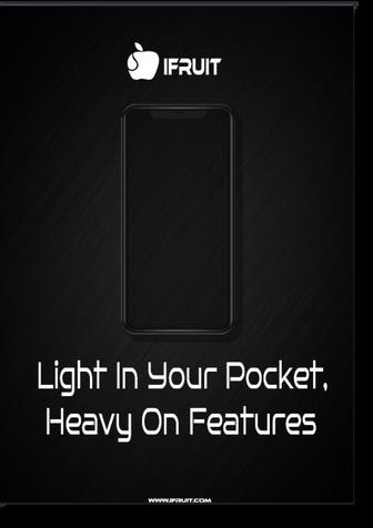
FANTAPOSTERSERIES
Idesignedasleekposterfeaturingthetagline"Lightin Your Pocket, Heavy on Features" to highlight the phone’s slim design and powerful features. A black background adds a premium touch, while bold typographyandstrikingvisualsenhanceitsappealto potentialbuyers.
SOFTWAREUSED :
COLORCODE:
ADVERTISING
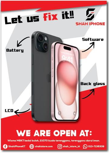
Thiscorporateidentityposterfeaturesacombination logopositionedatthetopleft,withaphoneimageat the center and Nexa Heavy typography for a bold look. The design adopts a clean white backdrop, exuding professionalism and clarity. The use of red accents highlights key elements, adding a dynamic and energetic feel, enhancing the overall visual impact. CORPORATEIDENTITYPOSTERDESIGN
SOFTWAREUSED :
COLORCODE:
ADVERTISING
Front
Back
CORPORATEIDENTITYFLYERSDESIGN
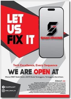
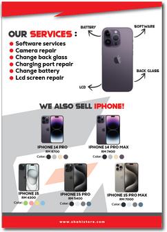
TheShahiPhoneflyersfeatureacombinationoflogo and bold typography (Nexa Heavy & Modern Machine) for a modern and impactful look, complemented by an image for visual appeal. The poster adopts a minimalist red and white color scheme, symbolizing clarity, passion, and energy, creating a strong contrast that enhances brand identityandvisualimpact.
SOFTWAREUSED :
COLORCODE:


ILLUSTRATION

FINALYEARPROJECT
Idesignedaboldandstronglogousingtheletter"S" as the main symbol to represent Shah iPhone. The geometric elements add a sense of strength and structure, while the modern machine font enhances its contemporary feel. The black symbol reflects elegance,whiletheredtypographyconveyspassion, creating a powerful and visually striking brand identity.
SOFTWAREUSED :
COLORCODE:
ILLUSTRATION
SONNET63POEMPOSTERDESIGN
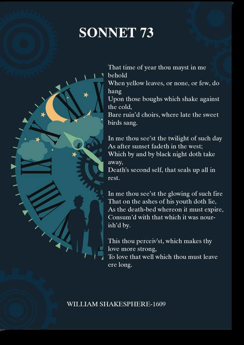
Thisdesigncapturesthepassageoftimewithadark blue background, symbolizing midnight’s reflective mood.Thecompositionblendsliteraryandvisualart, using color and layout to enhance the poem’s contemplative tone. This piece showcases my ability toconveyemotionsandthemesthroughbothwords andillustrations.
SOFTWAREUSED :
COLORCODE:
ILLUSTRATION

MOTIVATIONALPOSTER
I designed a bold and uplifting poster with the message "Be Yourself." A pointing hand illustration symbolizesself-identity,deliveringastronganddirect command.Thedesignmergespowerfulimageryand inspiring text to encourage self-confidence and authenticity.
SOFTWAREUSED :
COLORCODE:
ILLUSTRATION
DESIGN:
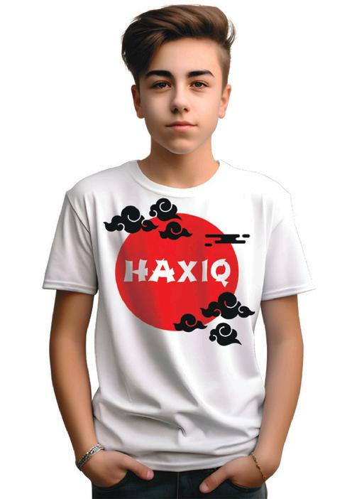
SELFDESIGNSHIRT(JAPANESETHEME)
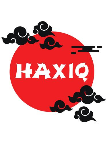
Icreatedaminimalistyetstrikingshirtdesignwitha cleanwhitebackgroundandaredcircleatthecenter, symbolizing the Japanese flag. Inspired by Naruto, I added cloud illustrations to blend traditional and modern elements, resulting in a culturally rich and visuallydynamicdesign.
SOFTWAREUSED :
COLORCODE:
PACKAGING PACKAGING PACKAGING PACKAGING PACKAGING PACKAGING

PACKAGING PACKAGING PACKAGING PACKAGING PACKAGING PACKAGING
PACKAGING
DESIGN:
MOCKUP:
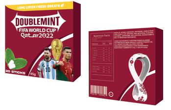
DOUBLEMINTWORLDCUP2022PACKAGING
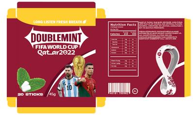
I designed thematic packaging for Doublemint, featuring two top football players to capture the excitementofWorldCup2022.Amaroonbackground reflects the tournament’s official color scheme, creatingaboldanddynamiclook.Thisdesignaimsto attract football fans and enhance the product’s appealduringtheevent.
SOFTWAREUSED :
COLORCODE:
PACKAGING
DESIGN:
MOCKUP:
SELFDESIGNSHIRT(JAPANESETHEME)
Icreatedaminimalistyetstrikingshirtdesignwitha cleanwhitebackgroundandaredcircleatthecenter, symbolizing the Japanese flag. Inspired by Naruto, I added cloud illustrations to blend traditional and modern elements, resulting in a culturally rich and visuallydynamicdesign.
SOFTWAREUSED :
COLORCODE:
PACKAGING
DESIGN:
NABATIPACKAGING
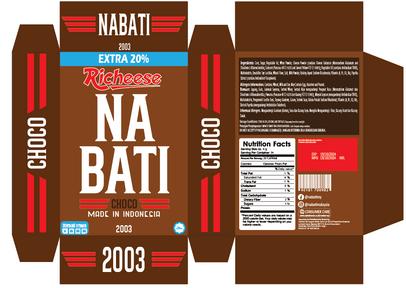
I designed Nabati’s packaging using rich chocolate tones and a bold, western-style font to create a classic, rustic feel inspired by the Old West. This typography-focused approach highlights the indulgent chocolate flavor, giving the packaging a distinctiveandappealinglook.
SOFTWAREUSED :
COLORCODE:
PACKAGING
DESIGN:
MOCKUP:
NABATIPACKAGING
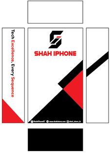
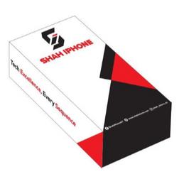
The Shah iPhone packaging features a combination logo, bold Nexa Heavy typography, and the tagline “Tech Excellence, Every Sequence” to highlight innovation.Contactdetailsareplacedatthebottom for easy access. Made from durable cardboard in a compact cuboid shape, the design’s modern colors and geometric patterns reflect precision and excellence.
SOFTWAREUSED :
COLORCODE:
PHOTOGRAPHY PHOTOGRAPHY PHOTOGRAPHY PHOTOGRAPHY PHOTOGRAPHY


PHOTOGRAPHY PHOTOGRAPHY PHOTOGRAPHY PHOTOGRAPHY PHOTOGRAPHY
PACKAGING
FOODPHOTOGRAPHY(DONUT)
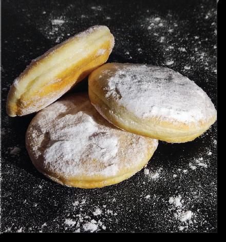
I captured a front-angle shot of a donut using side lighting to create dramatic shadows and highlights. Sprinkledsugaraddstextureandvisualinterest,while theblackbackgroundenhancescontrast,makingthe subject stand out. This composition showcases my skillsinlighting,composition,andfoodphotography.
CAMERAUSED :
PocoF3camera
PACKAGING
CREATIVEAPPROACHPHOTOGRAPHY
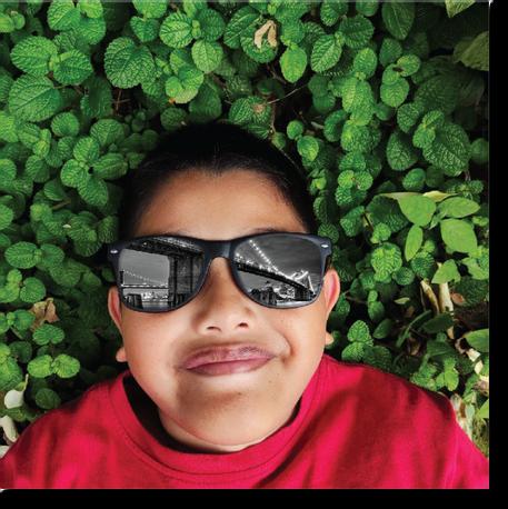
I captured a portrait of my brother wearing sunglasseswhilelyingontheground.Toaddaunique artistictouch,Ieditedthelensestoreflectanimageof a bridge. This creative technique blends portrait photography with a scenic element, making the compositionmorevisuallyengaging.
CAMERAUSED :
PocoF3camera
SOFTWAREUSED :
PACKAGING
PHOTOMANIPULATION
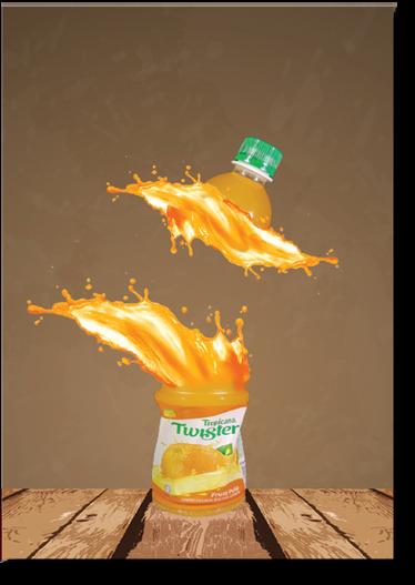
I captured a Twister Orange Juice bottle and creatively split the image in the middle, separating thetopandbottomhalves.Toenhancethedynamic effect, I added an orange juice splash at the split, creating a sense of movement and freshness. This technique highlights the product’s vibrant and refreshingnature.
CAMERAUSED :
PocoF3camera
SOFTWAREUSED :

BRANDING BRANDING BRANDING BRANDING BRANDING BRANDING BRANDING BRANDING BRANDING BRANDING BRANDING BRANDING BRANDING BRANDING BRANDING BRANDING
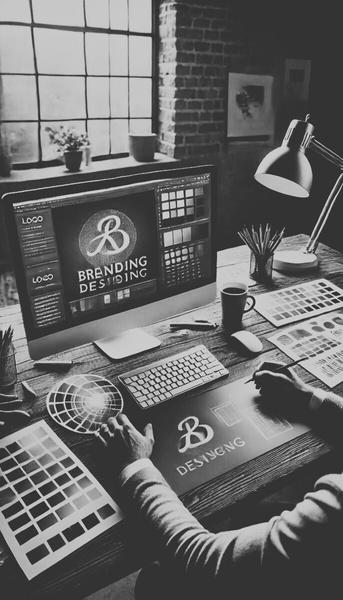
BRANDING
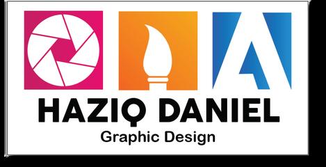
PERSONALLOGODESIGN
I designed a personal logo featuring three sketched icons:acameraforphotography,abrushforcreative artwork,andanAdobeiconfordigitalillustration.This designeffectivelyrepresentsmydiverseskillsetand professionalidentity.
SOFTWAREUSED :
COLORCODE:
BRANDING
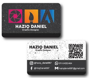
PERSONALBUSINESSCARD
I created a modern business card with a sleek grey and dark theme featuring a dust effect background. Thefrontshowcasesmyself-designedlogo,whilethe back displays my contact details and social media handles, ensuring a professional and stylish presentation.
SOFTWAREUSED :
COLORCODE:
BRANDING
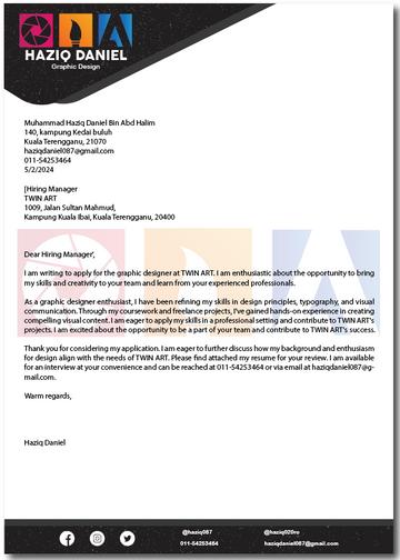
LETTERHEADDESIGN
I designed a sleek letterhead with a grey and dark themefeaturingasubtledusteffectbackground.My self-designed logo is prominently placed at the top, along with my contact details for consistency. This unified design reinforces my brand and professionalism.
SOFTWAREUSED :
COLORCODE:
BRANDING
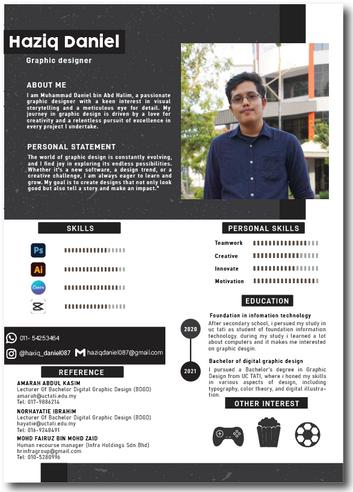
RESUMEDESIGN
I designed a clean and professional resume that ensures a consistent brand identity. It includes my name, photo, skills, education, contact details, and references, all presented in a visually appealing and organized format to highlight my experience and expertise.
SOFTWAREUSED :
COLORCODE:
BRANDING
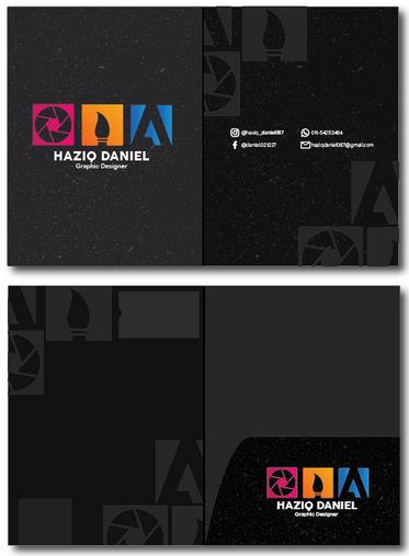
POCKETFILEDESIGN
I designed a sleek pocket file with a grey and dark themefeaturingasubtledusteffectbackground.My self-designed logo, representing my skills in photography,creativeartwork,anddigitalillustration, enhances brand consistency. This design reinforces myprofessionalimageacrossallmaterials.
SOFTWAREUSED :
COLORCODE:

INTERNSHIPPROJECT
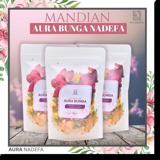
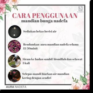
AURANADEFADIGITALPOSTER
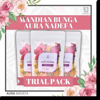
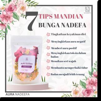
During my internship, I designed a digital poster for MandianBungaAuraNadefausingCanva.Thedesign complemented the white packaging with warmcoloredflowers,creatinganelegantandcalmingfeel. Stylish fonts and a subtle background enhanced the floraltheme,ensuringacleanandvisuallyappealing look.
SOFTWAREUSED :
COLORCODE:
AURANADEFADIGITALPOSTER
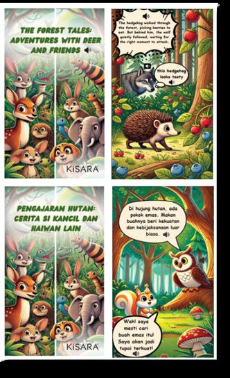
I designed a bilingual children's eBook in Malay and English, using Canva for an engaging, ageappropriate layout. To enhance the storytelling experience,IaddedvoicenarrationwithHeyzineand an AI-generated voiceover using CapCut. This interactive eBook combines visual and audio elements,makingitenjoyableforyoungreaders.
SOFTWAREUSED :

VOICEOVER:

BACKGROUND/PICTURE:

INTERNSHIPPROJECT
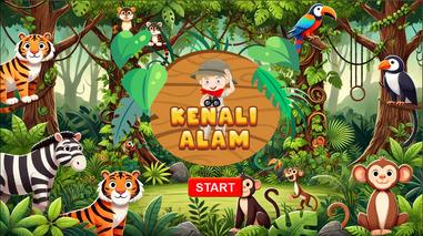
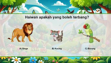
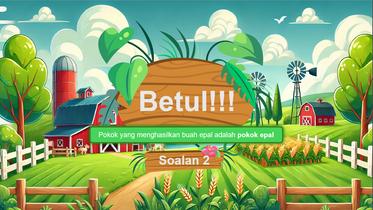
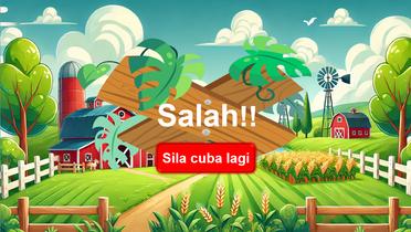
EDUCATIONALPUZZLEGAMES
Idesignedaseriesofinteractivepuzzlegamesusing Microsoft PowerPoint for children aged 5-7 years. Covering subjects like Mathematics, Pendidikan Jasmani, Science, Kenali Alam, and English, these engaging and visually appealing games make learning fun and effective, helping young learners developkeyskills.