Portfolio









HAZIQ DANIEL Graphic Designer
I am Muhammad Daniel bin Abd Halim, a passionate graphic designer with a keen interest in visual storytelling and a meticulous eye for detail. My journey in graphic design is driven by a love for creativity and a relentless pursuit of excellence in every project I undertake.
The world of graphic design is constantly evolving, and I find joy in exploring its endless possibilities. Whether it's a new software, a design trend, or a creative challenge, I am always eager to learn and grow. My goal is to create designs that not only look good but also tell a story and make an impact."
Foundation in infomation technology TATI University college 2020-2021
Bachelor Digital Graphic Design TATI University college 2021-2024



















I designed a flyer for the SafeTouch toy, aimed at parents to help them teach their children about safe touch. I used a minimalist concept to ensure the information is clear and easy to understand. The clean design focuses on essential details, making it straightforward for parents to read and communicate the message to their kids effectively. This flyer combines simplicity with important educational content, making it a useful and accessible tool for parents.











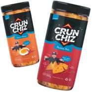










I designed a series of five web banners to advertise the SME product "CRUNCHIZ." Each banner features the product prominently in the center, surrounded by a list of its key characteristics. The gray background provides a sleek and modern look, ensuring that the product and text stand out clearly. At the bottom of each banner, I included icons for social media platforms to encourage engagement and connect with customers online












www.iFruit.com









I create a poster for phone selling with attractive word to attract customer. also i apply black color background to make it look premium.
Software used:





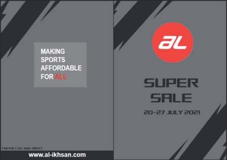
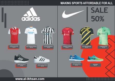
I designed a flyer for Al Ikhsan Sports Wear. I used a grey background to give it a sporty and modern look.The flyer features top-selling products prominently to attract and engage customers. This design aims to highlight the brand's popular itemsandcreateavisuallyappealingandeffective marketing tool.




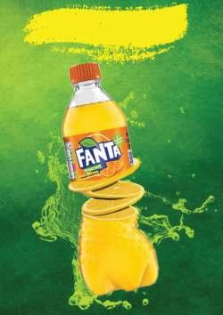

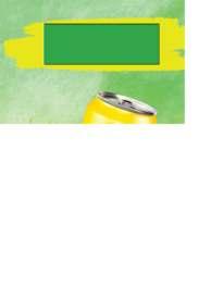
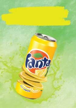

I designed a series of posters for Fanta, showcasing two different packaging options: a tin and a bottle. Each poster features photo manipulation techniques to enhance the visual appeal and make the product look fresh and enticing. The series highlights the vibrant and refreshing nature of Fanta, using creative visuals to attract and engage viewers.








That time of year thou mayst in me behold
When yellow leaves, or none, or few, do hang
Upon those boughs which shake against the cold, Bare ruin’d choirs, where late the sweet birds sang.
In me thou see’st the twilight of such day
As after sunset fadeth in the west; Which by and by black night doth take away, Death's second self, that seals up all in rest.
In me thou see’st the glowing of such fire
That on the ashes of his youth doth lie,
As the death-bed whereon it must expire, Consum’d with that which it was nourish’d by.
This thou perceiv'st, which makes thy love more strong, To love that well which thou must leave ere long.
WILLIAM SHAKESPHERE-1609
I designed a visual representation of my poem titled "Sonnet 73," which explores the theme of time. I incorporated a clock illustration and clock gears to symbolize the passage of time. The design features a dark blue background to evoke the feel of midnight, enhancing the poem's reflective and contemplative mood. This piece combines literary and visual art, demonstrating my ability to convey themes through both words and illustrations.







I designed a motivational poster with the message "Be Yourself." I illustrated a hand pointing forward to represent "you," delivering a bold and direct command to the reader. This visual element emphasizes the empowering message, encouraging self-confidence and authenticity. The design combines strong imagery with inspirational text to create a compelling and uplifting poster.



I designed a Japanese-themed shirt with a clean white background. At the center, I placed a red circle, evoking the iconic Japanese flag. To add a unique touch, I incorporated cloud illustrations inspired by the popular Naruto anime. This blend of traditional and contemporary elements creates a visually striking and culturally rich design.
Software used:





I created a detailed face trace illustration of Paulo Dybala using Adobe Illustrator. This vector art captures his likeness with clean lines and precise detailing, showcasing my skills in digital illustration and my ability to represent well-known figures accurately. This piece highlights my proficiency with Adobe Illustrator and my attention to detail in creating lifelike portraits.






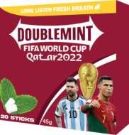
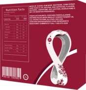
I designed imagery packaging for Doublemint with a World Cup 2022 theme. The design features two of the best players as models, capturing the excitement of the tournament. I used a maroon background to align with the official World Cup color scheme, creating a bold and dynamic look that celebrates the global event. This packaging design aims to attract football fans and enhance the product's appeal during the World Cup season.







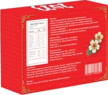










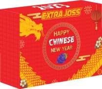
This design features a gold dragon illustration on a vibrant red background, celebrating the Chinese New Year. The dragon symbolizes strength and fortune, while the red and gold colors evoke prosperity and joy. This festive packaging creates a strong visual impact, perfect for seasonal promotions.






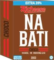
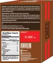
This Nabati packaging design, I used rich chocolate colors and a bold, western-style font layout. The design evokes a classic, rustic feel, reminiscent of the Old West. This typography-focused approach highlights the product's indulgent chocolate flavor while giving it a distinctive and appealing look.


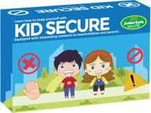








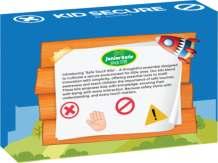
I created the packaging design for a Safe Touch Kit aimed at children. I used a kid-friendly blue color scheme and incorporated a clear "NO" sign to emphasize safe touch principles. While the kid illustration was prepared by my partner, my focus was on designing an engaging and informative package that appeals to children and effectively communicates the message of safety





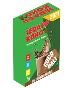
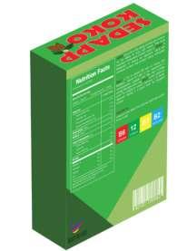
I designed packaging for "Koko Sedap," featuring vibrant illustrations. The main illustration showcases a cocoa fruit, emphasizing the natural and rich ingredients of the product. I used a green background to convey freshness and health. Additionally, I included a glass of cocoa drink in the background to highlight the product's delicious and refreshing nature.This design aims to attract customers with its appealing visuals and clear representation of the product.




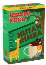
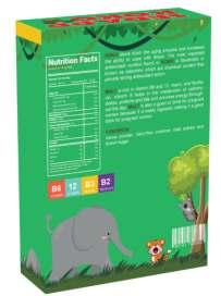
I designed packaging for "Koko Sedap" with a jungle theme. The design features illustrations of jungle creatures, creating a lively and adventurous feel. This approach highlights the product's natural origins and adds an element of fun and excitement. The vibrant and detailed jungle scene aims to attract customers and make the packaging stand out on the shelf.
Software used:




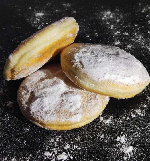
I photographed a donut as my assignment. I captured the shot from a front angle with side lighting to create dramaticshadowsandhighlights.Isprinkledabit of sugar around the donut to add texture and visual interest. The black background enhances the contrast, making the donut and sugar stand out vividly.This composition highlights my skills in lighting, composition, and creating an appealing food photograph.




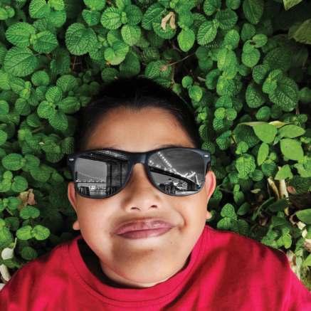
I photographed my brother wearing sunglasses while lying on the ground. As a creative approach, I edited the image to reflect a picture of a bridge in the lenses of the sunglasses. This technique adds a unique and artistic dimension to the photo, blending portrait photography with a scenic element.

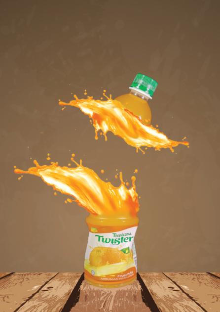
I photographed a Twister Orange Juice bottle. I creatively split the image of the bottle in the middle, separating the top and bottom halves. To add a dynamic and eye-catching effect, I applied an orangejuicesplashinthemiddlewherethebottleis split. This technique creates a sense of movement and freshness, highlighting the product's vibrant and refreshing nature.





In addition to scoring two goals, the 24-year-old Terengganu FC player also assisted naturalized player Lee Tuck to score his first goal on his debut with the national team before Stuart Wilkin followed suit with a goal at the end of the action. The central defender, Sharul Nazeem Zulpakar believes that other players are capable of shouldering the task of covering the gap left by the two players in the 'Causeway Derby' action in suzuki electric cup 2022. The 34-year-old player who is also a Sri Pahang FC striker described the victory over Cambodia asa good start for him in the national squad.
in Hanoi (December 27) and host Singapore in Bukit Jalil (January 3).The injury status of Ahmad Khuzaimi, better known as Piee, is still unclear after being seen using a stick after Malaysia narrowly won1-0overMyanmarintheopening matchofGroupBatThuwunnaStadium, Yangon, on 21 December. Muhammad Azam was shown a red cardwhenJapaneserefereeRyujiSato accused the young Terengganu FC player of fouling Doan Van Hau outside the field in a controversial action when Malaysia lost 0-3 to Vietnam at the My Dinh National Stadium, Hanoi, last Tuesday.

The Selangor FC captain is optimistic that the opportunity for the Harimau Malaya squad to continue progressing in the South EastAsia'WorldCup'competition is not yet over. Sharul Nazeem is determined to protect the defense as best as possible from being conceded by the Singapore players.Controversyeruptedinthe 59th minute when Japanese referee Ryuji Sato awarded a penalty kick to Vietnam after Azam Azmi Murad allegedly fouled Doan Van Hau.
The situation triggered a fierce competition between the three teams involved in an effort to seizethetoptwopositionstograb a slot in the semi-finals.At the same time, he also thinks that Malaysia must win against Singapore in an effort to get three full points and thus qualify for the semi-finals.. Vietnam and Singapore will first face off at the Jalan Besar Stadium on Friday with the action also affecting Malaysia's chances of reaching the piala malaysia in august semi-finals.
Theabsenceofthetwomainpillarsof the defense, Ahmad Khuzaimi Piee and Muhammad Azam Azmi Murad did not affect Harimau Malaya's preparations ahead of the crucial action against Singapore in the final match of Group B of the AFF Cup 2022 at the National Stadium, Bukit Jalil, 3 January ini.Muhammad Mukhairi also informed that his teammates have forgotten the sad episode inHanoiandarenowmorefocusedon trying to grab a slot to the semi-finals.now the team had a new season to face off. 2023 malaysia super.


"The presence of a player who has played with the team of his home state will have an impact in diversifying the team's attack, especially since TFC will compete in theAFC Cup (Asian Football Confederation) in addition to the Malaysian League (M League) nextseasonsowewilldoourbest,"saidthestatement Thisseasontheplayerwhostartedhiscareerwiththe Sri Pahang President's Cup team starting in 2014 performed brilliantly with TFC and was often dropped as the main player under former coach, Nafuzi Zain.he player who also got an offer from Sri Pahang FC helped TFC emerge as runners-up in the FA Cup and Super League, the semi-finals of the Malaysia Cup as well as qualifying for theAFC Cup next season. The absence of winger this season, MohdFaisalHalimwhochosetomigratetoSelangor FC next season is expected to be filled by Nik Muhammad Sharif in that position. however we must stay focus and put alot of effort to challenge top spot of malaysia super league
In this layout publication, I crafted a dynamic sports section featuring two captivating headlines that draw readers into the latest sporting events and highlights. Located in the bottom left corner, the advertising section showcases a variety of enticing promotions and offers. From local businesses to national brands, advertisers can reach their target audience in this prime location, attracting attention and driving sales.







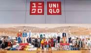
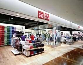

On the front page of this magazine, I feature a stunning model showcasing the latest Uniqlo products. With the title "Uniqlo Style," the cover promises a glimpse into the world of fashion and comfort that Uniqlo offers. This captivating image sets the tone for the magazine, inviting readers to explore the latest trends and styles from Uniqlo. Within the pages of this magazine, i put a lot of content for example background of Uniqlo, discovering its origins, values, and vision. Against a clean white background, articles and visuals shine brightly, offering clarity and focus.



















Graphic Design

I designed a personal logo featuring three sketched icons: a photography icon to showcase my photography skills, a brush icon to represent my creative artwork abilities, and an Adobe icon to highlight my digital illustration expertise. This logo succinctly captures my diverse skill set and professional identity.
Software used:





HAZIQ DANIEL


HAZIQ DANIEL
Graphic Designer
Graphic Designer _daniel087

I used a sleek grey and dark color scheme with a dust effect background to create a modern and professional look. On the front, I placed my self-designed logo, which features icons representing my skills in photography, creative artwork, and digital illustration. The back of the card includes my name, contact number, social media handles, and email address, ensuring all my essential contact information is easily accessible. This design effectively conveys my professional identity and personal style.




 HAZIQ DANIEL
Graphic Designer
HAZIQ DANIEL
Graphic Designer

Muhammad Haziq Daniel Bin Abd Halim 140, kampung Kedai buluh Kuala Terengganu, 21070 haziqdaniel087@gmail.com
011-54253464
5/2/2024
[Hiring Manager TWIN ART
1009, Jalan Sultan Mahmud, Kampung Kuala Ibai, Kuala Terengganu, 20400

Dear Hiring Manager',



am writing to apply for the graphic designer at TWIN ART. I am enthusiastic about the opportunity to bring my skills and creativity to your team and learn from your experienced professionals.
As a graphic designer enthusiast, I have been refining my skills in design principles, typography, and visual communication. Through my coursework and freelance projects, I've gained hands-on experience in creating compelling visual content. am eager to apply my skills in a professional setting and contribute to TWIN ART's projects. am excited about the opportunity to be a part of your team and contribute to TWIN ART's success.

Thank you for considering my application. I am eager to further discuss how my background and enthusiasm for design align with the needs of TWIN ART. Please find attached my resume for your review. I am available for an interview at your convenience and can be reached at 011-54253464 or via email at haziqdaniel087@gmail.com.
Warm regards,
The letterhead features the same sleek grey and dark color scheme with a subtle dust effect background. My self-designed logo, which highlights my skills in photography, creative artwork, and digital illustration, is prominently placed at the top. The layout includes my name, contact number, social media handles, and email address, ensuring consistencyacrossallmyprofessionalmaterials. This unified design reinforces my brand and professionalism.
Haziq Daniel

I

The
ensuring
AMARAH ABDUL KASIM
Lecturer Of Bachelor Digital Graphic Design (BDGD) amarah@uctati.edu.my Tel: 017-9886214
NORHAYATIE IBRAHIM
Lecturer Of Bachelor Digital Graphic Design (BDGD) hayatie@uctati.edu.my Tel: 016-9248491



The pocket file features the same sleek grey and dark color scheme with a subtle dust effect background, along with my self-designed logo that represents my skills in photography, creative artwork, and digital illustration. This design provides a cohesive look that reinforces my professional image across all materials.



_daniel087